Pedal to the Metal
I was asked by my husband recently to give a piece to an auction — something I don’t ordinarily consider — but for various reasons, he wore me down & I decided to make something. In deciding on something that would do well at auction, I started thinking about framing it — which I haven’t done before — but I am starting to think that there is a larger art market out there that appreciates the simplicity of hanging a piece on a nail. It has become 2nd nature for me to hang my work on a rod — but when I gave a piece to my mom last year, I started to understand the frustrations that a hanging sleeve will give to an average person.
So it is my intention to frame the piece. I’m being a little noncommittal because I want to be able to change my mind. But in making the piece, I intentionally started with a standard framing size — 20″ x 24″.
And subject matter was another issue. In the great state of Georgia, what would appeal to the masses? That was an easy question to answer — football. And the most beloved symbol of Georgia football is its bulldog, a majestic animal that would make a fine subject for a portrait.
I really sweated the fabric choices on this. The bulldog has white fur — and I could have gone white and then started adding B&W fabrics in different degrees — but the end piece would look more graphic than familiar — so I attempted <gasp> solids. Or almost solids.
Interestingly, I’ve found that I’ve started segregating beyond basic colors — I now look for shades of pink reds — and shades of orange red. I tell myself that it is more about the shade than the color — but if you have 2 different kinds of red in a piece, it makes a difference.
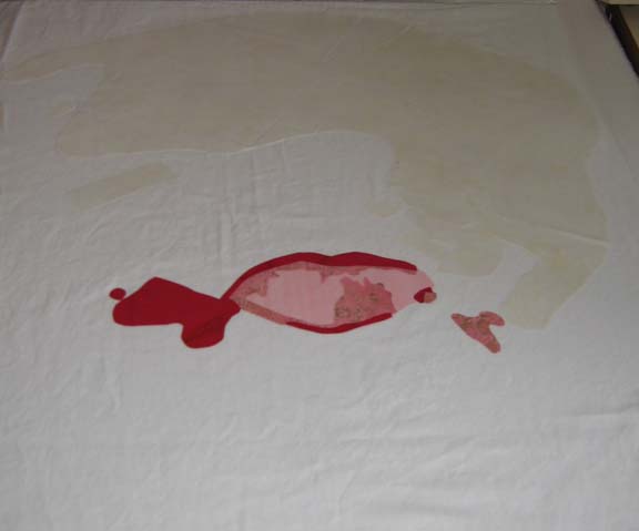
I started with his mouth. Why? I don’t know. I try to start with the lightest colors & move to the darker colors so that I don’t have shadowing problems. Sometimes the muse moves us in mysterious ways. The pink looks like it goes too far to the right and left — but trust me — a bulldog’s mouth opens really wide & parts of it hang out.
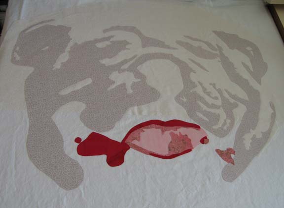
Then the 1st fabric for the white. After I laid it out & started the 2nd value, I realized that the 1st fabric was not right — it was casting a yellow cast that I didn’t like. I needed whites that were more blue — so I tore off what I had done of the 2nd & re-did the 1st — and then re-applied the 2nd.
It looks a lot better — although I don’t know if the camera catches the subtle shift in color. No matter — trust me, it wasn’t working. The 2nd layer adds a lot of character.
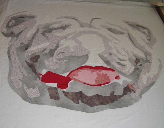
This is after the 3rd & 4th values. I really wondered if this was going to work after the 3rd value — but the 4th helps pull it together I think.
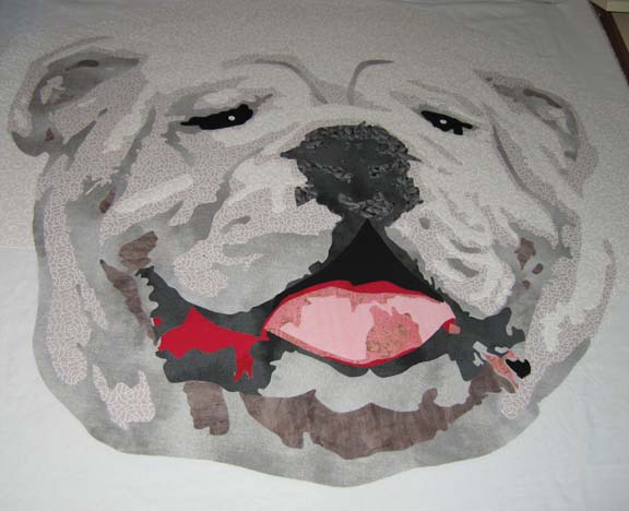
Adding the different shades of black add the spark to his eyes and nose.
There is still a lot to do — I have to be done by the end of the month. I’m considering making a piece a month this year in about this size. That way, I could make 8 instead of 3 or 4 larger ones — and I think that the exposure to more subjects is what I need right now.


