textile paintings
Just the Basics
My mother is an impressionist oil painter, and when I was young and she went back to college to receive another degree in art, I remember her talking about the bias against realism in the art world. Abstract work was more highly valued — and for a very long time, I’ve disagreed with that opinion. I do like some abstract work, but I tend to be more engaged with realistic work. In fact, I’ve always felt that realism was harder to achieve than many pieces I’ve seen. That’s a huge generalization obviously — but I thought that abstract art was more about serendipitous exploration than intentional exploration.
At this point, I realize that that isn’t true — at least it isn’t true of good abstract art. It’s based on a deep understanding of color theory and how to make it work for you. I also understand why some consider it more difficult than realism. With realism, you have a point of reference from which to work. (It may not be a good point of reference, but that’s a different issue.) With abstract work, you are working entirely with theories and attempting to turn them into something engaging.
I have respect for both points of view. I work primarily in realism because that is what I like to do — but occasionally, I challenge myself to do something different — and that is what I have started here. As part of my art group’s annual exhibit, we were given playing cards to interpret. I had all ready made Jacks Are Wild — but I was given another card that I thought I could play with in a more abstract way — the six of Diamonds.
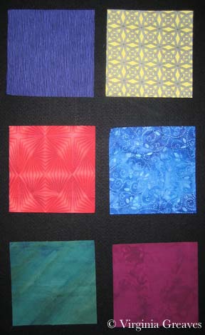
Using my color wheel, I chose six colors — starting with cyan — and then every other color around the wheel: blue, magenta, red, yellow, and green. I then picked out a light and a dark in each of these colors. Below are six 6 1/2″ squares of the dark. I know the yellow screams a little. It has a tight black pattern on it. It will make more sense when it is seen smaller and in the context of the entire piece.
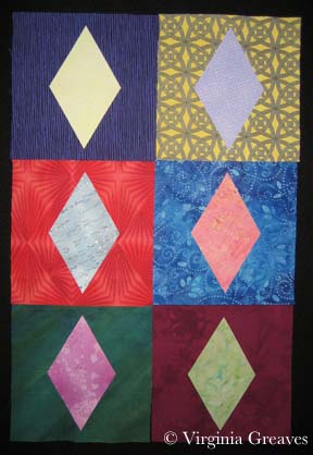
Then I made six diamonds from the light values and placed them on opposite sides of the color wheel — for example, the blue background got the yellow diamond.
Of course, at this point, I know I have to make the piece longer. The challenge requires it to be 36″ long, so I decide to add squares in the light values.
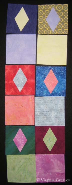
They look awful blank so I decide to add a common shape — a circle — in the dark values — to place on the light colored squares. I used a round container I had in the studio for a template. It was just the right size to fill the space in the squares I had cut.
I am, by the way, appliqueing all of these shapes. I had considered piecing the diamonds onto their backgrounds — but I wasn’t going to attempt to piece a circle — so I decided I would stick with machine appliqué. This is a Wonder Under template you see below.

I have two rows of blocks. This is how they were originally laid out on the design wall, but I decided it was too predictable. I left diamonds next to diamonds and circles next to circles, but I changed the color placements so that each color wasn’t clustered with its cousins.
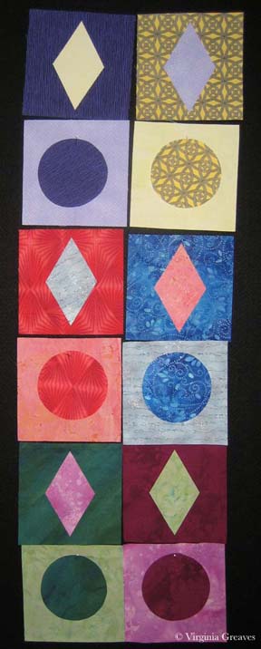
This was very straightforward playing with color theory. Below you can see the two strips of shapes. Not exciting enough on its own though.
I turned to my old pal deconstruction for the next part. I made a background with black, white, and a couple of grays.
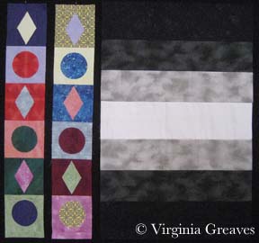
Then I cut the strips of shapes into 1/2″ sections and fused them onto the background.
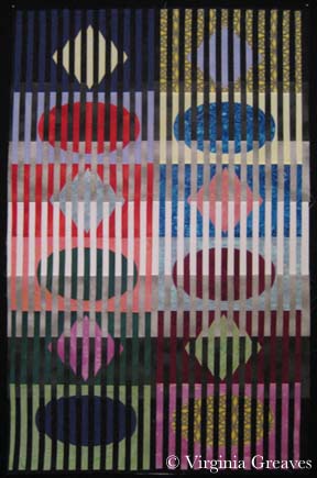
I’m still working on the appliqué. Even though it’s just shapes and color, does it sing? I definitely think it has a sense of movement.
I don’t know that I’ll ever work exclusively in abstract, but it’s good to dust off my skills and try something new once in a while.