textile paintings
Breathing Soul
I have been considering my portrait for entry into the National Portrait Gallery (NPG) competition. It’s always a challenge, artistically, to reverse engineer something — but it also can create a better opportunity for success.
I’ve been studying the work from last year that reached the finals — and I know that whatever I do, my goal is not realism necessarily. There were certainly pieces in last year’s competition that were realistic — and some that were abstract but clearly representative of the human form. I think the greater question is — what can I do that sets my work apart? I can make a piece that looks like a painting from a distance of a couple of feet — but perhaps the better curatorial choice would be one that best represents the materials being used — which in my case is fabric.
So I spent a few days considering the painting of the man with the quilt pulled up to his chin — but in the end, I decided that that’s a poor place for me to start. I don’t make traditional quilts and I have no interest in calling to mind the traditional pieced quilts that grandmothers have created for years.
And then a friend of mine said something on Facebook that struck me. She said — not in regards to me but in general — she felt that representative work in contemporary art was soulless. Wow. And I went back and looked at the fabrics that I was considering for my next portrait (yes there are some value issues here I had not yet resolved) — and I realized that I was following the formula I knew for creating a realistic portrait — and that it was going to feel soulless and boring.
I have felt for a long time that the soul of a portrait is found in the eyes — or the hands — and that’s true — but it’s not enough — not nearly enough for the piece to stand out and grab the attention of the viewer.
And then I started thinking in terms of color. Color does not have to be as straight forward as I was making it. A strict gradation from beige into black was perfectly acceptable — but was it exciting?
I’ve been considering the work of Vincent van Gogh a lot recently — and his work is largely arresting because he used color theory so successfully. Forget what color the thing you’re representing really is — make it what it needs to be in the piece to make the piece successful.
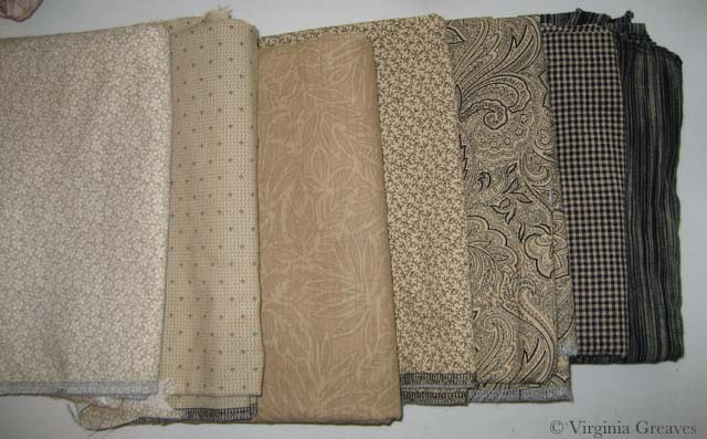
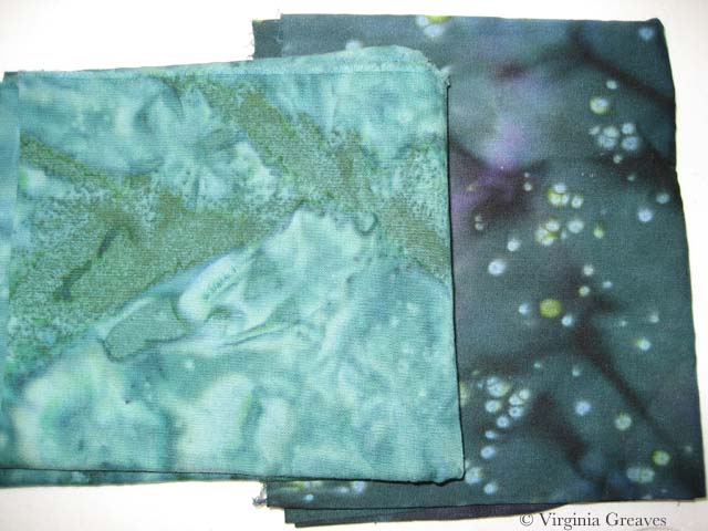
So I started over. I started with beige again but then I went into blue, ending with a deep midnight blue. My fifth fabric, the blue and brown batik, is a step out — but it transitions the beige into the blue. The fourth fabric was difficult. I ended up finding this clay color in my brown bin. It’s a transitional neutral fabric and it’s the right value so it works.
I usually pick the first color family and then start cutting, but I knew that all of it is in relationship to each other — so I went on to pick the fabrics for the eyes. My model does have green eyes — and for this piece, I think that these two will stand out well.
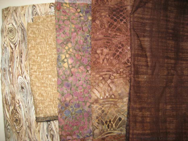
My goal in the hair is to have purplish brown. This is my starting place. The middle one may be too red — but unfortunately, I can’t make it to the fabric store today. (Someone stole my credit card number yesterday and I am stuck waiting on a new one to be delivered.) I think my stash is not complete enough here and I plan to change a couple of these with new fabrics soon — but this gives you an idea of where I’m headed.
I have a beautiful mottled green I’ll probably use in the background.
My goal is to create an analogous color harmony — to use what I know about color to breathe soul into her — to make her come alive in cloth — for her spirit to become apparent in the image. Let’s hope that my bold choices in fabric will help me achieve that goal.
As to whether it will be enough to be juried into the NPG — who knows? But hopefully it will help move me further along in my artistic journey.