Jonathan’s Stole
1It must be the season for liturgical stoles. I have been working on one for my Anglican priest and decided that he should have it in time for Easter. As I was making a page for it on my website, I noticed that someone else on QuiltArt has recently posted several stoles that she has done.
Jonathan is Anglican — but fairly nontraditional — and was interested in having a stole that he could wear throughout the church seasons. It only made sense to make it with a rainbow. I painted the colors on white fabric — blended them — added salt — and then let it sit on my design table knowing it needed more. I wasn’t sure what. I thought about it a lot & knew that time was ticking by. I eventually stamped gold filigree on it — but it wasn’t enough. I finally decided on a Celtic knot stamped in purple. OK — that seemed to make it come together. Then I reverse appliqued a cross on each side and a dove on each shoulder (reverse since the fabric is satin and would shred like crazy if I put it on top). I used some watermark purple taffeta I had in my stash for the lining — and finished it today.
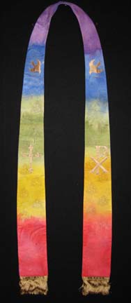
You can also see detail shots of it on my website page here. The camera went nuts with the color range and the sparkle, but I did the best I could.
By the way, I spent quite a bit of time worrying about a pattern. I didn’t really want to guess on the neckline. I finally found a copy of Simplicity’s discontinued #7950 for sale on eBay. It baffles me that there is such a demand for liturgical garments and no-one is currently providing patterns for them.
I Love Photoshop
2Photoshop is such a great design tool. I have the little Elements version — but it never ceases to amaze me. I don’t know what I would do without it. Julie Hirota showed me how to manipulate a piece of my work in Photoshop a couple of years ago — and I still use it a lot. It is always easier to visualize the piece before you cut everything out & then see your mistakes.
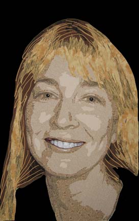
This morning I’ve been looking at my latest piece trying to decide what to use for the background — and if I should change the brown in the background of the hair. Stacy West suggested I use black for the background — and then I added some lines in a light blond/orange color for the quilting lines.
I think that the dark brown will work fine once I add the lighter color thread in the quilting stage. I tried to use a color closer to ash as a substitute — but then it kept fighting with the 3rd value range in the skin.
And I love the black. I haven’t decided if I’ll also use it for her shoulders or not.

First Things Last
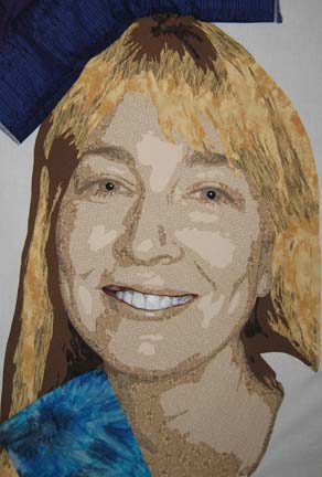
2When I make a portrait, I typically add the background last & do something unrelated to the original picture. Unfortunately, with my latest piece, I have used so much of my energy on the face, now that it is done, I have hit a creative block. I do not know what to do for the shirt and background.
Here is what it looks like now with a few fabrics auditioned against it:
I know that blue, green, and purple are far enough away on the color wheel from yellow to give me some good contrast, but I also know that the choices have to be fairly dark to offset the hair and the neck. Nothing in my closet is jumping out at me though.
This is frustrating because spring break is almost upon me — so I won’t get any work done next week — and then I only have a short period of time to finish it completely before school is out for summer — and I don’t have any studio time.
I can either use one big piece for the background, something patterned (but not too much — I don’t want it to look like bad wallpaper), or I can use strips — giving a more abstract feel. What to do, what to do . . . . .

Another Sneak Peek
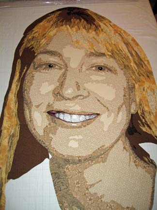
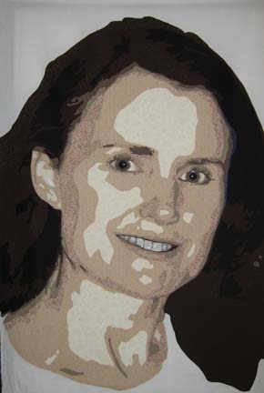
0This is what I have so far. The face is done — though I may still change the mouth — but I still have some work to do on the hair. I’m not sure about how the colors are working together — I may make some adjustments. But at this point, I’m going to finish it & then stand back from it & study it for a while. I knew that doing a blond would be challenging.

Always Up for a Challenge
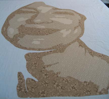
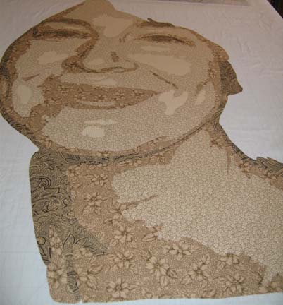
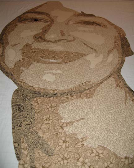
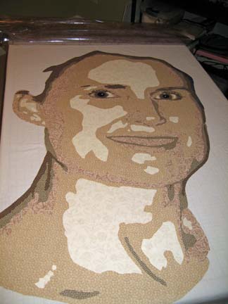
1Using commercial fabrics has added an interesting complexity to my work that I didn’t expect. Sometimes, a fabric works great in the auditioning — and then bombs in the piece — because of the tightness & regularity of the pattern relative to the size of the pieces cut out for the face. I have been building a new face in the last few days — and have been playing with her mouth quite a bit this morning. I thought the in-process pictures would be interesting. (Keep in mind that all of these are taken on a flat table — so there is some camera distortion in these pics.) I always love to see the life grow under my fingers when I work.
This is the base laid out:
This is the face with a little more detail added:
Here I’ve added detail to the eye on the left:
And here I’ve completed the 2nd eye on the right:
This was one of the mouths that I did. I wasn’t happy with how it came out from the original pattern I drew, so I grabbed my Sharpie and scissors and started working away:
This is the mouth as it is now. I’m fairly happy with it — although I may change it when I make final adjustments:
Now I’m off to work on her hair. She is a blond — so this is a new challenge for me. I think I have it all in my stash though — amazing what you can find in that closet if you just search hard enough through the bins.

Disappearing Act
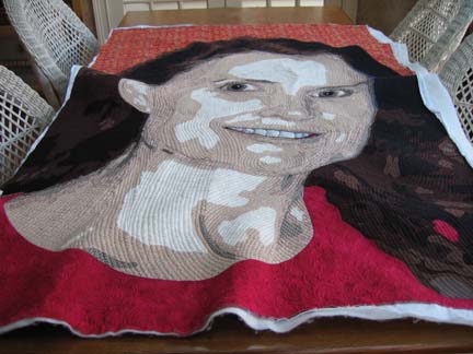
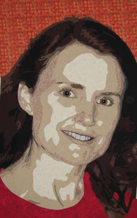
4I am guilty of a disappearing act. I have neglected writing on my blog because I have been working diligently on my latest piece, Shoshanna. I quilted it very closely, about 1/4 inch, and given its size and some problems with my machine (darn that Viking), it took me a long time to finish it. I do have a picture of it when the quilting was done:
It is incredibly wavy! I wasn’t worried — however, I knew that I would save myself a lot of headache if I added the binding after blocking it. It is always amazing to me how easily it flattens when wet.
Then when I went to add the binding, I decided to use the glue technique that I had seen Sharon Schamber use on her YouTube tutorial. Of course I forgot most of what I had seen and only used the glue to attach the binding to the back, but it is a HUGE timesaver and relief to my poor, noncallused fingers. Next time, I’ll try it all her way. When I was done, I did have to soak the quilt yet again to remove the glue (which is water soluble) — and block it AGAIN — but it is finally done — and I’m glad that I used this technique for the binding.
I have finished pictures on my website HERE.
By the way, I really struggled with a name for this piece. My work has changed from the style I had two years ago so I didn’t feel comfortable giving it the name Faces in Cloth with a number — that series has really developed into a body of work for me. I am also uncertain that using a person’s given name is wise — I wouldn’t want to provide too much access to a person’s personal life. The model’s husband suggested that I use the Hebrew intrepretation of her name — an idea which I really like and I think gives more insight into the feeling of the piece.
The other reason for my disappearing act is that I have many opinions about the economy — which perhaps spill over into politics — and I do not think this to be the right forum for that. I have friends — both conservative and liberal — and I find them all dear to me. This blog is not meant to be polarizing, and I do not personally like when I read the blog of an artist that allows her political views to take over. Artistry with political messages are fine — but I know that most read my blog for my art, not my political views. If I want to share those, I’ll start another blog — and then you can subscribe to that one separately or not. (I’m not to that point — yet.) Sometimes it’s important to know when to keep your mouth shut. IMHO

Color and Personality
1When I first started working on portraits, I asked the individual what their favorite color was — and then I would dye fabric in that colorway. It was easy to control the value changes this way — but I have since moved and do not have the facilities to dye. However, the interesting thing about working with color is the way it trains your eye — eventually, I could see that I had the commercial fabrics in my own stash to make a more realistic portrayal.
This is my 2nd piece using more realistic skin tones. In my last one, Sweet Dreams, her face pretty much encompassed the entire quilt — only a little of her coat showed. This quilt, however, required new colors for the shoulders and the space behind her head.
The personality of this particular individual screamed for some vibrant use of color. I tend more towards the cool colors — I tried green and blue — and blue green. But in the end, my husband agreed that this portrait called for hotter colors.
I will start covering the raw edges today or tomorrow — but I’ll have it on my design wall for a while. I can always change the background if I want to. The great thing about fusing is that you can always change your mind.

Working on Background
0I have made a lot of progress on my latest portrait quilt. I still have some work to do on the hair — but I am considering changing one of the fabrics. I am still not as good at seeing value change with my eyes as I would like — and I worry that there is not enough change between 2 of the browns in her hair. I am also beginning to think about what the background should be like. In the original photograph, she was wearing a sparkly silver sweater — but I don’t feel bound to stick with that. She and her husband lived several years in India, so I am considering a radical color scheme in fuschia, orange, & purple. We’ll just have to see how it goes. I’m going shopping this afternoon — I don’t have the right purple for something like that.

Making Progress
1I made more progress yesterday on my latest quilt. I added detail to the eyes and the ears. I still have her mouth (which will be hard — I picked out some fabrics today I think might work), the hair, and her sweater (which I will not recreate from the original photograph). I love to see the eyes come alive — one of the best parts.
This is a large piece & I had to take this picture standing on a chair — which is causing some distortion in the photograph — but I currently work with everything pinned down to a table. I don’t want to disturb that at this point in the process — it might throw off the alignment of remaining pieces. Just keep in mind that this is lying flat — and even though I am elevated, there is an angle from the camera’s perspective as I can’t get any higher without moving it.

The Zen of Cutting
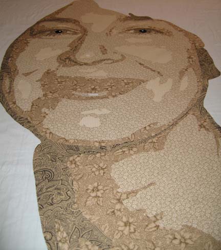
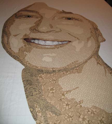
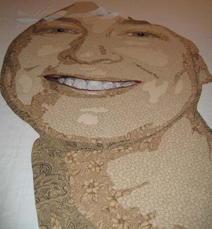
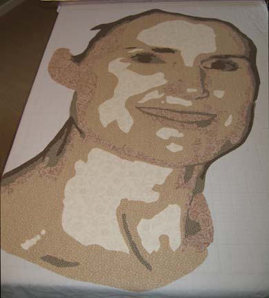
0Cutting is by far my most favorite piece of creating — for me. Even before I touch my sewing machine, I have an idea of what the final product is going to look like. I love when you lay down all the pieces and it begins to look realistic — especially when using commercially printed fabrics — when you can disengage the brain enough to go beyond the prints.
This is what I have been working on — a portrait of a friend of mine. Just her naked face — I still have her hair — and a lot of detail in the ear, eyes, and mouth — but you can begin to see her peaking out at you through the fabric.