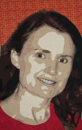
When I first started working on portraits, I asked the individual what their favorite color was — and then I would dye fabric in that colorway. It was easy to control the value changes this way — but I have since moved and do not have the facilities to dye. However, the interesting thing about working with color is the way it trains your eye — eventually, I could see that I had the commercial fabrics in my own stash to make a more realistic portrayal.
This is my 2nd piece using more realistic skin tones. In my last one, Sweet Dreams, her face pretty much encompassed the entire quilt — only a little of her coat showed. This quilt, however, required new colors for the shoulders and the space behind her head.
The personality of this particular individual screamed for some vibrant use of color. I tend more towards the cool colors — I tried green and blue — and blue green. But in the end, my husband agreed that this portrait called for hotter colors.

I will start covering the raw edges today or tomorrow — but I’ll have it on my design wall for a while. I can always change the background if I want to. The great thing about fusing is that you can always change your mind.
Wow, Ginny! Your portraits are really amazing. They were always great, but NOW – WOW!