Design
Design
Color and Value
0
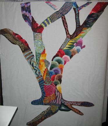
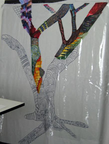
I have finally finished the machine applique process. I use a tight zigzag with a 1 mm length and 2 mm width which takes some practice to run smoothly since it is so small. I catch myself leaning in closer and closer to the machine, and sometimes, afterwards, my back hurts. Maybe my eyesight is changing.
It was seeing a quilt by Ricky Tims a couple of years ago that led me to use complementary colors for the thread. It gives an energy that wouldn’t otherwise be there. The only place I didn’t do that was on the small circles. I tried complementary color thread in a free motion circle around the outside edges — and I didn’t like the way it looked. Then I tried the same thread with the zigzag and it still didn’t look right. I finally decided that the shapes were so small that the zigzag was ruining the shape of the applique if used in a contrasting thread color — so for the two areas of the quilt with small circles, I used the zigzag with a matching thread color.
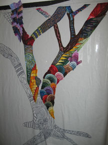
The interesting part of this experiment is that this picture is not altogether different from the picture of the quilt without any applique thread on it. It is more of a secret surprise for those that care to inspect the piece up close.
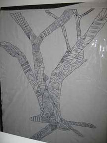
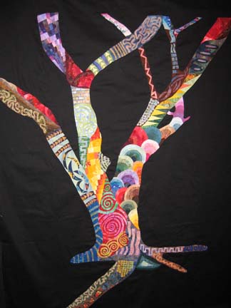
A year or so ago, someone on the quiltart list suggested taking final pieces into Photoshop and removing the color to view the color values. Although it looks like I have been working in color, all along I have been playing with color values — and it is interesting to see the piece without color.
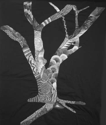
It is always surprising to me how design is affected by value. It is true that value does all of the work and color gets all of the credit.
Isn’t vinyl just for records?
1I have had so many people ask me what the vinyl is for so I decided to explain the set up in a little more detail.
I print out a full size of my pattern. I used to go to a drafting store — but I found that my local store was unreliable and began to charge me for all of their mistakes. Then I started printing it off my computer and taping the pieces together. I take the rough draft in Photoshop, flip it so that I get a mirror image of the piece, and then print it out. (I’m moving my process to CorelDraw since it does this part so much better — but I’m still in the learning mode at the moment.) This gives me what I need for tracing onto WonderUnder — which is my current fusible of choice.
Once it is all taped together, I turn it over and trace the back — which is really the front since what I printed out is the mirror image. I lay vinyl on top of this and, using a black permanent marker, trace the design onto the vinyl. I try to buy vinyl that is a medium weight — not too thick, not too thin.
Then I take white muslin for my base and sew the vinyl to the front of it using a teflon foot. If you use a metal foot, it will stick to the vinyl. When I first tried this method, I just pinned the muslin to my design wall and then pinned the vinyl on top — but as you work along the top edge, you have to flip the vinyl over and it gets out of alignment with the muslin.
At this point, I have the vinyl sewn to the muslin on my design wall.
I then take my printed pattern (on the side I printed out), trace WonderUnder pieces from it, fuse to fabric, cut along the lines (leaving overlap in some places), and place fused pieces between the vinyl and onto the muslin, ironing as I go. In this piece, there are a few areas that are paper pieced and then fused as a group onto the muslin.
The vinyl is a placement tool. It tells me where to place each piece. There is a point, however, with the portraits that I take off the vinyl, study the original photograph, and make adjustments off the pattern. It is my piece, and I’m allowed to change things if I want to. I changed a branch on the tree, but mistakes can always become design opportunities.
I Am The Vine . . . continued
5Although life keeps trying to get in the way, I have managed to make some headway on my latest quilt, “I Am the Vine . . . You Are the Branches.” I managed to complete the fusing a couple of days ago which is always bittersweet because I am ending a large part of the design process — and although I have degenerative problems in my thumbs from so much cutting, I miss when I have to put the scissors down.
At this point, I’m going to perform magic and change the background to black. I don’t start with black because I don’t want black shading my fabrics any darker than they all ready are — so I fuse to white and then add black. In this case, I’m going to reverse applique the tree to black fabric. This is where I take a leap and break a few rules.
First, I take the vinyl off the front of the tree. Then I put water soluble thread in the top and black thread in the bobbin of my sewing machine. Keeping an eye on where I want things to be, I free-motion stitch around the tree.
Then I take a piece of black sateen (which I love if I can find it) and place it face down on my cutting / design table. I clamp it and/or tape it down so that it is perfectly flat. Then I lay the tree on it wrong side up, flattening it out. At this point, I add anchoring pins around the outline of the tree with some pins in the tree. This is very similar to pinning the quilt sandwich, but I am only anchoring the black to the front of the tree.
Back at the sewing machine, I load black thread in the top and bobbin and sew on the black lines I created on the first pass. Then I lay the entire piece black side up on the cutting table and cut away the black from the inside where the tree pieces have been laid.
When I am done cutting, I have cleaned up all of my outside edges and the tree really comes to life.
The outside of the tree has rough edges that are only held down with a single line of stitching. The very next thing that I do will be to cover those edges with a tight zigzag. Then I will go about covering all of the applique edges inside the tree. I usually use a matching thread, but I have been thinking about a piece at Houston done a couple of years ago in which the artist used contrasting thread for all of his machine applique. I have a day or so to decide, but I may do it that way.
I Am the Vine, You Are the Branches
0I started this blog to journal my ongoing work — and it has been harder than I thought. When I work, I crawl into my head (so to speak) and forget about everything else. My mother, a painter herself, used to talk about it — so perhaps I have inherited this from her.
I spent most of last year working on portraits in single colorways — very instructive — but I have found a desire for lots of color and knew that I needed to take a break and do something more freeing. I happened to have a drawing on my design wall that has been there for a couple of years — and over that time, several people have seen it — and many of those people have recently inquired as to why I have done nothing with it.
When my children returned to school in August, I made the design larger and transferred it to vinyl. There are other ways to do this, but I find that fusing with this method allows a lot of spontaneity. Before I could really start, though, I had to have a color palette:
I went through my fabric stash and laid it out on my cutting table. I covered most of it — so that I have had to push it around in order to make templates from the design I have underneath it. Also, as I have been working, I have started pulling more and more fabric from my stash — my hidden goal may be to use a small piece of everything — but I love the flow of the color through the piece.
This is what it looked like September 6th:
and this is what it looked like this morning:
I have started on the left most branch and am about halfway down. It is fascinating to see it develop. When I am done, I plan to applique black onto the background — and I may discharge the black — I haven’t definitely decided yet.