

For the last couple of weeks, I’ve been busy working on another piece inspired by a pic taken by Leisa Rich. I know — I haven’t finished the last one — but I wanted something to work on when I handed the other piece off to her. I don’t like to have more than one project open at a time — but in working collaboratively, it just happened.
This one is much bigger — it’s about 42″ wide by 36″ high.
I didn’t take a ton of in process pics. It just doesn’t make as much sense as it does when working in pictorial. I tried to take pics for each color group, but I ran into a problem with that. This piece was pinned on my drafting table with the ironing pad. I pinned it there so it wouldn’t shift around. I couldn’t construct this piece in sections — the entire piece had to fit together like a puzzle. However, it’s so large, if I stood on a chair and took a picture of the top, I couldn’t get the entire piece in the frame and everything would be skewed. Therefore, I took a lot of pics, many of which were terrible — and I got to be friends with the Delete All option on my camera. Unfortunately, in doing that, I inadvertently deleted an all yellow and all red pic that I had taken and planned to use. C’est la vie.
That yellow with the pink is really horrid. I think that this was the worst stage — with all the hot colors and none of the cool colors (there was a little bit of purple and green but not enough to balance the hot).

Then I started adding the blues. It made a world of difference. Adding the cold colors gave life to the hot colors. I also needed the intensity of a deeper value. That comes in the dark blue — and then ultimately in the black.
I took this picture while it was tilted on the table. For the previous picture, I had unpinned it from the table and set it vertically on the design wall for a good pic. Unfortunately, it shifted everything around in my puzzle — so I wasn’t going to do that again until the end.
And here is the final pic of the top — vertical on the design wall — with all of that deep black.
I am very fond of this piece. I am using the skills that I learned in making pictorials but applying them to abstract design. 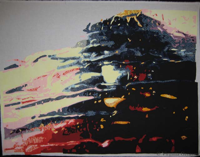


This week I pulled out the huge enameled pot that someone gave me to dye polyester fabric in some time ago (someone gave me bolts of the stuff — still don’t know what to do with it) — and I started an experiment on some of my reds. I knew that several of them have been crocking in my finished quilts and I was on a mission to stop it.
I should start by saying that I pre-wash — I bring my fabric home and throw them in the washing machine, set it to hot water, and add blue Dawn which has synthrapol in it — which will pull out excess dye molecules that may be present in the cloth but that haven’t bonded with the cotton.
So all of these reds, at one time or another, had gone through the pre-washing with hot water and synthrapol — but I had read a blog saying that you could take a crocked quilt and soak it in boiling water to fix it so I decided to try this with the fabric.
I pulled the darker reds for the piece I’m currently working on. (At this point in the week, I was still cutting yellows.) I boiled water in my massive pot and then added some blue Dawn. Once it was at a roiling boil, I added my first suspect. Immediately, the water turned wine red.
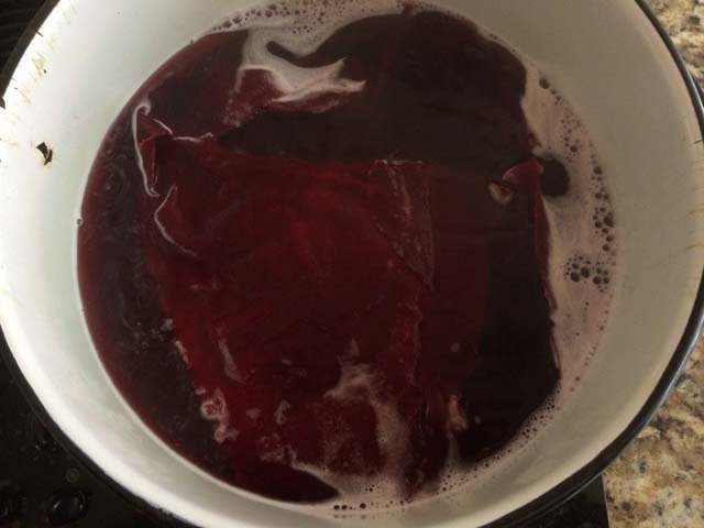
This was definitely the guilty party in several of my pieces. I boiled it for a few minutes and then set it aside to cool. When it was room temperature, I poured out the water and rinsed the fabric.
Here was the surprise — it almost immediately ran clear. I rinsed it thoroughly — even put it in more water to sit for a while — but all of the excess dye was now gone.
I did this same process with two other reds. One of them wasn’t bad — it ran a little in the beginning — the other ran a lot. Not surprisingly, the two that ran a lot were ones that I had dyed myself years ago — although in my defense, I definitely have some commercial prints in my stash that are also bleeding.
The result of this batch was the same as the first. After boiling and then cooling, the water ran clear.
The only difference between this process and what I’m doing in the washing machine is the temperature of the water. I could jack up the temperature on the water heater — but I risk boiling an innocent victim in the house. I don’t think that all fabrics need this extreme care, but there are definitely some that do. I’ll have to think on how to best identify which is which when I bring them home — maybe put a swatch in water after the washing machine cycle.
I also found the infamous bleeding green fabric in my stash this week. I thought I had thrown it away. I had bought it years ago in Florida and it runs like crazy so I vowed to never use. At the time, I washed it many times, and although the color faded, it never stopped bleeding. Now I’ll just boil it. I’m sure that’ll fix it.


 I did not post a Tweek last Sunday — I had had a long day entertaining and then spent three hours painting my daughter’s room. I was just too tired — so this post covers the last two weeks.
What else have I been up to? It’s summertime and the living is easy. I am not quite up to my usual studio speed but I do have more time than I’ve had in previous years. I’ve found that my teenager sleeps all morning so if I can get myself in gear, I can pack a couple of hours in.
I have been expanding on my car wash series collaboration with Leisa Rich and set her up a couple of days ago as my first contributing author on the blog. We met earlier this week to discuss what to do with the first piece — but I admit I’ve already put my attention into another piece — a bigger one. I’m almost done with the drafting. Hopefully I’ll have some pictures up on the blog by next week.
These are my tweets for the last couple of weeks. If you would rather follow me in real time, I’m @vsgreaves. I have several social media icons in the upper right above the menu.
Although leasing work is probably not a good consideration for textile work (given its added limitations on exposure to direct light and its ability to absorb smells), I found this article about leasing artwork to be a great marketing idea for most artists.
Have You Considered Leasing Your Artwork? – http://www.artsyshark.com/2014/06/12/leasing-artwork/ …
Wise words of Winkleman — he always has a pulse on the art world. As an MBA graduate, I was fascinated by his analysis of why the art market is an exception to many economic principles.
“Applying the Rules of all Markets to Art” Why economic principles don’t apply to the art market & unethical flipping http://feedly.com/e/JQarmMqG
I found this court case to be disturbing. Although it is wonderful that there will be more books digitized for the blind, I find it unconscionable that a judge would take away the rights of the authors as to whether or not their work would be digitized (and thus its subsequent inevitable pirating).
“Digitized Books for Disabled Don’t Need Authors’ OK – Bloomberg” Good for disabled — bad for authors. http://feedly.com/k/1pYwO8S
Another author making a case for doing work and not waiting for inspiration to strike.
“Don’t Waste Your Time on Inspiration” http://feedly.com/e/Msi0Qdk1
It’s not often that I find a fiber artist highlighted on My Modern Met. Ana Teresa Barboza’s work is striking. I love the one of the fiber lion placing the drawn woman’s head in his mouth.
Inspiration: “Artist Uses Colorful Embroidery to Explore Natural Forms” http://tinyurl.com/ka9rzr3 via @mymodernmet
I don’t usually refer people to music videos, but this one certainly qualifies as performance art.
This is genius performance art — check out OK Go’s new music video: http://tinyurl.com/lhaaolb @Colossal
I was fascinated by this article about Gauguin and that he often painted still lifes to bring home the bacon.
Even Gauguin needed to pay the bills. “Previously Unknown Gauguin Reveals a Lot About the Artist” http://feedly.com/e/NNfApeXh
This is Leisa Rich’s article on my blog about our collaboration. I’ve added a feed from my blog to Twitter. It occurred to me that I routinely tweet articles that I’ve read, but I haven’t been tweeting about my own work. It’s ironic that my first syndicated post is not written by me.
Ruminations on Collaboration http://wp.me/paQW6-1tC
Famed designer Massimo Vignelli who passed recently put forth the idea that all creatives need vision, courage, and determination to be successful.
“Massimo Vignelli: The 3 Traits of Great Creatives” Vision, courage, & determination. http://feedly.com/e/ofnU8ehr

This week I met Leisa Rich at Abernathy Arts Center. We picked up our work from the Georgia Artists show that closed last week and spent about an hour talking about our abstract piece. She has added a bunch of stitching and it looks amazing.
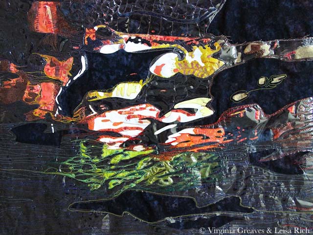
I love the vinyl on the piece — it makes it look a lot like water. She took these pictures. I admit to having a problem photographing it. The vinyl is very reflective and cannot take direct light. But I was so pleased at the different life that it has now taken on.
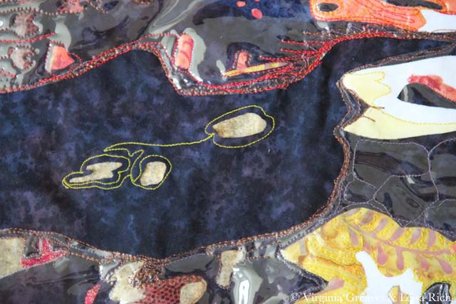
These are detail pics.
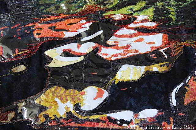

I can’t get over how much its character has changed. I love it so much more than what I would have done with it.
She handed the piece back to me and we talked about what to do next with it. We’re considering making a larger but more realistic piece that this would fit into — but I’m having a problem working out value problems. There is so much huge contrast in this section that it’s difficult to resolve the focal point issue with the entire piece. Obviously the focal point should be the abstract. I’m still working out in my head how to accomplish that in light of this other idea.
And while I was waiting on Leisa to do her part last weekend, I started another abstract piece — a much larger one — and to be honest, I’m struggling. I can’t rely on my usual practice of logic to determine where colors go. I usually have no problems turning my value studies into colors — but that system doesn’t work very well here. It was an issue with the small piece, but I was able to work around it. It’s harder to do in a piece 45″ wide.
I’m telling myself that there are no wrong answers. It can be whatever I want it to be.
Right now I’m marking all of the sections on my pattern with colors. I’ll hopefully finish that later today so I can move on to picking fabrics. Maybe I’ll even come up with an excuse to take a trip to Red Hen!
And let’s face it — it’s summer. There are numerous distractions to take me from something that isn’t holding my attention very well. Even in art we have to slog through difficult tasks sometimes.
One last thing — Leisa has asked if she can be a guest writer on this blog to which I happily agreed. Given that our work is a collaboration, I definitely think that her point of view should be shown as well. I’m looking forward to having her contribution.


When I went to the opening reception of Georgia Artists last month, I was so glad to see Lauren Bernazza there. She is the former Curator and Program Director of the Abernathy Arts Center (she’s retired to raise twins — been there, done that).
We did get the chance to talk about the work I had in the show, and at one point, she challenged me to make an abstract piece. I was standing with her and Leisa Rich, a friend of mine that had work hanging next to mine — and I slowly smiled. I challenged myself to make an abstract piece last year — and as whole, I didn’t consider it very successful — which I patiently explained — but neither of them would hear it! Finally Leisa took pity on me and told me that we could collaborate on a piece. I’ve never done that before and I was so excited at the thought of working with such a talented artist as Leisa, I quickly agreed.
The collaboration rules are that I start and then pass the piece to her. We pass it back and forth a few times. The goal is to end up with something different and hopefully better than either of us could create individually.
I purposefully made this small — it’s about 23″ x 17″.
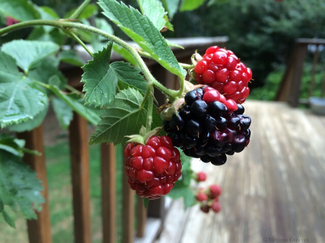
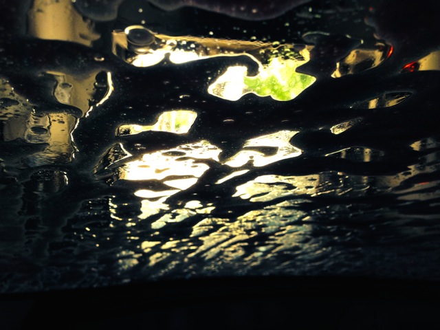
For inspiration, I started with a pic Leisa had taken from inside her car during a car wash. I loved the luminescence of it.
When I printed out the pic, I ran out of black ink halfway through — so I had to go to the store for more. Then I printed it out again — and ran out of colored ink. Such is my lot in life. I sighed and decided to take it as a sign that I could make it whatever I wanted — so I did. I’m supposed to not be so literal with this piece anyway — and I often change colors in my pieces.
I started with a white piece of muslin as my canvas. Then I added white. I know — but it’s a brighter white than the muslin — so I went to the trouble.
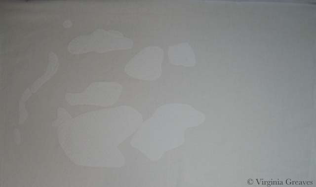
Then I added three values of yellow. I know — just blobs of color.
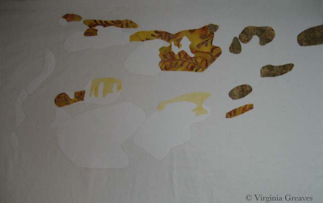
Then I added orange — I think there are five values.
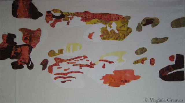
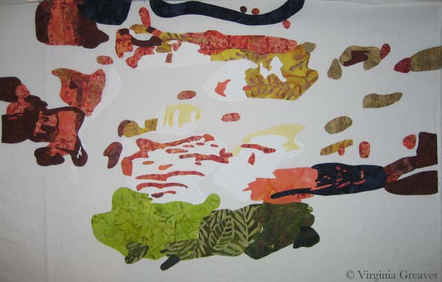
And then I added four values of green at the bottom — and I decided at this point to add some dark blue. It looks black here against the white — but it’s a subtle change from the black that will be placed in the background. (There is also just a little red in the upper right area.)
This is it except for the background. It doesn’t make much sense on the white.
However, once I added the black batik as the background, the entire piece comes together and makes sense. It took hours to cut out all those spaces in the background but worth it in the end.
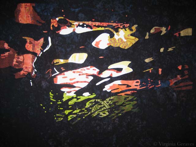 I’m pleased with it. I’ll take it to Leisa today or tomorrow and let her have her way with it.