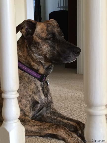


The golden retriever piece (Golden Moment) was finally dry today. When I put it in water to take out the water soluble glue I use to temporarily attach the binding — and to prepare it for blocking — some of the red in the harness crocked onto the lighter areas of fur. I’ve sadly had this happen before. Red dye is never predictable. I had the same thing happen on Beach Guardians. (I had to paint over that spot.) It’s probably the same fabric — when Beach Guardians comes back home, I’ll track that fabric down and throw it away. One of my first quilts was a very large red and white quilt — and it bled like crazy. I almost cried when I pulled it out of the water. I sprayed it liberally with Shout & threw some Oxi-Clean in — & then re-ran it through another cycle. That particular piece — Childhood — still shows some red on the back on the toile where it shouldn’t be. It happens.
Today I pulled out all of the pins on Golden Moment and photographed it. At first, I forgot to turn on my special lamps. When I was done, I remembered and re-did my shots with the lamps. All of the shots I took before I turned on the lamps were yellow — so all of them were trashed. So lucky I have those lamps (thank you Holly Knott).
I’m still a little uncertain about all of the space I left around the golden retriever. I bought a yard of fabric and fit it around her — and when I was done, it seemed wrong to cut off all of that extra fabric. I didn’t want her centered, and it feels to me as if the extra space on the left and top gives the viewer the feeling of being in the shoes of the person the golden is gazing at. That’s what I see when I look at it — I hope that I’ve successfully conveyed it.
I don’t know what my next project will be. I always spend some time wandering between projects. Today I went to JoAnn’s and bought muslin and velcro so that I could replace the cover on my ironing board. Years ago I made an ironing surface after watching Sharon Schamber’s video. I thought about taking a picture of the cover I was throwing away — but frankly it was embarrassing. Just know that my board is now clean and spotless.

I’ve never really addressed applique on my blog. I’ve stated that I do it — I may have even specified that I use a tight zip-zag — but I’ve never really talked about it or why — which seems a great omission given how often I’m asked about it from other quilters.
Some people fuse and then go directly to quilting. I’ve considered this, especially recently. Applique is tedious and is probably the least creative process I do. However, it gives a very neat finish. Raw edge applique without it can get rather messy over time, and I like the completeness that I get with a secured edge. I’ve used a blanket stitch and a satin stitch, but I prefer a tight zigzag — 1.0 mm length & 2.0 mm width (although I vary the width in tight spaces).
Why use stabilizer? I had someone ask me that recently. Years ago, I started using stabilizer and haven’t really questioned why in a long time. The answer is that it gives a professional finish. Yes, there are many layers of fabric which can stabilize the stitch, but in some areas, only two fabrics of cotton are too flimsy. The stitch will look much better if you use a stabilizer.
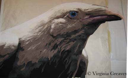
For years, I’ve been using tearaway stabilizer from embroidery shops. I had one that was soluble for a while but paper-y like a tearway that I really l liked but eventually couldn’t find anymore. When I was making the raven, I used the scraps of all of my old stabilizer. They were all good — except one. We’ll get to that in a minute.
This, by the way, is the beak on my raven as I showed it in my last post. It wasn’t right.

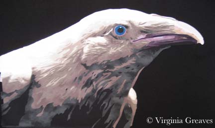
This picture, although taken when my studio was growing dark for the evening, shows how I changed the colors a little.
The raven shows up a little better on my design wall. Whenever I lay something on my design wall, I’m tempted to just lay it on black fabric and call it a day. BUT, my intention in making this piece is part of a story — and I had plans to work on the Tower of London.
I drew a stylized version of the towers and hoped that my fabric choices would get me where I wanted to go. I had no idea if it would work — but I took a leap of faith. This shows the two right towers with the brown decorated with the white architectural details. It was almost like frosting a cake. I was careful to use a white print that wouldn’t show the brown behind it. I would usually put the lighter value down first to avoid shadowing, but this design was more structurally sound to have the full brown background with the white fabric carefully cut and laid on top.
Then I added the black details.

And finally the rusted copper turrets.

The left towers were constructed in the same way.
With the darker details and turrets added, they make more sense.

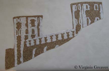
I put the towers on my design wall — and you can clearly see where the raven will sit. I posted this image to my FB Page and was surprised to find EVERYONE wanted me to finish the piece just like this. It does have a fascinating quality to it — but it isn’t the direction that I was working on. I will certainly consider it for another piece.

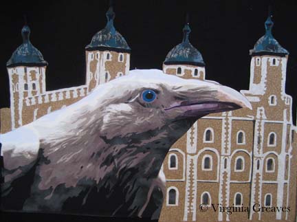
This shows the raven sitting on the design wall with the towers. Again, the black background makes everything look good.
This next photo shows the raven and towers once they were appliqued to muslin. Keep in mind that I had run out of my stash of stabilizer. The fabric stores only carried Pellon, and unwilling to take the time to traipse over to an embroidery store, I decided to try it. I use Pellon’s Wonder-Under all the time — how bad could their stabilizer be?
It was AWFUL. It is much thicker than any other stabilizer I’ve ever had, and it often interfered with my ability to move the fabric nimbly under the needle and get the thread where I intended it to go. It is my hope to never have to use it again. So there — I suppose I’m a stabilizer snob.
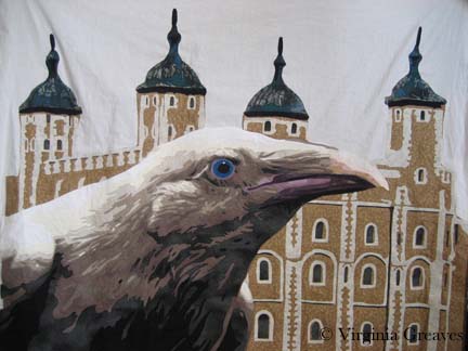
Certain in the belief that I had nothing in my stash that would do for the sky, I went to the fabric store and picked out a beautiful blue-gray — only to bring it home and find, in the bright natural light of my studio, that the fluorescents of the store had deceived me. The color was more powdery blue than what I wanted. So I searched my stash and found this funky batik. I love its contribution to the story of the piece. It’s a strange choice, but I’m happy with it. This is what the piece now looks like, fully appliqued and ready to be pinned for quilting.

Next week is Spring Break. I may not be able to begin quilting for a while, but I hope to at least get it pinned tomorrow.
One last thing — Martha Sielman has written a second book in her Art Quilt Portfolio series — People & Portraits. My piece, Celtic Woman, is on page 32. I feel privileged to be included — although I’m not overly happy with the photograph. I’ve always prided myself in taking my own pictures — but I’m missing something in terms of color. The printed picture is not anywhere near as good as what I see on my monitor. I need to start using a white balance card when photographing and re-calibrate my monitor.
I received my complimentary copy a couple of weeks ago. Beyond the thrill of having one of my pieces in publication, it’s a nice compilation of work. Several of my FB friends are included and it’s been fun to read more about their work.
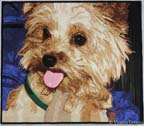 I finished the Yorkie piece on the last day of February — which is great so now I can put February on the label. I know it seems silly but it validates that I worked really hard in February. I had it blocked and drying by the end of the day but didn’t attempt to photograph it until today. It took me a while to get it just right. I even used white as a background so I could align the edges just so. I think I’ve been using a black background as a crutch. Using the white makes it much easier to see whether everything is lined up correctly before I go open the file on the computer. It’s best to go ahead & do it right the first time than have to re-photograph it later for an exhibit application. I know I can always fix camera distortion in Photoshop, but most shows won’t let you make those kinds of digital corrections.
I decided to call this piece Firecracker. This Yorkie has such an explosive personality, it seemed only fitting. Her page can be found here. And in case anyone wants to know — yes it really is an applique piece. This is NOT a photograph — this is NOT an inkjet printed piece. It was insanely difficult but I feel like I’ve solved a difficult puzzle.
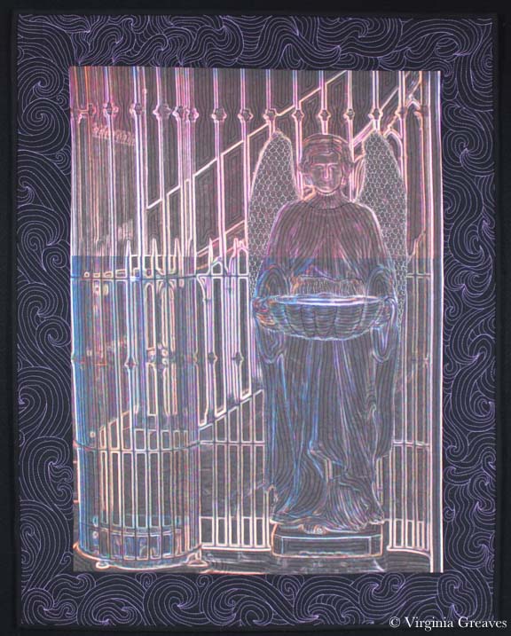
Back in December, I created a small 5″x7″ piece called The Dark Angel. As I’ve mentioned before, I loved it so much that I decided to use that as a study and create a larger piece based on that image. This is how I came to create The Bowl Judgments.
I do not usually add a border to my pieces but in this instance, I decided that a border could add another dimension to the piece. Just as the middle portion is about the luminosity of the colors on the black, I wanted the border to be the inverse. Using black fabric and a light purple thread, I created a subtle sweep of quilting lines.
I did, by the way, attempt the McTavish quilting technique on the borders. I probably got better as I went along. I suppose that the variance in the the quilting will just have to be chalked up to artistic variance.
I must admit that photographing his piece has been very difficult. My camera has not been happy and I have taken many pictures in an effort to create an image that accurately portrays how the piece looks.
At first, my camera locked up completely. As far as I can tell, it couldn’t tell where the image was — even in a room with special spotlights pointed at it. At some point, late in the day, it finally gave me something.
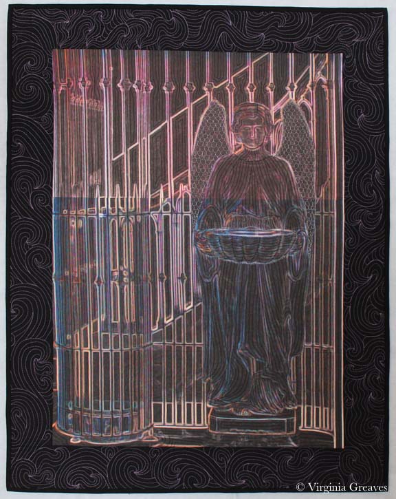
But really, this picture makes the border look almost like printed fabric. The quilting lines are more subtle and the image in the middle is not that washed out.
I finally realized that the camera would be happier if I used a white background. I thankfully had a large piece of white felt in my closet that I hung on my black design wall. From there, I set the autofocus point on the black border — and I think that this comes closest to the actual piece.
It always surprises me when the camera doesn’t just take a picture of what my eye can see. Our eyes are so much more complex than we give them credit for.
I so loved working on this angel that I would like to do another one — but I’ll have to plan some trips for pictures. Right now I’m researching another portrait to do but haven’t settled on an idea yet.
Taking photographs of quilt can be very challenging. I used to photograph quilts in front of my garage door — outside. I had a board covered with black felt — but if the wind kicked up, the whole thing could fly away. The sun might be too bright and I would pray for a cloudy day. It might be raining. It was a difficult system to rely on.
And then someone on QuiltArt pointed me in the direction of Holly Knott’s webpage Shoot That Quilt! After that, I made a few purchases & set up everything inside. I ordered the special bulbs — a few photography stands — reflector lamps at Wal-Mart — and I found a tripod somewhere in a closet.
I still have the same basic setup. The tripod could stand to be replaced. It skews slightly to the left — but I haven’t worried about it much because I always make corrections in Photoshop.

My backdrop is usually black but I almost always have a black binding on my art quilts and occasionally someone will ask for a white backdrop so they can see the entire outline of the quilt.
For the proposal I’m working on today, I can’t make any adjustments in Photoshop. The camera has to do all of the heavy lifting and the original picture has to be as perfect as I can make it. (To adjust for the tripod, I had to hang the pieces slightly sideways which felt strange but I used the viewfinder to put it where it needed to be for the picture to be straight in the camera.)
I slowed my ISO to 80, set my exposure for daylight fluorescent lighting (otherwise I get a bluish cast that becomes most apparent in closeups), turned off my flash, upped the megapixels to 12.1, and set a 10 second timer. I lined up the quilt perfectly within the top & bottom of the camera field (with the tilt of the camera at 45 degrees), adjusted the lamps so that one hit the top area & one hit the bottom area, and took the picture. For closeups, I set the macro option on my camera and moved the lighting in closer.
I’ve outgrown my camera. This is painful for me to say. I’ve really enjoyed the point and shoot for several years — but I’ve reached the limit of what I can do with its manual settings. I’m currently reading Chasing the Light, and it only highlights what I all ready know — it’s time for a DSLR.
Two of my quilts were just juried into the World of Beauty exhibit at International Quilt Festival: Houston — Bukonyan Elder and Just Call Me Jack. I’m hoping someone takes a picture of them hanging in the show for me. Festival runs November 3 – 6, 2011 and features the largest display of art quilts in the world (although it shows an equally impressive display of traditional quilts). The entire show is the size of eleven football fields. Mind boggling, isn’t it?
I finished my latest piece, Celtic Woman, on Friday, just in time for the end of the month. I had it blocked and drying over the weekend — and thought I could take a quick picture of it today and be done with it and on to the next project.
I took a couple of rounds of pictures, and none of them were right. They were all a little blurry in the middle. I finally decided that the high contrast was causing a problem with the camera. I had a similar problem a few years ago with a piece I made called Ama. It is a very light portrait (my 1st person so judge me kindly) with a very dark background of blacks. The black has very intricate feather quilting using a heavy metallic red thread. I found that I could take a picture that focused on the portrait — and the picture blurred out all of the feather quilting details — or I could focus the camera on the black to get the quilting detail and the portrait would be blurry.
At that time, splicing two photographs together — which is what a professional photographer would do in the dark room and we can now do in Photoshop — was not considered an acceptable practice. Guidelines for the big shows were very explicit that you could not make any digital changes to the original shot — which made it a quilt that I couldn’t enter into a judged show. It also taught me a lot about the boundaries of a camera. I always expected the camera to see something just as I saw it with my eyes — and that is not always the case.
So when I realized that I had a similar problem with Celtic Woman, I started playing with the manual settings on my camera. I finally found that if I used spot metering instead of weighted average, the camera would give me a clear image of the face but underexpose the cloak. I could compensate for that in Photoshop, however, and that is how I finally got what I believe is a good representation of the quilt.

You can see a bigger picture of it and a detail shot on the website here.
I joined SAQA recently and had my first Webinar. I holed up in the computer room, hogged the phone, and dialed in to hear Gregory Case talk about photographing textiles.
I take all of my own photographs — have for years — and have found that most instructional materials don’t cover the special topic of textiles. They photograph so differently from other medium — so I was thrilled to find this online class available through SAQA.
And I learned a lot. I’m fairly skilled at Photoshop, but he gave me a lot of helpful information about manual settings on my camera — all of which I put to use this morning. I finally finished Bull Dawg and needed to take pictures before sending it into its exhibition life — so I set up my camera and took what I think is the best textile shot I’ve ever made:

I’ve never taken a shot in which the quilting lines were so apparent. And the colors of the full view came out very true. I was so delighted!
I wish I could say the same of my detail shots — even placing the lights right next to the piece, they came out dark & the colors skewed. But Rome wasn’t built in a day. I may just need some more lights. I never realized how light hungry cameras are.