I started this portrait in yellow quite some time ago. I completely fused the front after very carefully following my current methodology, and then hung it on the wall for what I call the “gut check”.
And it failed. Part of the problem is that the main color is yellow and it is hard to develop features with this color. Another problem was my computer. The pictures on the computer looked better than the quilt top. Once I propped up the piece and walked down the hall away from her, her face became a mass with no distinction. The last problem was the initial picture. I realize now that it was a poor choice because it wasn’t helping me much.
And so I bought the fabric for the background and began working on Christmas projects. I even took the background fabric & draped it over the front of the quilt. It hurt to look at it — it just wasn’t right.
Once the holidays were over, I spent some time adding shadows — and they looked completely out of place. I folded up the quilt top and tried to decide if I should just abandon it.
But really folding it up seemed to help. I realized that the entire face needed to be redone in darker hues. I took out the pattern and decided on the line around the face that would be my new beginning point. The fabric at that point was a 3 in the value scale — so I pulled the 4 value fabric and made that the main part of the face. I then pulled a value that I had pulled out of the dyed stack & decided not to use. I used this one because it contrasted nicely with 4. Using a pencil, I then renumbered the values in the face using these other 2 fabrics as reference points.
While I was doing this, I redrew a few lines in order to simplify some shapes. I allowed myself to be less involved with the left side of the brain and let the right side run the process. It became a completely visual experience.
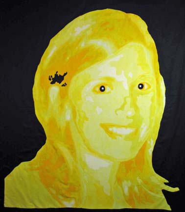
I don’t know how much of her personality it captures but I am hoping that more of that will come through with the quilting.
This is the original photo. Do you think I came close?

In the end, I need to remind myself that this is art and not intended to be a reproduction of the original photograph. There has been a lot of discussion on the quiltart email list about illustration and its merits. I think that I was greatly influenced by Wayne Spradley. He is a famous watercolorist that lives close by, and I took a class from him a couple of years ago. He is a master at offering suggestion of a shape and allowing the brain to fill in the rest. It would not be as engaging if he added all of the details, for example, of a person in the background, and yet the suggestion has to be just so in order for the brain to become involved.
Hi Ginny,
I have a couple of suggestions. Be aware that the yellow you have chosen to use is on the cool side, not the warm side. Also, as yellow is shaded it goes to a olive green. The would work beautifully for the shadows and also the eyes. The black eyes are a little too stark for the yellow color. Consider a darker olive green and also use some of the same color in her upper eye lids so that her eyeballs don’t look like they are popping off. Add olive green to the hair to add contrast and shadow, You can also use a tint of olive green in some of your highlights that would be shadowed.
Hope this helps…consider doing another yellow piece in warmer hues!
Liz
Ginny… I really like it… It would be cool to do 3 more the same with different colors.. kind of like an Andy Warhol thing… but, I think you did a great job. THe eyes are really intriguing… The only suggestion I would have would be to make the eyes lighter than black.. since she has blue eyes and blue and yellow are complimentary to each other you may try that… Very nice.. If you are worried about the color you could paint it or use watercolor pencils.
I think you have captured her perfectly in the piece. I agree that the eyes are popping off (amazing really) the face. You could play with the eye color – try the olive green but also maybe a lavender or plum.
It is a fantastic piece.
Kathleen
I agree with Liz that the black on the eyes is too stark. Go and check out an image of a lion. You will find that they eyes match the golden colour. Maybe test out a darker yellow (though yellow doesn’t get too dark) with a touch of purple to take the edge off the pure tone.
Also I find the black background really stark. It might be better to do a blue. (I know it is fused but to do another one would be quicker the second time around…I know!)
It is great to challenge yourself. I think that the face is quite good.
Shawna from Yellowknife
Another thing to consider. Next time take a photo without the flash. You can get a better image to work with. Flash images just flatten the face too much for working with in this fashion.
Also, check out Jan Kutz. SHe does very interesting faces in watercolour. She has a great section in her book that talks about how to set up for photographing interesting faces.
Shawna from Yellowknife