
I was giving an interview yesterday for a local paper. She asked me, now that I had won a prize in Houston, what was my next goal.
 I am a firm believer in having goals. I’ve spoken before about always reaching for the next rung on the ladder. But I didn’t have an answer for her. It sounds silly to say that I’m still stunned by having won in Houston. It was 7 months ago. Surely I’ve made new plans.
I’m not sure where my brain has been on this one. I know it should be doing something, but it seems stuck. I have applied for professional juried membership into an artists organization and I’m hoping to be accepted — I’m re-entering the same shows — but what am I going to do next that is different?
I have some distant things I’ve thought about — a shot in the dark. If I tell someone, will they be more likely to come true? Or less likely?
A couple of years ago, I entered the Outwin Boochever Portrait Competition at the National Portrait Gallery in DC. I was not accepted. I was not surprised — but because I had entered, they continue to send me emails on the competition and other events at the Gallery. I was surprised to see a LOT of mixed media winners in last years competition. I want to say that last year’s top winner was made from salt. It may be time that I hang up that lack of confidence and enter again. The only way to guarantee that you will never get into a show is to never enter. (I need to keep telling myself that. It’s true but sometimes it helps to use it like a mantra.)
This week, in the process of writing this post, I did make a change. A friend of mine told me about an opportunity for exhibition with a prestigious gallery in Brooklyn, NY. If I entered, I would be unable to enter two other shows that I’ve entered in the past. I would be competing at a much higher level with other artists — this is not a quilt show. It’s about time I change — reach for that next brass ring — so I sent in my application last week. The great thing about this show is that it only required that I be female — and there was no restriction on when the piece was made — so although I entered a couple of new pieces, I also entered a piece that has timed out for most quilt shows. It’s still a great piece and should still be exhibited. My mom was represented by a couple of galleries in NY at one time — so why couldn’t I also have my work shown there? If it was possible for her, it’s also possible for me.
So — this year, my exhibition list may not be as long as last year but hopefully I can shake things up a little and enter some new markets. If nothing else, I’ve pulled myself out of my rut of doing the same thing that I did the year before. Change is good. Carpe diem!

 I’m into the second week of summer and still trying to figure out how this works with teenagers. I have more time than when they were smaller — but still not as much as you would think. They come get me in my studio, asking for help. I started using the timer on my phone trying to keep better track of my time with all of the interruptions.
This week was mostly administrative. I put a bunch of old studio things on eBay for sale and I entered a couple of shows — a process that ALWAYS takes longer than it should. I’ll write more about that in another post.
This is my weekly wrap-up — and these are a collection of my tweets from the week. If you want to follow me in real time — I’m @vsgreaves — or hit the social media icons in the upper right above the menu.
This is an interesting discussion of the direction of the High Museum here in Atlanta. In my mind, it should be the center of cultural activity for the arts in the Southeast — but the fact that it is not pursuing the replacement of a folk art curator (and, in my mind, not creating a fiber arts collection) — are all reasons to question their status relative to other museums who are pursuing these directions.
High Museum stalls on hiring new folk art curator; collectors fear interest has waned | ArtsATL http://shar.es/P3YOc
There have been many articles recently about artists fed up with being asked to do work in exchange for exposure — which is to say that artists are routinely asked to work for free. This is fascinating considering the huge sums being made in the art market — largely NOT ending up in the pockets of the artists themselves. A new study in the UK gives us all facts to ponder. There’s also mention of the blog “Who Pays Artists” that has been collecting anecdotal stories about artists being paid (or not) for their work.
“Artists Still Not Getting Paid (But at Least We’re Starting to Talk About It)” http://feedly.com/e/AfdeaCGz
Procrastination — something we all need to deal with. I need to work on making my processes more portable — so I can still be with my daughters but also contributing to projects along the way.
“Dash Your Way Out of Procrastination” — something I really need right now http://feedly.com/e/215scFC_
This article explains the Flame Challenge at the 2014 World Science Competition and the event “What is Color?” There is discussion of the biology of the human eye relative to other animals and how that affects our perception of color. This article also discusses how surrounding colors change color perception — meaning that the proximity of one color to another can affect how it is seen by your eyes — as can wavelengths of pulsing light.
“The Complications of Color, as Explained to an 11-Year-Old” — color is relative http://feedly.com/e/csRlNgAY
It seems that Harper Lee has reached an undisclosed settlement with the museum of her hometown as both sides petitioned for dismissal of the copyright suit between them.
“Judge ends lawsuit by ‘Mockingbird’ author Lee” http://feedly.com/k/1oJ1xoW
Although this link is in French, the video shows an installation of photography in the Paris Pantheon by the French artist JR. I’m so fascinated with this that I’m considering a similar project with my daughter’s senior class. It’s so wonderfully cool.
French artist JR has covered areas of the int & ext of the Paris Pantheon with a mosaic of 4,000 faces — cool! http://feedly.com/k/1oJ2lu5

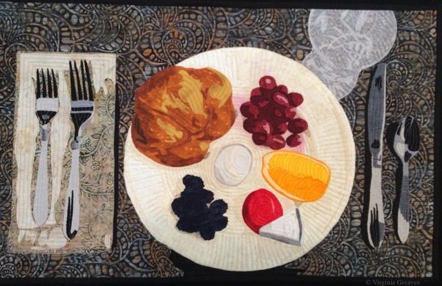
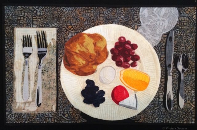
After realizing that the “It’s Raining Cats & Dogs” special exhibit at IQF/Houston had added a new virgin rule this year — thereby disqualifying my piece Golden Moment since I had posted LOTS of pics of it on my website and blog — I decided to make a small piece for another one of IQF’s special exhibits. At first I thought about Life Begins At 40 — since I am currently in my 40’s — but what struck my interest more was What’s For Dinner.
I’m friends with Jamie Fingal, one of the curators, on Facebook, and every night she posts the question “what’s for dinner?” I get to hear about what delicious meal she is preparing and it usually makes me hungry.
Keep in mind that at this decision making point, I was at the beginning of May. I don’t typically spend many hours in the studio during the summer, and May itself is full of constant interruptions — so I was looking for a small piece to do. This needed to be an exact size — 24″ x 15″. Perfect.
Then I started thinking about what to put on the plate — and I started to get hung up on plate design. Let’s face it — there are people that go to culinary school to learn how to properly plate food. (I know — I’ve watched way too many hours of Food Network.) So I was stuck for a while — until I decided I was making this too difficult. I went to my cabinet, pulled out a plate, knife, fork, spoon, and a crystal glass. Then I pulled some simple things from my kitchen — a croissant, a couple of different kinds of miniature cheeses, a boiled egg, and some fruit.
Simple yet elegant. It reminded me of the plate that Julia Roberts makes in the movie Eat, Pray, Love when she is learning about “dolce far niente” — the sweetness of nothing.
I started with my cream Wedgwood Edme plate. There are shadows all ready added for the different items on the plate.
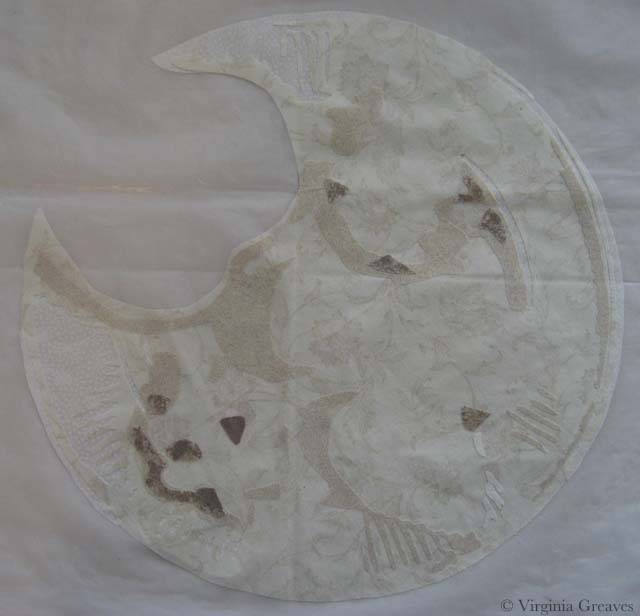
I put the egg in the middle. Probably not my best choice — a white egg in the middle of a cream plate. And I really struggled with how to make it stand out on that plate. I tried many combinations of white and gray. This is what I ended up with (with one change later).

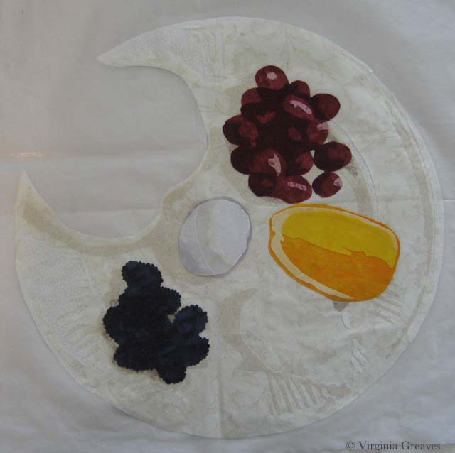
And then I added the fruit. The blackberries are from one fabric — a dark blue batik. It looks really dark in the pic but that’s the limitation range of a camera. If I want the plate to be sharp, then the darkest dark will be a little blurry. Then I added the grapes — and then the orange. I actually had a print of grapes — perfect size too. I thought about using it — but I wanted an artistic representation — not perfection.
You’ll also noticed that I added a rim of gray around the egg. I think it gives the egg more depth than it had. (The bias of white is a little choppy but it’ll clean up when it’s appliquéd.)
And then I added the croissant in the corner. I was dubious about the fabrics but I think they turned out well. It looks even better quilted.
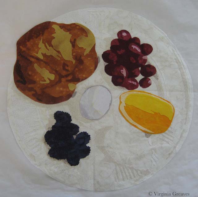
My last food items were miniature cheeses. When I originally photographed them, they were covered in their commercial labels. Those had to go. I redrew them plainer for my plate.

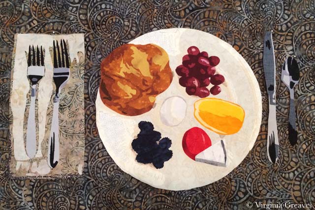
And here you can see the napkin and the silverware. I could tell from last year’s entries that people struggled with the silverware. Using non-metallic grays and black, I took a literal interpretation of the values in the silver. (I did use a metallic thread for quilting them though.)
I chose the background before the napkin. I loved this print and how it worked with the plate. I barely had enough — although I’ll admit at this point that I had it in my mind that the piece had to be 24″ x 18″ — and I wasn’t sure if I would end up with 18″ after quilting. I used it anyway, figuring I could add across the bottom if I had to — and it was just as well since the actual height requirement is 15″.
The glass was also something that I think presented a high level of difficulty. I had a nylon sparkly sheer in my stash that I thought might work. I started by experimenting with it and Wonder Under. I wasn’t sure if the heat from the iron needed to bond the Wonder Under would melt the fabric — so I kept the iron low and raised the heat as needed to make it bond. I worked in reverse order. I usually work light to dark — but since I could add depth by layering the fabric on top of itself, I put the pieces that I wanted to be darkest on my pressing sheet first.
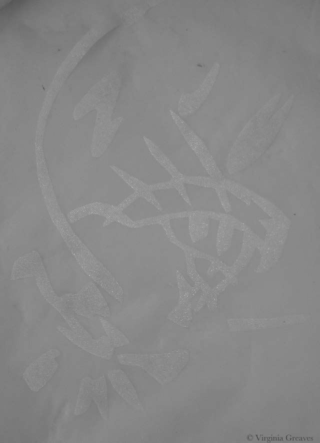
Then I laid my largest piece of sheer on top. Not only are the raw edges of the first layer all covered (and there are a LOT of raw edges down there), but the layer on top gives the layer underneath more opacity.
I know — it’s a little hard to see on the white pressing sheet.

This is the glass on the background fabric. Not as sheer as I would have liked — but good enough. (It really looks fabulous wet — you can really see the background coming through then.)
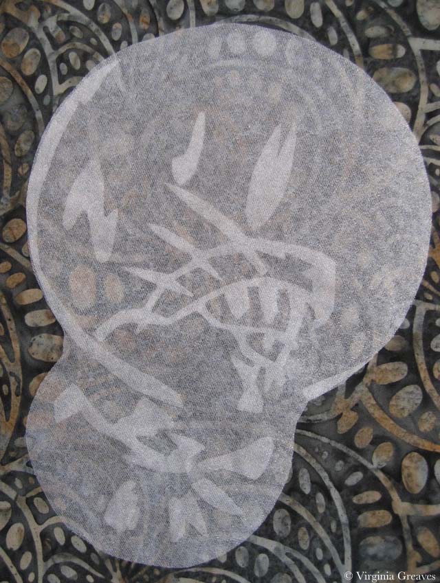
And here is the full appliqué top before quilting.
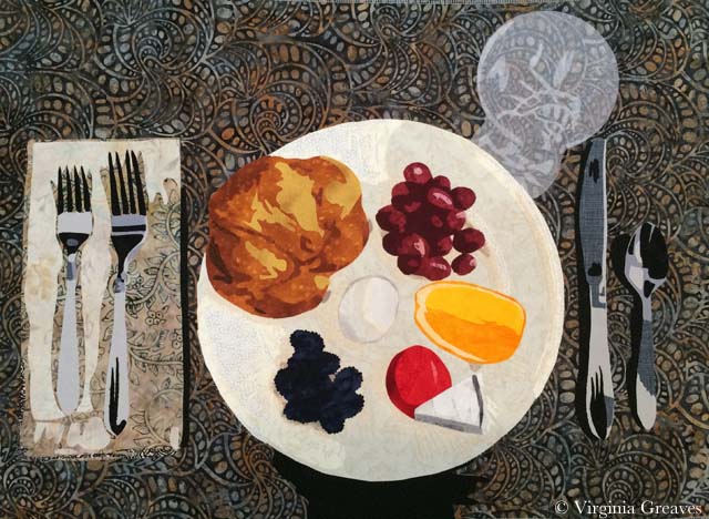
At some point after quilting, I realized that I only needed 15″ in height — which was just as well since my background fabric had shrunk closer to 17″ — but it’s sad because it meant that I would have to cut off the top of my glass. Oh well. No use spending too much time worrying about that. The glass is to scale and shrinking it to make it fit on the 15″ height would have made it look too small for the place setting.
I just returned from a short vacation to celebrate the beginning of summer so much of my week was lost to the Muses, a respite of intellectual machinations to hopefully be cashed in at a later time. It was restful although I had hoped to spend time gathering inspiration through my camera. Unfortunately, the weather had a different agenda and a lot of time was spent looking at the ocean through large plate glass windows as we were inundated with rain, thunder, and lightening. (I will never understand the logic of people that think playing in the ocean or on a wet beach while lightening crashes around them is a good idea.)
I let my youngest daughter have the camera a good portion of the little bit of beach time that we enjoyed — so it will be interesting to pull them off the camera and see what enduring messages she has given me from our trip.
I did find time to tweet some — here is my weekly wrap-up. If you want to follow me in real time, I’m @vsgreaves — or hit the social media icons in the upper right above the menu.
This is a deeply moving series of portraits of dogs that were in service during the chaos of 9/11. I couldn’t help but wonder if it was the skill of the photographer the captured the deep pools of their eyes — or if it is a reflection of the horrors that they lived through during that time.
@mymodernmet: Moving Portraits of Surviving 9/11 Search and Rescue Dogs 10 Years Later http://bit.ly/1teXXE0
The world grew a little dimmer this week as we lost the life of Maya Angelou to the angels. This was her last tweet. May she rest in peace and rise in Glory.
RT @DrMayaAngelou: Listen to yourself and in that quietude you might hear the voice of God.
I was asked recently — by another artist — “how long did that take you to make?” As artists, we should consider this one as it is an opportunity to market ourselves if we answer it correctly.
“How to Answer “How Long Did That Take You to Make?”” Always a hard one to answer. http://feedly.com/e/c1VKM4YQ
As Creatives, we are familiar with working in “the flow” — this book review covers “wu wei,” a similar concept, and why it’s important to use our unconscious brain in other difficult activities.
RT @brainpicker: How to cultivate the paradoxical art of spontaneity in work, life, and love through the Chinese concept of wu-wei http://j.mp/1kRg3LD
My mom, a painter, never had the back of her art remarked upon — although it’s something routinely considered in fabric art since it’s rooted in the traditional quilting world (whether we like it or not). I think that it presents a marketing opportunity for any artist in any medium if we’re willing to take the time to be thoughtful about it (as well as neat).
RT @ArtsyShark: What’s the Back Story on Your Art? – http://buff.ly/RKbtDu
A thoughtful consideration of why artists create the work that we do — and in the end, why the answer is probably best left unanswered.
RT @brainpicker: Why do we create? The great Leonard Bernstein on artistic motivation – absolutely brilliant and necessary read http://j.mp/1k9zK2r
I couldn’t help but share this incredible pen and ink master. Although his inspiration is inarguably baroque, his images are beautiful to behold.
@mymodernmet: Incredibly Detailed Ink Drawings of Winged Insects by Alex Konahin http://bit.ly/1kucN45


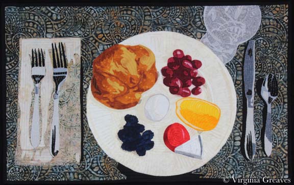
What is crocking? It’s when you wash something and the dye particles that haven’t bonded completely with the fabric (usually cotton) float free and bond to something else. It is commonly seen when someone washes a new article of red clothing that then turns all of their other clothes pink after a trip through the washing machine.
How can you avoid this happening in a quilt? The easiest way is to prewash your fabrics. After you bring them home, wash them in synthrapol (a squirt of blue Dawn dishwashing detergent — as long as you have an older washer that can handle high sudsing detergents — works just as well) and a dye catcher sheet. This will hopefully take out all excess dye particles that were not rinsed before the fabric was sold.
That’s usually more than enough — but not always. I had a green commercial hand dye I bought once in Florida that would never stop running dye. I finally threw it away.
Reds are notorious for this. I have this problem with even commercially printed cottons. It’s especially heartbreaking when it happens in a finished piece. You don’t want to throw all of your hours of hard work into the garbage.
Fear not. It’s not worth the tears. If you can’t fix it with hot water, Shout, or any other stain remover (short of bleach of course) — they make something that works just as well. It’s called fabric paint.
Admittedly, this works better on some prints than others. There are some textures that cannot be replicated — but then you just need to reframe your expectations and accept it as it is. This is art and I can use fabric paint if I want to.
This is my latest piece.
I sighed when I pulled it out of the washer. (I typically run my pieces in water when they’re done to take out the water soluble glue I use to help me in the binding process — and to prepare the piece for blocking.) I sprayed it with Shout, turned the water to hot, and threw it back in.
No luck. There was still red all around the grapes on the plate. So I spun out the water and pinned it up to dry.
Once it was blocked and dry — I waited a few days. You have to be patient. You don’t want to have any anxiety when you do this.
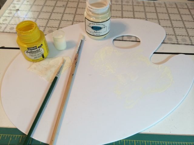
I pulled out my palette and put a pinch of yellow on it — and by a pinch, I mean a very small amount. Then I added a large amount of white and mixed it together on my palette. I tried it out on a piece of my cream fabric — the same that I will paint on the quilt — and it was too white — so I added another very small amount of yellow and mixed it in. This was a closer match on my swatch. So I grabbed a paintbrush and painted it onto the affected areas of the quilt. I used a light hand — and added water to thin it out so it wouldn’t look gloppy — went to another section — went back after it had dried a little and added a little more paint. I ended up pulling out a smaller brush to get that very small section between grapes.
And voila’! Much better. I believe it now qualifies as show worthy. I’ll give it shot anyway.
This was the last week of school for my girls so there was a lot of interruption and not a lot of studio time. I did manage to finish my latest small piece — a still life — but blocking it caused some fabric crocking that I will correct tomorrow. I’ll post about how I do that. I also took some in process pics that I’ll share. I admit I’ve been a little stingy with sharing my studio time lately. I think the truth of it is that I’m a little burned out creatively.
I also have not had a lot time for reading — so I only have four Tweets this weeks. Remember that if you want to follow me in real time, I’m @vsgreaves — or hit the social media icons in the upper right above the menu.
I thought it interesting, after writing a recent post Branding Yourself As An Artist, that Winkleman has carried the torch and furthered the discussion. Being a gallerist from NY, he has a lot more wise thoughts on the subject.
“Branding for the Fine Artist : Part I” Wise words of Winkleman. http://feedly.com/e/HWftCphx
Brain Pickings presents yet another thoughtful essay on the secret to creative success as demonstrated by the masters — work ethic.
“The Long Game:Brilliant Visual Essays on the Only Secret to Creative Success, from Leonardo da Vinci to Marie Curie” http://feedly.com/e/pgtauIUC
Although it’s curious enough to follow the bullying ways of WalMart, it’s equally fascinating to ask the question — who own the photograph? Although federal law says that it is the photographer, I have had subjects that are adamant that they are the owners of their own image.
“Walmart Goes After Photographer’s Widow” — who owns the photo — the photographer or the subject? http://feedly.com/e/4cUqyTB3
Harper Lee again takes her hometown to court for copyright infringement as the town continues to capitalize on their claim to fame.
“‘To Kill a Mockingbird’ author Harper Lee heading back to court in fight with hometown museum” http://feedly.com/k/1pkzE7a