Virginia Greaves

Virginia Greaves

(7 comments, 341 posts)

This user hasn't shared any profile information

Home page: http://www.virginiagreaves.com

Posts by Virginia Greaves

2012 Accomplishments

0

One of my art friends on Facebook, Kimberly Baxter Packwood, asked yesterday what was our top accomplishment for the year. Lisa Call and Dale Anne Potter chimed in — and I began to realize that making a list of what I accomplished in 2012 was definitely something I needed to do. My first list was less than twenty, but after reading Lisa’s list (she lists 100 every year), I realized I wasn’t giving myself enough credit. So I’ve been working on it.

At first I also had a list of disappointments, but I decided that those were actually risks that I took that should be counted as accomplishments. Without risk, we’d never travel anywhere new.

Lincoln

Lincoln

– Accepted into Fulton County Artist’s Registry in Atlanta, GA.

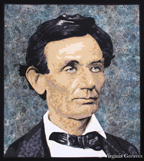
– Accepted into the La Conner Quilt Festival in La Conner, WA (Bukonyan Elder).

– Won 1st place at the La Conner Quilt Festival (Bukonyan Elder).

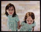
– Accepted into the Georgia Artists Show at the Abernathy Arts Center in Sandy Springs, GA (Amelia EarhartBeach Guardians).

– Won 3rd place at the Georgia Artists Show (Amelia Earhart).

– Accepted into International Quilt Festival/Houston: World of Beauty in Houston, TX (Beach GuardiansA Walk In Twilight).

– Included in the invitational show International Quilt Festival/Houston: Pets in Houston, TX (Unconditional).

– Included in a IQF exhibit review by Sophie Rubin on Youtube (Unconditional).

– Accepted into the book Art Quilt Portfolio: People & Portraits being published by Lark Crafts in April 2013 (Celtic Woman).

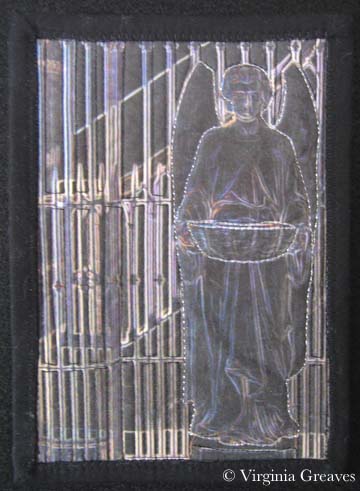
– Included in the invitational show Fiber Art Fusion: Artifact at The Art Place in Marietta, GA (Arminta PattersonThe Ties That Bind Us).

– Spoke about my work at the Gwinnett Quilter’s Guild & taught my workshop on Pet Portraits.

– Gave a seminar on Textile Photography at Fiber Art Fusion in Marietta, GA.

Laura Margaret

Laura Margaret

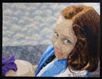
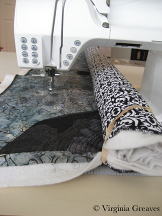
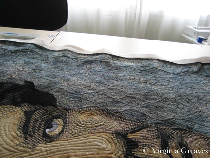
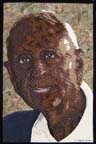
– Created five portrait pieces, two of them with two figures.

– Made a portrait almost exclusively with ties from my stash and local thrift stores (The Ties That Bind Us).

– Updated my website for each of my new pieces.

– Reconstructed and updated my art resume.

– Updated my LinkedIn resume, adding my exhibition achievements.

– Wrote 22 blog posts (23 with this one) — averaging almost twice a month.

– Submitted work to Art Book Archive: Atlanta for inclusion (haven’t heard on e-book publication yet).

– Created a Page on Facebook for my art & syndicated my blog posts to it.

The Ties That Bind Us

The Ties That Bind Us

– Lost 11 pounds and dropped two clothes sizes.

– Developed a way to create figures in large sections so that I could construct them in manageable pieces on a temporary surface and then build a more complicated piece on the background.

– Went zip-lining in Honduras.

– Went cave tubing in Belize (after hiking over river rocks and breaking my toe).

– Went snuba diving in Mexico.

– Took thousands of sports photos and learned to share them through DropBox.

– Photographed the Fiber Art Fusion Artifact annual exhibit and holiday exchange.

– Indoor trained a new puppy.

A Walk in Twilight

A Walk In Twilight

– Converted hundreds of printed family pics to digital.

– Finally found the names of my paternal grandfather’s parents and was then able to take that part of my tree back to 466 AD with the birth of King Clovis I.

– Served as a Unit Leader and Troop Treasurer for my daughter’s American Heritage Girls troop.

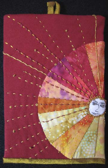
– Created a 5”x7” piece for the Fiber Art Fusion holiday exchange that I’m using as a model for a larger piece.

– Visited Mary Jo’s Cloth Store in Gastonia, NC.

– Learned about head concussions and other soccer injuries from my daughter.

– Spent a week in Ponte Vedra, FL for Spring Break taking lots of beach pictures and exploring Saint Augustine.

– Helped Rebecca Reasons-Edwards curate Fiber Art Fusion: Artifact exhibit.

– Played roles of volleyball mom, lacrosse mom, soccer mom, and choir mom.

Beach Guardians

Beach Guardians

– Saw MacBeth downtown at Shakespeare’s Tavern.

– Applied for a part time job at local children’s hospital (not accepted).

– Applied for entry into Quilts=Art=Quilts for the first time (not juried in).

– As of 12/30/12, there were 12,680 views on my website for the year — which was down 23% from 2011. This was caused by a bubble in 2011 from a mention of my blog in Quilter’s Home Magazine, but although views dropped between 2011 and 2012, views increased 154% from 2010 to 2012 so I was able to keep a lot of my traffic after this unexpected marketing windfall.

– Created a Facebook banner highlighting my work.

– Learned how to make resin jewelry.

At this point, only half of the work is done. I’m still working on my goals and will share that in another post.

Quilting Lincoln

0

I spent a long time quilting this piece. I took about a week to quilt his figure — but then I needed to do something for the background. I found that incorporating two different ideas gave me something workable without being overwhelming.

Like many people quilting on a domestic machine — I found some angles to be very challenging. My first design was a parallel flowing line which wasn’t too hard — but then I added swirls in the open spaces. These had to be done all in the same direction — so the left hand side of the quilt became a bear to manage. I found that rolling up the right hand side and holding it with rubber bands at the top and bottom gave me something to hold on to.

Quilting thru Machine

From this angle, you can see the background quilting better. I am so glad I took the time to add this texture to the piece. I think it adds to the feeling of age in it — and it’s a nice contrast to the contour lines on the face.

Background Quilting Detail


I think I’m slowing getting better at quilting. Although I’m not a huge proponent of the quilt police guidelines that the stitch length has to be perfectly consistent — and I do not have the luxury of a stitch regulator on my machine — over time, that is what is happening. I did not mark my design and chose instead to keep the framework of wavy lines organic — but even those became more uniform the more time I spent making them.

Lincoln


After a week of background quilting, I finally completed  Lincoln. When I sat down to write my artist’s statement, I found it entirely too political, so I decided to merely include some of Lincoln’s quotes instead.

It feels good to finish before the holidays. I already have ideas for my next piece.


Holiday Spirit

0

Last night my Fiber Art Fusion art group had our holiday party and we exchanged 5″x7″ sized pieces.

I created this from a picture I took in a church in New Orleans. I’m so pleased with it that I think I will make a larger version for myself. I love the dark angel against all of the ironwork. My friend Hellene Vermillion took this home. She is an incredible silk painter — you can visit her on her website here.

Dark Angel

We brought all of our pieces in a plain brown wrapper so no-one could cherry pick. A couple of women wanted to turn it into Dirty Santa and have stealing — but we decided that that might lead to hurt feelings so we kept what we opened.

I was lucky indeed to receive this piece entitled Here Comes the Sun from Martha Myers. The sun wraps around the back. I love the sashiko stitches in gold thread — and the colors are wonderfully vibrant.

Here Comes the Sun by Martha Myers

Here Comes the Sun by Martha Myers

I have quite a collection of pieces from past parties. I almost didn’t go — everything is so crazy this time of year — but I set aside several hours yesterday to finish my piece so I could go. I’m glad I did.

I feel blessed to have such wonderful friends — and artists to boot!

Me and Abe

3

I am guilty of ignoring my blog. I took many pictures as I made his shirt, tie, coat, and finally his hair — but the progressions are not that interesting. The white doesn’t photograph well and the black — well I was overcome with black. Lincoln has a dour personage and although I didn’t intend this to be a dark piece, by nature of his hair and his clothing, there are a LOT of black prints in this piece.

This is how he looks on my black design wall. Not bad — but I thought he would look really good on a deep navy — something that would be lighter than his hair but still strong enough to evoke images of the Union flag. I even considered adding flag details in the background but decided that it would only distract from his piercing stare.

Clearly, I was wrong. It is hard to tell in the artificial lighting of most fabric stores how a value is really going to work. This one is much too dark. Sadly, I had been to a couple of local quilt stores, and this is the only one I felt had promise.

I found this sky fabric in my stash. It has a cool feel about it, almost as if Lincoln is standing on the battleground — but the white in the clouds is too distracting — another reason I finally declared that he needed a plainer background.

And then I found this green batik. It has a feeling of age to it. It has some texture in the print, but not much. It is exactly the right value. I wouldn’t have thought this would work — but there is some smoky blue in it that pulls out the color in his eyes — a faded gray that hopefully reflects weariness.

Today I’m pondering how to quilt him. I’ve been drawing on my picture of him. The lines of his face are so distinctive and different from what I’ve done before that I had to pull some new tricks out of my bag. The line under the left cheek for example had to be highlighted. The chin also sits in an awkward fashion and makes the joining of the cheek to the chin different from how I’ve approached it before.

Choosing Faces With Character

1

At some point, as a portrait artist, you begin to want to do something different. Most faces aren’t as distinctive as you would think and the thought of working on a face with a lot of character becomes appealing.

Couple that with the recent election and my need to study American history, and I came up with the idea of working on a piece portraying Abraham Lincoln — our 16th President.

This is the very beginning — the first two values that show a rough outline of his face and ear.

Adding the third value makes his face almost immediately begin to come to life. (I was obviously starting this late in the day when the natural light in my studio was failing.)

The fourth value begins to show us the deep wrinkles that Lincoln had in his later years.

The fifth value is very subtle but shows some distinction from the fourth one.

It is at about this time that I realized, given the size of my pressing sheet that I’m using (sometimes I’ll fuse directly to muslin but this time decided to use the Teflon sheet), I am going to have to wait to finish the darker values in his ear and neck. (My sheet is 18″x18″ — I have my eye on one that is 27″x30″.) Otherwise, I would be fusing fabrics onto my ironing board — and that would just make a mess.

This is the sixth value. I am really pushing the envelope having this many values but I think it will work in the end.

This is the seventh value with the gray blue of the irises added.

And the eighth value is black. It adds that finishing touch of contrast. It highlights his eyes, his nose, his mouth, and his chin. I have also added the spark of white in his eyes.

This shows him with a completed ear. (You might not be able to see it here, but I’ve moved the pressing sheet over so that it is directly under the ear.)

There is actually a piece of black from his hair that will flow into the darkest part of his ear. I decided to add it all as one piece — so you’ll see that final detail after his hair is attached.

And then I started on his neck. (Again, I moved the pressing sheet down into the neck area.) I thought about only showing it completed, but I think it is equally interesting to see its creation in layers. This is the first value (which is actually the 2nd value in his face.)

The second value gives a little more definition.

The third value shows us his Adam’s apple.

The fourth value accentuates that.

The fifth value begins to give us shadow.

The sixth value completes the shadow.

And the black again gives the contrast, showing the outline of his jaw and the separation of his neck from the face.

The previous pictures were all taken while the piece was lying flat on my ironing board so there is some perspective distortion. This is the completed face on my design wall.

I may change his eyes to make them darker — but all in all, I think he is looking fairly good.

My daughter asked me the other day if I was going to put his stovepipe top hat on him. Although his hat is iconic, I can’t say that that had occurred to me — so I may put off working on his hair while I consider the design of the overall piece. As usual, I have not decided what to do in the background yet either.

Not At Houston

0

Years ago, I had the privilege is attending the AQS Quilt Show in Paducah. There were miles and miles of the most extraordinary quilts I had ever seen. Every time I came to the end of a row, there was another one, each quilt more breathtaking than the last. I marveled that anyone could jury awards and somehow discern the placement of one over another.

Although I don’t enter Paducah anymore because of their size restrictions — this is how I imagine the International Quilt Festival in Houston to be like — probably larger. I have had the honor of having many quilts there but have not been able to visit myself. At this time of year, the blog posts from friends attending makes me wish I could hop on a plane. I’ll get there one day.

I have one quilt in the invitational exhibit Pets — Unconditional. This is a piece I created several years ago and shows the unconditional love that my mother’s Brittany Spaniel has for her. Given the popularity of the animal pieces that I have done, I should really make more of them. They are much more marketable — portraits of people are much more personal to the subject — although I do not use marketability often in choosing a subject for a piece — no more than I use exhibit themes as guidelines for ideas. I like to create pieces that are inspirational to me — although I can appreciate that that is not always the most marketable decision.

I also have two pieces at the same show in the World of Beauty Exhibit — People, Places, & Figures category. I confess I don’t actually know if they hang the exhibit by category — although it makes sense that they would.

The first is Beach Guardians, a piece I made last year based on my children when they were younger. I love the perspective of looking down on them from above.


The second piece in the same exhibit is called A Walk in Twilight created earlier this year. It is about friendship and the joy that we share in each other’s company. Sometimes we just need to remember to take our friends along to make the journey more enjoyable.

These were the first two pieces I made with multiple subjects — although you could argue that Amelia Earhart had two subjects — Amelia and her plane. I still struggle with backgrounds and deciding whether more complex is actually helpful to the piece or not. Sometimes I think something simple is best — you don’t want to detract from the main subject — but other times, a complex background adds to the story of the piece and still enhances the portrait.

I have also been privileged with winning a first place ribbon from the La Conner Quilt Festival in the Open: Fiber Art Quilted category for Bukonyan Elder. This is my first year to have entered this show and I was thrilled to place. Their Top Honors Exhibit will extend until the end of the year and will be available for viewing at the La Conner Quilt & Textile Museum in La Conner, WA.


Lastly, my piece Celtic Woman is being included in a book to be released this coming April. I have not been published in a book before so I can’t wait to receive my copy. I will give more details on this publication at a later date.

Finito

1

I have finally finished my latest piece Laura Margaret. It is going immediately into a private collection. With any luck, it will be a complete surprise. I loved working on the eyes in this one. I put a lot more detail into them than I have in the past. I took some liberty over-highlighting the rim under the eyes — but I think it makes the piece more striking.

I’m not certain about what I’m going to do next. I am mulling over a few ideas and will hopefully decide soon. I don’t have a lot of time in November and December because of school holidays — but hopefully I can finish a small piece between now and the end of the year.

My piece Bukonyan Elder won first place in the Open: Fiber Art Quilted category at the La Connor Quilt Festival in October and will be held in their extended Top Honors exhibit until the end of the year. I also received exciting news that Celtic Woman will be highlighted in a book being published in April — more details to come later. Finally, my piece Unconditional was invited into a special exhibit called Pets at the International Quilt Show in Houston this November.

Working With Color

2

Working with color can be very confusing — almost as difficult as working with values.

Since my last blog post, my figure was complete, but she needed a space in which to inhabit. She is holding up an iris on the back of her hand — so in adding color to the piece, I have a wonderful deep purple to add to the green in her eyes.

I also decided to pull the green down into the sliver of her shirt that is just peeking out from the towel draped around her shoulders.

And then this is where things got interesting. At this point, I had not added color to her mouth. I was ignoring that for the time being and trying to decide on a good color for the stripes in her towel to alternate with white. The actual photograph was a pink — but that didn’t seem to add to the piece for me. It seemed too close in color to purple.

According to the color wheel, if you have purple and green — then you need orange — so I went headlong into orange for the towel. I also added color to her mouth in rusty orange tones. I tried pinks and reds in the mouth and they all ended up looking like lipstick — so I went with something closer to browns.

It’s not that the orange in the towel is wrong — but it is too much. You no longer look directly into her beautiful green eyes. I kept this on my design wall for a while. It just didn’t look right to me.

So I switched to this cooler color of blue. Now you see her eyes first and the piece is in greater harmony. I still have the orange in her mouth to go with the purple and green. I think this composition of color works much better.

I did make two other adjustments. The water is a smoky blue with hints of purple so the iris melted into it. All I had to do was add a small border of a lighter value around the iris where it touched the water fabric. Now it stands out.

I also darkened the light spot on her nose just a little. It was too bright before and didn’t look natural.

Why did I choose what I did for the water and sky? I didn’t want anything overly complicated to compete with the figure and her engaging gaze so I originally planned to have just one fabric in the background. I had nothing in my stash and the only thing that I found in the fabric stores was the smoky batik. I decided that the pattern gave the impression of reflections on water and would be great. In reality, it overwhelmed the piece. I used a sky piece that I had on hand for the top part.

Strictly speaking, I should have used the rule of thirds when deciding on the horizon line, but I broke that rule. I liked it much better when the horizon line brought the viewer’s eye across to the bottom of the figure’s eye.

Her eyes are what is important in this piece, and visual cues like color and line bring up the supporting cast in the overall design.

Green Eyes

1

Now that we’ve covered drafting, it’s time to move on to my favorite part — cutting the fabric.

Using the back side of the pattern — the reverse — trace shapes with a Sharpie onto Wonder Under and fuse to the back of fabric. Then cut out shapes, peel off the paper, and fuse to the muslin using the vinyl overlay as a guide to where to place the shapes.

This shows the first three values in the face of my newest piece. I know — not much to look at yet.

But just adding the next layer gives us an idea of the outline of her face.

Then the fifth value shows us the rest of the face. Obviously the light sources comes from the left side — so the right hand side of her face is in shadow.

The sixth value shows us more of her personality.

Wow! And those eyes. I have added a seventh value — not much — just a little — but it adds a little more pop. I have exaggerated the outline of her eyes — it makes then read well at a distance.

At this point, I’m leaving her mouth alone. I experimented with adding some color but it detracted from the focal point of her eyes. I may just need something closer in color to her skin tone. I’ve set that aside for now.

And then I started on her hair. She’s a brunette, but I’ve learned from experience to start much lighter for highlights. Using the yellow bin and the brown bin, I can get a great range of values.

This shows the first two values in her hair.

And this shows her third value. It does worry me a little at this point — whether the end result be brunette — because this looks really blonde.

I start adding in the fourth value — which goes into brown — to the left of her part.

But then of course I realize I need to start working to the right of her part.

And of course I’ve forgotten her blonde values in the lower section of her hair below her chin.

I then go back and start filling in with the fourth value.

This is the Wonder-Under’ed fabric for value 5. It’s really intricate. I wonder if I’m a glutton for punishment. I have to remember — I have to cut this out — and I’ll eventually have to sew it.

But doesn’t it look good on.

My final value is black — which is a great way to end a value range and pull one last value out of the stack.

I think she definitely reads as a brunette — and the blonde highlights give her a range that makes her face pop. And those eyes! I think they turned out well — if I do say so myself.

Drafting, Drawing, Sketching, & Photoshop

1

I am always asked about how I draft a pattern. Yes — I start with a digital picture. Yes — I use the posterize tool in Photoshop. And yet — if it were that easy — everyone would be doing it. Beyond the mechanics of the process — it’s a skill. The truth of the matter, as any good photographer will tell you, is that cameras lie. The more pictures you take, you’ll begin to see why. They don’t have the ability to record things in the same way as the human eye.

So my starting point is the photograph — but making the pattern believable requires some drawing. The eyes and the mouth are always wrong. The chin is rarely defined. The dimples that create character in some people’s faces are easily obscured in the light. And Photoshop isn’t perfect either. I use the information I receive from posterizing to start a value painting, but when you posterize, you often lose details that you want to keep and you have to add those back in. This usually takes me 3-4 days.

I have a Wacom tablet — not a big one — it’s the 2nd smallest — and I pick up colors and use the electronic pen to draw in Photoshop. I have the original picture in another layer that I can use for reference.

This is my latest piece, a small girl holding up a flower on the back of her hand and looking up expectantly. The important shape here are her eyes — and I’ve exaggerated some of the detail in them for that reason.

The value painting isn’t really my pattern — but it has everything I need. I used to take my value painting, export it as a BMP, pull it into CorelDraw, and then create my drawing in CorelDraw by drawing lines around all of my closed shapes. Then I would tile print it. It looks very professional when it’s done — but it does take longer than my Sharpie method.

I still export the file from Photoshop to a BMP file — and then I pull it into PosteRazor (which is shareware). I make it the size I want it, and then tile print it. (Tile printing, by the way, is sorely lacking in Photoshop.) At that point, I have to start putting the puzzle together.

This shows 2 sheets of the bottom left that need to be joined.

First I take off the right hand side of the first sheet (starting from the left) — and using a rotary cutter and a ruler, I take off the white strip that is not part of the pattern. (I also crop the bottom a little. If this wasn’t the bottom row, I would take off the white strip of the bottom as well.) I always take off two sides — the right and the bottom — so the pieces will fit together with overlap.

Now I can take the first piece and lay it directly onto the second piece.

Once I tape it, it’s seamless. Use clear tape and keep the tape within one value if at all possible. If you cross over values, your Sharpie won’t touch the paper and the ink won’t be visible on the other side of the paper.

The trick comes in putting it all together. I used to not be very good at it and my pattern would ripple with my mistakes. Don’t worry if it does. Retape it. You probably won’t lose much of a shape. But if you cut out the overlap carefully and tape it together carefully, you’ll have a flat pattern when you’re done.

You don’t want seams to fall in complex areas like the eyes. One reason I printed this out in landscape rather than portrait was to avoid that.

Once that’s done, outline your shapes using an ultra thin Sharpie.

This has the added benefit of creating the reverse of the pattern on the back — so from one tile printed & taped pattern — I get a front (used for the vinyl overlay) and a back (used for the Wonder Under patterns).

You can see here that this works great — except for the joins where the paper comes together.

Just grab a lightbox & draw in the missing lines. If you can’t see it, you can flip the paper back.

And finally, go back and label everything with value numbers. I always number the face F1, F2, etc. and then think up other prefixes for other things. In this drawing, FL stands for flower. And then grab a highlighter and mark the lines between areas — like the face, her shirt, her hand, the flower.

And since this is a value painting, you’ll find that your value shapes won’t always stop between objects. You have to go back in and add those lines yourself. I use a pencil until I get the lines where I like them — then go back over them with a Sharpie.

And — then you’re almost done — you flip the pattern back to the value side and tape vinyl over it and trace it out. Then you’ll sew the vinyl onto white fabric (using a Teflon foot that won’t stick to the vinyl). The fabric acts as your canvas, and the vinyl overlay is your road map showing you where to fuse your shapes.

Then flip the pattern back over to the back side — where there is no value distinction other than the letters & numbers you assigned to shapes — and you’ll use this to start tracing Wonder Under shapes.

That’s a lot of work before you even begin to look at fabric — but it’s time well spent. Keep in mind that whatever you draw, you have to be willing to cut it out and sew around it. Sometimes, you can use patterned fabric that will do some of the work for you. Often I draft tiny pieces that don’t end up in the final piece. And I’m always ready with a pencil to draw out changes at the last minute if something isn’t working out. Just because it’s been inked doesn’t mean it’s written in stone. If it’s wrong, change it. Sometimes you won’t see it until you start doing it. In this particular piece, one of her eyes was clearly wrong — and I sketched out my changes with a pencil and kept moving forward.

Virginia Greaves's RSS Feed
Go to Top