Working with color can be very confusing — almost as difficult as working with values.
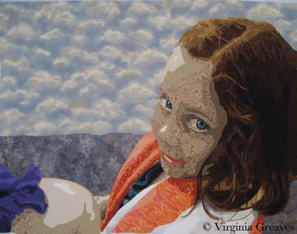
Since my last blog post, my figure was complete, but she needed a space in which to inhabit. She is holding up an iris on the back of her hand — so in adding color to the piece, I have a wonderful deep purple to add to the green in her eyes.
I also decided to pull the green down into the sliver of her shirt that is just peeking out from the towel draped around her shoulders.
And then this is where things got interesting. At this point, I had not added color to her mouth. I was ignoring that for the time being and trying to decide on a good color for the stripes in her towel to alternate with white. The actual photograph was a pink — but that didn’t seem to add to the piece for me. It seemed too close in color to purple.
According to the color wheel, if you have purple and green — then you need orange — so I went headlong into orange for the towel. I also added color to her mouth in rusty orange tones. I tried pinks and reds in the mouth and they all ended up looking like lipstick — so I went with something closer to browns.
It’s not that the orange in the towel is wrong — but it is too much. You no longer look directly into her beautiful green eyes. I kept this on my design wall for a while. It just didn’t look right to me.
So I switched to this cooler color of blue. Now you see her eyes first and the piece is in greater harmony. I still have the orange in her mouth to go with the purple and green. I think this composition of color works much better.
I did make two other adjustments. The water is a smoky blue with hints of purple so the iris melted into it. All I had to do was add a small border of a lighter value around the iris where it touched the water fabric. Now it stands out.
I also darkened the light spot on her nose just a little. It was too bright before and didn’t look natural.
Why did I choose what I did for the water and sky? I didn’t want anything overly complicated to compete with the figure and her engaging gaze so I originally planned to have just one fabric in the background. I had nothing in my stash and the only thing that I found in the fabric stores was the smoky batik. I decided that the pattern gave the impression of reflections on water and would be great. In reality, it overwhelmed the piece. I used a sky piece that I had on hand for the top part.
Strictly speaking, I should have used the rule of thirds when deciding on the horizon line, but I broke that rule. I liked it much better when the horizon line brought the viewer’s eye across to the bottom of the figure’s eye.
Her eyes are what is important in this piece, and visual cues like color and line bring up the supporting cast in the overall design.


Very nice choices! You were right about the orange towel…I looked at her hair. And now I looked at her eyes again.
Ginny, not only is your art astounding but so is your ability to explain it. I feel so fortunate to call you friend!