Posts tagged values

Loyal

2016 IQA Auction

0

This year, I was again asked to create a piece for IQA’s Celebrity Mini Quilt Silent Auction. It’s an honor to be invited, and I try to support IQA as much as I can. They have helped sell my work, and they have bought my work for their private collection. That’s a lot. So once a year, I stop what I’m doing and create something for them for their auction.

This year, I wanted to make a piece that was more like the rest of my work The last two years, the pieces have been tiny. So I wanted something that was a little bigger but still small that would give more of a sense of my personal style. I finally decided that the broadest appeal to the general public would be a dog or cat, and given that I don’t have a cat and people don’t typically take their cats out in public in the same way that dog owners do, I chose a pic from my catalogue of dog pics.

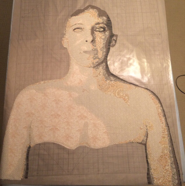
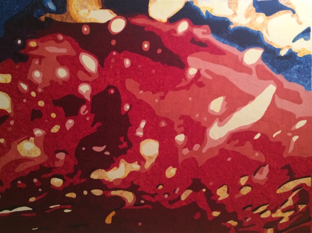
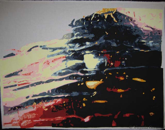
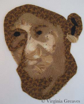
I found this pic of a black dog that I’m sure I took during a lacrosse game. I have no idea who he belonged to, but he was cute so I took his picture. I think he’s a schnauzer. I zoomed in on his face and loved his quirky expression.

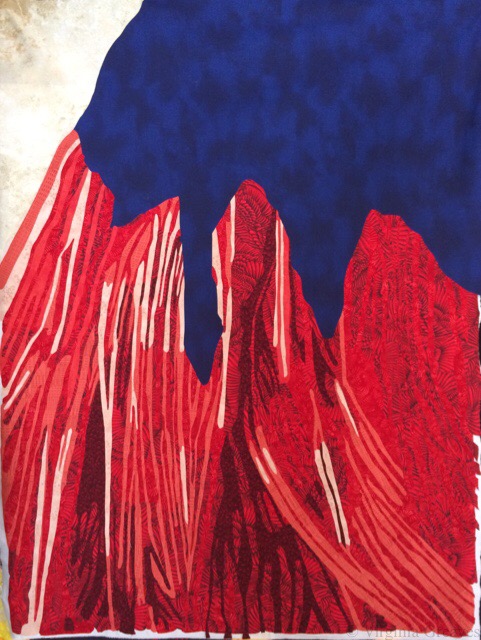
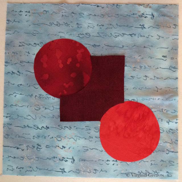
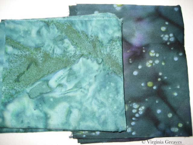
In keeping with my new penchant to use unexpected fabrics (but then also working only from my current stash), I decided that the best way to do a black dog would be to use blue fabrics. Gray doesn’t have the same character as the blue grays. So, like with Minerva, I wanted to create a black dog using blue fabrics — but the end result should look like a black dog, not a blue one.

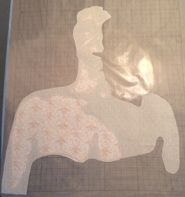
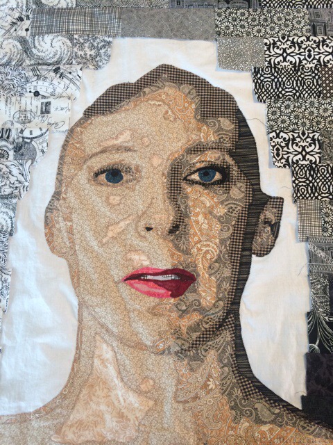
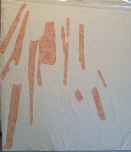
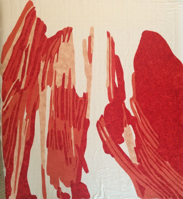
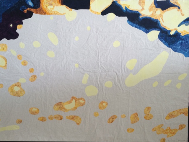
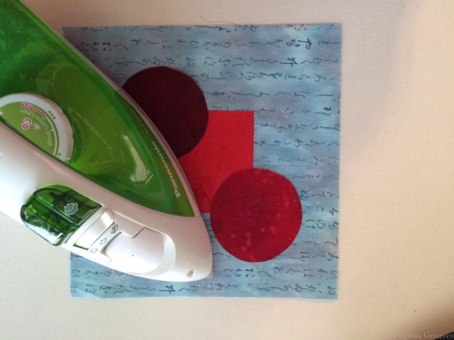
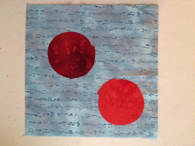
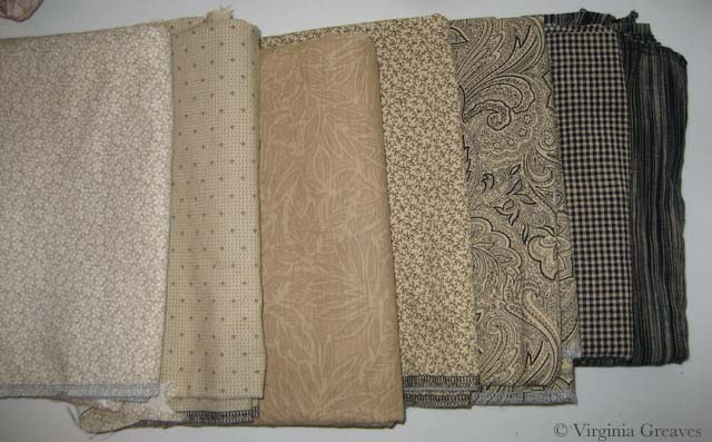
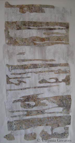
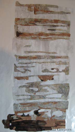
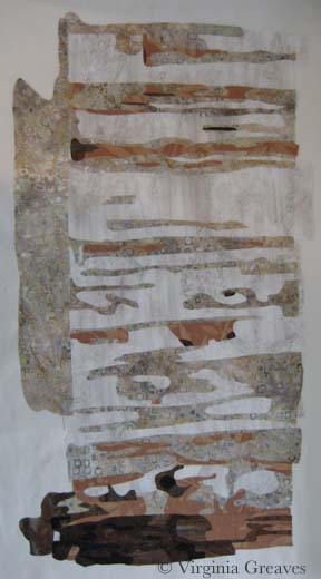
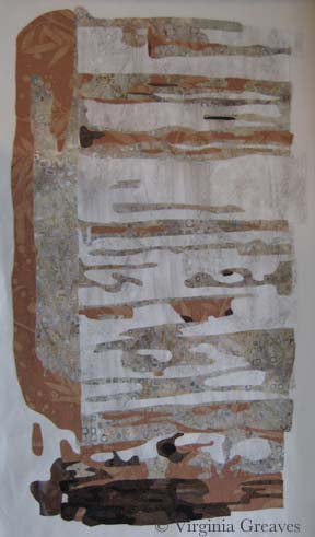
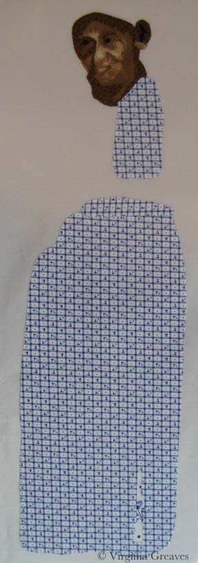
This shows the 1st two values on my pressing sheet.

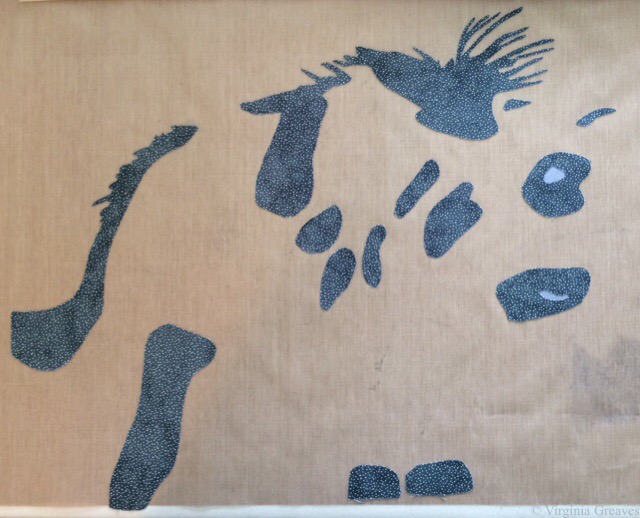
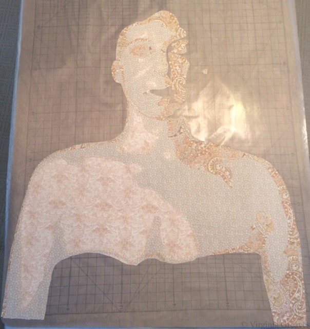
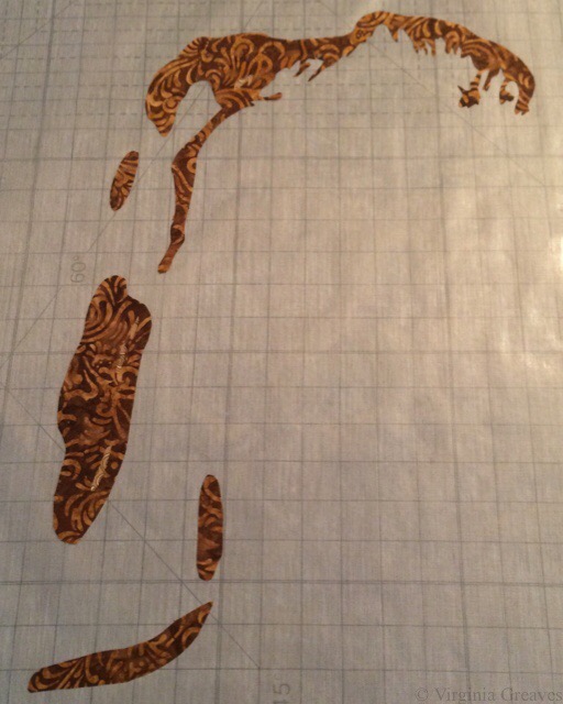
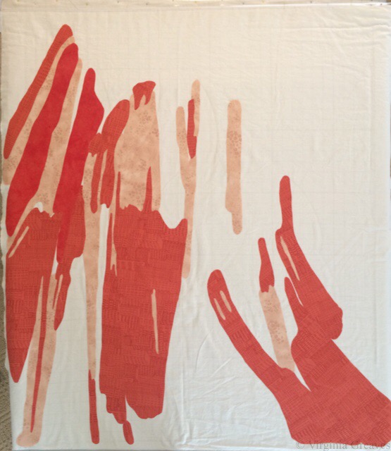
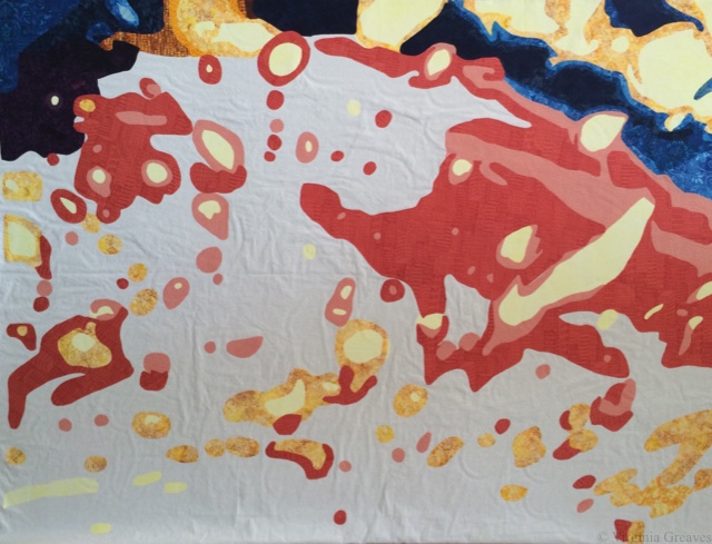
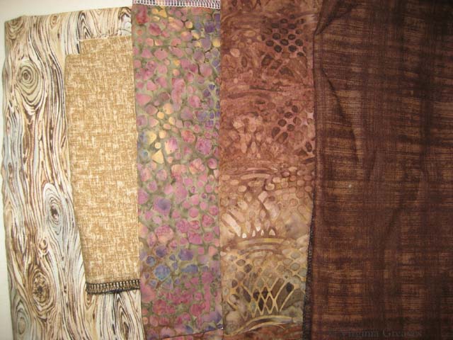
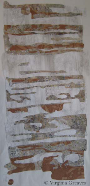
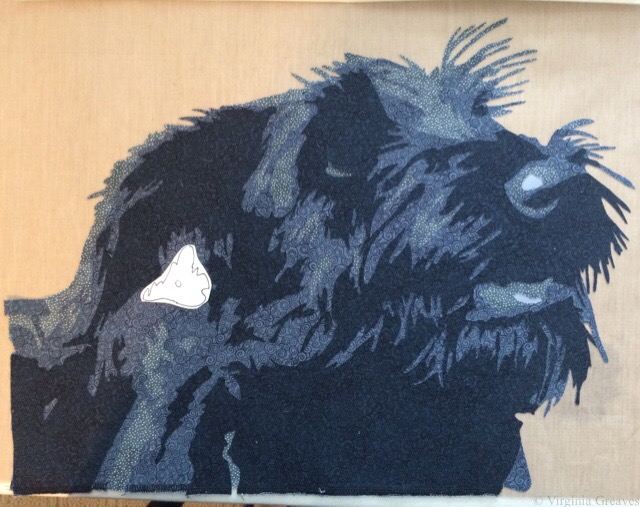
This is my 3rd value. You’ll see in a minute, there was a hole for the space at the bottom of the ear that I forgot to cut out of this layer.

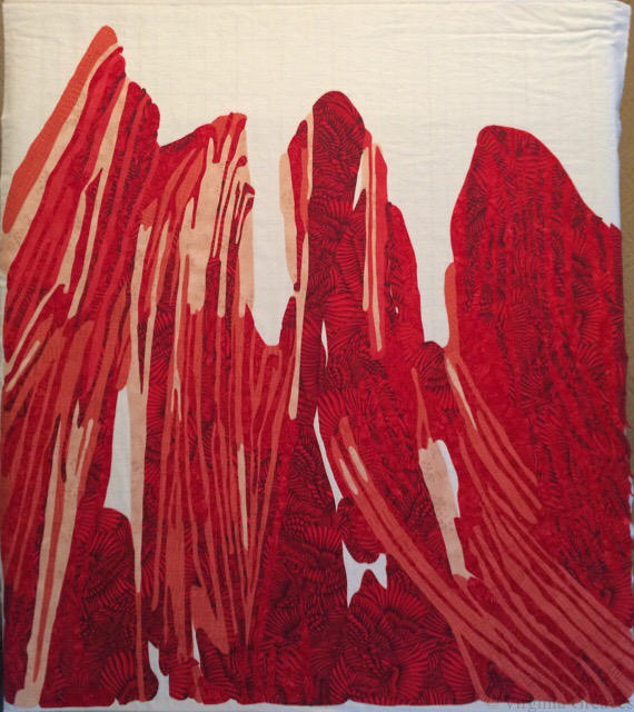
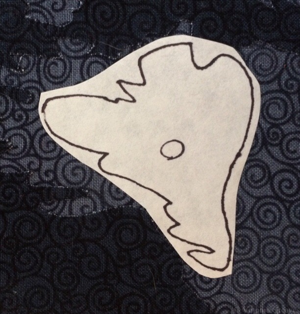
When I realized it, I traced the shape onto freezer paper and ironed it to the front.

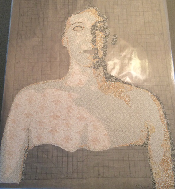
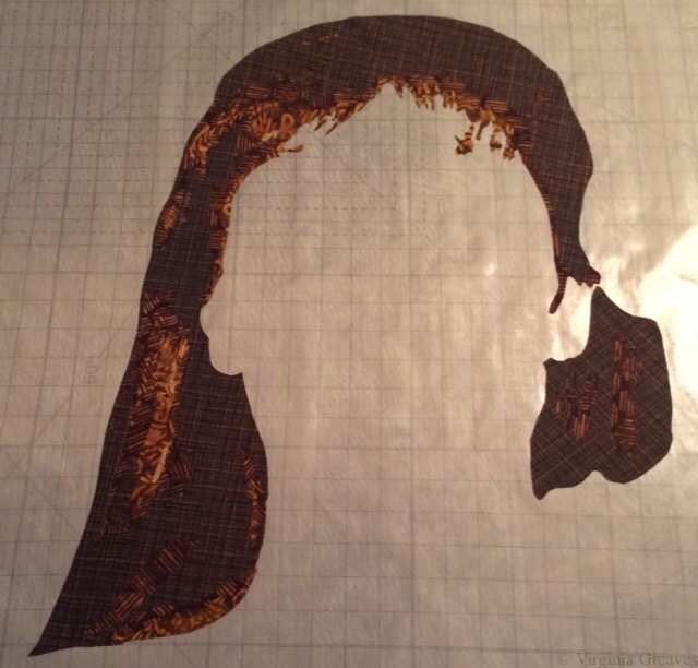
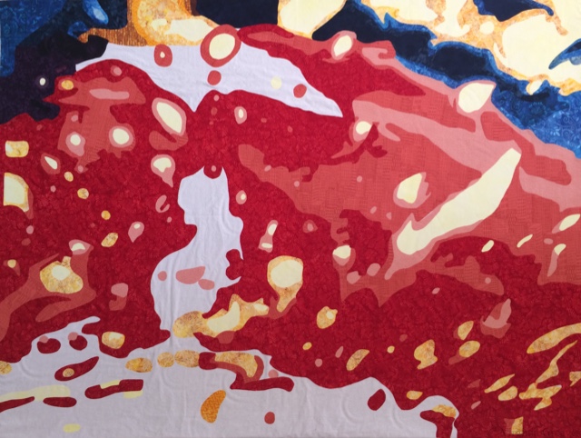
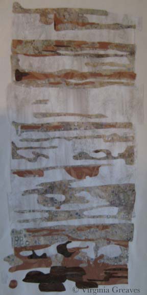
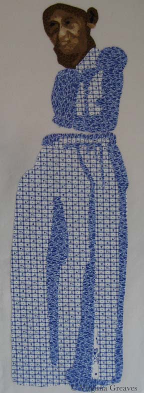
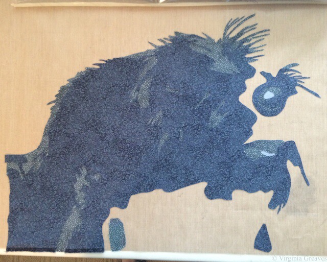
You can see the freezer paper template in this one — which also shows the 4th value. There’s a lot more character in him now.

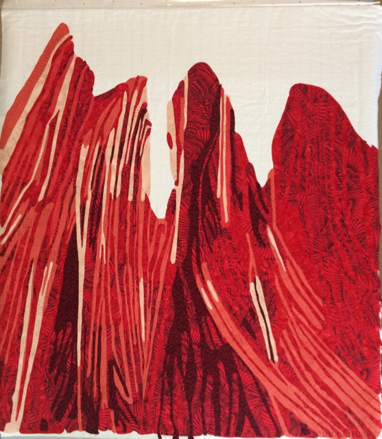
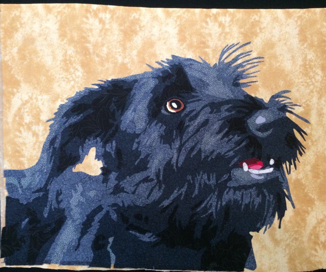
And then the 5th value was the actual pure black. He has a lot more dimension now — but he needs a proper mouth and eye.

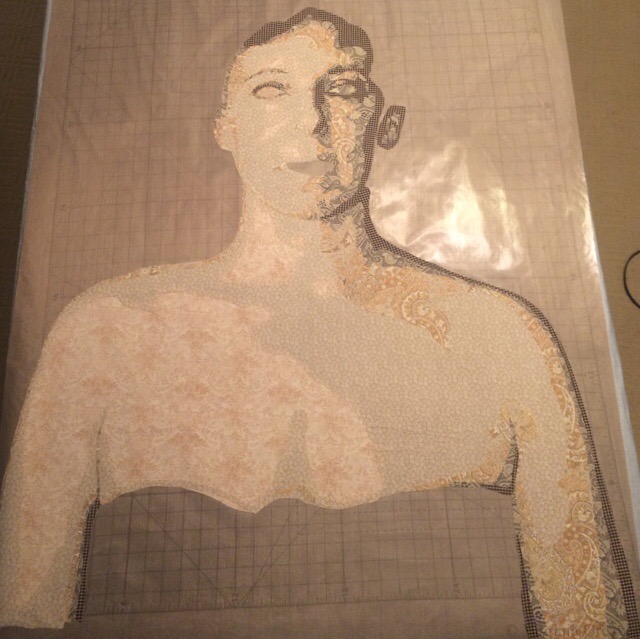
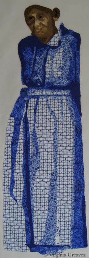
There’s a little bit of tongue tucked in there and then a row of teeth and two fangs on either side of his gum line.

And then his eyeball. As I have often done lately, I constructed it as it was in the drawing made from the values in the pic — but then ripped it off and redrew it as it needed to be in order to look as it needed to look. There are some things you can finesse if they’re not quite right — the eye isn’t one of them.

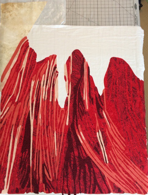
And then I ripped the appliqué off the pressing sheet and cut out the freezer template to give me the space I needed on the underside of the ear. You can see the ear more clearly now, especially ironed on to the background fabric. This yellow was a nice contrast.

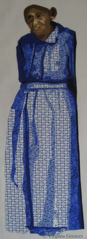
At this point, it isn’t appliquéd. I decided to appliqué stitch and quilt at the same time, so I sandwiched this rough top up and straight free-motion stitched around all of the shapes.

After the appliqué was done, it still needed more quilting to be evenly quilted — and of course the background had to be quilted.

The only thing I might do differently in the future, in terms of construction of a small piece, would be to pillowcase it so I wouldn’t have to add a facing to finish the edges. That took a while. But I opted against doing it because I thought this piece was a little big for that and I didn’t want any issues with it not laying flat or creating a tuck on the back. I wanted it to be perfect.

I snapped a few shots before sending him off in the mail — he’s due Thursday — so I cut it close but he’ll make in under the wire.

Let’s hope he goes to a good home. He’ll debut at the Silent Auction in Houston in November.

Loyal
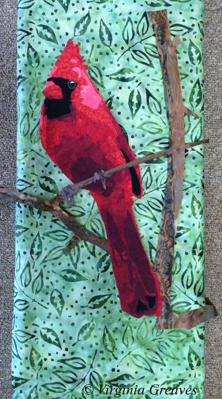
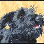
If you want to see the finished piece, he’s here.


Creating the Canary

8

So I haven’t written in a while. I’ve been working on a very personal piece, a self-portrait. I’m a very private person, and I need to remind a few of you of the boundaries here. I write my blog as a teaching tool. This is not intended as a preview into my personal life. If you enjoy reading it, that’s great, but if you know me personally, I don’t intend to answer questions about anything other than process to fellow artists and/or quilters. So please, don’t ask.

My original intention was to make two companion pieces. I intended to make a whole portrait of me (a picture I took of myself with a handy remote control for my camera) and then cut it in half. One piece would be the left half of the realistic me, & the right side would be an artistic interpretation of me inside. The other piece would be the same in reverse. Each piece would focus on two different views of who I am.

But this piece took on a life of its own. It didn’t want to be cut in half, and as I worked on her, she told me what to do.

This is the first flesh value.


This is the second. It’s a full bust and shows my shoulders and a little of my arms.


This is the third value. You can begin to see the outline of my face.


The fourth value shows shadow.


The fifth value.


The sixth value.


My eyes added. Don’t know why I don’t have a pic with the mouth. I used strong colors on the mouth — very red.


I am, by the way, creating these sections on a pressing sheet. In fact, I bought the Holy Cow pressing sheet just for this project.

This is the beginning of the hair.


Second value.


Third value.


Fourth value.


At this point, I pinned the sections up on the design board to see if they were working together. I even added a black sarong around my chest (because I’m just not THAT girl).


And then rather than add a solid background, I started cutting out black and white fabrics. Not sure why. I had a lot of them in my stash, small pieces, and I cut them into strips and arranged them by value.


And then I sewed on the flesh section. It was really humbling to see myself bald. I had a friend years ago who shaved her head in solidarity with another woman who lost her hair due to cancer treatments. I had not really thought about it before, but women invest some of their identity in their hair. I don’t know that I could have done the same & shaved it. What would I look like bald? I guess now I have an idea. It’s not as bad as I expected.


At this point in the appliqué, the interfacing underneath causes some wrinkling on the top. It’s a little unsettling, but when I rip it off the back and iron it, it will be flat again.

And then I pinned this piece on the wall and asked my muse what it needed next.

I considered adding a raven on my shoulder. I like ravens, but I didn’t think it would work well with the background. So after thinking about it for a while, I settled on a little yellow canary. She adds a nice punch of color to my shoulder. Canaries are also the birds that miners used take into the mines with them to judge the air quality. As they went about their work in a dangerous place, the bird kept them safe through their life.
This was my first try. Yellow is hard to do. I decided she was too dark.


So here’s my second try — much better. I also added some white highlights in the iris of the eyes.


Then I decided that I wanted her to be wrapped with vines, so I cut 1/4 strips of a green fabric on the bias and ironed them on in waves.


After appliquéing them down, they looked too plain, so I decided to embroider thorns on the vines.


And at this point, it’s just not quite right. The left eye is too plain compared to the right eye. So I added darker fabric and some black embroidery around the left eye. It’s the light side of the face, but it has to balance the right.


Subtle, but I think it makes a difference.

Did I think of Frida Kahlo’s self-portrait with thorns when I did this? At some point, I did. But this is my interpretation. Me and my canary.

She’s basted now and ready for quilting. The deadline for the exhibit I’m entering her in is still over a month away, but I have a lot to get done between now and then. The first week of March, the Wash & Wax exhibit will be hung at Jacksonville State University, and Leisa Rich and I are making 5 more Microbubbles (small framed pieces) and one more large piece — a triptych.

Abstract #6 Cut 

0

You may not realize it, but I work on deadlines — by the ones laid out by exhibitions and shows and the ones I set for myself. I have a calendar that I mark with all important dates for shows I’m interested in entering. If I’m not diligent in keeping track, I would be guilty of promising a piece of work at more than one place at the same time, and because I’m a professional, I work hard to make sure that doesn’t happen.

However, at least twice in the past year, I’ve had shows that I’ve entered change their dates mid-stream. I’ve entered the show knowing that I’ll have until X date to be notified as to whether it will be included or not in the show, and after that date, if it isn’t accepted, I can enter it somewhere else.

Friday, I spent the afternoon looking at my inbox. Finally, at 5 o’clock, I went to the website for the show and found that they had changed their notification date. Today (4 days later), I received an email with an apology and announcement of the new notification date. <sigh> <shakes head> This show was a long shot for me, and quite frankly, I had another show I was going to enter it into, but now I can’t do that. I suppose if I win the lottery and get in, I won’t mind a bit, but chances are good that notification day will be a bit more bitter than if they had just given notification on time. <grumble grumble>

I have been cruising through #6 in the abstract series.  This collaboration with Leisa Rich is called Wash & Wax and will premiere at The Abernathy Arts Center in Sandy Springs this coming September.

We met a couple of weeks ago and planned on it having the appliqué in one section and embellishment after quilting from Leisa in another section that would overlap mine.

The majority of the appliqué is red. I started with a new fabric for the first value, something peachy pink, a little hard to find in my local quilt shop. (It’s hard to find a pink that will work as a first value for red without screaming PINK.)

I then used up the secondary red color from #5 as my secondary value here as well. I planned out all of the pieces on my remaining fabric, and after it was all fused down, I found two pieces that didn’t make it to the ironing board, and I didn’t have enough of the building print to accommodate them. Rather than panic, I found a solid hand-dyed fabric that I had made several years ago. It isn’t textured, but it makes a decent substitution. Once all of the other fabrics are on there, I don’t think it’ll be noticeable at all.

The third value is also from #5, and I used up almost all of it. I only have a few very small scraps left.

I changed my fourth value for this one. I didn’t think that there was enough contrast between the red pinecones and the 5th value in #5, so this time, I found a red print of wings in my stash that’s been there at least 10 years. I like the movement it adds here.

And my fifth value is the same as what I used in #5, but it shows up better with the wing fabric.

I hope it’s obvious by now that this piece is less about color interpreted through water and more about the machinery that washes the car with strips of fabric. I have done all of the red in appliqué. The majority of the blue will be embellishment attached to the top after it’s quilted.

There’s a little yellow in the corner to show where the light is coming from.

And then this is a blotch of blue where all of the blue embellishment will go. I just wanted to put a dark fabric here that would be a background for the strips put on top, a better choice than the white.

I’m meeting with Leisa again later this week. She’s done embroidering #5 so I can start quilting it, and I’ll give her #6 to start on. If you remember, #5 is very large — 60″ x 48″ — so I suspect quilting it will be a bear. I had to order more batting for it.

Right now I’m quilting some of the smaller pieces for the wall installation piece. So much to do — so little time.

Abstract #5 Comes Together

0

All of my studio time nowadays is dedicated to completing the projects for the two-person show I’m collaborating on with Leisa Rich to be debuted in October. Last week, while she was working on #4, I drafted #5 and started cutting it out.

Leisa asked me to go big on this one — so that is what I did. I went to the limits of what I could currently handle in my studio for this kind of project — 48″ x 60″. I had to have a surface large enough to fuse the shapes onto my canvas. Since my table wasn’t large enough, I ended up laying one of my design walls flat on the floor — it was exactly 48″ wide.

And for the pattern, for the first time in years, I used the services of a blueprint company and a vector program. My copy of CorelDraw was woefully out of date, and I don’t have a PC anymore, so I ended up purchasing iDraw which worked perfectly for my purposes. (Even after 15 or so years, my Wacom Graphire 4 tablet continues to be a workhorse for me.) I created the pattern and emailed it to the local shop. I did spend some time talking to them about what I wanted though because a print of this size can cost upwards of $80. I had it printed out on inexpensive paper on their 36″ wide printer and then taped the two pieces together (the final cost was under $10).

I also had to buy some rather large pieces of red fabric for this. I didn’t have anything in my stash nearly large enough.

Here you see it with all the yellows, blues, and dark purples.

abstract5_1


And here you see the beginnings of the red.

abstract5_2

Lots and lots of red. For this particular value, I had to buy 2 yards, and the largest piece still had to be spliced in one place because it was wider than 42″ (the width of the fabric).

abstract5_3

And this is the final piece. I don’t know that my iPhone did the best job in the world, but it’s fine for an in-process shot. I think that this one is the most evocative of the car wash theme that we’ve done so far.

abstract5_4

To be honest, I was surprised at the huge leap between value 4 and 5 — and that 6 didn’t stand out very well against value 5– but after cutting out almost 2 yards of value 5, I wasn’t willing to start over. It still accomplishes what I wanted it to. There is a lot of room for Leisa to go wild on the embroidery — can’t wait to see what she does with this one.

The last time we met, she gave me some more pieces to work on for the large wall piece, and I still have #4 to quilt. Lots to do.

Working with Paper Backed Fusible

0

Last week, I drove up to Blairsville, GA to talk to the Misty Mountain Quilter’s Guild just before Thanksgiving. It was a wonderful group, and even though my wireless connection from the iPad to the projector decided not to work, we made do with the quilts that I had brought and still had a memorable time. I love telling stories about my work and inspiring other quilters to push themselves — to see the possibilities of what they can do with determination in their hearts.

I am always surprised at how many people ask me about how I use fusible in my work. It would be tough to do what I do without fusible. Deidre Scherer free-hand cuts all of her pieces, pins them down, and then machine embroiders them to completion. I marvel at her ability to do this. I typically have everything drawn out in advance, and if adjustments have to be made to the paper copy, I use a pencil to make sure I get it right before I ink it.

For those of you familiar with paper backed fusible, this short tutorial will not be interesting — but for those that are curious or just want to see how I work, I made a couple of small pieces to demonstrate the most basic principles.

First I start with a drawing. For this piece, I drew a square with my ruler and then two conjoining circles with the top of my spray starch can. The circles are considered primary to the square in this pattern — which means that the circles are intended to sit above the square in comparative space.

Each shape is numbered 1,2,3 — these are my value numbers. 1 is always the lightest.

This is the 1st version and the easiest to do because the square is on the bottom and the darker circles are on top. I <almost> always work from light to dark. If you work from dark to light, you run the risk of the darker fabrics showing through the edges of the lighter fabrics.

template2

The first thing you do is trace out your shapes onto paper backed fusible. I use Wonder Under. Trace the shape onto the smooth paper side and then roughly cut out around the shape — just outside the drawn line.

image

You should always use the reverse of your pattern as the template for your fusible templates. I forgot to do this — but in this particular instance, it won’t matter (It does in the 2nd version — so you may notice that I just left both of the final fused pieces in reverse.)

And by the way, reversing a pattern is easy; simply trace over the shapes with an ultra fine point Sharpie. All of the marks will transfer to the back of the paper. Then you use the back of the pattern for tracing your Wonder Under shapes.

Fuse your templates onto the BACK of your fabric with the iron on a cotton setting. (This is a batik so the back is the same as the front.) Roughly cut out around the shape.

fused on fabric

Cut directly on the line you have drawn.

cut fabric on line

Score the back of the paper with something sharp like a pin.

score fabric

Then you can rip the paper off the back of the fabric. The fusible should stay on the back of the fabric. If it sticks to the paper, re-iron the paper back down with a hotter iron and when cool, re-score and rip the paper off.

tear off paper backing

Prepare a backing fabric to fuse to. You could fuse directly to an appliqué pressing sheet. This is a special plastic sheet to which you can fuse and then later peel off and use as a large appliqué later. I do this sometimes, especially with large and complex pieces.

backing

Fuse down the lightest value first. For this template, it’s the square in the middle. Use your iron on the setting BELOW cotton, the one for polyester. If you leave the iron on the cotton setting, you will eventually bake the fused fabric to the point that it will not stick.

Fusibles are temporary. They need to hold long enough for you to stitch over them to hold them more permanently. In complex designs, you will find that things start to move as you scrunch everything around and under the needle, but re-ironing will re-stick them where you want them to stay — for a while. Over-ironing with an iron that is too hot, however, can burn the fusible away and there will be a lot more movement. So although it is difficult to iron the fusible onto the fabric with the cotton and then bring the heat down to fuse the shapes onto the final appliqué, it is worthwhile to remember if at all possible.

template1 iron square

Then fuse the next darker circle — and then the next darker circle.

template1 iron circle2

And it’s finished.

This is the 2nd version which is more difficult because the darkest fabric is in the middle with the lighter fabrics in the two corner circles. Remember that we want to keep the circles primary even though they will be fused before the square.

template1

The two circles are traced onto fusible — but the area that will overlap with the square now has an extra lip added so that it will slip under the square. If this extra wasn’t added, then the background fabric might show in the space between the circles and square. That happens at times and is easily covered with thread, but it should be the exception, not the rule, or you’ll be spending a lot of time covering things that are much more easily handled at this point in the process.

Also note that the square is now no longer a square. If we fuse the 3rd value down last, if we cut out an entire square, then the circles would no longer be on top (which is our goal — for them to be primary).

image

First fuse the lightest value circle and then fuse the 2nd value. Make certain that the overlap flaps will fall under the “square” shape.

template2 with 2 circles

And then add the “square” shape in the darkest value. Since the circles are primary, the square is set behind them. Notice that the square shape covers the flaps that were created on the circle shapes.

templ2_compl

These are the two designs. The one on the right is the first template. The one on the left is the second template. They are identical in final form, but by moving the values, we have changed the construction.

compl

Hopefully this explains the process in its most basic forms. Understanding how values affect how you cut your shapes is essential to working with a paper backed fusible. I always start with my lightest values and work to my darkest values.

The exception to this are the teeth in faces. They never look right done this way. I always make them from dark to light — but the overall pieces are small enough and the pieces are light enough in value that color shadowing isn’t an issue.

Around the World

0

Last year in Houston at Quilt Festival, I had the pleasure of meeting Marilyn Wall. I had admired her work for some time and was excited to meet her. She was attending with an old friend of mine, Denny Webster, who had recently moved from Atlanta to North Carolina.

Marilyn asked me recently if I was interested in participating in the Around the World blog hop. I’ve never done one of these before, but it’s essentially a way for bloggers to promote each other. Marilyn nominated me and another blogger — and I’m supposed to nominate a couple of other bloggers. Hmmmm. Most of the bloggers I know have already participated in this blog hop — and quite frankly, life has been very full around here recently.

BUT — what I CAN do is introduce a few things about me that you might not know.

What quilting/sewing thing am I working on?

If you follow my blog at all, you see what I’m working on. Right now, in my studio, I’ve been cutting out a portrait — I’m working on the hair right now. I’ll blog post about the face later this week. It’s my intention to enter this one in the National Portrait Gallery competition and hope it at least makes it to the semi-finals. Hope springs eternal. And in a little over a week, I’m traveling to Quilt Festival in Houston to step out in the Winner’s Circle and find out what my prize will be. I’m starting to feel butterflies in my stomach.

How does my work differ from others of its genre?

This is an interesting question. I started making representative patterns because I enjoyed the process, and my first series of portraits were all monochromatic color studies. Once I moved to Georgia and no longer had a wet studio, I was forced to begin considering commercial prints in portraits, and in this, I was definitely influenced by Deidre Scherer. I studied how she used patterns to her advantage rather than seeing them as an obstacle. I also studied Charlotte Warr Andersen, although all of her faces were made with solids. In the end, I made what I wanted to make. The norm at the time in fabric portraiture was not detail but rather obscurity — the side of the face or the back of the head, a closed mouth, a limited value range. I challenged myself to do teeth, to suggest the gum line or the tongue, to add the intention of the ear. I also made surprising fabric choices, not shying away from patterns, and learned how to make them work for me.

Why do I write/create what I do?

I create what I do because it makes me happy. It’s challenging, and I enjoy a challenging puzzle. I remember taking a picture of my daughter and making it into a pattern — and I loved to see the light of her eyes shine out at me from the design wall. I loved taking the impossibility of a waving flag and successfully presenting it within the confines of my 2D fabrics and the sculpture of my quilting thread.

How does my writing/creating process work?

Now this is a really long thing for me to answer succinctly. I have a picture for inspiration (usually one that I’ve taken but sometimes one that I’ve asked permission to use) and from that, I make a value painting in Photoshop (which means that I draw all over it because pictures are only the beginning and will never give you everything that you need because they are not as good as the human eye). From that, I make a pattern. From that pattern, I create fabric templates that I collage together (cutting and fusing — this is secretly my most favorite part). I then stitch it all together through raw edge appliqué, and then I quilt it.

That’s my story. I’ve had my website since April 2005 because I have always enjoyed computers and it was a way for me to stay connected when I lived in a small town in Alabama (particularly when I became a stay-at-home mom), and I started the blog in September 2007. I had been a writer in my youth, and I have enjoyed adding writing as an expression of my creative intentions. I have enjoyed my journey — and I’ve enjoyed sharing it with anyone that has cared to read it and follow it here.

Breathing Soul

0

I have been considering my portrait for entry into the National Portrait Gallery (NPG) competition. It’s always a challenge, artistically, to reverse engineer something — but it also can create a better opportunity for success.

I’ve been studying the work from last year that reached the finals — and I know that whatever I do, my goal is not realism necessarily. There were certainly pieces in last year’s competition that were realistic — and some that were abstract but clearly representative of the human form. I think the greater question is — what can I do that sets my work apart? I can make a piece that looks like a painting from a distance of a couple of feet — but perhaps the better curatorial choice would be one that best represents the materials being used — which in my case is fabric.

So I spent a few days considering the painting of the man with the quilt pulled up to his chin — but in the end, I decided that that’s a poor place for me to start. I don’t make traditional quilts and I have no interest in calling to mind the traditional pieced quilts that grandmothers have created for years.

And then a friend of mine said something on Facebook that struck me. She said — not in regards to me but in general — she felt that representative work in contemporary art was soulless. Wow. And I went back and looked at the fabrics that I was considering for my next portrait (yes there are some value issues here I had not yet resolved) — and I realized that I was following the formula I knew for creating a realistic portrait — and that it was going to feel soulless and boring.

fabrics_face1

I have felt for a long time that the soul of a portrait is found in the eyes — or the hands — and that’s true — but it’s not enough — not nearly enough for the piece to stand out and grab the attention of the viewer.

And then I started thinking in terms of color. Color does not have to be as straight forward as I was making it. A strict gradation from beige into black was perfectly acceptable — but was it exciting?

I’ve been considering the work of Vincent van Gogh a lot recently — and his work is largely arresting because he used color theory so successfully. Forget what color the thing you’re representing really is — make it what it needs to be in the piece to make the piece successful.

So I started over. I started with beige again but then I went into blue, ending with a deep midnight blue. My fifth fabric, the blue and brown batik, is a step out — but it transitions the beige into the blue. The fourth fabric was difficult. I ended up finding this clay color in my brown bin. It’s a transitional neutral fabric and it’s the right value so it works.

fabrics_face2

I usually pick the first color family and then start cutting, but I knew that all of it is in relationship to each other — so I went on to pick the fabrics for the eyes. My model does have green eyes — and for this piece, I think that these two will stand out well.

fabrics_eye

My goal in the hair is to have purplish brown. This is my starting place. The middle one may be too red — but unfortunately, I can’t make it to the fabric store today. (Someone stole my credit card number yesterday and I am stuck waiting on a new one to be delivered.) I think my stash is not complete enough here and I plan to change a couple of these with new fabrics soon — but this gives you an idea of where I’m headed.

fabrics_hair

I have a beautiful mottled green I’ll probably use in the background.

My goal is to create an analogous color harmony — to use what I know about color to breathe soul into her — to make her come alive in cloth — for her spirit to become apparent in the image. Let’s hope that my bold choices in fabric will help me achieve that goal.

As to whether it will be enough to be juried into the NPG — who knows? But hopefully it will help move me further along in my artistic journey.

IP3 Carwash #2 Final

Making Friends with Abstract

1

For the last couple of weeks, I’ve been busy working on another piece inspired by a pic taken by Leisa Rich. I know — I haven’t finished the last one — but I wanted something to work on when I handed the other piece off to her. I don’t like to have more than one project open at a time — but in working collaboratively, it just happened.

This one is much bigger — it’s about 42″ wide by 36″ high.

I didn’t take a ton of in process pics. It just doesn’t make as much sense as it does when working in pictorial. I tried to take pics for each color group, but I ran into a problem with that. This piece was pinned on my drafting table with the ironing pad. I pinned it there so it wouldn’t shift around. I couldn’t construct this piece in sections — the entire piece had to fit together like a puzzle. However, it’s so large, if I stood on a chair and took a picture of the top, I couldn’t get the entire piece in the frame and everything would be skewed. Therefore, I took a lot of pics, many of which were terrible — and I got to be friends with the Delete All option on my camera. Unfortunately, in doing that, I inadvertently deleted an all yellow and all red pic that I had taken and planned to use. C’est la vie.

That yellow with the pink is really horrid. I think that this was the worst stage — with all the hot colors and none of the cool colors (there was a little bit of purple and green but not enough to balance the hot).

IP1 Carwash #2 Hot

Then I started adding the blues. It made a world of difference. Adding the cold colors gave life to the hot colors. I also needed the intensity of a deeper value. That comes in the dark blue — and then ultimately in the black.

I took this picture while it was tilted on the table. For the previous picture, I had unpinned it from the table and set it vertically on the design wall for a good pic. Unfortunately, it shifted everything around in my puzzle — so I wasn’t going to do that again until the end.IP2 Carwash #2 Cold

And here is the final pic of the top — vertical on the design wall — with all of that deep black.

I am very fond of this piece. I am using the skills that I learned in making pictorials but applying them to abstract design. IP3 Carwash #2 Final

Complete Figure

North Carolina Insanity

1

For my current piece, I was inspired by another picture by Dorothea Lange. This one was taken in North Carolina — 1936 I believe — and shows a woman, probably a sharecropper, standing in an old wooden shack. It appealed to me.

And as I started to work on the first wall of the cabin — I wondered what I was doing. I do portraits. This piece will have a figure in it, but she is not the main focus of the piece.

At one point, I did come to the realization that she is the house. I saw something online by Alice Walker in which she opined the situation of a slave that didn’t have the opportunity to express herself creatively — and I knew that this was the woman in the picture. She is bereft of herself and as worn down and tattered as the house in which she stands.

This is the first value for the right wall of the cabin. It’s a stand-in for plaster. The light in the pic isn’t great — I was working on this at night and didn’t think to turn on my natural light lamp.

Right Wall value 1

This is the second value. It looks stark against the first value. It’s a batik that I bought to work as the background of my last piece, Worry, but it was too light so it ended up in my stash and works nicely here. Really — it does. Just keep going.

Right Wall value 2

My third value is a rusty brown. I had to search some to find this. I had some rusts in my stash but they were too dark.

Right Wall value 3

It’s a wall — I promise — although I’ll admit that I was getting disheartened. Sometimes you just have to keep going. This wall on the right of the piece is lighter than the rest of the cabin.

The next value is the first true brown — but there isn’t a lot of it here.

Right Wall value 4

And then there is the darkest brown. Still doesn’t look right.

Right Wall value 5 & 6

I did realize at this point that I needed to add the door facing — so I went back to the 2nd value.

Right Doorframe 2

And the 3rd value.

Right Doorframe 3

And the 4th value. Done. OK — it doesn’t look right to me either. The only thing missing is the black. There are many tiny lines of black separating the boards — and I had intended to do this in thread at the end — but at this point, I was disheartened and wondering if I had wasted my time — so I added the black.

Right Doorframe 4

Why does that make so much more sense? It just does. Without it, the eye just sees a jumble of shapes.

Right Side Final

And then I did her face. I had painted myself into a corner. I couldn’t use the same brown tones I had used in the cabin for her face, so I decided to try the more yellow browns.

Her face is tiny — maybe an inch and a half — and when I first did this, I took this pic and then threw it in the trash. But, looking at it again in my camera with a little more perspective, I thought it might work — so I fished it out and started making her clothes.

Woman's Face

I needed a color that would make her stand out but not look expensive. In the end, the blue would look best against her skin. This shows the first (very small) and second values.

Dress value 1


The third value shows more of the outline of her dress.

dress2

The fourth value brings it even more to life.

dress3

This is the fifth value — and at this point, I’m happy with her face.

dress4

And then there is a little bit of black to add in there. (Don’t worry about her ear — it won’t be that large once I add her hat.)

Dress value 5

Here she is in her hat and shoes. I chose gray which will be similar to the tiles in the roof. The background will be black and will fill in the space between her dress and shoes.

Woman with hat and shoes

And here she is complete. The tablecloth and table leg are suggested objects. The rest of it falls into shadow.

Complete Figure

As of today, I’ve done both the right and left walls of the cabin, the steps, and I’m almost done with the boards above the door and across the entire top.

I have to admit that I must be insane. This is a very complex piece. The applique is taking a very long time to do. And it is a true departure from the kind of work I normally do.

And yet I keep going. When I’m done with the cabin top — there are still a couple of rows of shingles at the top — and then rocks at the bottom. Hopefully all of this will make sense in the end.

Cardinal with potential background7

Setting the Mood

0

Today I escaped from my house to the fabric store — the one closest to me — Tiny Stitches. If you remember, this is what I started with — a yellow green. The more I looked at it, the more I didn’t like it. It’s too yellow for me.

cardinal with potential background

This piece really relies on the background to set the mood — and this yellow green takes too much away from the cardinal.

So I went back to my color wheel — and found something strange. I have two color wheels. One says that the opposite of red is green — the other one says that it’s cyan. The plot thickens.

So I pulled this light cyan from my stash. It’s not quite right either.

Cardinal with potential background2

So I went to the store — the batik section — and started laying bolts on the ground and then laying my appliqué on top. I’m fortunate that it’s so small — I can’t usually carry my appliqué work in a folder.

This is nice but feels urban to me — not what I’m going for. It’s just a little too distracting.

Cardinal with potential background3

And this is the green that should work — except it doesn’t.

Cardinal with potential background4

This one is a little better — but it still doesn’t make the bird sing.

Cardinal with potential background5

And then I pulled out this blue green. I liked it a lot more. It’s a good value change and sets off the cardinal nicely. So I carried this bolt around for a while and started walking through the aisles — because sometimes you can find interesting things in places you wouldn’t think to look — so it helps to go exploring.

Cardinal with potential background6

Wow. A print. It is also a light blue green.

Cardinal with potential background7

This is the same pattern in a darker color — too dark for the cardinal.

Cardinal with potential background8

So at this point, I looked at all of the pics on my phone and I really loved the blue green print — but I thought I should try one more green batik. No — it just doesn’t work for me. It’s the right value and the print is the right proportion — but it isn’t for me.

Cardinal with potential background9

So I lost a couple of days — but I now have the right background — the light blue green print. Better to change it now than wish I had later.

Go to Top