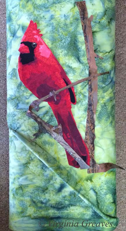
Today I escaped from my house to the fabric store — the one closest to me — Tiny Stitches. If you remember, this is what I started with — a yellow green. The more I looked at it, the more I didn’t like it. It’s too yellow for me.
This piece really relies on the background to set the mood — and this yellow green takes too much away from the cardinal.
So I went back to my color wheel — and found something strange. I have two color wheels. One says that the opposite of red is green — the other one says that it’s cyan. The plot thickens.
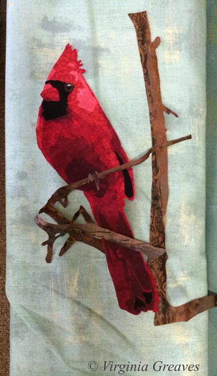
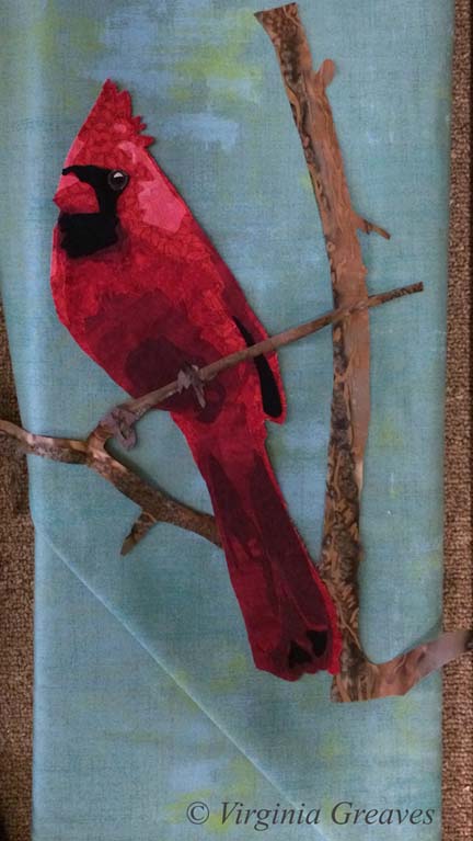
So I pulled this light cyan from my stash. It’s not quite right either.
So I went to the store — the batik section — and started laying bolts on the ground and then laying my appliqué on top. I’m fortunate that it’s so small — I can’t usually carry my appliqué work in a folder.
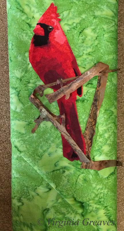
This is nice but feels urban to me — not what I’m going for. It’s just a little too distracting.
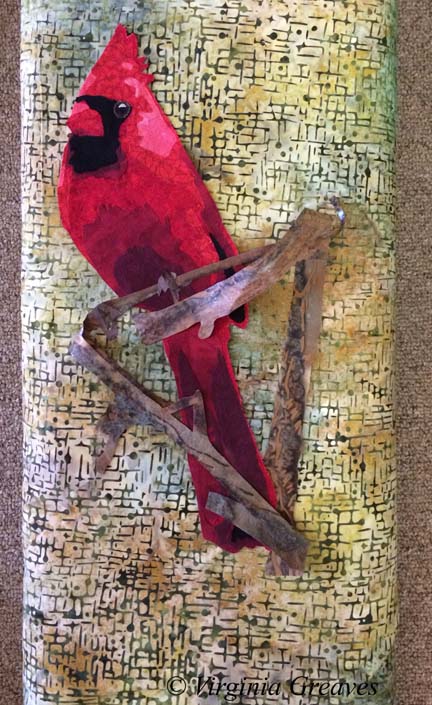
And this is the green that should work — except it doesn’t.
This one is a little better — but it still doesn’t make the bird sing.
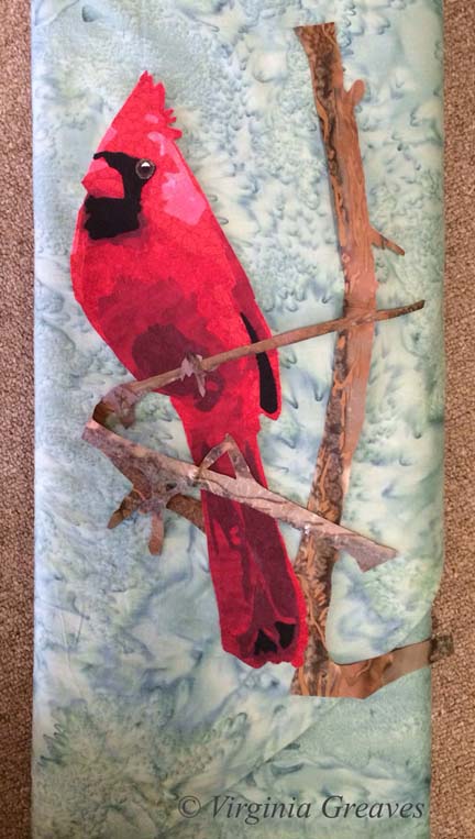
And then I pulled out this blue green. I liked it a lot more. It’s a good value change and sets off the cardinal nicely. So I carried this bolt around for a while and started walking through the aisles — because sometimes you can find interesting things in places you wouldn’t think to look — so it helps to go exploring.
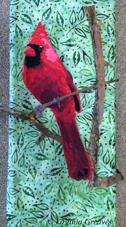
Wow. A print. It is also a light blue green.
This is the same pattern in a darker color — too dark for the cardinal.
So at this point, I looked at all of the pics on my phone and I really loved the blue green print — but I thought I should try one more green batik. No — it just doesn’t work for me. It’s the right value and the print is the right proportion — but it isn’t for me.
So I lost a couple of days — but I now have the right background — the light blue green print. Better to change it now than wish I had later.

