Posts tagged color theory

Tweek!

0

twitter.jpg
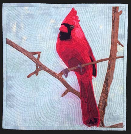
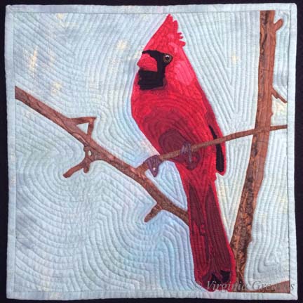
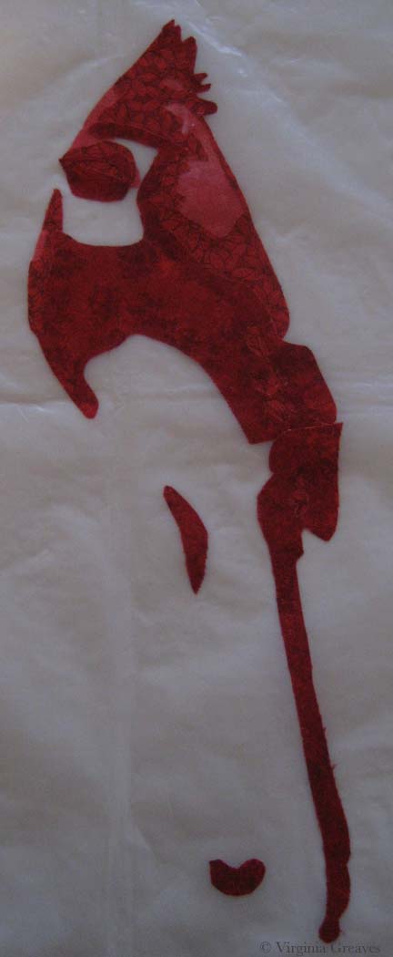
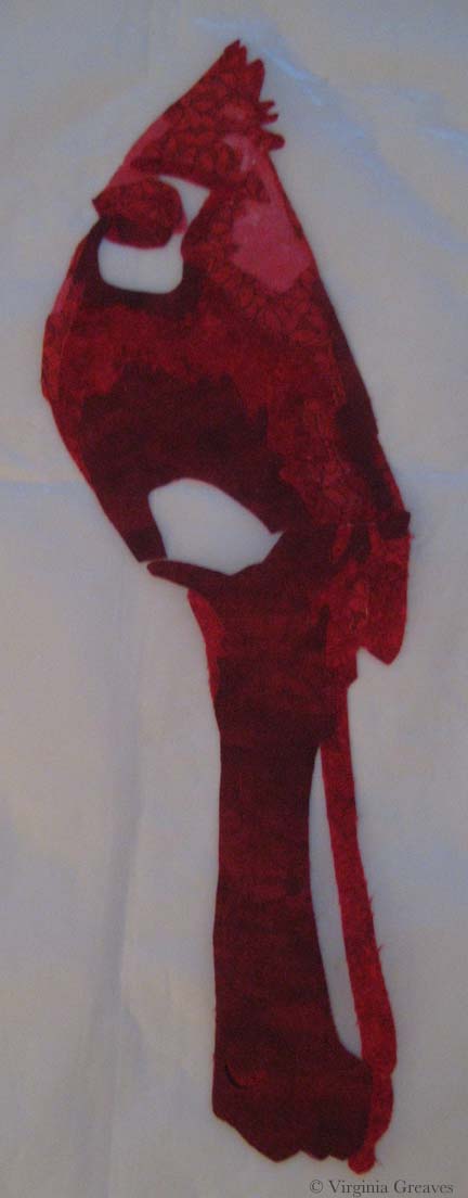
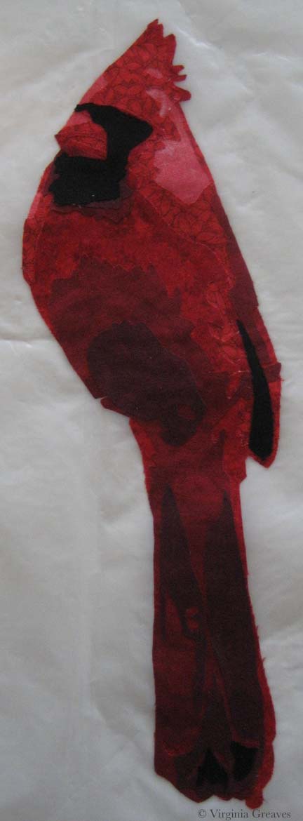
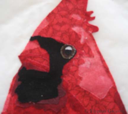
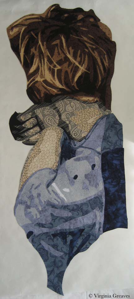
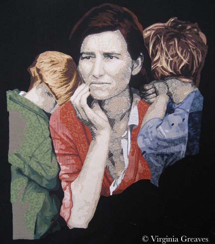
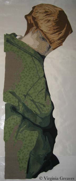
I’m into the second week of summer and still trying to figure out how this works with teenagers. I have more time than when they were smaller — but still not as much as you would think. They come get me in my studio, asking for help. I started using the timer on my phone trying to keep better track of my time with all of the interruptions.

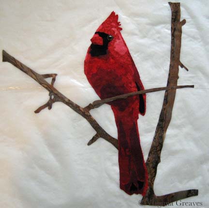
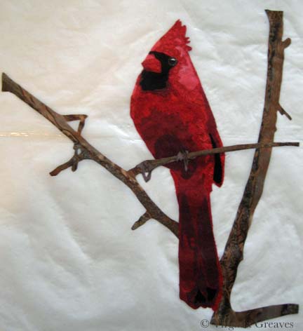
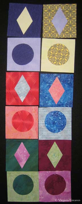
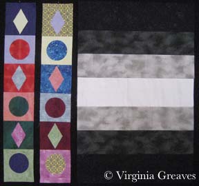
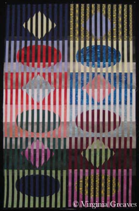
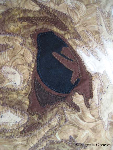
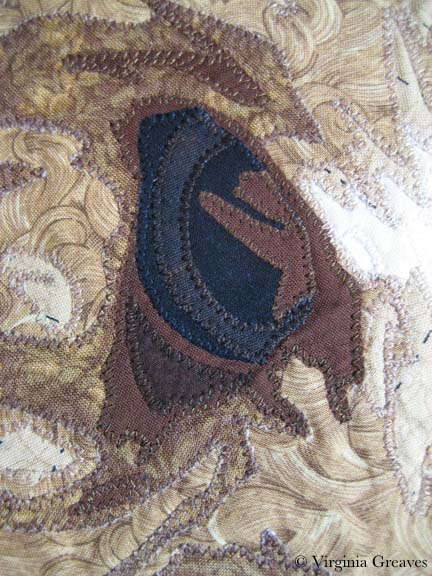
This week was mostly administrative. I put a bunch of old studio things on eBay for sale and I entered a couple of shows — a process that ALWAYS takes longer than it should. I’ll write more about that in another post.

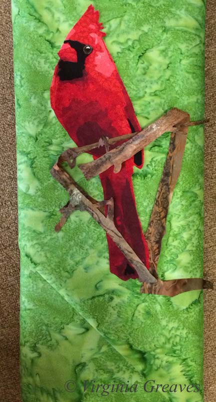
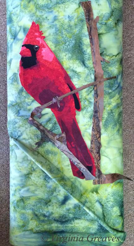
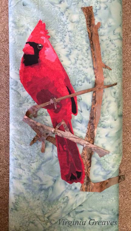
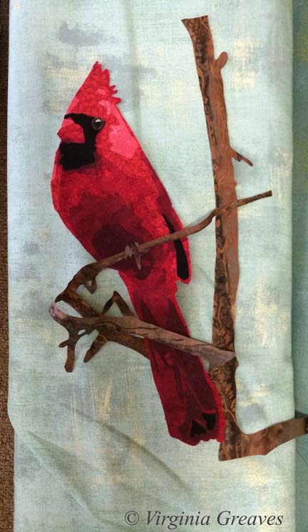
This is my weekly wrap-up — and these are a collection of my tweets from the week. If you want to follow me in real time — I’m @vsgreaves — or hit the social media icons in the upper right above the menu.

This is an interesting discussion of the direction of the High Museum here in Atlanta. In my mind, it should be the center of cultural activity for the arts in the Southeast — but the fact that it is not pursuing the replacement of a folk art curator (and, in my mind, not creating a fiber arts collection) — are all reasons to question their status relative to other museums who are pursuing these directions.
High Museum stalls on hiring new folk art curator; collectors fear interest has waned | ArtsATL

There have been many articles recently about artists fed up with being asked to do work in exchange for exposure — which is to say that artists are routinely asked to work for free. This is fascinating considering the huge sums being made in the art market — largely NOT ending up in the pockets of the artists themselves. A new study in the UK gives us all facts to ponder. There’s also mention of the blog “Who Pays Artists” that has been collecting anecdotal stories about artists being paid (or not) for their work.
“Artists Still Not Getting Paid (But at Least We’re Starting to Talk About It)”

Procrastination — something we all need to deal with. I need to work on making my processes more portable — so I can still be with my daughters but also contributing to projects along the way.
“Dash Your Way Out of Procrastination” — something I really need right now

This article explains the Flame Challenge at the 2014 World Science Competition and the event “What is Color?” There is discussion of the biology of the human eye relative to other animals and how that affects our perception of color. This article also discusses how surrounding colors change color perception — meaning that the proximity of one color to another can affect how it is seen by your eyes — as can wavelengths of pulsing light.
“The Complications of Color, as Explained to an 11-Year-Old” — color is relative

It seems that Harper Lee has reached an undisclosed settlement with the museum of her hometown as both sides petitioned for dismissal of the copyright suit between them.
“Judge ends lawsuit by ‘Mockingbird’ author Lee”

Although this link is in French, the video shows an installation of photography in the Paris Pantheon by the French artist JR. I’m so fascinated with this that I’m considering a similar project with my daughter’s senior class. It’s so wonderfully cool.
French artist JR has covered areas of the int & ext of the Paris Pantheon with a mosaic of 4,000 faces — cool!

fabric paint

Make It Work

0

Last week, I finished the cardinal and put it in water to soak.

I had a thoughtless moment where I put synthrapol in the washing machine while the bin was filling with water. I thought to myself — that’s a mistake — I should empty the tub and start over. But then I thought — it’s so small — it shouldn’t matter.

If I had been really thinking, I would have reminded myself that red is bad to bleed — but I wasn’t thinking so I threw the piece in the water with a Color Catcher on top (I wasn’t totally brainless).

But of course, as you can see, the reds bled onto the background. This is what it looked liked after spraying it with Shout and washing it with OxyClean in cold and hot water — many times. I couldn’t get out any more of the red from the background. (I was able, thankfully, to shrink it a little. It was just over 12″ square — and for the exhibit I made it, it needed to be 12″ square — which now it is.)

cardinal before paint


I have had this happen before — with Beach Guardians. Thankfully, the background wasn’t printed so painting it with fabric paint should work. At this point, it was my only option left.

But I put it off — and worried — and procrastinated. No one wants to ruin something in the final stage with paint. I had spent almost two weeks on this piece — and I wasn’t looking forward to that going down the tubes if it didn’t work.

I took my fabric paint and mixed it on my palette — and got really close to where I needed to be.

fabric paint


I thinned it with water and blended it into the background.

cardinal after paint

I think it works.

I compared it to my picture of the piece from last week before I put on the binding — and the background looks less green. That is really only a difference in lighting. It’s almost scary how big the color shift is. This time, I used a side light — and last week I didn’t — but I couldn’t go back & re-take the pic with the bleeding — so I just kept it like this so you could compare apples to apples.

You may have noticed that I used a binding that matches the background. I almost always use black for binding — but as I said — I was trying to make this piece a specific size — and my cardinal just barely fit in the space. The best way to give him some breathing space was to use a binding in the same color as the background. If I had used black, he would have looked squeezed on there.

Did I mention I don’t like making something to a specific size requirement?


Cardinal with potential background7

Setting the Mood

0

Today I escaped from my house to the fabric store — the one closest to me — Tiny Stitches. If you remember, this is what I started with — a yellow green. The more I looked at it, the more I didn’t like it. It’s too yellow for me.

cardinal with potential background

This piece really relies on the background to set the mood — and this yellow green takes too much away from the cardinal.

So I went back to my color wheel — and found something strange. I have two color wheels. One says that the opposite of red is green — the other one says that it’s cyan. The plot thickens.

So I pulled this light cyan from my stash. It’s not quite right either.

Cardinal with potential background2

So I went to the store — the batik section — and started laying bolts on the ground and then laying my appliqué on top. I’m fortunate that it’s so small — I can’t usually carry my appliqué work in a folder.

This is nice but feels urban to me — not what I’m going for. It’s just a little too distracting.

Cardinal with potential background3

And this is the green that should work — except it doesn’t.

Cardinal with potential background4

This one is a little better — but it still doesn’t make the bird sing.

Cardinal with potential background5

And then I pulled out this blue green. I liked it a lot more. It’s a good value change and sets off the cardinal nicely. So I carried this bolt around for a while and started walking through the aisles — because sometimes you can find interesting things in places you wouldn’t think to look — so it helps to go exploring.

Cardinal with potential background6

Wow. A print. It is also a light blue green.

Cardinal with potential background7

This is the same pattern in a darker color — too dark for the cardinal.

Cardinal with potential background8

So at this point, I looked at all of the pics on my phone and I really loved the blue green print — but I thought I should try one more green batik. No — it just doesn’t work for me. It’s the right value and the print is the right proportion — but it isn’t for me.

Cardinal with potential background9

So I lost a couple of days — but I now have the right background — the light blue green print. Better to change it now than wish I had later.

cardinal with potential background

Cardinal Longing

1

After I finished Worry, I had no idea what my next project would be. I get so involved in one project that I don’t tend to think ahead to the next — can’t really split my focus. I concentrate on one thing to the exclusion of other things.

But when I was done, I decided to make a small piece for the SouthEast Fiber Arts Alliance (SEFAA) Square Foot Fiber Art Pin Up Show. No theme — the piece just has to be 12×12 or smaller. I don’t usually work in this small scale — but I needed a rest and working on a small piece seemed like a good way to do that.

I had seen many pictures of cardinals in the snow being posted on Facebook — and I think that this is what I had in my mind’s eye when I began — a piece of hope flying across the frozen tundra (a little melodramatic, but we’re currently iced in for the second time in a couple of weeks and this southern girl is more acclimated to sunshine than snow.)

So I searched through all my reds and picked out a decent range. I wasn’t really happy with my first value — but then, what could I do? The weather was too iffy for me to risk a trip over to Marietta to pick out fabric — so I was limited to what I had on hand.

Just as I was getting ready to iron my WonderUnder templates down, I had the funny realization that I had paid for both sides of my fabric (obvious, I know, but a fact often overlooked) — so I ironed the templates to the front — so the back would show — which was exactly the shade I needed for the first value.

cardinal value1

This is the second value — you can begin to see the outline of the cardinal.

cardinal value2

The third value gives you even more — although I should have added to the lighting in the room before I took my pics.

cardinal value3

The fourth value was all I got done before I heard that the news was telling me (I had the TV on while I was ironing) that I might lose power for several days — and I realized I needed to add a few things to my pantry. It was at this point that I ran out the door with fading daylight before the roads became truly impassable the next day (and they did).

cardinal value4

I returned to this yesterday and added values five and six — the sixth one being black. Not bad but I really miss the eye.

cardinal value 5&6

Again, other blurry shot. I think the ISO on the camera I was using was way down — but you can see how I built up the eye in a similar way to the eye on The White Raven. I did add a larger highlight than I usually do — this guy has a small eye and the light coming off it gave the impression of the dimension of the eyeball.

cardinal eye

Once he was done, I added the branches. I thought about adding a bunch of detail and then decided that it was so small, it made more sense to let the fabric do the work for me — so I found a brown wood batik and fussy cut it so I roughly had highlights and shadows where I wanted them.

cardinal with tree

And finally, I added his claws. They are really similar in tone to the branch — and I decided to stay with that. I used a purple with a lot of gray in it — but they are obviously the same value as the branch. I’ll define them more with texture in the quilting stage.

cardinal with claws

The last part is to add a background. This was my first pick. It’s a really bright acid green but it makes the cardinal pop. I tried other greens from my stash — but the greens with more gray in them make the cardinal more sedate — more like it’s a common wildlife scene.

And I could try something other than green — but the color wheel shows the green is the best choice — and holding up colors — it’s the one that makes the most sense visually — even if I did originally imagine more white and gray blues.

cardinal with potential background

I’m not sold on this yet. I would love it if I could go to store and see if I could find something better — or validate my choice here — but there is still too much ice on the roads. I may go ahead for something to do. Sewing is a good antidote for cabin fever.

Stress and Family

2

When I started working on this project, I needed a name for this project’s folder on my computer. In the beginning, it was Depression — since it’s based on a Depression era picture. As I worked on the mother, I began to see it has a reflection of the stress of mothers — so I changed the name of the folder to Stress Project — knowing that that wouldn’t be it’s final name. And as I get closer to Christmas and I see the insanity that is family that comes out during the holidays — this has becomes a difficult project for me to work on — much less talk about.

But — I should share my progress from last week. I had finished the mother and her son & began work on the daughter that is on the mother’s other side. This shows her neck, arm, and fingers curled up.

sister1

And her hair. I think it turned out well.

sister3

I snuggled her up to her mom. You may noticed that I’ve added some darker tones to the son’s hair. I also changed the fabric just under the mom’s hand — they were previously shirt fabrics but they were too close in tone to her skin so I just changed them to coat fabrics so you could see the back of her hand clearer.

The right hand side of the daughter is an extension that I’m creating because the photograph has something obscuring the view here (I think it’s a pole). I decided to lighten the lower shadow.

family1

I like it better here. I also did the babies face. I don’t like how her face comes together but have decided that I’ll work on it after I’ve made her blanket. I’ll probably have the blanket wrap over the top of her head.

family2

The blanket will extend across the bottom of the piece.

I think that I’ll continue as much as I can in the studio to try to black out the insanity of the holidays. It gives me a peace that’s hard to explain.

Mama’s Clothes

0

I have a dream to finish cutting out all this entire piece before the Christmas break. It’s ambitious but I’m putting the pedal to the metal and seeing what I can get done in the time that I have.

I started this week with her shirt. It’s hard to see hear since it’s white.

shirt

Here I’ve completed her jacket and her shirt shows up better. She’s actually hanging on my design board — that’s why the background is black. When I take a picture of this piece on the ironing board, I can’t get high enough above it to take a pick that doesn’t have some distortion. You can see some of that in the pic above.

The only issue I have is that some of darker values of the shirt are blending into her skin. The two pieces under her hand I can easily swap into jacket fabric. The lower pieces on the left will probably become lighter values.

Although it looks red in this picture, the colors are an orange red — more rust colored. I wanted the mother to have a hot color — and then the children will have cool colors. A bright red would have been too cheery — the rust conveys a more worn feeling.

jacket

Then I started on the son leaning on her left shoulder. He is turned away from the viewer so you only see the back of his neck.

I did use the same fabrics that I used for the mother. When I made Beach Guardians, the two sisters have the same fabrics. I think it gives a feeling of relationship between the two — unlike the duet piece A Walk in Twilight when I used different fabrics for the two friends.

boy's neck

And this is his hair. I like that he’s more blond relative to the darkness of his mother. He is, however, tucking himself into her side & behind her so I will at some point have to add some darker tone to the crown of his head where his head leans into his mother’s hair.

boy with hair

I was free to make his jacket any color I chose — but really, the smart thing is to let the color wheel have a say in it. Since I chose an orange red for the mother, I chose a green for her son. On her other side, her daughter will have a blue — probably more on the gray side though.

boy with clothes

And the baby in her lap — I just don’t know at this point. Today I’ve finished the daughter’s neck, fist, and arm — but her hair will take some time.

Just the Basics

0

My mother is an impressionist oil painter, and when I was young and she went back to college to receive another degree in art, I remember her talking about the bias against realism in the art world. Abstract work was more highly valued — and for a very long time, I’ve disagreed with that opinion. I do like some abstract work, but I tend to be more engaged with realistic work. In fact, I’ve always felt that realism was harder to achieve than many pieces I’ve seen. That’s a huge generalization obviously — but I thought that abstract art was more about serendipitous exploration than intentional exploration.

At this point, I realize that that isn’t true — at least it isn’t true of good abstract art. It’s based on a deep understanding of color theory and how to make it work for you. I also understand why some consider it more difficult than realism. With realism, you have a point of reference from which to work. (It may not be a good point of reference, but that’s a different issue.) With abstract work, you are working entirely with theories and attempting to turn them into something engaging.

I have respect for both points of view. I work primarily in realism because that is what I like to do — but occasionally, I challenge myself to do something different — and that is what I have started here. As part of my art group’s annual exhibit, we were given playing cards to interpret. I had all ready made Jacks Are Wild — but I was given another card that I thought I could play with in a more abstract way — the six of Diamonds.

Using my color wheel, I chose six colors — starting with cyan — and then every other color around the wheel: blue, magenta, red, yellow, and green. I then picked out a light and a dark in each of these colors. Below are six 6 1/2″ squares of the dark. I know the yellow screams a little. It has a tight black pattern on it. It will make more sense when it is seen smaller and in the context of the entire piece.

abstract1

Then I made six diamonds from the light values and placed them on opposite sides of the color wheel — for example, the blue background got the yellow diamond.

abstract2

Of course, at this point, I know I have to make the piece longer. The challenge requires it to be 36″ long, so I decide to add squares in the light values.

abstract3

They look awful blank so I decide to add a common shape — a circle — in the dark values — to place on the light colored squares. I used a round container I had in the studio for a template. It was just the right size to fill the space in the squares I had cut.

I am, by the way, appliqueing all of these shapes. I had considered piecing the diamonds onto their backgrounds — but I wasn’t going to attempt to piece a circle — so I decided I would stick with machine appliqué. This is a Wonder Under template you see below.

abstract4

I have two rows of blocks. This is how they were originally laid out on the design wall, but I decided it was too predictable. I left diamonds next to diamonds and circles next to circles, but I changed the color placements so that each color wasn’t clustered with its cousins.

abstract5

This was very straightforward playing with color theory. Below you can see the two strips of shapes. Not exciting enough on its own though.

I turned to my old pal deconstruction for the next part. I made a background with black, white, and a couple of grays.

abstract6

Then I cut the strips of shapes into 1/2″ sections and fused them onto the background.

abstract7

I’m still working on the appliqué. Even though it’s just shapes and color, does it sing? I definitely think it has a sense of movement.

I don’t know that I’ll ever work exclusively in abstract, but it’s good to dust off my skills and try something new once in a while.

How To Make Lemonade

1

Last week I finished fusing the Yorkie. I put her up on my black design wall for a quick pic. Most things look so stunning on black.

Fusing Completed

And then I started the tedious process of appliquing all of those raw edges. I use a tiny zigzag. There is so much thread in this piece from applique, I doubt there will be much stabilizer that I can tear off the back.

I did applique the piece onto white muslin. I knew that my background was going to have its own applique elements — so it was easiest to use the muslin as my canvas.

Just as I was finishing the applique on the Yorkie, Pokey Bolton announced the exhibit It’s Raining Cats & Dogs at the IQA-Houston show in the Fall. I had known about it earlier because there was an invitational exhibit that included my piece Unconditional last year — and I was told that the following year, it would be juried. So I did have this in mind as I started this piece — and I also think that animals are much more marketable than people in terms of selling my work.

However, Pokey threw me a curve ball. The minimum on any side must be 25″ — the shortest side of mine was 24″. Clearly, I was going to have to make the best of things. I threw on my creative thinking cap and starting working. I considered a border — the easiest solution — but I don’t think that that would add anything to the design. I finally decided to extend the bottom. I freeform cut it too — I felt very brave. There is more here than I’ll need but there will be some shrinkage in quilting.

Applique Completed

I also decided that the left eye just wasn’t cutting it. There is a sprig of hair obstructing our view of the eye, but I still felt like it needed more of the detail of the iris.

Left Eye Before

Now it makes more sense to me.

Left Eye After

This is the final top. I have added the details of a jacket around her and the background behind the two figures.

To Be Quilted

I taught a class last week to my Fiber Art Fusion group about Color/Value & Picking Fabrics. It made me realize how dependent I’ve become on my color wheel. Can you see the tetradic color scheme (or double complement) I used? I think it works — although this is technically the hardest color combination to do successfully. I actually had no idea what to put in the background on the right — but figured out that pulling the green over from the collar but in a value deeper than the coat would work best.

So now I will start quilting. I just wanted to share with you how this little piece was coming along.


Choosing Faces With Character

1

At some point, as a portrait artist, you begin to want to do something different. Most faces aren’t as distinctive as you would think and the thought of working on a face with a lot of character becomes appealing.

Couple that with the recent election and my need to study American history, and I came up with the idea of working on a piece portraying Abraham Lincoln — our 16th President.

This is the very beginning — the first two values that show a rough outline of his face and ear.

Adding the third value makes his face almost immediately begin to come to life. (I was obviously starting this late in the day when the natural light in my studio was failing.)

The fourth value begins to show us the deep wrinkles that Lincoln had in his later years.

The fifth value is very subtle but shows some distinction from the fourth one.

It is at about this time that I realized, given the size of my pressing sheet that I’m using (sometimes I’ll fuse directly to muslin but this time decided to use the Teflon sheet), I am going to have to wait to finish the darker values in his ear and neck. (My sheet is 18″x18″ — I have my eye on one that is 27″x30″.) Otherwise, I would be fusing fabrics onto my ironing board — and that would just make a mess.

This is the sixth value. I am really pushing the envelope having this many values but I think it will work in the end.

This is the seventh value with the gray blue of the irises added.

And the eighth value is black. It adds that finishing touch of contrast. It highlights his eyes, his nose, his mouth, and his chin. I have also added the spark of white in his eyes.

This shows him with a completed ear. (You might not be able to see it here, but I’ve moved the pressing sheet over so that it is directly under the ear.)

There is actually a piece of black from his hair that will flow into the darkest part of his ear. I decided to add it all as one piece — so you’ll see that final detail after his hair is attached.

And then I started on his neck. (Again, I moved the pressing sheet down into the neck area.) I thought about only showing it completed, but I think it is equally interesting to see its creation in layers. This is the first value (which is actually the 2nd value in his face.)

The second value gives a little more definition.

The third value shows us his Adam’s apple.

The fourth value accentuates that.

The fifth value begins to give us shadow.

The sixth value completes the shadow.

And the black again gives the contrast, showing the outline of his jaw and the separation of his neck from the face.

The previous pictures were all taken while the piece was lying flat on my ironing board so there is some perspective distortion. This is the completed face on my design wall.

I may change his eyes to make them darker — but all in all, I think he is looking fairly good.

My daughter asked me the other day if I was going to put his stovepipe top hat on him. Although his hat is iconic, I can’t say that that had occurred to me — so I may put off working on his hair while I consider the design of the overall piece. As usual, I have not decided what to do in the background yet either.

Working With Color

2

Working with color can be very confusing — almost as difficult as working with values.

Since my last blog post, my figure was complete, but she needed a space in which to inhabit. She is holding up an iris on the back of her hand — so in adding color to the piece, I have a wonderful deep purple to add to the green in her eyes.

I also decided to pull the green down into the sliver of her shirt that is just peeking out from the towel draped around her shoulders.

And then this is where things got interesting. At this point, I had not added color to her mouth. I was ignoring that for the time being and trying to decide on a good color for the stripes in her towel to alternate with white. The actual photograph was a pink — but that didn’t seem to add to the piece for me. It seemed too close in color to purple.

According to the color wheel, if you have purple and green — then you need orange — so I went headlong into orange for the towel. I also added color to her mouth in rusty orange tones. I tried pinks and reds in the mouth and they all ended up looking like lipstick — so I went with something closer to browns.

It’s not that the orange in the towel is wrong — but it is too much. You no longer look directly into her beautiful green eyes. I kept this on my design wall for a while. It just didn’t look right to me.

So I switched to this cooler color of blue. Now you see her eyes first and the piece is in greater harmony. I still have the orange in her mouth to go with the purple and green. I think this composition of color works much better.

I did make two other adjustments. The water is a smoky blue with hints of purple so the iris melted into it. All I had to do was add a small border of a lighter value around the iris where it touched the water fabric. Now it stands out.

I also darkened the light spot on her nose just a little. It was too bright before and didn’t look natural.

Why did I choose what I did for the water and sky? I didn’t want anything overly complicated to compete with the figure and her engaging gaze so I originally planned to have just one fabric in the background. I had nothing in my stash and the only thing that I found in the fabric stores was the smoky batik. I decided that the pattern gave the impression of reflections on water and would be great. In reality, it overwhelmed the piece. I used a sky piece that I had on hand for the top part.

Strictly speaking, I should have used the rule of thirds when deciding on the horizon line, but I broke that rule. I liked it much better when the horizon line brought the viewer’s eye across to the bottom of the figure’s eye.

Her eyes are what is important in this piece, and visual cues like color and line bring up the supporting cast in the overall design.

Go to Top