Posts tagged art

Be Creative Cover Girl

1

I have the honor of being the cover girl for Be Creative’s current issue of Be Inspired, volume 6. It’s on sale now at www.creativewithworkbox.com and will be available in stores starting November 10th.

If you want to see the article, you can read it here (with permission from the publisher): Be Creative: Creating Order From Chaos

2017 IQA Auction

0

This year I wanted to make another animal portrait for the IQA Silent Auction in Houston. I think they’re easily relatable and are a good choice for broad appeal for the auction.

I was going over my inspiration folder and found this adorably cute Cavalier King Charles spaniel which I thought I could do rather simply. Oh, the best laid plans. See, I fell in love with this piece as I worked on him. I spent way more time than I had intended, but he grew under my hands into the adorable creature that had captured my heart in the photograph. I’m really fond of this piece.

This shows the 1st two values.

And the 3rd.

Although he’s all black and white, there are a couple of points of orange. I studied the spots above his eyes. Logic told me that the color was brown, but no, it was really fairly orange, although the darkest orange tends toward brown. I decided it would look better underneath the black fabrics rather than on top, so they were added at this point.

And then the 4th value. Now you can see the outline of the nose and the mouth.

The fifth value. I took this pic on my iPhone at night in my studio so the grays look darker than they actually are.

The 5th value.

I realized at this point that I had neglected his nose and went back to do that.

And then the last value. Better picture.

I played with his eyes quite a bit until I got them just right. The pupils were bigger than I had anticipated, but this gives the expression I was looking for. Isn’t he charming? The eyes really do make the piece.

And then because I could, I went back and added some whiskers.

This is what he looked like all cut out. I spent several hours machine appliquéing him down and quilting him.

The final pice is called King Charles and can be found in its quilted and completed state on its own page here.

It will be available for sale in Houston at the Silent Auction in November 2017. I hope that you’ll consider bidding on it. I’ll mail him off this week — be a little sad to see him go.

Brindled

0

Although I’ve made many dog portraits, my current pet is brindled, something I despaired that I would never be able to capture in fabric. A brindled animal is typically brown with streaks of black. It’s very distinctive. Given the nature of closed shapes in appliqué, I didn’t think that it was something that I could recreate. However, I was speaking with one of my SAQA mentees recently, and she had tried it in her work with success and encouraged me to do the same. It’s all about the fabric.

So for this piece, I chose a picture I had taken of her with her great big tongue curled up over her nose. It showed a lot of her personality. I searched through my pinks for just the right ones and started there. I could have put the tongue on last but worried about the darker fabrics I would use for her fur showing through, so I started with the tongue.

And then after the tongue, I went on to the wet nose.

And then the hard part — the fur. I chose highly textured browns. These are the first two values, although there’s only the tiniest amount of the lightest brown up there in the top left-hand corner.

This is the 3rd value — not a very clear pic but probably taken late at night in my studio. Did I mention these are flat on my drafting table and I’m standing above them on a ladder taking the pics?

And here, with the next value, you can start to see the magic happen. The textures start to blend together but still maintain their integrity.

The next value.

And the darkest value.

The eyes always make a big difference. It was interesting finding a brown iris color that wouldn’t blend into the fur.

And then this is the background I went with. I cut strips of green and randomly assembled them for the background to give an abstracted look.

And this is her. This is what she looks like. This is the piece before quilting.

I almost finished this piece in July but a confluence of activity prevented that from happening — so it was finished in early August. And then I was able to then create a piece from beginning to end for the IQA Auction by the end of August. No idea how that happened. I will share pics of that one in another post.

I named it Tasty, and you can find it once quilted and completed on its page here.

Making Tattoo

0

Woohoo! My first piece in Dinner@8! I know there are a lot of you that can’t comprehend what a big deal this is, but it’s kind of like winning the lottery. It’s a juried invitational show, so I had to apply to be a part of the Dinner@8 group in order to be invited to make a piece for the current year’s show. After I was accepted, I made a piece according to the theme, which this year was Personal Iconography: Graffiti on Cloth.

I haven’t shown the piece in process on the website because that’s a no-no in this show. Virgin rules, except you can post after acceptances go out.

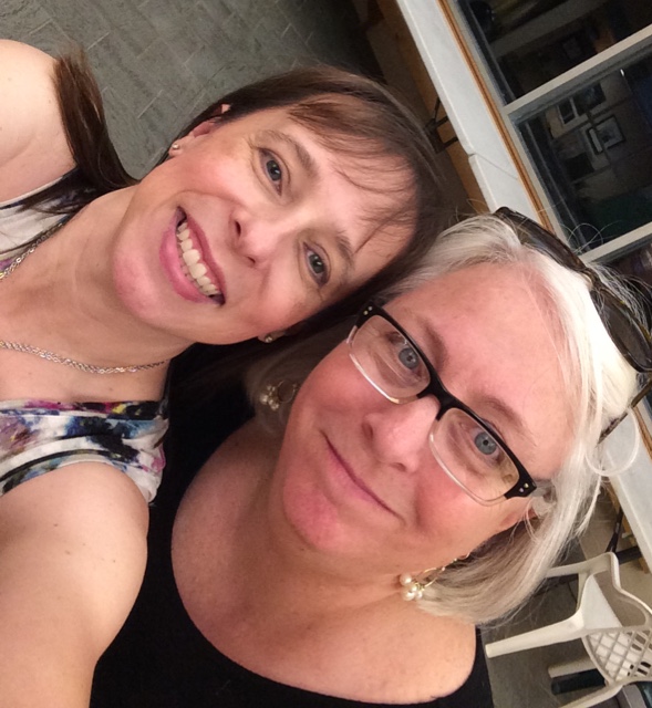
I’ll admit that I was stumped by this year’s theme. My goal, just as I did the Yvonne Porcella piece (Yvonne in the Garden), was to make a piece that was wholly in my style while still working within the framework of the theme, but I knew that doing that with this theme was going to be hard. I knew that I was going to make a portrait of a person, and I spent some time thinking about how tattoos are so personal and would work well within the theme. My daughter has several tattoos, and she spends a lot of time considering the symbology of each piece and finding the right artist before she gets them. I wanted to honor that, but I also knew that finding a female model would be hard. I envisioned a back shot with the main tattoo on the arm. I’m not entirely sure why, but it seems to me to be a deeply personal pose, enough that I didn’t know anyone personally that I felt I could ask. And really, who’s always available? (Me.) Thank goodness I have a remote control for my camera. I set it up in my studio, and by the end of one afternoon, I had a series of shots I could work with to create what I had in my mind.

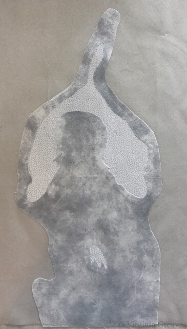
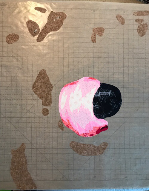
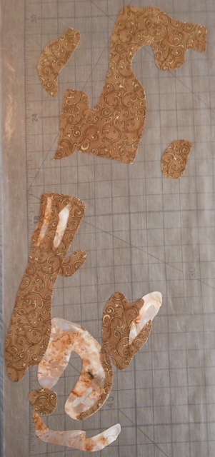
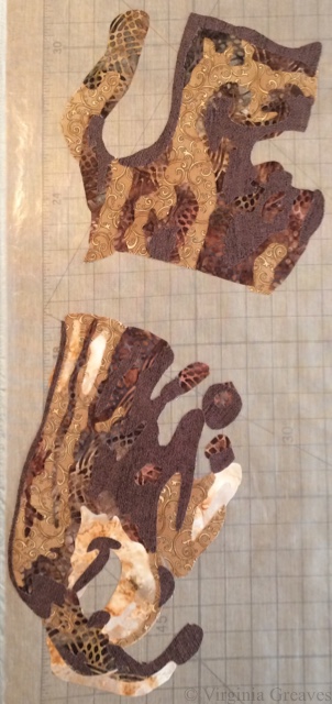
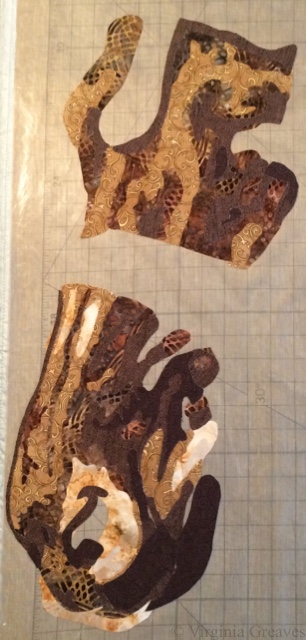
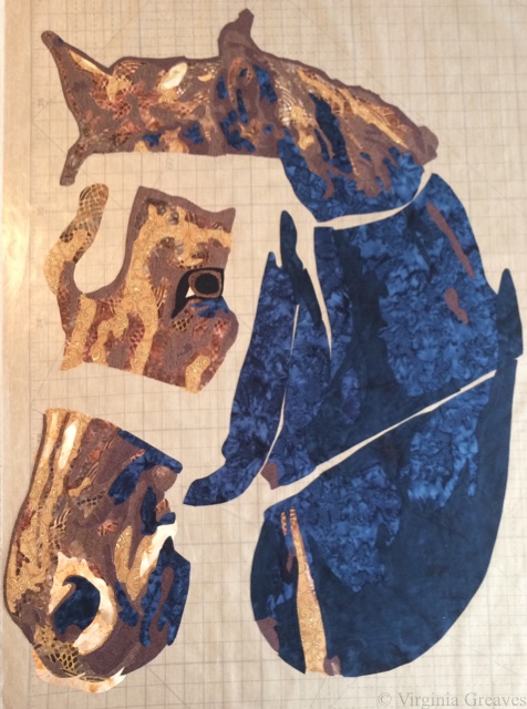
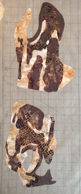
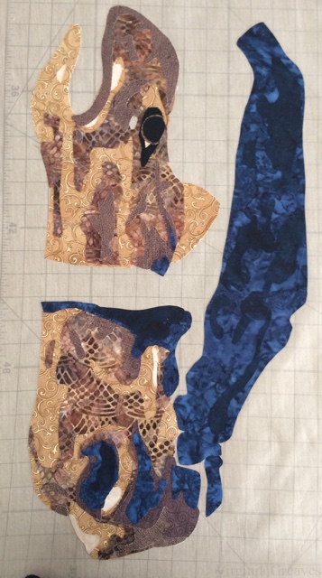
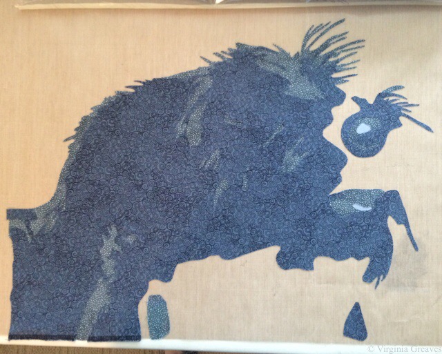
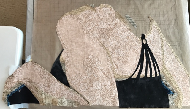
I started with the shoulders and back first since the hair would drop over the back. I usually start with the face, but in this instance, the shoulders made more sense. This is the first couple of values.

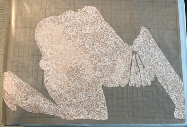
This is the 3rd value. I ran out of the fabric — or rather ran short on it. I knew I needed enough to cut out for the face and decided that I needed to supplement with a fabric that was close. I could use it on the extended arm and the change would be less visible. (This prompted a late night run to JoAnn’s as it was the only thing open at the time, & I was in the creative head space to keep moving forward.)

This is also the point at which I realized I needed to complete the hand along with the arm — and make sure I had enough fabric to do it as well.

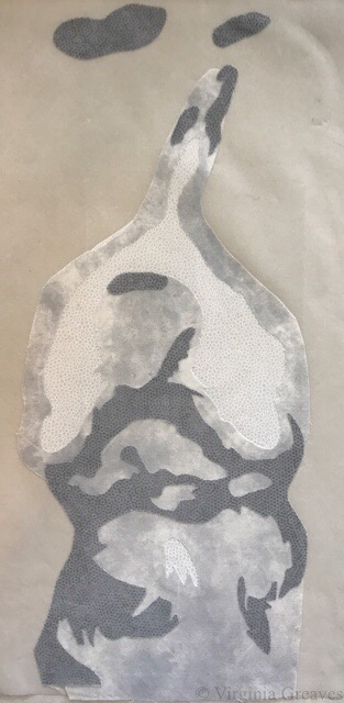
And then I added the deeper values, a dark tan and a couple of dark blues — and then the black garment.

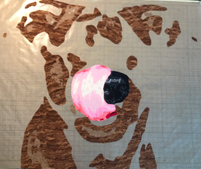
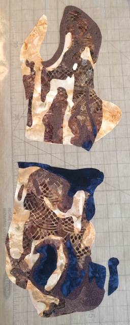
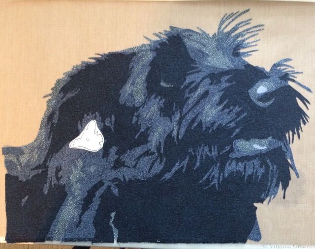
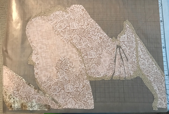
And then I started on the face using the same fabric. These are the first two, and you can just see the basic outline.

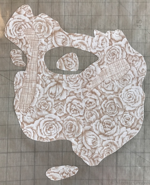
This is the 3rd value, the one that I ran out of. I’ve had this fabric for a long time, and I’ll have to try to replace it. (Never let anyone tell you that calicos don’t have value. They’re wonderful for faces.)

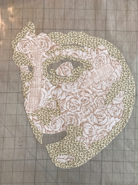
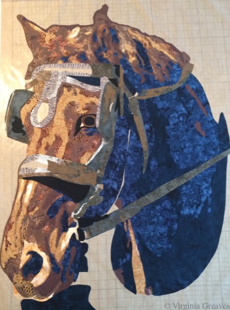
This is the 4th value. It inadvertently looks a little like horns, but really, that’s just my high forehead that will go under the hair.

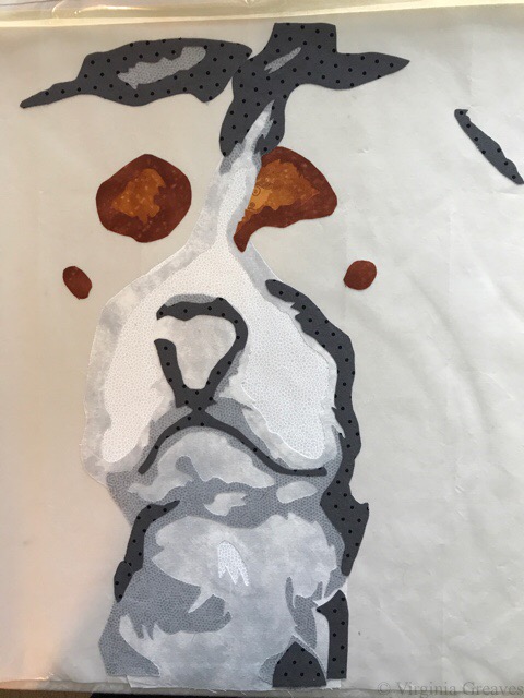
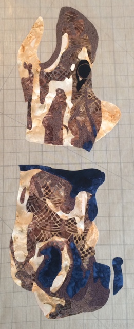
The 5th value. You can tell I was working at night in this one.

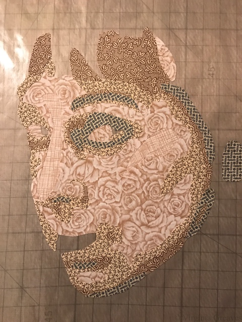
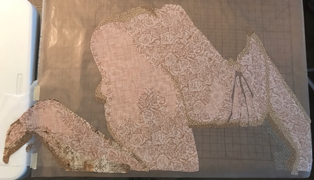
And then the rest of the darkest values. I leave the main parts of the eyes and the mouth for the end, so at this point, she looks a little bit like a zombie. I did play around with the darks around the eyes a little bit. I naturally have very dark circles around my eyes, but it wasn’t aesthetically pleasing in the piece, so I backed off on the value a little. (This is part of what I call creative license. Do what’s best for the piece and don’t feel tied to exact duplication of the photograph.)

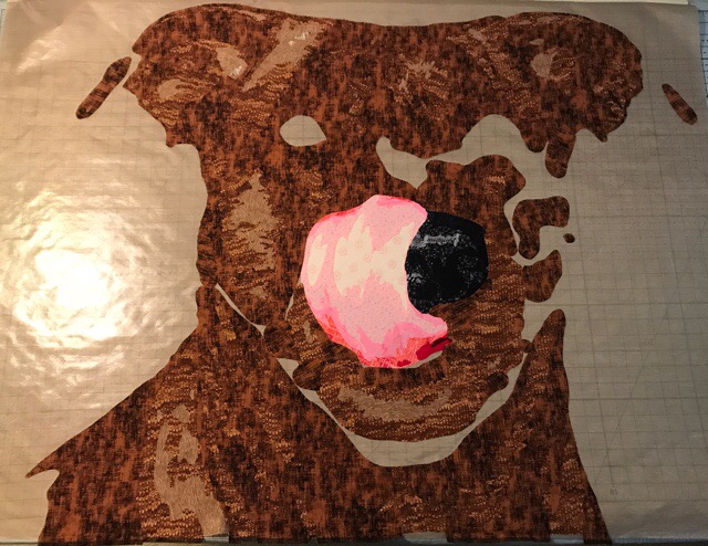
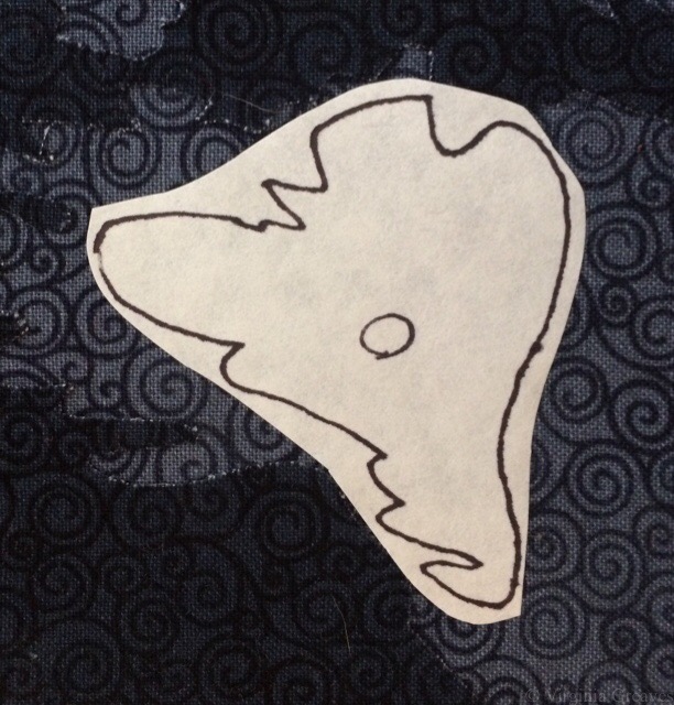
These are the eyes. Not quite right. I almost always freehand cut these nowadays.

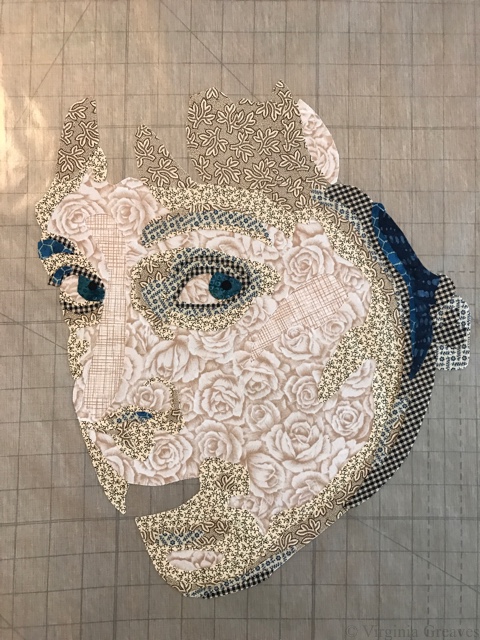
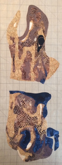
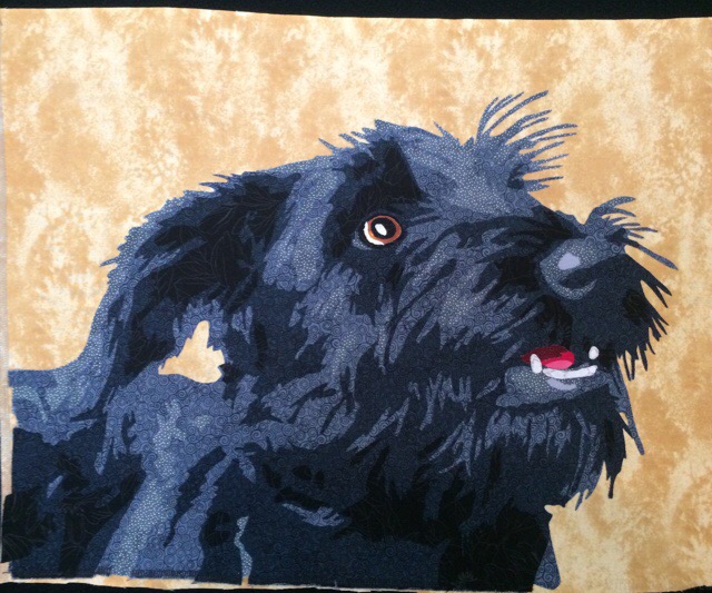
And in this one, a darker blue around the rims of the irises and larger pupils. Then I made the teeth (or the suggestion of teeth) and the mouth.

I did go back later and make the eyebrow on the right darker.

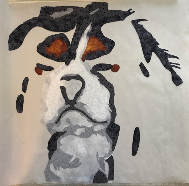
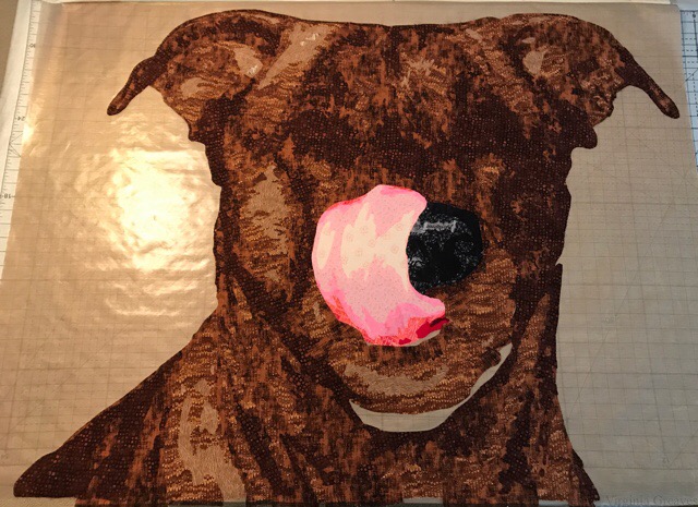
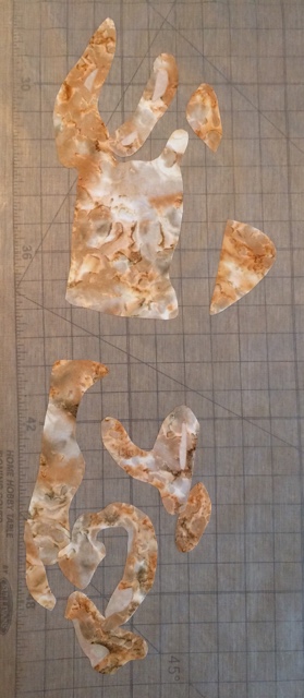
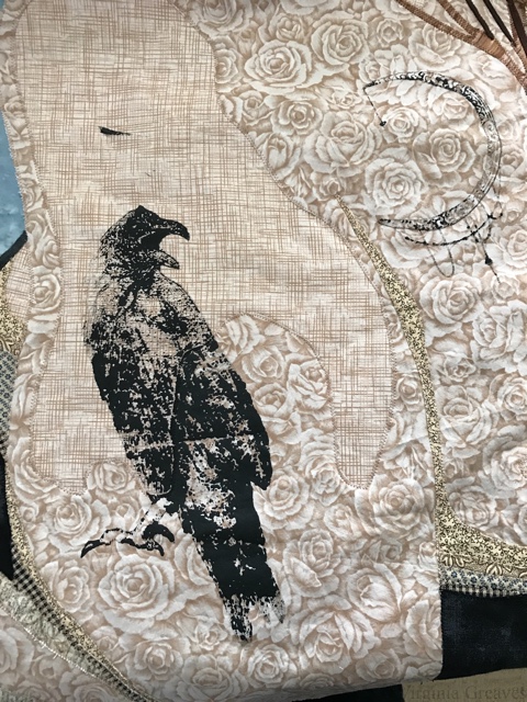
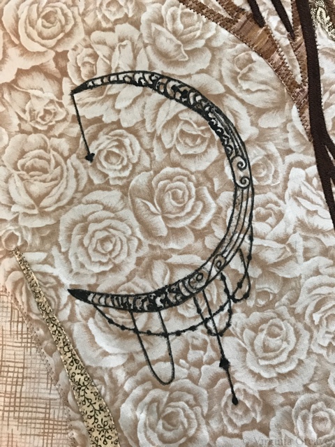
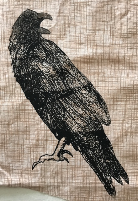
I spent quite some time trying to figure out how I would do the tattoos. I wanted them to look like dotwork tattoos, and so screen printing seemed the way to go. I had, years ago, done some screen printing. What could go wrong? I drew the tattoos in my sketchbook, scanned them, skewed them in Photoshop so they would look as if they were on an arm and tilted across the back, and sent them to Fiber on a Whim to be burned to screens. After fusing my figure to a background and appliquéing it in place, I then screened them right on my piece. What was I thinking? The moon is clean but way too light, and the crow is a mess. I even have a paint blotch above the crow’s head.

With the moon, I just grabbed a fabric marker and filled in all of the light spots to clean it up.

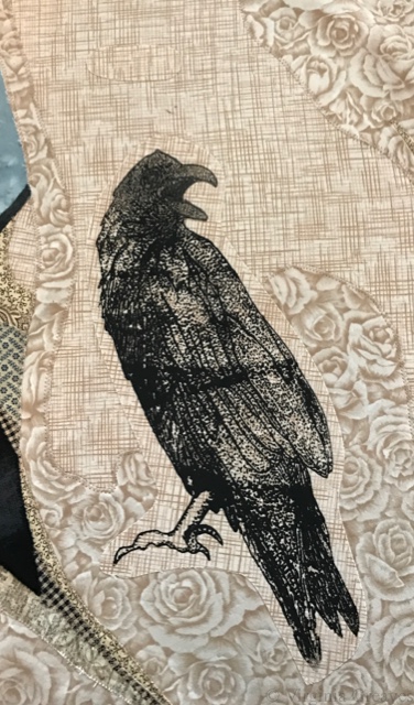
The crow was much harder. I think it sat on my ironing board for at least a week while I thought it over. No use crying over split milk. I had leftover fabric, so I made a bunch of screens of the crow until I got a decent screen. I now have mad appreciation for anyone that screen prints, especially to fabric. It’s much harder than it looks to get a clean screen print.

On the finished piece, I cut out the crow and the blotch. I had to pick out appliqué stitches in two places. Those will be covered by the new crow.

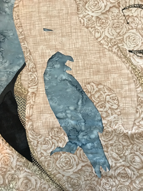
Then I took the new crow, cut around the crow shape, and then fused it onto the arm. I also made a patch to fuse onto the area of the blotch that I had to cut out. Then I ran an appliqué stitch around the crow and the patch. I worried that it would be too obvious around the bottom area where the fabric value is darker, but it’s hardly noticeable on the final piece. There’s only about a quarter inch of light fabric around the crow, and it blends with the fabric it’s next to. In the end, it was a good solution to a difficult problem.

As I was making the piece, I thought it would be cool to add graffiti to the background. That’s why I went with a solid blue background. I even studied graffiti shapes and practiced lettering. I made the graffiti, but then I decided it was too much of an in-your-face interpretation of the theme — so I took them off. That was much worse. So I spent time thinking about the background — and about how I approach my work. In the end, I decided that I didn’t want to be safe, and leaving off the graffiti was safe. Keeping them on there gave the piece a vibrancy it didn’t have without them. So I played with their placement and added black outlines to them and some sparkly points.

You can see the final piece on the Tattoo page here.

Tattoo will premiere in the Dinner@8 exhibit at International Quilt Market & Festival in Houston this coming October/November.

Wash & Wax article in Be Creative

0
Leisa Rich wrote an article for the upcoming issue of Be Creative about our collaboration on the Wash & Wax project. It’s in Issue 162 which goes on sale June 9th.
You can enjoy the article here: Wash & Wax: A Collaboration
If you want to purchase a copy of the magazine or to subscribe, you can do that HERE.
It was a great collaboration, and we still have pieces available from that collection. Please contact me if you are interested.

The Creative Spirit

2

I’ve been hard at work in my studio since my last post, pouring the creative spirit out of me and into my work. And I’ve surprised myself.

If you remember, I had finished the first horse, so I began cutting out the second horse, its companion. This shows the light values of the face.

img_3015

And then the darker brown values.

img_3017

And finally the darkest brown values.

img_3018

Here is the horse head without all of the leather straps, bridle, and silver.

img_3024

Then I added all of the leather parts around the face.

img_3030

And finally the leather collar.

img_3038

Once I added the silver, I put it up on the design wall for a quick picture.

img_3041

At this point, I put it up next to the other horse to see how it would look. Wow. I loved it on the black, but I always do.

I considered for a while making a pieced background, but I finally decided that the horses themselves are so intricate, a pieced background would only create a distraction. I found a great smudged black that works well.

This is both of the horses appliquéd onto the background. The grays in the background black look lighter than they actually are — my camera phone is limited in its range and chose to highlight all of the silver. The final photographs after quilting will be difficult, but this piece may warrant my first trip to a professional photographer.

img_0006

For those interested in the process, I abandoned my usual appliqué technique, which is a tight zigzag around all of the rough edges. Even a free-motion straight stitch around the edges as an appliqué technique was difficult as the pieces tried to pull off as I worked on it. The horses were large and complex, and Wonder Under can only hold so well. The silver, especially, didn’t want to adhere. It was always the first appliquéd for each of the horses.

And the end result is more artistic. I’m letting go of the restrictions of the quilt world and embracing the art side. The free motion stitch is much more like drawing on the piece. I still haven’t decided if I’ll add some tulle for added protection to the raw edges.

They each have their own personalities, and I’m surprised at what has crawled out of my brain.

And now I begin thinking about the quilting process. I have a hard time just pinning this on the wall by myself because it’s so large. I tried to take a local long-arm class at the beginning of the month but it was full. The next one is not until the first of December, and I don’t know that I want to wait, but I’m also uncertain about tackling this bear of a piece on my local machine. I do happen to have a Hinterberg frame that I bought years ago — it sits in pieces in the corner. I abandoned it when I realized that my Viking didn’t have enough harp space for me to use it on the frame. But I did get another 4.5 inches, I believe, in harp space when I upgraded to the Janome. It might be worth trying it.

For the Love

2

So after finishing Minerva and going through my Quilt National rejection, I needed a new direction in my work. So I was flipping through photographs that I’ve taken, and I found one of two horses in full military gear that I took during the Gold Rush Parade in Dahlonega last year. I knew instantly that it was going to be my next piece.

It’s the first piece in a while that I haven’t made for a show theme, and I gave zero consideration to marketing it. I am making this simply because I want to, which appears to be feeding my creative muse in a positive way.

And almost unconsciously, I have made this piece huge — which is funny, because two years ago, I would have made something that would fit the size of my table. I suppose I felt the need to make these life size. So the general size of the pattern that I’ve made is 48″ long by 69″ or so wide. And let me just say that making a piece in this scale is daunting. I have broken it up into sections to make it easier — I’m making each horse separately — and for each horse, I make the face, and then the rest of the head, and then the back, and then the neck, and then all the leather, and then all the silver hardware. It still causes unique difficulties. I’m not sure that I can appliqué it in the same way that I usually do — certainly not all at once — maybe not even one horse at a time. And there are so many pieces in even just the first horse, I’m considering doing what I did with the auction piece I did for IQA, Loyal, and using a straight stitch around the shapes instead of my usual zigzag — maybe even incorporating it into the quilting in the same way I did Loyal. I’m even considering covering the piece with tulle like Susan Carlson does, to provide another layer of protection for the raw edges.

But all of that discussion in my head is not while I’m in my studio. In my studio, I am in the zone.

For this piece, the first 2 values are very light — in fact, I probably could have dispensed with the lightest and just used the batik here. It’s hard to discern where the first value even is.

Horse Value 1 and 2

And this shows the 3rd and 4th values. The 3rd value is a batik I’ve always struggled with, but I think it works well here.

Horse Value 3 and 4

For the 5th & 6th values, I purposefully went into navy blues. Painters sometimes use blues for shadows, and I love the richness it gives the piece.

Horse Value 5 and 6

And then I had to construct an eye. In the photograph, there’s a piece of leather to the right of the eye that mostly obscures it. However, it’s important for the piece to have a successful eye. It’s a large part of what draws in the viewer’s eye. So I found a pencil and drew out what I thought would work.

Horse Eye

And then I stepped back and really looked at it. I wanted to make sure that the fabrics were working before I continued — and they’re just not. There is a definite value change between two and three, but the step is too great. The horse looks more like a palomino with spots. So I went back to my fabrics and pulled out a honey yellow. Much better, and I can see the first value now.

Horse Value 2 change

I recut all the pieces and carefully peeled away the fabric that wasn’t working and re-fused it back together. And then I started on the neck. All the spaces are for leather bridle, harness, et cetera.

Horse Neck

And then I went to work and stopped taking pictures. But as you can see, I worked one section at a time so I wouldn’t be overwhelmed. I had fused down all of the horse pieces before doing any of the leather or silver. Here is the horse completed with the leather.

Horse with Bridle

And then here it is with the silver. The only thing I really questioned was the chain running from the top down to the mouth. There really wasn’t an easy way to do it. I may go look for some silver braided trim to use instead.

At this point, she’s finally off the flat table and pinned up on my design. She’ll be the far left horse — that’s why so much of her body is in deep shadow. The forward horse on the right will have a lot more of the brown detail.


Horse with Silver

I have a few drafting things to finish before I start cutting out the front horse. I also think that I’ll change the horse fabrics a little. I don’t think I’d have enough fabric to make the other one completely anyway. It’s amazing that I was able to get this far without making a trip to the fabric store — well, except for the silver.

And yes, this is silver spandex, just like the gold spandex that I used in The Last Supper. This time I was smarter and fused a non-woven interfacing to it before cutting it out to help control stretch, and then I added the fusible. Last time, I only used the fusible and it was harder to control.

Minerva in process 7

I Got Rejected from Quilt National ’17!

0

Minerva in process 7So I just got my email saying that my piece, Minerva, didn’t get into QN ’17, and I was talking to a friend of mine who also didn’t get in (who, incidentally, was in their last exhibit in ’15), and I started thinking — wouldn’t it be really cool to see all the amazing work that didn’t get into QN ’16. I mean, the pieces I know that didn’t get in are spectacular! The acceptance rate was just slightly over 11% — imagine seeing the awesome work that isn’t going to QN ’17!

So I’m going to do this — I’m going to start a gallery page “I Got Rejected From Quilt National,” and I’m inviting other artists that weren’t accepted to send me a pic of their work.

You can email it to me at ginny@virginiagreaves.com with subject line “QN” — and please make the pics 1800 px on the longest side.

And if I get more than just a couple, I’ll post the page for all to see.

Even if you don’t want to participate, if you received a rejection, know that you’re in good company. Keep going. Enter your work somewhere else. There are lots of other shows out there.

UPDATE: I created a FB group, Quilt National Salon des Refuses. It’s a public group so you can post there directly.
https://www.facebook.com/groups/1237861046301053/

Loyal

2016 IQA Auction

0

This year, I was again asked to create a piece for IQA’s Celebrity Mini Quilt Silent Auction. It’s an honor to be invited, and I try to support IQA as much as I can. They have helped sell my work, and they have bought my work for their private collection. That’s a lot. So once a year, I stop what I’m doing and create something for them for their auction.

This year, I wanted to make a piece that was more like the rest of my work The last two years, the pieces have been tiny. So I wanted something that was a little bigger but still small that would give more of a sense of my personal style. I finally decided that the broadest appeal to the general public would be a dog or cat, and given that I don’t have a cat and people don’t typically take their cats out in public in the same way that dog owners do, I chose a pic from my catalogue of dog pics.

I found this pic of a black dog that I’m sure I took during a lacrosse game. I have no idea who he belonged to, but he was cute so I took his picture. I think he’s a schnauzer. I zoomed in on his face and loved his quirky expression.

In keeping with my new penchant to use unexpected fabrics (but then also working only from my current stash), I decided that the best way to do a black dog would be to use blue fabrics. Gray doesn’t have the same character as the blue grays. So, like with Minerva, I wanted to create a black dog using blue fabrics — but the end result should look like a black dog, not a blue one.

This shows the 1st two values on my pressing sheet.

This is my 3rd value. You’ll see in a minute, there was a hole for the space at the bottom of the ear that I forgot to cut out of this layer.

When I realized it, I traced the shape onto freezer paper and ironed it to the front.

You can see the freezer paper template in this one — which also shows the 4th value. There’s a lot more character in him now.

And then the 5th value was the actual pure black. He has a lot more dimension now — but he needs a proper mouth and eye.

There’s a little bit of tongue tucked in there and then a row of teeth and two fangs on either side of his gum line.

And then his eyeball. As I have often done lately, I constructed it as it was in the drawing made from the values in the pic — but then ripped it off and redrew it as it needed to be in order to look as it needed to look. There are some things you can finesse if they’re not quite right — the eye isn’t one of them.

And then I ripped the appliqué off the pressing sheet and cut out the freezer template to give me the space I needed on the underside of the ear. You can see the ear more clearly now, especially ironed on to the background fabric. This yellow was a nice contrast.

At this point, it isn’t appliquéd. I decided to appliqué stitch and quilt at the same time, so I sandwiched this rough top up and straight free-motion stitched around all of the shapes.

After the appliqué was done, it still needed more quilting to be evenly quilted — and of course the background had to be quilted.

The only thing I might do differently in the future, in terms of construction of a small piece, would be to pillowcase it so I wouldn’t have to add a facing to finish the edges. That took a while. But I opted against doing it because I thought this piece was a little big for that and I didn’t want any issues with it not laying flat or creating a tuck on the back. I wanted it to be perfect.

I snapped a few shots before sending him off in the mail — he’s due Thursday — so I cut it close but he’ll make in under the wire.

Let’s hope he goes to a good home. He’ll debut at the Silent Auction in Houston in November.

LoyalIf you want to see the finished piece, he’s here.


2016 Fierce Fibers 

0

Last week, we had our annual opening of Fierce Fibers at The Art Place in Marietta. Rebecca Reasons-Edwards and I have been co-curating this show together for six years. I’ve learned a lot from her, and we had a great time putting this show of local Atlanta fiber artists together this year. We had a great turnout at the opening reception last Thursday, but the show will hang through September 29th if you still want to go see it.

We had a Viewers Choice award, and it was a tie between two of my pieces, The Last Supper and The Abyss, which was a nice surprise. Thank you to everyone that came to the reception and voted.

And especially, thank you to all the artists that allowed us to hang your work in the show. It’s a beautiful exhibit and a great example of the amazing fiber work currently being done in Atlanta.

For the benefit of those that aren’t local to Atlanta, I’ve been asked to post pics of the show online. Enjoy!

Queen Bee

Queen Bee by Heidi Miracle

Still a Pig

Still a Pig by Rebecca Reasons Edwards

Dolce Far Niente

Dolce Far Niente by Virginia Greaves

Cloud Spirit Mask

Cloud Spirit Mask by Hellenne Vermillion

Breaking Free

Breaking Free by Hellenne Vermillion

Emerging

Emerging by Hellene Vermillion

Polish

Polish by Virginia Greaves & Leisa Rich

Your Children Are Not Your Children

Your Children Are Not Your Children by Heidi Miracle

Today I Will Be a Mermaid

Today I Will Be a Mermaid by Heidi Miracle

Loving Heart, Open Minds and Helping Hands

Loving Heart, Open Minds and Helping Hands by Heidi Miracle

Innocent Bystanders

Innocent Bystanders by Deb Lacativa

Dots and Floral

Dots and Floral by Sandy Teepen

Pink and Oranges

Pink and Oranges by Sandy Teepen

Baghdad Bazaar

Baghdad Bazaar by Deb Lacativa

The Crane Queen

The Crane Queen by Vickie Meredith Lord

Exuberance

Exuberance by Heidi Miracle

Untitled

Untitled by Heidi Miracle

Skeleton

Skeleton by Sharon Ahmed

The Last Supper

The Last Supper by Virginia Greaves

Bubble Bath

Bubble Bath by Virginia Greaves & Leisa Rich

Untitled

Untitled by Heidi Miracle

Headbandz, the Pulse Edition

Headbandz, the Pulse Edition by Rebecca Reasons Edwards

The Abyss

The Abyss by Virginia Greaves

Limbo

Limbo by Deb Lacativa

In Memory: Eugenia Calle

In Memory: Eugenia Calle by Heidi Miracle

Orlando

Orlando by Rebecca Reasons Edwards

Kodamas I

Kodamas I by Deb Lacativa

Mindfulness Doodles I

Mindfulness Doodles I by Heidi Miracle

Mindfulness Doodles II

Mindfulness Doodles II by Heidi Miracle

Mindfulness Doodles III

Mindfulness Doodles III by Heidi Miracle

The Dream Team

The Dream Team

Go to Top