Drafting

For the Love

2

So after finishing Minerva and going through my Quilt National rejection, I needed a new direction in my work. So I was flipping through photographs that I’ve taken, and I found one of two horses in full military gear that I took during the Gold Rush Parade in Dahlonega last year. I knew instantly that it was going to be my next piece.

It’s the first piece in a while that I haven’t made for a show theme, and I gave zero consideration to marketing it. I am making this simply because I want to, which appears to be feeding my creative muse in a positive way.

And almost unconsciously, I have made this piece huge — which is funny, because two years ago, I would have made something that would fit the size of my table. I suppose I felt the need to make these life size. So the general size of the pattern that I’ve made is 48″ long by 69″ or so wide. And let me just say that making a piece in this scale is daunting. I have broken it up into sections to make it easier — I’m making each horse separately — and for each horse, I make the face, and then the rest of the head, and then the back, and then the neck, and then all the leather, and then all the silver hardware. It still causes unique difficulties. I’m not sure that I can appliqué it in the same way that I usually do — certainly not all at once — maybe not even one horse at a time. And there are so many pieces in even just the first horse, I’m considering doing what I did with the auction piece I did for IQA, Loyal, and using a straight stitch around the shapes instead of my usual zigzag — maybe even incorporating it into the quilting in the same way I did Loyal. I’m even considering covering the piece with tulle like Susan Carlson does, to provide another layer of protection for the raw edges.

But all of that discussion in my head is not while I’m in my studio. In my studio, I am in the zone.

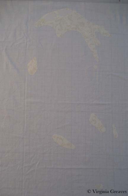
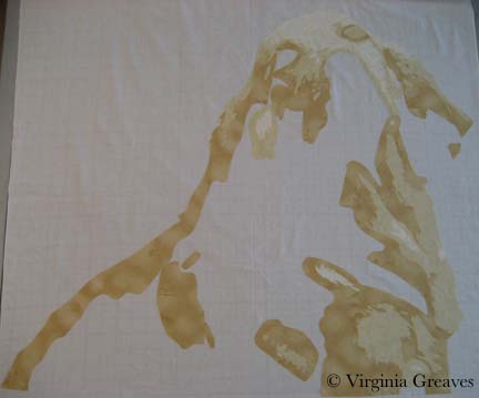
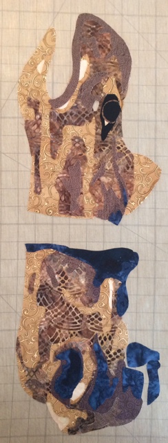
For this piece, the first 2 values are very light — in fact, I probably could have dispensed with the lightest and just used the batik here. It’s hard to discern where the first value even is.

Horse Value 1 and 2

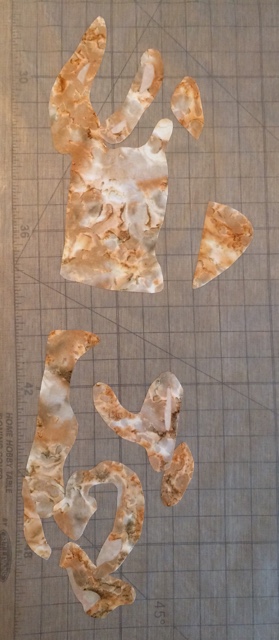
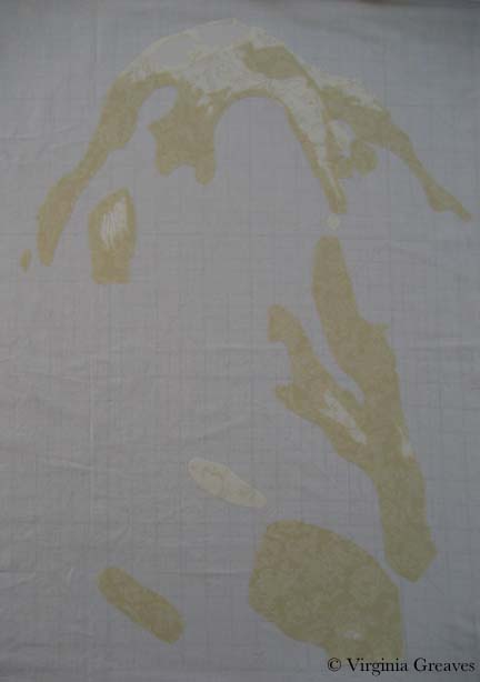
And this shows the 3rd and 4th values. The 3rd value is a batik I’ve always struggled with, but I think it works well here.

Horse Value 3 and 4

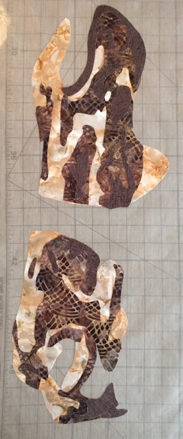
For the 5th & 6th values, I purposefully went into navy blues. Painters sometimes use blues for shadows, and I love the richness it gives the piece.

Horse Value 5 and 6

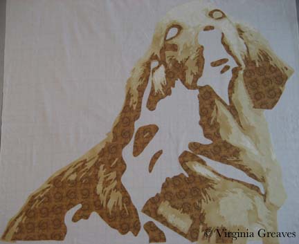
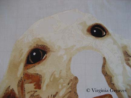
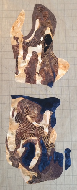
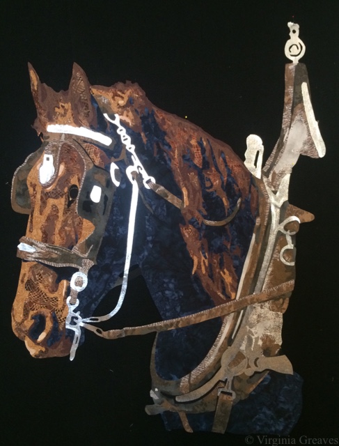
And then I had to construct an eye. In the photograph, there’s a piece of leather to the right of the eye that mostly obscures it. However, it’s important for the piece to have a successful eye. It’s a large part of what draws in the viewer’s eye. So I found a pencil and drew out what I thought would work.

Horse Eye

And then I stepped back and really looked at it. I wanted to make sure that the fabrics were working before I continued — and they’re just not. There is a definite value change between two and three, but the step is too great. The horse looks more like a palomino with spots. So I went back to my fabrics and pulled out a honey yellow. Much better, and I can see the first value now.

Horse Value 2 change

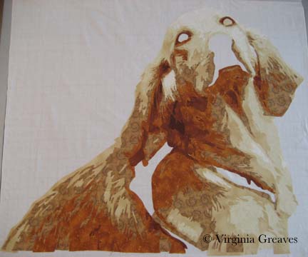
I recut all the pieces and carefully peeled away the fabric that wasn’t working and re-fused it back together. And then I started on the neck. All the spaces are for leather bridle, harness, et cetera.

Horse Neck

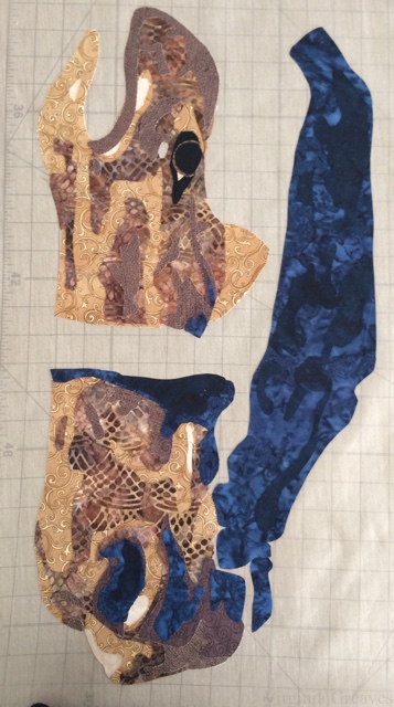
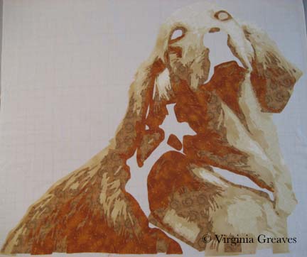
And then I went to work and stopped taking pictures. But as you can see, I worked one section at a time so I wouldn’t be overwhelmed. I had fused down all of the horse pieces before doing any of the leather or silver. Here is the horse completed with the leather.

Horse with Bridle

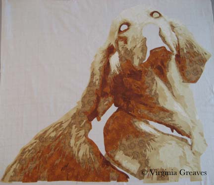
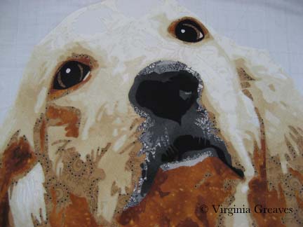
And then here it is with the silver. The only thing I really questioned was the chain running from the top down to the mouth. There really wasn’t an easy way to do it. I may go look for some silver braided trim to use instead.

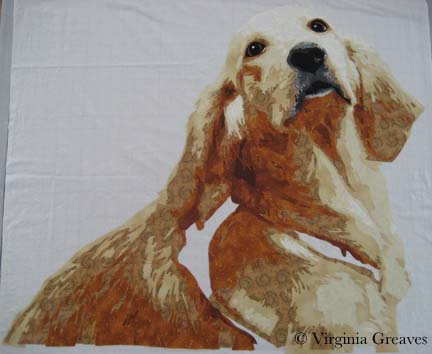
At this point, she’s finally off the flat table and pinned up on my design. She’ll be the far left horse — that’s why so much of her body is in deep shadow. The forward horse on the right will have a lot more of the brown detail.


Horse with Silver

I have a few drafting things to finish before I start cutting out the front horse. I also think that I’ll change the horse fabrics a little. I don’t think I’d have enough fabric to make the other one completely anyway. It’s amazing that I was able to get this far without making a trip to the fabric store — well, except for the silver.

And yes, this is silver spandex, just like the gold spandex that I used in The Last Supper. This time I was smarter and fused a non-woven interfacing to it before cutting it out to help control stretch, and then I added the fusible. Last time, I only used the fusible and it was harder to control.

Golden

0

As I’ve mentioned before, I was lucky enough to have two pieces in the recent Sacred Threads show in Herndon, VA — Beach Guardians and The Bowl Judgments. It’s a biannual show and I haven’t participated in about four years — so I was delighted to find that the show published a book with all of the pieces from the show. Not having the ability to see the show in person, it gave me the chance to enjoy the exhibit from home and read all of the artist’s statements with time to study them alongside the work. You can order a copy of the book here.

Sacred Threads book

Then a couple of weeks ago, I received a manila envelope in the mail. Inside was this new copy of Machine Quilting Unlimited and nothing else. I don’t have a subscription (although I might have to get one now — it’s really well done) — so I was confused until I saw the little strip at the top that said “Sacred Threads 2013.” I flipped to the article for the exhibit — and Beach Guardians was one of the highlighted pieces.

I was really stunned. I have never had my work included in a magazine before. I felt like I had reached a milestone. My 15 minutes anyway.

Machine Quilting magazine

I have not been writing much on the blog lately. Part of me thinks that to have a blog, you need to write at least weekly. Another part of me really despises blog writers that fall off subject or write about nothing just to get a post out. I try to prepare something interesting and present it in a large enough piece that you can see progress. If I just showed you one day at a time, the blog would show everything in reverse order and it wouldn’t be nearly as interesting — to me anyway.

Once I had the girls back in school in August, I started thinking about my next piece. I really had no idea what I wanted to do. I started sifting through pics I took in the Spring and came across one that I really liked of a golden retriever. She is looking over her shoulder at her owner and has such a look of love in her eyes. If I found it captivating, maybe someone else would too.

I spent about a week drafting her. I typically bring the pic into Photoshop and reduce it to values only, adding lines of separation between differing objects — like the dog from her harness — or even her eyes and her nose from her fur. Then I spend a lot of time drawing in Photoshop using my Wacom tablet pen. Not only do I clean up the light scatter, I deepen shadows, add shadows to create definition, redraw the eyes, and simplify shapes.

From there, I continue the drafting process by pulling the final pattern into PosteRazor as a BMP file & scaling it to what I wanted. In this program, I can then tile print. Then I take the puzzle pieces, cut off the margins, and tape it back together. Now my pattern is back together — but larger.

Then I outline everything with an ultra thin black Sharpie. It bleeds through to the back giving me the reverse image that I’ll need for WonderUnder templates. I’ll have to go back & re-draw the lines on paper overlap — but it’s otherwise done. And FINALLY, I place a layer of see-through vinyl over the top of the pattern, tape it down, and trace it. I can then sew the vinyl to a piece of muslin (using a teflon foot that won’t stick) to use as my guide when I fuse the pieces down — or I can work on a very large fusing sheet and tape the vinyl pattern over that.

This is the beginning  showing the first & second value. The first value is almost impossible to see as it’s white like the muslin background.

Value 1 & 2

The third value gives you a better idea of the face.

Value 3

The fourth value shows the outline of the entire dog.

Value 4

The fifth value begins to give shadows and therefore definition to shapes.

Value 5

The sixth value goes into an orange. There is only so far you can go with yellow — even cream. The color that shows for this value will depend largely on what is placed next to it. In the pic, it looks a lot more orange than it actually is.

Value 6

The seventh value gives more depth and tones down the orange.

Value 7

I debated having an eighth value — I though about just making it black — but between yellow and orange, I had room to move into a dark brown cinnamon. There isn’t a lot of it anyway.

Value 8

Now the eyes. The pic normally gives me useless information here. I’ve found it best to draw them myself. The pupils are wide — and the irises are brown but has more gray in it than the brown tones in her fur. The outline of her eyes is black. You have to have a deep contrast here to feel the depth of the eye and most dogs can easily take the rich black for that function.

Eyes

The nose is an experiment — although I’m leaning towards keeping it. You would think that all the fur around the mouth would match her other fur — but it doesn’t. It’s shades of back and gray.

Nose

Seeing a full picture of her, I think the nose makes sense. The gray and the black have to work together to give the impression of a snout — which I think they do.

The open patches around her shoulder are for a harness — which I’ll work on today.

Without Harness

I ripped off the orange under her left eye — I found it distracting.

I’m not sure about the light gray at the bottom of the mouth — I’m still considering it.

I made the entire piece without extra around the edges — which I should have done since I put her right on the muslin. Making her this way, I should have fused her to a fusing sheet where I could detach her & place her on a background. I wasn’t thinking through it — I was too excited to get to my favorite part — the cutting! I love the meditative process of fusing the shapes, cutting them out, and layering them until I start to see recognizable shapes.

I’ll have to think around what to do to correct this.

Drafting, Drawing, Sketching, & Photoshop

1

I am always asked about how I draft a pattern. Yes — I start with a digital picture. Yes — I use the posterize tool in Photoshop. And yet — if it were that easy — everyone would be doing it. Beyond the mechanics of the process — it’s a skill. The truth of the matter, as any good photographer will tell you, is that cameras lie. The more pictures you take, you’ll begin to see why. They don’t have the ability to record things in the same way as the human eye.

So my starting point is the photograph — but making the pattern believable requires some drawing. The eyes and the mouth are always wrong. The chin is rarely defined. The dimples that create character in some people’s faces are easily obscured in the light. And Photoshop isn’t perfect either. I use the information I receive from posterizing to start a value painting, but when you posterize, you often lose details that you want to keep and you have to add those back in. This usually takes me 3-4 days.

I have a Wacom tablet — not a big one — it’s the 2nd smallest — and I pick up colors and use the electronic pen to draw in Photoshop. I have the original picture in another layer that I can use for reference.

This is my latest piece, a small girl holding up a flower on the back of her hand and looking up expectantly. The important shape here are her eyes — and I’ve exaggerated some of the detail in them for that reason.

The value painting isn’t really my pattern — but it has everything I need. I used to take my value painting, export it as a BMP, pull it into CorelDraw, and then create my drawing in CorelDraw by drawing lines around all of my closed shapes. Then I would tile print it. It looks very professional when it’s done — but it does take longer than my Sharpie method.

I still export the file from Photoshop to a BMP file — and then I pull it into PosteRazor (which is shareware). I make it the size I want it, and then tile print it. (Tile printing, by the way, is sorely lacking in Photoshop.) At that point, I have to start putting the puzzle together.

This shows 2 sheets of the bottom left that need to be joined.

First I take off the right hand side of the first sheet (starting from the left) — and using a rotary cutter and a ruler, I take off the white strip that is not part of the pattern. (I also crop the bottom a little. If this wasn’t the bottom row, I would take off the white strip of the bottom as well.) I always take off two sides — the right and the bottom — so the pieces will fit together with overlap.

Now I can take the first piece and lay it directly onto the second piece.

Once I tape it, it’s seamless. Use clear tape and keep the tape within one value if at all possible. If you cross over values, your Sharpie won’t touch the paper and the ink won’t be visible on the other side of the paper.

The trick comes in putting it all together. I used to not be very good at it and my pattern would ripple with my mistakes. Don’t worry if it does. Retape it. You probably won’t lose much of a shape. But if you cut out the overlap carefully and tape it together carefully, you’ll have a flat pattern when you’re done.

You don’t want seams to fall in complex areas like the eyes. One reason I printed this out in landscape rather than portrait was to avoid that.

Once that’s done, outline your shapes using an ultra thin Sharpie.

This has the added benefit of creating the reverse of the pattern on the back — so from one tile printed & taped pattern — I get a front (used for the vinyl overlay) and a back (used for the Wonder Under patterns).

You can see here that this works great — except for the joins where the paper comes together.

Just grab a lightbox & draw in the missing lines. If you can’t see it, you can flip the paper back.

And finally, go back and label everything with value numbers. I always number the face F1, F2, etc. and then think up other prefixes for other things. In this drawing, FL stands for flower. And then grab a highlighter and mark the lines between areas — like the face, her shirt, her hand, the flower.

And since this is a value painting, you’ll find that your value shapes won’t always stop between objects. You have to go back in and add those lines yourself. I use a pencil until I get the lines where I like them — then go back over them with a Sharpie.

And — then you’re almost done — you flip the pattern back to the value side and tape vinyl over it and trace it out. Then you’ll sew the vinyl onto white fabric (using a Teflon foot that won’t stick to the vinyl). The fabric acts as your canvas, and the vinyl overlay is your road map showing you where to fuse your shapes.

Then flip the pattern back over to the back side — where there is no value distinction other than the letters & numbers you assigned to shapes — and you’ll use this to start tracing Wonder Under shapes.

That’s a lot of work before you even begin to look at fabric — but it’s time well spent. Keep in mind that whatever you draw, you have to be willing to cut it out and sew around it. Sometimes, you can use patterned fabric that will do some of the work for you. Often I draft tiny pieces that don’t end up in the final piece. And I’m always ready with a pencil to draw out changes at the last minute if something isn’t working out. Just because it’s been inked doesn’t mean it’s written in stone. If it’s wrong, change it. Sometimes you won’t see it until you start doing it. In this particular piece, one of her eyes was clearly wrong — and I sketched out my changes with a pencil and kept moving forward.

Go to Top