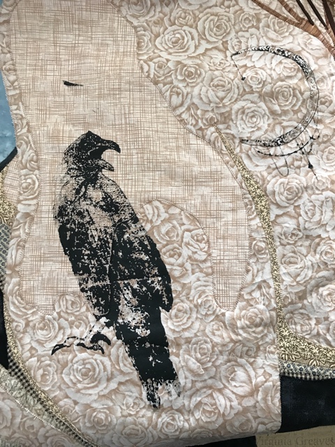
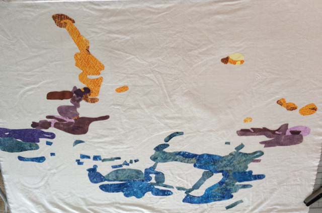
Last week, I drove up to Blairsville, GA to talk to the Misty Mountain Quilter’s Guild just before Thanksgiving. It was a wonderful group, and even though my wireless connection from the iPad to the projector decided not to work, we made do with the quilts that I had brought and still had a memorable time. I love telling stories about my work and inspiring other quilters to push themselves — to see the possibilities of what they can do with determination in their hearts.
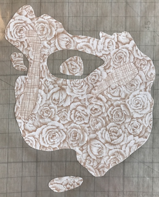
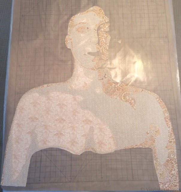
I am always surprised at how many people ask me about how I use fusible in my work. It would be tough to do what I do without fusible. Deidre Scherer free-hand cuts all of her pieces, pins them down, and then machine embroiders them to completion. I marvel at her ability to do this. I typically have everything drawn out in advance, and if adjustments have to be made to the paper copy, I use a pencil to make sure I get it right before I ink it.
For those of you familiar with paper backed fusible, this short tutorial will not be interesting — but for those that are curious or just want to see how I work, I made a couple of small pieces to demonstrate the most basic principles.
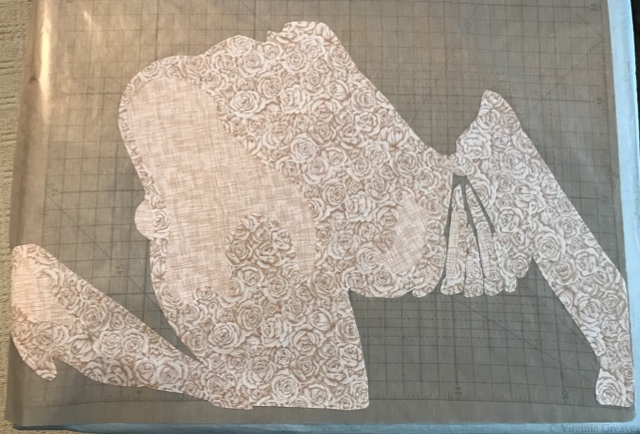
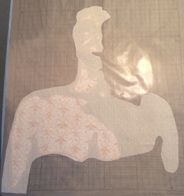
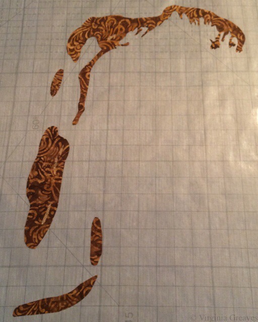
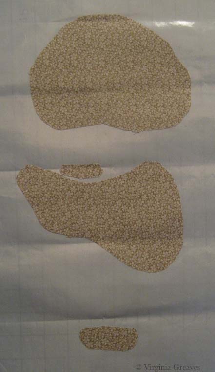
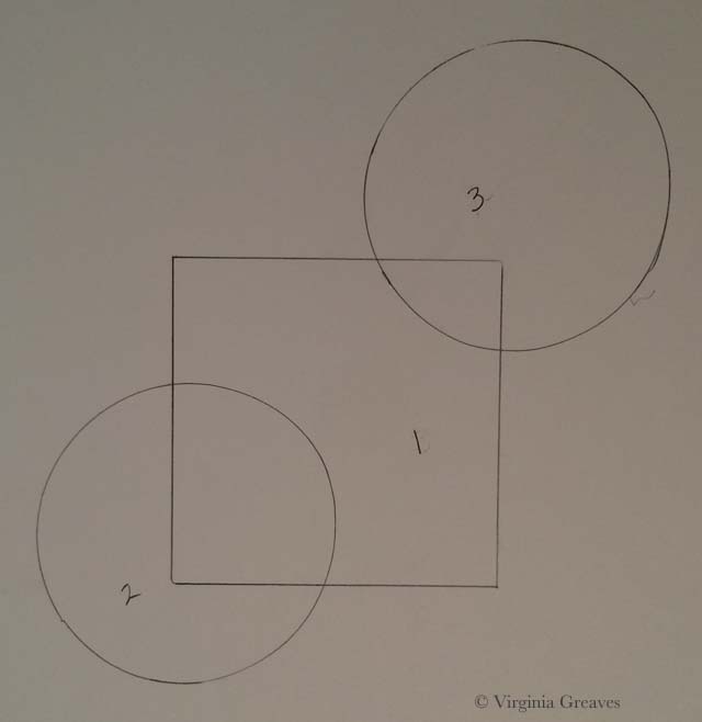
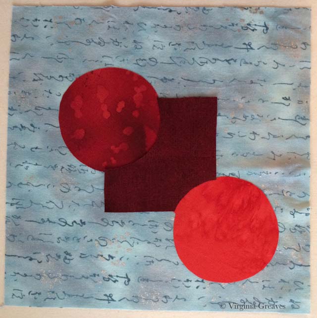
First I start with a drawing. For this piece, I drew a square with my ruler and then two conjoining circles with the top of my spray starch can. The circles are considered primary to the square in this pattern — which means that the circles are intended to sit above the square in comparative space.
Each shape is numbered 1,2,3 — these are my value numbers. 1 is always the lightest.
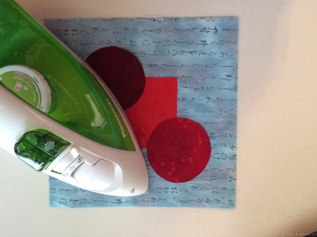
This is the 1st version and the easiest to do because the square is on the bottom and the darker circles are on top. I <almost> always work from light to dark. If you work from dark to light, you run the risk of the darker fabrics showing through the edges of the lighter fabrics.
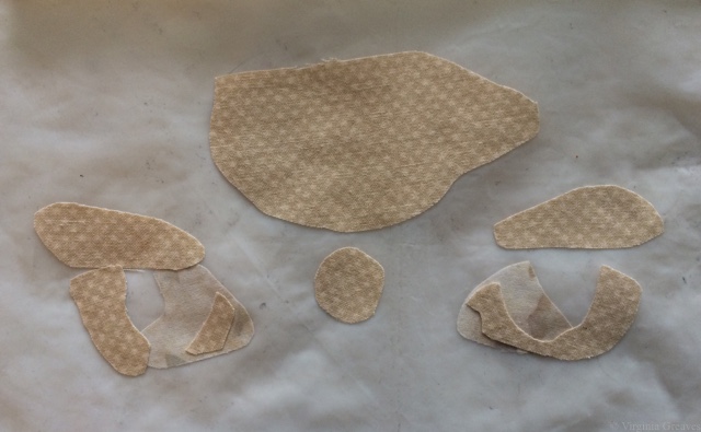
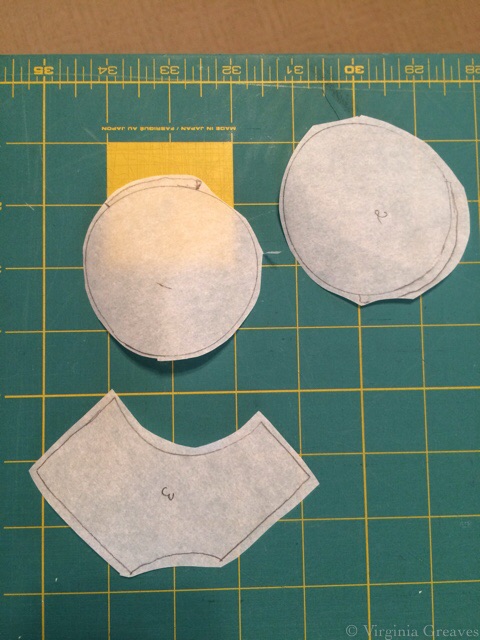
The first thing you do is trace out your shapes onto paper backed fusible. I use Wonder Under. Trace the shape onto the smooth paper side and then roughly cut out around the shape — just outside the drawn line.
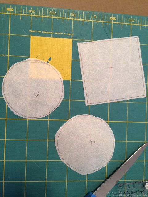
You should always use the reverse of your pattern as the template for your fusible templates. I forgot to do this — but in this particular instance, it won’t matter (It does in the 2nd version — so you may notice that I just left both of the final fused pieces in reverse.)
And by the way, reversing a pattern is easy; simply trace over the shapes with an ultra fine point Sharpie. All of the marks will transfer to the back of the paper. Then you use the back of the pattern for tracing your Wonder Under shapes.
Fuse your templates onto the BACK of your fabric with the iron on a cotton setting. (This is a batik so the back is the same as the front.) Roughly cut out around the shape.
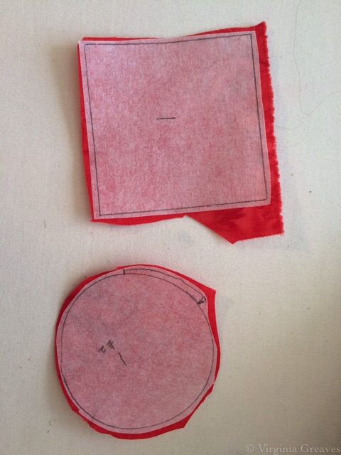
Cut directly on the line you have drawn.
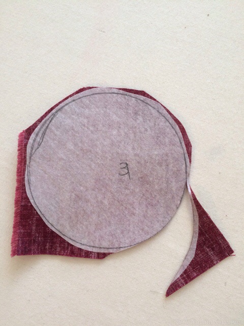
Score the back of the paper with something sharp like a pin.
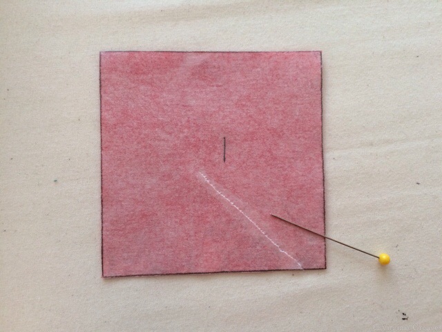
Then you can rip the paper off the back of the fabric. The fusible should stay on the back of the fabric. If it sticks to the paper, re-iron the paper back down with a hotter iron and when cool, re-score and rip the paper off.
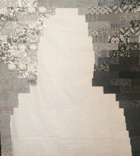
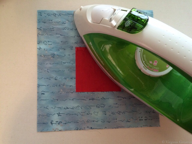
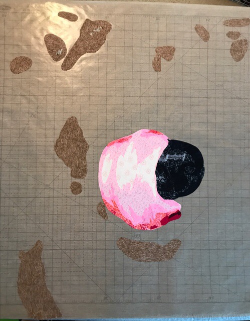
Prepare a backing fabric to fuse to. You could fuse directly to an appliqué pressing sheet. This is a special plastic sheet to which you can fuse and then later peel off and use as a large appliqué later. I do this sometimes, especially with large and complex pieces.
Fuse down the lightest value first. For this template, it’s the square in the middle. Use your iron on the setting BELOW cotton, the one for polyester. If you leave the iron on the cotton setting, you will eventually bake the fused fabric to the point that it will not stick.
Fusibles are temporary. They need to hold long enough for you to stitch over them to hold them more permanently. In complex designs, you will find that things start to move as you scrunch everything around and under the needle, but re-ironing will re-stick them where you want them to stay — for a while. Over-ironing with an iron that is too hot, however, can burn the fusible away and there will be a lot more movement. So although it is difficult to iron the fusible onto the fabric with the cotton and then bring the heat down to fuse the shapes onto the final appliqué, it is worthwhile to remember if at all possible.
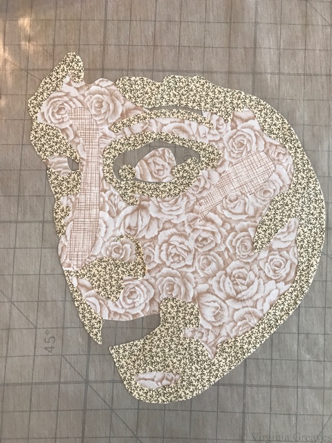
Then fuse the next darker circle — and then the next darker circle.
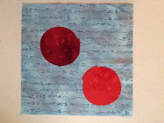
And it’s finished.
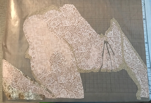
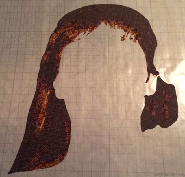
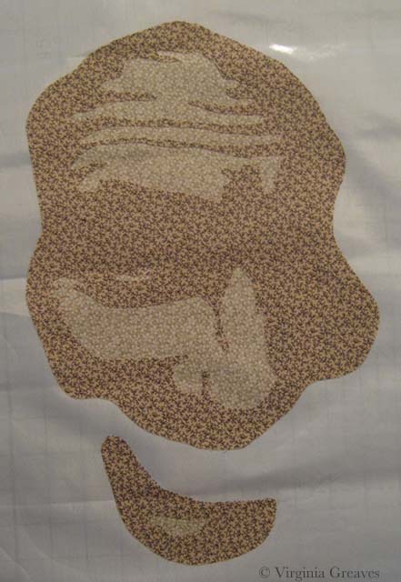
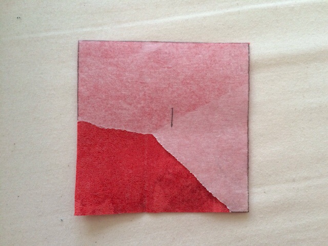
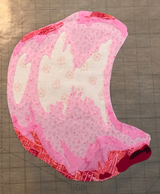
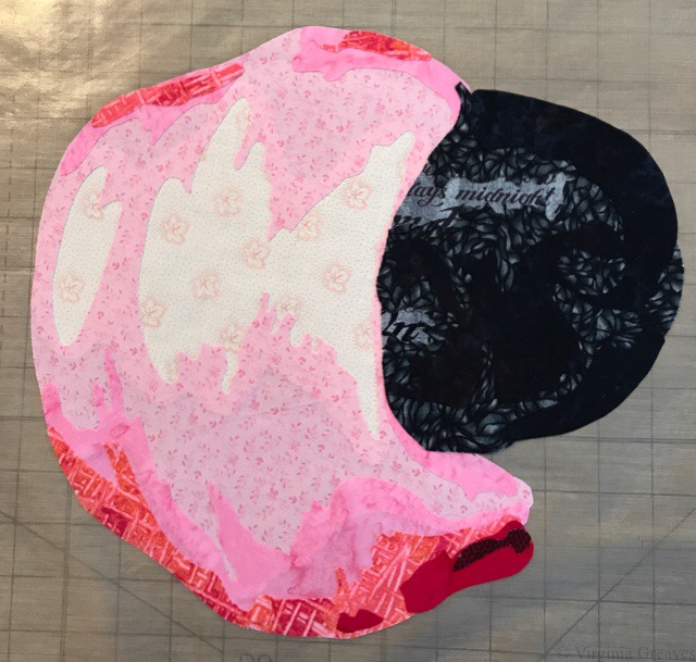
This is the 2nd version which is more difficult because the darkest fabric is in the middle with the lighter fabrics in the two corner circles. Remember that we want to keep the circles primary even though they will be fused before the square.
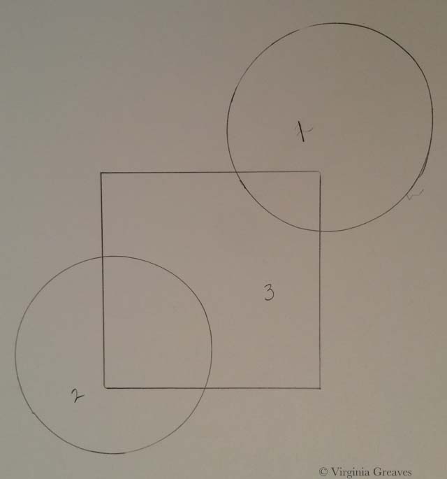
The two circles are traced onto fusible — but the area that will overlap with the square now has an extra lip added so that it will slip under the square. If this extra wasn’t added, then the background fabric might show in the space between the circles and square. That happens at times and is easily covered with thread, but it should be the exception, not the rule, or you’ll be spending a lot of time covering things that are much more easily handled at this point in the process.
Also note that the square is now no longer a square. If we fuse the 3rd value down last, if we cut out an entire square, then the circles would no longer be on top (which is our goal — for them to be primary).
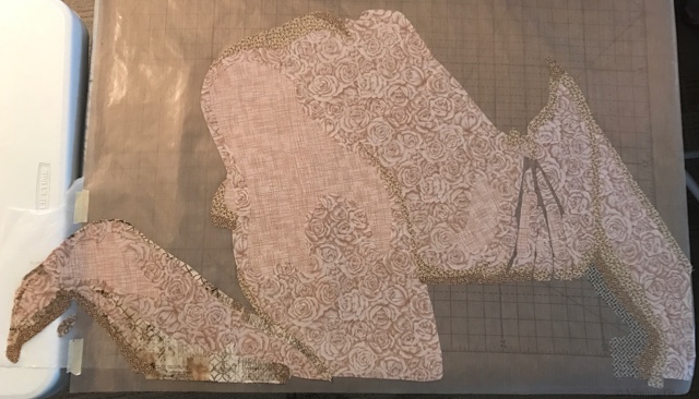
First fuse the lightest value circle and then fuse the 2nd value. Make certain that the overlap flaps will fall under the “square” shape.
And then add the “square” shape in the darkest value. Since the circles are primary, the square is set behind them. Notice that the square shape covers the flaps that were created on the circle shapes.
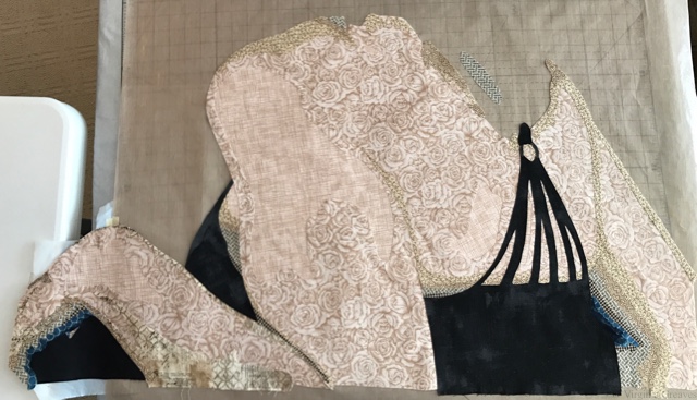
These are the two designs. The one on the right is the first template. The one on the left is the second template. They are identical in final form, but by moving the values, we have changed the construction.

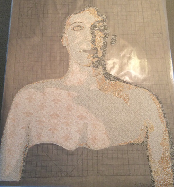
Hopefully this explains the process in its most basic forms. Understanding how values affect how you cut your shapes is essential to working with a paper backed fusible. I always start with my lightest values and work to my darkest values.
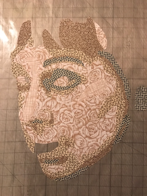
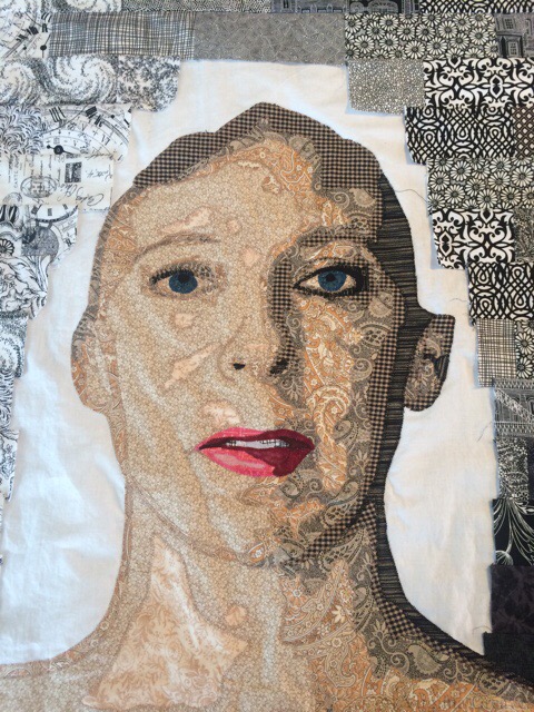
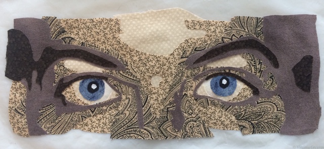
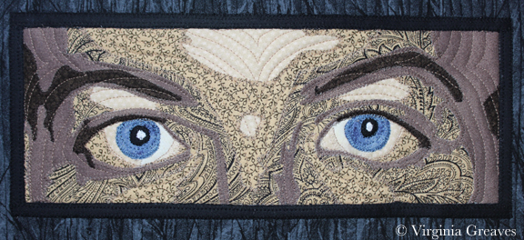
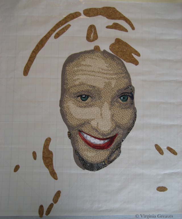
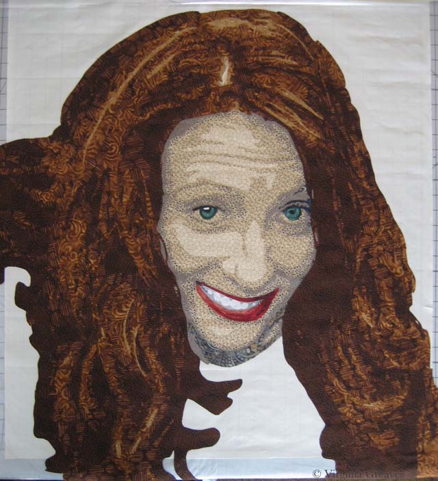
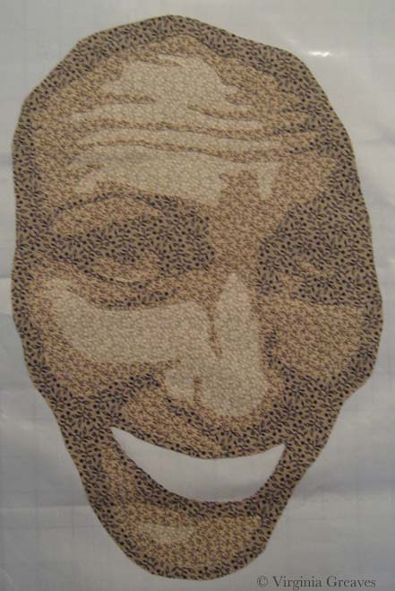
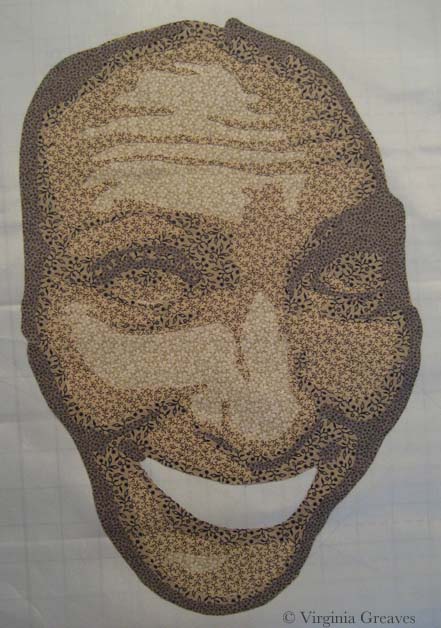
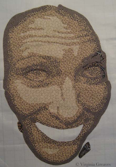
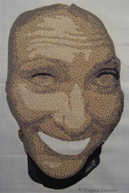
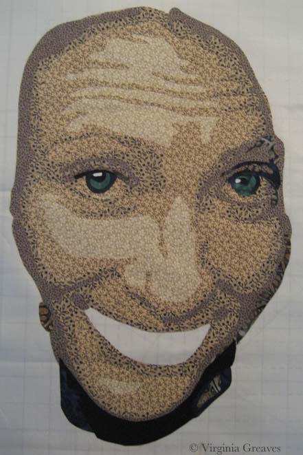
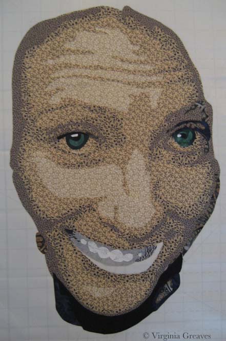
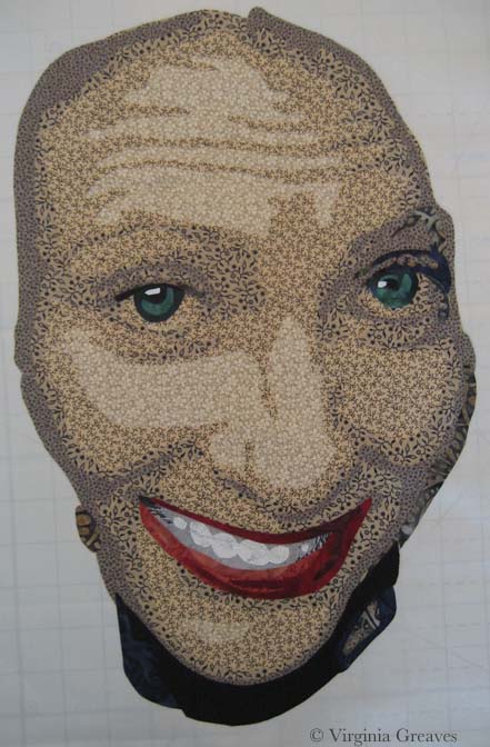
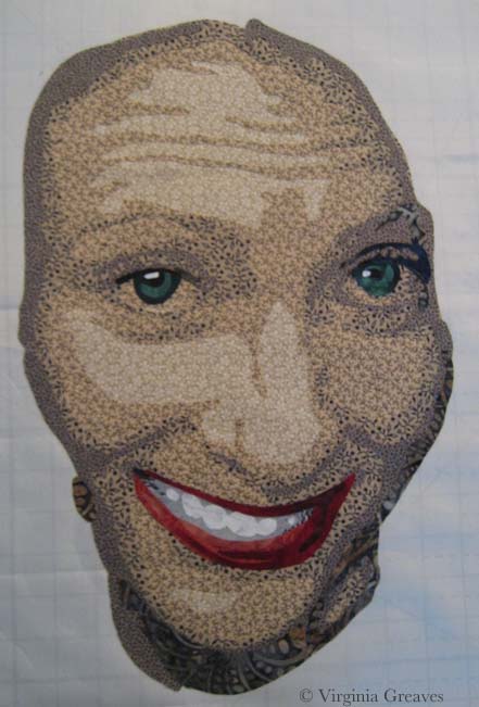
The exception to this are the teeth in faces. They never look right done this way. I always make them from dark to light — but the overall pieces are small enough and the pieces are light enough in value that color shadowing isn’t an issue.

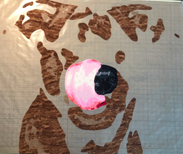
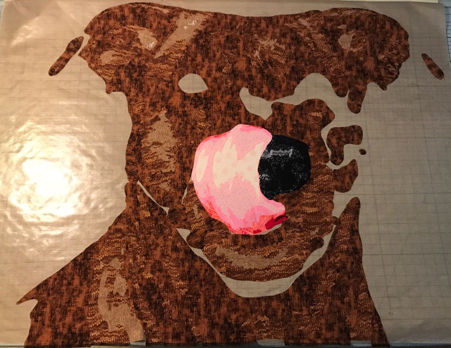
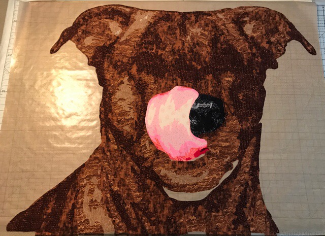
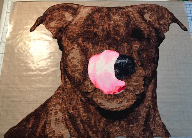
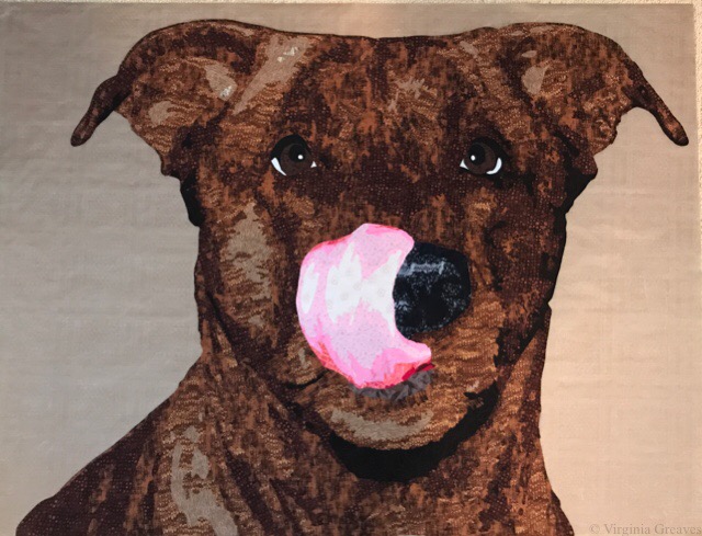
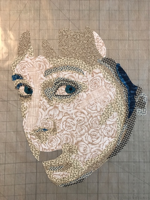
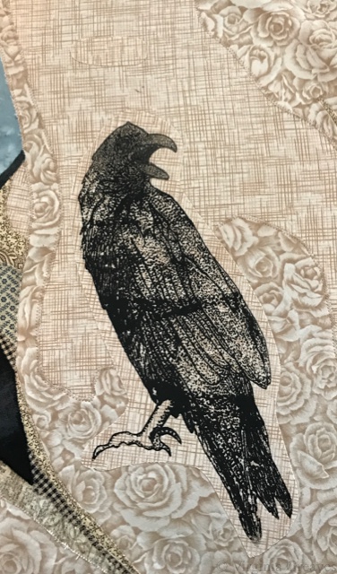
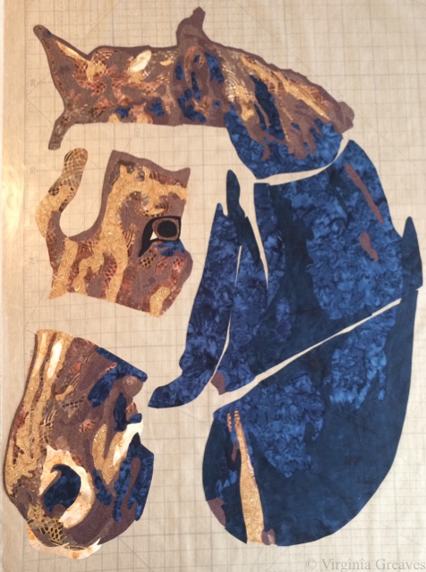
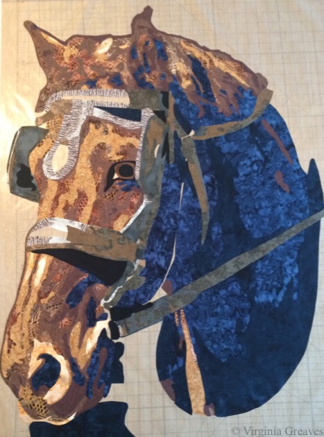
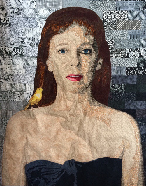
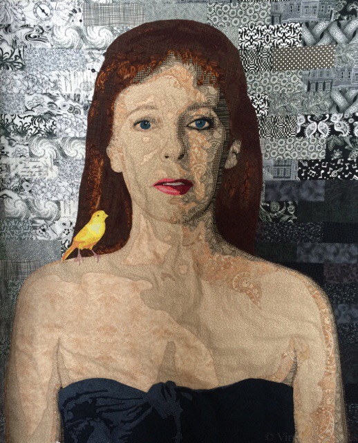
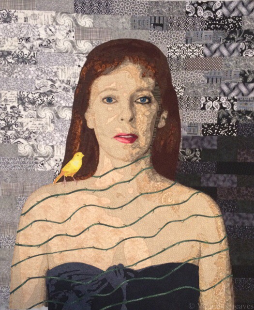
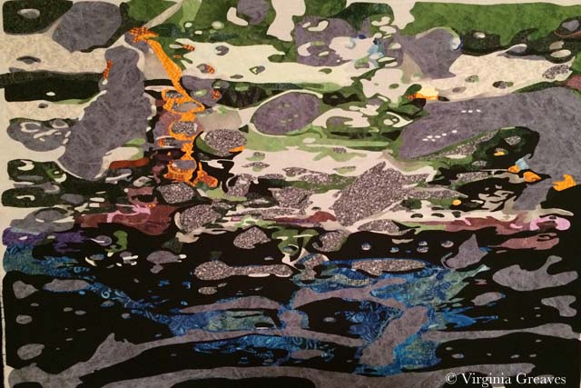
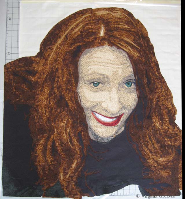
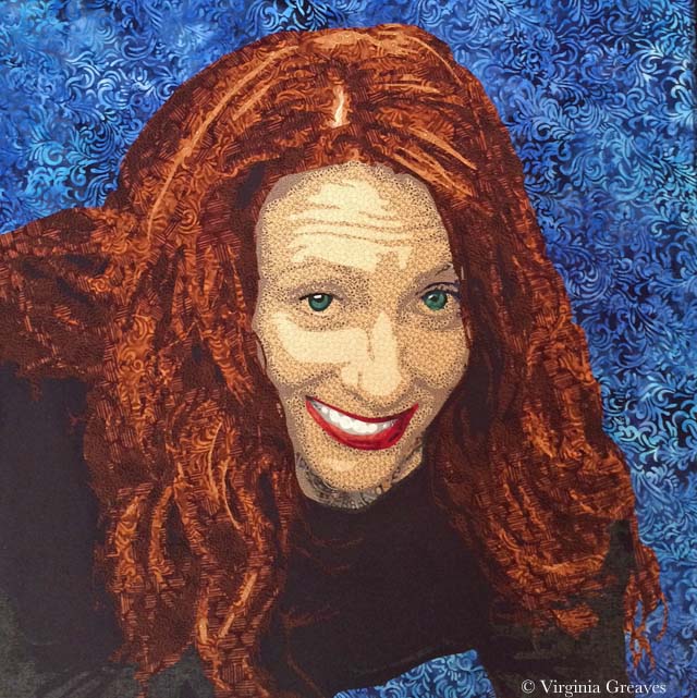
 I named it Tasty, and you can find it once quilted and completed on its page here.
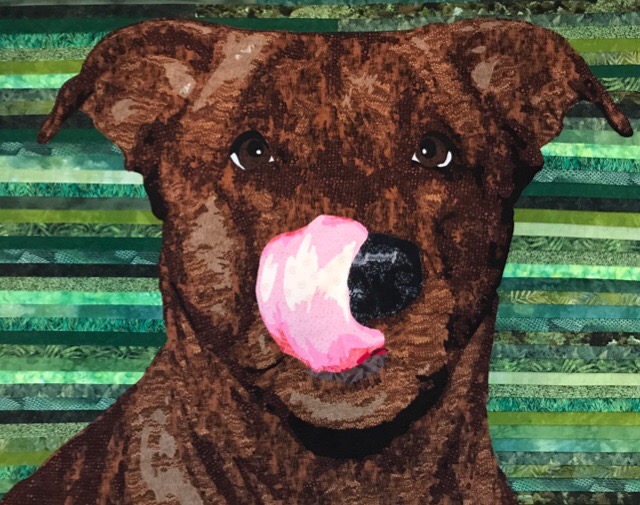