Applique

The Creative Spirit

2

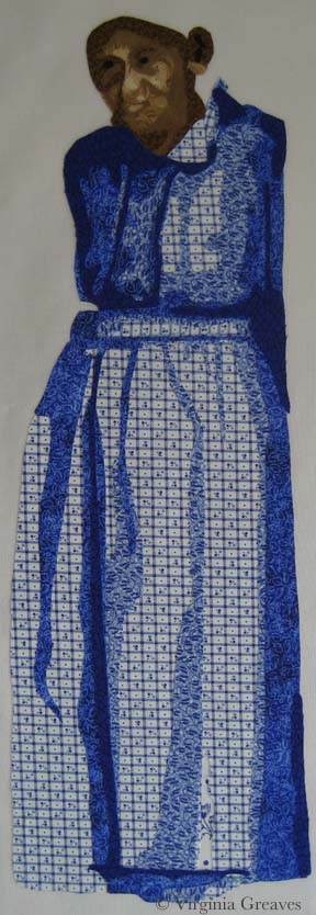
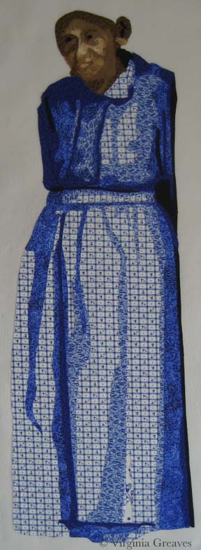
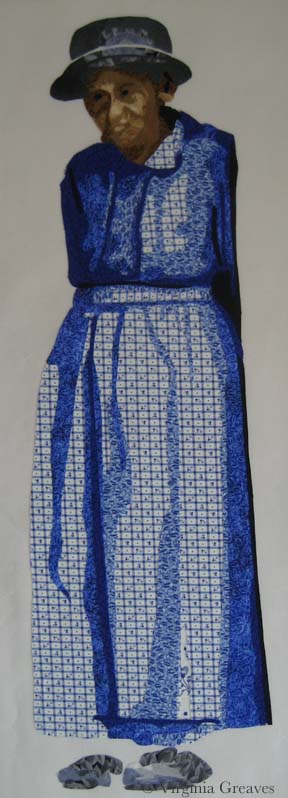
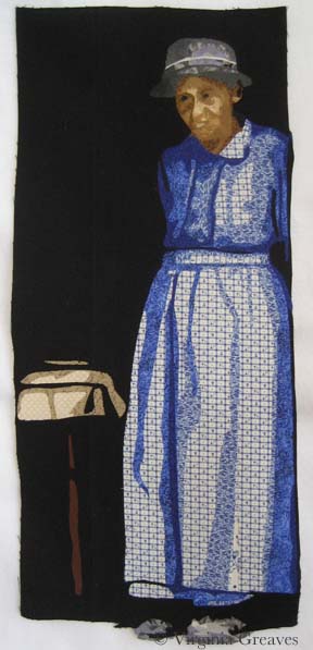
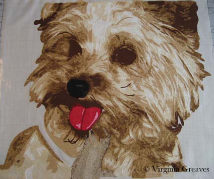
I’ve been hard at work in my studio since my last post, pouring the creative spirit out of me and into my work. And I’ve surprised myself.

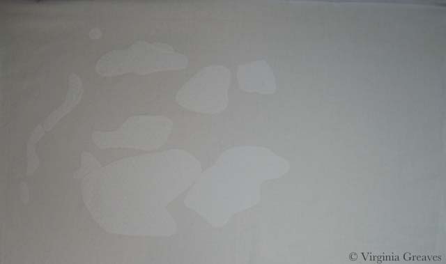
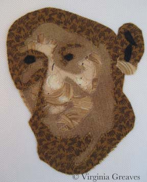
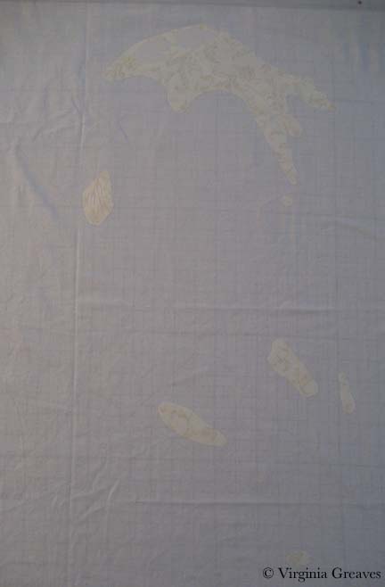
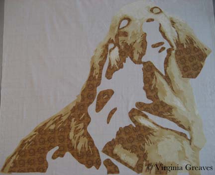
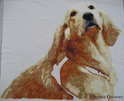
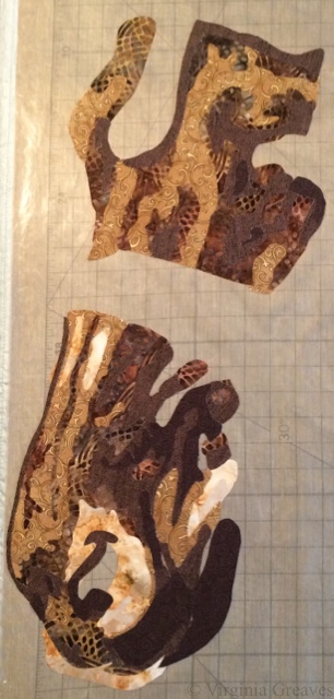
If you remember, I had finished the first horse, so I began cutting out the second horse, its companion. This shows the light values of the face.

img_3015

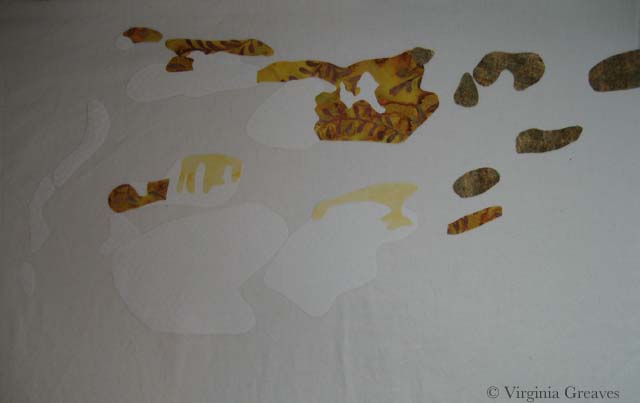
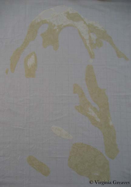
And then the darker brown values.

img_3017

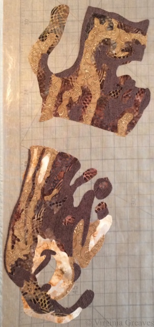
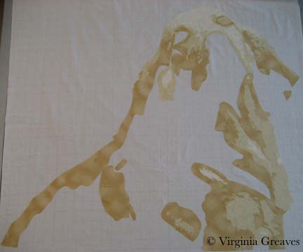
And finally the darkest brown values.

img_3018

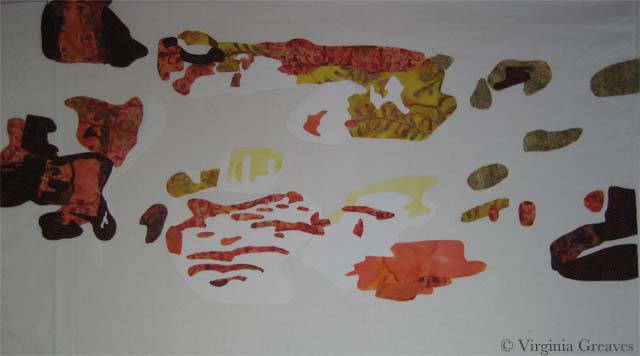
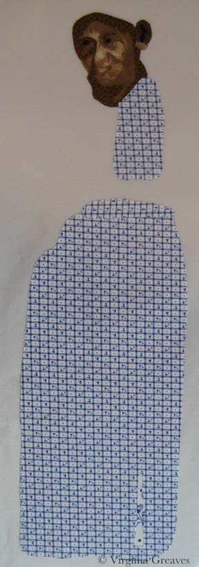
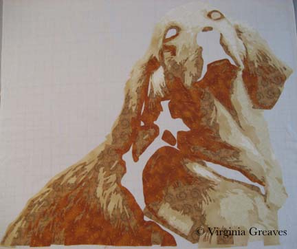
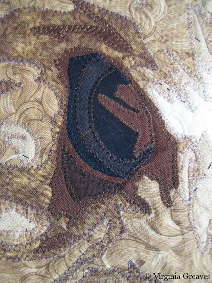
Here is the horse head without all of the leather straps, bridle, and silver.

img_3024

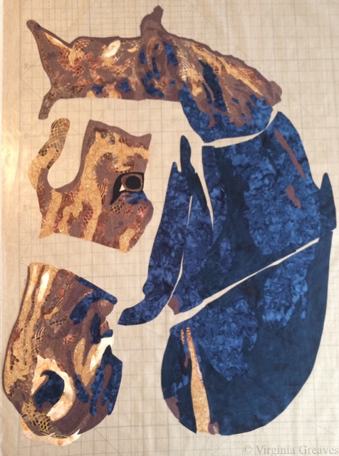
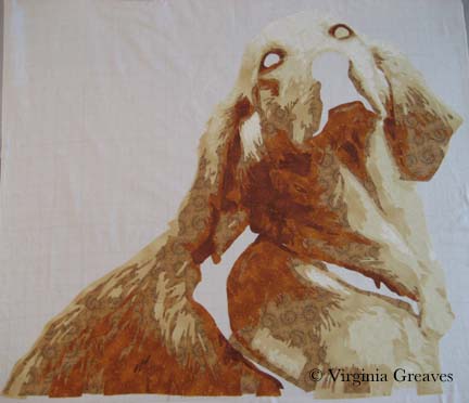
Then I added all of the leather parts around the face.

img_3030

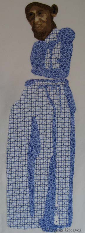
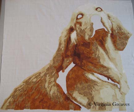
And finally the leather collar.

img_3038

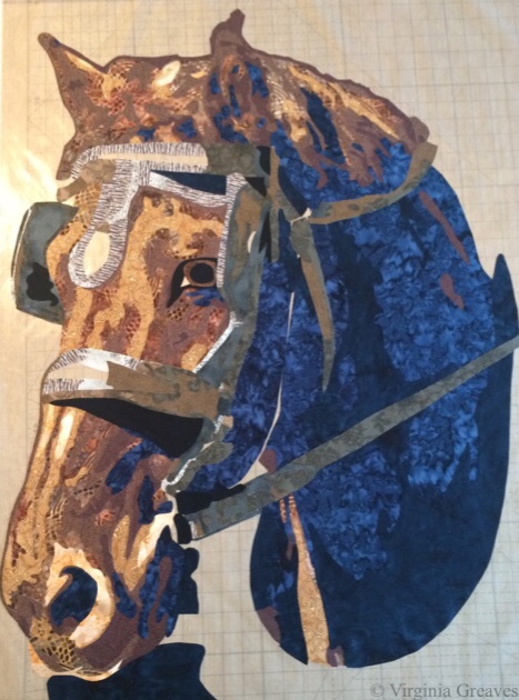
Once I added the silver, I put it up on the design wall for a quick picture.

img_3041

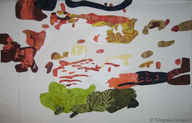
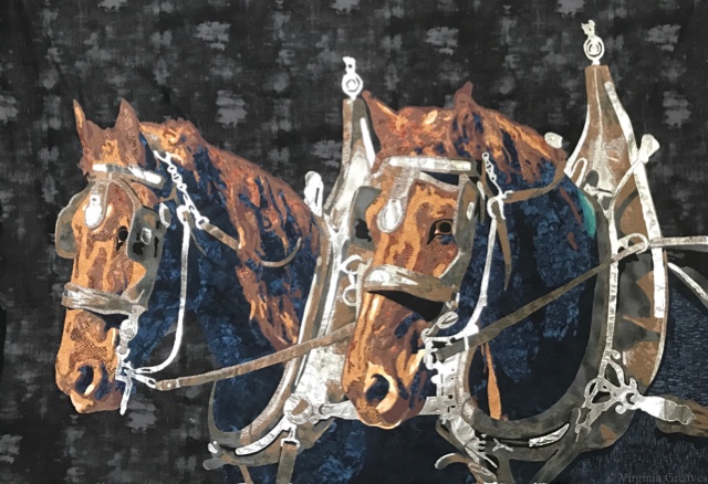
At this point, I put it up next to the other horse to see how it would look. Wow. I loved it on the black, but I always do.

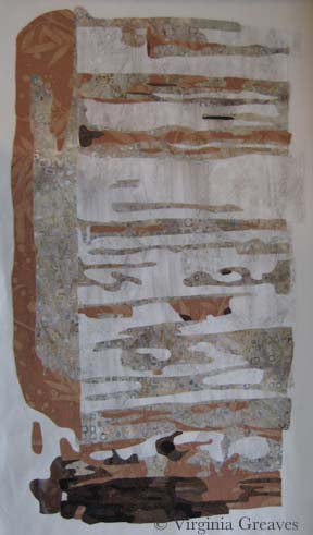
I considered for a while making a pieced background, but I finally decided that the horses themselves are so intricate, a pieced background would only create a distraction. I found a great smudged black that works well.

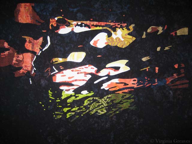
This is both of the horses appliquéd onto the background. The grays in the background black look lighter than they actually are — my camera phone is limited in its range and chose to highlight all of the silver. The final photographs after quilting will be difficult, but this piece may warrant my first trip to a professional photographer.

img_0006

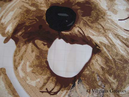
For those interested in the process, I abandoned my usual appliqué technique, which is a tight zigzag around all of the rough edges. Even a free-motion straight stitch around the edges as an appliqué technique was difficult as the pieces tried to pull off as I worked on it. The horses were large and complex, and Wonder Under can only hold so well. The silver, especially, didn’t want to adhere. It was always the first appliquéd for each of the horses.

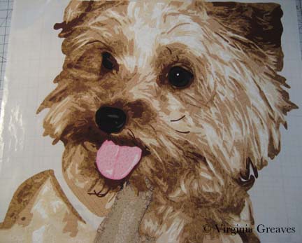
And the end result is more artistic. I’m letting go of the restrictions of the quilt world and embracing the art side. The free motion stitch is much more like drawing on the piece. I still haven’t decided if I’ll add some tulle for added protection to the raw edges.

They each have their own personalities, and I’m surprised at what has crawled out of my brain.

And now I begin thinking about the quilting process. I have a hard time just pinning this on the wall by myself because it’s so large. I tried to take a local long-arm class at the beginning of the month but it was full. The next one is not until the first of December, and I don’t know that I want to wait, but I’m also uncertain about tackling this bear of a piece on my local machine. I do happen to have a Hinterberg frame that I bought years ago — it sits in pieces in the corner. I abandoned it when I realized that my Viking didn’t have enough harp space for me to use it on the frame. But I did get another 4.5 inches, I believe, in harp space when I upgraded to the Janome. It might be worth trying it.

Home Stretch

0

I haven’t been very motivated to write much recently, but I have been getting a lot of studio time in. I think I’m just growing weary. Preparing for a big two-person show like this has been interesting — and a lot of work. At this point, everything is fairly planned, & it’s the execution that remains.

I finished quilting #5 — the really big one. So glad I bought a big cone of red thread for this. I love the trapunto I put in all the yellow areas, but now I’m debating how to finish off the edges. I had planned on facing it, but I’m not sure how that would work with so many layers of batting along the top edge. I might use a red and blue binding, although that would mean yet another trip to the fabric store since my last 2 pieces took all my good red & blue fabric pieces & reduced them to scraps. For now, I’ve put it aside. Leisa wants to add some handwork, so I’ll pass it back to her.

I picked up #6 yesterday & started quilting it. I had to take off all the strips Leisa had pinned on there. I numbered them & took pics — I even made some marks with my erasable white pen (though it’s almost empty & I can’t see most of the marks now).  Not sure if I can get them in exactly the same place, but I’ll do my best. Figured they could wait until after its quilted — maybe even bound (or faced).

And then I’ve started planning out one that I’ll cut into a smaller pieces to be framed. It’s still in draft mode, but it’s been started.

After that, other than the pieces for the big wall installation — & another big installation piece that Leisa’s planning for the middle — there’s one left. I’ll call it #7. (I promise to give them better names eventually.) I think that I’ll have it printed from a manipulated digital image directly on to the fabric rather than another appliqué piece. Maybe 3 panels. Different from the others. 

Home stretch.

5th black

Outside My Comfort Zone

2

When I went to the opening reception of Georgia Artists last month, I was so glad to see Lauren Bernazza there. She is the former Curator and Program Director of the Abernathy Arts Center (she’s retired to raise twins — been there, done that).

We did get the chance to talk about the work I had in the show, and at one point, she challenged me to make an abstract piece. I was standing with her and Leisa Rich, a friend of mine that had work hanging next to mine — and I slowly smiled. I challenged myself to make an abstract piece last year — and as whole, I didn’t consider it very successful — which I patiently explained — but neither of them would hear it! Finally Leisa took pity on me and told me that we could collaborate on a piece. I’ve never done that before and I was so excited at the thought of working with such a talented artist as Leisa, I quickly agreed.

The collaboration rules are that I start and then pass the piece to her. We pass it back and forth a few times. The goal is to end up with something different and hopefully better than either of us could create individually.

I purposefully made this small — it’s about 23″ x 17″.

For inspiration, I started with a pic Leisa had taken from inside her car during a car wash. I loved the luminescence of it.

Car Wash pic

photo courtesy of Leisa Rich

When I printed out the pic, I ran out of black ink halfway through — so I had to go to the store for more. Then I printed it out again — and ran out of colored ink. Such is my lot in life. I sighed and decided to take it as a sign that I could make it whatever I wanted — so I did. I’m supposed to not be so literal with this piece anyway — and I often change colors in my pieces.

I started with a white piece of muslin as my canvas. Then I added white. I know — but it’s a brighter white than the muslin — so I went to the trouble.

1st white

Then I added three values of yellow. I know — just blobs of color.

2nd yellow

Then I added orange — I think there are five values.

3rd orange

And then I added four values of green at the bottom — and I decided at this point to add some dark blue. It looks black here against the white — but it’s a subtle change from the black that will be placed in the background. (There is also just a little red in the upper right area.)

This is it except for the background. It doesn’t make much sense on the white.

4th blue & green

However, once I added the black batik as the background, the entire piece comes together and makes sense. It took hours to cut out all those spaces in the background but worth it in the end.

5th blackI’m pleased with it. I’ll take it to Leisa today or tomorrow and let her have her way with it.


Making Progress

4

I have finally finished the appliqué on my latest piece. This piece was tricky to put together. I made it in sections — middle with figure, right wall, left wall, stairs, top of cabin, roof, and sand and rocks at the bottom. Each piece had it’s own vinyl overlay and as I put each section on to the last, I taped the overlays together using the pattern as a guide — and then used to overlays to align the appliqué sections.

First I appliquéd the middle section to white muslin — and then added the right wall.

20140414-150259.jpg

Then I added the left wall.

20140414-150315.jpg

At this point, I had a small section of stairs — forgot to take a pic at this point. It was a difficult join because it brought together the previous three pieces — but I made it work.

Then I added the wood pieces at the top of the cabin.

20140414-150333.jpg

Then I added the shingles of the roof. This was an easy piece because there was almost all black between the cabin and the roof.

20140414-145233.jpg

And finally I added the sand and rocks at the bottom.

20140414-150346.jpg

All of this appliqué took about twice as long as usual. This is how it finally turned out.

20140414-152033.jpg

And this is the back.

20140414-152046.jpg

It is now pinned and ready to begin quilting. My fingers are sore so I probably won’t start until tomorrow. I still haven’t printed out my value painting & started drawing quilting designs on it, but I think the cabin will be very straightforward. There’s so much detail in the appliqué, I don’t know that there’s much room to show off quilting.

There’s also the issue of machines. I got so mad at my Viking during the appliqué that I wrapped it up and stuck it in a corner — and used a borrowed Janome to finish it. I am not as sure with the Janome to do the free motion quilting though. I may go back to the Viking for that. It doesn’t jam during free motion work — just during appliqué.

Complete Figure

North Carolina Insanity

1

For my current piece, I was inspired by another picture by Dorothea Lange. This one was taken in North Carolina — 1936 I believe — and shows a woman, probably a sharecropper, standing in an old wooden shack. It appealed to me.

And as I started to work on the first wall of the cabin — I wondered what I was doing. I do portraits. This piece will have a figure in it, but she is not the main focus of the piece.

At one point, I did come to the realization that she is the house. I saw something online by Alice Walker in which she opined the situation of a slave that didn’t have the opportunity to express herself creatively — and I knew that this was the woman in the picture. She is bereft of herself and as worn down and tattered as the house in which she stands.

This is the first value for the right wall of the cabin. It’s a stand-in for plaster. The light in the pic isn’t great — I was working on this at night and didn’t think to turn on my natural light lamp.

Right Wall value 1

This is the second value. It looks stark against the first value. It’s a batik that I bought to work as the background of my last piece, Worry, but it was too light so it ended up in my stash and works nicely here. Really — it does. Just keep going.

Right Wall value 2

My third value is a rusty brown. I had to search some to find this. I had some rusts in my stash but they were too dark.

Right Wall value 3

It’s a wall — I promise — although I’ll admit that I was getting disheartened. Sometimes you just have to keep going. This wall on the right of the piece is lighter than the rest of the cabin.

The next value is the first true brown — but there isn’t a lot of it here.

Right Wall value 4

And then there is the darkest brown. Still doesn’t look right.

Right Wall value 5 & 6

I did realize at this point that I needed to add the door facing — so I went back to the 2nd value.

Right Doorframe 2

And the 3rd value.

Right Doorframe 3

And the 4th value. Done. OK — it doesn’t look right to me either. The only thing missing is the black. There are many tiny lines of black separating the boards — and I had intended to do this in thread at the end — but at this point, I was disheartened and wondering if I had wasted my time — so I added the black.

Right Doorframe 4

Why does that make so much more sense? It just does. Without it, the eye just sees a jumble of shapes.

Right Side Final

And then I did her face. I had painted myself into a corner. I couldn’t use the same brown tones I had used in the cabin for her face, so I decided to try the more yellow browns.

Her face is tiny — maybe an inch and a half — and when I first did this, I took this pic and then threw it in the trash. But, looking at it again in my camera with a little more perspective, I thought it might work — so I fished it out and started making her clothes.

Woman's Face

I needed a color that would make her stand out but not look expensive. In the end, the blue would look best against her skin. This shows the first (very small) and second values.

Dress value 1


The third value shows more of the outline of her dress.

dress2

The fourth value brings it even more to life.

dress3

This is the fifth value — and at this point, I’m happy with her face.

dress4

And then there is a little bit of black to add in there. (Don’t worry about her ear — it won’t be that large once I add her hat.)

Dress value 5

Here she is in her hat and shoes. I chose gray which will be similar to the tiles in the roof. The background will be black and will fill in the space between her dress and shoes.

Woman with hat and shoes

And here she is complete. The tablecloth and table leg are suggested objects. The rest of it falls into shadow.

Complete Figure

As of today, I’ve done both the right and left walls of the cabin, the steps, and I’m almost done with the boards above the door and across the entire top.

I have to admit that I must be insane. This is a very complex piece. The applique is taking a very long time to do. And it is a true departure from the kind of work I normally do.

And yet I keep going. When I’m done with the cabin top — there are still a couple of rows of shingles at the top — and then rocks at the bottom. Hopefully all of this will make sense in the end.

Applique Beginnings

1

Once break was over and the girls returned to school on Tuesday morning, I hit the studio and I’ve been working like crazy ever since.

I finished fusing the baby’s blanket — the last fusing section — and then I moved into fusing the larger pieces onto the muslin to begin appliquéing.

I did have a moment when I was working on the mom that I thought I should have kept her in smaller pieces — her face, her hair, her lower body, her jacket — but I fused whole people together and I was just going to have to live with everything trying to fall off as I started the appliqué process.

I laid my value study on the floor and covered it with muslin, cutting it to fit.

fuse1

Using the drawing behind as a guide, I laid down the mother and fused her right down onto the muslin on the floor.

fuse2

I started with her arm but quickly moved into whatever fabric didn’t want to hold onto the fusible the most. I can iron as I go — but squinching (new word?) the fabric under the harp of the machine can wreak havoc on your relationship with your fusible. Bottom line — fusible is a temporary relationship. Everything has to be sewn down.

I do use Wonder Under — and they’ve obviously recently changed the formula. Everyone raves about Misty Fuse — I’m not sure I could get used to something I can’t easily buy and that isn’t already paper backed — but one day I may give it a try. My feelings about Wonder Under vary with the complexity of the project.

Also — I made a command decision on this piece. After having gone to IQF/Houston & realized that I’m one of the few remaining artists that feels the need to cover raw edges — I’ve changed my strategy. A little, anyway. I couldn’t bring myself to get rid of it altogether. As I said, given the size & complexity of my appliqué shapes — if I fused the entire thing down & started to free motion quilt — I would have chaos on my hands. I did, however, compromise with a free motion zigzag. This is my first time with this stitch but given that I free motion quilt with the feed dogs up — it wasn’t much different — it gave me a little more control. And it’s faster — which is the biggest thing.

This is the woman after I finished appliquéing her this morning — from the back.

 back of mom appliquéd

Once she was done, I fused her son to her left. He is also a complete fused piece. I started appliquéing him this morning — and will probably finish him in my next studio time (since it’s Friday, there’s no telling when that will be.)

fuse3

Golden

0

As I’ve mentioned before, I was lucky enough to have two pieces in the recent Sacred Threads show in Herndon, VA — Beach Guardians and The Bowl Judgments. It’s a biannual show and I haven’t participated in about four years — so I was delighted to find that the show published a book with all of the pieces from the show. Not having the ability to see the show in person, it gave me the chance to enjoy the exhibit from home and read all of the artist’s statements with time to study them alongside the work. You can order a copy of the book here.

Sacred Threads book

Then a couple of weeks ago, I received a manila envelope in the mail. Inside was this new copy of Machine Quilting Unlimited and nothing else. I don’t have a subscription (although I might have to get one now — it’s really well done) — so I was confused until I saw the little strip at the top that said “Sacred Threads 2013.” I flipped to the article for the exhibit — and Beach Guardians was one of the highlighted pieces.

I was really stunned. I have never had my work included in a magazine before. I felt like I had reached a milestone. My 15 minutes anyway.

Machine Quilting magazine

I have not been writing much on the blog lately. Part of me thinks that to have a blog, you need to write at least weekly. Another part of me really despises blog writers that fall off subject or write about nothing just to get a post out. I try to prepare something interesting and present it in a large enough piece that you can see progress. If I just showed you one day at a time, the blog would show everything in reverse order and it wouldn’t be nearly as interesting — to me anyway.

Once I had the girls back in school in August, I started thinking about my next piece. I really had no idea what I wanted to do. I started sifting through pics I took in the Spring and came across one that I really liked of a golden retriever. She is looking over her shoulder at her owner and has such a look of love in her eyes. If I found it captivating, maybe someone else would too.

I spent about a week drafting her. I typically bring the pic into Photoshop and reduce it to values only, adding lines of separation between differing objects — like the dog from her harness — or even her eyes and her nose from her fur. Then I spend a lot of time drawing in Photoshop using my Wacom tablet pen. Not only do I clean up the light scatter, I deepen shadows, add shadows to create definition, redraw the eyes, and simplify shapes.

From there, I continue the drafting process by pulling the final pattern into PosteRazor as a BMP file & scaling it to what I wanted. In this program, I can then tile print. Then I take the puzzle pieces, cut off the margins, and tape it back together. Now my pattern is back together — but larger.

Then I outline everything with an ultra thin black Sharpie. It bleeds through to the back giving me the reverse image that I’ll need for WonderUnder templates. I’ll have to go back & re-draw the lines on paper overlap — but it’s otherwise done. And FINALLY, I place a layer of see-through vinyl over the top of the pattern, tape it down, and trace it. I can then sew the vinyl to a piece of muslin (using a teflon foot that won’t stick) to use as my guide when I fuse the pieces down — or I can work on a very large fusing sheet and tape the vinyl pattern over that.

This is the beginning  showing the first & second value. The first value is almost impossible to see as it’s white like the muslin background.

Value 1 & 2

The third value gives you a better idea of the face.

Value 3

The fourth value shows the outline of the entire dog.

Value 4

The fifth value begins to give shadows and therefore definition to shapes.

Value 5

The sixth value goes into an orange. There is only so far you can go with yellow — even cream. The color that shows for this value will depend largely on what is placed next to it. In the pic, it looks a lot more orange than it actually is.

Value 6

The seventh value gives more depth and tones down the orange.

Value 7

I debated having an eighth value — I though about just making it black — but between yellow and orange, I had room to move into a dark brown cinnamon. There isn’t a lot of it anyway.

Value 8

Now the eyes. The pic normally gives me useless information here. I’ve found it best to draw them myself. The pupils are wide — and the irises are brown but has more gray in it than the brown tones in her fur. The outline of her eyes is black. You have to have a deep contrast here to feel the depth of the eye and most dogs can easily take the rich black for that function.

Eyes

The nose is an experiment — although I’m leaning towards keeping it. You would think that all the fur around the mouth would match her other fur — but it doesn’t. It’s shades of back and gray.

Nose

Seeing a full picture of her, I think the nose makes sense. The gray and the black have to work together to give the impression of a snout — which I think they do.

The open patches around her shoulder are for a harness — which I’ll work on today.

Without Harness

I ripped off the orange under her left eye — I found it distracting.

I’m not sure about the light gray at the bottom of the mouth — I’m still considering it.

I made the entire piece without extra around the edges — which I should have done since I put her right on the muslin. Making her this way, I should have fused her to a fusing sheet where I could detach her & place her on a background. I wasn’t thinking through it — I was too excited to get to my favorite part — the cutting! I love the meditative process of fusing the shapes, cutting them out, and layering them until I start to see recognizable shapes.

I’ll have to think around what to do to correct this.

Applique and the Stabilizer Snob

0

I’ve never really addressed applique on my blog. I’ve stated that I do it — I may have even specified that I use a tight zip-zag — but I’ve never really talked about it or why — which seems a great omission given how often I’m asked about it from other quilters.

Some people fuse and then go directly to quilting. I’ve considered this, especially recently. Applique is tedious and is probably the least creative process I do. However, it gives a very neat finish. Raw edge applique without it can get rather messy over time, and I like the completeness that I get with a secured edge. I’ve used a blanket stitch and a satin stitch, but I prefer a tight zigzag — 1.0 mm length & 2.0 mm width (although I vary the width in tight spaces).

Why use stabilizer? I had someone ask me that recently. Years ago, I started using stabilizer and haven’t really questioned why in a long time. The answer is that it gives a professional finish. Yes, there are many layers of fabric which can stabilize the stitch, but in some areas, only two fabrics of cotton are too flimsy. The stitch will look much better if you use a stabilizer.

For years, I’ve been using tearaway stabilizer from embroidery shops. I had one that was soluble for a while but paper-y like a tearway that I really l liked but eventually couldn’t find anymore. When I was making the raven, I used the scraps of all of my old stabilizer. They were all good — except one. We’ll get to that in a minute.

This, by the way, is the beak on my raven as I showed it in my last post. It wasn’t right.

1st Beak

This picture, although taken when my studio was growing dark for the evening, shows how I changed the colors a little.

2nd Beak

The raven shows up a little better on my design wall. Whenever I lay something on my design wall, I’m tempted to just lay it on black fabric and call it a day. BUT, my intention in making this piece is part of a story — and I had plans to work on the Tower of London.

Final Raven

I drew a stylized version of the towers and hoped that my fabric choices would get me where I wanted to go. I had no idea if it would work — but I took a leap of faith. This shows the two right towers with the brown decorated with the white architectural details. It was almost like frosting a cake. I was careful to use a white print that wouldn’t show the brown behind it. I would usually put the lighter value down first to avoid shadowing, but this design was more structurally sound to have the full brown background with the white fabric carefully cut and laid on top.

Right Tower 1

Then I added the black details.

Right Tower 2

And finally the rusted copper turrets.

Right Tower 3

The left towers were constructed in the same way.

Left Tower 1

With the darker details and turrets added, they make more sense.

Left Tower 2

I put the towers on my design wall — and you can clearly see where the raven will sit. I posted this image to my FB Page and was surprised to find EVERYONE wanted me to finish the piece just like this. It does have a fascinating quality to it — but it isn’t the direction that I was working on. I will certainly consider it for another piece.

Completed Towers

This shows the raven sitting on the design wall with the towers. Again, the black background makes everything look good.

Towers with Raven

This next photo shows the raven and towers once they were appliqued to muslin. Keep in mind that I had run out of my stash of stabilizer. The fabric stores only carried Pellon, and unwilling to take the time to traipse over to an embroidery store, I decided to try it. I use Pellon’s Wonder-Under all the time — how bad could their stabilizer be?

It was AWFUL. It is much thicker than any other stabilizer I’ve ever had, and it often interfered with my ability to move the fabric nimbly under the needle and get the thread where I intended it to go. It is my hope to never have to use it again. So there — I suppose I’m a stabilizer snob.

Applique Before Sky

Certain in the belief that I had nothing in my stash that would do for the sky, I went to the fabric store and picked out a beautiful blue-gray — only to bring it home and find, in the bright natural light of my studio, that the fluorescents of the store had deceived me. The color was more powdery blue than what I wanted. So I searched my stash and found this funky batik. I love its contribution to the story of the piece. It’s a strange choice, but I’m happy with it. This is what the piece now looks like, fully appliqued and ready to be pinned for quilting.

Before Quilting

Next week is Spring Break. I may not be able to begin quilting for a while, but I hope to at least get it pinned tomorrow.

One last thing — Martha Sielman has written a second book in her Art Quilt Portfolio series — People & Portraits. My piece, Celtic Woman, is on page 32. I feel privileged to be included — although I’m not overly happy with the photograph. I’ve always prided myself in taking my own pictures — but I’m missing something in terms of color. The printed picture is not anywhere near as good as what I see on my monitor. I need to start using a white balance card when photographing and re-calibrate my monitor.

I received my complimentary copy a couple of weeks ago. Beyond the thrill of having one of my pieces in publication, it’s a nice compilation of work. Several of my FB friends are included and it’s been fun to read more about their work.

How To Make Lemonade

1

Last week I finished fusing the Yorkie. I put her up on my black design wall for a quick pic. Most things look so stunning on black.

Fusing Completed

And then I started the tedious process of appliquing all of those raw edges. I use a tiny zigzag. There is so much thread in this piece from applique, I doubt there will be much stabilizer that I can tear off the back.

I did applique the piece onto white muslin. I knew that my background was going to have its own applique elements — so it was easiest to use the muslin as my canvas.

Just as I was finishing the applique on the Yorkie, Pokey Bolton announced the exhibit It’s Raining Cats & Dogs at the IQA-Houston show in the Fall. I had known about it earlier because there was an invitational exhibit that included my piece Unconditional last year — and I was told that the following year, it would be juried. So I did have this in mind as I started this piece — and I also think that animals are much more marketable than people in terms of selling my work.

However, Pokey threw me a curve ball. The minimum on any side must be 25″ — the shortest side of mine was 24″. Clearly, I was going to have to make the best of things. I threw on my creative thinking cap and starting working. I considered a border — the easiest solution — but I don’t think that that would add anything to the design. I finally decided to extend the bottom. I freeform cut it too — I felt very brave. There is more here than I’ll need but there will be some shrinkage in quilting.

Applique Completed

I also decided that the left eye just wasn’t cutting it. There is a sprig of hair obstructing our view of the eye, but I still felt like it needed more of the detail of the iris.

Left Eye Before

Now it makes more sense to me.

Left Eye After

This is the final top. I have added the details of a jacket around her and the background behind the two figures.

To Be Quilted

I taught a class last week to my Fiber Art Fusion group about Color/Value & Picking Fabrics. It made me realize how dependent I’ve become on my color wheel. Can you see the tetradic color scheme (or double complement) I used? I think it works — although this is technically the hardest color combination to do successfully. I actually had no idea what to put in the background on the right — but figured out that pulling the green over from the collar but in a value deeper than the coat would work best.

So now I will start quilting. I just wanted to share with you how this little piece was coming along.


Little Dog Personality

2

The hard work done, I began last week to add the final dark values to my Yorkie. This shows the fifth value.

Value 5

And this shows the sixth value. She really comes alive once the deeper values have been established.

Value 6

And here I’ve added her black nose.

Nose

I actually had marked some black spots around the mouth, but they didn’t make sense at all — so I added a seventh value. It’s subtle but it’s still nice to have. I also ripped off that red mouth. Now that I had the dark values laid out, I knew it was a mistake.

Value 7

This is my newest take on the tongue. I took what was previously my lightest value & made it my darkest one. It seemed odd to me — but her tongue is really a light pink — a blush with a lot of white on top of it. I even managed to stay within my stash at home — which I didn’t originally think I could do (I don’t have much pink fabric on hand).

Tongue

After that, I worked on the detail in the eyes. The left one is not really visible — she’s turned to the side and it’s obstructed by her hair curling out over it — but the right eye is detailed. Her iris is yet another really dark brown. It’s not much different from the black in value — but it needs the break to define the eye.

Eyes

Today I’m studying my color wheel and thinking about what to use for her collar and the background.


Go to Top