Posts tagged textile photography

The Space In Between

0

I find myself currently in the space in between. I accomplished so much work in January and February, and I now find that my creative self is requiring a break. I’ve been trying to cajole it into motion with small projects, leafing through pictures, reviewing calls for entry — it’s just not going anywhere right now. And that’s fine. Right now I have house company, and I’m enjoying doing for them. My studio went from looking like a train wreck a couple of weeks ago to a point now where it’s almost sterile. I put away all of the fabric from my last two projects as well as a bunch I got for Christmas. At least this gives me time to finish my taxes.

Dripped
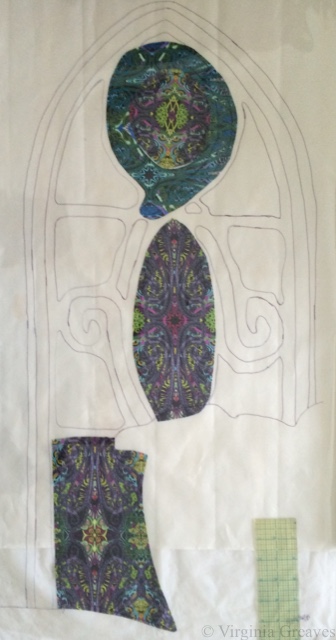
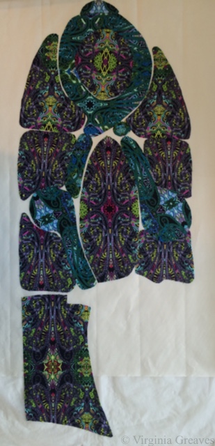
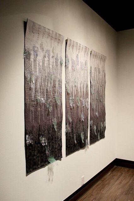
Leisa Rich & I decided to make one more piece for the Wash & Wax show exhibiting at Hammond Gallery at Jacksonville State University, thinking that the space was large enough to accommodate another piece. (By the way, we were wrong and ended up deleting a piece from the show for space limitations.) It’s a triptych in all grays — but with blue and green nail polish painted vinyl appliqués on the top. It’s much quieter from the other pieces but is striking on its own. I have a created a page for Dripped here.

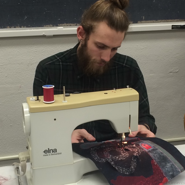
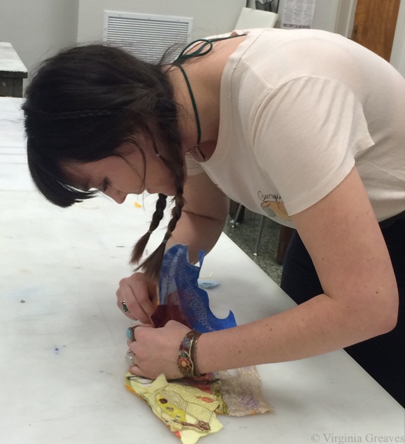
While we were in Jacksonville, we had a one-day workshop for the art students. They do not currently have a textile program, but it was mind-blowing to me what these young adults could do with fabric in such a short period of time.

This is one of the students next to Bryce Lafferty, one of the professors who also curated our exhibit. The student is learning on to draw using one of Leisa’s sewing machines, and Bryce is working on a hand-sewn 3-dimensional piece.

IMG_2318

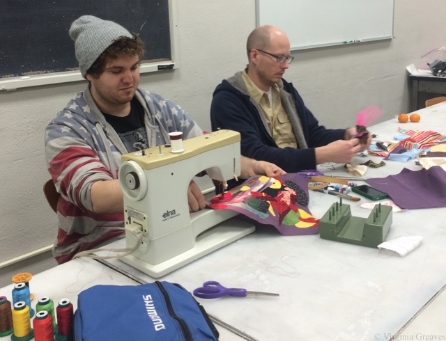
Another one of the students, perfectly comfortable using the sewing machine as he would a pencil.

IMG_2320

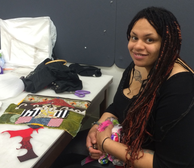
This is Brittany, who I predict is a future fabric stash-er in the making. I spent some time talking with Brittany. She’s incredibly talented. She’s graduating in May, and I hope that she finds the perfect place to grow in her artistic journey after graduation.

IMG_2321

This particular piece is 2-d but organically shaped.

IMG_2322

Hammond Gallery is newly renovated, and it’s a gorgeous gallery space. This is the entry with Entry Point above the guest book.

IMG_0278

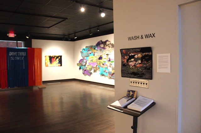
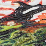
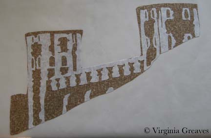
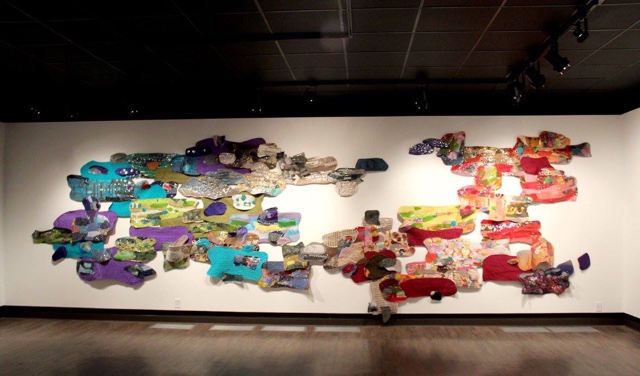
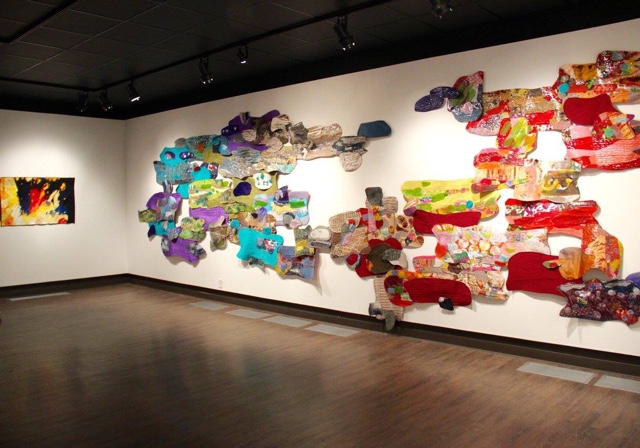
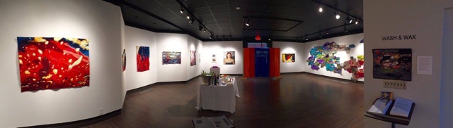
The large wall was reserved for Industrial Car Wash. It’s in a completely different composition than how it was presented at Abernathy. It has interchangeable pieces so it can fit different spaces. Given that the wall was a little smaller than the one we used at Abernathy, it is taller and reaches almost floor to ceiling.

IMG_0279

Next to it is Skitter.

IMG_0280

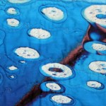
On the other adjoining wall are 6 of the photographs and 6 of the Micro Bubble Series. We actually had 8 of each but felt the wall was too crowded with 2 more rows.

IMG_0281

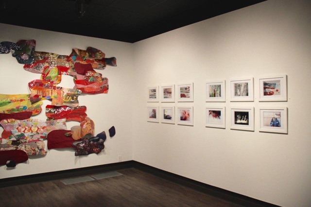
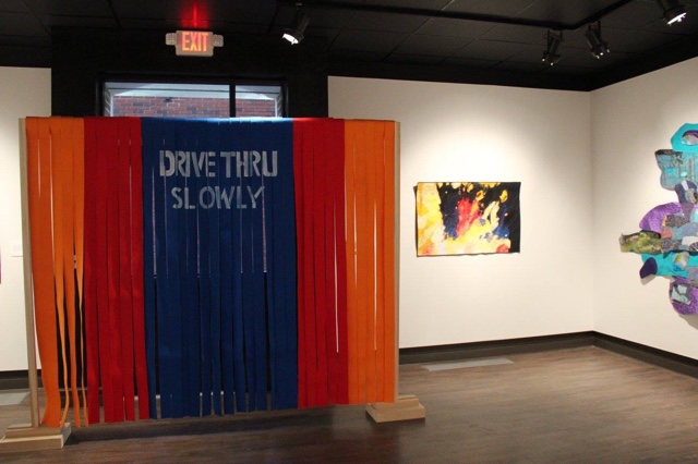
Next to Skitter and covering the back entrance is Drive Thru Slowly made from actual car wash strips.

IMG_0282

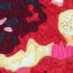
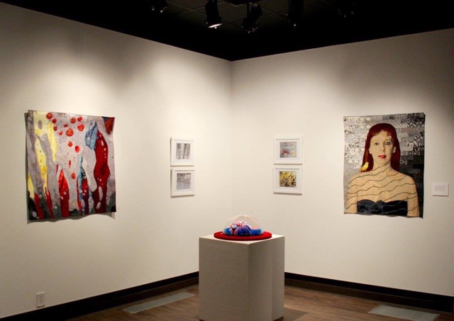
A far corner has Polish on the left, the 2 remaining photographs and 2 remaining Micro Bubbles, and then Leisa and I decided to bring individual pieces of our work for comparison to the collaborative work. Leisa brought Placid which we placed sculpturally on a pedestal (although it can also hang on the wall). I didn’t get a close-up picture of it, but you can find it on Leisa’s website here.

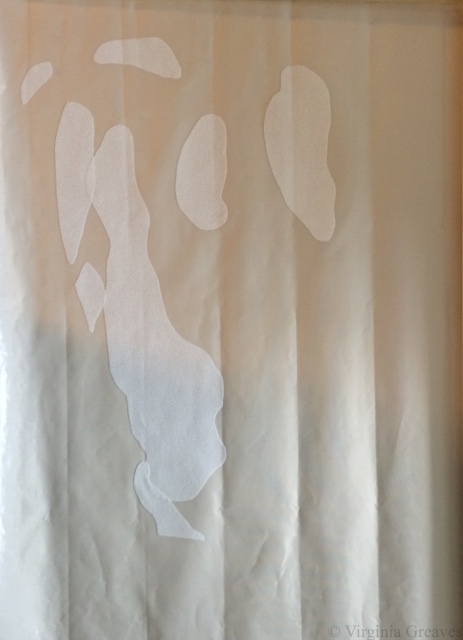
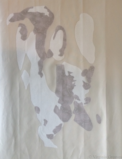
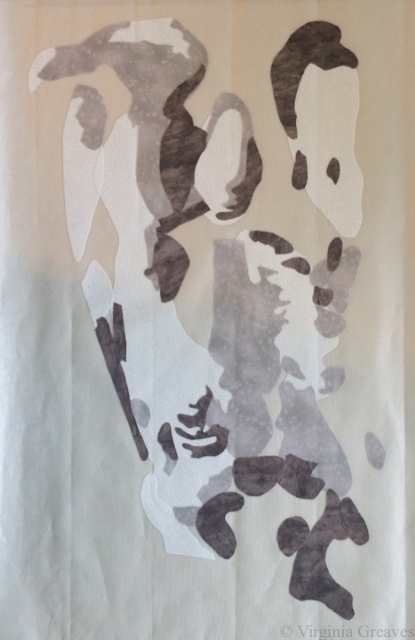
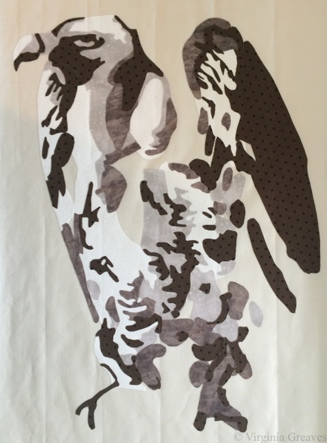
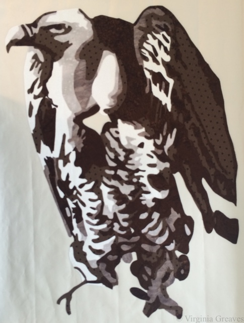
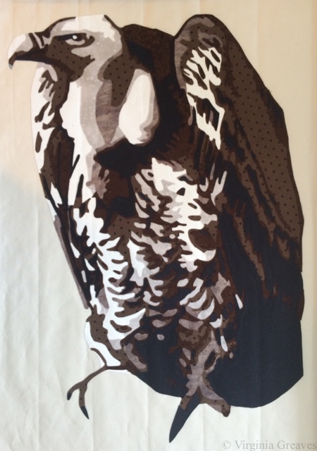
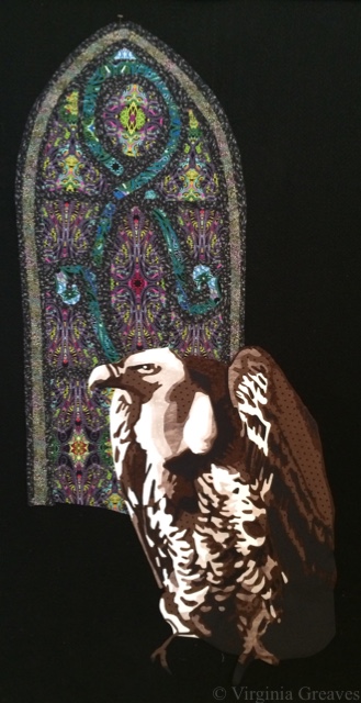
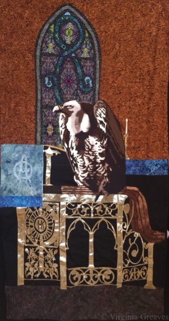
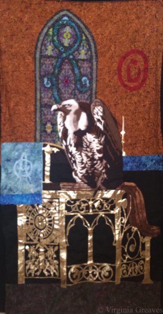
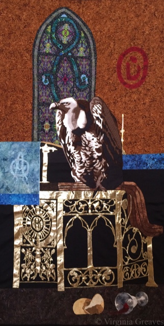
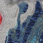
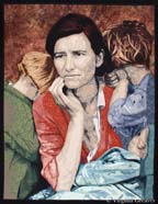
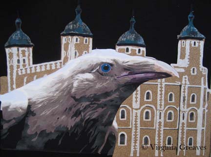
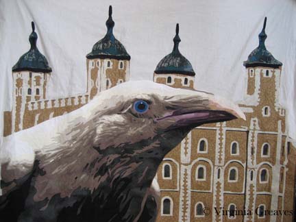
My piece is a self-portrait entitled The Canary. You can read more about it here.

IMG_0283

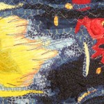
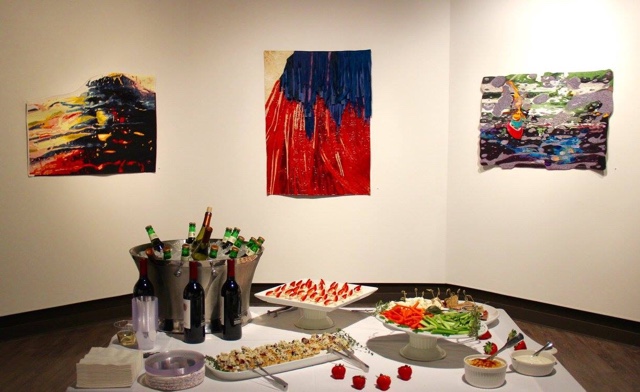
This is a pic taken during the reception. From the left, Blurred Vision, Agitated, and Bubble Bath.

IMG_0284

This is an awesomely cool panoramic shot of the gallery that Leisa took.

IMG_0285

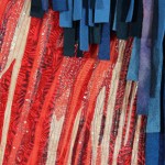
And this is a side view of Dripped. It was at the far end and couldn’t be stretched into the panoramic. You can see the blue and green nail polish accents a little better in this shot.

IMG_0287

The Canary
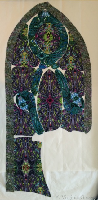
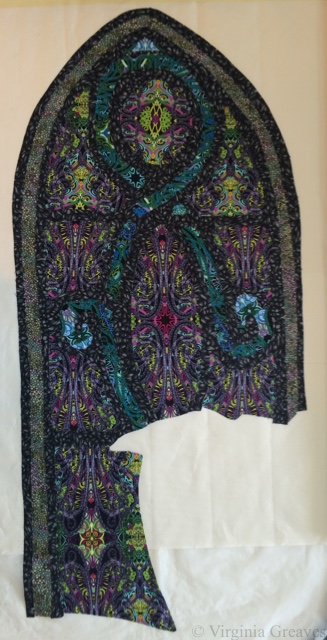
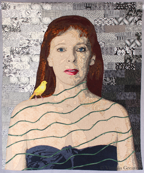
And as I mentioned before, the other piece that I hurriedly finished in time to be finished for the JSU show was my self-portrait, The Canary.

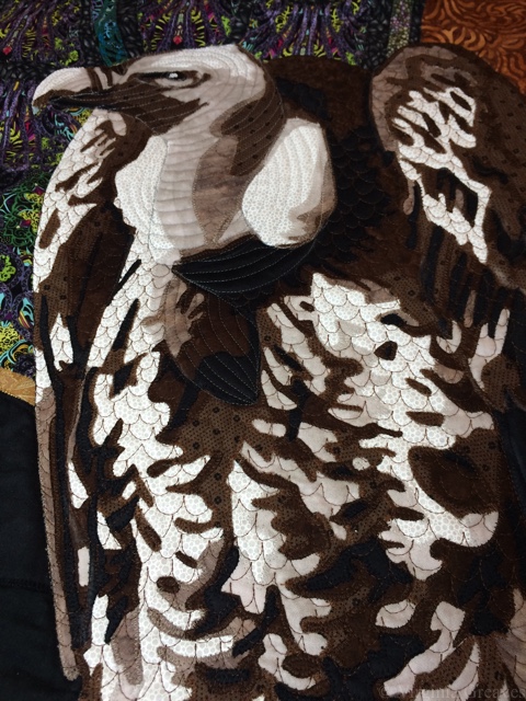
This one was really tough to photograph, and I’m not sure how well I succeeded. I was considering purchasing an external flash, but now I’m leaning towards using a local photographer that I’ve been introduced to that I think would do a better job of photographing my work. He essentially creates a white box — but a whole room like that, and then shoots through a pinhole. He also knows exactly the angles to set up the lights so that you’ll still see the texture of the surface of the work. I’ve photographed my own work enough to appreciate that the man really knows what he’s talking about.

But now here I am. I went from insanely busy finishing work for the opening at the JSU and preparing for the workshop — to nothing. I am in between. I think I’ll just enjoy it for a while.

The Last Supper

From Sting to Sing

2

Back in late July (I had to look this up — I can’t believe how long I’ve been working in this piece), I had an idea for a new piece. I had finished up most of the work for the Wash & Wax exhibit and wanted to get back to realism. A SAQA call for entry created a spark of imagination, and I was off and running on a large ambitious piece.

The central figure in this piece is a vulture. This is the vulture with the first value.

vulture1

The second value.

vulture2

The third value.

vulture3

The fourth value. The bird really starts to come alive here.

vulture4

The fifth value.

vulture5

And the sixth value — all those really dark nooks and crannies.

vulture6

But there’s a lot more to this piece than just the vulture. There’s also a stained glass window. I knew that if I had the right fabric, I could fussy cut sections to give me the stained glass effect. I scoured the local quilt shops, but they just didn’t have what I needed. I ended up finding some Paula Nadelstern prints online, however, that were perfect.

This is the beginning. The drawing is under the pressing sheet so you can see where I’m going with this.

glass1

I originally picked a print in teal, but at the last minute, I also bought it in another color way and ended up using them both. I used the teal for the swirls and the purple/green/red for the main windows.

glass2

I had a very small piece of fabric in my stash that was perfect for the outer border. I had less than a fat quarter, but I had just enough.

glass3

And then I added this black stained glass print for the leading (also a Paula Nadelstern print.)

glass4

I pinned it to my black design wall with the vulture to see how if they were working together.

glass & vulture

And then I kept going. I had a picture I had taken years ago of the brass lectionary podium in a church. I considered drafting out values and using flat cotton fabrics, but really, there’s a lot more choices in that fabric store beyond cottons. I found this metallic gold spandex nylon that has a black shadow to it. It’s stretchy, but what the heck. I figured the Wonder Under would help stabilize it.

I was still able to cut out some fairly complex shapes without it falling apart. This is a part of a screen section.

brass1

And this is part of the larger structure. I didn’t take many pictures of the lectionary as I worked on it. Suffice it to say that I had luckily cut out all of the complex parts before I broke my wrist — my right wrist.

brass2

That was on Labor Day. I was in the middle of curating a show at The Art Place and preparing for the opening of Wash & Wax. Thankfully, the only work I had left for the opening was to hand sew the binding of a 9 foot long piece. With a cast on my right arm, I would insert the needle with the right hand, and then pull it through & out with the left.

This shows the lectionary completed with a wooden railing at the top, the stained glass window, and other elements.

background without vulture

And here is the vulture in his place. I did, by the way, appliqué each piece on to the background as I went. I couldn’t risk the spandex stretching out of control on me, and it didn’t stick as well as I would have liked with the Wonder Under — but working one piece at a time, I worked through it like a large puzzle.

background with vulture

This pic is blurry (the sheen off that metallic fabric was confusing the camera in my iPhone), but it shows the addition of the Arabic symbol for Nazarene spray painted on the back wall.

background with Nazarene

And then of course I had to add the spilled wine and broken bread at the bottom — symbolizing the broken blood and body of Christ — which also symbolizes the broken body and blood of Christians being murdered in the Middle East.

background with wine & bread

And even though I was in a lot of pain, I just kept going. Entries were due October 31, and I had spent too much time on this piece to miss the deadline.

I really worried about quilting this large piece. I still had my cast on, and I knew it would be heavy. I debated renting time on a long arm at the local quilt shop, but I finally realized that that was a new skill for me, and I really didn’t want this to be a practice piece for quilting.

So I moved all of my tables in my studio. In front of my machine, I have a board (which sits on my ironing board), and I put one table on the other side of that. Then I crammed another one just to the left of my chair. (I briefly envisioned creating a sewing table built like a doughnut.)

In the end, it worked. It supported the quilt perfectly, and I was able to quilt this in a week.

In this pic, you can see how the quilting outlines the vulture’s neck and defines his feathers better.

quilted vulture

At about this time, I got my cast off, only to learn that I had lost 50% range of motion in my wrist. But I just kept going. I managed to add the facing and the sleeve to the back. And then I photographed it myself. I bought some more lights since the piece is so large (once again wishing I had a Speedlite flash), but after spending a couple of days on it (and wishing I had someone I could just take it to), I finally got some good, sharp pics for entry.

I entered it a week before the deadline. I was so proud of myself. I loved how the piece turned out, and I felt confident that it would be a great contender for inclusion in the show. You can see the full piece on its page The Last Supper.

The Last Supper

I was wrong. My rejection email came this morning. However, I’m still very proud of this piece, and I was pushed to develop a complex story for my subject. I wouldn’t change a thing.

So I take the sting of rejection, and I move on. I will enter it somewhere else, and it will have a life. It didn’t fit in that show, but it will fit somewhere else. I just have to figure out where next is.

Show Prep

0

So we are closing in on opening for the Wash & Wax exhibit at Abernathy in September, the collaboration I’ve been creating Leisa Rich for over a year. My, how time flies. There are so many last minute details to take care. I still have to add labels to all the pieces — and I have figure out how to put a sleeve on a piece that’s 9 feet long.

I spent a great deal of time yesterday photographing work. I’m realizing that Leisa is a lot more particular about photography since she’s had experience working with a professional photographer. I see now that I don’t have enough even lighting, although I’ve gotten a lot better at taking a really sharp pic. Eventually, we’ll have them professionally photographed, but for now it’s me.

And now that we’re about a month out from opening, it’s time to start showing some details of what we’ve been doing. We have named all of the pieces, and I’ve upgraded their pages with detail shots. Closer to the opening, I’ll share full shots with pricing.

Wash & Wax: Entry Point

Wash & Wax: Entry Point


Wash & Wax: Blurred Vision

Wash & Wax: Blurred Vision


Wash & Wax: Skitter

Wash & Wax: Skitter


Wash & Wax: Bubble Bath

Wash & Wax: Bubble Bath


Wash & Wax: Agitated

Wash & Wax: Agitated


Wash & Wax: Sparkle and Shine

Wash & Wax: Sparkle and Shine


Wash & Wax: Polish

Wash & Wax: Polish


Wash & Wax: Emerging Viewpoint

Wash & Wax: Emerging Viewpoint

I don’t have pics yet of the small pieces that we’ve done. They’re 10″x8″ and framed under glass — known as The Micro Bubble Series. Also, the 25 foot by 7 foot piece that we’ve named Industrial Car Wash will have to be photographed in the gallery. (It only fits in my studio in a stack.) And there’s one last piece made with actual car wash strips, Drive Through Slowly. Oh yes — and there will also be some 10″x8″ framed photographs of Leisa’s inspirations.

I have written an article about the collaboration that will be coming out in the next SAQA Journal, and ArtsATL will have an interview with us published closer to the time of the show.

The show at Abernathy Arts Center will open September 18 and will run through October 16. The opening reception is Sept. 18th 6:30-8:30.

Then we will have a few pieces hang in Signature Gallery in Atlanta in January, and the entire show will be exhibited again at Hammond Gallery at Jacksonville State University for the month of February.

Creativity in Motion

0

Today I finally took pics of Worn (and finally decided on a title). It is so much easier to take pics when you have the right equipment and use a level. I no longer rely on my design board that leans against the wall — it was creating a keystone effect that I was having to counteract in Photoshop. I now use a photography support stand so the piece hangs from a bar and there is no distortion. I have also made friends with my level. I level the bar on the photography stand — and now also on my camera. I’ve always wondered by my pics lean to one side — and now I use the level to adjust the camera tripod until it’s level. I just ordered a level for the camera shoe which should make it even easier. You would think that if you opened the stand completely in all directions and the bubble level on the stand was level that you would be fine — and that’s just not true. So having leveled my stand and my camera on my tripod, I came out with perfect pics the first time. The only thing I did in Photoshop was crop — and for the website, I adjusted the size and added watermarks (so if they migrate to Pinterest it might generate some traffic back to my site).

Worn I also drew up a new Page for Worn. There are a few recent changes in WordPress 3.9 that are making the pics act strange but I just worked around it. Overall I think the page looks fine.

I was worried when I finished this piece that I wouldn’t know what to do next — what my next piece should be. I spent a day this week looking at exhibits to enter this year and trying to decide how I wanted that to influence me. In the end, I decided that I wanted to think with my hands. I started working on a small piece for a very specific themed juried exhibit — but it isn’t large and will give me time to think about my next large project.

Tonight have the opening reception for the Georgia Artists show at the Abernathy Arts Center in Sandy Springs, GA. If you’re in the ATL, it’s 6:30-8:30pm. I will take pics and share them soon.

studio

Wordless Wednesday

0

studio

fabric paint

Make It Work

0

Last week, I finished the cardinal and put it in water to soak.

I had a thoughtless moment where I put synthrapol in the washing machine while the bin was filling with water. I thought to myself — that’s a mistake — I should empty the tub and start over. But then I thought — it’s so small — it shouldn’t matter.

If I had been really thinking, I would have reminded myself that red is bad to bleed — but I wasn’t thinking so I threw the piece in the water with a Color Catcher on top (I wasn’t totally brainless).

But of course, as you can see, the reds bled onto the background. This is what it looked liked after spraying it with Shout and washing it with OxyClean in cold and hot water — many times. I couldn’t get out any more of the red from the background. (I was able, thankfully, to shrink it a little. It was just over 12″ square — and for the exhibit I made it, it needed to be 12″ square — which now it is.)

cardinal before paint


I have had this happen before — with Beach Guardians. Thankfully, the background wasn’t printed so painting it with fabric paint should work. At this point, it was my only option left.

But I put it off — and worried — and procrastinated. No one wants to ruin something in the final stage with paint. I had spent almost two weeks on this piece — and I wasn’t looking forward to that going down the tubes if it didn’t work.

I took my fabric paint and mixed it on my palette — and got really close to where I needed to be.

fabric paint


I thinned it with water and blended it into the background.

cardinal after paint

I think it works.

I compared it to my picture of the piece from last week before I put on the binding — and the background looks less green. That is really only a difference in lighting. It’s almost scary how big the color shift is. This time, I used a side light — and last week I didn’t — but I couldn’t go back & re-take the pic with the bleeding — so I just kept it like this so you could compare apples to apples.

You may have noticed that I used a binding that matches the background. I almost always use black for binding — but as I said — I was trying to make this piece a specific size — and my cardinal just barely fit in the space. The best way to give him some breathing space was to use a binding in the same color as the background. If I had used black, he would have looked squeezed on there.

Did I mention I don’t like making something to a specific size requirement?


Worry Completed

0

This week I was intent on finishing my latest piece Worry. I quilted the background and then applied the binding. The hand work is getting harder for me to do. I’m a fairly thin skinned person and piercing my fingers with an extremely sharp needle seem masochistic at best — and my eyes are beginning to struggle to see the tiny stitches. I have only machine applied one binding but I may revisit that on my next piece.

You may have noticed that I missed Wordless Wednesday. That’s because I didn’t think about it until Thursday — and at that point, I felt like it was just too late.

WorryYesterday I finished sewing on the sleeve and blocking it — and today it was dry enough for me to take pictures. I took some for the website — but I’ve about decided it’s time I buy a photographic background stand. I have two design walls made from creosote that have black flannel taped to them which I have used for both blocking and a photography background. I started using them for blocking after I moved here when I discovered that you can’t pin into looped carpet — but sadly, blocking it warps the creosote — which wreaks havoc on the photographs if you’re using the same surface as a back drop. I have learned all the tricks in Photoshop Elements to straighten a pic. Once I realized that water was warping it, I kept one for blocking and the other for photography. Sadly, the one I kept for photography has still warped.

So I intend to order a photography stand this week and re-photograph the pieces I’ve done this year. I probably won’t re-do the images on the website — but I’ll have the proper pics for exhibition entries and publication opportunities.

Tweek!

0

twitter.jpgAnother week has gone by — January is disappearing fast. I am hoping to finish my current piece by the end of the month — but I have a lot of personal roadblocks in the coming week — so that may just not be possible. I have finished all of the appliqué and I’m getting ready to start quilting it. Wish me luck.

I shared a lot of fun articles this week — and this is my weekly summary. Remember if you want to follow my posts directly on Twitter — I am @vsgreaves — or click the Twitter icon in the upper right above the menu. You’ll also notice the Facebook icon there next to it — that will take you to my Facebook Page.

This is Kathleen Loomis’s review of the book Thinking Through Craft by Glenn Adamson — sobering view of the art world — but I’ve definitely put this book on my reading list:
“Clawing your way out — or in” of the “art world” http://artwithaneedle.blogspot.com/2014/01/clawing-your-way-out-or-in.html 

I’ve become a big believer in tracking your progress — even if you’re a studio artist and you’re only accountable to yourself:
““The Ostrich Problem” and The Danger of Not Tracking Your Progress” http://feedproxy.google.com/~r/The99Percent/~3/hy5rJbiMTIE/the-ostrich-problem-and-the-danger-of-not-tracking-your-progress 

I’m always interested in marketing my work and finding new information that will help:
How Artists Can Make Art That Will Sell – Artpromotivate http://buff.ly/1i8N5DV via @ArtProMotivate

Lisa Call is textile artist that I started following a couple of years ago because she’s so successful at making a lot of work and selling it — so when she talks, I listen:
“To make it happen, I write it down” @lisacall http://tinyurl.com/nssckaj 

Since I photograph my own work, I’m always interested in fine tuning my textile photography skills:
How to photograph textile art http://tinyurl.com/kdrjw6n 

I liked this article — it talked about getting your brain into the flow and why critiquing can be harmful to that:
“Work First, Critique Second” getting into the creative flow http://feedproxy.google.com/~r/The99Percent/~3/FK_gfyT5D7I/work-first-critique-second 

I share all of my in process work on my blog — which is ironic because I’m highly protective of sharing the work out of my studio. When someone comes to the house, I typically cover it up so it won’t be seen — because, as the previous article mentioned, criticism can be harmful to flow. There are only a couple of people that I’ll discuss in process work with — but I suppose my blog hasn’t contradicted that rule because I don’t typically receive a lot of comments. This article argues that sharing work with the masses can be harmful to the creative cycle and that special support groups are what is needed.
“In Praise of the Creative Support Group” http://feedproxy.google.com/~r/The99Percent/~3/CjJUNjy1SHk/in-praise-of-the-creative-support-group 

This article is written from the perspective of a photographer but still has an important lesson — if you’re given lemons, make lemonade:
“Use Optimism to Avoid “Work Paralysis”” http://feedproxy.google.com/~r/The99Percent/~3/L1X6FzTnjao/use-optimism-to-avoid-work-paralysis 

I found this discussion of ivory an interesting one. Ivory is typically used as a carving medium for sculpture — but its harvesting also typically results in the death of elephants and the subsequent elimination of free roaming elephants. The question becomes — does a piece of sculpture that is made of ivory constitute art — or is it only a sign of the slaughter of wild elephants — and should we grind down all ivory whether it is carved or not to dissuade poachers from continuing to slaughter elephants?
“To Stop the Illegal Ivory Trade, You Have to Stop the Art” http://hyperallergic.com/103288/to-stop-the-illegal-ivory-trade-you-have-to-stop-the-art/ 

Tweek!

0

twitter.jpg

This is my weekly Twitter update. It’s been a rough week but I had a lot of time for reading.

If you want to follow my Twitter posts directly, I’m @vsgreaves — or click the Twitter icon in the upper right just above the menu.

This is a very fun video to watch. Brene’ Brown is hugely entertaining — and she gets creatives & what we have to do to produce our work. It’s 22 minutes long, but it’s worth the investment of your time:
Brene’ Brown does an amazing speech on “the sweaty creatives”: 22 minutes that all creatives should invest in: http://tinyurl.com/mwbx8qy 

Don’t we all need guidance about how to price our artwork correctly:
A Guide to Pricing Your Artwork – http://buff.ly/19adxuE via @ArtsyShark

I have both an undergraduate & graduate degree in business and I’ve always wondered what you do if you’re starting with nothing. This article tries to answer that:
“The Secret of the Chicken and the Egg” : what to do if you’re starting with nothing http://feedly.com/k/IBfeHv 

This is an video interview with a brilliant mathematician about how he approaches impossibility (he died a few days after the interview):
“How to Tackle Impossible Problems” interview with the creator of fractals Benoit Mandlebrot http://feedly.com/k/1ceBKgr 

To find that our support of the arts in the US is dwarfed by our support of football is unsettling at best:
“Where’s the Money? US Arts and Culture Economy By the Numbers” does our culture in the US support the arts? http://hyperallergic.com/97423/wheres-the-money-us-arts-and-culture-economy-by-the-numbers/ 

Let’s face it — as artists, we are our own worst critics — and it’s good to hear that we’re in good company:
“Bruce Springsteen, Woody Allen, and the Long Tradition of Hating Your Own Work” http://feedproxy.google.com/~r/The99Percent/~3/uU23FDGkqcg/bruce-springsteen-woody-allen-and-the-long-tradition-of-hating-your-own-work 

This is not art related at all but I found it fascinating because it explained a hole in history that I rarely see discussed — the decisions of the British & French & how they shaped the current state of the Middle East:
How the Middle East was shaped after the Ottoman Empire “The map that caused a century of trouble” http://zite.to/1dyunCQ 

This is a photography article but its discussion of using the Golden Mean for composition is applicable to all visual art:
“Beyond Basic Composition: Line, Shape and Form in Photography” http://zite.to/191Of4a 

Again, not an art article but a scientist interview about how having widespread technology without widespread understanding of how it works will lead to a controlled society:
“A Science Icon Died 17 Years Ago. In His Last Interview, He Made A Warning That Gives Me Goosebumps.” http://zite.to/19Hnnk7 

“British Library uploads one million public domain images to the net for remix and reuse” http://zite.to/1kGOVLU 

Applique and the Stabilizer Snob

0

I’ve never really addressed applique on my blog. I’ve stated that I do it — I may have even specified that I use a tight zip-zag — but I’ve never really talked about it or why — which seems a great omission given how often I’m asked about it from other quilters.

Some people fuse and then go directly to quilting. I’ve considered this, especially recently. Applique is tedious and is probably the least creative process I do. However, it gives a very neat finish. Raw edge applique without it can get rather messy over time, and I like the completeness that I get with a secured edge. I’ve used a blanket stitch and a satin stitch, but I prefer a tight zigzag — 1.0 mm length & 2.0 mm width (although I vary the width in tight spaces).

Why use stabilizer? I had someone ask me that recently. Years ago, I started using stabilizer and haven’t really questioned why in a long time. The answer is that it gives a professional finish. Yes, there are many layers of fabric which can stabilize the stitch, but in some areas, only two fabrics of cotton are too flimsy. The stitch will look much better if you use a stabilizer.

For years, I’ve been using tearaway stabilizer from embroidery shops. I had one that was soluble for a while but paper-y like a tearway that I really l liked but eventually couldn’t find anymore. When I was making the raven, I used the scraps of all of my old stabilizer. They were all good — except one. We’ll get to that in a minute.

This, by the way, is the beak on my raven as I showed it in my last post. It wasn’t right.

1st Beak

This picture, although taken when my studio was growing dark for the evening, shows how I changed the colors a little.

2nd Beak

The raven shows up a little better on my design wall. Whenever I lay something on my design wall, I’m tempted to just lay it on black fabric and call it a day. BUT, my intention in making this piece is part of a story — and I had plans to work on the Tower of London.

Final Raven

I drew a stylized version of the towers and hoped that my fabric choices would get me where I wanted to go. I had no idea if it would work — but I took a leap of faith. This shows the two right towers with the brown decorated with the white architectural details. It was almost like frosting a cake. I was careful to use a white print that wouldn’t show the brown behind it. I would usually put the lighter value down first to avoid shadowing, but this design was more structurally sound to have the full brown background with the white fabric carefully cut and laid on top.

Right Tower 1

Then I added the black details.

Right Tower 2

And finally the rusted copper turrets.

Right Tower 3

The left towers were constructed in the same way.

Left Tower 1

With the darker details and turrets added, they make more sense.

Left Tower 2

I put the towers on my design wall — and you can clearly see where the raven will sit. I posted this image to my FB Page and was surprised to find EVERYONE wanted me to finish the piece just like this. It does have a fascinating quality to it — but it isn’t the direction that I was working on. I will certainly consider it for another piece.

Completed Towers

This shows the raven sitting on the design wall with the towers. Again, the black background makes everything look good.

Towers with Raven

This next photo shows the raven and towers once they were appliqued to muslin. Keep in mind that I had run out of my stash of stabilizer. The fabric stores only carried Pellon, and unwilling to take the time to traipse over to an embroidery store, I decided to try it. I use Pellon’s Wonder-Under all the time — how bad could their stabilizer be?

It was AWFUL. It is much thicker than any other stabilizer I’ve ever had, and it often interfered with my ability to move the fabric nimbly under the needle and get the thread where I intended it to go. It is my hope to never have to use it again. So there — I suppose I’m a stabilizer snob.

Applique Before Sky

Certain in the belief that I had nothing in my stash that would do for the sky, I went to the fabric store and picked out a beautiful blue-gray — only to bring it home and find, in the bright natural light of my studio, that the fluorescents of the store had deceived me. The color was more powdery blue than what I wanted. So I searched my stash and found this funky batik. I love its contribution to the story of the piece. It’s a strange choice, but I’m happy with it. This is what the piece now looks like, fully appliqued and ready to be pinned for quilting.

Before Quilting

Next week is Spring Break. I may not be able to begin quilting for a while, but I hope to at least get it pinned tomorrow.

One last thing — Martha Sielman has written a second book in her Art Quilt Portfolio series — People & Portraits. My piece, Celtic Woman, is on page 32. I feel privileged to be included — although I’m not overly happy with the photograph. I’ve always prided myself in taking my own pictures — but I’m missing something in terms of color. The printed picture is not anywhere near as good as what I see on my monitor. I need to start using a white balance card when photographing and re-calibrate my monitor.

I received my complimentary copy a couple of weeks ago. Beyond the thrill of having one of my pieces in publication, it’s a nice compilation of work. Several of my FB friends are included and it’s been fun to read more about their work.

Go to Top