Posts tagged textile photography

The White Raven

1

After finishing Firecracker, I did not have another project in mind. I spent a few days doing administrative things — donating my time to do some volunteer work — but then it was time for the rubber to hit the road. If inspiration doesn’t come, you still have to keep creating. So I went looking.

I have had a fascination for years with ravens. I have a newspaper clipping that is probably eight years old on my design wall about the ravens kept at the Tower of London. Legend tells us that if the ravens were to leave the Tower, the Tower and thus the Kingdom of Great Britain would be lost. Charles II declared that at least six be held captive there for the rest of time. Their wings are clipped and they are cared for by a Yeoman Warder.

All of those ravens are common — or black — but there are rare instances of white ravens in British Columbia, Canada. These are not albino ravens with red eyes but rather white ravens with blue eyes.

Which leads me to the inevitable question — what if a white raven were to inhabit the Tower?

There is a wonderful photographer at Qualicum which the white ravens call home — Mike Yip. He very graciously gave me permission to use one of his photographs as inspiration for this piece.

This is the first value — pure white. I started this piece in the late afternoon and the failing light gave me a yellow cast on my design surface.

value1

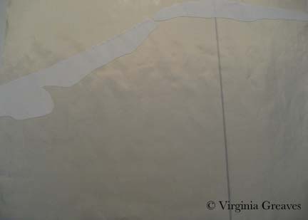
The second value is almost harder to see as it has a yellow cast to it.

value2

The third value is a little easier to see.

value3

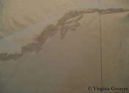
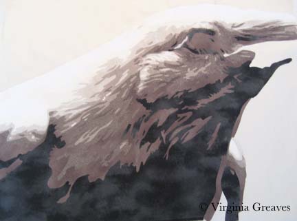
The next day, of course, the light in my studio was better for photography. This is the fourth value and you can really start to see the bird emerge. It is strange to think that a white bird is more than white — but even the majority of the colors in the clouds in the sky are not white. White always has a supporting cast of characters.

value4

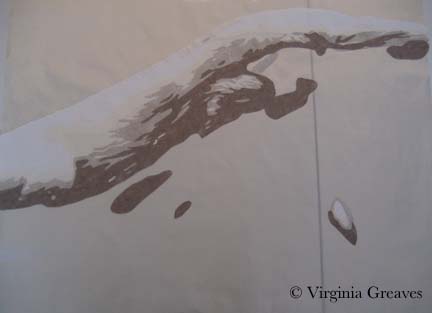
This is the fifth value.

value5

And this is the sixth. I had to go outside my stash to find the fabrics for this piece and I had counted on 7 values — but I miscalculated — there are 8. So I took my range of fabrics, tried to figure out where I felt like there was a large enough value jump between two fabrics, and went to my fabric drawer to try to fill it. I was very lucky — I had the perfect fabric that snuggled in perfectly to what I had already set up — and that is the fabric here.

value6

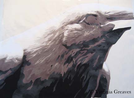
The seventh value goes into gray.

value7

And the eighth and final value is the black.

value8

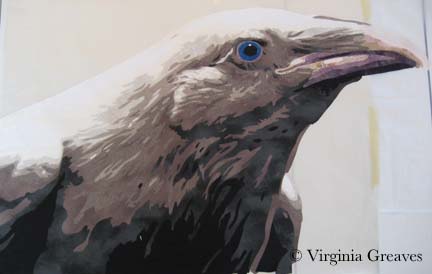
Then I worked on her eye. I had the perfect blue in my stash. It is actually a little lighter than the blue in the photograph but I think it works well. I’m surprised at how visual I’ve become. I envisioned the exact blue that I wanted and then went to pull it from the drawer.

eye

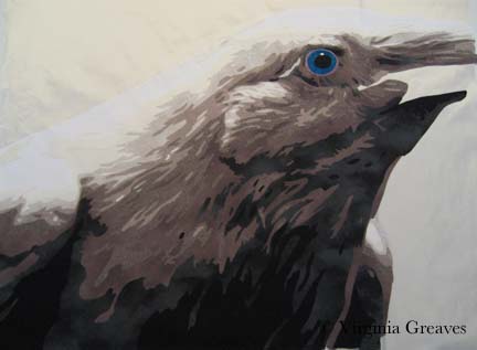
The beak was tricky. It has a different texture to the feathers and I knew that to make it stand out visually from what I had done previously, I needed to use different fabrics. I liked the range of pink for the top of the beak, but they didn’t work as well for the bottom.

beak1

In the photograph, the plum around her eye is repeated in the lower section of the beak — so I tried a range of plums for the lower beak. This is closer to where I want to be. There is always something in a piece that isn’t clear cut.

beak2

You’ll notice that I had to tape my smaller pressing sheet to my newer one. I never thought I would go beyond the dimensions of my ultra large pressing sheet — but it didn’t take me long to press the boundaries.

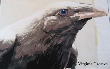
I don’t know if I’ll keep the beak the way it is, but I’ve set it aside on my design wall for now. I’m working on the Tower pieces. Once again, I loved the way she looked so much on the black, I considering giving her a plain background — but then she also looks good on the primary Tower fabric that I chose, so I’m going to experiment with that and see where it takes me.


Finishing Firecracker

2

Firecracker smI finished the Yorkie piece on the last day of February — which is great so now I can put February on the label. I know it seems silly but it validates that I worked really hard in February. I had it blocked and drying by the end of the day but didn’t attempt to photograph it until today. It took me a while to get it just right. I even used white as a background so I could align the edges just so. I think I’ve been using a black background as a crutch. Using the white makes it much easier to see whether everything is lined up correctly before I go open the file on the computer. It’s best to go ahead & do it right the first time than have to re-photograph it later for an exhibit application. I know I can always fix camera distortion in Photoshop, but most shows won’t let you make those kinds of digital corrections.

I decided to call this piece Firecracker. This Yorkie has such an explosive personality, it seemed only fitting. Her page can be found here. And in case anyone wants to know — yes it really is an applique piece. This is NOT a photograph — this is NOT an inkjet printed piece. It was insanely difficult but I feel like I’ve solved a difficult puzzle.

Enter the Angel

1

Back in December, I created a small 5″x7″ piece called The Dark Angel. As I’ve mentioned before, I loved it so much that I decided to use that as a study and create a larger piece based on that image. This is how I came to create The Bowl Judgments.

I do not usually add a border to my pieces but in this instance, I decided that a border could add another dimension to the piece. Just as the middle portion is about the luminosity of the colors on the black, I wanted the border to be the inverse. Using black fabric and a light purple thread, I created a subtle sweep of quilting lines.

I did, by the way, attempt the McTavish quilting technique on the borders. I probably got better as I went along. I suppose that the variance in the the quilting will just have to be chalked up to artistic variance.

I must admit that photographing his piece has been very difficult. My camera has not been happy and I have taken many pictures in an effort to create an image that accurately portrays how the piece looks.

At first, my camera locked up completely. As far as I can tell, it couldn’t tell where the image was — even in a room with special spotlights pointed at it. At some point, late in the day, it finally gave me something.

The BowlJudgments black

But really, this picture makes the border look almost like printed fabric. The quilting lines are more subtle and the image in the middle is not that washed out.

I finally realized that the camera would be happier if I used a white background. I thankfully had a large piece of white felt in my closet that I hung on my black design wall. From there, I set the autofocus point on the black border — and I think that this comes closest to the actual piece.

The Bowl Judgments

It always surprises me when the camera doesn’t just take a picture of what my eye can see. Our eyes are so much more complex than we give them credit for.

I so loved working on this angel that I would like to do another one — but I’ll have to plan some trips for pictures. Right now I’m researching another portrait to do but haven’t settled on an idea yet.

2013 Goals

1

Snowflake

Now that the new year has begun, it is time to start looking forward. This year, I’m planning more than I have in the past. Maybe by sharing goals on my blog, I’ll feel more accountable.

I went back and forth on some of these. The truth of the matter is that as much as I would like gallery representation, I know from my mom, a very talented impressionist painter, that the galleries in Atlanta typically demand 20 of your newest pieces with a regular rotation. My current mode of working requires a month or two to complete one piece. Last year, I completed only six pieces. So it comes down to the desire to enter exhibitions versus gallery representation (even if I could produce enough work to satisfy the inventory demands of a gallery). I could put both on my goals list, but I know that realistically, only one will work. I chose exhibitions.

Reverse Round Back

I am, however, considering starting a different series of smaller pieces that I could complete more quickly and that I could then list on some online galleries. I’m going to experiment with that. You’ll notice I put it at the bottom of the list with asterisks as caveats. I’m uncertain about these goals for several reasons — we’ll see how it goes.

I’m also planning to start writing more on my Facebook Page and my blog — and I’ll be visiting my local galleries, getting to know them, and then I’ll share all of that local flavor with you. There are a LOT more galleries than I thought in my town — but I think that it’s important to get to know your local art scene as intimately as possible. I’ve been cooped up in my studio a bit too much. Time to get out and shake things up a bit. EVENTUALLY I hope to add some galleries in downtown Atlanta — but for now, I’m starting small.

  • Have at least 2 years of my blog printed into hardback books (plan to use Blog2Print.com).
  • Design & print new business cards.
  • Take a photography class (probably lynda.com).
  • Develop a workshop on Choosing Fabrics Creatively.
  • Finish a piece to enter Sacred Threads 2013.
  • Develop new method for designing quilt labels on the Apple platform so that I can finally pitch my PC.
  • Complete the first draft of a book about Textile Portraits.
  • Join Southeast Fiber Arts Alliance.
  • Increase blog posts to once a week.
  • Create at least six portraits.
  • Create an Art Contact email and snail mail list.
  • Double the number of Facebook Page fans.
  • Enter at least 6 different exhibitions.
  • Update Facebook banner with newer work.
  • Post to Facebook Page 3x per week.
  • Visit at least 12 art galleries in Roswell and write a review of at least one exhibition per gallery.
  • Increase web traffic 20% from last year.
  • Make spreadsheet with goals and dates to monitor progress.
  • *** Make two small pieces per month.
  • *** List small work on artfire.com or artfulhome.com.

2012 Accomplishments

0

One of my art friends on Facebook, Kimberly Baxter Packwood, asked yesterday what was our top accomplishment for the year. Lisa Call and Dale Anne Potter chimed in — and I began to realize that making a list of what I accomplished in 2012 was definitely something I needed to do. My first list was less than twenty, but after reading Lisa’s list (she lists 100 every year), I realized I wasn’t giving myself enough credit. So I’ve been working on it.

At first I also had a list of disappointments, but I decided that those were actually risks that I took that should be counted as accomplishments. Without risk, we’d never travel anywhere new.

Lincoln

Lincoln

– Accepted into Fulton County Artist’s Registry in Atlanta, GA.

– Accepted into the La Conner Quilt Festival in La Conner, WA (Bukonyan Elder).

– Won 1st place at the La Conner Quilt Festival (Bukonyan Elder).

– Accepted into the Georgia Artists Show at the Abernathy Arts Center in Sandy Springs, GA (Amelia EarhartBeach Guardians).

– Won 3rd place at the Georgia Artists Show (Amelia Earhart).

– Accepted into International Quilt Festival/Houston: World of Beauty in Houston, TX (Beach GuardiansA Walk In Twilight).

– Included in the invitational show International Quilt Festival/Houston: Pets in Houston, TX (Unconditional).

– Included in a IQF exhibit review by Sophie Rubin on Youtube (Unconditional).

– Accepted into the book Art Quilt Portfolio: People & Portraits being published by Lark Crafts in April 2013 (Celtic Woman).

– Included in the invitational show Fiber Art Fusion: Artifact at The Art Place in Marietta, GA (Arminta PattersonThe Ties That Bind Us).

– Spoke about my work at the Gwinnett Quilter’s Guild & taught my workshop on Pet Portraits.

– Gave a seminar on Textile Photography at Fiber Art Fusion in Marietta, GA.

Laura Margaret

Laura Margaret

– Created five portrait pieces, two of them with two figures.

– Made a portrait almost exclusively with ties from my stash and local thrift stores (The Ties That Bind Us).

– Updated my website for each of my new pieces.

– Reconstructed and updated my art resume.

– Updated my LinkedIn resume, adding my exhibition achievements.

– Wrote 22 blog posts (23 with this one) — averaging almost twice a month.

– Submitted work to Art Book Archive: Atlanta for inclusion (haven’t heard on e-book publication yet).

– Created a Page on Facebook for my art & syndicated my blog posts to it.

The Ties That Bind Us

The Ties That Bind Us

– Lost 11 pounds and dropped two clothes sizes.

– Developed a way to create figures in large sections so that I could construct them in manageable pieces on a temporary surface and then build a more complicated piece on the background.

– Went zip-lining in Honduras.

– Went cave tubing in Belize (after hiking over river rocks and breaking my toe).

– Went snuba diving in Mexico.

– Took thousands of sports photos and learned to share them through DropBox.

– Photographed the Fiber Art Fusion Artifact annual exhibit and holiday exchange.

– Indoor trained a new puppy.

A Walk in Twilight

A Walk In Twilight

– Converted hundreds of printed family pics to digital.

– Finally found the names of my paternal grandfather’s parents and was then able to take that part of my tree back to 466 AD with the birth of King Clovis I.

– Served as a Unit Leader and Troop Treasurer for my daughter’s American Heritage Girls troop.

– Created a 5”x7” piece for the Fiber Art Fusion holiday exchange that I’m using as a model for a larger piece.

– Visited Mary Jo’s Cloth Store in Gastonia, NC.

– Learned about head concussions and other soccer injuries from my daughter.

– Spent a week in Ponte Vedra, FL for Spring Break taking lots of beach pictures and exploring Saint Augustine.

– Helped Rebecca Reasons-Edwards curate Fiber Art Fusion: Artifact exhibit.

– Played roles of volleyball mom, lacrosse mom, soccer mom, and choir mom.

Beach Guardians

Beach Guardians

– Saw MacBeth downtown at Shakespeare’s Tavern.

– Applied for a part time job at local children’s hospital (not accepted).

– Applied for entry into Quilts=Art=Quilts for the first time (not juried in).

– As of 12/30/12, there were 12,680 views on my website for the year — which was down 23% from 2011. This was caused by a bubble in 2011 from a mention of my blog in Quilter’s Home Magazine, but although views dropped between 2011 and 2012, views increased 154% from 2010 to 2012 so I was able to keep a lot of my traffic after this unexpected marketing windfall.

– Created a Facebook banner highlighting my work.

– Learned how to make resin jewelry.

At this point, only half of the work is done. I’m still working on my goals and will share that in another post.

Finishing the Little Details

2

I finished my latest piece, Celtic Woman, on Friday, just in time for the end of the month. I had it blocked and drying over the weekend — and thought I could take a quick picture of it today and be done with it and on to the next project.

I took a couple of rounds of pictures, and none of them were right. They were all a little blurry in the middle. I finally decided that the high contrast was causing a problem with the camera. I had a similar problem a few years ago with a piece I made called Ama. It is a very light portrait (my 1st person so judge me kindly) with a very dark background of blacks. The black has very intricate feather quilting using a heavy metallic red thread. I found that I could take a picture that focused on the portrait — and the picture blurred out all of the feather quilting details — or I could focus the camera on the black to get the quilting detail and the portrait would be blurry.

At that time, splicing two photographs together — which is what a professional photographer would do in the dark room and we can now do in Photoshop — was not considered an acceptable practice. Guidelines for the big shows were very explicit that you could not make any digital changes to the original shot — which made it a quilt that I couldn’t enter into a judged show. It also taught me a lot about the boundaries of a camera. I always expected the camera to see something just as I saw it with my eyes — and that is not always the case.

So when I realized that I had a similar problem with Celtic Woman, I started playing with the manual settings on my camera. I finally found that if I used spot metering instead of weighted average, the camera  would give me a clear image of the face but underexpose the cloak. I could compensate for that in Photoshop, however, and that is how I finally got what I believe is a good representation of the quilt.

You can see a bigger picture of it and a detail shot on the website here.

Textile Photography

3

I joined SAQA recently and had my first Webinar. I holed up in the computer room, hogged the phone, and dialed in to hear Gregory Case talk about photographing textiles.

I take all of my own photographs — have for years — and have found that most instructional materials don’t cover the special topic of textiles. They photograph so differently from other medium — so I was thrilled to find this online class available through SAQA.

And I learned a lot. I’m fairly skilled at Photoshop, but he gave me a lot of helpful information about manual settings on my camera — all of which I put to use this morning. I finally finished Bull Dawg and needed to take pictures before sending it into its exhibition life — so I set up my camera and took what I think is the best textile shot I’ve ever made:

I’ve never taken a shot in which the quilting lines were so apparent. And the colors of the full view came out very true. I was so delighted!

I wish I could say the same of my detail shots — even placing the lights right next to the piece, they came out dark & the colors skewed. But Rome wasn’t built in a day. I may just need some more lights. I never realized how light hungry cameras are.

Go to Top