Inspiration

Brindled

0

Although I’ve made many dog portraits, my current pet is brindled, something I despaired that I would never be able to capture in fabric. A brindled animal is typically brown with streaks of black. It’s very distinctive. Given the nature of closed shapes in appliqué, I didn’t think that it was something that I could recreate. However, I was speaking with one of my SAQA mentees recently, and she had tried it in her work with success and encouraged me to do the same. It’s all about the fabric.

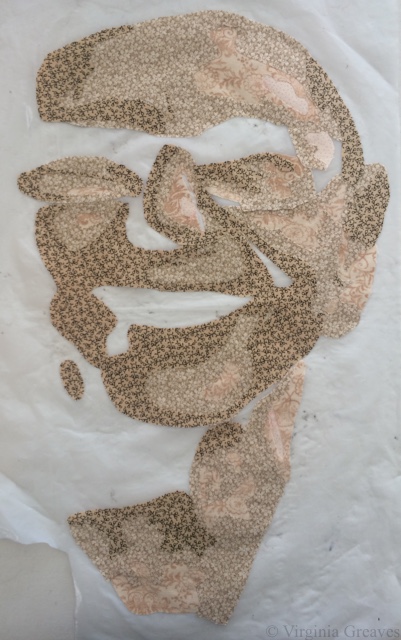
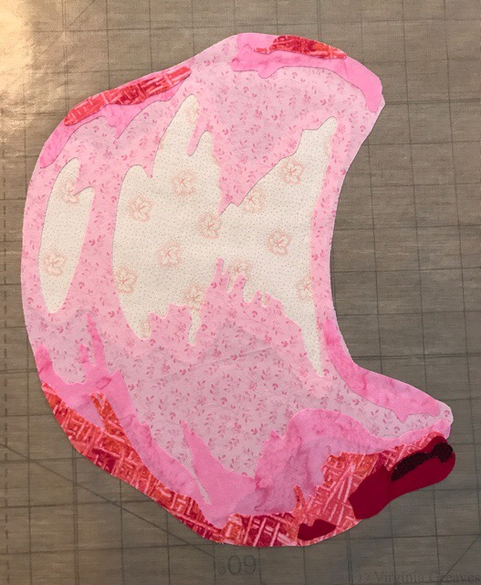
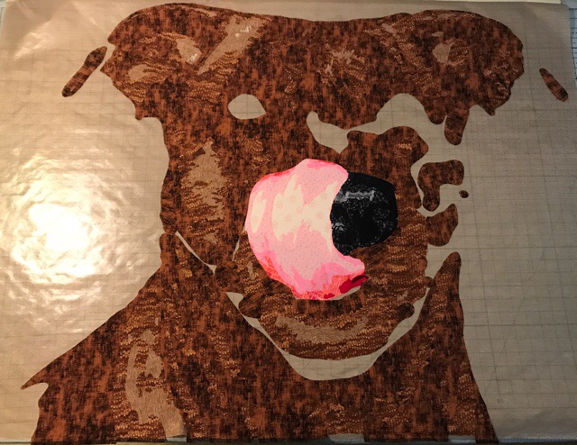
So for this piece, I chose a picture I had taken of her with her great big tongue curled up over her nose. It showed a lot of her personality. I searched through my pinks for just the right ones and started there. I could have put the tongue on last but worried about the darker fabrics I would use for her fur showing through, so I started with the tongue.

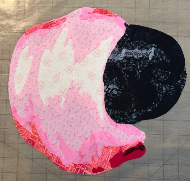
And then after the tongue, I went on to the wet nose.

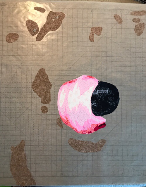
And then the hard part — the fur. I chose highly textured browns. These are the first two values, although there’s only the tiniest amount of the lightest brown up there in the top left-hand corner.

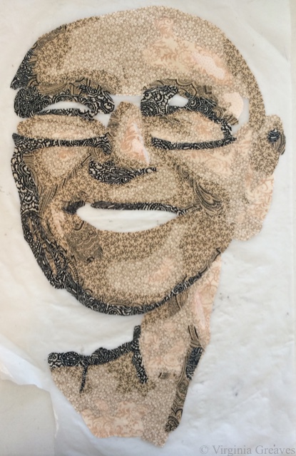
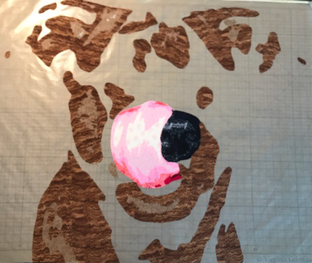
This is the 3rd value — not a very clear pic but probably taken late at night in my studio. Did I mention these are flat on my drafting table and I’m standing above them on a ladder taking the pics?

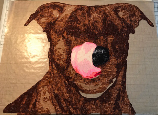
And here, with the next value, you can start to see the magic happen. The textures start to blend together but still maintain their integrity.

The next value.

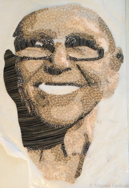
And the darkest value.

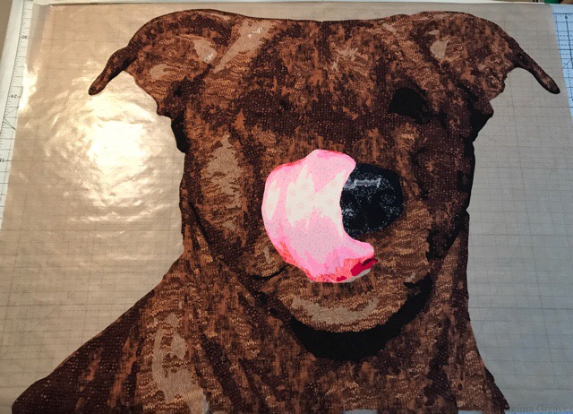
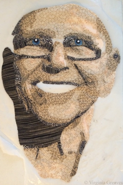
The eyes always make a big difference. It was interesting finding a brown iris color that wouldn’t blend into the fur.

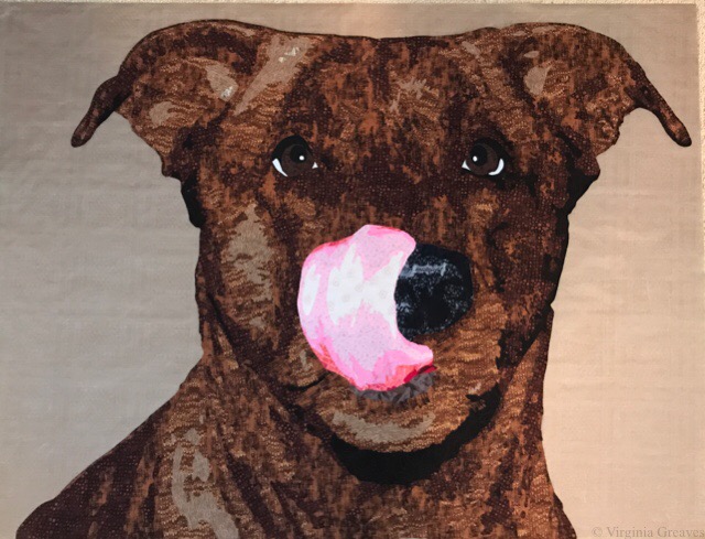
And then this is the background I went with. I cut strips of green and randomly assembled them for the background to give an abstracted look.

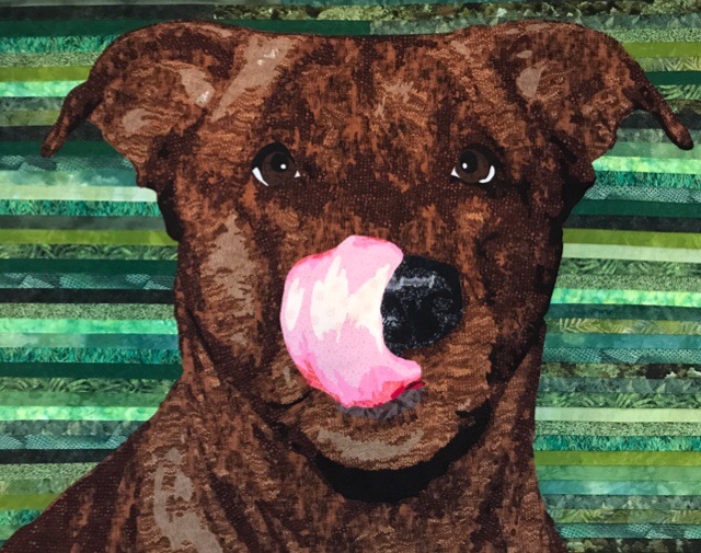
And this is her. This is what she looks like. This is the piece before quilting.

I almost finished this piece in July but a confluence of activity prevented that from happening — so it was finished in early August. And then I was able to then create a piece from beginning to end for the IQA Auction by the end of August. No idea how that happened. I will share pics of that one in another post.

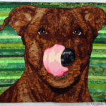
I named it Tasty, and you can find it once quilted and completed on its page here.

Channeling My Inner Yvonne

3

Pokey Bolton put out a call a few months ago for an exhibit honoring Yvonne Porcella. I was never personally acquainted with her, but she was the founder and first president of Studio Art Quilt Associates, an organization that has made great strides in advancing the art of the quilt in our culture, from which I have personally benefitted. So I have decided to pay homage to her exquisite life and learn more about her in the process.

She was part of a group of ladies for whom red was a neutral. Such brass. I struggle with hot colors, but I knew that this would be a fun challenge. I also hoped to merge my style with hers, and in the process, learn to further loosen up my creativity. My process of portraiture is largely controlled, but there is something to be said for freeing your mind to accept creative karma into your work. As you’ll see, it helped me immensely in the final design.

I chose a selfie of her from her Facebook photo album. I later realized that it was also the pic being used as the cover for the show, although that was not my original intent in choosing it. No matter. I was only using it for inspiration. My final piece would be markedly different.

I started with the lightest shades. The final piece will be relatively small — 18″ x 26″, so I could fit her face on my small pressing sheet (which at this point is torn and marked but it still works).

Yvonne IP1

This is the 3rd value — you can begin to see the outline of her face take shape.

Yvonne IP2

The 4th value give you shadows.

Yvonne IP3

The 5th gives more.

Yvonne IP4

The 6th value. The lines under her eyes are the shadows of her glasses on her face.

Yvonne IP5

And yes, I’m pushing the envelope with a 7th value.

Yvonne IP6

Her eyes in the picture were of no help. The shadow from her glasses was too great, so I had to redraw them as I thought they would be.

Yvonne IP7

And here are her signature black and white checked glasses.

Yvonne IP8

Then I added the teeth and the mouth.

Yvonne IP9

And then she sat for a while, and I decided that her eyes weren’t commanding enough, so I changed the irises of her eyes to a deeper blue.

Yvonne IP10

Yesterday, I finally had to time to work on her for a while. My original idea was not to have a hat or clothing — just have her face among blooms, but when the time came to cut into fabric, I wasn’t seeing it that way anymore. I changed my mind about the hat and the scarf and shirt, and I decided to have a green background with red, purple, pink, and orange squares covering it in a grid fashion.

Yvonne IP11

And by the way, I didn’t photograph my first attempt at her hat. It was awful. When something is yellow, it is hardly every TRULY yellow. I threw it in my scrap bin and remade it in more orange and brown tones.

Yvonne IP12

But you see, this is wrong also. It is not the spirit of her at all. So after I woke up this morning, I ripped her off that green. Red is her neutral, so I knew I needed to start with red.

I had the perfect piece, but it wasn’t large enough — which was actually perfect because it forced me to use purple — which is more like what she would have done. I also changed her shirt to a pattern that had warmer colors.

I studied several of her pieces, and decided that free-hand block letters of her name would be perfect in a bright red. Then I added the stars that she often used, and then finished with a few flowers.

I’m going to let it sit for the rest of the day before I decide if I want to add more. The print on the scarf is the right mix and black and white — but the square of the dominoes are making the scarf seem less flowing than a scarf should be. I may have to run to the fabric store for a replacement.

Yvonne IP13

Working From Photographs

0

This morning, I was spending a few minutes on Facebook, and Dorte Jensen, who was accepted in SAQA as a JAM member at the same time I was, posted a picture of a piece she made of Lincoln to the Art Quilts page. Given the recent discussion of the use of historical photographs in your artwork, I couldn’t help but think that comparing her picture of Lincoln to mine makes my argument all too clear — that the use of a photograph as inspiration does not mean that the artist is merely copying the photograph. Obviously, there is immense skill in drafting a pattern from any photograph and rendering it in your own style.

Although the inspirational photograph for her piece is slightly different than the one I used, it is obvious that our styles are completely different.

This is Dorte’s piece.

Dorte_Lincoln

And this is mine.

Lincoln

If our pieces were merely copies, they would look almost identical.  Clearly they do not. They each have their own spirit and life and attributes that make each one special.

Dorte has also recently made a piece of Ben Franklin that is marvelous. I hope you enjoy her website.

As portraitists, it is inevitable that we will turn to historical photographs if we want our work to be marketable. The skill with which they are rendered are no less than if we were to use one of our own photographs. As long as the copyright is clear, they are a wonderful source of inspiration.

Wordless Wednesday

0

Christmas star

Wordless Wednesday

0

brussel sprouts

The Use of Someone Else’s Photograph in Your Work

8

Worry

Worry has been quite the topic of conversation today. The QuiltArt List (an online email list for quilters) has been abuzz since someone brought up the subject of this piece at IQF-Houston — and not in a good way.

Many people are familiar with Dorothea Lange’s iconic photograph from the Great Depression — titled Migrant Mother — from which this piece is inspired. The original poster thought that I had merely printed the picture onto fabric and then thread painted it — therefore saying that it was a gross violation of Dorothea Lange’s copyright.

Well obviously Dorothea Lange’s photograph is in black and white and this is not. My piece is all machine appliquéd from commercial fabrics. It is NOT a colorized version of her photograph that was printed onto one sheet of fabric.

Also, I am clear that this is inspired by Dorothea Lange’s photograph, and if you look it up, you will find that — however famous the photograph is — it is in the public domain and therefore free of copyrights.

I also assure that there was extensive drawing from the original photograph to create this pattern. I make a value painting of all of my pieces that start from a photograph, but photographs rarely ever tell you everything you need to know. There are many details that photographs don’t tell you — like fingers and eyes — and many shadows have to be deepened and highlights have to be brought out. You can obviously and easily posterize any picture in Photoshop, but these patterns will never have the level of detail for which I strive.

Furthermore, since it’s a black and white photograph, the color story is entirely mine.

You can make an argument regarding composition. I understand that. In using Dorothea Lange’s photograph, I used her composition. I did not violate her copyright nor did I break any of the rules of the competitions in which she has been entered.

It’s a decision. A couple of years ago, I researched how to make my work more marketable. One way to do that is to use historical figures as subjects. This means using someone else’s composition — essentially. I don’t always do this, but sometimes I do.

There are people that don’t agree that this should be viewed as art.

It’s interesting. I only find this discussion among quilters. I hung this piece in an art exhibit back in May. Everyone knows its inspiration is a well-known photograph — and no comment was made about whether or not it was art. It was not brought into question whether or not it was eligible for a ribbon. I am sharing this merely to contrast the differences between the two communities.

Is it art? Have I created something that hearkens back to the story Dorothea Lange created — and yet made it my own, using my own medium? Does anyone see the modern era mother who has the same stress as the mother from the Great Depression about caring for her children in times of economic hardship?  I suppose the answer will be a personal one to everyone reading this.

Wordless Wednesday

0

IMG_1260

IMG_1261

IMG_1263

Wordless Wednesday

0

sunrise

Wordless Wednesday

0

sunflower

Wordless Wednesday

0

Pumpkins

Go to Top