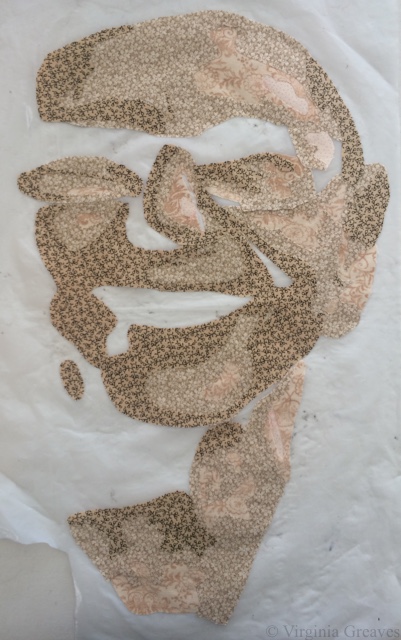
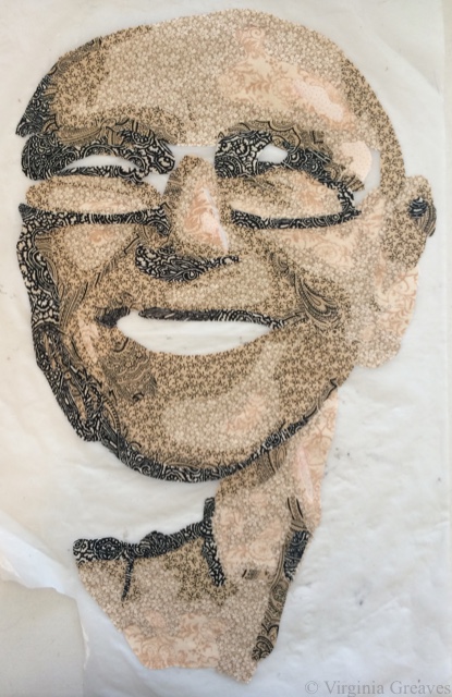
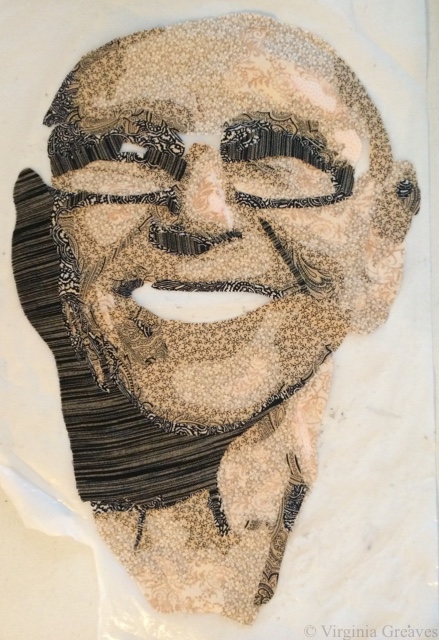
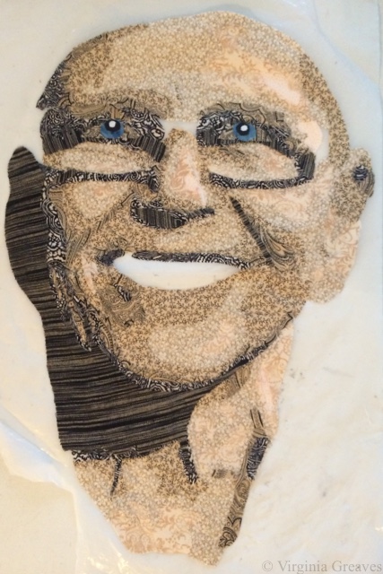
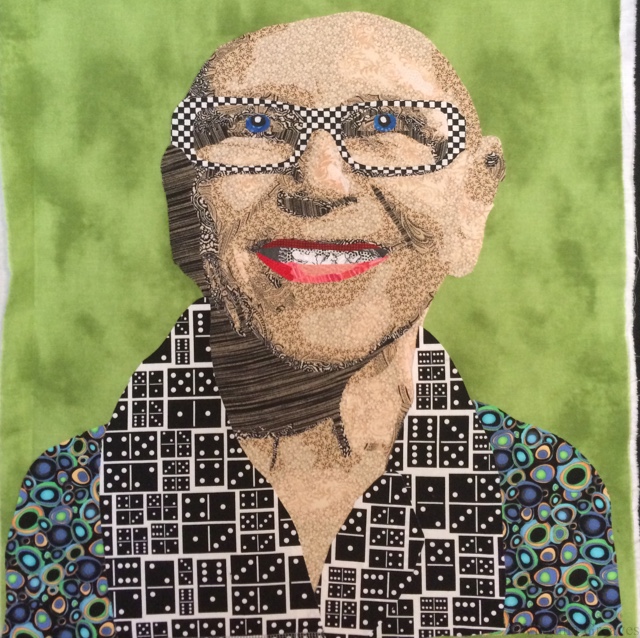
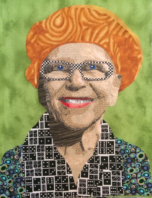
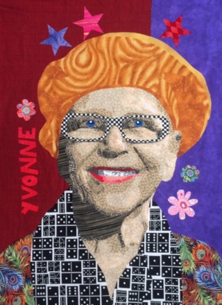
 I have completed Yvonne in the Garden. She was surprisingly easy to do. I’ve reached a point where portraits are not difficult constructions for me. Giving the piece deeper meaning is more difficult, however, than the technical skill required to create a portrait. For Yvonne, after her portrait was completed, I was tasked with putting her in a space that was hers. To anyone familiar with her work, I have hopefully succeeded by drawing on the inspiration of her work. For Yvonne, red was a neutral so it was an obvious choice. She loved hot colors. When I didn’t have enough of the right red, I just supplemented with purple — which I think was actually pretty close to what Yvonne would do. I then freehand drew out her name and flowers and a few stars to give the feeling of her inhabiting one of her own pieces. Since her passing, I think she would be happy existing in a realm of her own imagination.
I currently have two pieces hanging at the Abernathy Arts Center in Sandy Springs, GA through June 17th — both The Canary and The Last Supper. The reception was more fun than I’ve had in ages. I believe I was the only fiber artist in the show, but I had a very warm reception from the other artists and a lot of interest in my subjects. I’m finding that putting clues in my work is definitely a successful way of drawing interest in a piece. The gallery was packed that night, and I was surprised there weren’t more people that approached me regarding my self-portrait, but later in the evening, as the crowd thinned, I had more people recognize me from my work.
And now here we are at summer. I think I counted 10 or 12 pieces that I’ve done in the last year which is double what I usually do. At this point, I’m entering shows — 3 on Sunday and a couple more to come in the next month. I think I’m going to take a breath now and consider my next piece. DD2 came home last night with a very large raven painting that she did in school, and it calls to me. I’ve always loved the grace of ravens.


