Fusing

Third in Abstract Series
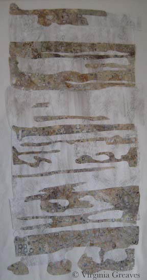
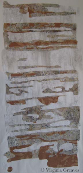
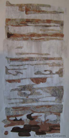
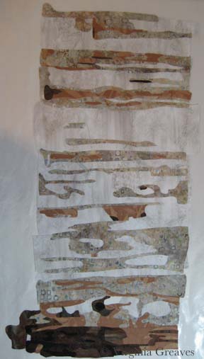
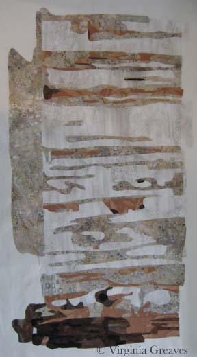
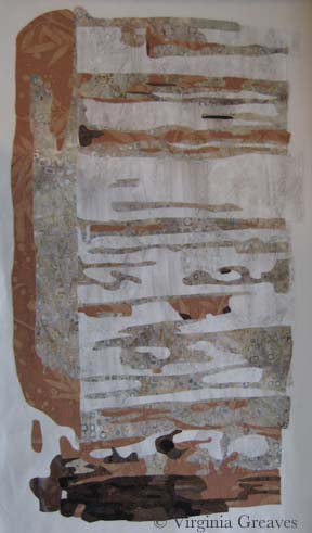
0I met with Leisa over a week ago. As I last mentioned, I had finished quilting our 2nd collaborative piece and I offered it back to her for additional changes. We decided that it was done and that I would bind it — which I started yesterday. Last week, I spent a glorious week of cutting and fusing our 3rd abstract piece. Leisa was out of town and I wanted to have something to give her when she returned this week.
She asked in that meeting if we could extend out the edges on this piece. It was already drafted but after talking about it, we decided to rotate it and extend the two sides — which would become the top and bottom.
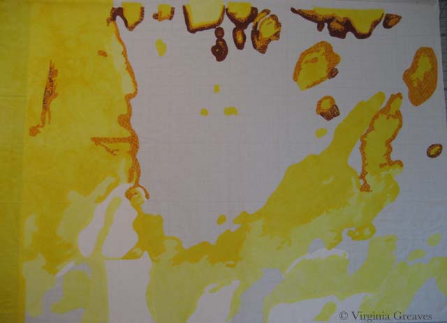
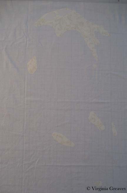
I started with the whites and yellows. In retrospect, this piece has a lot of yellow and I wish I had toned it down. This is its original orientation. It’s on my drafting table that’s covered with an ironing mat. I have to stand on a ladder and hold the camera above the piece to attempt a picture. Moving it to the design wall doesn’t work well for my process.
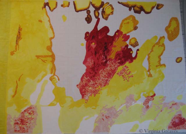
Then I added the reds.
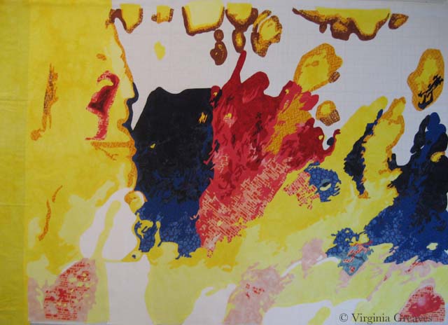
And then the blues. I rather like it at this point.
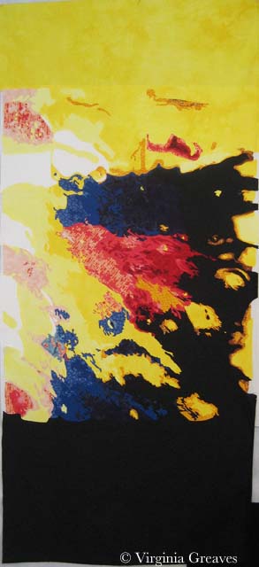
Then I added the black and changed the orientation. I’d be lying if I didn’t say I was completely flummoxed. There are several things that changed in the piece when I changed in the orientation — some of the shapes began to take on new and unintended meanings.
My first reaction was to take off the black and replace it with something else — but Leisa wants it just like this. I hope she paints it. I know she intends to cut strips in the bottom — maybe also the top. It’s just very striking color wise. Maybe that isn’t such a bad thing. It still has a lot of transformation until it becomes its final self.
ad;lkfja;skdjf

North Carolina Insanity
1For my current piece, I was inspired by another picture by Dorothea Lange. This one was taken in North Carolina — 1936 I believe — and shows a woman, probably a sharecropper, standing in an old wooden shack. It appealed to me.
And as I started to work on the first wall of the cabin — I wondered what I was doing. I do portraits. This piece will have a figure in it, but she is not the main focus of the piece.
At one point, I did come to the realization that she is the house. I saw something online by Alice Walker in which she opined the situation of a slave that didn’t have the opportunity to express herself creatively — and I knew that this was the woman in the picture. She is bereft of herself and as worn down and tattered as the house in which she stands.
This is the first value for the right wall of the cabin. It’s a stand-in for plaster. The light in the pic isn’t great — I was working on this at night and didn’t think to turn on my natural light lamp.
This is the second value. It looks stark against the first value. It’s a batik that I bought to work as the background of my last piece, Worry, but it was too light so it ended up in my stash and works nicely here. Really — it does. Just keep going.
My third value is a rusty brown. I had to search some to find this. I had some rusts in my stash but they were too dark.
It’s a wall — I promise — although I’ll admit that I was getting disheartened. Sometimes you just have to keep going. This wall on the right of the piece is lighter than the rest of the cabin.
The next value is the first true brown — but there isn’t a lot of it here.
And then there is the darkest brown. Still doesn’t look right.
I did realize at this point that I needed to add the door facing — so I went back to the 2nd value.
And the 3rd value.
And the 4th value. Done. OK — it doesn’t look right to me either. The only thing missing is the black. There are many tiny lines of black separating the boards — and I had intended to do this in thread at the end — but at this point, I was disheartened and wondering if I had wasted my time — so I added the black.
Why does that make so much more sense? It just does. Without it, the eye just sees a jumble of shapes.
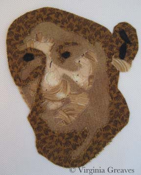
And then I did her face. I had painted myself into a corner. I couldn’t use the same brown tones I had used in the cabin for her face, so I decided to try the more yellow browns.
Her face is tiny — maybe an inch and a half — and when I first did this, I took this pic and then threw it in the trash. But, looking at it again in my camera with a little more perspective, I thought it might work — so I fished it out and started making her clothes.
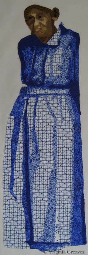
I needed a color that would make her stand out but not look expensive. In the end, the blue would look best against her skin. This shows the first (very small) and second values.
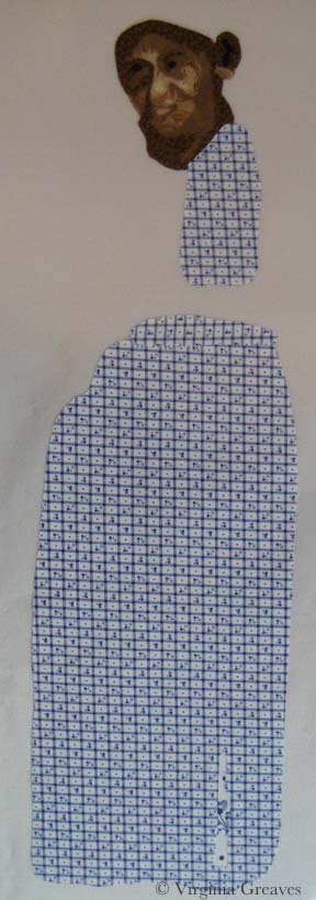
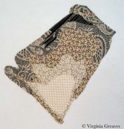
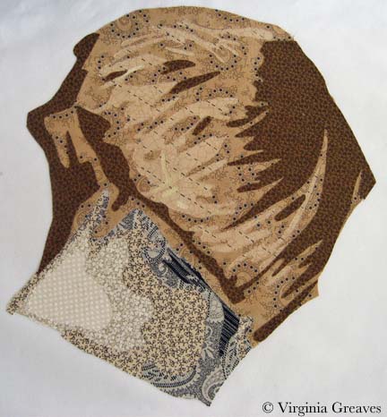
The third value shows more of the outline of her dress.
The fourth value brings it even more to life.
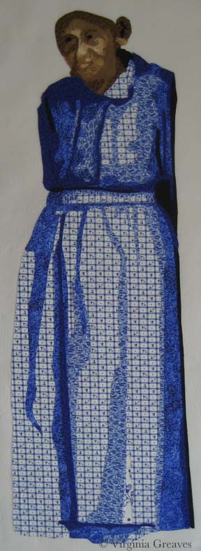
This is the fifth value — and at this point, I’m happy with her face.
And then there is a little bit of black to add in there. (Don’t worry about her ear — it won’t be that large once I add her hat.)
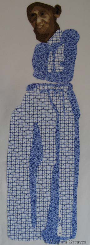
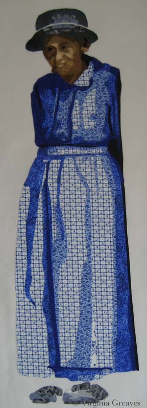
Here she is in her hat and shoes. I chose gray which will be similar to the tiles in the roof. The background will be black and will fill in the space between her dress and shoes.
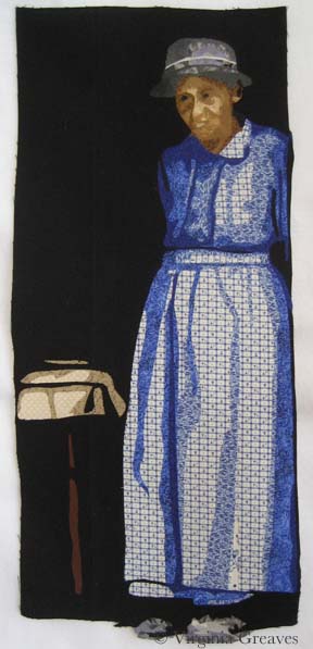
And here she is complete. The tablecloth and table leg are suggested objects. The rest of it falls into shadow.
As of today, I’ve done both the right and left walls of the cabin, the steps, and I’m almost done with the boards above the door and across the entire top.
I have to admit that I must be insane. This is a very complex piece. The applique is taking a very long time to do. And it is a true departure from the kind of work I normally do.
And yet I keep going. When I’m done with the cabin top — there are still a couple of rows of shingles at the top — and then rocks at the bottom. Hopefully all of this will make sense in the end.

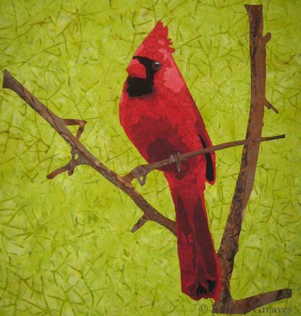
Cardinal Longing
1After I finished Worry, I had no idea what my next project would be. I get so involved in one project that I don’t tend to think ahead to the next — can’t really split my focus. I concentrate on one thing to the exclusion of other things.
But when I was done, I decided to make a small piece for the SouthEast Fiber Arts Alliance (SEFAA) Square Foot Fiber Art Pin Up Show. No theme — the piece just has to be 12×12 or smaller. I don’t usually work in this small scale — but I needed a rest and working on a small piece seemed like a good way to do that.
I had seen many pictures of cardinals in the snow being posted on Facebook — and I think that this is what I had in my mind’s eye when I began — a piece of hope flying across the frozen tundra (a little melodramatic, but we’re currently iced in for the second time in a couple of weeks and this southern girl is more acclimated to sunshine than snow.)
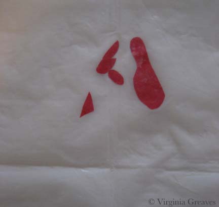
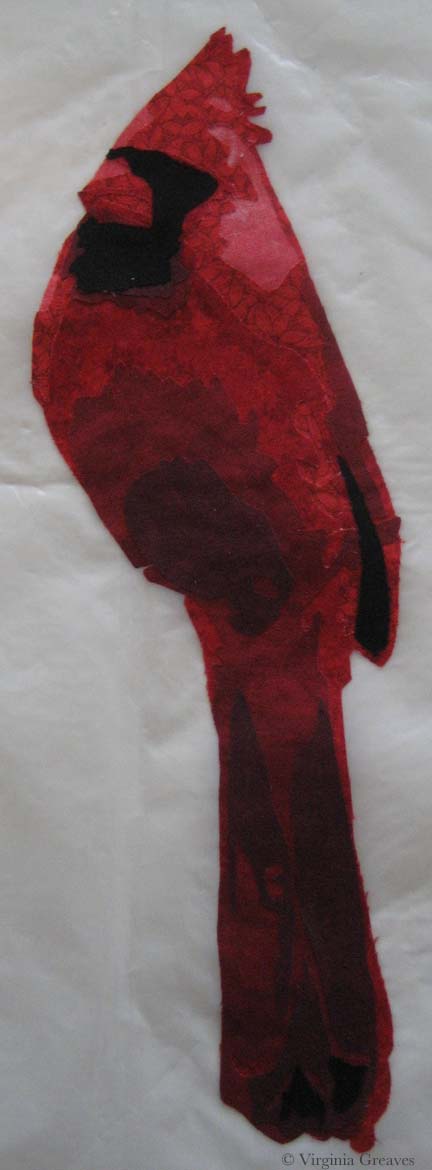
So I searched through all my reds and picked out a decent range. I wasn’t really happy with my first value — but then, what could I do? The weather was too iffy for me to risk a trip over to Marietta to pick out fabric — so I was limited to what I had on hand.
Just as I was getting ready to iron my WonderUnder templates down, I had the funny realization that I had paid for both sides of my fabric (obvious, I know, but a fact often overlooked) — so I ironed the templates to the front — so the back would show — which was exactly the shade I needed for the first value.
This is the second value — you can begin to see the outline of the cardinal.
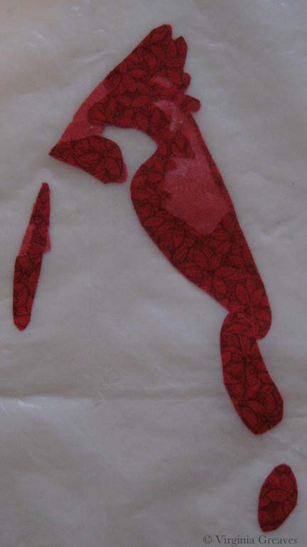
The third value gives you even more — although I should have added to the lighting in the room before I took my pics.
The fourth value was all I got done before I heard that the news was telling me (I had the TV on while I was ironing) that I might lose power for several days — and I realized I needed to add a few things to my pantry. It was at this point that I ran out the door with fading daylight before the roads became truly impassable the next day (and they did).
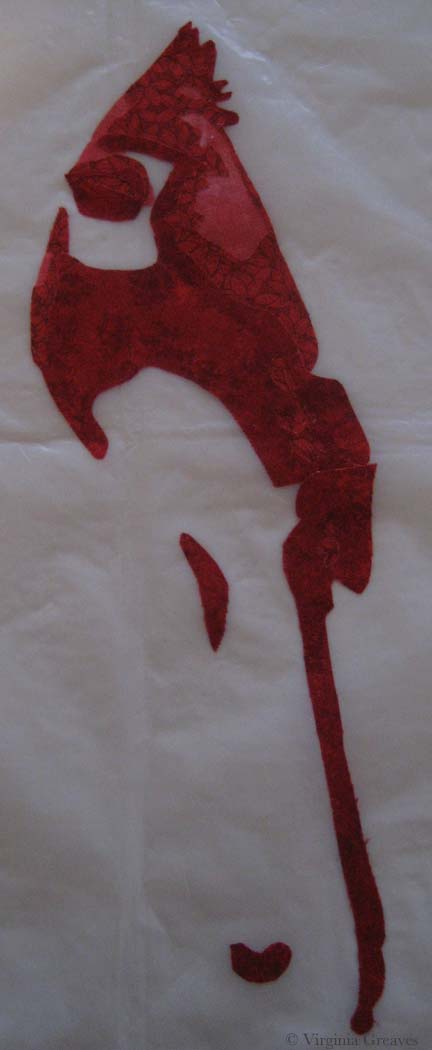
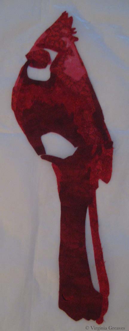
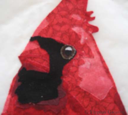
I returned to this yesterday and added values five and six — the sixth one being black. Not bad but I really miss the eye.
Again, other blurry shot. I think the ISO on the camera I was using was way down — but you can see how I built up the eye in a similar way to the eye on The White Raven. I did add a larger highlight than I usually do — this guy has a small eye and the light coming off it gave the impression of the dimension of the eyeball.
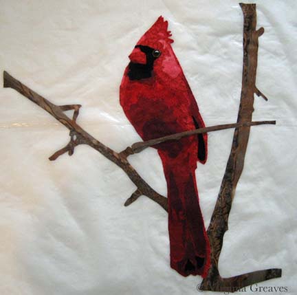
Once he was done, I added the branches. I thought about adding a bunch of detail and then decided that it was so small, it made more sense to let the fabric do the work for me — so I found a brown wood batik and fussy cut it so I roughly had highlights and shadows where I wanted them.
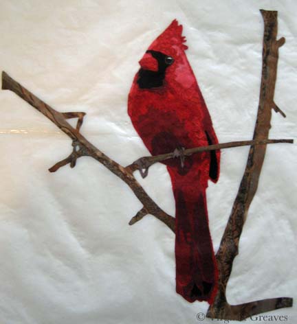
And finally, I added his claws. They are really similar in tone to the branch — and I decided to stay with that. I used a purple with a lot of gray in it — but they are obviously the same value as the branch. I’ll define them more with texture in the quilting stage.
The last part is to add a background. This was my first pick. It’s a really bright acid green but it makes the cardinal pop. I tried other greens from my stash — but the greens with more gray in them make the cardinal more sedate — more like it’s a common wildlife scene.
And I could try something other than green — but the color wheel shows the green is the best choice — and holding up colors — it’s the one that makes the most sense visually — even if I did originally imagine more white and gray blues.
I’m not sold on this yet. I would love it if I could go to store and see if I could find something better — or validate my choice here — but there is still too much ice on the roads. I may go ahead for something to do. Sewing is a good antidote for cabin fever.

Applique Beginnings
1Once break was over and the girls returned to school on Tuesday morning, I hit the studio and I’ve been working like crazy ever since.
I finished fusing the baby’s blanket — the last fusing section — and then I moved into fusing the larger pieces onto the muslin to begin appliquéing.
I did have a moment when I was working on the mom that I thought I should have kept her in smaller pieces — her face, her hair, her lower body, her jacket — but I fused whole people together and I was just going to have to live with everything trying to fall off as I started the appliqué process.
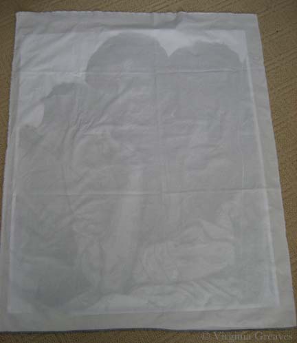
I laid my value study on the floor and covered it with muslin, cutting it to fit.
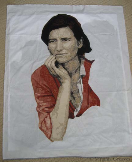
Using the drawing behind as a guide, I laid down the mother and fused her right down onto the muslin on the floor.
I started with her arm but quickly moved into whatever fabric didn’t want to hold onto the fusible the most. I can iron as I go — but squinching (new word?) the fabric under the harp of the machine can wreak havoc on your relationship with your fusible. Bottom line — fusible is a temporary relationship. Everything has to be sewn down.
I do use Wonder Under — and they’ve obviously recently changed the formula. Everyone raves about Misty Fuse — I’m not sure I could get used to something I can’t easily buy and that isn’t already paper backed — but one day I may give it a try. My feelings about Wonder Under vary with the complexity of the project.
Also — I made a command decision on this piece. After having gone to IQF/Houston & realized that I’m one of the few remaining artists that feels the need to cover raw edges — I’ve changed my strategy. A little, anyway. I couldn’t bring myself to get rid of it altogether. As I said, given the size & complexity of my appliqué shapes — if I fused the entire thing down & started to free motion quilt — I would have chaos on my hands. I did, however, compromise with a free motion zigzag. This is my first time with this stitch but given that I free motion quilt with the feed dogs up — it wasn’t much different — it gave me a little more control. And it’s faster — which is the biggest thing.
This is the woman after I finished appliquéing her this morning — from the back.
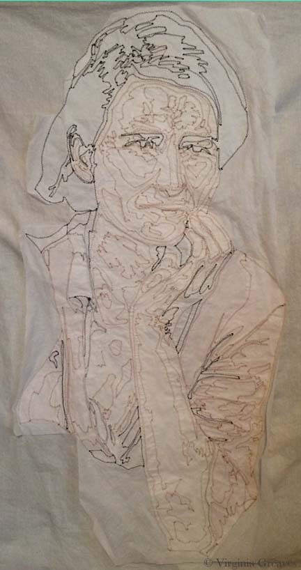
Once she was done, I fused her son to her left. He is also a complete fused piece. I started appliquéing him this morning — and will probably finish him in my next studio time (since it’s Friday, there’s no telling when that will be.)

Stress and Family
2When I started working on this project, I needed a name for this project’s folder on my computer. In the beginning, it was Depression — since it’s based on a Depression era picture. As I worked on the mother, I began to see it has a reflection of the stress of mothers — so I changed the name of the folder to Stress Project — knowing that that wouldn’t be it’s final name. And as I get closer to Christmas and I see the insanity that is family that comes out during the holidays — this has becomes a difficult project for me to work on — much less talk about.
But — I should share my progress from last week. I had finished the mother and her son & began work on the daughter that is on the mother’s other side. This shows her neck, arm, and fingers curled up.
And her hair. I think it turned out well.
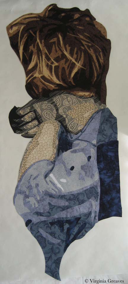
I snuggled her up to her mom. You may noticed that I’ve added some darker tones to the son’s hair. I also changed the fabric just under the mom’s hand — they were previously shirt fabrics but they were too close in tone to her skin so I just changed them to coat fabrics so you could see the back of her hand clearer.
The right hand side of the daughter is an extension that I’m creating because the photograph has something obscuring the view here (I think it’s a pole). I decided to lighten the lower shadow.
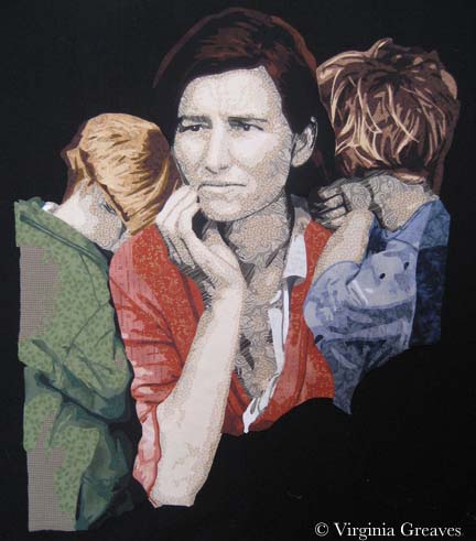
I like it better here. I also did the babies face. I don’t like how her face comes together but have decided that I’ll work on it after I’ve made her blanket. I’ll probably have the blanket wrap over the top of her head.
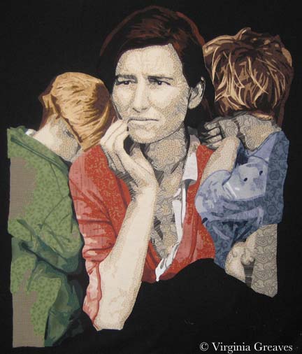
The blanket will extend across the bottom of the piece.
I think that I’ll continue as much as I can in the studio to try to black out the insanity of the holidays. It gives me a peace that’s hard to explain.

Mama’s Clothes
0I have a dream to finish cutting out all this entire piece before the Christmas break. It’s ambitious but I’m putting the pedal to the metal and seeing what I can get done in the time that I have.
I started this week with her shirt. It’s hard to see hear since it’s white.
Here I’ve completed her jacket and her shirt shows up better. She’s actually hanging on my design board — that’s why the background is black. When I take a picture of this piece on the ironing board, I can’t get high enough above it to take a pick that doesn’t have some distortion. You can see some of that in the pic above.
The only issue I have is that some of darker values of the shirt are blending into her skin. The two pieces under her hand I can easily swap into jacket fabric. The lower pieces on the left will probably become lighter values.
Although it looks red in this picture, the colors are an orange red — more rust colored. I wanted the mother to have a hot color — and then the children will have cool colors. A bright red would have been too cheery — the rust conveys a more worn feeling.
Then I started on the son leaning on her left shoulder. He is turned away from the viewer so you only see the back of his neck.
I did use the same fabrics that I used for the mother. When I made Beach Guardians, the two sisters have the same fabrics. I think it gives a feeling of relationship between the two — unlike the duet piece A Walk in Twilight when I used different fabrics for the two friends.
And this is his hair. I like that he’s more blond relative to the darkness of his mother. He is, however, tucking himself into her side & behind her so I will at some point have to add some darker tone to the crown of his head where his head leans into his mother’s hair.
I was free to make his jacket any color I chose — but really, the smart thing is to let the color wheel have a say in it. Since I chose an orange red for the mother, I chose a green for her son. On her other side, her daughter will have a blue — probably more on the gray side though.
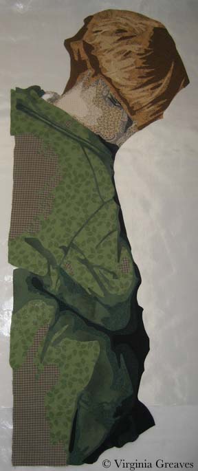
And the baby in her lap — I just don’t know at this point. Today I’ve finished the daughter’s neck, fist, and arm — but her hair will take some time.

Mothers and Their Children
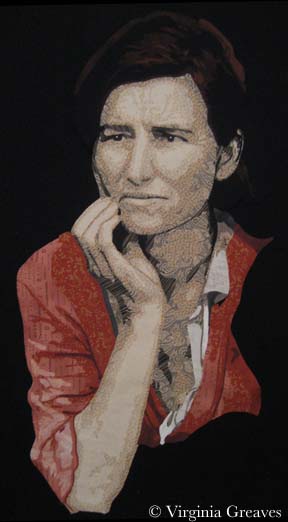
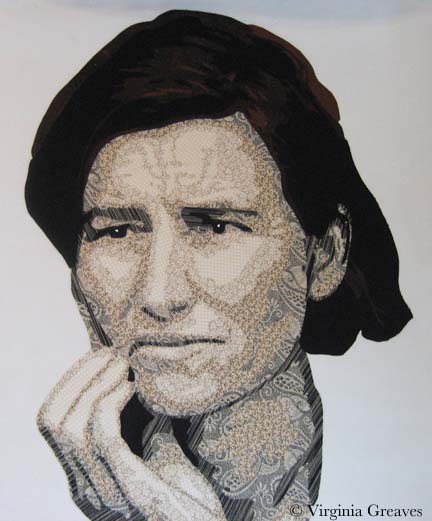
4I haven’t worked on a person since I made Lincoln a year ago — but given that it was so successful at IQF, I thought maybe I should revisit making people again.
So I found this incredible picture taken by a government official in the 1930’s of a woman surrounded by her children and the lines of worry embedded in her face — and I decided to use this as my inspiration. (Don’t worry — this is a public domain picture.)
At first I chose this because of the parallels between the economy today and that of the Great Depression, but as I worked on it, I began to see it more as a metaphor for motherhood — how mothers worry and how their children are naturally oblivious to her stress.
This is the first value. Not much to see — although I’ve found this to be one of the most important layers. If I’m going to be criticized, it’s usually on the brightness of this first layer.
In the second value, you can see the worry lines in her forehead and the outline of her arm and fingers.
The third value gives you a fuller outline of her face and arm.
The fourth value gives you the deepening of shadows.
She begins to come alive in the fifth value.
And the deepest shadows are in the sixth value. I did not add color to her irises — I intentionally kept them black. I also added a dot of white to her eyes.
Then I went to her hair. I purposefully decided to keep it dark.
The second value is a dark brown.
And the third value is black.
At this point, I need to start her blouse and jacket. I’m considering making her very conspicuous with hot colors in her clothes — and then using coolers colors in the children — to convey the difference in mood between them — but I’m also considering making the children into more literal shadows using tulle and thread and not completely appliquéing them with fabric like I did the mother. It’s something for me to consider for a while.

Golden
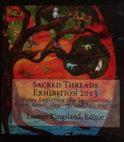
0As I’ve mentioned before, I was lucky enough to have two pieces in the recent Sacred Threads show in Herndon, VA — Beach Guardians and The Bowl Judgments. It’s a biannual show and I haven’t participated in about four years — so I was delighted to find that the show published a book with all of the pieces from the show. Not having the ability to see the show in person, it gave me the chance to enjoy the exhibit from home and read all of the artist’s statements with time to study them alongside the work. You can order a copy of the book here.
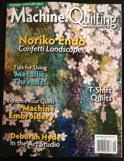
Then a couple of weeks ago, I received a manila envelope in the mail. Inside was this new copy of Machine Quilting Unlimited and nothing else. I don’t have a subscription (although I might have to get one now — it’s really well done) — so I was confused until I saw the little strip at the top that said “Sacred Threads 2013.” I flipped to the article for the exhibit — and Beach Guardians was one of the highlighted pieces.
I was really stunned. I have never had my work included in a magazine before. I felt like I had reached a milestone. My 15 minutes anyway.
I have not been writing much on the blog lately. Part of me thinks that to have a blog, you need to write at least weekly. Another part of me really despises blog writers that fall off subject or write about nothing just to get a post out. I try to prepare something interesting and present it in a large enough piece that you can see progress. If I just showed you one day at a time, the blog would show everything in reverse order and it wouldn’t be nearly as interesting — to me anyway.
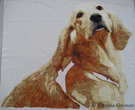
Once I had the girls back in school in August, I started thinking about my next piece. I really had no idea what I wanted to do. I started sifting through pics I took in the Spring and came across one that I really liked of a golden retriever. She is looking over her shoulder at her owner and has such a look of love in her eyes. If I found it captivating, maybe someone else would too.
I spent about a week drafting her. I typically bring the pic into Photoshop and reduce it to values only, adding lines of separation between differing objects — like the dog from her harness — or even her eyes and her nose from her fur. Then I spend a lot of time drawing in Photoshop using my Wacom tablet pen. Not only do I clean up the light scatter, I deepen shadows, add shadows to create definition, redraw the eyes, and simplify shapes.
From there, I continue the drafting process by pulling the final pattern into PosteRazor as a BMP file & scaling it to what I wanted. In this program, I can then tile print. Then I take the puzzle pieces, cut off the margins, and tape it back together. Now my pattern is back together — but larger.
Then I outline everything with an ultra thin black Sharpie. It bleeds through to the back giving me the reverse image that I’ll need for WonderUnder templates. I’ll have to go back & re-draw the lines on paper overlap — but it’s otherwise done. And FINALLY, I place a layer of see-through vinyl over the top of the pattern, tape it down, and trace it. I can then sew the vinyl to a piece of muslin (using a teflon foot that won’t stick) to use as my guide when I fuse the pieces down — or I can work on a very large fusing sheet and tape the vinyl pattern over that.
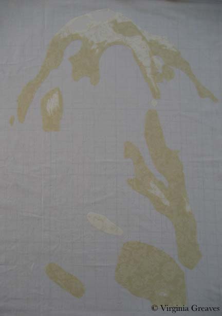
This is the beginning showing the first & second value. The first value is almost impossible to see as it’s white like the muslin background.
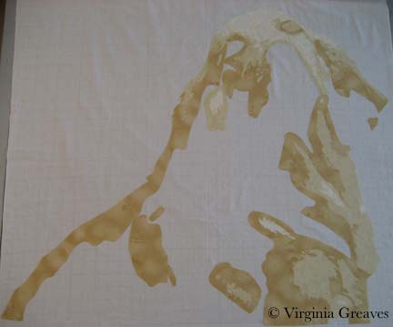
The third value gives you a better idea of the face.
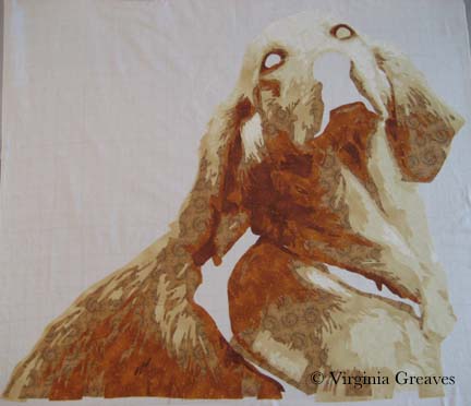
The fourth value shows the outline of the entire dog.
The fifth value begins to give shadows and therefore definition to shapes.
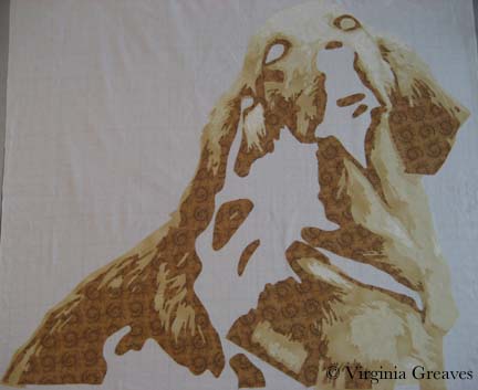
The sixth value goes into an orange. There is only so far you can go with yellow — even cream. The color that shows for this value will depend largely on what is placed next to it. In the pic, it looks a lot more orange than it actually is.
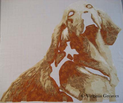
The seventh value gives more depth and tones down the orange.
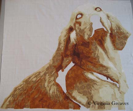
I debated having an eighth value — I though about just making it black — but between yellow and orange, I had room to move into a dark brown cinnamon. There isn’t a lot of it anyway.
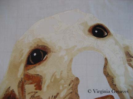
Now the eyes. The pic normally gives me useless information here. I’ve found it best to draw them myself. The pupils are wide — and the irises are brown but has more gray in it than the brown tones in her fur. The outline of her eyes is black. You have to have a deep contrast here to feel the depth of the eye and most dogs can easily take the rich black for that function.
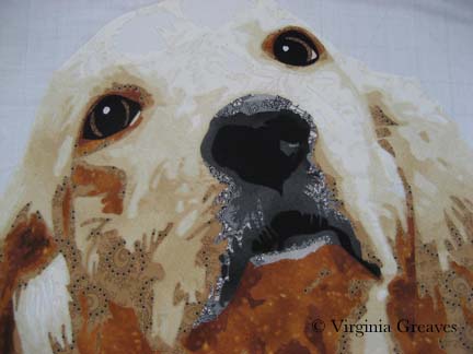
The nose is an experiment — although I’m leaning towards keeping it. You would think that all the fur around the mouth would match her other fur — but it doesn’t. It’s shades of back and gray.
Seeing a full picture of her, I think the nose makes sense. The gray and the black have to work together to give the impression of a snout — which I think they do.
The open patches around her shoulder are for a harness — which I’ll work on today.
I ripped off the orange under her left eye — I found it distracting.
I’m not sure about the light gray at the bottom of the mouth — I’m still considering it.
I made the entire piece without extra around the edges — which I should have done since I put her right on the muslin. Making her this way, I should have fused her to a fusing sheet where I could detach her & place her on a background. I wasn’t thinking through it — I was too excited to get to my favorite part — the cutting! I love the meditative process of fusing the shapes, cutting them out, and layering them until I start to see recognizable shapes.
I’ll have to think around what to do to correct this.

Jacks Are Wild
0I am currently working on a piece for an invitational show — my third animal portrait in a row. It’s not that I’m done making portraits of people, but I’m acknowledging the marketability of an animal piece over one of a specific person. People typically see one of my portraits and say “I’d love to have you make one of my grandchildren” — which is great, but moving people from the inspiration of a commission to the commitment of one is much more difficult than them finding inspiration in a piece you’ve already made and then committing to buying it. I’ve found that if I make a piece centered around a particular breed, everyone that has had that breed as a pet can see their cute little snuggly in it.
What I’m considering here is an antelope jackrabbit. This is a very large and muscular rabbit with huge ears. This pic shows the highlights — the beginning.
I’m using my new large pressing sheet — but it still wasn’t big enough to capture the tip of the ear — so I have taped my old pressing sheet behind it to catch the space at the top.
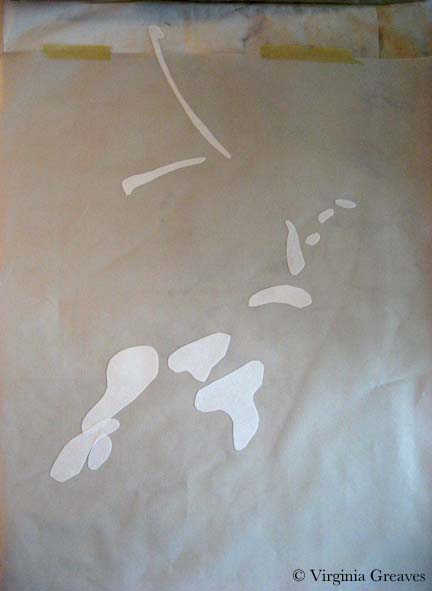
This pic shows the second value.
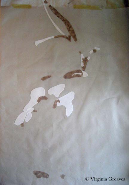
This shows the third value.
Once I cut the pieces small, I realized there wasn’t as much contrast between the second and third values as I saw in the comparison of larger pieces of fabric — but that’s ok. It happens sometimes. There isn’t enough of two or three to matter much.
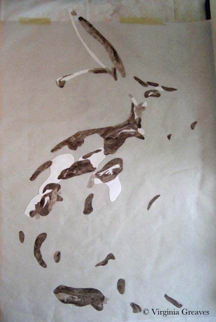
The fourth value definitely shows the creature emerging.
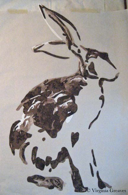
The fifth value is a fun brown I found with creatures leaping across it — rabbits as well as deer. It’s a fun detail for someone that looks close enough to find it.
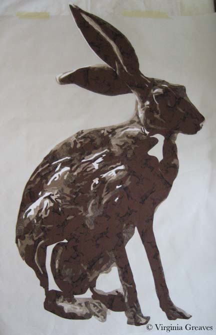
Then I finished with the sixth value of brown and then black. I completed him with an orange eyeball. This is him on my black design wall. I brightened up the pic so you could see the prints better.
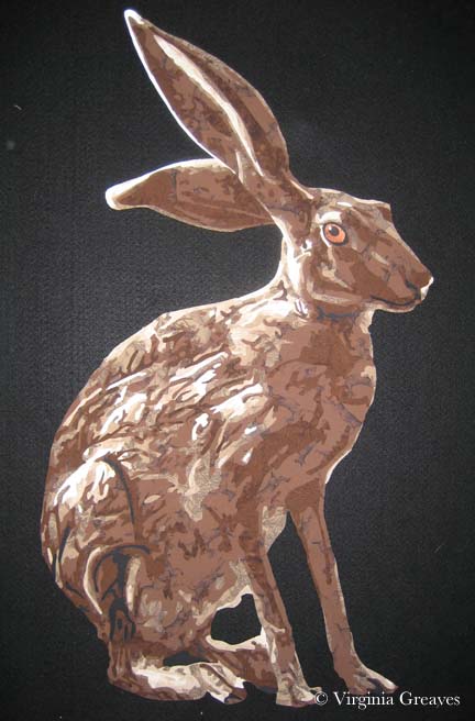
He looks at home there.
Tomorrow I’ll start thinking about where he’s going to live.
