I am always asked about how I draft a pattern. Yes — I start with a digital picture. Yes — I use the posterize tool in Photoshop. And yet — if it were that easy — everyone would be doing it. Beyond the mechanics of the process — it’s a skill. The truth of the matter, as any good photographer will tell you, is that cameras lie. The more pictures you take, you’ll begin to see why. They don’t have the ability to record things in the same way as the human eye.
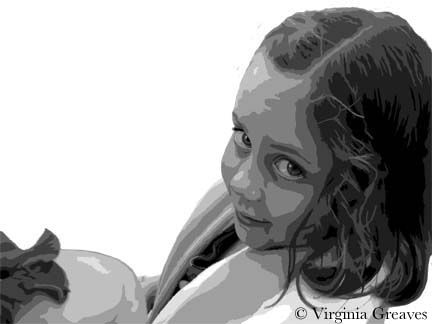
So my starting point is the photograph — but making the pattern believable requires some drawing. The eyes and the mouth are always wrong. The chin is rarely defined. The dimples that create character in some people’s faces are easily obscured in the light. And Photoshop isn’t perfect either. I use the information I receive from posterizing to start a value painting, but when you posterize, you often lose details that you want to keep and you have to add those back in. This usually takes me 3-4 days.
I have a Wacom tablet — not a big one — it’s the 2nd smallest — and I pick up colors and use the electronic pen to draw in Photoshop. I have the original picture in another layer that I can use for reference.
This is my latest piece, a small girl holding up a flower on the back of her hand and looking up expectantly. The important shape here are her eyes — and I’ve exaggerated some of the detail in them for that reason.
The value painting isn’t really my pattern — but it has everything I need. I used to take my value painting, export it as a BMP, pull it into CorelDraw, and then create my drawing in CorelDraw by drawing lines around all of my closed shapes. Then I would tile print it. It looks very professional when it’s done — but it does take longer than my Sharpie method.
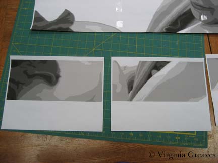
I still export the file from Photoshop to a BMP file — and then I pull it into PosteRazor (which is shareware). I make it the size I want it, and then tile print it. (Tile printing, by the way, is sorely lacking in Photoshop.) At that point, I have to start putting the puzzle together.
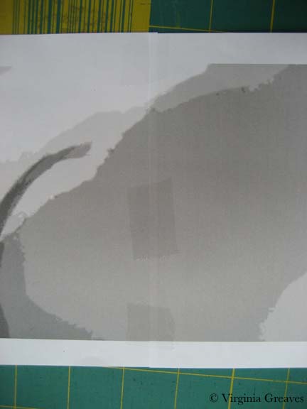
This shows 2 sheets of the bottom left that need to be joined.
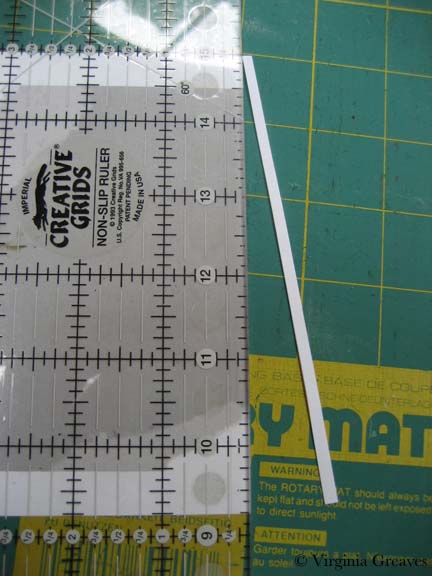
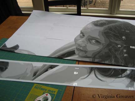
First I take off the right hand side of the first sheet (starting from the left) — and using a rotary cutter and a ruler, I take off the white strip that is not part of the pattern. (I also crop the bottom a little. If this wasn’t the bottom row, I would take off the white strip of the bottom as well.) I always take off two sides — the right and the bottom — so the pieces will fit together with overlap.
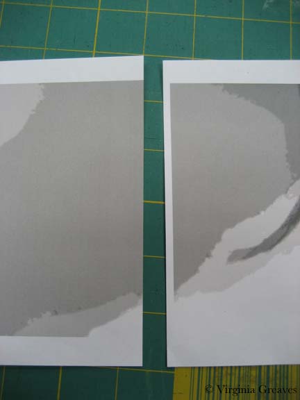
Now I can take the first piece and lay it directly onto the second piece.
Once I tape it, it’s seamless. Use clear tape and keep the tape within one value if at all possible. If you cross over values, your Sharpie won’t touch the paper and the ink won’t be visible on the other side of the paper.
The trick comes in putting it all together. I used to not be very good at it and my pattern would ripple with my mistakes. Don’t worry if it does. Retape it. You probably won’t lose much of a shape. But if you cut out the overlap carefully and tape it together carefully, you’ll have a flat pattern when you’re done.
You don’t want seams to fall in complex areas like the eyes. One reason I printed this out in landscape rather than portrait was to avoid that.
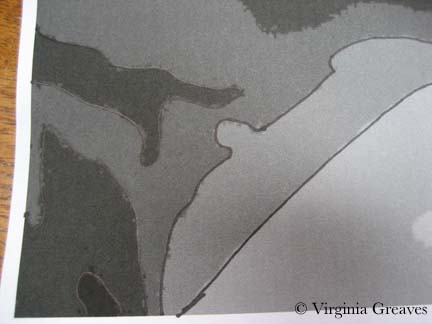
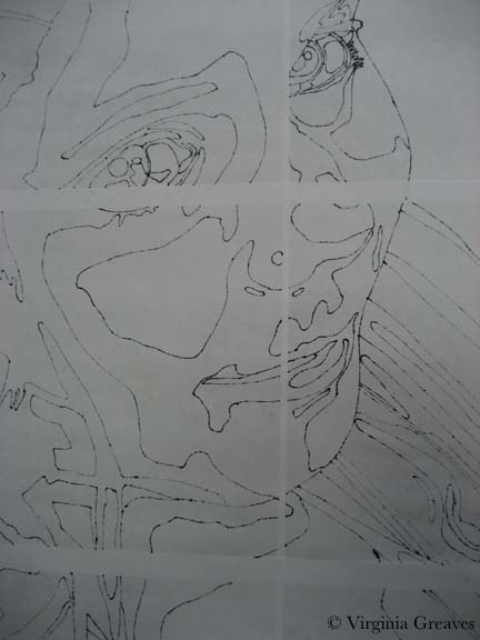
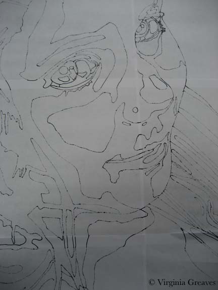
Once that’s done, outline your shapes using an ultra thin Sharpie.
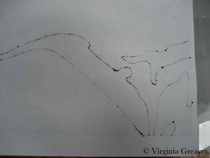
This has the added benefit of creating the reverse of the pattern on the back — so from one tile printed & taped pattern — I get a front (used for the vinyl overlay) and a back (used for the Wonder Under patterns).
You can see here that this works great — except for the joins where the paper comes together.
Just grab a lightbox & draw in the missing lines. If you can’t see it, you can flip the paper back.
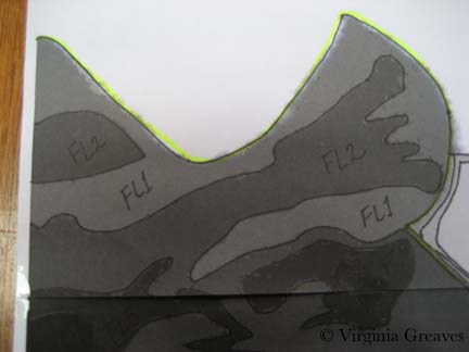
And finally, go back and label everything with value numbers. I always number the face F1, F2, etc. and then think up other prefixes for other things. In this drawing, FL stands for flower. And then grab a highlighter and mark the lines between areas — like the face, her shirt, her hand, the flower.
And since this is a value painting, you’ll find that your value shapes won’t always stop between objects. You have to go back in and add those lines yourself. I use a pencil until I get the lines where I like them — then go back over them with a Sharpie.
And — then you’re almost done — you flip the pattern back to the value side and tape vinyl over it and trace it out. Then you’ll sew the vinyl onto white fabric (using a Teflon foot that won’t stick to the vinyl). The fabric acts as your canvas, and the vinyl overlay is your road map showing you where to fuse your shapes.
Then flip the pattern back over to the back side — where there is no value distinction other than the letters & numbers you assigned to shapes — and you’ll use this to start tracing Wonder Under shapes.
That’s a lot of work before you even begin to look at fabric — but it’s time well spent. Keep in mind that whatever you draw, you have to be willing to cut it out and sew around it. Sometimes, you can use patterned fabric that will do some of the work for you. Often I draft tiny pieces that don’t end up in the final piece. And I’m always ready with a pencil to draw out changes at the last minute if something isn’t working out. Just because it’s been inked doesn’t mean it’s written in stone. If it’s wrong, change it. Sometimes you won’t see it until you start doing it. In this particular piece, one of her eyes was clearly wrong — and I sketched out my changes with a pencil and kept moving forward.

