Virginia Greaves
(7 comments, 341 posts)
This user hasn't shared any profile information
Home page: http://www.virginiagreaves.com
Posts by Virginia Greaves
Dream Machine
3Quilters have an intimate relationship with their sewing machine. They learn what it needs and how to use it to create amazing works of art. Many quilters are experienced in using their machine to free motion quilt, use difficult metallic threads, and play with tension. Every machine is different, and knowing your machine and what it needs to do something amazing is part of the talent of each quilter.
A couple of years ago — 6 1/2 to be precise — my husband bought me my dream machine. A top of the line Viking — a Designer I. I had been sewing for a year on a Lilly — which I traded in — and I was ready to do more. It has embroidery capabilities and hundreds of stitches. I knew that it was a machine built to last because it was made by Husqvarna Viking. There was no point in considering a low end machine with plastic parts that would just break in a couple of years. Husqvarna Viking has a reputation for high quality products. Besides, I was given a 20 year warranty on the machine. What a wonderful investment.
Do I sound bitter? I’m getting rid of the last of it — bear with me. Because it isn’t a dream machine. After less than 7 years, the sensor on the motor head is breaking down. Because it is an electrical problem, it only has a 5 yr warranty — and thus is no longer covered. The repair costs $1,000. Right.
When I asked the repairman what caused this problem — he said that it was just age. It is like a computer that isn’t designed to last more than 5 years.
So I bought a 5 year machine. It isn’t a total paperweight — yet — so I suppose from their point of view, I’m lucky.
The new top of the line Viking is $9,000. The top of the line Bernina is $12,000. I thought that the sewing machine dealers were starting to listen to us — but I was wrong. At this point, they are catering to embroiderers that buy patterns to put on towels, clothes, burp cloths, etc. Interestingly, when the local Viking dealer told me the cost of the new machine & I gasped, she said that I needed to look at it like a car that only costs $200 a month. I would be very surprised if most home sewers are willing to equate their sewing machine with the expense of a car. The reason that longarm machines cost so much is that the buyers inevitably start a commercial business quilting for other people.
So rather than be negative, I think that there is a better way that I can spend $1,000. Interestingly, at this point in my quilting career, I don’t know if there is a dream machine, though. I would like a great straight stitch, at least a 9 harp (although more is always better), and a zigzag for machine applique. I used to love the sensor lift system on the Viking — no presser foot lever to constantly flip up & down — but it’s the electronics that won’t last over time.
I suppose even if I spend my $1,000 (and a little more) on something like the Janome 6600, the 5 yr limit on electronics (they have this limit too) won’t seem as bad as if I had spent $9,000.
I would love a long arm too (I even have a frame waiting for one)– but I still have to have something to piece & applique with.
My machine has been gone almost three weeks and I’m expecting it home on Friday. I think that it will be difficult for us to work together. “The thrill is gone baby.”
It’s Not Over . . .
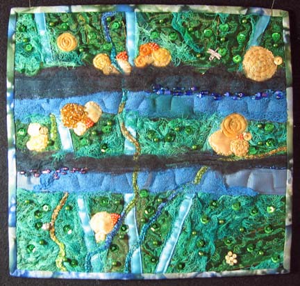
1I was cleaning up my studio the other day and found a quilt that I had finished in February of last year. I decided that even though it was completed, it really looked boring and needed some beading — which is wonderful because I have a lot of time on my hands in the summertime in which I can bead.
This is what it looked like before:
This is what it looks like now:
I don’t usually change something after I’ve “finished” it — but it just didn’t feel done to me. The smaller pieces are always nicer, I think, with a little bit of glitz on them.
Apathy & Copyright Lessons
5A week or so ago, there was a large discussion on QuiltArt.com about copyright. Congress is debating the Orphan Works bill (there is an excellent article on this subject here) and the subject of Flickr.com came up. Someone mentioned that they had found their work on Flickr posted by someone else and were upset that anyone logging on could use their image to put on coffee mugs. In the back of my mind, I remembered Gloria Hansen discussing how she had found an image of her work on Cafepress.com and that it was being used on lots of merchandise.
So on a lark, I went to Flickr, which I didn’t know much about, and typed “quilts” into the search engine. There were so many — so I typed in “quilts Greaves”. Holy Cannoli — there were my quilts that have been in the International Quilt Festival in Houston the last couple of years, some posted more than once.
When I started looking at the pages, there were copyrights on my quilts granted to the poster. I was stunned. In looking further, I found that Flickr automatically gives an “all rights reserved” copyright to people that post to their servers. (This can be changed to different degrees of copyright, but really none would apply in this situation.)
Their help files indicate that it is possible for the image poster to restrict downloads on an image, but there is no way to see download restrictions on an image page. To the casual observer, anyone could use the image on any Flickr products. (Which is interesting — one woman wrote me that she had put download restrictions on the images of my work — and my mom pointed out the irony that I couldn’t have made myself a coffee mug with an image of my own work.)
Flickr appears to be a community photo album — but there are people using it for sharing their experiences at exhibitions — which would be personal use and no problem (for me anyway) if Flickr did not presume the poster to be the sole copyright holder and automatically grant them an “all rights reserved” copyright on their images (of other people’s work).
This has been hard for me because I am flattered when someone likes my work enough to take a picture and share it with others. I believe that personal use of images is a good thing and that including images on blogs and other photo album sites is great when full attribution is given.
Someone on quiltart pointed out, however, they we do not have a working definition of “personal use” when it comes to copyright. And strictly speaking, copyright is either authorized or not — there is no room under the current rules for anyone to copy a piece of artwork unless authorized or otherwise not covered under the existing law.
Of course, Flickr’s reaction was to notify each poster of my work that they were being given “NOI’s” (notice of infringement) on their account and that more violations would result in termination of their accounts.
I am saddened by this entire thing. I have had very upset emails from the posters — who I honestly do NOT think realized that Flickr was giving them copyrights on my work — and all they want is to have continued access to their pictures. I wish that they would consider another photo album service — and have told them so — but in the end, it is easier to stick with what you know. (And sadly, from a legal sense, although their intentions were good, they did indeed violate my copyrights by not asking for my permission.)
And following the easy way is why there is apathy about the Orphan Works bill. No-one wants to think about how it is going to affect them. Actually, I would hazard to say that apathy is strong nowadays about a lot of things. My family had to face this same issue when we left — hmmm, let’s just say a mainstream church denomination. Everyone in our local church agreed with us, but no-one was willing to do anything about it. The minority has taken over. Political correctness has overcome our ability to defend our positions. We think that as long as we believe what we do that the others can’t really affect us. That is wrong.
Breast Armour
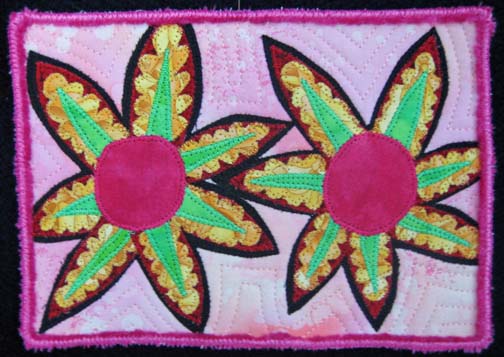
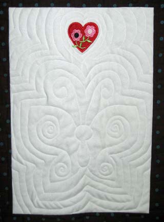
1As part of the Atlanta Breast Cancer Challenge put forth by It’s the Journey, Inc., I made a piece for Brazenly Radiant Art (BRA) sponsored by Fiber On A Whim. It will be auctioned on the Fiber On A Whim website starting June 15, 2008.
I have really debated what to call the piece. I love some of the slogans out there like “save the ta-ta’s” — but then I also read some really heartfelt responses by breast cancer survivors to these campaigns — and I can understand their hurt after mastectomy. I think I’ll call it “Breast Armour” — which is a big name for a small piece — it’s only 5″ x 7″. I may change my mind.
Happy Birthday Angel
1I know a little angel in heaven. Her name is Anna-Elizabeth and she is 9 today. Her family misses her very much, but today is her birthday, and I think that she would rejoice to know that her birthday is celebrated here as it is in heaven.
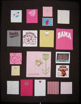
I have been working on a t-shirt quilt for her mother. This last Sunday was Mother’s Day and probably doubly hard for her mom to not have her here with her — but the secret that I know is that she is with her every day. Not everyone can see angels, but if you try really hard, you can feel them there with you. She helped me quilt this piece and I think that our hard work shows. It took two weeks of hard work, but here it is. The handwork — the binding and the label — still has to be done, but this is a short glimpse into where my energies have gone lately.
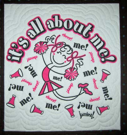
I think I’m going to call it “It’s All About Me” because one of the t-shirts says that — and really it is all about Anna-Elizabeth and her joy.

My Life in Black and White
0I am waiting for some supplies to come through the mail so I have spent today setting up my quilting frame. It was good to see it not lying on the floor — but it takes up a good chunk of space & now I want to rearrange everything — including where the cable line is. Nothing in life is ever easy.
I also took my latest quilt into Photoshop & removed all of the color. This is a great design trick to do when you are evaluating a piece before committing it to quilting. You want a good range of values — darks to mediums to lights — and a good flow across the piece. This piece has that — but I expected that since its theme was centered around values. I can also see a few spots that fell a little shorter of the mark than I realized — but overall, I think it holds its own.
Letting the Art Lead Me
2I have been working on my profile. When I had finished all of the applique sewing, I was stuck on how to assemble them. I wasn’t interested in a traditional setting but had no idea what I wanted to do. I went to the bookstore & stumbled upon a great book — Art Quilts: A Celebration: 400 Stunning Contemporary Designs by Lark Books. It shows several years of quilts from Quilt National, a very prestigious art quilt exhibition held every other year.
There was one quilt in particular that caught my attention. It was many blocks of applique set on a wholecloth with words behind it. Voila! Great idea. I didn’t want words, but complex cloth for a background sounded perfect.
I laid out a couple of card tables in the garage & covered them with plastic. I laid out the background PFD fabric and started painting. I considered dyeing it, but since I’ve moved, I no longer have a shop sink — only my kitchen sink — and I’m not quite ready to christen my new kitchen with the spoils of dyeing. So I painted — blue & green — and it looked very good — and very dark. I knew that the piece would have to be a light value to hold up the blocks. I considered finishing it and then doing another one — but I am running low on my bolt of PFD, so I brought it into the kitchen, plopped it into the sink (carefully that is), and ran water over it until the color was more of a sky color. Perfect. I then hung it outside to dry — which it did very quickly. I went to eat lunch, and when I was done, it was almost dry. I place it in the dryer to finish it.
I should also exlain that I had played with the layout on the computer — in CorelDraw. I knew that I didn’t care for the horizontal orientation — and having the bright yellow in the bottom right didn’t read right — so I took my digital picture, made a layout in CorelDraw, and set it all up. Then I changed the layout from vertical to horizontal, and then I flipped all of the blocks so that the yellow started in the top left and the black ended in the bottom right. I would show you the CDW files, but I set them in pages in one file & CorelDraw won’t let me export the pages. Oh well.
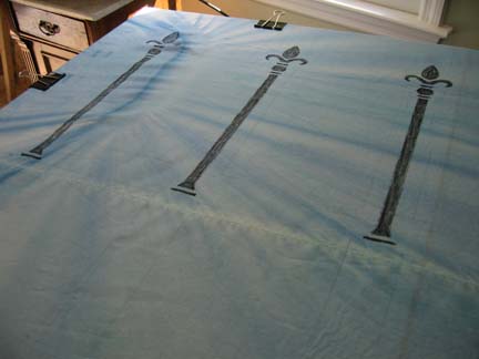
When the background fabric was dry, I laid it out, marked the middle, and drew boxes with light pencil marks for each block. And then I started thinking about this great stencil that I bought 8 years ago of an iron fence that I intended to use in my daughter’s room & never did. At first I was afraid that I had thrown it out in the move, but it was waiting for me in my work-in-progress stack. I measured and placed each rail, marking it with a black Pentel FabricFun Dye Stick. When I was done, I set the dye with a hot iron. This is my first time to use a stencil on a quilt.
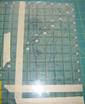
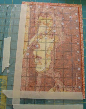
Then I started trimming my blocks. The original was 6 1/2 by 10 1/2 — so I grabbed my large square ruler & lay masking tape along those dimensions. It seemed like a good idea — but really was more irritating than helpful. Then I placed the overlay of the profile that I used to make the blocks on the top of the ruler & taped it down. I turned it to the back and cut off the 2 sides along the top and right side that stuck out. This became my guide for cutting.
Then I placed it over a block, aligned the image on the plastic on the top of the ruler to the block beneath it, and then cut the top & right side. Then I flipped the block over and cut the remaining 2 sides based on the 6 1/2 by 10 1/2 inch finished measurement.
When I was done, I pinned all of the blocks to the background on my design wall so that I could see where I was going.
I love CorelDraw. I used to use Photoshop to lay things out, but CorelDraw is really better for this. This is the first project in which I have exclusively used CorelDraw. Thank you Julie Duschack for introducing me to the wonders of using my computer for design work.
Which is to say that the design wall is very close to what I had done in CorelDraw.
I am currently sewing the blocks on. There are many ways that I could have done this, but I decided on the easy way — more fusing.
Now I want to add keys and I have been looking for key stamps. Sounds easy enough — and I live in a big city now so I should be able to find a stamp with a decent key. I have been looking for 2 days. At this point, I either have to order it from the internet or I can go down to Dick Blick and get the materials to carve a stamp myself.
Why keys? I don’t really know.
Model of an Atom
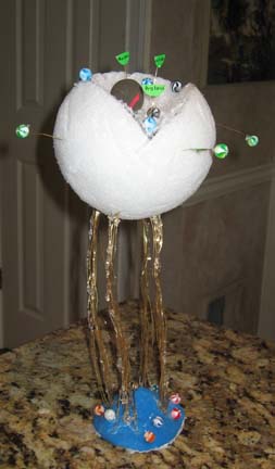
0My oldest daughter asked me to take her to WalMart the other day so she could buy supplies for a school project — a model of an atom. She bought gold jewelry wire, a large styrofoam ball, beads, and air dry clay. I could see the creative spark in her so I let her have whatever she wanted. (Thank goodness she didn’t ask for a pony.)
Isn’t it cool? I was so impressed that she could dream this up in her head. She used the wires to hold up the styrofoam ball, but she ended up using hot glue to attach the ball to the wires — and then had a blast making jewelry with the wire, beads, and glue. The styrofoam has a section cut out of it. She marked it with black marker and then I cut it out using a knife — carefully. It wasn’t as easy as florist’s foam, but I marked the outside & wedged it out in sections.
She used the beads and some of the air dry clay to make parts of the atom — and then used the wires and round green circle stickers folded in half to identify different parts of the atom. I think she added the beads at the bottom because they looked good there.
I can identify with that.
Reality Bites
0I was getting ready yesterday to write about my trip to the beach and about some books I had read recently — but I got distracted by upgrading WordPress. Sometimes those mundane tasks are comfortable and keep us from moving forward.
And then yesterday, I watched that old movie Reality Bites with Ethan Hawke and Winona Ryder — an early Ben Stiller movie. Much more serious than his later stuff.
I am a member of Generation X — and that is what this movie is about. At one point, Winona says that she was supposed to really be somebody by the age of 23 — and Ethan tells her that all she has to be is herself — and she says that she doesn’t know who that is.
Another theme in this movie is about selling out. Ben Stiller’s character (he cast himself in the movie) is Winona’s corporate boyfriend — and he has sold his soul. He takes her heartfelt documentary about her friends and their problems and changes it into a puff piece about how silly they are in order to impress the TV networks. When she finds out & gets upset, he promises to have them delete the pizza image — as if a silly fix like that would undo the damage that has been done.
And Troy, Ethan Hawke, Winona’s live-in friend who wants to be the boyfriend — he lives on the edge. He has been fired 12 times and his passion is singing nights in a band. That is the only thing he can commit himself to — unless Winona will change her mind and dump her boyfriend for him.
There is a great scene in which Winona accuses Troy of having sold out just like everybody else — except he doesn’t get paid for it.
And I think that that is what has me stumped.
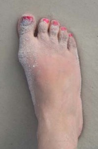
Anyway, last week we went to the beach. I took a picture of my foot:
I went to all that trouble to paint my toenails, I thought that I should preserve them for posterity. I also did my girls’ toes and intended to take pictures of their toes in the sand, but good intentions don’t usually get us very far.
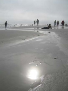
This is the view down the beach at SanDestin last week:
The first 2 days were beautiful and I burned. I always burn in Destin no matter how much sun block I put on. The last full day I spent under shelter.
I’ve been trying to improve my photography skills. I think that the hardest thing is just composition. I know my camera fairly well at this point — but the outside world is another thing. Maybe I’ll get a friend & go out one day next week just to take pictures. I could use the inspiration. I have felt burned out lately — the move took a lot more energy than I expected. I have almost all of the applique done on the cloned profiles I’ve been working on — and I finally got a good idea about setting it all together — but it will involve paint and stamps and foil and playing. I am thinking about setting it up in the garage. We don’t have a shop sink at this house, though. I didn’t realize how nice that was until it was gone. A wet studio is harder to set up than a dry one — although my dry studio is still a mess.
Cloning
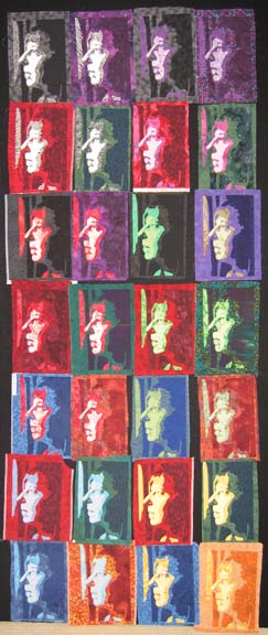
0I have been making progress at putting my studio together in our new house. I had to cut down the design walls to fit 8 foot ceilings but I realized that I didn’t have to wait on someone else & I did it myself. I had to have to room for my cloning. I took the piece that I started at the old house and started experimenting. I started with black (& white) facing purple, red facing green, and blue facing yellow. Then I made an inverse of yellow which I thought would be cool — it wasn’t. Then I made stages between the sets horizontally — light shades of black with dark shades of purple and light shades of purple with dark shades of black — and then I made stages between the sets vertically.
Sharon, a friend of mine, came over to the house yesterday, and since she was being toured through the house, she saw it. I don’t like showing in process pieces — well, at a stage that I haven’t picked at least — and she obviously didn’t like it. Don’t get me wrong — I realize not everyone is going to like my work and I’m OK with that — but Sharon is a friend of mine & it took a little bit of excitement out of the piece for me. I’m going to work on an exciting way to set all of the blocks in the hopes of bringing life back to it. Oh well — it happens sometimes. It’s usually my husband.
And I forgot to mention — some of these were very challenging to do and I have a few rejects — and a few that had several lives before they were happy on the design wall. It is very hard, for example, to put 2 light blues with 2 dark yellows — and get the contrast in values that I’m looking for in order to have depth. That is why I had to move into orange.