Posts tagged dog

Finishing Firecracker

2

Firecracker smI finished the Yorkie piece on the last day of February — which is great so now I can put February on the label. I know it seems silly but it validates that I worked really hard in February. I had it blocked and drying by the end of the day but didn’t attempt to photograph it until today. It took me a while to get it just right. I even used white as a background so I could align the edges just so. I think I’ve been using a black background as a crutch. Using the white makes it much easier to see whether everything is lined up correctly before I go open the file on the computer. It’s best to go ahead & do it right the first time than have to re-photograph it later for an exhibit application. I know I can always fix camera distortion in Photoshop, but most shows won’t let you make those kinds of digital corrections.

I decided to call this piece Firecracker. This Yorkie has such an explosive personality, it seemed only fitting. Her page can be found here. And in case anyone wants to know — yes it really is an applique piece. This is NOT a photograph — this is NOT an inkjet printed piece. It was insanely difficult but I feel like I’ve solved a difficult puzzle.

How To Make Lemonade

1

Last week I finished fusing the Yorkie. I put her up on my black design wall for a quick pic. Most things look so stunning on black.

Fusing Completed

And then I started the tedious process of appliquing all of those raw edges. I use a tiny zigzag. There is so much thread in this piece from applique, I doubt there will be much stabilizer that I can tear off the back.

I did applique the piece onto white muslin. I knew that my background was going to have its own applique elements — so it was easiest to use the muslin as my canvas.

Just as I was finishing the applique on the Yorkie, Pokey Bolton announced the exhibit It’s Raining Cats & Dogs at the IQA-Houston show in the Fall. I had known about it earlier because there was an invitational exhibit that included my piece Unconditional last year — and I was told that the following year, it would be juried. So I did have this in mind as I started this piece — and I also think that animals are much more marketable than people in terms of selling my work.

However, Pokey threw me a curve ball. The minimum on any side must be 25″ — the shortest side of mine was 24″. Clearly, I was going to have to make the best of things. I threw on my creative thinking cap and starting working. I considered a border — the easiest solution — but I don’t think that that would add anything to the design. I finally decided to extend the bottom. I freeform cut it too — I felt very brave. There is more here than I’ll need but there will be some shrinkage in quilting.

Applique Completed

I also decided that the left eye just wasn’t cutting it. There is a sprig of hair obstructing our view of the eye, but I still felt like it needed more of the detail of the iris.

Left Eye Before

Now it makes more sense to me.

Left Eye After

This is the final top. I have added the details of a jacket around her and the background behind the two figures.

To Be Quilted

I taught a class last week to my Fiber Art Fusion group about Color/Value & Picking Fabrics. It made me realize how dependent I’ve become on my color wheel. Can you see the tetradic color scheme (or double complement) I used? I think it works — although this is technically the hardest color combination to do successfully. I actually had no idea what to put in the background on the right — but figured out that pulling the green over from the collar but in a value deeper than the coat would work best.

So now I will start quilting. I just wanted to share with you how this little piece was coming along.


Little Dog Personality

2

The hard work done, I began last week to add the final dark values to my Yorkie. This shows the fifth value.

Value 5

And this shows the sixth value. She really comes alive once the deeper values have been established.

Value 6

And here I’ve added her black nose.

Nose

I actually had marked some black spots around the mouth, but they didn’t make sense at all — so I added a seventh value. It’s subtle but it’s still nice to have. I also ripped off that red mouth. Now that I had the dark values laid out, I knew it was a mistake.

Value 7

This is my newest take on the tongue. I took what was previously my lightest value & made it my darkest one. It seemed odd to me — but her tongue is really a light pink — a blush with a lot of white on top of it. I even managed to stay within my stash at home — which I didn’t originally think I could do (I don’t have much pink fabric on hand).

Tongue

After that, I worked on the detail in the eyes. The left one is not really visible — she’s turned to the side and it’s obstructed by her hair curling out over it — but the right eye is detailed. Her iris is yet another really dark brown. It’s not much different from the black in value — but it needs the break to define the eye.

Eyes

Today I’m studying my color wheel and thinking about what to use for her collar and the background.


Yorkie

0

For Christmas, I received this wonderful large applique pressing sheet. My old one is 18″x18″ — and I’ve done some larger pieces that made it difficult to do it off of a base like muslin.

Applique Pressing Sheet

To be honest, I don’t love it. I taped my vinyl overlay on top of it — placed it on my work table with the ironing cover — but when I iron the pressing sheet, it holds the heat a long time. If I place the vinyl overlay back on top too soon, it melts and shrinks the vinyl. (Ask me how I know.) My old sheet is made from a different material and I never had this issue.

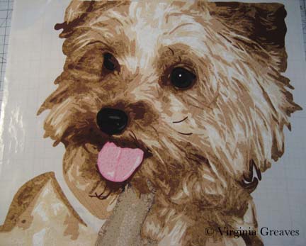
Anyway, I started working on my Yorkie last week. I know — it’s a complex pattern. The only way I could begin to keep track of it was to cover it with Sharpie in different colors.

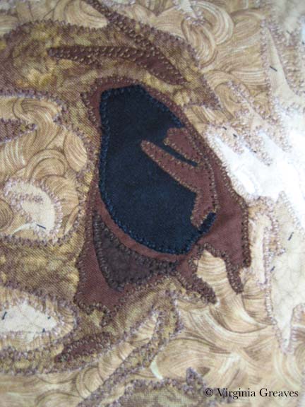
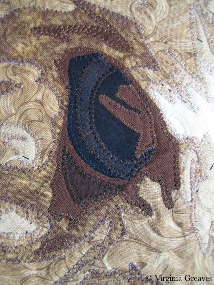
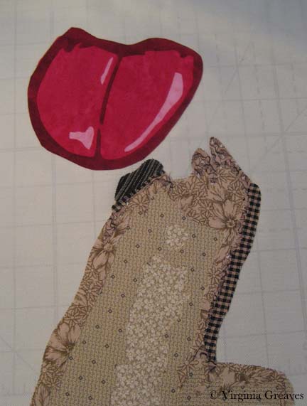
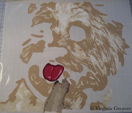
This shows the finger in front of the dog. It will be surrounded by fur.

Finger

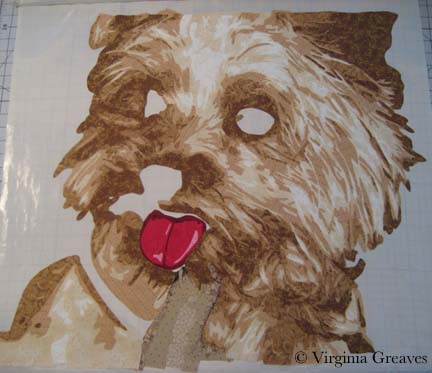
And this shows her tongue. I have reservations about the tongue — but because it’s all constructed on the pressing sheet, I can always rip it off later.

Tongue

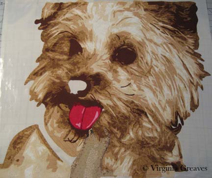
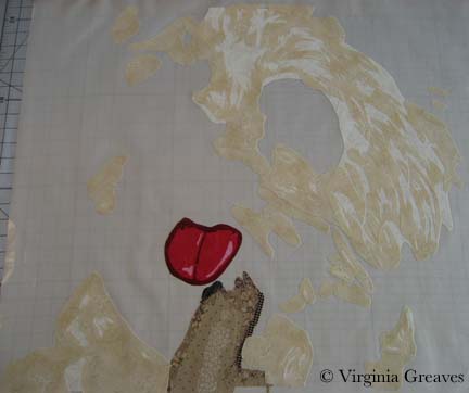
This shows the first value of the Yorkie. Not a lot to see yet.

Value 1

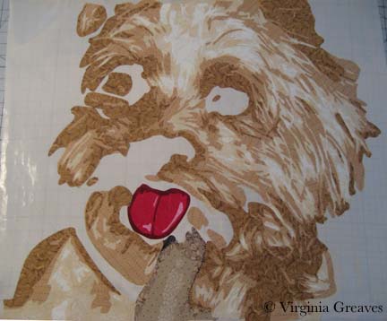
The second value shows more definition.

Value 2

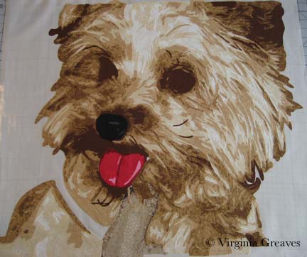
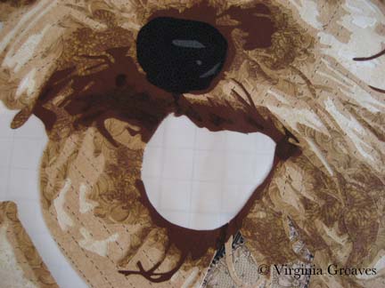
And the third value really brings out her personality. This layer was painful to do. Can you tell? There was a lot to keep track of.

Value 3

And this is the fourth layer. Also difficult. I like the way the fabrics are working together though.

Value 4

I’ve just finished the fifth layer today and have started on the sixth — then I’ll go back & add the black, the eyes, the collar around her neck, and finally the background.

I have been working on only fabrics in my stash. In some cases, I had little fabric to work with. The third layer I actually ran out of — but I remembered where I bought it a year ago and took a scrap back in the hopes that they still had some. The fabric angels were smiling on me that day — the woman at Tiny Stitches went into the back and came back with a very small bolt. She said she couldn’t sell me much because it was on hold for their embroidery group, but I only needed a small amount.

The fourth layer was also close — I made all of my patterns and placed them on the fabric before I started for fear that I would run out of it.

Next week, I’m speaking at my Fiber Art Fusion group on Color/Value & Choosing Fabrics. I’ve been writing out some notes but need to pull out fabrics to take with me. It’s hard for me to pull out of a project once I’ve sunken into it. It’s like becoming a hermit and it’s difficult to focus on other things.
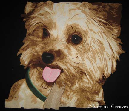
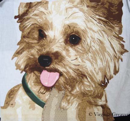
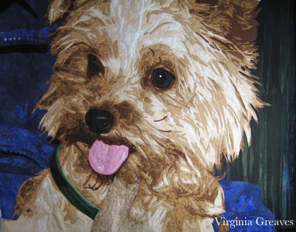
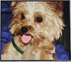
Pushin’ that Bull-Dawg

4

I finally finished the applique on the bulldog. This is what it looks like before I quilt him. I changed his right eye a little, but I think that is the only big change. Finding good thread matches was challenging, but it isn’t very obvious unless you look at it closely — and most people view my quilts from 4 feet away or more. I did re-use a background that I’ve used previously — but it was the only thing that I really liked. It makes it look like he’s standing out on the field on a beautiful sunny day, full of excitement for the players on the field.

I have four days next week to quilt him & bind him — or put him in a frame — before I have to deliver him to the auction chair. Let’s hope I can do it.

I received the news yesterday that my quilt Duodecim will be included in Art Quilts XV: Needleplay to be shown at Visions Gallery in Chandler, AZ. The exhibit will run November 5th through January 15. From looking at the list of those juried into the show, I think it will be a phenomenal show, and I feel blessed to be included.

If you notice a few changes here & there, I have been working on my blog. I recently changed my theme to one that accepts menus, and I’m hoping to re-write my entire website into WordPress. It has been many years since I created my original website in DreamWeaver, and it has everything on it that I’ve done in the last ten or so years. I think it is time to pare it down & bring it into line with the blog so that it is all seamless. I may even write a blog post about how I do it.

Pedal to the Metal

3

I was asked by my husband recently to give a piece to an auction — something I don’t ordinarily consider — but for various reasons, he wore me down & I decided to make something. In deciding on something that would do well at auction, I started thinking about framing it — which I haven’t done before — but I am starting to think that there is a larger art market out there that appreciates the simplicity of hanging a piece on a nail. It has become 2nd nature for me to hang my work on a rod — but when I gave a piece to my mom last year, I started to understand the frustrations that a hanging sleeve will give to an average person.

So it is my intention to frame the piece. I’m being a little noncommittal because I want to be able to change my mind. But in making the piece, I intentionally started with a standard framing size — 20″ x 24″.

And subject matter was another issue. In the great state of Georgia, what would appeal to the masses? That was an easy question to answer — football. And the most beloved symbol of Georgia football is its bulldog, a majestic animal that would make a fine subject for a portrait.

I really sweated the fabric choices on this. The bulldog has white fur — and I could have gone white and then started adding B&W fabrics in different degrees — but the end piece would look more graphic than familiar — so I attempted <gasp> solids. Or almost solids.

Interestingly, I’ve found that I’ve started segregating beyond basic colors — I now look for shades of pink reds — and shades of orange red. I tell myself that it is more about the shade than the color — but if you have 2 different kinds of red in a piece, it makes a difference.

I started with his mouth. Why? I don’t know. I try to start with the lightest colors & move to the darker colors so that I don’t have shadowing problems. Sometimes the muse moves us in mysterious ways. The pink looks like it goes too far to the right and left — but trust me — a bulldog’s mouth opens really wide & parts of it hang out.

Then the 1st fabric for the white. After I laid it out & started the 2nd value, I realized that the 1st fabric was not right — it was casting a yellow cast that I didn’t like. I needed whites that were more blue — so I tore off what I had done of the 2nd & re-did the 1st — and then re-applied the 2nd.

It looks a lot better — although I don’t know if the camera catches the subtle shift in color. No matter — trust me, it wasn’t working. The 2nd layer adds a lot of character.

This is after the 3rd & 4th values. I really wondered if this was going to work after the 3rd value — but the 4th helps pull it together I think.

Adding the different shades of black add the spark to his eyes and nose.

There is still a lot to do — I have to be done by the end of the month. I’m considering making a piece a month this year in about this size. That way, I could make 8 instead of 3 or 4 larger ones — and I think that the exposure to more subjects is what I need right now.

Go to Top