Posts tagged inspiration

The Last Supper

From Sting to Sing

2

Back in late July (I had to look this up — I can’t believe how long I’ve been working in this piece), I had an idea for a new piece. I had finished up most of the work for the Wash & Wax exhibit and wanted to get back to realism. A SAQA call for entry created a spark of imagination, and I was off and running on a large ambitious piece.

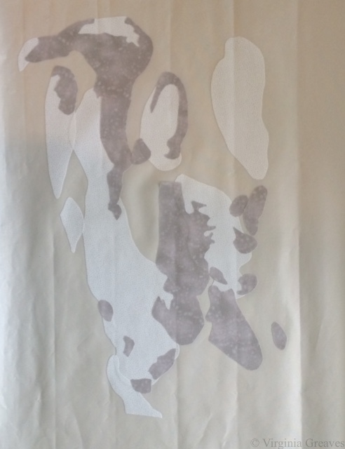
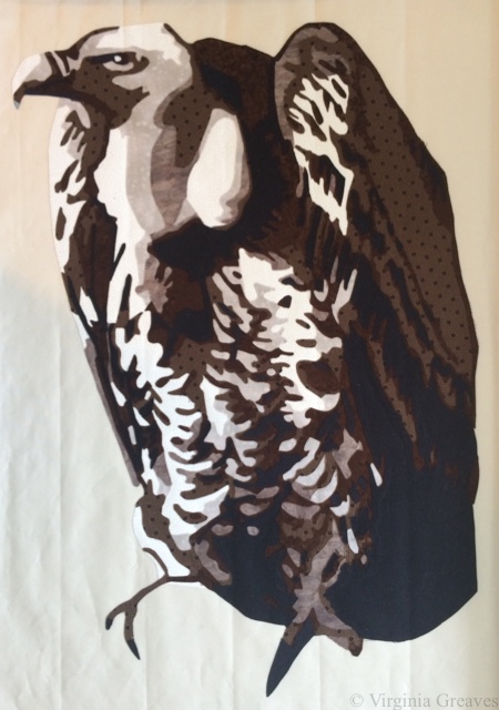
The central figure in this piece is a vulture. This is the vulture with the first value.

vulture1

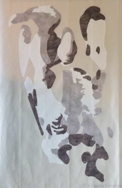
The second value.

vulture2

The third value.

vulture3

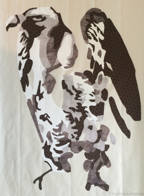
The fourth value. The bird really starts to come alive here.

vulture4

The fifth value.

vulture5

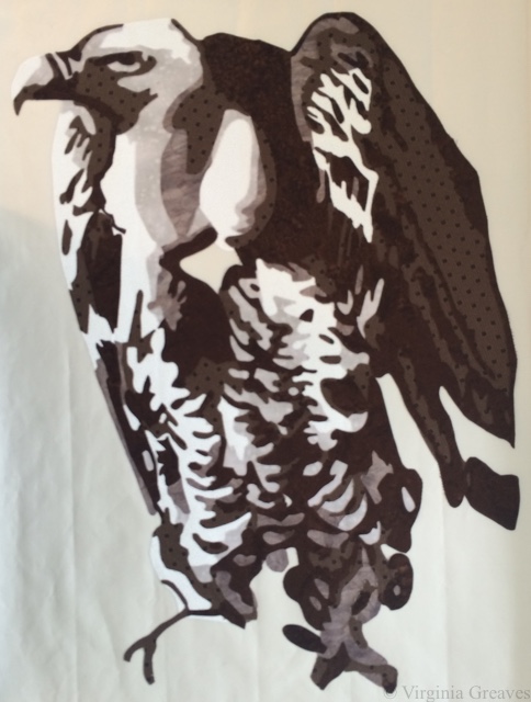
And the sixth value — all those really dark nooks and crannies.

vulture6

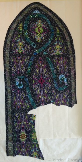
But there’s a lot more to this piece than just the vulture. There’s also a stained glass window. I knew that if I had the right fabric, I could fussy cut sections to give me the stained glass effect. I scoured the local quilt shops, but they just didn’t have what I needed. I ended up finding some Paula Nadelstern prints online, however, that were perfect.

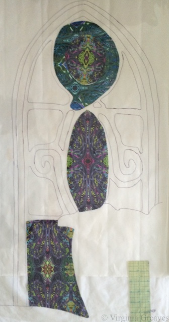
This is the beginning. The drawing is under the pressing sheet so you can see where I’m going with this.

glass1

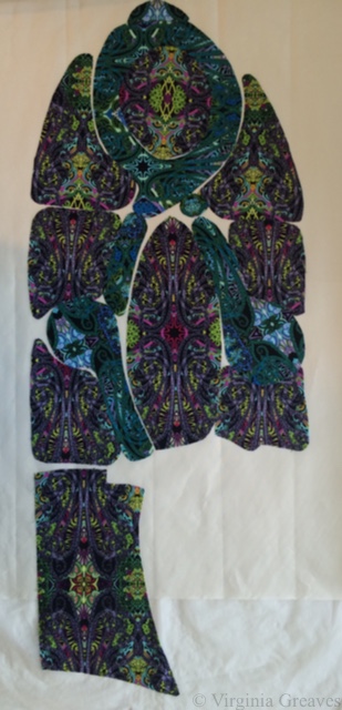
I originally picked a print in teal, but at the last minute, I also bought it in another color way and ended up using them both. I used the teal for the swirls and the purple/green/red for the main windows.

glass2

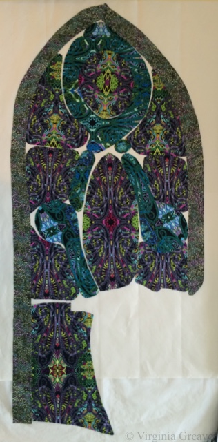
I had a very small piece of fabric in my stash that was perfect for the outer border. I had less than a fat quarter, but I had just enough.

glass3

And then I added this black stained glass print for the leading (also a Paula Nadelstern print.)

glass4

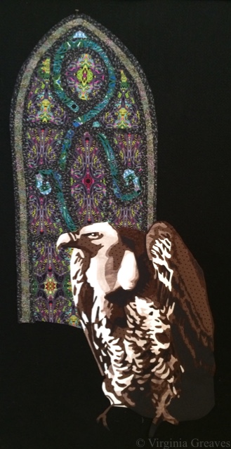
I pinned it to my black design wall with the vulture to see how if they were working together.

glass & vulture

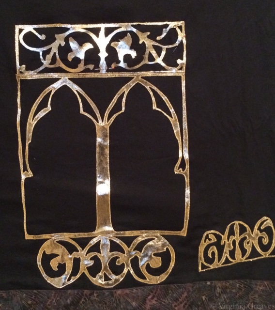
And then I kept going. I had a picture I had taken years ago of the brass lectionary podium in a church. I considered drafting out values and using flat cotton fabrics, but really, there’s a lot more choices in that fabric store beyond cottons. I found this metallic gold spandex nylon that has a black shadow to it. It’s stretchy, but what the heck. I figured the Wonder Under would help stabilize it.

I was still able to cut out some fairly complex shapes without it falling apart. This is a part of a screen section.

brass1

And this is part of the larger structure. I didn’t take many pictures of the lectionary as I worked on it. Suffice it to say that I had luckily cut out all of the complex parts before I broke my wrist — my right wrist.

brass2

That was on Labor Day. I was in the middle of curating a show at The Art Place and preparing for the opening of Wash & Wax. Thankfully, the only work I had left for the opening was to hand sew the binding of a 9 foot long piece. With a cast on my right arm, I would insert the needle with the right hand, and then pull it through & out with the left.

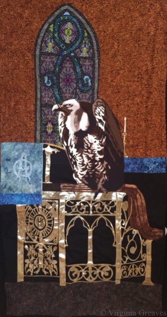
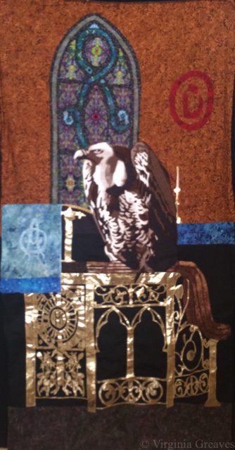
This shows the lectionary completed with a wooden railing at the top, the stained glass window, and other elements.

background without vulture

And here is the vulture in his place. I did, by the way, appliqué each piece on to the background as I went. I couldn’t risk the spandex stretching out of control on me, and it didn’t stick as well as I would have liked with the Wonder Under — but working one piece at a time, I worked through it like a large puzzle.

background with vulture

This pic is blurry (the sheen off that metallic fabric was confusing the camera in my iPhone), but it shows the addition of the Arabic symbol for Nazarene spray painted on the back wall.

background with Nazarene

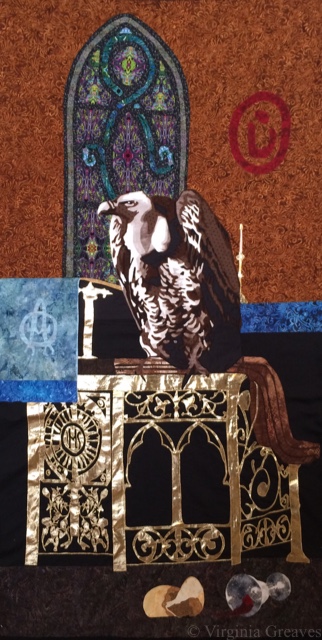
And then of course I had to add the spilled wine and broken bread at the bottom — symbolizing the broken blood and body of Christ — which also symbolizes the broken body and blood of Christians being murdered in the Middle East.

background with wine & bread

And even though I was in a lot of pain, I just kept going. Entries were due October 31, and I had spent too much time on this piece to miss the deadline.

I really worried about quilting this large piece. I still had my cast on, and I knew it would be heavy. I debated renting time on a long arm at the local quilt shop, but I finally realized that that was a new skill for me, and I really didn’t want this to be a practice piece for quilting.

So I moved all of my tables in my studio. In front of my machine, I have a board (which sits on my ironing board), and I put one table on the other side of that. Then I crammed another one just to the left of my chair. (I briefly envisioned creating a sewing table built like a doughnut.)

In the end, it worked. It supported the quilt perfectly, and I was able to quilt this in a week.

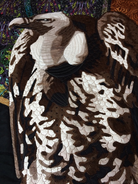
In this pic, you can see how the quilting outlines the vulture’s neck and defines his feathers better.

quilted vulture

At about this time, I got my cast off, only to learn that I had lost 50% range of motion in my wrist. But I just kept going. I managed to add the facing and the sleeve to the back. And then I photographed it myself. I bought some more lights since the piece is so large (once again wishing I had a Speedlite flash), but after spending a couple of days on it (and wishing I had someone I could just take it to), I finally got some good, sharp pics for entry.

I entered it a week before the deadline. I was so proud of myself. I loved how the piece turned out, and I felt confident that it would be a great contender for inclusion in the show. You can see the full piece on its page The Last Supper.

The Last Supper

I was wrong. My rejection email came this morning. However, I’m still very proud of this piece, and I was pushed to develop a complex story for my subject. I wouldn’t change a thing.

So I take the sting of rejection, and I move on. I will enter it somewhere else, and it will have a life. It didn’t fit in that show, but it will fit somewhere else. I just have to figure out where next is.

The Best of Intentions

0

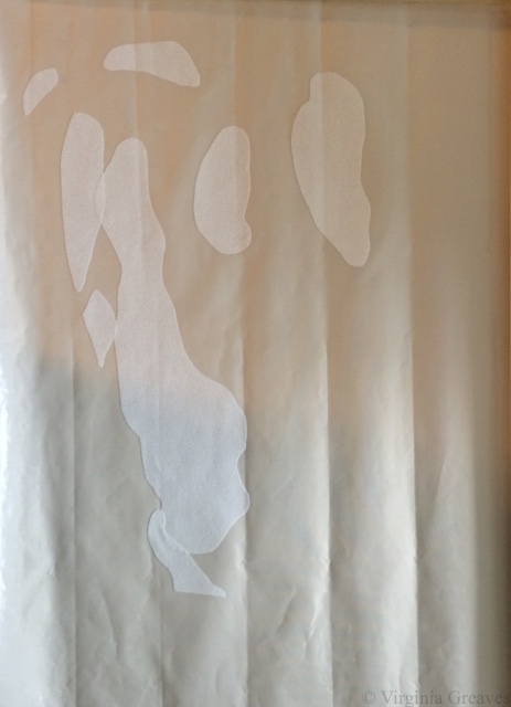
One of the last pieces that Leisa and I planned for our collaboration was a piece that we planned to cut into 12 smaller pieces that we would then frame and sell individually. I planned it to be a size that would split easily into 12 pieces and would fit in the size frame we chose with some extra to pull around to the back.

The best of intentions. So in my notes, I’ve been referring to this piece as Abstract-Mini’s.

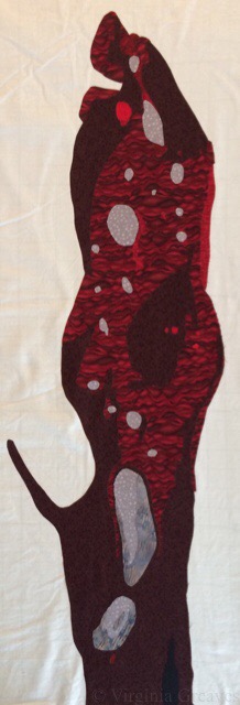
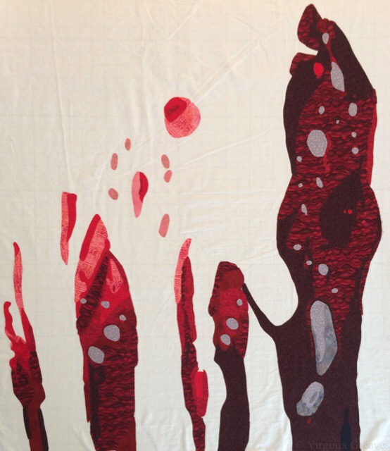
I started with the red. I shared this on my Facebook to give a taste of what the new piece would be like.

abstract7_1

And here is all the red laid out. I put on the grays only if they fell within the color areas I was working on.

abstract7_2

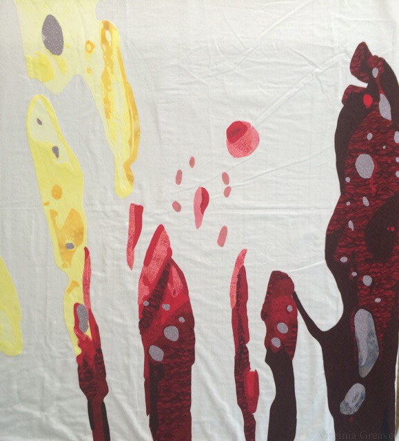
Then I added yellow. Should have really done it first. Tucked it under the red.

abstract7_3

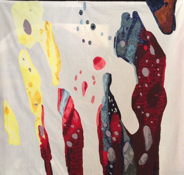
And here are the blues — with a little bit of orange up in the right-hand corner.

abstract7_4

Then I had to go back to the store because I didn’t have nearly enough gray. I had promised Leisa the appliqué of this last week, and so I was really pressed for time. When I came home to wash it (because I always wash my fabric before I use it), I realized my washing machine had died. It was full of soaking wet towels. The engine still worked, but a belt had broken so the tub couldn’t spin out all the water.

So I triaged all the towels across my deck. Unlike in other countries, hanging laundry in the yard is largely frowned upon here. It is certainly against my HOA rules, but I didn’t have a lot of choices.

And for my new fabrics, I set them to boil in my extra large ceramic pot on the stove. Boiling is actually better for getting out excess dye, and while I had it going, I rewashed all my new reds, too. (One of them had crocked onto some of the gray fabric all ready.)

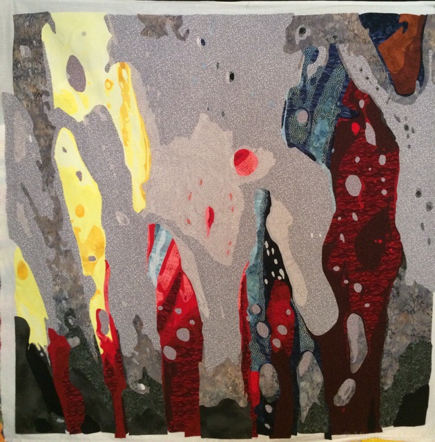
By early Sunday, it was all cut out. I pinned it on my design wall and took a pic.

abstract7_5

It’s much calmer than the other pieces. There isn’t as much darkness, and the grays give a lighter feeling of the soapiness in the car wash. I liked it, but I started to see that it wasn’t going to cut up well at all.

I did tell Leisa about my concern and told her that I’d leave her with the final decision. We set a meeting for today.

This morning, I had some time and decided that the dots in the pattern of the gray fabrics didn’t add enough texture, so I started randomly cutting out bubbles and adding them. I think it looks better. (The color is also better overall since it’s daylight in my studio at the time I took the pic versus nighttime in the pic above.)

abstract7_6

We met at Starbuck’s, and she agreed — this wouldn’t cut up well into 12 pieces. Each of the 12 pieces needs to have a lot of detail. The scale of this is wrong for that. This will, however, still be a wonderful piece in its entirety. I have changed its temporary name to abstract #7.

And now Leisa has it to work her embroidery magic on. I also gave her #5. It’s done except for a sleeve on the back. She wants to spend a couple of weeks hand-stitching on that one.

The planned abstract #7 will now become #8. It will be digitally printed onto fabric, and I will share more on that piece at a later time. We both agreed that we love that inspirational piece too much to not include it in the show.

I still have to do 12 mini’s, though. I am planning to cut them more organically using the fabrics that I used in #7.

So I’m behind — and yet ahead.

My new washing machine comes tomorrow. When I picked it out, I told the salesman, it has to be a top loader, it has to accept high sudsing detergent (which any quilter that uses synthrapol knows — and which means no High Efficiency), and the basket has to be big because I do a lot of laundry. There were two choices. I went with the Whirlpool. I suspect that the next time I have to buy a washing machine, I won’t have a choice but to buy an HE. Let’s hope they’ve worked out the problems with them by then.

I’m also working on an article about the collaboration for the SAQA Journal. Leisa and I talked about the draft today, and this afternoon, I spent a couple of hours rephotographing three of the pieces in my studio on a white background. It took me a couple of hours to get the pics where I felt like they would be good enough. I understand why people pay a professional photographer. One shot can take a really long time.

Working From Photographs

0

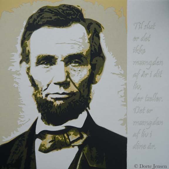
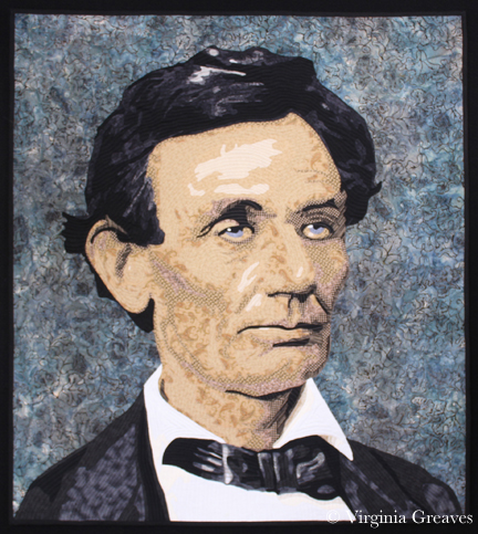
This morning, I was spending a few minutes on Facebook, and Dorte Jensen, who was accepted in SAQA as a JAM member at the same time I was, posted a picture of a piece she made of Lincoln to the Art Quilts page. Given the recent discussion of the use of historical photographs in your artwork, I couldn’t help but think that comparing her picture of Lincoln to mine makes my argument all too clear — that the use of a photograph as inspiration does not mean that the artist is merely copying the photograph. Obviously, there is immense skill in drafting a pattern from any photograph and rendering it in your own style.

Although the inspirational photograph for her piece is slightly different than the one I used, it is obvious that our styles are completely different.

This is Dorte’s piece.

Dorte_Lincoln

And this is mine.

Lincoln

If our pieces were merely copies, they would look almost identical.  Clearly they do not. They each have their own spirit and life and attributes that make each one special.

Dorte has also recently made a piece of Ben Franklin that is marvelous. I hope you enjoy her website.

As portraitists, it is inevitable that we will turn to historical photographs if we want our work to be marketable. The skill with which they are rendered are no less than if we were to use one of our own photographs. As long as the copyright is clear, they are a wonderful source of inspiration.

Wordless Wednesday

0

Christmas star

Wordless Wednesday

0

brussel sprouts

The Use of Someone Else’s Photograph in Your Work

8

Worry

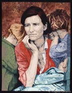
Worry has been quite the topic of conversation today. The QuiltArt List (an online email list for quilters) has been abuzz since someone brought up the subject of this piece at IQF-Houston — and not in a good way.

Many people are familiar with Dorothea Lange’s iconic photograph from the Great Depression — titled Migrant Mother — from which this piece is inspired. The original poster thought that I had merely printed the picture onto fabric and then thread painted it — therefore saying that it was a gross violation of Dorothea Lange’s copyright.

Well obviously Dorothea Lange’s photograph is in black and white and this is not. My piece is all machine appliquéd from commercial fabrics. It is NOT a colorized version of her photograph that was printed onto one sheet of fabric.

Also, I am clear that this is inspired by Dorothea Lange’s photograph, and if you look it up, you will find that — however famous the photograph is — it is in the public domain and therefore free of copyrights.

I also assure that there was extensive drawing from the original photograph to create this pattern. I make a value painting of all of my pieces that start from a photograph, but photographs rarely ever tell you everything you need to know. There are many details that photographs don’t tell you — like fingers and eyes — and many shadows have to be deepened and highlights have to be brought out. You can obviously and easily posterize any picture in Photoshop, but these patterns will never have the level of detail for which I strive.

Furthermore, since it’s a black and white photograph, the color story is entirely mine.

You can make an argument regarding composition. I understand that. In using Dorothea Lange’s photograph, I used her composition. I did not violate her copyright nor did I break any of the rules of the competitions in which she has been entered.

It’s a decision. A couple of years ago, I researched how to make my work more marketable. One way to do that is to use historical figures as subjects. This means using someone else’s composition — essentially. I don’t always do this, but sometimes I do.

There are people that don’t agree that this should be viewed as art.

It’s interesting. I only find this discussion among quilters. I hung this piece in an art exhibit back in May. Everyone knows its inspiration is a well-known photograph — and no comment was made about whether or not it was art. It was not brought into question whether or not it was eligible for a ribbon. I am sharing this merely to contrast the differences between the two communities.

Is it art? Have I created something that hearkens back to the story Dorothea Lange created — and yet made it my own, using my own medium? Does anyone see the modern era mother who has the same stress as the mother from the Great Depression about caring for her children in times of economic hardship?  I suppose the answer will be a personal one to everyone reading this.

Wordless Wednesday

0

IMG_1260

IMG_1261

IMG_1263

Wordless Wednesday

0

sunrise

Wordless Wednesday

0

sunflower

Wordless Wednesday

0

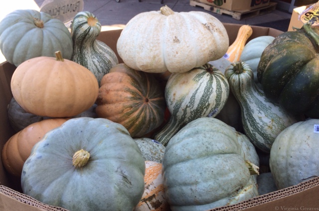
Pumpkins

Go to Top