Virginia Greaves
(7 comments, 341 posts)
This user hasn't shared any profile information
Home page: http://www.virginiagreaves.com
Posts by Virginia Greaves

Textile Photography
3I joined SAQA recently and had my first Webinar. I holed up in the computer room, hogged the phone, and dialed in to hear Gregory Case talk about photographing textiles.
I take all of my own photographs — have for years — and have found that most instructional materials don’t cover the special topic of textiles. They photograph so differently from other medium — so I was thrilled to find this online class available through SAQA.
And I learned a lot. I’m fairly skilled at Photoshop, but he gave me a lot of helpful information about manual settings on my camera — all of which I put to use this morning. I finally finished Bull Dawg and needed to take pictures before sending it into its exhibition life — so I set up my camera and took what I think is the best textile shot I’ve ever made:
I’ve never taken a shot in which the quilting lines were so apparent. And the colors of the full view came out very true. I was so delighted!
I wish I could say the same of my detail shots — even placing the lights right next to the piece, they came out dark & the colors skewed. But Rome wasn’t built in a day. I may just need some more lights. I never realized how light hungry cameras are.

Pushin’ that Bull-Dawg
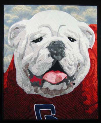
4I finally finished the applique on the bulldog. This is what it looks like before I quilt him. I changed his right eye a little, but I think that is the only big change. Finding good thread matches was challenging, but it isn’t very obvious unless you look at it closely — and most people view my quilts from 4 feet away or more. I did re-use a background that I’ve used previously — but it was the only thing that I really liked. It makes it look like he’s standing out on the field on a beautiful sunny day, full of excitement for the players on the field.
I have four days next week to quilt him & bind him — or put him in a frame — before I have to deliver him to the auction chair. Let’s hope I can do it.
I received the news yesterday that my quilt Duodecim will be included in Art Quilts XV: Needleplay to be shown at Visions Gallery in Chandler, AZ. The exhibit will run November 5th through January 15. From looking at the list of those juried into the show, I think it will be a phenomenal show, and I feel blessed to be included.
If you notice a few changes here & there, I have been working on my blog. I recently changed my theme to one that accepts menus, and I’m hoping to re-write my entire website into WordPress. It has been many years since I created my original website in DreamWeaver, and it has everything on it that I’ve done in the last ten or so years. I think it is time to pare it down & bring it into line with the blog so that it is all seamless. I may even write a blog post about how I do it.

Pedal to the Metal
3I was asked by my husband recently to give a piece to an auction — something I don’t ordinarily consider — but for various reasons, he wore me down & I decided to make something. In deciding on something that would do well at auction, I started thinking about framing it — which I haven’t done before — but I am starting to think that there is a larger art market out there that appreciates the simplicity of hanging a piece on a nail. It has become 2nd nature for me to hang my work on a rod — but when I gave a piece to my mom last year, I started to understand the frustrations that a hanging sleeve will give to an average person.
So it is my intention to frame the piece. I’m being a little noncommittal because I want to be able to change my mind. But in making the piece, I intentionally started with a standard framing size — 20″ x 24″.
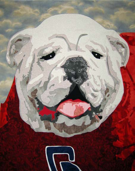
And subject matter was another issue. In the great state of Georgia, what would appeal to the masses? That was an easy question to answer — football. And the most beloved symbol of Georgia football is its bulldog, a majestic animal that would make a fine subject for a portrait.
I really sweated the fabric choices on this. The bulldog has white fur — and I could have gone white and then started adding B&W fabrics in different degrees — but the end piece would look more graphic than familiar — so I attempted <gasp> solids. Or almost solids.
Interestingly, I’ve found that I’ve started segregating beyond basic colors — I now look for shades of pink reds — and shades of orange red. I tell myself that it is more about the shade than the color — but if you have 2 different kinds of red in a piece, it makes a difference.
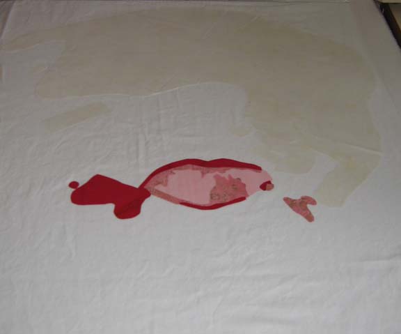
I started with his mouth. Why? I don’t know. I try to start with the lightest colors & move to the darker colors so that I don’t have shadowing problems. Sometimes the muse moves us in mysterious ways. The pink looks like it goes too far to the right and left — but trust me — a bulldog’s mouth opens really wide & parts of it hang out.
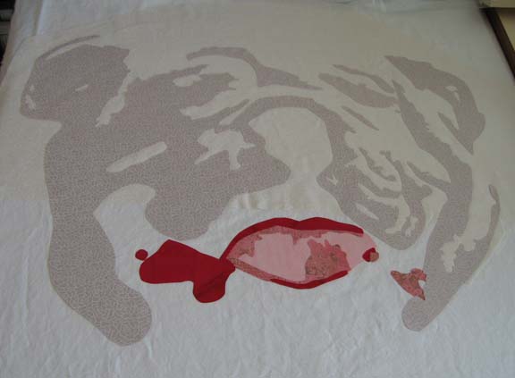
Then the 1st fabric for the white. After I laid it out & started the 2nd value, I realized that the 1st fabric was not right — it was casting a yellow cast that I didn’t like. I needed whites that were more blue — so I tore off what I had done of the 2nd & re-did the 1st — and then re-applied the 2nd.
It looks a lot better — although I don’t know if the camera catches the subtle shift in color. No matter — trust me, it wasn’t working. The 2nd layer adds a lot of character.
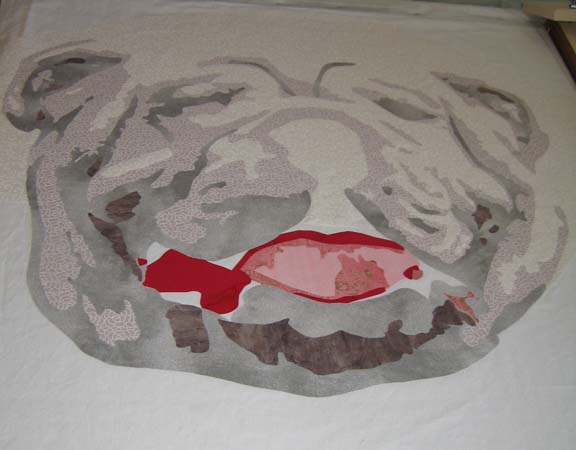
This is after the 3rd & 4th values. I really wondered if this was going to work after the 3rd value — but the 4th helps pull it together I think.
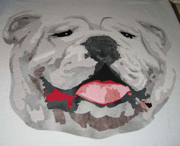
Adding the different shades of black add the spark to his eyes and nose.
There is still a lot to do — I have to be done by the end of the month. I’m considering making a piece a month this year in about this size. That way, I could make 8 instead of 3 or 4 larger ones — and I think that the exposure to more subjects is what I need right now.

Motus 2010
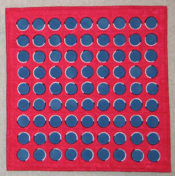
1My Fiber Art Fusion group had our annual show reception last night. (It will continue to be on public display at The Art Place in Marietta through the month of September.) The theme this year was Motus — or Movement — which was a tough one for me. My first thought was to do an optical illusion — more abstract than what I usually do, but I wanted to see if it could be done in fabric. I used colors from the American flag & created Altered States of America:
When I made this piece, I showed it to a friend of mine that couldn’t see it — which I really didn’t understand — until another friend told me that some people can’t see optical illusions. (Learn something new every day.)
I also made this much larger piece, We the People:
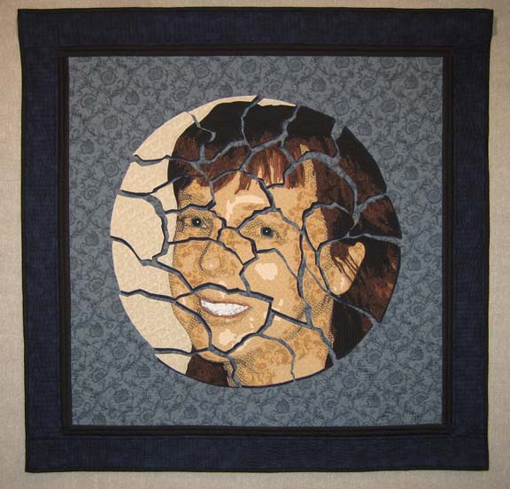
and included a piece I made earlier in the year, Cracked:
I think it was a very successful show, and I was honored to be included with such a wonderful group of women (and Ben).

We the People
4In the past year, I’ve started to show my age. I’ve spent time looking through photo albums, archiving pictures in digital form, researching relatives (with the help of DAR, I’ve gone all the way back to the late 1700’s) — I’ve wanted to know where I came from. And part of that journey has been looking at how my lovely country developed — why our founding fathers here in America made the decisions that they did. Probably my best exposure to the Constitution, however, was provided by School House Rock.
So I’ve been considering this lovely document — hand written by our founding fathers — created at a time in which typewriters had not yet been invented. There is some beautiful calligraphy for the titles, and the majority of it was transcribed by James Madison’s cursive script. Cursive is a personal thing, unique to each individual. I’ve heard that there are some schools that have stopped teaching it — a shame. It is a beautiful and artistic expression.
All of this finally came out this past week — my kids went back to school and I had time on my hands. I also have the unique opportunity to include the piece in my local group’s art show — but I have to work fast. I only have a couple of weeks.
So this is where my muse led me — running at an insane pace.
I took white muslin & dyed it overnight in coffee. Coffee gives such a wonderfully rich color — very antique. I did not completely wash it out — I wanted to be able to add water stains to the piece to add to its age & make it look like old parchment.
Did I mention it was a lot of muslin? One & 2/3 yards. I thought that that would do it. Oh naive. For some reason, I thought that I could fit the Constitution on this. Well I was wrong. But I did fill it up with as much as I could. I tried to follow the calligraphy, but the rest is my own dear cursive hand writing. Did I mention that my hand cramped a lot? I forgot about that part of hand writing. But I kept going. I got through Article II Section 1 (although the final piece won’t show all of Section 1 because of how it’s cut out).
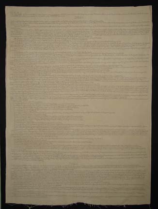
In copying it, I was struck by the number of capitals, the most wonderful of which is People. We the People — we are capitalized, just like President. We are important and have a soul in this document. It felt so beautiful and empowering. It is a document for us — We the People.
I decided to use Peltex for the inside — which was challenging. This is a large piece and required a lot of Peltex. It was my intention to quilt it after I sandwiched it with Peltex — what was I thinking? My domestic machine was no match for this. No — I would have to cut it up before I could begin to quilt it.
And did I say something about cutting this up? I’ve developed an interest in deconstruction — a fact that disturbs my DH — but I find fascinating. The Constitution is a living document that we have been amending — or deconstructing & rebuilding — practically since it was written. I wanted to make this hard edged piece fluid.
I started by marking my pieces on the top — I was lucky & found the perfect circle to use that would cover the entire width in exact repeats — and then I added tape numbers — because once this is cut up, putting it back together could be tricky. The circle seemed the perfect shape to me.
It was so large, I had to cut half of it on the floor — and I’m very sore today. You wouldn’t think that crouching on the floor would use muscles that you don’t usually use — but it does. After I was half done — it was small enough, thankfully, that I could finish at a table.
My first thought was to only use the circles, but now, looking at it on the design wall, I think I’m going to keep the diamond intersections.
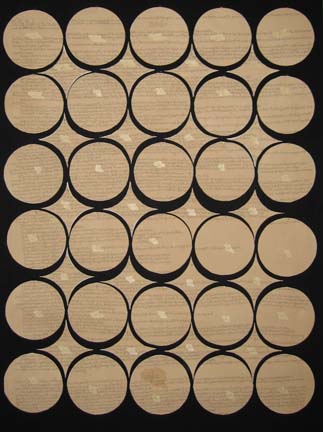
After I took this picture, I sprayed it carefully to create more water marks.
My next move will be quilting each piece — and then the difficult task of edging each piece with thread — and when that is done, I have to think about hanging it. I’m still mulling it over in my mind — but the circles will hang horizontally, each from the piece above it — and the diamonds in a similar way but at an offset to the circles. I may use thread, I may use chain — I may add tea bags since they symbolize the freedom that we grasped by turning away from British imperialism.
It’s a work in progress — not like my illustrative work — but something the Muse commanded me to make.
The Fat and the Skinny
3Although this may sound like a discussion of waist size, it’s actually about envelopes. When you enter an juried exhibition, you generally know by the size of the envelope whether or not your piece was accepted. It is the same when sending applications to colleges. A fat envelope tells you that you got in — the skinny envelope is <hopefully> a polite decline.
I was lucky enough yesterday to receive a fat — and a skinny. One acceptance — one rejection. I value humility as a character trait so I can swallow the rejection — and certainly, it’s more digestible with a fat envelope in the other hand.
For those in the know, I’m talking about the International Quilt Festival World of Beauty exhibition to be held in Houston in November of this year. I am thrilled to be included. I’m still holding out hope that some day I’ll win something — “hope springs eternal” right?
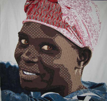
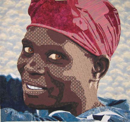
Both of my entries were in the “Art: People, Portraits, & Figures” category. The one going to Houston is Rwandan Lady:
I hope she does well.
I try to show each piece at least once, so I now have 2 other pieces from this year to put out into the world. I’ll have to start thinking about other venues.

Quilting a Face & Conquering Your Fears
6I should say, conquering MY fears. Every time I finish a quilt, the hardest point for me is when I have to sit down & start quilting. I think about everything else in the world I can do to put it off, and my heart races at the thought of beginning. I think it is very similar to the fear of drawing — which is the fear of failure. Moving through a process that makes it less initimidating & breaks it into smaller, workable pieces is how I have to approach quilting — or I would never get it done. To be honest, I’ve even considered skipping this part altogether. I know an artist that mounts all of his fabric pieces on wood — and another one that mounts it onto a frame — but in the end, I know that the quilting adds a dimensionality to the piece that I like. I just don’t always know how to get there.
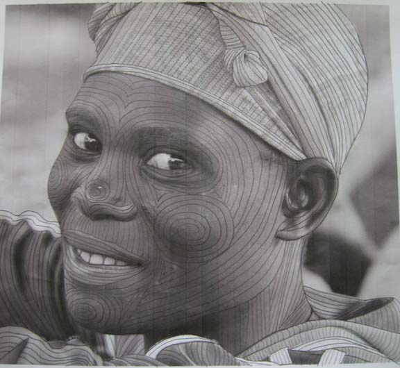
What works for me is to take a black & white picture of my photograph & start drawing on it with a pencil. I can mess up, erase, and start over. I try to follow the natural contours of the face — or the line of the shirt, or the neck, or the ear. Pulling all of these lines together into something cohesive is what I am working out on paper so that I won’t be pulling out stitches later on the quilt. I used to draw all of my lines on the quilt — I don’t do that anymore (it took too long & once I had my confidence, I didn’t need it anymore.) I look at my roadmap & I draw in a few primary lines on the quilt — and then fill them in with contour quilting lines.
I won’t always follow my map exactly, but I have an idea of where I want to go and I refer back to it as I quilt.

Studio Time
5I had to remind myself today to hold studio time more sacred. I realized that I have just over a month to complete my current quilt if I want to enter it into Houston. So I ignored the ringing phone and did everything I could to finish cutting out the appliques on my latest quilt. I had to re-do the turban — I really didn’t like the fabrics in my 1st effort & the actual drawing in the turban needed some tweaking.
Even though the light is at the back of her head, all of that white just looked wrong so I switched it with my medium tone used on the front of the forehead to add balance. I then added some deeper tones in the folds and ignored the final value I had in the drawing — I didn’t have enough in my new fabric range & I decided it looked fine without it.
I am so pleased with it. Strange that the turban would be the part that gave me the most trouble.
Tomorrow I will begin covering the raw edges with an applique stitch — I use a narrow zig-zag. That will take me about a week — although it will be next week until I finish it as I have company coming tomorrow for a few days. Nose to the grindstone.

Rwandan Redemption
1One of the great things about being in the Anglican church in Atlanta is that we fall under the diocese of Rwanda. Years ago, when our priest went to Rwanda to talk to our bishop, he asked him if there was anything that he could do in return to help Rwanda in exchange for all of the blessings that they had provided him — and the bishop answered him simply “sell our coffee”.
So Jonathan started Land of a Thousand Hills which owns three coffee houses here in Atlanta & sells coffee directly to many churches in our area. It is a beautiful opportunity to provide the people of Rwanda a living wage while giving others the gift of their wonderful coffee.
Jonathan returns to Rwanda about once a year and as I was sitting in church a couple of weeks ago, he started talking about the friendship between a man and a woman — one Hutu, one Tutsi — who were personally linked through murder during the genocide of the 90’s but who now accept redemption and forgiveness — and work together in the coffee fields.
That is an amazing thing — to ask for & receive — or to give — forgiveness for murdering family members — all through the grace of God.
I had been struggling with my next project — which sounds like a meagre anxiety in comparison to people familiar with machetes — but it became clear to me that it was important that I make a portrait that would capture this beautiful story. Jonathan (and his coordinator Karen) were kind enough to allow me to choose one of the many pictures that he has taken on his trips. After looking through many, there was one of a woman bending over the grates, sorting coffee beans, with a relaxed and happy expression on her face — a light in her eyes.
I am Caucasian and all I’ve done in the past have been Caucasians so I was nervous about working on an African portrait — I knew that the palette would have to be different — but I surprised myself. I walked into the fabric store & came out with a wonderful value range. It was strangely easier — but I do think that my eyes are becoming more trained to see value over color. The more you do it, the more you can see it.
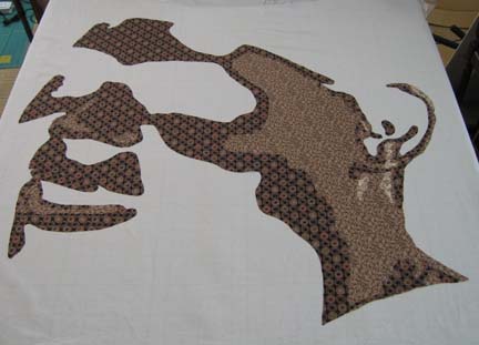
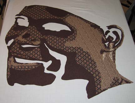
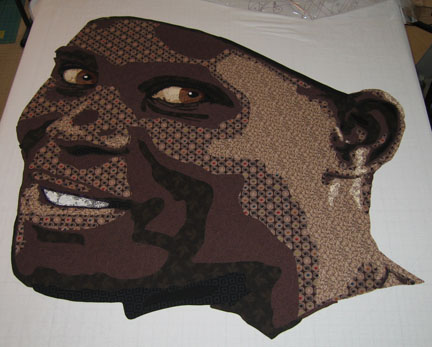
This is what she looks like with the 1st 3 values. You can’t see the outline of her face well with only the 1st 2 so I thought I would skip to the 3rd. I was really surprised at what I chose for the 3rd value. It is a dark brown with taupe circles with green, red, black, & blue in the centers. It doesn’t seem that it would work — but the print is small enough in relation to the overall piece that it does.
This is with the 4th value — you can really see her coming to life.
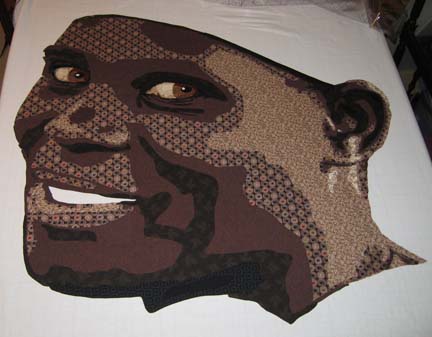
This is with all of the values — and her eyes. I will admit I had an uh-oh moment — I had 6 values & realized I needed 7 but all ready had 5 fused. The last value is a jet black — so I used a black for the 6th that has a pattern on it. Although the effect is subtle — and you probably can’t see it here — it works OK in the piece. I could have technically eliminated one of them & just used the jet black — there is only one place where they are touching — but what I did works fine.
And the eyes. Most Africans have brown irises — but with the brown skin, I thought it important to use another brown altogether. I think that the more yellow brown helps her eyes pop a little more. Also, in Caucasians, I have used the face colors to make the sclera — or white part of the eye — and it’s always worked. I’ve always preferred that to just white fabric. However, with this piece, I couldn’t re-use the face fabrics for the eye — but it was easy to see that I just had to go pull the fabrics I used in previous pieces & that would work perfectly.
The mouth was another challenge. The teeth were made the same but the color around the mouth was an issue. I realized that I had to choose something that would be darker in value than the skin tone just around it. I tried browns, reds, purples — I had half my stash out of the closet. After thinking about it for a while, I decided I needed a really deep purple — which I did have to run out & get since I didn’t have any on hand. I also shortened the mouth & used the printed black for the corner of her mouth as the purple extending beyond her gumline made no sense.
I’m really pleased with how she is turning out. Next week I will work on adding her hair turban and shirt as well as a background. In the photograph, she has an orange turban & blue shirt — but I may well change it. I’ll take this last in-process picture into Photoshop & decides what looks best on her next to her skin as I have recreated it.

Fiber Art Fusion Class
0Last night, I walked through my process with my Fiber Art Fusion group. Great bunch — always a fun group to spend creative time with — but I was so nervous about doing this in front of MY group. Speaking in front of strangers is so much easier. In addition, this was more than a trunk show — I was walking through my process — which is complicated. Yes, there are other ways to achieve the same ends. I tried to tell them which things I had tried & explain why I do things the way that I do. I tried to make it as simple as possible — but at one point, all of those blank faces was truly daunting. It’s a detailed technique and requires a lot of drafting — so I guessed that about half would love it and half would hate it — which I think accurately described the meeting.
I have been working with fusibles for so long I had forgotten all of the misunderstandings. Although most everyone immediately understood machine applique — and there were hardly any questions about Photoshop — using Wonder Under created the most problems. If I do this again, I’ll have to come up with a better way to demo how it’s done.
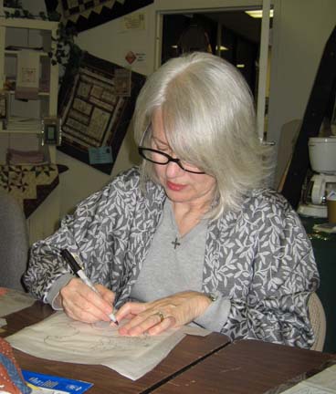
This is Martha Meyers working on drafting:
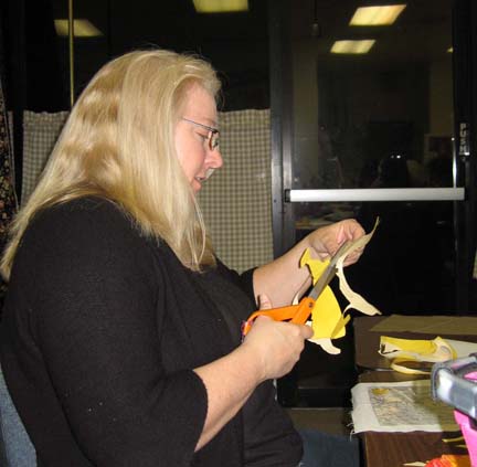
And this is Rebecca Reasons-Edwards happily cutting away (my favorite part):
I’m hoping that a few of them will share their finished fused projects. Unfortunately, most of them only got through with drafting and a couple only through the first value by the time we were done for the evening.
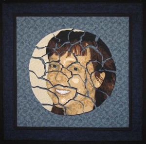
Before I ran through the project, I did spend some time showing them some of my portrait quilts including one that I finished just in time for show & tell — Cracked:
You can read more about this piece in the gallery section of my website here.
I did have someone ask for resources for learning Photoshop. I have taken online classes at both Eclectic Academy & LVSOnline & found them both to be wonderful.
After spending the last 3 weeks quilting & wanting to finish my quilt in time for the class, it feels strange to have a day without a deadline looming over me.
I do want to point out that there is a substantial border on Cracked — which I don’t usually do. After hanging Duodecim in my dining room with my usual black skinny binding as a stand-in for the only border — I decided that maybe my piece needed breathing room. If it were a painting, I would have added a broader frame — for a quilt, a wider border. So I added one on this quilt.
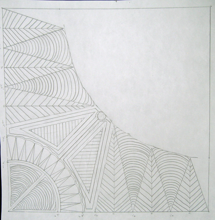
When I was done quilting the plate pieces, I was really stuck on how to quilt the rest of it. I took a 16 x 20 piece of paper, mapped out a corner, took out the quarter circle, and starting drawing with a pencil. I made a few adjustments along the way — and the corners had to have room to change since the plate pieces affected each corner a little differently, but this is my last drawing.
In the final border, I added what I call piano keys. I had intended to stipple — but it’s been a while & my stipple was just too rough. The keys add a more formal border anyway, which I like.
I’m not sure I’ll do another one with a wide border again. I’ll have to hang it in my dining room first and see if I like it better.