Drafting Part II
1In case it wasn’t obvious in my previous post, we have been working on drafting a pattern.
At this point, we can print out the pattern. For a long time, I would take an 8 1/2 x 11 sheet to a blueprint shop and ask them to enlarge it for me. If I remember correctly, most of the large format printers go up to 36 inches. The problem I had was inconsistency — if the employee wasn’t skilled, he would give me something smaller.
I finally found that I enjoyed having control over the final size. You can make anything large in Photoshop — but after many years of complaints, it still won’t tile print. For that function, you must use a vector program like Illustrator or CorelDraw.
A couple of years ago when I made the change, I went with CorelDraw. I took a class and was able to purchase it at a student rate. And CorelDraw is a very good product. Unfortunately, it isn’t Mac compatible — so I keep a PC in my studio just for CorelDraw — which, if I haven’t mentioned, is a pain.
When I first bought CorelDraw, I learned about all of the many things it could do — and for a while, I would import my BMP from Photoshop, and using my Graphire pad and pen, I would draw the outline of all of the shapes — and add in the numbers for values. Over time, I found that it is really easiest for me to import the file, print it out, and draw on it with a Sharpie. It gives me my pattern and my reverse pattern all at once.
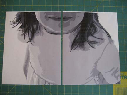
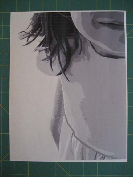
In this picture — just one slice of the overall piece — there are overlap places on all four sides — the white area. You can choose which two sides to take off — just be consistent. I take off the right and bottom sides.
This is what it looks like after it is cropped.
After I have cropped the first page, it will fit neatly over the next page, hiding the white spaces on the top and left sides (in this picture, just the left side). I find the closest join that I can, and then I attach them with clear tape, being careful not to tape on a form that I’ll need to outline with Sharpie.
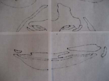
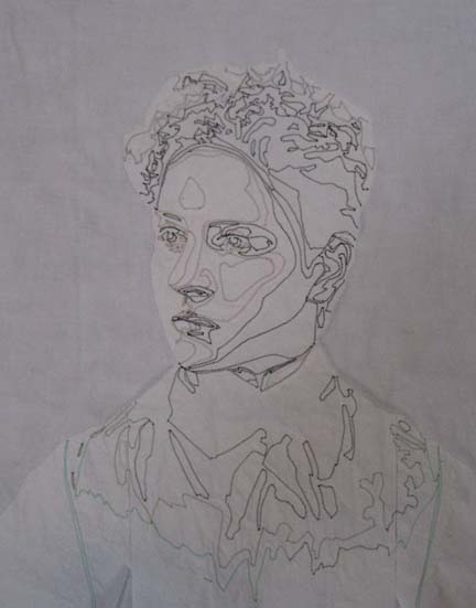
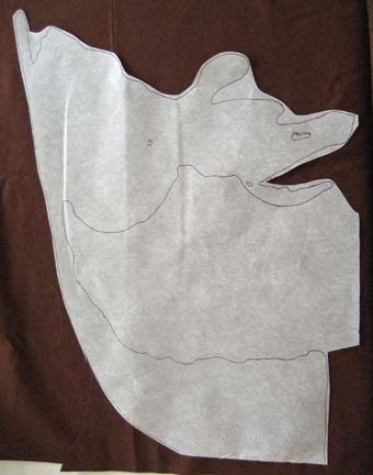
This is what it starts to look like after I have outlined shapes with a black ultra-thin Sharpie.
And this is the backside. It is a perfect mirror image of the front because the Sharpie bleeds through — and the only thing I need to correct are the overlaps — using the Sharpie to fill in the edges of the shapes that are lost in the overlap. This doesn’t take long and is much faster than assembling another set of mirror printouts.
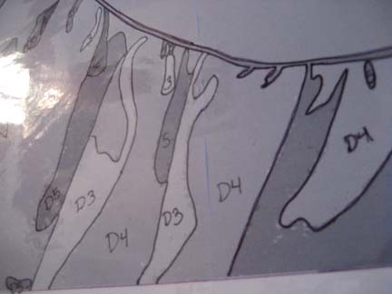
I also need to mark the values by number. If the shapes are close to another color family, sometimes I will add another code to keep the items separate in the pattern.
Also, unfortunately, I need a third copy of the pattern: the front side copied onto thin vinyl. This is found in general fabric stores in the same place as tablecloth covers sold by the yard.
From this point, I can start looking at fabric and choosing my color palette.
I Have An Eraser & I’m Not Afraid To Use It
0Drawing is a scary subject for many people and everyone wants an easy answer for coming up with a pattern. Typically, when I get into the technical aspects of drafting, people’s eyes glaze over. It is a process best enjoyed by someone that can stand spending a lot of time sorting through details.
I use Photoshop Elements. I am not an expert in Photoshop, but I know how to use it for my purposes. If you want to learn Photoshop, I recommend classes. I took mine online at Eclectic Academy & LVSOnline. If you have the CS version and know how to make it dance in circles — then good for you.
Some people say that I take my work from pictures — as if there are no artistic decisions that are being made. RARELY do I find a photograph that gives me everything I need. The truth of the matter is that a picture only gives you a guideline. You can put the picture in black & white & posterize it — but there is almost always a lot of scattering of values and details lost in the posterizing that you need to give dimension to your piece. Taking out color and working with value is your STARTING point. But there are always people in the art community that want to criticize the process.
Whatever. Let the critics be . . . well, you know.
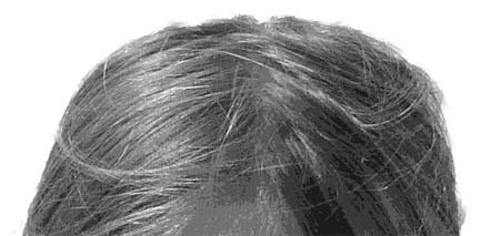
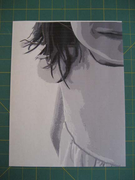
Here is a good example:
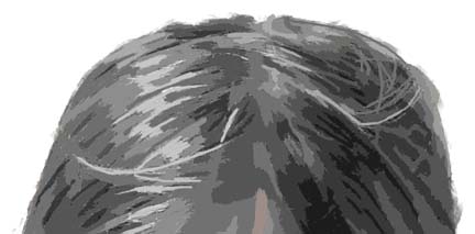
This is a posterized picture in black and white. The values are too scattered to work with. We are doing applique with closed shapes — not painting — so we have to make decisions about how to create closed shapes that still give us the feeling of the hair without creating endless shapes for us to recreate. Remember, we can still use the textures in the fabrics to help us.
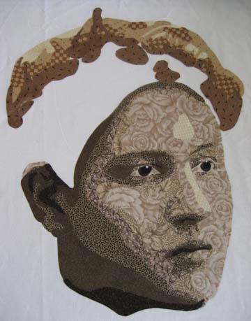
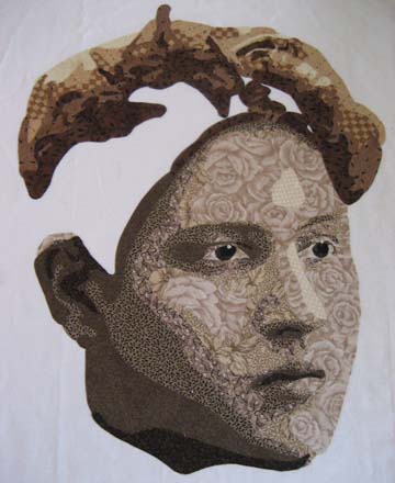
And this is the same image of hair cleaned up with closed shapes. It still gives us the general feel of the hair but in a different way.
I typically start with a color picture I pull into Photoshop. I use layers. They are essential for me to capture restore and comparison points. From the original picture, I copy it to another layer and if I intend to use another background, I delete the background using the Magic Extractor. Then I copy that to another layer and adjust the lighting if I need to. Then I copy that to another layer and make it black and white — only values now, no color. Then I copy that to another layer and posterize it. This is the point at which I’ll keep it or toss it. I can go back to my lighting layer and make changes, deleting layers above it — trying to make it work — but I do need some help in sculpting the face. For instance, I had a picture of a one year old that I was reviewing yesterday. Unfortunately, no matter what I did, there were only two values in the face. (Babies have such round faces that they don’t have the personality curves we see in older children and adults.)
And then I copy that layer again to another layer that I will clean up, draw on, erase, and do whatever I please to make my pattern as realistic as I can.
A good example are the eyes. A picture rarely gives you usable information on the eyes — but we can look at an anatomy book and study the structure of the eyes and know what should be there.
This gives us the shape of the eyes but not much else. We know there is sclera & iris in there — as well as that pinpoint of light reflecting back at us.
This is what they look like cleaned up. The eyebrows have been defined and the eyes are visible. Forgot to add the sclera — the whites of the eyes.
Much better.
Don’t be afraid to draw. You have an eraser — or in my case, an UNDO button. If I make a mistake, I hit Cmd-Z and it’s history.

Deep Thoughts
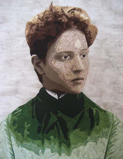
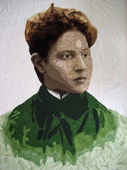
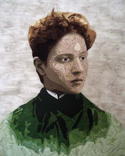
0I have just finished my latest piece, Arminta Patterson.
She is a straight forward portrait. I’m now looking for something not so straight forward. At this point, I know that I can make a realistic looking portrayal of a person in fabric. What more can I do? What makes a portrait of someone more than just a portrait — what elevates it to art? We all need to spend time growing.
I usually advocate just working on something — keep moving. Now I feel that I need to spend a little time in reflection — deciding what it is I want to say.
I just sold Bull Dawg (yay!) but I think it was because it was a market-able piece. I’m more likely to sell a piece that isn’t so personal. You can argue that you make art for it’s own sake but if you only make art for yourself, you’ll soon run out of storage — unless you start deconstructing — but I don’t do much of that in my current series.
And yet I have to be inspired. I want to be inspired. I’m waiting for the Muse to come over and start moving things along.

Quilting the Third Dimension
0Most people presume that quilts are two dimensional objects. It is flat like a painting. But in actuality, the quilting that we add to a piece can add another layer of realism to surprise the people that view the piece from an arms length distance.
I’m always surprised by how much a piece changes from the end of the applique stage to the end of the quilting stage.
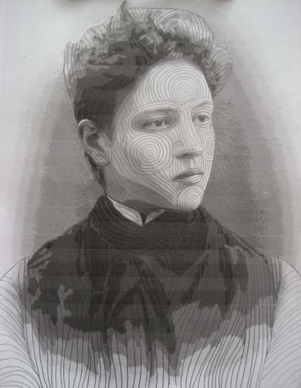
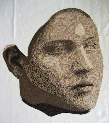
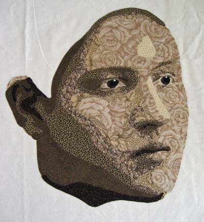
This is a picture of Arminta after applique but before quilting.
And for those of you curious about the back (and for some reason a lot of quilters are), this is what the back looks like before the excess stabilizer is removed. It’s interesting on its own — in a different way from the realistic perspective.
I used to get a creative block whenever it came time to quilt a piece, but I’ve found over the years that if I take my drafted pattern and draw on it with a pencil, I can create a quilting plan for how to approach this piece. The best part about it is that if I don’t like what is happening, I can erase it — which is much easier than un-sewing on the actual piece.
This is her face once it is quilted. I quilt about 1/4″ apart so I have to quilt from the middle out. Because the quilting is so close together, I can easily have the piece stretch as I quilt — and sometimes I have to move pins out as I go to accommodate the wave of fabric I’m pushing over — hopefully to the edge. I had this issue when I made Amelia Earhart.
So I tend to start with the face as it’s the focus in most portraits & the central design element. I start with the nose as it’s the center of the face. Its line affects the eyes, the forehead, the cheeks. I usually do the forehead second, but on this piece, I knew from my plan that the lines from the nose would extend & end at the cheek lines — so I made those second.
I usually have a few independent lines from which the rest branch out. Why do I quilt the face the way that I do? I’m trying to give an impression of the bones and muscles under the face — and this is how I see that coming out for this person.
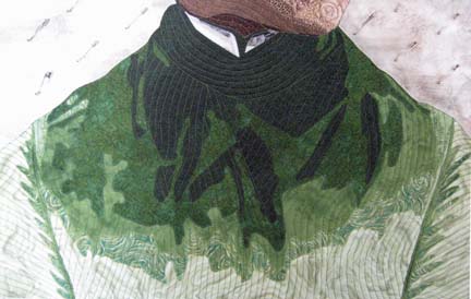
After the face I do the shirt. Notice that I used all one color thread to quilt the face and all one color thread to quilt the shirt. I used to worry a lot about thread — but then I made I Am the Vine, You Are the Branches. When I made the tree, I used the opposite thread on the color wheel from the fabric — and I found it astonishing how almost completely unnoticeable this fact is in the final piece. It isn’t unless you get within inches of the piece that it is noticeable at all.
So now I choose a midrange color from the color family I’m in. A taupe for the face (although I will use a dark brown around the irises) and a medium green for the coat.
Her last part is her hair. I purposefully left a couple of the guidelines for you to see. I draw 3 or 4 of them and the remaining ones are based on those structures.
Of course, at this point, I have to start thinking about the background. I always spend some time puzzling over this part. I spend some time at Leah Day’s website or leaf through the book on backgrounds I have by Dijanne Cevaal — and in the end, I spend a little time sketching in my sketch book. Pencil is so much easier to erase than thread.

Continuing On
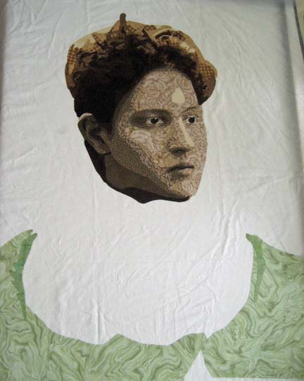
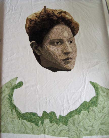
1Arminta — what to wear . . . what to wear. In the original photograph, she has on a fitted jacket with a lace collar — very intricate. I had to be more simple. I decided to go with emerald green — I’ve been working with a lot of blue lately and wanted a change.
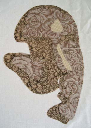
This is the first value.
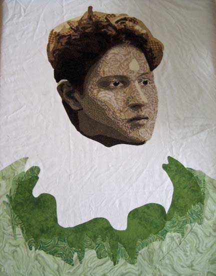
When you see the second value and compare this picture to the one above it, you can see I made a mistake in my cutting. Given my limited supply of this fabric, I laid some additional pieces underneath. These seams will require some extra stitching to cover them but because I will match the thread to the fabric, they won’t be noticeable in the final piece.
The third value shows the curve of the collar.
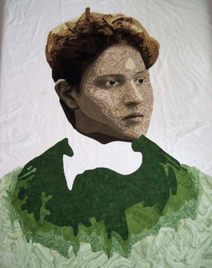
And the fourth value fills in the rest of the shape except for the deepest shadows.
It is at this point I realize that I have to complete her collar before I can add the final dark green — which you see here — values of white into gray.
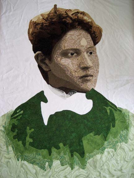
And here you see the final green. (This is the first picture taken vertically. All of the previous pictures were taken horizontally and suffer from some distortion.)
With the collar done, it was time to start thinking about the background. I spent a lot of time on this part — which sounds strange given how simple it is. I tried to create a halo effect similar to the one in the original photograph — and it just didn’t look right — no matter what color range I was using. My husband finally told me that it was distracting from Arminta — it made the eye want to look elsewhere.
I don’t ever want the background to be an after-thought — something added that doesn’t add to the final piece — but I’ve decided that for many portraits, the purpose of the background is to not distract. Although the Amelia Earhart piece has a plane in the background, it is not always advantageous to start adding extraneous information into the background of a portrait for the portrait to be successful.
The jacket at this point bothered me. I realized that she needed the definition of her sleeves so I sketched up a quick change on my pattern.

Butterscotch
0Butterscotch makes me think of fall — warm apple cider, crisp cold air, leaves in all shades of brown and orange. Since we’ve have a chill in the air here, I’ve welcomed fall’s return — and I’ve tried to beckon its haste with the scent of homemade soups brewing in my kitchen.
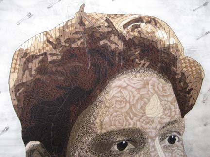
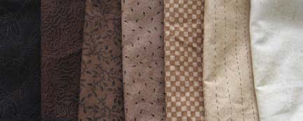
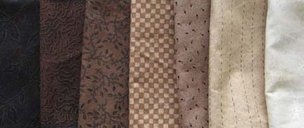
And that is probably why I started with butterscotch as the beginning for Arminta’s hair. Just like with the face, I challenged myself to do seven values. I knew that I could begin with yellow highlights & work myself back to brown. I had several fabrics in my stash but ended up going fabric shopping for the set. Luckily, I was able to find a great range.
I don’t talk about fabric very much but I should. It is really the most important thing as far as I’m concerned — it is all about color and value. If your values don’t work — your piece won’t work — the illusion won’t work. Color is second IMHO to value. I don’t shop for colors — I pick a color family and then I look for values. I rarely buy a fabric just because I like it — I buy it because I need it. If I LOVE an individual fabric — then I need to make something with it like a cellphone case or Kindle cover that I’ll look at a lot. I don’t need to love the fabrics in my portraits because they work together — and they shouldn’t stand out individually.
This is what I came up with.
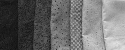
I always look at the fabrics in black & white to make sure that the values work. Pattern can really affect value — the checkerboard here for instance.
So I switched the checkerboard with the next darker value.
But you can see in black & white that it doesn’t work here. It needs to be back where it was. If you look at it in Photoshop & minimize it way down — there isn’t a lot of definition between the checkerboard & the brown next to it — so it’s a risk. But I decided that the checkerboard is a great bridging fabric between the yellow and the brown — it brings the continuum together.
And so I started with her hair. Using the yellow on top, you think that she may end up looking blonde — but these are merely the highlights.
The next color is still yellow but moving into butterscotch.
And then the next fabric is the wonderful checkerboard that moves us into the browns.
The fourth value is the first of the browns and the primary color of her hair — although we’re still at this point only working on the very top of her hair.
The next value begins to show us the how it will begin to pull together.
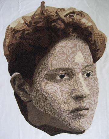
And the last two values complete the look.
I think she’s a very handsome woman. The highlight on her ear looks a little stark — hopefully, once I add the background, it will make more sense.

Circa 1900
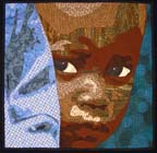
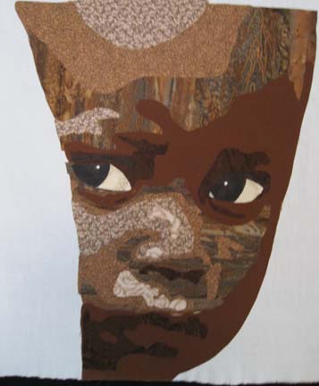
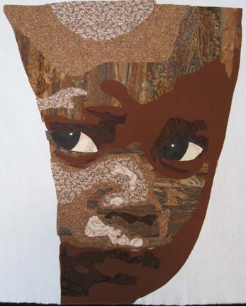
2I finished Caution the other day — the Rwandan child peeking around the arm of an adult. He was difficult to photograph — it was hard to keep some of the browns in his face from having a greenish tint.
Then I started on Arminta. I have a very old family photo album with pictures taken between 1890 & 1910. There is a wonderful picture of a woman in it named Arminta Patterson. We haven’t been able to place her in the family tree but suspect she was a cousin of my great grand-mother. She had such wonderful curves in her face that I wanted to see what I could do with her.
The original is a sepia print so I have license to color — which is freeing but also a little terrifying. Let’s start with the face.
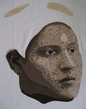
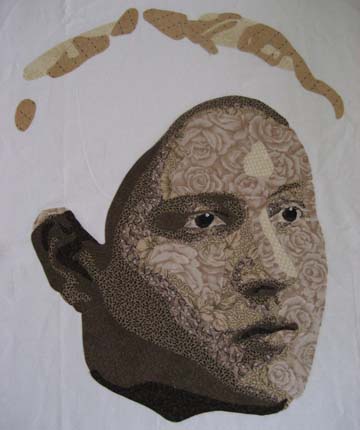
I have seven — yes seven — values in her face. That is a big number to find values for. In fact, halfway in, I added another fabric for a smoother transition between two values. Even better, I managed to do it within my current stash.
This is the first & second value — her face is still a mystery.
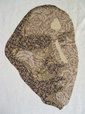
With the third value, you begin to see the outline of her face. I know — that green print is a strange choice — but it works.
The fourth value is darker and you begin to feel the depth of her face. You can see her nose, where her eyes will be, and the curve of her cheek and chin.
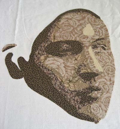
The fifth value gives us personality. She has a very distinctive look about her.
The sixth value shows us the determination in her expression.
The sixth and final value completes her ear, her nose, and her mouth.
With the eyes added, she all but leaps off the fabric at you.
I am uncertain how to do her hair. It was dark — but like I said, I have license to color. The final choice will contribute quite a bit to the mood of the piece and will be the color choice upon which most of the other colors are chosen.

Peering Through
0When the excitement of summer dies down and the children return to school, I always find it difficult to focus myself again. I try to envision where I want to be — and then begin setting goals for myself. Like many people, things are hazy for me right now. Peering into the looking glass, the reflection isn’t clear, and want and need have become mixed up with different pathways, different decisions.
I know that I’m not alone in this. I think the reason I chose the image of the young child peering around the hip of an adult was that recognition of being lost yet determined. I shared an in-process picture a few weeks ago. I had a short time in the summer that I was able to start him — and I finished his eyes today.
I did want to mention working with difficult angles. I typically trace my pattern onto fusible, cut it close to (but not on) the drawn edge, press onto fabric, and then cut on the drawn line. But there are some difficult angles for which this won’t work. In this example, if you cut out the middle part & fused it down, the final piece would be skewed. So, in these situations, I leave the fusible in place but I don’t iron the middle part down. I carefully iron only on the parts I’m going to keep.
Then I can go back & cut out the middle. This way the bottom section isn’t at a really strange angle from the top. I will then re-press the edges to make everything secure before I cut it out.
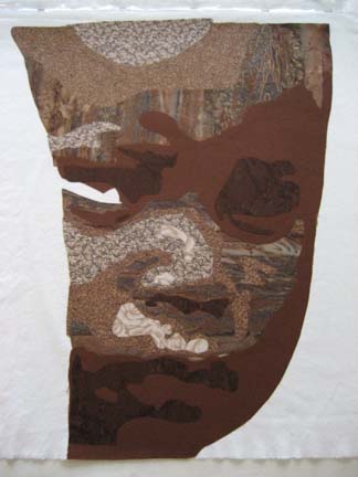
I know I should have taken pictures from the beginning, but I think I was distracted that day. These are the child’s first three layers.
This is the next layer. You can really start to see his face coming together now.
Another layer . . .
And this is the picture I shared a few weeks ago. He looks fairly good but he needs eyes. I need to concentrate to do eyes so I put it off until I knew I would have quiet studio time to concentrate.
This is fairly representative of the photograph — but the little piece of white in the bottom corner of his right eye is distracting. This is a good example of not following the original photograph.
This is better I think.
You would think I would have a better idea of what I was going to do with him, but the truth is that I sometimes make a person before building their backgrounds around them.

Technical Treachery
0For those of you visiting the blog and notice that it looks strange — it does. WordPress isn’t playing nice. I have a different WordPress version on my blog than I have on the rest of the site — so I have had to abandon my theme until I can resolve the issue. I am stuck with one of WordPress’s overused but dependable themes. I hope to have the old look & feel back within a couple of days.
For those of you curious as to what I have been doing, I have this small project on my work table:
No eyes yet but I’ll get there when I have more time next week.

Quilt Photography
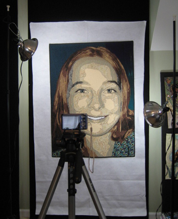
1Taking photographs of quilt can be very challenging. I used to photograph quilts in front of my garage door — outside. I had a board covered with black felt — but if the wind kicked up, the whole thing could fly away. The sun might be too bright and I would pray for a cloudy day. It might be raining. It was a difficult system to rely on.
And then someone on QuiltArt pointed me in the direction of Holly Knott’s webpage Shoot That Quilt! After that, I made a few purchases & set up everything inside. I ordered the special bulbs — a few photography stands — reflector lamps at Wal-Mart — and I found a tripod somewhere in a closet.
I still have the same basic setup. The tripod could stand to be replaced. It skews slightly to the left — but I haven’t worried about it much because I always make corrections in Photoshop.
My backdrop is usually black but I almost always have a black binding on my art quilts and occasionally someone will ask for a white backdrop so they can see the entire outline of the quilt.
For the proposal I’m working on today, I can’t make any adjustments in Photoshop. The camera has to do all of the heavy lifting and the original picture has to be as perfect as I can make it. (To adjust for the tripod, I had to hang the pieces slightly sideways which felt strange but I used the viewfinder to put it where it needed to be for the picture to be straight in the camera.)
I slowed my ISO to 80, set my exposure for daylight fluorescent lighting (otherwise I get a bluish cast that becomes most apparent in closeups), turned off my flash, upped the megapixels to 12.1, and set a 10 second timer. I lined up the quilt perfectly within the top & bottom of the camera field (with the tilt of the camera at 45 degrees), adjusted the lamps so that one hit the top area & one hit the bottom area, and took the picture. For closeups, I set the macro option on my camera and moved the lighting in closer.
I’ve outgrown my camera. This is painful for me to say. I’ve really enjoyed the point and shoot for several years — but I’ve reached the limit of what I can do with its manual settings. I’m currently reading Chasing the Light, and it only highlights what I all ready know — it’s time for a DSLR.
Cause for Celebration
Two of my quilts were just juried into the World of Beauty exhibit at International Quilt Festival: Houston — Bukonyan Elder and Just Call Me Jack. I’m hoping someone takes a picture of them hanging in the show for me. Festival runs November 3 – 6, 2011 and features the largest display of art quilts in the world (although it shows an equally impressive display of traditional quilts). The entire show is the size of eleven football fields. Mind boggling, isn’t it?