Posts tagged textile painting

Stress and Family

2

When I started working on this project, I needed a name for this project’s folder on my computer. In the beginning, it was Depression — since it’s based on a Depression era picture. As I worked on the mother, I began to see it has a reflection of the stress of mothers — so I changed the name of the folder to Stress Project — knowing that that wouldn’t be it’s final name. And as I get closer to Christmas and I see the insanity that is family that comes out during the holidays — this has becomes a difficult project for me to work on — much less talk about.

But — I should share my progress from last week. I had finished the mother and her son & began work on the daughter that is on the mother’s other side. This shows her neck, arm, and fingers curled up.

sister1

And her hair. I think it turned out well.

sister3

I snuggled her up to her mom. You may noticed that I’ve added some darker tones to the son’s hair. I also changed the fabric just under the mom’s hand — they were previously shirt fabrics but they were too close in tone to her skin so I just changed them to coat fabrics so you could see the back of her hand clearer.

The right hand side of the daughter is an extension that I’m creating because the photograph has something obscuring the view here (I think it’s a pole). I decided to lighten the lower shadow.

family1

I like it better here. I also did the babies face. I don’t like how her face comes together but have decided that I’ll work on it after I’ve made her blanket. I’ll probably have the blanket wrap over the top of her head.

family2

The blanket will extend across the bottom of the piece.

I think that I’ll continue as much as I can in the studio to try to black out the insanity of the holidays. It gives me a peace that’s hard to explain.

Mama’s Clothes

0

I have a dream to finish cutting out all this entire piece before the Christmas break. It’s ambitious but I’m putting the pedal to the metal and seeing what I can get done in the time that I have.

I started this week with her shirt. It’s hard to see hear since it’s white.

shirt

Here I’ve completed her jacket and her shirt shows up better. She’s actually hanging on my design board — that’s why the background is black. When I take a picture of this piece on the ironing board, I can’t get high enough above it to take a pick that doesn’t have some distortion. You can see some of that in the pic above.

The only issue I have is that some of darker values of the shirt are blending into her skin. The two pieces under her hand I can easily swap into jacket fabric. The lower pieces on the left will probably become lighter values.

Although it looks red in this picture, the colors are an orange red — more rust colored. I wanted the mother to have a hot color — and then the children will have cool colors. A bright red would have been too cheery — the rust conveys a more worn feeling.

jacket

Then I started on the son leaning on her left shoulder. He is turned away from the viewer so you only see the back of his neck.

I did use the same fabrics that I used for the mother. When I made Beach Guardians, the two sisters have the same fabrics. I think it gives a feeling of relationship between the two — unlike the duet piece A Walk in Twilight when I used different fabrics for the two friends.

boy's neck

And this is his hair. I like that he’s more blond relative to the darkness of his mother. He is, however, tucking himself into her side & behind her so I will at some point have to add some darker tone to the crown of his head where his head leans into his mother’s hair.

boy with hair

I was free to make his jacket any color I chose — but really, the smart thing is to let the color wheel have a say in it. Since I chose an orange red for the mother, I chose a green for her son. On her other side, her daughter will have a blue — probably more on the gray side though.

boy with clothes

And the baby in her lap — I just don’t know at this point. Today I’ve finished the daughter’s neck, fist, and arm — but her hair will take some time.

Mothers and Their Children

4

I haven’t worked on a person since I made Lincoln a year ago — but given that it was so successful at IQF, I thought maybe I should revisit making people again.

So I found this incredible picture taken by a government official in the 1930’s of a woman surrounded by her children and the lines of worry embedded in her face — and I decided to use this as my inspiration. (Don’t worry — this is a public domain picture.)

At first I chose this because of the parallels between the economy today and that of the Great Depression, but as I worked on it, I began to see it more as a metaphor for motherhood — how mothers worry and how their children are naturally oblivious to her stress.

This is the first value. Not much to see — although I’ve found this to be one of the most important layers. If I’m going to be criticized, it’s usually on the brightness of this first layer.

face1

In the second value, you can see the worry lines in her forehead and the outline of her arm and fingers.

face2

The third value gives you a fuller outline of her face and arm.

face3

The fourth value gives you the deepening of shadows.

face4

She begins to come alive in the fifth value.

face5

And the deepest shadows are in the sixth value. I did not add color to her irises — I intentionally kept them black. I also added a dot of white to her eyes.

face6

Then I went to her hair. I purposefully decided to keep it dark.

hair1

The second value is a dark brown.

hair2

And the third value is black.

hair3

At this point, I need to start her blouse and jacket. I’m considering making her very conspicuous with hot colors in her clothes — and then using coolers colors in the children — to convey the difference in mood between them — but I’m also considering making the children into more literal shadows using tulle and thread and not completely appliquéing them with fabric like I did the mother. It’s something for me to consider for a while.


Houston Festival part 3

1

To continue from my last post, at this point in my adventure, preview night is getting ready to start.

TWEET: Preview night starts in 15 minutes.

5 hours of marathon-ing for me. I had high hopes. I knew that I only had 5 hours to see all of the quilts and then see the vendors with what little strength I would have left. After walking around the convention center yesterday, I had convinced myself that tennis shoes, however practical they may be, were going to be my shoes of choice. I admit to vanity — after seeing a certain someone looking incredibly fashionable in leather pants and low heels — I just couldn’t do it. I came to regret that later. This is the view of the vendor area from a portal on the 2nd floor before the show opened.

vendors

TWEET: Line to get to escalator to go downstairs to exhibit hall. Waiting for it to open. Quilters are such polite and friendly people. This was probably most apparent in the line of people waiting to go down the escalator to get in the show.

lineforfestival

I took a lot of pictures of quilts at the show. Immediately as I started taking pictures, I could see myself being a hypocrite. For years, I’ve been concerned with people taking pictures of my work at shows and not giving attribution — or giving attribution but then putting their copyright image on the picture of my piece (which then gets pinned somewhere & causes confusion about copyright ownership) — or not putting the right permissions on something posted in FLICKR that allows anyone to print mouse pads with my images. I really need to just take a breath. I will show some pieces, I will give attribution, I will give links if possible, and if someone is uncomfortable with that, I will gladly delete the piece. First of all, I had another piece in the show — The White Raven.

whiteraven

There were many other birds in the show. I have to say that there were so many well done birds in the show, I may be done with birds. To say that the work was fantastic doesn’t quite cover it. This is Barb Forrister‘s Sunrise Serenade. I had to take this piece at a strange angle so there is some camera distortion — but the colors and the threadwork on this piece are inspiring. Barb really knows how to bring a peacock alive.

Barb Forrister

This is Ricky & Lucy by Nancy Sterett Martin and Karen Sistek. It’s painted silk. It is fabulous.

Ricky & Lucy

TWEET: My piece Firecracker next to Barbara Beasley’s Best Friend. I love hers. #quiltfestival

Firecracker

Remember my new friend Karen Ponischil?

Karen_me

This is her wonderful piece Princess Daphne that won an honorable mention in the Art-Miniature category. LOTS of thread painting to get that wonderfully furry effect.

Princess Daphne

I don’t want to forget to show you Christine Alexiou‘s piece Seven Deadly Sins one last time — so you can truly see that there were multiple pages in her fabric book.

Christine Alexiou

I had a great opportunity to spend some time speaking with Thelma Bearden. Her piece, Very Berries, won 2nd place in Art-Abstract, Small. She is also a painter and has a wonderful grasp of how to make color work for her. I don’t think that my camera does this piece justice.

thelmabearden

At the very end of the exhibit hall was the Healing Threads in Medicine exhibit, a group of quilts curated by the same people that curated Sacred Threads. I had two pieces in the Herndon, VA Sacred Threads exhibit but was unable to attend. They have since also traveled to the Sacred Threads-Omaha exhibit. It was wonderful to meet Lisa Ellis and Vicki Pignatelli and thank them for the wonderful opportunity to be included.

TWEET: Me with Lisa Ellis & Vicki Pignatelli.

Pignatelli_Ellis Pignatelli

At this point, I stopped and went back to my piece. Can you believe I only took this one shot of it with its blue ribbon? I didn’t even think about getting someone to take a pic of it with me and the ribbon.

Lincoln_ribbon

Then I went to dinner with my new friends at the other end of the exhibit hall. When we were done, I wandered through the vendor area. It was completely overwhelming. There was stuff everywhere. I should have bought things — but I didn’t. I bought one Pashmina scarf. All of the fabric was either a novelty or brights so nothing really interested me — but I think also that exhaustion was starting to overtake me. I really wanted to find the Superior Threads booth because I love their thread — and I did manage to find them — but by that point, I was done. I was completely exhausted. I had almost an hour left before preview night closed down, and I just couldn’t do anymore. I did love this booth — it was full of the most amazing dolls. These are the dragons.

TWEET: Amazing doll patterns!

Dolls - Dragons

On the way out, I took one last look at the section where Lincoln was. I thought about getting a good group shot of the White Raven — but I just couldn’t make myself go backwards. TWEET: I’m exhausted — can’t do any more. Crawling back to my room.

art_people

Thank goodness the convention center is attached to the hotel. It was so easy to get back to my room. This is what the convention center looked like from my room.

Houston_night1

And this is some of the skyline of Houston that night.

Houston_night2

I had a fabulous time — but I was ready to go home. This shot was taken very early the next morning outside the front of the Hilton while I waited on my shuttle. TWEET: Houston — I’ve had a blast — but I’m heading back home to my girls.

Hilton: early morning

One of the items in my winner’s envelope was a  long list of awards sponsors to whom I was asked to send thank you notes. I have to admit that my first reaction was one of trepidation, but upon further reflection, I realized the wonderful extended opportunity it offered. I went home and ordered postcards from Moo.com with Lincoln on the front. I am currently addressing them in preparation of sending them to all of the wonderful sponsors.

TWEET: I’ve ordered from MOO! Jealous? Get 10% off: http://www.moo.com/share/mctdkn  via @overheardatmoo

— It is now a week since I wrote this post. Unfortunately, server problems kept me from posting it.

I will have one last post on Houston — with the remaining pieces that I fell in love with.

Houston Festival part 2

0

After the Winner’s Circle, you can be certain that I hardly slept. I went to the hotel bar (perfect spot for a party of one), had some soup, and then went back to my room to try to sleep.

TWEET: Victoria Findlay Wolfe took this just before I walked on stage last night. #quiltfestival

stage

I wish I had a pic of me on the stage. There was a photographer there but I have no idea who he was working for. Anyway, I’m very grateful to Victoria for taking this.

The next day I had a leisurely morning and basically waited for lunch time.

TWEET: Luncheon!

luncheon

I was so pleased that my new friend Karen sent me a message asking if I wanted to join her for lunch. We met at the door and sat at a table with several of the winners from Japan. They didn’t speak very good English but they were incredibly kind and friendly.

TWEET: Takido Fusako on the left game me a hand sewn flower that is beautiful!

Japanese winners

The woman on the left, Takido Fusako (her piece Crest of Tulip won a Judge’s Choice award), gave me a hand sewn pin (which looked awesome on my black jacket). The woman on the right, Sachiko Chiba, gave me an autographed print of her beautiful quilt My Hope that won 3rd place in Hand Quilting.

TWEET: Flower that Takido Fusako gave me. #quiltfestival

flowerpin

On the stage, all of the top winners ate lunch and then spoke about their piece. The first speaker was Best of Show winner Melissa Sobotka.

TWEET: Melissa Sobotka winner of best of show Chihuly’s Gondola. It’s truly stunning.

BOS_Sobotka

bos_chihuly

TWEET: Melissa — “pay attention to the judge or blow them off” — love it!

She had shown this quilt at another venue and one of the judges told her that there was a problem with the binding. Melissa’s point is that you either take their opinion or don’t worry about it. She did ultimately choose to take off the binding and re-apply another one before sending it off to Houston for judging.

TWEET: Vicki Anderson owes 18 sewing machines! Her speech on Getting Published.

Thompson

TWEET: #judimadsen mentioned in her speech – on how to make a beautifully quilted quilt.

I’m Facebook friends with Judi and I follow her beautiful machine quilting so I was excited that Vicki showed her work and gave it its proper praise.

After the luncheon, there were a couple — just a couple —  of vendor tables outside. I loved these fabric cakes. It reminded me of the felted teacup I made a few years ago.

TWEET: Too cute!

cupcakes

TWEET: I bought this year’ spin & they gave me freebies for 2004, 2007, & 2012. The one on the top left is this year’s pin.

pins

It was strange walking back to my room, seeing quilters that are famous quilters.

TWEET: I feel like such a stalker. I know their names, I follow them on FB but I can’t bring myself to introduce myself.

I went back to my room and took pics of the Convention Center from there. It is such a large building, I couldn’t even get half of it in a frame.

Convention2

With time to spare before Preview Night at 5pm, I spent some time in the gym. This is the view from the west tower of the Hilton.

Convention

TWEET: Technology is so cool. Delta emailed me a check-in, they txt’d a link to my boarding pass, & I saved it in Passbook for tomorrow.

This is my first time to be completely dependent on my smart phone to check in. I’ll never print another boarding pass.

I had planned on putting everything in one post from this one day in Houston — but this post is growing by the minute. I think I’m going to split the rest of it into another post. So look for a part 3 in a couple of days.

Houston Festival part 1

2

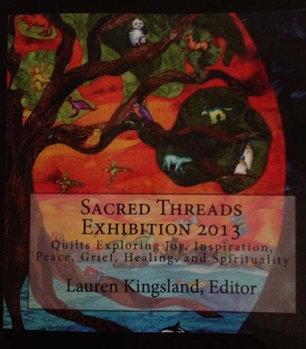
TWEET: While I’m in Houston, I’m sending my tweets to my personal FB & my FB Page. I apologize for double tweets but want everyone to see the pics!

This is how I started my exciting 48 hour adventure to the Houston Quilt Festival. I wanted to share it with as many as my friends as possible. I was so excited and nervous about going, I accomplished practically nothing in the last couple of weeks leading up to the show other than packing my suitcase.

I went alone. I haven’t traveled alone since I was much younger and I looked at it as a grand adventure.

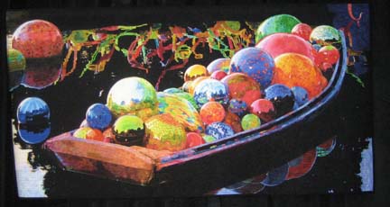
TWEET: Checked into Hilton Americas — isn’t the Chihuly glass chandelier amazing?

chihuly

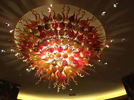
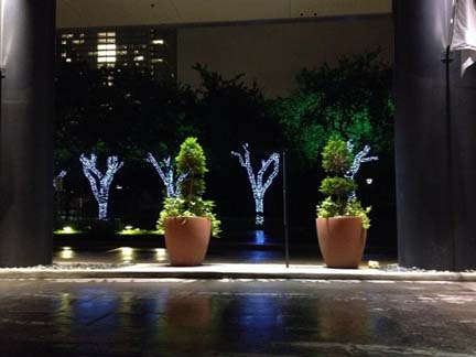
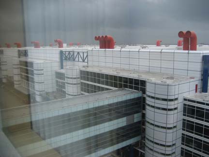
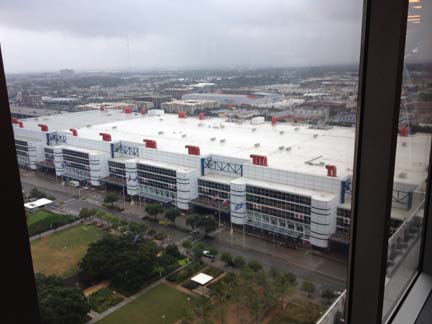
It’s impossible to mistake a Chihuly. There are two of them like this at Hilton Americas. I was lucky to find a room in the Hilton — it’s connected by a walkway to the Convention Center — something greatly appreciated by me when it poured rain on Wednesday and Thursday.

TWEET: Walked down bad streets to find this amazing place — District 7 Grill.

district7

But this Tuesday, the skies were clear. I checked into the Hilton. I was starving — it was so late — but I was determined to be more original than eating in the hotel. I turned on my iPhone & looked for a restaurant nearby with at least a 90% approval rating. The closest one was District 7 Grill. I crossed the street to the convention center and made a left — which unhappily took me in the wrong direction. I ended up walking completely around the convention center — which is huge and covers probably 4 or more city blocks. I had to be careful about the streets I walked down and stick to ones with cars on them. I eventually found this haven of wonderful food. I had someone tell me it was in China Town. It was certainly a place that the locals go.

TWEET: Did I mention — no calorie counting on this trip?

Lunch

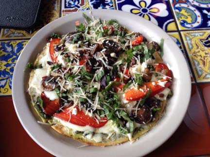
I know it’s cliche’ to have a picture of my plate — but I couldn’t help it. It was 2:30 my time & I hadn’t eaten since 6am. This is a grilled veggie pizza on naan bread with feta cheese & pecans. I ate the entire thing. No regrets.

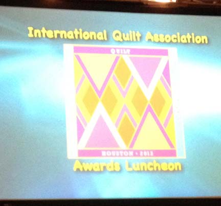
TWEET: An hour until I get ready. Decided I can’t eat dinner before I go — too nervous. Next tweet — Winners Circle.

I ate so late though that I wasn’t hungry later. Mix that with the excitement of getting ready for the Winners Circle — and the most I could get down was a banana. At least I was able to find some fruit downstairs in the lobby.

TWEET: The infamous Paula Nadelstern carpet.

rug

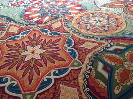
Many quilters know the story of Paula Nadelstern, a quilter famous for her kaleidoscopes, showing up one year, looking down, and seeing her designs on the rug leading from the hotel to the convention center in the walkway. She successfully sued them for copyright infringement.

TWEET: I’ve seen Charlotte Warr Andersen & Jamie Fingal in the halls — rock stars in the quilt world.

I kept passing people that I know — but I don’t know. It was very surreal. Although non-quilters won’t necessarily know these people, I’ve seen their work & followed them for years — some of them I’ve even spoken with on Facebook. And yet I couldn’t bring myself to say something to them. I suppose a part of me thinks that famous people should be allowed their privacy.

TWEET: I’m here!

winners

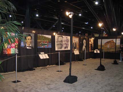
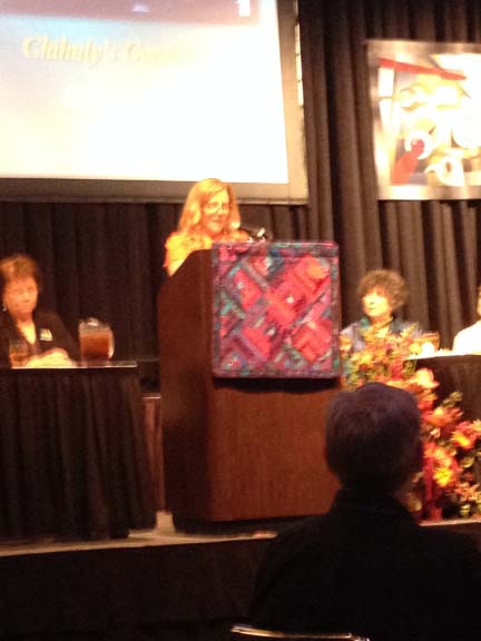
I finally found the correct ballroom. There are signs every 100 feet for a ballroom down the length of the convention center — none of them marked anything other than “ballroom”.

Karey Bresenhan

This is Karey Bresenhan speaking at the beginning. She is the the nexus of the entire International Market and Festival. She is the founder and without her, none of us would be there.

TWEET: Ran into my friend Denny Webster & her friend Marilyn Wall! I took pic with my camera so I’ll blog those later in the week.

Marilyn Wall & Denny Webster

Me with Marilyn & Denny

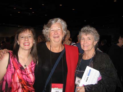
I was standing by myself in line waiting to go in to the ballroom when I spotted my friend Denny Webster! She used to live here in Atlanta but moved a few months ago to North Carolina. She was there with Marilyn Wall who I was delighted to meet.

TWEET: I’m in my red Vera Wang — I’m overdressed.

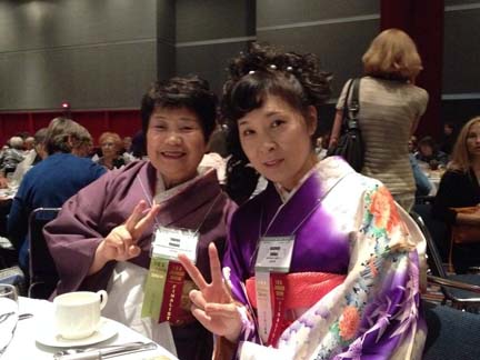
I did feel overdressed — although later I was glad that I had chosen it. There was a full range of dress code — from jeans to full kimonos.

TWEET: I’m really close to Sharon Schamber — too strange!

She was sitting in the front row. I’ve followed her work for years. I follow her techniques for my bindings. I have my pressing board built like hers. Thank goodness for YouTube — I’ve never met her in person though. She’s petite like me.

TWEET: Bonnie McCaffrey is videoing at the front & Luana Rubin is sitting next to her.

Again, two people who I find interesting and follow. Bonnie was videoing the ceremony from the 2nd row and Luana was seated next to her.

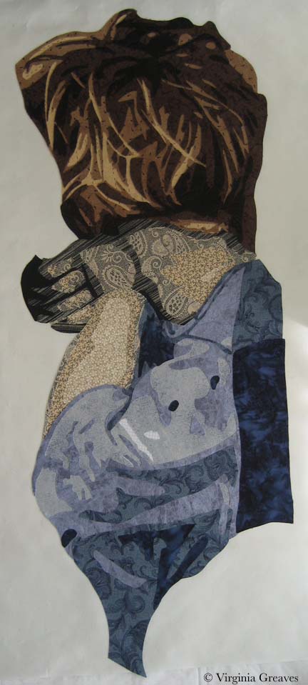
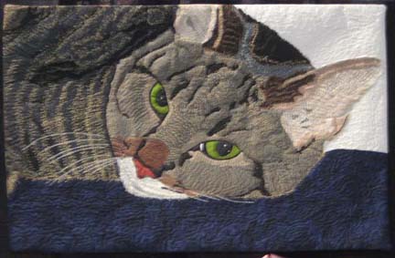
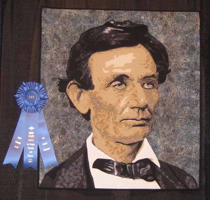
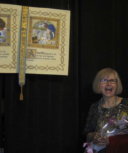
TWEET: My heart just stopped! Did you hear it? 1st place in Art-People.

That was a moment to remember. They called 3rd place — so I thought — oh good! 2nd place! And then they called 2nd place — and I knew. I whispered “I think my heart just stopped.” I certainly stopped breathing.

stage

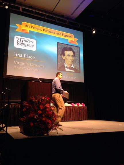
I wish I had a picture of me on stage. I managed to get this picture from Victoria Findlay Wolfe.

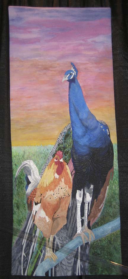
TWEET: Fairfield Mastery Contemporary Artistry to Noriko Nozawa — gorgeous!

MastArtistry

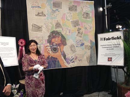
I took this pic the next day but it came out better than the ones I took the previous night. I found this quilt (Photographer Darling) worth studying. The background is quilted with a grid of black thread on white (mostly) — the postcards are black thread-work on white — and the image of the photographer is cross stitch! I did wonder how she managed to keep this piece flat — given the change in thread layers across the piece, it had to be challenging.

TWEET: Babylock master award for innovative artistry — Jane Sassaman!

International Quilt Festival 2013

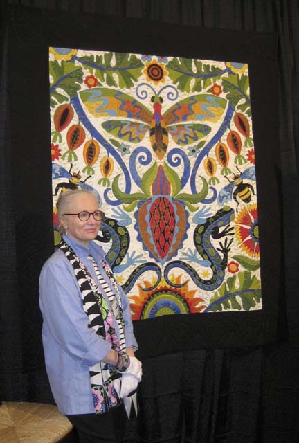
This is also a pic from the next day (Illinois Album). It has a black border that is difficult to see because of the black hanging background. The design is phenomenal, but what struck me as surprising is that the white background is not a typical cotton fabric — it’s an embroidered white, probably not cotton. She also used a lot of embroidery stitches from her machine. These are not details that affect the overall design but they are interesting details for close inspection.

TWEET: Superior Award for Thread Artistry — Masanobu Miyama! (He’s a man!)

MastThread

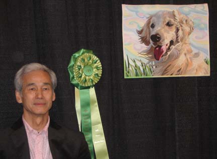
The majority of quilters are women so I’m always struck by a man that’s a quilter. He was the only man in the top winners. This piece (Wind) is very small. He painted the fabric with Tsukineko dyes, fused all the pieces down, and then heavily thread painted it. His wife was there and also had a piece in the show. They were from Japan. (30% or so of the winners were from Japan.)

TWEET: Pfaff Award for machine artistry — Shirley Gisi!

I didn’t get a great picture of this — but you can see it on the IQA Winners page here. It’s an abstract piece that effectively uses gradation fabrics to create 3D effects. Very clever.

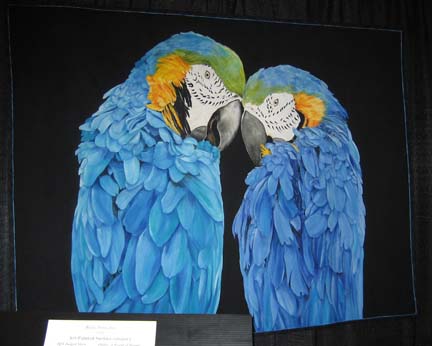
TWEET: eQuilter award for WOB — Christine Alexiou — love this one!

Christine Alexiou

Christine Alexiou

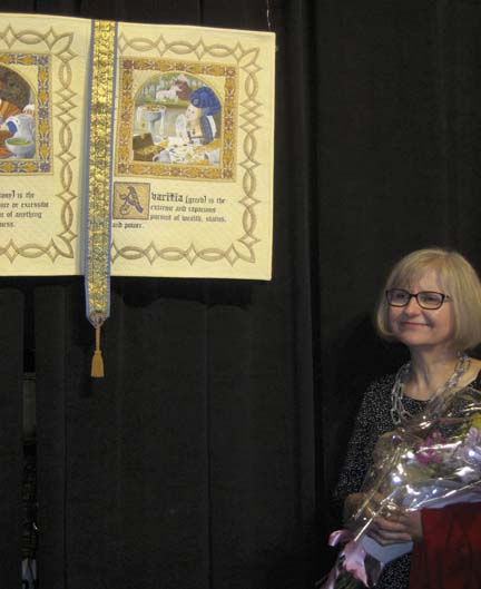
This piece is called Septum Peccata Mortalia (Seven Deadly Sins). It opens like a book and has several pages.

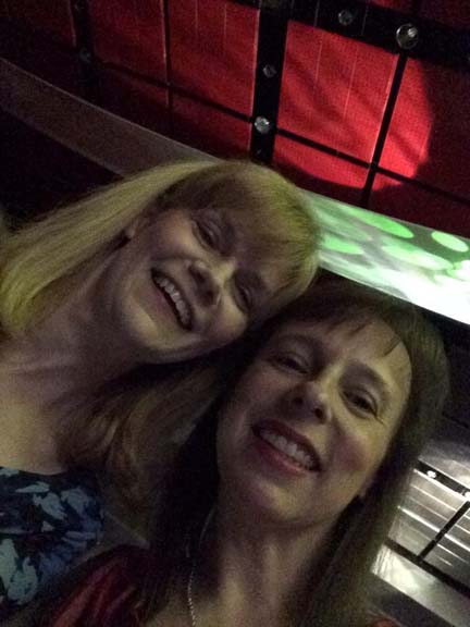
That night, I was sitting next to Karen Ponischil (who won an Honorable Mention) and Christine on the other side. We shared our joy of the evening together and ended up meeting the next day to spend time together. My experience in Houston wouldn’t have been the same without them.

karen_me

TWEET: Founder’s Award – Karen Seivert & a 2nd one to Margo Hardie!

I was confused here. Karen Seivert won a Founder’s Honorable Mention. Then Margo Hardie and Janet Stone both won Founder’s Awards.

TWEET: Another one to Janet Stone!

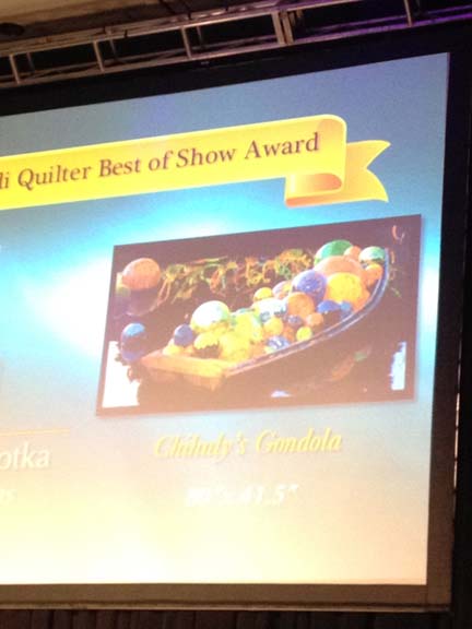
TWEET: Best Of Show — $10,000 award — wait for it ………

TWEET: Best of Show — Melissa Sobotka — stunning!!!

bos

Melissa Sobotka

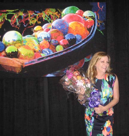
I don’t know that she could have found a better dress to stand beside her piece.

TWEET: Will get a better pic soon!

bos_chihuly

This, of course, is my better pic. It looks like a painting — or a photograph. It is raw edge  with commercially bought batiks. I was stunned that raw edge  has gained such acceptance. I hazard to guess that this is the 1st raw edge  that has won Best of Show in Houston. And when I saw raw edge — I mean that there is no appliqué stitch — only tight quilting. I saw this on many pieces at Houston — raw edge but tight quilting or thread painting. It’s making me wonder if I should continue to spend so many hours covering my edges with appliqué stitches.

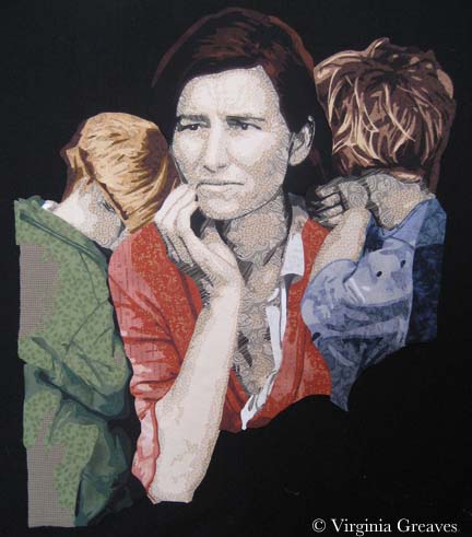
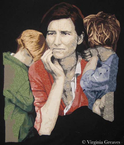
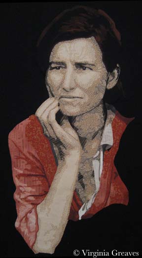
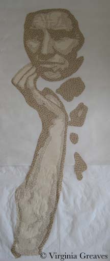
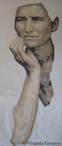
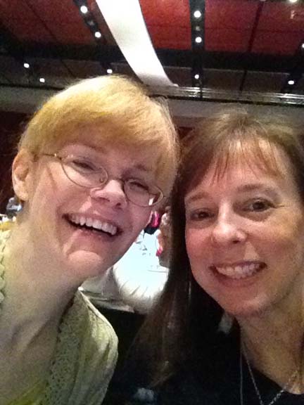
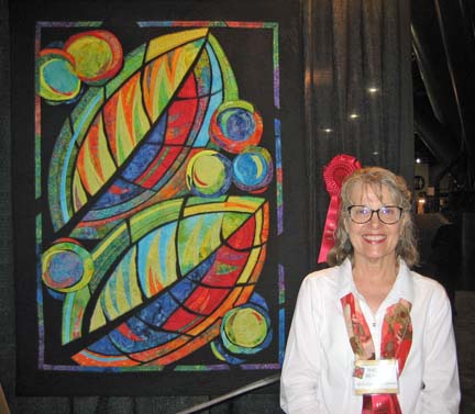
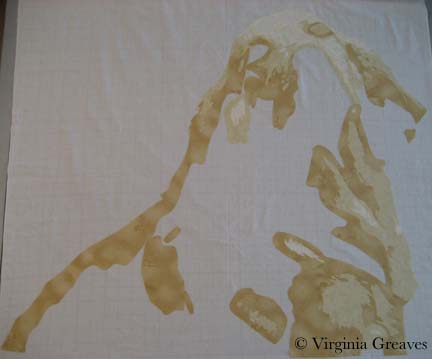
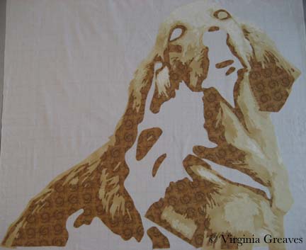
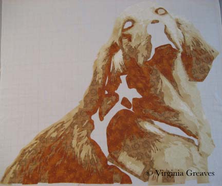
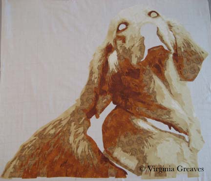
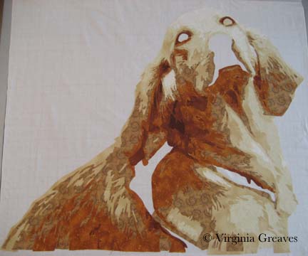
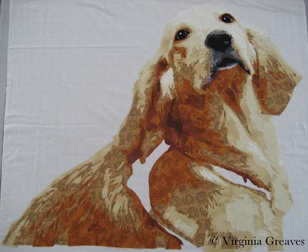
TWEET: I stood by my quilt for an hour — wow!! Everyone was so nice!!

me&Linc

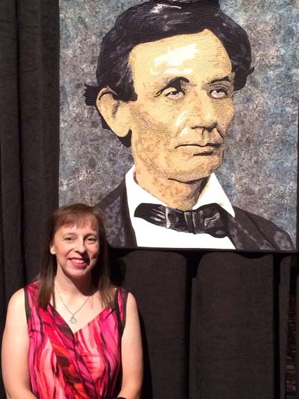
I’m so glad that my new friend Karen insisted on taking my pic as I didn’t get one with me later the next day when Lincoln had it’s blue ribbon next to it.

International Quilt Festival 2013: Winner's Circle

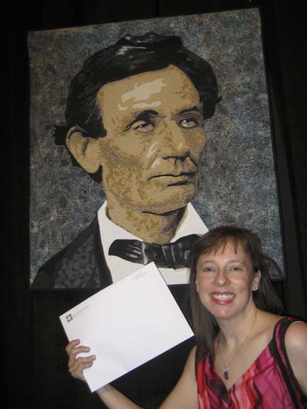
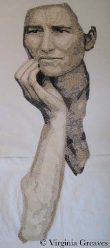
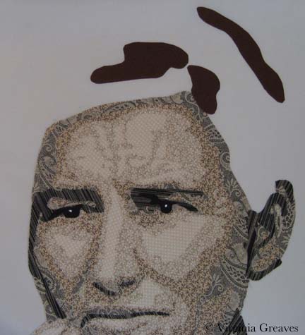
And the money shot. This is also Karen — I don’t know what I would have done without her.

TWEET: I took a bunch of pics that I’ll post on my blog when I get home.

And so I’ve incorporated them here — both my tweeted pictures and the ones on my phone.

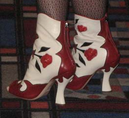
And finally — I couldn’t ignore the coolest shoes in the room. These were Philappa Naylor’s boots. She won first place for Scarlett’s Crimson in the Wearable Art category. She does beautiful quilts usually around a medallion so I was surprised to see her in the Wearable Art category — but I understand that it can be thrilling to step outside your comfort zone. Even better to do it and succeed at such a high level.

coolest shoes

I had a blast. Although I didn’t get to stay very long, it was incredibly fun.

Part 2 will come tomorrow and I’ll show pics from my second day in Houston.

Happy Friday

0

Amelia Earhart

I just found out that Amelia Earhart has won 1st place in the open division, original design realistic pictorial wall category at the La Conner International Quilt & Fiber Arts Festival. Life has been full of blessings lately. I wish I could see the exhibit but it’s on the opposite coast from me. Hopefully some kind soul will take a pic and send me a copy.

It will hang in the extended exhibit through December at the La Conner Quilt & Textile Museum in La Conner, WA.

Going to Houston

1

I have been working away here on my Golden Retriever. This is what she looked like before appliqué and quilting. I have since completed appliquing her and just finished pinning her this morning in preparation for quilting.

Golden before appliqué I bought several backgrounds before I settled on this batik. I didn’t want anything busy to distract from the Golden — so piecing a background was out. I also had decided to stick with analogous colors on the color wheel — so I knew yellow green was the correct color choice. The first piece I bought was a lime green that I thought would be perfect, but the minute I brought it into my studio, I knew it was wrong. I also bought a yellow green with some gray in it — which worked, but it didn’t make the Golden sing. It was just too flat. There was a batik at the store I had decided wouldn’t work because it had too much yellow in it — but at home, looking at my other choices, I knew it would work — and it does. Sometimes you have to move out of your own way.

I have also had some exciting news — I’ve been given the honor of being invited into the Winner’s Circle at the International Quilt Festival in Houston this year for my piece Lincoln. I’ve never even been to the show before — but I’ve made my reservations and I’m looking forward to meeting other artists I’ve only met on the internet and feeling honored to be in their presence. When I find out my prize at the end of October, I’ll be sure to share.

Golden

0

As I’ve mentioned before, I was lucky enough to have two pieces in the recent Sacred Threads show in Herndon, VA — Beach Guardians and The Bowl Judgments. It’s a biannual show and I haven’t participated in about four years — so I was delighted to find that the show published a book with all of the pieces from the show. Not having the ability to see the show in person, it gave me the chance to enjoy the exhibit from home and read all of the artist’s statements with time to study them alongside the work. You can order a copy of the book here.

Sacred Threads book

Then a couple of weeks ago, I received a manila envelope in the mail. Inside was this new copy of Machine Quilting Unlimited and nothing else. I don’t have a subscription (although I might have to get one now — it’s really well done) — so I was confused until I saw the little strip at the top that said “Sacred Threads 2013.” I flipped to the article for the exhibit — and Beach Guardians was one of the highlighted pieces.

I was really stunned. I have never had my work included in a magazine before. I felt like I had reached a milestone. My 15 minutes anyway.

Machine Quilting magazine

I have not been writing much on the blog lately. Part of me thinks that to have a blog, you need to write at least weekly. Another part of me really despises blog writers that fall off subject or write about nothing just to get a post out. I try to prepare something interesting and present it in a large enough piece that you can see progress. If I just showed you one day at a time, the blog would show everything in reverse order and it wouldn’t be nearly as interesting — to me anyway.

Once I had the girls back in school in August, I started thinking about my next piece. I really had no idea what I wanted to do. I started sifting through pics I took in the Spring and came across one that I really liked of a golden retriever. She is looking over her shoulder at her owner and has such a look of love in her eyes. If I found it captivating, maybe someone else would too.

I spent about a week drafting her. I typically bring the pic into Photoshop and reduce it to values only, adding lines of separation between differing objects — like the dog from her harness — or even her eyes and her nose from her fur. Then I spend a lot of time drawing in Photoshop using my Wacom tablet pen. Not only do I clean up the light scatter, I deepen shadows, add shadows to create definition, redraw the eyes, and simplify shapes.

From there, I continue the drafting process by pulling the final pattern into PosteRazor as a BMP file & scaling it to what I wanted. In this program, I can then tile print. Then I take the puzzle pieces, cut off the margins, and tape it back together. Now my pattern is back together — but larger.

Then I outline everything with an ultra thin black Sharpie. It bleeds through to the back giving me the reverse image that I’ll need for WonderUnder templates. I’ll have to go back & re-draw the lines on paper overlap — but it’s otherwise done. And FINALLY, I place a layer of see-through vinyl over the top of the pattern, tape it down, and trace it. I can then sew the vinyl to a piece of muslin (using a teflon foot that won’t stick) to use as my guide when I fuse the pieces down — or I can work on a very large fusing sheet and tape the vinyl pattern over that.

This is the beginning  showing the first & second value. The first value is almost impossible to see as it’s white like the muslin background.

Value 1 & 2

The third value gives you a better idea of the face.

Value 3

The fourth value shows the outline of the entire dog.

Value 4

The fifth value begins to give shadows and therefore definition to shapes.

Value 5

The sixth value goes into an orange. There is only so far you can go with yellow — even cream. The color that shows for this value will depend largely on what is placed next to it. In the pic, it looks a lot more orange than it actually is.

Value 6

The seventh value gives more depth and tones down the orange.

Value 7

I debated having an eighth value — I though about just making it black — but between yellow and orange, I had room to move into a dark brown cinnamon. There isn’t a lot of it anyway.

Value 8

Now the eyes. The pic normally gives me useless information here. I’ve found it best to draw them myself. The pupils are wide — and the irises are brown but has more gray in it than the brown tones in her fur. The outline of her eyes is black. You have to have a deep contrast here to feel the depth of the eye and most dogs can easily take the rich black for that function.

Eyes

The nose is an experiment — although I’m leaning towards keeping it. You would think that all the fur around the mouth would match her other fur — but it doesn’t. It’s shades of back and gray.

Nose

Seeing a full picture of her, I think the nose makes sense. The gray and the black have to work together to give the impression of a snout — which I think they do.

The open patches around her shoulder are for a harness — which I’ll work on today.

Without Harness

I ripped off the orange under her left eye — I found it distracting.

I’m not sure about the light gray at the bottom of the mouth — I’m still considering it.

I made the entire piece without extra around the edges — which I should have done since I put her right on the muslin. Making her this way, I should have fused her to a fusing sheet where I could detach her & place her on a background. I wasn’t thinking through it — I was too excited to get to my favorite part — the cutting! I love the meditative process of fusing the shapes, cutting them out, and layering them until I start to see recognizable shapes.

I’ll have to think around what to do to correct this.

Just the Basics

0

My mother is an impressionist oil painter, and when I was young and she went back to college to receive another degree in art, I remember her talking about the bias against realism in the art world. Abstract work was more highly valued — and for a very long time, I’ve disagreed with that opinion. I do like some abstract work, but I tend to be more engaged with realistic work. In fact, I’ve always felt that realism was harder to achieve than many pieces I’ve seen. That’s a huge generalization obviously — but I thought that abstract art was more about serendipitous exploration than intentional exploration.

At this point, I realize that that isn’t true — at least it isn’t true of good abstract art. It’s based on a deep understanding of color theory and how to make it work for you. I also understand why some consider it more difficult than realism. With realism, you have a point of reference from which to work. (It may not be a good point of reference, but that’s a different issue.) With abstract work, you are working entirely with theories and attempting to turn them into something engaging.

I have respect for both points of view. I work primarily in realism because that is what I like to do — but occasionally, I challenge myself to do something different — and that is what I have started here. As part of my art group’s annual exhibit, we were given playing cards to interpret. I had all ready made Jacks Are Wild — but I was given another card that I thought I could play with in a more abstract way — the six of Diamonds.

Using my color wheel, I chose six colors — starting with cyan — and then every other color around the wheel: blue, magenta, red, yellow, and green. I then picked out a light and a dark in each of these colors. Below are six 6 1/2″ squares of the dark. I know the yellow screams a little. It has a tight black pattern on it. It will make more sense when it is seen smaller and in the context of the entire piece.

abstract1

Then I made six diamonds from the light values and placed them on opposite sides of the color wheel — for example, the blue background got the yellow diamond.

abstract2

Of course, at this point, I know I have to make the piece longer. The challenge requires it to be 36″ long, so I decide to add squares in the light values.

abstract3

They look awful blank so I decide to add a common shape — a circle — in the dark values — to place on the light colored squares. I used a round container I had in the studio for a template. It was just the right size to fill the space in the squares I had cut.

I am, by the way, appliqueing all of these shapes. I had considered piecing the diamonds onto their backgrounds — but I wasn’t going to attempt to piece a circle — so I decided I would stick with machine appliqué. This is a Wonder Under template you see below.

abstract4

I have two rows of blocks. This is how they were originally laid out on the design wall, but I decided it was too predictable. I left diamonds next to diamonds and circles next to circles, but I changed the color placements so that each color wasn’t clustered with its cousins.

abstract5

This was very straightforward playing with color theory. Below you can see the two strips of shapes. Not exciting enough on its own though.

I turned to my old pal deconstruction for the next part. I made a background with black, white, and a couple of grays.

abstract6

Then I cut the strips of shapes into 1/2″ sections and fused them onto the background.

abstract7

I’m still working on the appliqué. Even though it’s just shapes and color, does it sing? I definitely think it has a sense of movement.

I don’t know that I’ll ever work exclusively in abstract, but it’s good to dust off my skills and try something new once in a while.

Go to Top