Virginia Greaves

Virginia Greaves

(7 comments, 341 posts)

This user hasn't shared any profile information

Home page: http://www.virginiagreaves.com

Posts by Virginia Greaves

Shipping Demystified

0

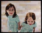
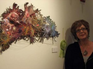
At some point along the way, I started entering exhibitions far away. My quilts have always traveled better than I have. I always have some trepidation when I drop them at a shipper, but I have know that shipping them is the best way to show them to large numbers of people.

At home, I either store my pieces on the wall or rolled up and placed in a pillowcase. At one time, I only wanted to ship my pieces rolled, but not only were round shipping containers hard to find at the time, the shipping charges were MUCH higher. My more conservative nature took over and I learned how to ship my work folded. Even though I quilt my pieces tightly, 1/4″ apart or less, folding them for a couple of days in this way does not cause drastic wrinkles.

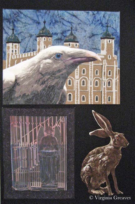
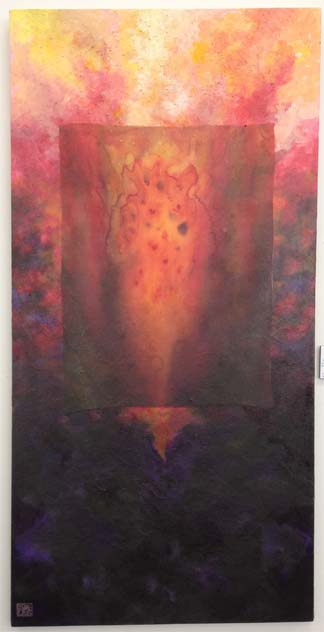
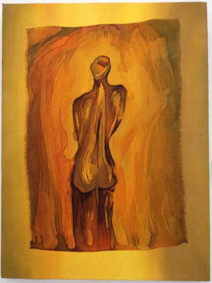
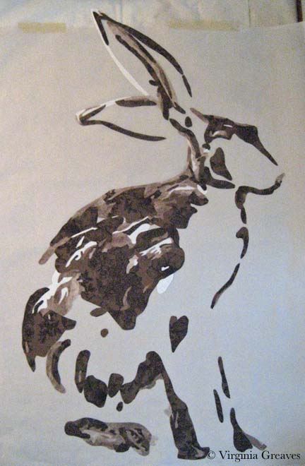
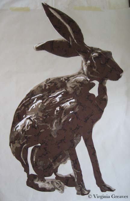
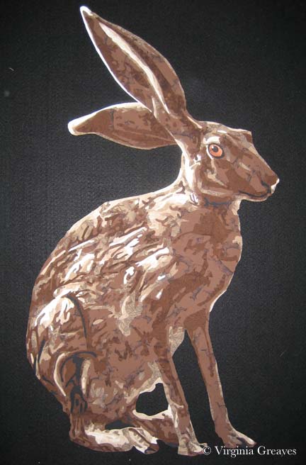
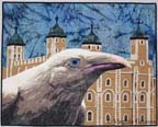
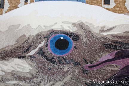
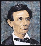
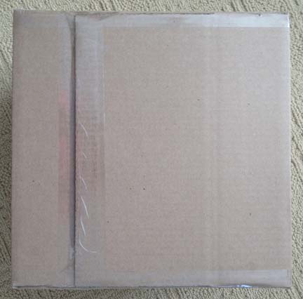
This week I was shipping Lincoln and The White Raven to IQF: Houston. I have small boxes for one quilt, but for two, there is a great box at Staples that is 14″ x 14″ x 14″. The depth is too high — but I can cut the sides of the box down to 10″ — and this particular box all ready has crease marks at 10″ — so it’s a very easy adjustment to make and I don’t have to fill the box with extraneous materials to keep the pieces from floating around in a box that is too big.

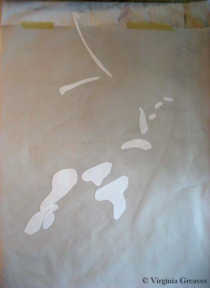
The goal is to fold the piece into a square that is 14″ x 14″. For Lincoln, I laid it out on the floor and crumpled up some tissue paper on the top.

before 1st fold

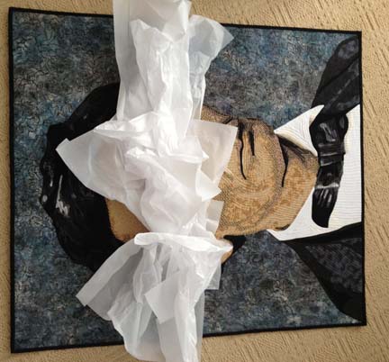
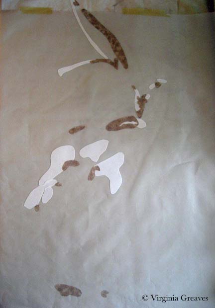
And then I made my first fold — from the top to the middle. I then put more tissue paper in the middle.

fold 1

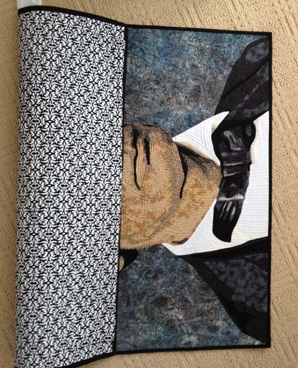
And then made my second fold. This is now just under 14″ wide.

fold 2

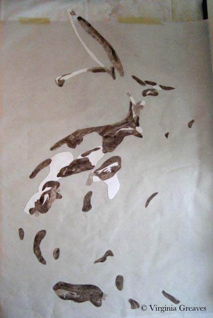
For this piece, I’ll need to make one more fold in the middle so I crumple up more tissue paper in the middle. It doesn’t have to be a lot. The tissue paper gives enough volume that the crease isn’t too small and won’t cause a nasty wrinkle on the top.

before fold 3

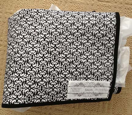
And this is what I looks like when it’s done. I then folded my second quilt in the same way so that I had two squares just under 14″. Some shows ask that you place the work inside a pillowcase with your name and other information written on it and then place it in a clear plastic bag. IQF does not want the pillowcase or muslin — they only want your work in a clear plastic bag.

I keep the plastic bags I get back from shows and re-use them, but if you’re just starting out, you can buy XXL Ziploc bags in the grocery store.

folded

I stacked them one on top of the other and folded the remainder of the plastic bag around the work. They fit perfectly into the box.

bagged

For any show, I always have an envelope. At the minimum, the envelope should have your name on it. Inside I put an index card with my name and other contact information. For IQF, they also have some paperwork that they want included. Since there are two quilts in this box, I have included two separate envelopes. I tape the tops of the envelopes to the bag.

If I close the box as it is, I would have extra room, so I merely cut down the four corners with some scissors.

inside papers

Then I fold the sides over and tape them with clear packing tape — once on the top, then the two sides, then across the top again. (By the way, this is exactly how I tape the bottom of the box as well.)

taped

I don’t reuse boxes. They can be reused to be sent home — but I don’t keep them beyond a round trip. It’s the least I can do for the safety of my work.

I have one more piece going to Houston to be in a special exhibit — Firecracker — but I won’t send that one for a few weeks.

I have had Amelia Earhart accepted into the La Conner Quilt Show — so I’ll be shipping that one out soon as well.

And finally, I have Jacks Are Wild and It’s All Relative (which I’m finishing now) to be included in a local show that Rebecca Reasons Edwards and I are curating. Those two will show in It’s All In The Cards at The Art Place in September and at the SEFAA Center in October.


Just the Basics

0

My mother is an impressionist oil painter, and when I was young and she went back to college to receive another degree in art, I remember her talking about the bias against realism in the art world. Abstract work was more highly valued — and for a very long time, I’ve disagreed with that opinion. I do like some abstract work, but I tend to be more engaged with realistic work. In fact, I’ve always felt that realism was harder to achieve than many pieces I’ve seen. That’s a huge generalization obviously — but I thought that abstract art was more about serendipitous exploration than intentional exploration.

At this point, I realize that that isn’t true — at least it isn’t true of good abstract art. It’s based on a deep understanding of color theory and how to make it work for you. I also understand why some consider it more difficult than realism. With realism, you have a point of reference from which to work. (It may not be a good point of reference, but that’s a different issue.) With abstract work, you are working entirely with theories and attempting to turn them into something engaging.

I have respect for both points of view. I work primarily in realism because that is what I like to do — but occasionally, I challenge myself to do something different — and that is what I have started here. As part of my art group’s annual exhibit, we were given playing cards to interpret. I had all ready made Jacks Are Wild — but I was given another card that I thought I could play with in a more abstract way — the six of Diamonds.

Using my color wheel, I chose six colors — starting with cyan — and then every other color around the wheel: blue, magenta, red, yellow, and green. I then picked out a light and a dark in each of these colors. Below are six 6 1/2″ squares of the dark. I know the yellow screams a little. It has a tight black pattern on it. It will make more sense when it is seen smaller and in the context of the entire piece.

abstract1

Then I made six diamonds from the light values and placed them on opposite sides of the color wheel — for example, the blue background got the yellow diamond.

abstract2

Of course, at this point, I know I have to make the piece longer. The challenge requires it to be 36″ long, so I decide to add squares in the light values.

abstract3

They look awful blank so I decide to add a common shape — a circle — in the dark values — to place on the light colored squares. I used a round container I had in the studio for a template. It was just the right size to fill the space in the squares I had cut.

I am, by the way, appliqueing all of these shapes. I had considered piecing the diamonds onto their backgrounds — but I wasn’t going to attempt to piece a circle — so I decided I would stick with machine appliqué. This is a Wonder Under template you see below.

abstract4

I have two rows of blocks. This is how they were originally laid out on the design wall, but I decided it was too predictable. I left diamonds next to diamonds and circles next to circles, but I changed the color placements so that each color wasn’t clustered with its cousins.

abstract5

This was very straightforward playing with color theory. Below you can see the two strips of shapes. Not exciting enough on its own though.

I turned to my old pal deconstruction for the next part. I made a background with black, white, and a couple of grays.

abstract6

Then I cut the strips of shapes into 1/2″ sections and fused them onto the background.

abstract7

I’m still working on the appliqué. Even though it’s just shapes and color, does it sing? I definitely think it has a sense of movement.

I don’t know that I’ll ever work exclusively in abstract, but it’s good to dust off my skills and try something new once in a while.

Artsy Shark and Promotion

3

Jack on design wallAs an artist, one of the hardest things to do is promote yourself. Really, marketing and creativity are separate pursuits and it’s difficult to come out of the studio to show your work — and yet if you don’t, you’re creating work that goes directly into your closet. Part of the joy in creating is in sharing — and today is an awesome day because I’m featured on Artsy Shark, an online network for helping artists build their business. You can find my article here.

I’m also sending two of my pieces off today to Sacred Threads in Herndon, VA– The Bowl Judgments and Beach Guardians. I’m going to fold them up with tissue paper, tuck them into a pillowcase and a plastic bag, drop them into a box, and send them off with prayers to FedEx. I was lucky enough to also have them both included in the extension of selected pieces to Omaha, NE so it will be a while before I see them again. One day I hope to travel as well as my work does.

I completed my latest piece, Jacks Are Wild, over a week ago — but it’s summer, the girls are home, and there isn’t a lot of studio time to be had. I’m hoping to make pictures today & post a new page — but I’m not making any promises. It’s part of the Fiber Art Fusion show in September and the members want us to not show our pieces until the show — but there isn’t technically a virgin rule — and I don’t enter shows that have them — so I plan to share. That is why my blog exists — I share.

There are still a few more shows to enter this year — but I’ll have to choose carefully. The deadlines are all about the same time — end of August, beginning of September. I have a few pieces not entered and not promised — but I can’t have them overlap and entered in two places at the same time — so I’m going to have to choose. I like to stretch myself and try to enter a show I haven’t been in before — but the other part of me is more practical and thinks I should enter the shows I’m more likely to be accepted into. It’s always a shame to have a piece sit at home when it could have been somewhere else.

Silk To Dye For Exhibit

2

The Silk Painter’s of Atlanta are exhibiting right now at the South East Fiber Arts Alliance space downtown. My friend Hellenne Vermillion had several pieces in the show so I took one of my daughters with me to see it today.

Silk To Dye For Exhibit Card

Many people think of wearables when they think of silk, and this piece called Luna by Margaret Agner is a wonderful example. (It’s also laid out on the exhibit card above where you can see how it fans out beautifully at the ends.)

Luna by Margaret Agner $150

Luna
by Margaret Agner
$150

There were also many pieces by Martha Andreatos. I loved the colors of the silk in this piece and how they are tiled together like a roof.

Colors by Martha Andreatos $225

Colors
by Martha Andreatos
$225

This is another stunning piece from Martha.

Double Pears by Martha Andreatos $450

Double Pears
by Martha Andreatos
$450

And this is a piece from Hellenne Vermillion. She has added a lot of hand stitching in this piece. I fear that the reflectiveness of the silk combined with the broad value range were too much for the camera on my iPhone — it doesn’t do the piece justice.

Koi Fish and Lotus Leaves by Hellenne Vermillion $450

Koi Fish and Lotus Leaves
by Hellenne Vermillion
$450

This is one of Hellenne’s silk masks. She forms a clay mask and covers it with silk. This was my daughter’s favorite piece.

Tattoo Mask by Hellenne Vermillion $350

Tattoo Mask
by Hellenne Vermillion
$350

This is another one of Hellenne’s pieces displayed on a canvas. I just love the heat coming off this one.

Fertility by Hellenne Vermillion $350

Fertility
by Hellenne Vermillion
$350

This is another piece by Martha, also painted silk on a canvas. It has a very luminous feel to it.

Contemplative Figure by Martha Andreatos $450

Contemplative Figure
by Martha Andreatos
$450

And finally, another piece from Margaret. I love the playfulness of this one. It is a silk wrap hung vertically on the wall with pins. It would be stunning draped on someone’s shoulders.

Octopus Smiles by Margaret Agner $150

Octopus Smiles
by Margaret Agner
$150

All of the work included in the exhibit was beautiful. Silk is such a vibrant medium and holds the color so well.

Please contact the artist individually if you are interested in their work.

Entering Shows

0

This week I’ve been appliquéing my rabbit onto my background. It’s almost done. There isn’t a lot to show in that process. It’s been hard for me to concentrate as the routine of my girls is already starting to change. I fear I may be a victim of Spring fever.

I did think I would take a few minutes and talk about entering shows. Why do I enter shows? Well, why do I make art? I make art as a form of self expression. I enter shows so that people can see what I do. It is more satisfying for me to have my work in shows than for my work to collect dust in the closet. In fact, I have a growing collection in my closet — it makes me sad. Art is meant to be seen.

ChildhoodMy first show ever was back when I lived in Alabama. The fabric store advertised for the Alabama Quilt Symposium to be held (that year anyway) in Birmingham. I thought it would be fun to enter and take a few classes. It was my first time. When I walked into the hall, I was enthralled by all the pieces. I had been working with textiles for a couple of years. I turned a corner — and saw my piece Childhood hanging — with a blue ribbon beside it! Best of Show & 1st place in its division. (That was, by the way, the only time I’ve won a Best of Show.) It was shocking — and thrilling!

Dalmatian DownsI took that piece and Dalmatian Downs and entered them in the AQS Quilt Show in Paducah in 2004 — and what a surprise I had when they were both accepted. No ribbons, but I did visit the show and get to see them hanging. There was row after row after row of the most incredible quilts I had ever seen in my life. I couldn’t believe it. I couldn’t process how a judge could pick a best in show.

I also entered one of the Mancuso shows — Pacific International (PIQF)– and the International Quilt Festival (IQF) in Houston. I had several quilts accepted over the years into PIQF — but I was not lucky enough to be accepted to IQF. I stopped entering AQS-Paducah as my work became artistic and fell outside of their size restrictions. (At one time, they wouldn’t accept a quilt whose width was between 24″ and 40″ — although I don’t know if they’ve since changed that rule or not.) I told myself year after year that if I didn’t enter IQF, I’d never get in — so I kept entering.

Faces in Cloth ISeveral years went by and I started to lose hope. We all do at one point or another — but then one year, I thought “one last time.” That was 2006, and my first monochromatic portrait Faces in Cloth I was accepted.

I have since entered Quilt National, Quilt Visions, and Quilts=Art=Quilts — but have not been accepted. I do admit that I haven’t been as diligent about entering as I had been with IQF. Sometimes it is because of the expense — and sometimes it’s easy to see from the other work accepted why mine was not.

I have also been accepted at some other wonderful shows — Art Quilts (at the Chandler), Sacred Threads, and the La Conner Quilt Festival — as well as some local Atlanta shows — Georgia Artists, Fiber Art Fusion (which I now co-curate with Rebecca Reasons-Edwards), SEFAA’s ARTlanta, and East Cobb Quilt Guild.

Right now, my desk is littered with folders — for quilts and for shows — as I try to decide shows to enter, how much it will cost, which quilts to send, how long they’ll be gone if they’re accepted, and how to enter pieces in such a way that I don’t enter a piece in more than one show at a time (because that’s just bad business). Decisions, decisions. I tend to enter & support the same shows that I have in previous years — but throw in a new one here and there to see if I get in — to expand my horizons.

Beach GuardiansI have had one piece juried into the East Cobb Quilt Guild Show this June — Beach Guardians. In July, both Beach Guardians and The Bowl Judgments will travel to Sacred Threads in DC. They have both also been chosen for an extended travel exhibit of Sacred Threads in Omaha, NE.

I also have been working on entries this week — but I think it’s bad luck to mention an entry before the jurying process is complete.

Sometimes I help Lyric Kinard with her list of Shows to Enter. At one point years ago, she thought about not keeping up the list and I offered to help. It was the only resource of its kind at the time and I wanted to see it continue. It’s a great way to look at the landscape and see what venues are available. Although many of the more local shows have not survived the current economy, there are still a lot of opportunities available.

Jacks Are Wild

0

I am currently working on a piece for an invitational show — my third animal portrait in a row. It’s not that I’m done making portraits of people, but I’m acknowledging the marketability of an animal piece over one of a specific person. People typically see one of my portraits and say “I’d love to have you make one of my grandchildren” — which is great, but moving people from the inspiration of a commission to the commitment of one is much more difficult than them finding inspiration in a piece you’ve already made and then committing to buying it. I’ve found that if I make a piece centered around a particular breed, everyone that has had that breed as a pet can see their cute little snuggly in it.

What I’m considering here is an antelope jackrabbit. This is a very large and muscular rabbit with huge ears. This pic shows the highlights — the beginning.

I’m using my new large pressing sheet — but it still wasn’t big enough to capture the tip of the ear — so I have taped my old pressing sheet behind it to catch the space at the top.

Jack value 1

This pic shows the second value.

Jack value 2 & 3

This shows the third value.

Once I cut the pieces small, I realized there wasn’t as much contrast between the second and third values as I saw in the comparison of larger pieces of fabric — but that’s ok. It happens sometimes. There isn’t enough of two or three to matter much.

Jack value 4

The fourth value definitely shows the creature emerging.

Jack value 4

The fifth value is a fun brown I found with creatures leaping across it — rabbits as well as deer. It’s a fun detail for someone that looks close enough to find it.

Jack value 6

Then I finished with the sixth value of brown and then black. I completed him with an orange eyeball. This is him on my black design wall. I brightened up the pic so you could see the prints better.

Jack value 6 & 7

He looks at home there.

Jack on design wall

Tomorrow I’ll start thinking about where he’s going to live.


2013 Georgia Artists Reception

0

Last Friday was the Georgia Artists reception at the Abernathy Arts Center in Sandy Springs. I was excited to go. This is my 3rd year to be included in this exhibit and it’s always a great way to meet other Atlanta artists.

So this year, I prepared myself. I designed business cards & had them rush printed. I even went so far as to buy a new dress — something I never do. I came prepared as the professional artist.

I’m still glad that I did that — I should always do that — but this year was different. The artists didn’t mingle. I didn’t have the opportunity to meet one other artist other than the one that I already knew — and I pushed my card on her so I could at least have given one away. In retrospect, we didn’t have name tags like we have in previous years. Maybe that made the difference. Also, there was only one artist in the show that had been included previously. I wonder what damage the economy has inflicted on its community of artists.

Lincoln was beautifully hung. I always love to see my work hanging in a professional gallery.

Lincoln

This is me with my Lincoln.

Lincoln & me

And this is SPLAT! created by Leisa Rich. I’ve known her for a few years although we have mostly conversed on Facebook. I was blown away by this piece. It looks more like sculpture than fiber given the way it undulates from the wall. It’s mostly stitching on a vinyl material but there are holes filled with what I think is fine silk.

SPLAT!

SPLAT! by Leisa Rich

And here is Leisa with an Honorable Mention! Well deserved. Probably my favorite piece in the show.

SPLAT! with Leisa Rich

SPLAT! with creator Leisa Rich


Designing Business Cards for Artists

1

As I’ve mentioned, I have a couple of openings coming up soon, and one of the goals that I listed for this  year was to produce new business cards. I had made some a couple of years ago — printed them on my inkjet printer using tear-able sheets — and comparing them to the professional ones that several artists have given me & I’ve saved for posterity — they are truly tear-able / terrible.

With literally a week to go, I needed to come up with something fast. I had been toying with the idea of using a non-standard size. I googled best cards for artists and came up with oodles of original ideas. The biggest take away from that was that one of the easiest ways to make your card stand out was to either make it a different size from a standard card — or make it out of non-standard materials. Knowing the enormous amount of time that could go into making cards out of fabric — like mini Artist Trading Cards — I decided that the mini-moo’s were probably the best way to go with my limited time table.

The mini moo’s are from moo.com — they are half the size of a typical business card (in length). I debated using someone local — but in the end, I was able to design a card using their template in a short amount of time, upload it, and still get them back quickly.

I knew that one side would have my information. I debated adding a QR code — I had actually convinced someone else to use one recently & researched how to make one — but it just didn’t make sense in terms of size on the mini-moo.

The other side would essentially be part of my brand — so I had to think carefully about what I would use. It would stand for my work as a whole — but it had to be small enough to look good on a mini-moo.
Minicard MockupIn the end, I went with a small closeup shot from a piece I made a few months ago — an eyeball. I am fairly proud of this eyeball — I love the color and it gives you an idea of the depth that I put into my pieces while still being small enough to fit on the card. I did end up trimming the sides with black to even it up with the template and help make the picture pop.

I’ll concede that I also used an eyeball on my last business cards. The majority of my work in the last few years has been portraits so it makes sense to me to use an eyeball. A full portrait would not have stood out on a mini-moo — the eyeball seems just right.

Business Cards

I used rush printing but regular shipping. I was ordering on a Thursday & moo.com printed them on Friday & shipped them out. I received them, surprisingly, on Monday.

The picture is dark — but I expected that. Monitors use the RGB (red green blue) color model — and printers use CMYK (cyan magenta yellow key or black) — and my Photoshop Elements isn’t advanced enough for me to use professional printing standards. I still think it looks fine.

It is also matte. I wanted gloss — but that isn’t available with rush printing. C’est la vie. I still think they look professional.

Notice I used different fonts. I think that mixing fonts can be an effective way to draw the eye. The font for “textile paintings” is more drawn out than the one above it. My name at the top is in bold & in a larger font. The combination draws the eye to the name.

The email address & website are variations on the name so they’re in the same font as the name at the top. The phone number is in the same font as the subtitle “textile paintings” — I think it makes the numbers easier to read.

For a long time, I had “Fiber Artist” as my subtitle — both on my cards and on my website — but I’ve come to see that that is not as accurate a description as I should have. I work in fiber as a medium — and I am an artist — but my pieces have a strong relation to paintings and I think it’s important to acknowledge that. I am often told by people that glance at my pieces that they think that they ARE paintings. “Textile Paintings” describes my work better.

The White Raven

Completing the Raven

0

The White RavenI have finally completed The White Raven. The bird was wonderful — the Tower of London was tedious — but I think in the end that it all came together. It’s ironic that I now have such a creative flow while constructing portraits and my more difficult moments are in the backgrounds.

I used a stacking type of stitch while quilting the raven to give the impression of feathers — it was interesting to see how the white thread changed the character of the darker fabric shades. I am becoming completely reliant on Isacord thread for free motion quilting. I can run my machine at a high speed and the thread is less likely to shred. It’s also available in a huge selection of colors. A thread run before I start quilting is almost a must for me at this point.

The Tower was not as much continuous line quilting as I would have liked. There was a lot of stopping and starting — so it took much longer to do — but hopefully I’ve created the impression of the Tower in a minimalist way. I still wanted the focus to be on the raven.

The background was also difficult because of the Tower peaks. I started in the middle between two towers and echo stitched a wavy line upwards — but once I reached the top, I attempted to echo stitch back down between another set of towers. Any quilter knows that you have to quilt from the inside out — especially if you’re quilting densely. By quilting from a less dense to a more dense area, I created some ripples that could only be resolved by ripping out all of my quilting and starting over in the correct direction — from the more dense outwards to the less dense area.

The White Raven detailAt the end, after I had washed it, blocked it, and added the label, I went back and added more quilting in the raven’s eye. It’s the focus of the piece and it did not have enough quilting relative to what was around it. I didn’t want it to sag over time.

The raven isn’t exactly like the original — I had to take liberties with the beak especially — but I think it is definitely reminiscent of the pictures of Mike Yip. His photographs of the white ravens in the Vancouver Islands are really wonderful.

Adding the Tower of London gave the piece whimsy — a story — which I think adds to the visual interest of the piece.

New Exhibitions

0

I have been blessed with several exhibition opportunities lately that I wanted to share.

Bukonyan Elder


Bukonyan Elder was chosen as one of two pieces to represent my Fiber Art Fusion group in our sister organization Southeast Fiber Arts Alliance show Fiber ARTlanta. The opening reception will be May 3rd at the Unitarian Universalist Congregation of Atlanta 6:30 – 8:30pm. The show will run through May 27th.


Lincoln


Lincoln has been juried into the Georgia Artist exhibit opening at the Abernathy Arts Center in Sandy Springs, GA also on May 3rd 6:30 – 8:30pm. The show will run through June 14.


The BowlJudgments smbeachguardians_sm


Both The Bowl Judgments & Beach Guardians have been juried into Sacred Threads 2013. Show dates are July 10 – 28 at Floris United Methodist Church in Herndon, VA. The artists reception is July 13 1 – 4 pm.

Virginia Greaves's RSS Feed
Go to Top