Design

Design


Creative Streak

5

I have had a major creative streak lately. I have several ideas in my head and am working happily away in my studio.

I went to visit a friend the day before yesterday — Heidi Miracle-McMahill. (You can find her work here.) I love the watercolor feel of her work. She let me play with her Caran D’Ache Neocolor II wax pastels. They are water soluble which means that they start to blend when you add water. I had brought over a set of Carb-Othello colored charcoal pencils that my mom had given me. They say that they are blendable but I didn’t find that to be the case. However, their color is very intense and work well in conjunction with the Caran D’Ache wax pastels.

I also really liked the fabric that she works with. She bought it from Fiber on a Whim. They called it Corona cotton canvas from Kaufman. It is a nice lightweight canvas — but heavier than Kona Cotton.

After we played, we went over to Dick Blick (which is just around the corner from both of us). I bought a small pack of the Caran D’Ache pastels and a nice paintbrush that I’ve been wanting. We looked at all of their canvas rolls, but they were unbleached and much heavier than what Heidi had.

When I came home, I had some cotton duck in the closet — so I thought that if I washed it, it would be close to the canvas cloth Heidi was using. It did soften, but when it was completely dry, it was stiff again. I have some Kona white in the closet. I think I’m going to experiment with that for a while. I don’t tend to paint my pieces — I am an applique kind of a gal — but surface design can be a lot of fun too.

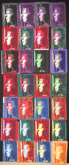
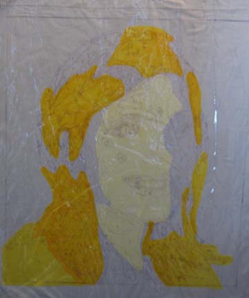
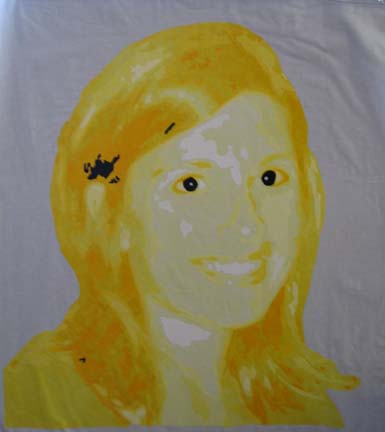
I have not been keeping up on my blog with what I have in process. I have just laid out my latest piece. Here you can see the progress I made in the last few days:

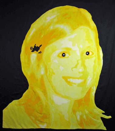
I had a fabric epiphany last week. It hit me how to use commercial fabrics to make faces. I went into my closet & found exactly what I needed in my stash stuck in my white & brown drawers. I was so excited — and knew immediately that it would work.

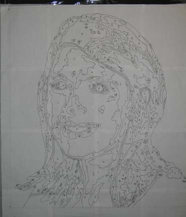
Also, this is the first piece I’ve done in which I separate the face from the clothing — and from the lips. When I start in Photoshop & reduce the picture to B&W — then posterize it — I lose definition between objects that are different colors. I transferred the picture from Photoshop to CorelDraw to make my drawing — and then printed it out. I always smooth over the lines with a Sharpie marker on the final pattern. This time, I used colored Sharpies to define the jacket and the mouth. I had to go back to the original color picture to see where the lines should be drawn.

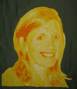
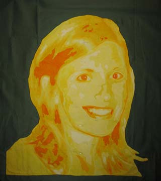
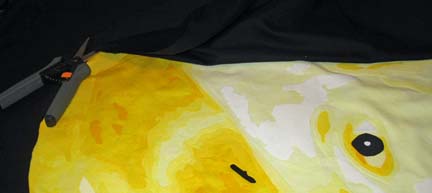
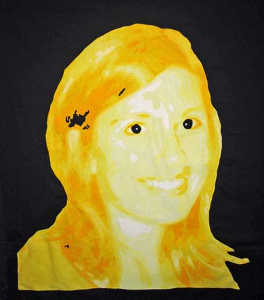
And here it is. I thought at first that the mouth was too red, but I’ve looked at it in Photoshop and a lighter color red doesn’t work. You may  not see it in the picture, but there are supposed to be highlights on the bottom lip. I may change that.

Hmmmmm. I’m not sure about the lips. I’ll have to think about it.

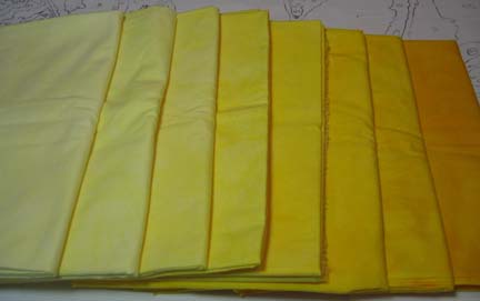
I should also mention that in my last two pieces, this one and Unconditional, I was very careful with selecting fabrics. I am usually so eager to start. I love cutting up all of the pieces — I think it is my favorite part. But I have learned that making sure now will make the project so much smoother. (I have to save spontaneity for my non-applique pieces.) On pieces that I made last year, I just used my  judgment, but the truth of the matter is that it is hard for my eye to always distinguish good value changes. Batiks especially can come out lighter in value than is expected. So I have been photographing my choice of fabrics and putting them on my computer. In Photoshop, I can take out the color, and when the picture is in B&W, I can easily see what works well and what doesn’t.

Back to the studio.


Breast Armour

1

As part of the Atlanta Breast Cancer Challenge put forth by It’s the Journey, Inc., I made a piece for Brazenly Radiant Art (BRA) sponsored by Fiber On A Whim. It will be auctioned on the Fiber On A Whim website starting June 15, 2008.

I have really debated what to call the piece. I love some of the slogans out there like “save the ta-ta’s” — but then I also read some really heartfelt responses by breast cancer survivors to these campaigns — and I can understand their hurt after mastectomy. I think I’ll call it “Breast Armour” — which is a big name for a small piece — it’s only 5″ x 7″. I may change my mind.

Breast Armour

My Life in Black and White

0

I am waiting for some supplies to come through the mail so I have spent today setting up my quilting frame. It was good to see it not lying on the floor — but it takes up a good chunk of space & now I want to rearrange everything — including where the cable line is. Nothing in life is ever easy.

I also took my latest quilt into Photoshop & removed all of the color. This is a great design trick to do when you are evaluating a piece before committing it to quilting. You want a good range of values — darks to mediums to lights — and a good flow across the piece. This piece has that — but I expected that since its theme was centered around values. I can also see a few spots that fell a little shorter of the mark than I realized — but overall, I think it holds its own.


Letting the Art Lead Me

2

I have been working on my profile. When I had finished all of the applique sewing, I was stuck on how to assemble them. I wasn’t interested in a traditional setting but had no idea what I wanted to do. I went to the bookstore & stumbled upon a great book — Art Quilts: A Celebration: 400 Stunning Contemporary Designs by Lark Books. It shows several years of quilts from Quilt National, a very prestigious art quilt exhibition held every other year.

There was one quilt in particular that caught my attention. It was many blocks of applique set on a wholecloth with words behind it. Voila! Great idea. I didn’t want words, but complex cloth for a background sounded perfect.

I laid out a couple of card tables in the garage & covered them with plastic. I laid out the background PFD fabric and started painting. I considered dyeing it, but since I’ve moved, I no longer have a shop sink — only my kitchen sink — and I’m not quite ready to christen my new kitchen with the spoils of dyeing. So I painted — blue & green — and it looked very good — and very dark. I knew that the piece would have to be a light value to hold up the blocks. I considered finishing it and then doing another one — but I am running low on my bolt of PFD, so I brought it into the kitchen, plopped it into the sink (carefully that is), and ran water over it until the color was more of a sky color. Perfect. I then hung it outside to dry — which it did very quickly. I went to eat lunch, and when I was done, it was almost dry. I place it in the dryer to finish it.

I should also exlain that I had played with the layout on the computer — in CorelDraw. I knew that I didn’t care for the horizontal orientation — and having the bright yellow in the bottom right didn’t read right — so I took my digital picture, made a layout in CorelDraw, and set it all up. Then I changed the layout from vertical to horizontal, and then I flipped all of the blocks so that the yellow started in the top left and the black ended in the bottom right. I would show you the CDW files, but I set them in pages in one file & CorelDraw won’t let me export the pages. Oh well.

When the background fabric was dry, I laid it out, marked the middle, and drew boxes with light pencil marks for each block. And then I started thinking about this great stencil that I bought 8 years ago of an iron fence that I intended to use in my daughter’s room & never did. At first I was afraid that I had thrown it out in the move, but it was waiting for me in my work-in-progress stack. I measured and placed each rail, marking it with a black Pentel FabricFun Dye Stick. When I was done, I set the dye with a hot iron. This is my first time to use a stencil on a quilt.
Layout of Background

Then I started trimming my blocks. The original was 6 1/2 by 10 1/2 — so I grabbed my large square ruler & lay masking tape along those dimensions. It seemed like a good idea — but really was more irritating than helpful. Then I placed the overlay of the profile that I used to make the blocks on the top of the ruler & taped it down. I turned it to the back and cut off the 2 sides along the top and right side that stuck out. This became my guide for cutting.

Cutting Guide

Then I placed it over a block, aligned the image on the plastic on the top of the ruler to the block beneath it, and then cut the top & right side. Then I flipped the block over and cut the remaining 2 sides based on the 6 1/2 by 10 1/2 inch finished measurement.

Cutting Yellow Profile

When I was done, I pinned all of the blocks to the background on my design wall so that I could see where I was going.

Final Layout

I love CorelDraw. I used to use Photoshop to lay things out, but CorelDraw is really better for this. This is the first project in which I have exclusively used CorelDraw. Thank you Julie Duschack for introducing me to the wonders of using my computer for design work.

Which is to say that the design wall is very close to what I had done in CorelDraw.

I am currently sewing the blocks on. There are many ways that I could have done this, but I decided on the easy way — more fusing.

Now I want to add keys and I have been looking for key stamps. Sounds easy enough — and I live in a big city now so I should be able to find a stamp with a decent key. I have been looking for 2 days. At this point, I either have to order it from the internet or I can go down to Dick Blick and get the materials to carve a stamp myself.

Why keys? I don’t really know.


Cloning

0

I have been making progress at putting my studio together in our new house. I had to cut down the design walls to fit 8 foot ceilings but I realized that I didn’t have to wait on someone else & I did it myself. I had to have to room for my cloning. I took the piece that I started at the old house and started experimenting. I started with black (& white) facing purple, red facing green, and blue facing yellow. Then I made an inverse of yellow which I thought would be cool — it wasn’t. Then I made stages between the sets horizontally — light shades of black with dark shades of purple and light shades of purple with dark shades of black — and then I made stages between the sets vertically.

Sharon, a friend of mine, came over to the house yesterday, and since she was being toured through the house, she saw it. I don’t like showing in process pieces — well, at a stage that I haven’t picked at least — and she obviously didn’t like it. Don’t get me wrong — I realize not everyone is going to like my work and I’m OK with that — but Sharon is a friend of mine & it took a little bit of excitement out of the piece for me. I’m going to work on an exciting way to set all of the blocks in the hopes of bringing life back to it. Oh well — it happens sometimes. It’s usually my husband.

Profile 28

And I forgot to mention — some of these were very challenging to do and I have a few rejects — and a few that had several lives before they were happy on the design wall. It is very hard, for example, to put 2 light blues with 2 dark yellows — and get the contrast in values that I’m looking for in order to have depth. That is why I had to move into orange.


Refinement

3

Trying to refine a picture is one of the most challenging things to do. I move away from the pattern and use the original photograph to make alterations. The goal is to give the essence of the person in the quilt.

I have made subtle changes to the yellow portrait. This is what I started with:

Amy in process again

This morning, I added deeper color to her eyebrows and the area around her eyes. I also made the eye on the right side smaller since that side of the face is receding away from the viewer.

070122 001

I then decided that there was not enough highlight on the right eye in the corner by the nose so I added a lighter color there. I needed deeper shadows in a few places to highlight certain areas so I added deeper color under the chin, in the throat area, and on the right side of the face to give more separation between the face and her hair.

070122 003

At this point, the mouth still looked wrong to me. At some point, I had cut away the shadow of the upper lip on the right hand side because it was too deep — but in hindsight, there needed to be some deeper line there to show the full character of the smile. I raised the lip a quarter inch or so and changed the shadow so that it created a crease in its corner.

070122 004

I feel very good about the piece at this point.


Working Through Fear and Difficulty

4

OK. I received a bunch of really helpful feedback from some of the members of quiltart. It is so helpful to belong to this group (www.quiltart.com). Constructive criticism can be hard to come by since I don’t have a creative outlet — and it is difficult for painters to understand the limits of fabric as opposed to paint. It is true that I could have painted the quilt top to make changes — but I am not a painter. I am more of a collage artist — in fabric. My mom, a fantastic painter, has been wonderfully supportive over the years, and her comments, for the most part, are helpful. However, she inevitably says that I have to have a specific color — which I don’t have and don’t know how to dye. One day I’ll get to take Carol Soderlund’s class and I’ll be able to dye anything — but at this point, I recognize my limitations.

So I read all of the constructive criticism and started thinking. I was so dead set on using the black — so I decided that I probably needed to let it go. It sets off colors so well, but it just wasn’t helping me with the bright yellow. Someone mentioned using an olive green instead — which was kismet since I have a great olive green sateen in my collection that I had been thinking about.

Someone reminded me that the values were all light & middle — which led me to an exercise I should have thought to do on my own which is to take a picture of the piece into Photoshop & remove all of the color. It fell flat. My darkest yellow just wasn’t dark enough.

I decided to go into a dark yellow orange for the shadows since that is what is next on the color wheel — rather than introducing a contrasting color. This is really meant to be a color study of yellow — and I have learned a lot. When I made the pink quilt, I had to go into red, so it only made sense in this series for me to include orange in the yellow range.

Perhaps the most fascinating realization was that orange worked best for the eyes. Thank goodness you can peel off fusing as you go along — and I have peeled off many sets of eyes on this one. Really, if the eyes don’t work, the whole thing falls flat. Someone made the interesting comment that I should look at the eyes of lions — that they are yellow and match their manes. Beautiful — but they are rimmed in black which didn’t work here, but I realized that it was really OK to not use black.

When I stepped back from the piece, I finally started to see Amy peeking back at me. When I get that feeling, I think that I am getting close.

Amy in process again

Following the progress of this piece wasn’t intended as a documentation of failure, but I suppose in following the ups and downs of the piece, it is easier to learn about what can go wrong. I have never been one to accept defeat easily, but I will say that this yellow piece almost got me.


Art & Fear

5

I started this portrait in yellow quite some time ago. I completely fused the front after very carefully following my current methodology, and then hung it on the wall for what I call the “gut check”.

And it failed. Part of the problem is that the main color is yellow and it is hard to develop features with this color. Another problem was my computer. The pictures on the computer looked better than the quilt top. Once I propped up the piece and walked down the hall away from her, her face became a mass with no distinction. The last problem was the initial picture. I realize now that it was a poor choice because it wasn’t helping me much.

And so I bought the fabric for the background and began working on Christmas projects. I even took the background fabric & draped it over the front of the quilt. It hurt to look at it — it just wasn’t right.

Once the holidays were over, I spent some time adding shadows — and they looked completely out of place. I folded up the quilt top and tried to decide if I should just abandon it.

But really folding it up seemed to help. I realized that the entire face needed to be redone in darker hues. I took out the pattern and decided on the line around the face that would be my new beginning point. The fabric at that point was a 3 in the value scale — so I pulled the 4 value fabric and made that the main part of the face. I then pulled a value that I had pulled out of the dyed stack & decided not to use. I used this one because it contrasted nicely with 4. Using a pencil, I then renumbered the values in the face using these other 2 fabrics as reference points.

While I was doing this, I redrew a few lines in order to simplify some shapes. I allowed myself to be less involved with the left side of the brain and let the right side run the process. It became a completely visual experience.

Amy in process

I don’t know how much of her personality it captures but I am hoping that more of that will come through with the quilting.

This is the original photo. Do you think I came close?

Amy original

In the end, I need to remind myself that this is art and not intended to be a reproduction of the original photograph. There has been a lot of discussion on the quiltart email list about illustration and its merits. I think that I was greatly influenced by Wayne Spradley. He is a famous watercolorist that lives close by, and I took a class from him a couple of years ago. He is a master at offering suggestion of a shape and allowing the brain to fill in the rest. It would not be as engaging if he added all of the details, for example, of a person in the background, and yet the suggestion has to be just so in order for the brain to become involved.


You Want It In Yellow?

1

I have been working on a portrait recently but haven’t had the time or the energy to write about it in my blog, although I did try to keep track of what I was doing with pictures as I promised several people that I would document how I develop one of my portrait quilts.

I took a picture of a friend of mind recently and talked with her about what color she felt would personify her personality. Yellow. Can you make someone in yellow? But I wanted the piece to give the feeling of her and letting her choose the color seems important. If I made her in green — which is what I might have chosen — the essence of her might not come through in the final piece.

I use Procion MX fiber reactive dyes on cotton and chose a mixture of 7 parts bright yellow and 1 part golden yellow. The golden yellow was essential as it is more orange and helped me come up with a good color range. Value is the most important thing, and if the fabric doesn’t work, then it shows in the final piece. However, I was asking for a lot. I needed 7 good distinct values with white & black also added. I dyed 8 and was pleased with the results.

yellow color range

I took the picture of my friend and played with it in Photoshop, CorelDraw, and then on paper before I got a good pattern. I then printed it out, traced a copy with permanent pen onto vinyl, and then traced a copy in reverse for the fusing patterns.

facesvi inprocess 1

There are many ways to approach construction. For the most part, I fuse onto white fabric (because it doesn’t create shading problems) using an overlay of vinyl with the pattern copied onto it for help in placement of pieces. Once I have the pattern on the vinyl, I baste it onto the white fabric and then pin the entire piece on my design wall. I pull back the vinyl as I go to fuse directly to the white fabric.

facesvi inprocess 2

facesvi inprocess 3

The large pieces define the face, but the interest and magic is in the details.

facesvi inprocess 4

This is interesting — but the white background is distracting. I intended to have a black background, but I didn’t want to use that as my base fabric and cause shadowing problems behind the yellow. I don’t want to fuse all of that on either, so I decided to use reverse applique — but first, I need a line to follow on the back side.

Again, there are several ways to accomplish this, but I was limited to what I had in my studio. Using a water soluble pen, I outlined the head using the vinyl overlay as a guide. I then put gray thread in the bobbin & water soluble thread in the top and followed the line I had drawn on the top.
Then I laid black sateen fabric face down on my table and clipped it down so that it would be as flat as possible. Then I laid the portrait face down and pinned on both sides of the gray line. When I was done, I put black in the top & bobbin and sewed on the back following the gray line. Then I CAREFULLY cut away the black from the face.

facesvi inprocess 4

And now I have a rough draft of what the piece will look like.

facesvi inprocess 5

At this point I do a gut check and make changes. For example, the photograph has a small white speck on the neck that was distracting — I never added it. And I don’t like the small black pieces on the bottom left and middle top — although the piece where her hair changes direction seems fine. I will look at this for a few days before I start sewing the pieces down. Although it looks done, I add a zigzag around all of the pieces.

I usually use matching thread when I do machine applique — but I have a strange desire to use black or gray with this piece. I may play with it in Photoshop to see what that would look like.


It’s All About Me

1

I haven’t written in while since I got the news that we will be moving. I have been in the same house for 10 years and have found that I have roots that are difficult to move. I was much more agile in my twenties and always moved at the drop of a hat. Even as a child, my parents moved me around at a fairly steady rate and we rarely stayed in a house five years. I suppose that as we grow older, we become more settled and resistant to change — which is an odd feeling for me since I have always considered myself akin to a chameleon.

I have been working on a Tshirt quilt. It is made from Tshirts and baby blankets from the daughter of a friend of mine. She died at the age of 6 about a year and a half ago, but we still think of her and miss her.

It’s All About Me

She had a lot of pink so I asked her mother if I could go with the pink and brown color scheme that is so popular now. Although I’ve never been a fan of brown, it has lately started to grow on me. I even painted my bedroom a cafe au lait color. I love the way that the chocolate sets off the pink in this quilt.

Now to figure out how to quilt it. It is very large — over a queen size but not quite a king — and was difficult to hang for a picture. I would throw it on my Hinterberg frame, but I had to take it down to declutter the house. I’ll have to think on this one.

I have also been working steadily on my next portrait quilt. I have had many requests to follow the creation of a portrait and will post progress soon.

Go to Top