I have been working on a portrait recently but haven’t had the time or the energy to write about it in my blog, although I did try to keep track of what I was doing with pictures as I promised several people that I would document how I develop one of my portrait quilts.
I took a picture of a friend of mind recently and talked with her about what color she felt would personify her personality. Yellow. Can you make someone in yellow? But I wanted the piece to give the feeling of her and letting her choose the color seems important. If I made her in green — which is what I might have chosen — the essence of her might not come through in the final piece.
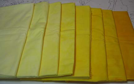
I use Procion MX fiber reactive dyes on cotton and chose a mixture of 7 parts bright yellow and 1 part golden yellow. The golden yellow was essential as it is more orange and helped me come up with a good color range. Value is the most important thing, and if the fabric doesn’t work, then it shows in the final piece. However, I was asking for a lot. I needed 7 good distinct values with white & black also added. I dyed 8 and was pleased with the results.
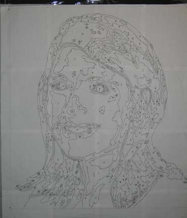
I took the picture of my friend and played with it in Photoshop, CorelDraw, and then on paper before I got a good pattern. I then printed it out, traced a copy with permanent pen onto vinyl, and then traced a copy in reverse for the fusing patterns.
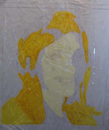
There are many ways to approach construction. For the most part, I fuse onto white fabric (because it doesn’t create shading problems) using an overlay of vinyl with the pattern copied onto it for help in placement of pieces. Once I have the pattern on the vinyl, I baste it onto the white fabric and then pin the entire piece on my design wall. I pull back the vinyl as I go to fuse directly to the white fabric.
The large pieces define the face, but the interest and magic is in the details.
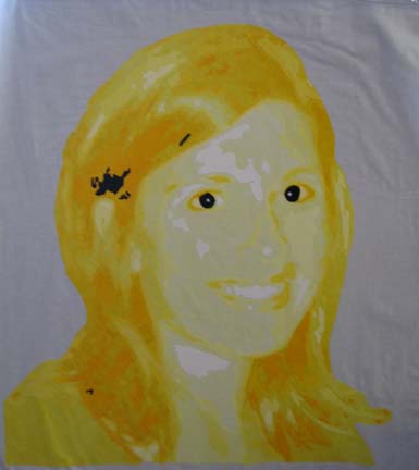
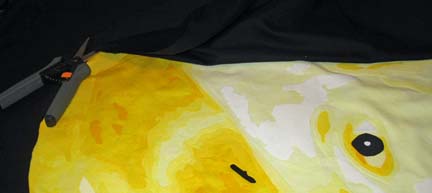
This is interesting — but the white background is distracting. I intended to have a black background, but I didn’t want to use that as my base fabric and cause shadowing problems behind the yellow. I don’t want to fuse all of that on either, so I decided to use reverse applique — but first, I need a line to follow on the back side.
Again, there are several ways to accomplish this, but I was limited to what I had in my studio. Using a water soluble pen, I outlined the head using the vinyl overlay as a guide. I then put gray thread in the bobbin & water soluble thread in the top and followed the line I had drawn on the top.
Then I laid black sateen fabric face down on my table and clipped it down so that it would be as flat as possible. Then I laid the portrait face down and pinned on both sides of the gray line. When I was done, I put black in the top & bobbin and sewed on the back following the gray line. Then I CAREFULLY cut away the black from the face.
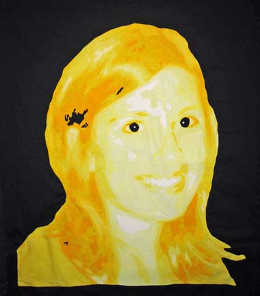
And now I have a rough draft of what the piece will look like.
At this point I do a gut check and make changes. For example, the photograph has a small white speck on the neck that was distracting — I never added it. And I don’t like the small black pieces on the bottom left and middle top — although the piece where her hair changes direction seems fine. I will look at this for a few days before I start sewing the pieces down. Although it looks done, I add a zigzag around all of the pieces.
I usually use matching thread when I do machine applique — but I have a strange desire to use black or gray with this piece. I may play with it in Photoshop to see what that would look like.

You did a great job on the face, I love it. But can I suggest a background color? I think a brown or a gradient light to dark brown would look good. IMveryHO.
Hugs, Anji