Posts tagged art

Building Character in a Face

3

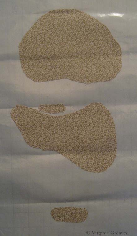
I have been busy cutting away here recently. This is my favorite part — cutting and fusing. It’s meditative and yet the puzzle is still challenging.

I do have to say, however, that my decision to choose different colors has resulted in an even greater sense of realism than I have had before. Because of this, presenting the face in layers feels more odd than ever before. By the time the face is fully shown at the end of this post, without hair, it feels like looking at a naked face. It’s a little unsettling.

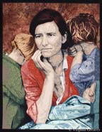
I also confess that, after taking several pictures of my model, I chose not to go with one that you would choose to go on your mantle. I think this is a more playful picture that shows her personality better. She’s actually looking up a little at the viewer.

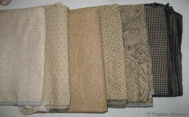
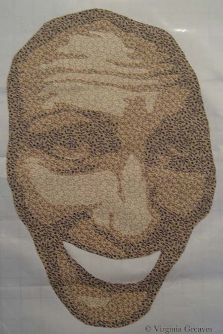
This is the first layer. I’ve learned the hard way not to go any lighter than this.

face value 1

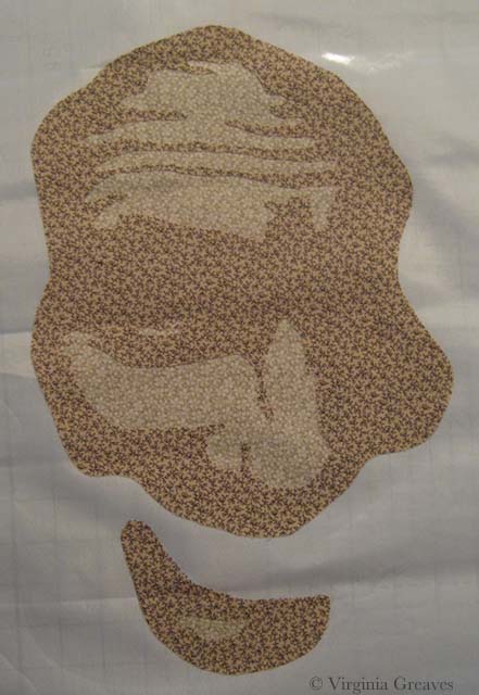
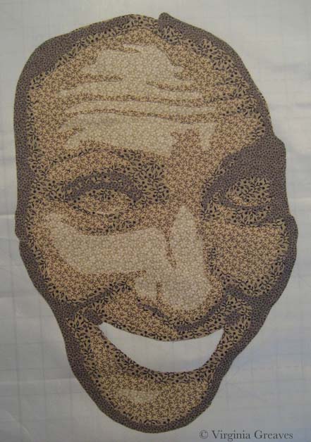
And this is the second value. I know that my model is screaming at me right now. I promised not to show any wrinkles. The truth is that because she is looking up into the camera, there are lines of personality here. They seem stark in this picture, but bear with me. In the end, especially once all of the hair is fused on, they will only add to her character and will not be seen as age lines.

face value 2

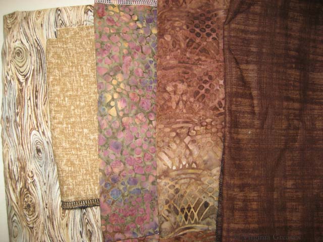
Here is the third value. It’s always important to remember that eyes are set INTO our faces so even if the picture doesn’t give us darker values around the eyes, it’s best to put it there for our rendering to give a sense of depth.

face value 3

Here is the fourth value. I was surprised that this stony gray worked so well in this gradation.

face value 4

This is the sixth value. There isn’t much of it here.

face value 5

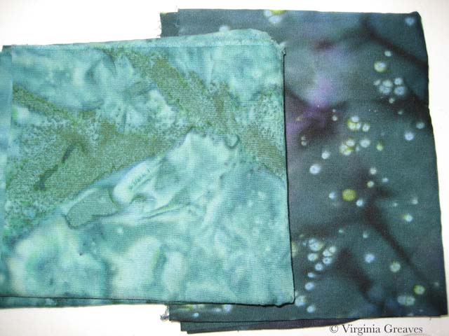
This is the seventh value. It’s actually a deep navy blue.

face value 6

The eighth value is black which is mostly in the neck. I’ll revisit that in a minute.

face value 7

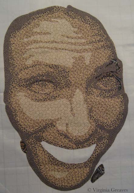
These are her lovely green eyes. You can begin to see her peeking out of the fabric.

face with eyes

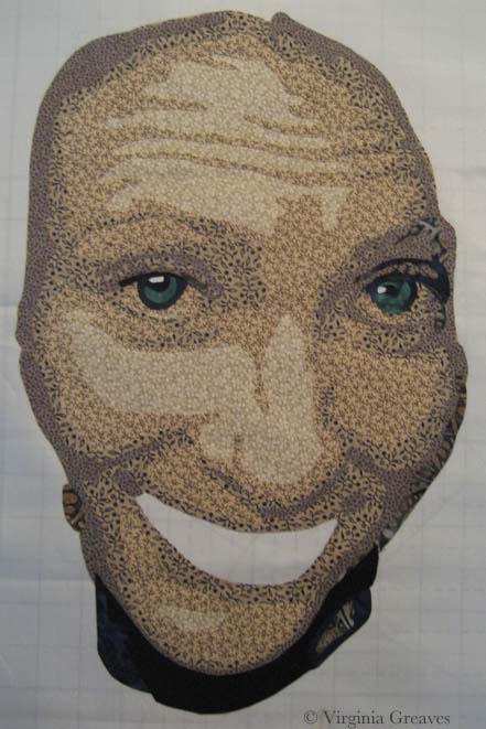
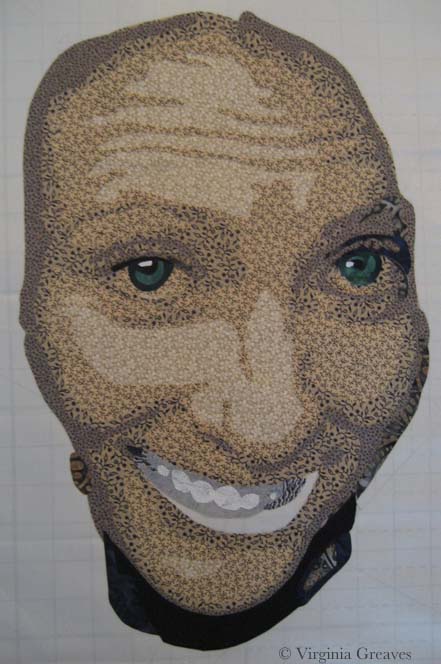
And these are her teeth. They don’t make a lot of sense yet without her lips. These are the only pieces that I put on in reverse order — dark to light.

face with teeth

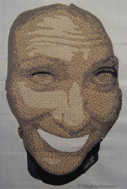
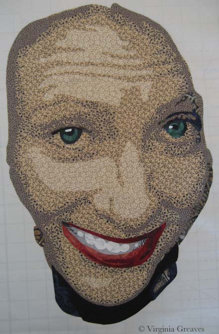
And here she is with her mouth. She looks a little stark without her hair — but I’m working on that now.

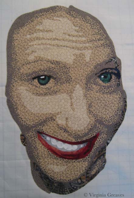
At this point, I step back and think about how this will work with what I have to do next. Her neck is too dark given that her shirt will be black, so I decide to pull the values back and re-do the neck.

face with mouth

Here they are re-done. You see a lot more of value six, which I prefer, but you still get the sense of the jawline and the recession of the neck.

face with redone neck

Hopefully I’ll finish her hair before I leave for Houston next week.

Around the World

0

Last year in Houston at Quilt Festival, I had the pleasure of meeting Marilyn Wall. I had admired her work for some time and was excited to meet her. She was attending with an old friend of mine, Denny Webster, who had recently moved from Atlanta to North Carolina.

Marilyn asked me recently if I was interested in participating in the Around the World blog hop. I’ve never done one of these before, but it’s essentially a way for bloggers to promote each other. Marilyn nominated me and another blogger — and I’m supposed to nominate a couple of other bloggers. Hmmmm. Most of the bloggers I know have already participated in this blog hop — and quite frankly, life has been very full around here recently.

BUT — what I CAN do is introduce a few things about me that you might not know.

What quilting/sewing thing am I working on?

If you follow my blog at all, you see what I’m working on. Right now, in my studio, I’ve been cutting out a portrait — I’m working on the hair right now. I’ll blog post about the face later this week. It’s my intention to enter this one in the National Portrait Gallery competition and hope it at least makes it to the semi-finals. Hope springs eternal. And in a little over a week, I’m traveling to Quilt Festival in Houston to step out in the Winner’s Circle and find out what my prize will be. I’m starting to feel butterflies in my stomach.

How does my work differ from others of its genre?

This is an interesting question. I started making representative patterns because I enjoyed the process, and my first series of portraits were all monochromatic color studies. Once I moved to Georgia and no longer had a wet studio, I was forced to begin considering commercial prints in portraits, and in this, I was definitely influenced by Deidre Scherer. I studied how she used patterns to her advantage rather than seeing them as an obstacle. I also studied Charlotte Warr Andersen, although all of her faces were made with solids. In the end, I made what I wanted to make. The norm at the time in fabric portraiture was not detail but rather obscurity — the side of the face or the back of the head, a closed mouth, a limited value range. I challenged myself to do teeth, to suggest the gum line or the tongue, to add the intention of the ear. I also made surprising fabric choices, not shying away from patterns, and learned how to make them work for me.

Why do I write/create what I do?

I create what I do because it makes me happy. It’s challenging, and I enjoy a challenging puzzle. I remember taking a picture of my daughter and making it into a pattern — and I loved to see the light of her eyes shine out at me from the design wall. I loved taking the impossibility of a waving flag and successfully presenting it within the confines of my 2D fabrics and the sculpture of my quilting thread.

How does my writing/creating process work?

Now this is a really long thing for me to answer succinctly. I have a picture for inspiration (usually one that I’ve taken but sometimes one that I’ve asked permission to use) and from that, I make a value painting in Photoshop (which means that I draw all over it because pictures are only the beginning and will never give you everything that you need because they are not as good as the human eye). From that, I make a pattern. From that pattern, I create fabric templates that I collage together (cutting and fusing — this is secretly my most favorite part). I then stitch it all together through raw edge appliqué, and then I quilt it.

That’s my story. I’ve had my website since April 2005 because I have always enjoyed computers and it was a way for me to stay connected when I lived in a small town in Alabama (particularly when I became a stay-at-home mom), and I started the blog in September 2007. I had been a writer in my youth, and I have enjoyed adding writing as an expression of my creative intentions. I have enjoyed my journey — and I’ve enjoyed sharing it with anyone that has cared to read it and follow it here.

Breathing Soul

0

I have been considering my portrait for entry into the National Portrait Gallery (NPG) competition. It’s always a challenge, artistically, to reverse engineer something — but it also can create a better opportunity for success.

I’ve been studying the work from last year that reached the finals — and I know that whatever I do, my goal is not realism necessarily. There were certainly pieces in last year’s competition that were realistic — and some that were abstract but clearly representative of the human form. I think the greater question is — what can I do that sets my work apart? I can make a piece that looks like a painting from a distance of a couple of feet — but perhaps the better curatorial choice would be one that best represents the materials being used — which in my case is fabric.

So I spent a few days considering the painting of the man with the quilt pulled up to his chin — but in the end, I decided that that’s a poor place for me to start. I don’t make traditional quilts and I have no interest in calling to mind the traditional pieced quilts that grandmothers have created for years.

And then a friend of mine said something on Facebook that struck me. She said — not in regards to me but in general — she felt that representative work in contemporary art was soulless. Wow. And I went back and looked at the fabrics that I was considering for my next portrait (yes there are some value issues here I had not yet resolved) — and I realized that I was following the formula I knew for creating a realistic portrait — and that it was going to feel soulless and boring.

fabrics_face1

I have felt for a long time that the soul of a portrait is found in the eyes — or the hands — and that’s true — but it’s not enough — not nearly enough for the piece to stand out and grab the attention of the viewer.

And then I started thinking in terms of color. Color does not have to be as straight forward as I was making it. A strict gradation from beige into black was perfectly acceptable — but was it exciting?

I’ve been considering the work of Vincent van Gogh a lot recently — and his work is largely arresting because he used color theory so successfully. Forget what color the thing you’re representing really is — make it what it needs to be in the piece to make the piece successful.

So I started over. I started with beige again but then I went into blue, ending with a deep midnight blue. My fifth fabric, the blue and brown batik, is a step out — but it transitions the beige into the blue. The fourth fabric was difficult. I ended up finding this clay color in my brown bin. It’s a transitional neutral fabric and it’s the right value so it works.

fabrics_face2

I usually pick the first color family and then start cutting, but I knew that all of it is in relationship to each other — so I went on to pick the fabrics for the eyes. My model does have green eyes — and for this piece, I think that these two will stand out well.

fabrics_eye

My goal in the hair is to have purplish brown. This is my starting place. The middle one may be too red — but unfortunately, I can’t make it to the fabric store today. (Someone stole my credit card number yesterday and I am stuck waiting on a new one to be delivered.) I think my stash is not complete enough here and I plan to change a couple of these with new fabrics soon — but this gives you an idea of where I’m headed.

fabrics_hair

I have a beautiful mottled green I’ll probably use in the background.

My goal is to create an analogous color harmony — to use what I know about color to breathe soul into her — to make her come alive in cloth — for her spirit to become apparent in the image. Let’s hope that my bold choices in fabric will help me achieve that goal.

As to whether it will be enough to be juried into the NPG — who knows? But hopefully it will help move me further along in my artistic journey.

More Pics Please!

0

A friend told me that it was hard to see what I had done on the piece from my last blog post so I have posted some more detail pics. I hope this makes it easier to see the quilting.

#3 quilting detail 2


#3 quilting detail 3

#3 quilting detail 4


Quilting as Another Dimension

1

Yesterday I finally finished quilting the 3rd abstract piece that I’ve been working on collaboratively with Leisa Rich. I have to admit that I let my mind run away with this one.

This is a pic that Leisa took of it after she had added embroidery.

#3 quilting before

And this is the same piece after I have quilted it.

#3 quilting after

I started with free motion quilted feathers — in metallic thread. CRAZY if you’ve ever sewn with metallic copper thread — but I had the wind at my back that day and it flowed like water onto the surface of the piece. I graduated through copper, purple, blue, and then a gray for the deepest part of the black fabric. I then moved over to the red and brought a flame stitch out of my bag of tricks. Then I moved down into the yellows and whites. I did change to more of a wavy frond for the white — I liked the difference in texture — and some of the yellow blobs were awarded with scallops.  I did revisit the copper thread on the lighter blue fabric over on the right hand side — but I was not lucky on those days and struggled with a lot of broken thread. I moved back into blue thread as soon as the piece was ready for a change.

I love free motion quilting on my Janome. Even sewing on the plastic overlay didn’t cause many problems. My Viking would have given me fits.

I hope Leisa forgives me for putting traditional feathers all over it. It called out for that organic feeling. I’ve never used so many free flowing feathers on a piece in my life. It felt good to step out of contour quilting.

#3 quilting detailI am giving this back to Leisa next week — I think she’s planning some hand embellishment.

We have a curator that approached a local Atlanta gallery about having a two person show of our work — and it looks like we have reached an agreement and the show will go on in late 2015. Time to get busy — I have a lot to do to get ready!


Wordless Wednesday

0

sunflower

Opportunities

1

I have been quilting the third abstract in the car wash series — having fun with it. I eschewed my usual contour quilting for feathers, flames, & fronds. I love the way it’s turning out. I’m also using the thread to pull colors across applique boundaries — and playing with thread choices. I even coaxed a metallic thread to free motion into feathers.

But I only worked in the studio a couple of days this week. I have a friend that’s been giving me scoping work. I hope to get back in the studio tomorrow.

I would like to say that I’ve been working on another portrait for the National Portrait Gallery competition — but inspiration hasn’t struck. Right now I am in the flow with abstract and I have not been successful in changing my direction.

WorryIf you read my Facebook Page, you saw me hyperventilating when I was notified that I won a ribbon in Houston again this year. It’s such a huge honor & completely unexpected. I won’t know till the ceremony at the end of October what the prize is exactly. I’m lucky that I’ll get to go to Houston again this year and actually stand in the Winners Circle.

I may even tweet the whole event like I did last year. It was such an exciting time and I loved sharing it.

For those interested in attending, Preview Night for IQF/Houston is October 30. The show is at the George R. Brown Convention Center and runs through November 2.

I did, in fact, come home after winning a ribbon with Lincoln last year and decided — after making animal portraits for a year — that I would make a person portrait again. Worry was the piece that I made from that decision.

Golden MomentI also found at that Golden Moment was accepted into Art Quilts XIX: Permission to Play. This exhibit is at the Chandler Center for the Arts in Chandler, AZ and will show November 7, 2014 – January 17, 2015.

Permission to Play Art Quilts XIX 1 Sheet

Fierce Fibers Reception

3

Last Thursday was the opening reception of Fierce Fibers at The Art Place in Marietta. It’s a beautiful show in a beautiful space.

This is Sharon Ahmed with her heavily threaded piece Why Is There a Rooster in my Garden? The rooster was dimensional.

FF_Sharon


This is my co-curator Rebecca Reasons Edwards with her Mighty Women pieces. There are five of them so far in this series — women of strength in Rebecca’s life — and we hope that there are many more of them to come. (You may recognize our friend Julie Kokan in the bottom left piece.)FF_Rebecca


This is Hellenne Vermillion with three of her masks — from the left — Blue Sky Spirit Mask, Lunar Spirit Mask, and Bird Spirit Mask. FF_Hellenne

And then this is all of us having fun. The silk scarf around my neck was a present from Hellenne that night. I’m so glad she chose purple — I love it.

FF_group1

We had three different cameras that Rebecca’s husband was rotating through to take pictures. Thank goodness we had a patient and willing photographer. He also took some stop-motion photography of the whole affair that will be fun to watch.

FF_group2

I couldn’t resist pulling out my fisheye lens to get a picture of the gallery in its entirety. There is obvious distortion but it’s fun to have a shot of everything at once. (That’s Leisa Rich’s teapot and top entitled Falling from the Nest on the two pedestals.)

FF_fisheye

Thank you to everyone that took time out of your busy lives to come to the reception. It meant a lot to see familiar faces showing up to support our art. For the artists that were not able to attend — you were greatly missed. We raise a glass to your efforts — all great artists and mighty women of Fierce Fibers!

This show will remain on exhibit through October 3rd. The gallery is officially open Monday through Thursday 10am – 5pm — but I’m told that although they don’t have official weekend hours, they’re almost always open on Saturday and Sunday.

Leisa’s Turn with Abstract #3

0

Leisa and I are having a such an exciting time with this series. It is so much fun to see what the other is going to do with the work. This is the 3rd one that we’ve done and we’re already planning #4 and #5.

I was wrong — this is not the one Leisa plans to cut into strips. In fact, she cut off all the extra yellow and black that I had added at the top and bottom and returned it to its horizontal orientation. I just chuckled. I liked it better that way too but it was her prerogative.

She free motion embroidered it like crazy, added black lace, painted it, added vinyl, and painted some of the vinyl (on the inward facing side) with nail polish. It gives it the coolest effect. (I’ll have to be careful about quilting those sections lightly though. I’m a little worried if you can needle through nail polish.)

Leisa's in process #3

And this is a detail shot — you can see the wandering embroidery lines a little bit better here.Leisa's in process #3 detail


It’s interesting to see the unintended forms that come out of this process. I love where this one is going. I’m going to quilt it and then let Leisa have another crack at it — she is thinking about adding handwork after the quilting.

I have finished the binding on #2 — and I’m almost done with adding the sleeve. I do think I’ll have to add another one though. It’s not straight across at the top so figuring out how to sleeve this one has been a challenge. I added a short sleeve at the very top where it is straight — I think I’ll have to add another one lower down on the other side. I couldn’t work it into the binding edge thought because it isn’t straight.

And then I need to bind and sleeve #1, the first small one that we did. I’m having to use different techniques on these. For instance, I couldn’t pin baste #1 because of the vinyl — I had to spray baste. I’ll have to do the same with #3. #1 also has a lot of vinyl on it around the edges — so it occurs to me that can’t use my usual water soluble glue trick to help me bind the edges (which thankfully are at least straight on this one).

And because of this issue, I realized that I probably shouldn’t use my usual blocking technique on these — particularly the ones with vinyl. If I soak them in water, the vinyl may inhibit evaporation and could lead to molding — a distinct possibility as I live in the Deep South — so I’m going to forego that as well. I haven’t had a waviness problem on any of them — yet — but if it becomes an issue, I’ll block them with spritzes of water — not a full soaking.

I need to make myself stop. It’s September and I would like to have a piece to enter in the Outwin Boochever Portrait Competition sponsored by the National Portrait Gallery. I need to start photographing inspiration for that one. I entered a few years ago and wasn’t juried in so I just assumed that it was a bias against alternative mediums. Completely untrue. Be careful not to create obstacles for yourself that don’t exist. Last year, the People’s Choice award winner was a sculpture made from rice, rice noodles, and glue by Saeri Kiritani — and there was a fiber finalist — Lia Cook. I can’t be accepted if I don’t enter. You can see last year’s winners here.

Hanging Fierce

0

When I moved to Atlanta, I started helping Rebecca curate an annual exhibit at The Art Place in Marietta, GA. At first I just showed up and held things for her, but over the years she has taught me more and more about curating. This year, we hung Fierce Fibers, an invitational exhibit including Sharon Serrano Ahmed, Rebecca Reasons Edwards, Deb Lacativa, Leisa Rich, Karen Reese Tunnell, Hellenne Vermillion, and me.

This is the show card I created (I had great images to work with though).

Fierce Fibers Show Card


Yesterday we gathered all of the work at the gallery for the hanging. Leisa came too — and she was a whirling dervish! I learned a lot from her too.

This is what it looked like with everything laid out before we started. (There are a few white circles on the wall of the two pics I have of the hanging. This was caused by the new studio lights and my camera — although they were not apparent on the wall in person.) Love the new wood floors.

This was the first time that we had too much work. It’s a much better feeling than not having enough to fill the space.

Fierce Fibers hanging 1

And then this is us after all of the work has been hung and arranged — Rebecca, me, and then Leisa. Less than two hours. I don’t know if you can tell but I had so much fun. To spend a day surrounded by art and then crafting it into an exhibit that people will enjoy viewing is the joy of curating.

Fierce Fibers hanging 2


We added the exhibit cards after this.

There are a few minor adjustments to make before the reception tomorrow. I’m still figuring out what I’m going to wear.

Go to Top