Posts tagged fabric

Not At Houston

0

Years ago, I had the privilege is attending the AQS Quilt Show in Paducah. There were miles and miles of the most extraordinary quilts I had ever seen. Every time I came to the end of a row, there was another one, each quilt more breathtaking than the last. I marveled that anyone could jury awards and somehow discern the placement of one over another.

Although I don’t enter Paducah anymore because of their size restrictions — this is how I imagine the International Quilt Festival in Houston to be like — probably larger. I have had the honor of having many quilts there but have not been able to visit myself. At this time of year, the blog posts from friends attending makes me wish I could hop on a plane. I’ll get there one day.

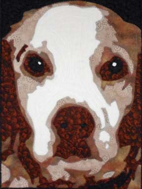
I have one quilt in the invitational exhibit Pets — Unconditional. This is a piece I created several years ago and shows the unconditional love that my mother’s Brittany Spaniel has for her. Given the popularity of the animal pieces that I have done, I should really make more of them. They are much more marketable — portraits of people are much more personal to the subject — although I do not use marketability often in choosing a subject for a piece — no more than I use exhibit themes as guidelines for ideas. I like to create pieces that are inspirational to me — although I can appreciate that that is not always the most marketable decision.
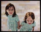
I also have two pieces at the same show in the World of Beauty Exhibit — People, Places, & Figures category. I confess I don’t actually know if they hang the exhibit by category — although it makes sense that they would.

The first is Beach Guardians, a piece I made last year based on my children when they were younger. I love the perspective of looking down on them from above.


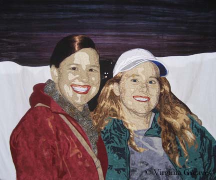
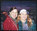
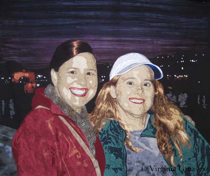
The second piece in the same exhibit is called A Walk in Twilight created earlier this year. It is about friendship and the joy that we share in each other’s company. Sometimes we just need to remember to take our friends along to make the journey more enjoyable.

These were the first two pieces I made with multiple subjects — although you could argue that Amelia Earhart had two subjects — Amelia and her plane. I still struggle with backgrounds and deciding whether more complex is actually helpful to the piece or not. Sometimes I think something simple is best — you don’t want to detract from the main subject — but other times, a complex background adds to the story of the piece and still enhances the portrait.

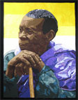
I have also been privileged with winning a first place ribbon from the La Conner Quilt Festival in the Open: Fiber Art Quilted category for Bukonyan Elder. This is my first year to have entered this show and I was thrilled to place. Their Top Honors Exhibit will extend until the end of the year and will be available for viewing at the La Conner Quilt & Textile Museum in La Conner, WA.


Lastly, my piece Celtic Woman is being included in a book to be released this coming April. I have not been published in a book before so I can’t wait to receive my copy. I will give more details on this publication at a later date.
Finito

1

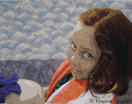
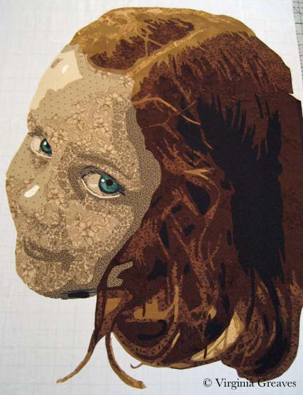
I have finally finished my latest piece Laura Margaret. It is going immediately into a private collection. With any luck, it will be a complete surprise. I loved working on the eyes in this one. I put a lot more detail into them than I have in the past. I took some liberty over-highlighting the rim under the eyes — but I think it makes the piece more striking.

I’m not certain about what I’m going to do next. I am mulling over a few ideas and will hopefully decide soon. I don’t have a lot of time in November and December because of school holidays — but hopefully I can finish a small piece between now and the end of the year.

My piece Bukonyan Elder won first place in the Open: Fiber Art Quilted category at the La Connor Quilt Festival in October and will be held in their extended Top Honors exhibit until the end of the year. I also received exciting news that Celtic Woman will be highlighted in a book being published in April — more details to come later. Finally, my piece Unconditional was invited into a special exhibit called Pets at the International Quilt Show in Houston this November.

Working With Color

2

Working with color can be very confusing — almost as difficult as working with values.

Since my last blog post, my figure was complete, but she needed a space in which to inhabit. She is holding up an iris on the back of her hand — so in adding color to the piece, I have a wonderful deep purple to add to the green in her eyes.

I also decided to pull the green down into the sliver of her shirt that is just peeking out from the towel draped around her shoulders.

And then this is where things got interesting. At this point, I had not added color to her mouth. I was ignoring that for the time being and trying to decide on a good color for the stripes in her towel to alternate with white. The actual photograph was a pink — but that didn’t seem to add to the piece for me. It seemed too close in color to purple.

According to the color wheel, if you have purple and green — then you need orange — so I went headlong into orange for the towel. I also added color to her mouth in rusty orange tones. I tried pinks and reds in the mouth and they all ended up looking like lipstick — so I went with something closer to browns.

It’s not that the orange in the towel is wrong — but it is too much. You no longer look directly into her beautiful green eyes. I kept this on my design wall for a while. It just didn’t look right to me.

So I switched to this cooler color of blue. Now you see her eyes first and the piece is in greater harmony. I still have the orange in her mouth to go with the purple and green. I think this composition of color works much better.

I did make two other adjustments. The water is a smoky blue with hints of purple so the iris melted into it. All I had to do was add a small border of a lighter value around the iris where it touched the water fabric. Now it stands out.

I also darkened the light spot on her nose just a little. It was too bright before and didn’t look natural.

Why did I choose what I did for the water and sky? I didn’t want anything overly complicated to compete with the figure and her engaging gaze so I originally planned to have just one fabric in the background. I had nothing in my stash and the only thing that I found in the fabric stores was the smoky batik. I decided that the pattern gave the impression of reflections on water and would be great. In reality, it overwhelmed the piece. I used a sky piece that I had on hand for the top part.

Strictly speaking, I should have used the rule of thirds when deciding on the horizon line, but I broke that rule. I liked it much better when the horizon line brought the viewer’s eye across to the bottom of the figure’s eye.

Her eyes are what is important in this piece, and visual cues like color and line bring up the supporting cast in the overall design.

Green Eyes

1

Now that we’ve covered drafting, it’s time to move on to my favorite part — cutting the fabric.

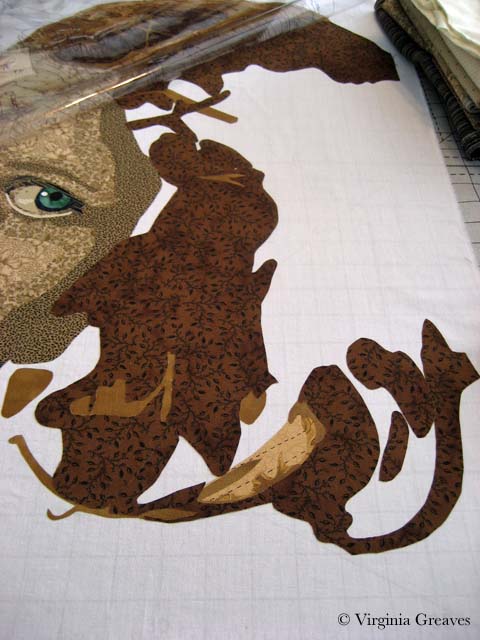
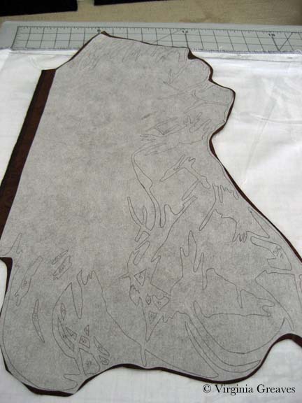
Using the back side of the pattern — the reverse — trace shapes with a Sharpie onto Wonder Under and fuse to the back of fabric. Then cut out shapes, peel off the paper, and fuse to the muslin using the vinyl overlay as a guide to where to place the shapes.

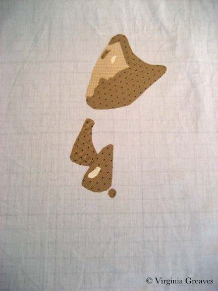
This shows the first three values in the face of my newest piece. I know — not much to look at yet.

But just adding the next layer gives us an idea of the outline of her face.

Then the fifth value shows us the rest of the face. Obviously the light sources comes from the left side — so the right hand side of her face is in shadow.

The sixth value shows us more of her personality.

Wow! And those eyes. I have added a seventh value — not much — just a little — but it adds a little more pop. I have exaggerated the outline of her eyes — it makes then read well at a distance.

At this point, I’m leaving her mouth alone. I experimented with adding some color but it detracted from the focal point of her eyes. I may just need something closer in color to her skin tone. I’ve set that aside for now.

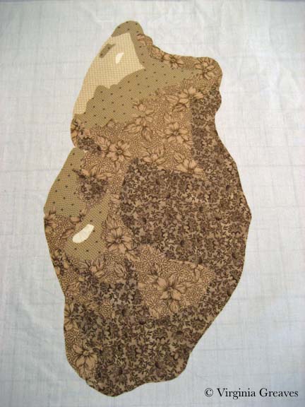
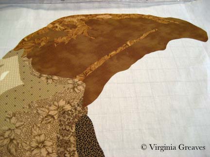
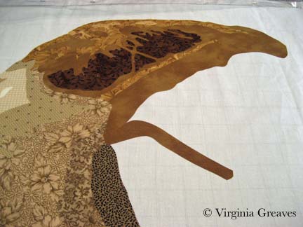
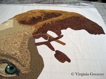
And then I started on her hair. She’s a brunette, but I’ve learned from experience to start much lighter for highlights. Using the yellow bin and the brown bin, I can get a great range of values.

This shows the first two values in her hair.

And this shows her third value. It does worry me a little at this point — whether the end result be brunette — because this looks really blonde.

I start adding in the fourth value — which goes into brown — to the left of her part.

But then of course I realize I need to start working to the right of her part.

And of course I’ve forgotten her blonde values in the lower section of her hair below her chin.

I then go back and start filling in with the fourth value.

This is the Wonder-Under’ed fabric for value 5. It’s really intricate. I wonder if I’m a glutton for punishment. I have to remember — I have to cut this out — and I’ll eventually have to sew it.
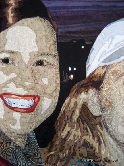
But doesn’t it look good on.

My final value is black — which is a great way to end a value range and pull one last value out of the stack.

I think she definitely reads as a brunette — and the blonde highlights give her a range that makes her face pop. And those eyes! I think they turned out well — if I do say so myself.

A Walk in Twilight

1

Some time has passed since my last blog entry. Although I try to write regularly, I think my posts are more dramatic when they offer a progression of a work in progress. I also tend to be drawn into the creative process, and although I take pictures along the way, writing uses a different part of the brain, and once I get rolling, I don’t want to stop and write on the blog. Writing is a different kind of pleasure — each to be savored in their own time.

My last post discussed my Dog Portrait workshop at the Gwinnett Quilter’s Guild. Two members sent me pictures of their finished work. I think they did an excellent job bringing my sweet Solomon to life.

Molly Samuels

Kathleen Ward

Both of them worked in brown tones. I had the students bring 3 values — and then they added black & white — from which comes a most convincing portrayal of our deceased Brittany Spaniel.

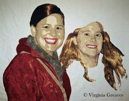
Once I had finished working with the guild, I came home to my current work in progress. In my last update, I showed both figures on the design wall. Keep in mind that although they were photographed on white, they were only pieces pinned on the wall — their heads, their torsos, and in the case of the figure on the right — her hair.

This is also a mock-up of the pieces. You can see that when I started the red jacket, I chose three values that work — but not together. Sadly, the lightest value is just too pink.

I took the jacket piece and ripped the pink off the back — and then found a rusty orange that works better I think. It’s more subtle.

And then I started working on the second figure’s t-shirt and jacket. Here you see the original t-shirt. It doesn’t work at all. The original photograph shows a medium gray value t-shirt with a light gray sweater on top. The lighter color on bottom doesn’t look right — and the ruffles of the sweater don’t translate.
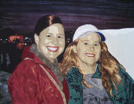
I first changed the colors from blue to blue gray — and then simplified the lines of the shirt, taking out references to the sweater. Then I added the jacket. This picture also shows her with her hat finally on her head.

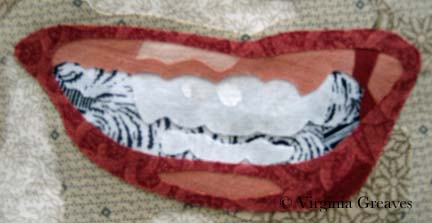
I wanted to point out that I changed the teeth on the first figure. When I stood back from the piece, it looked to me like she had braces. When I went back to look at the pattern, I had forgotten to add the piece for the bottom row of teeth.
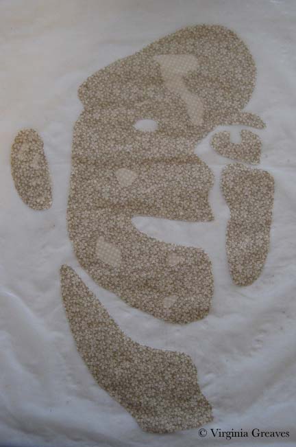
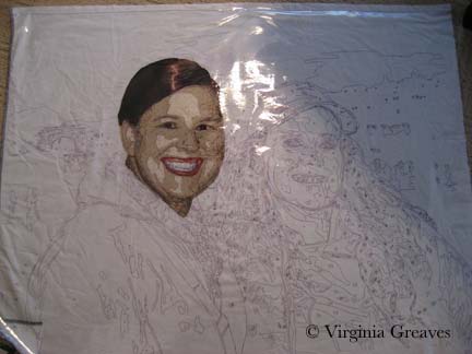
With all of the pieces for the two figures, I could begin to assemble them. I laid down my white muslin with the plastic overlay and positioned the first figure’s head. I did realize at this point that I would have to take off the overlay. If I fused everything down and then tried to appliqué it, pieces would start coming off everywhere. If I was going to appliqué in sections, the overlay would get in the way. So after fusing a section — in this case, the first head — I took off the overlay and appliquéd it down. This meant that I had to be very careful with using the overlay in the succeeding sections. In fact, when I first laid down the red jacket, I had to rip off the scarf and relay it because the jacket didn’t line up correctly with the scarf.

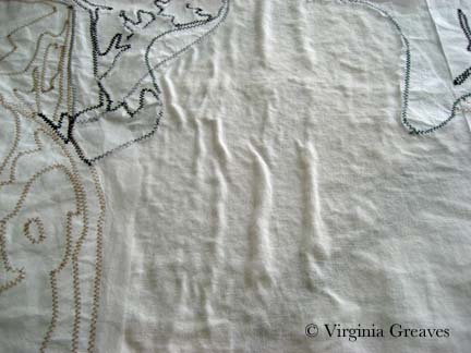
I did want to point out that — given the complexity of the piece — and given that I was appliquéing in between sections — the white muslin developed some wrinkles on the back side. I decided it didn’t really matter as long as the top layer is flat. The wrinkles should nestle into the batting and not be an issue.

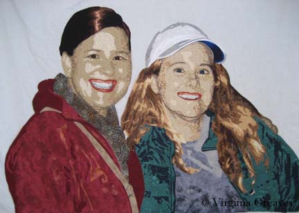
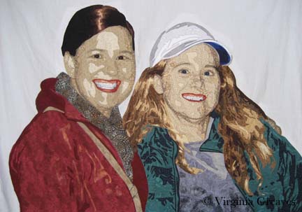
This is both of the figures appliquéd with no background. It was startling to see it with the white background knowing that I would be working them into a night scene. With a white background, the white hat really doesn’t look right.

The sky was a difficult piece of fabric to find but it works well to convey the feel of the sky after the sun has set.

The background is really another design that has to enhance the figures. It is definitely different than what I’ve done before. There are two blacks in this center detail — one represents the water and the other represents the shadow of buildings with lights. (I wish the photograph showed the difference — but c’est la vie.)

This next picture shows the edge of the wall that the figures are standing in front of — then the water — and then a Roman arch with the city in the very background. I took a chance using the rust orange in the lit up arch but I think it works.

And then this shows the completed water and skyline of buildings on the right.

And that is the final composition. This afternoon I pinned it to ready it for quilting.

Does it work from a color standpoint? The hot colors are on the left, the cool colors are on the right, and the mixture falls into the sky. Is there enough tension created by using complementary colors?


It Takes Two to Tango

2

Sometimes, it can be difficult to get on the computer in my house. I have been continuing to work and take a lot of pictures, but I can’t always get on my blog to share them. I’ll start with some catching up.

In my current piece — I have finished my first face and started on my second face. I tend to start with the faces and build the rest of the piece around them. I’ll explain that more when I start adding pieces around the faces.

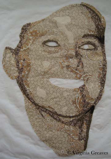
These are the first two values in my second face.

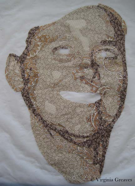
This particular person has Autumn coloring so I went back to my wonderful orange beige paisley. This is a risky fabric to use but I love the movement it gives to the face.

Then the darker shadows begin to show more of the outline in the face.

I have started adding dark around the eyes to give them more depth.

Once the eyes have been added, the outlining is a subtle difference — but an important one.

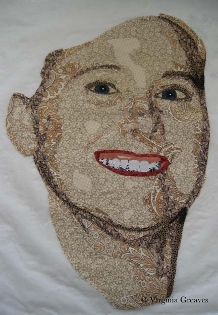
The irises of the eyes are a dark green — although not quite as dark as this picture shows. The true color of the eyes are a light green — but then the contrast would be lost and the eyes wouldn’t be as engaging.

Once I’ve added the mouth, you can see more of her personality. Like the first figure, she also shows some gum in her mouth — and I’ve added the same experiment as before.

This is what she looks like on my design wall before I’ve added her hair. Her hair is much more complex than the last figure. She has long tresses down the right and left sides — and then a cap over the top. (Notice the color shift my camera made from a white background to a black one — the tones in the face look more gray now.)

This shows the first three values of her hair on the left side of her face. She has a lot of blond in her hair, although the deeper tones go into brown.

This is the completed left side.

The right side is more flowing — and with only three values, the pieces won’t fuse together as one large piece yet.

The darker values bring it all together though.

This is what they begin to look like on my design wall. The second figure still needs her hat but I’m putting off adding it because its color will affect the rest of the piece — and I want more elements added before I decide what to use. Her hair also drapes over her jacket which will be more obvious once those pieces have been added.

I wanted to point out that I’ve complicated my process. In order to create more complex pieces, I have one very large vinyl overlay — and many small ones. I use the small ones to tape onto my fusing sheet and create the smaller pieces. I can then assemble them back together under the large overlay.

Also, I have returned to a white piece of muslin for my base. Because the background of this piece will be dark, the faces need something light underneath them. A dark fabric underneath them would change the color of the fabrics on top.

I have also starting adding a watermark to my images. I don’t care for watermarks — but with the advent of Pinterest, many images of my blog have started floating free. Although many kind souls give attribution, there are still instances in which it goes unmarked. Promotion is always welcome, but for a visual artist, lack of attribution can be quite damaging. It’s also important for the servers to which my pictures are copied to have some idea of the original copyright holder. So I have turned to watermarks. Interestingly, I can find no quick way to add a watermark to all pictures already existing on a WordPress blog (the latest version) — that works. I tremble at the thought of adding them all manually.

Peering Through

0

When the excitement of summer dies down and the children return to school, I always find it difficult to focus myself again. I try to envision where I want to be — and then begin setting goals for myself. Like many people, things are hazy for me right now. Peering into the looking glass, the reflection isn’t clear, and want and need have become mixed up with different pathways, different decisions.

I know that I’m not alone in this. I think the reason I chose the image of the young child peering around the hip of an adult was that recognition of being lost yet determined. I shared an in-process picture a few weeks ago. I had a short time in the summer that I was able to start him — and I finished his eyes today.

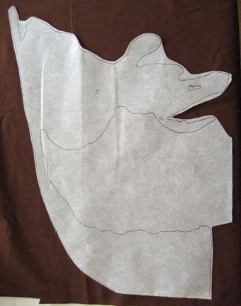
I did want to mention working with difficult angles. I typically trace my pattern onto fusible, cut it close to (but not on) the drawn edge, press onto fabric, and then cut on the drawn line. But there are some difficult angles for which this won’t work. In this example, if you cut out the middle part & fused it down, the final piece would be skewed. So, in these situations, I leave the fusible in place but I don’t iron the middle part down. I carefully iron only on the parts I’m going to keep.

Then I can go back & cut out the middle. This way the bottom section isn’t at a really strange angle from the top. I will then re-press the edges to make everything secure before I cut it out.

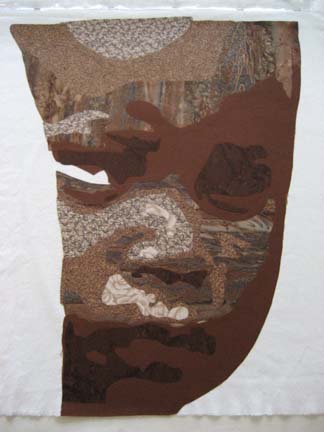
I know I should have taken pictures from the beginning, but I think I was distracted that day. These are the child’s first three layers.

This is the next layer. You can really start to see his face coming together now.

Another layer . . .

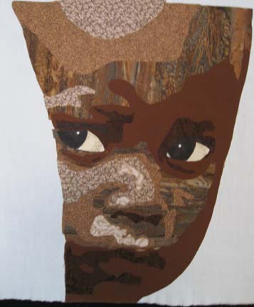
And this is the picture I shared a few weeks ago. He looks fairly good but he needs eyes. I need to concentrate to do eyes so I put it off until I knew I would have quiet studio time to concentrate.

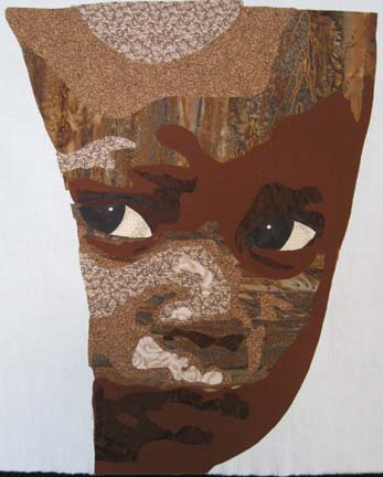
This is fairly representative of the photograph — but the little piece of white in the bottom corner of his right eye is distracting. This is a good example of not following the original photograph.

This is better I think.

You would think I would have a better idea of what I was going to do with him, but the truth is that I sometimes make a person before building their backgrounds around them.

Go to Top