Some time has passed since my last blog entry. Although I try to write regularly, I think my posts are more dramatic when they offer a progression of a work in progress. I also tend to be drawn into the creative process, and although I take pictures along the way, writing uses a different part of the brain, and once I get rolling, I don’t want to stop and write on the blog. Writing is a different kind of pleasure — each to be savored in their own time.
My last post discussed my Dog Portrait workshop at the Gwinnett Quilter’s Guild. Two members sent me pictures of their finished work. I think they did an excellent job bringing my sweet Solomon to life.
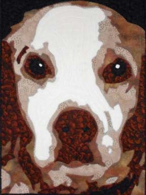

Both of them worked in brown tones. I had the students bring 3 values — and then they added black & white — from which comes a most convincing portrayal of our deceased Brittany Spaniel.
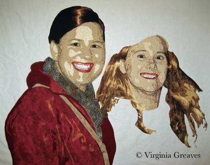
Once I had finished working with the guild, I came home to my current work in progress. In my last update, I showed both figures on the design wall. Keep in mind that although they were photographed on white, they were only pieces pinned on the wall — their heads, their torsos, and in the case of the figure on the right — her hair.
This is also a mock-up of the pieces. You can see that when I started the red jacket, I chose three values that work — but not together. Sadly, the lightest value is just too pink.
I took the jacket piece and ripped the pink off the back — and then found a rusty orange that works better I think. It’s more subtle.
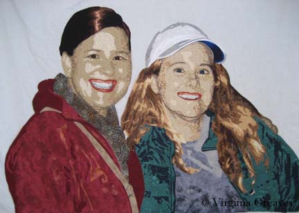
And then I started working on the second figure’s t-shirt and jacket. Here you see the original t-shirt. It doesn’t work at all. The original photograph shows a medium gray value t-shirt with a light gray sweater on top. The lighter color on bottom doesn’t look right — and the ruffles of the sweater don’t translate.
I first changed the colors from blue to blue gray — and then simplified the lines of the shirt, taking out references to the sweater. Then I added the jacket. This picture also shows her with her hat finally on her head.
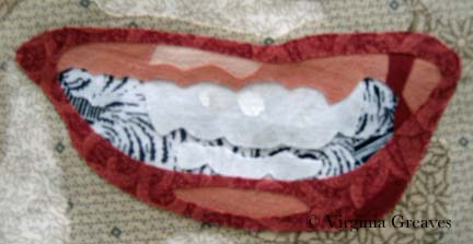
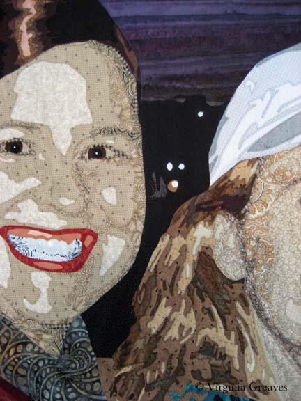
I wanted to point out that I changed the teeth on the first figure. When I stood back from the piece, it looked to me like she had braces. When I went back to look at the pattern, I had forgotten to add the piece for the bottom row of teeth.
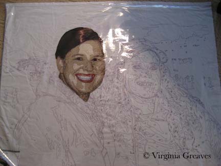
With all of the pieces for the two figures, I could begin to assemble them. I laid down my white muslin with the plastic overlay and positioned the first figure’s head. I did realize at this point that I would have to take off the overlay. If I fused everything down and then tried to appliqué it, pieces would start coming off everywhere. If I was going to appliqué in sections, the overlay would get in the way. So after fusing a section — in this case, the first head — I took off the overlay and appliquéd it down. This meant that I had to be very careful with using the overlay in the succeeding sections. In fact, when I first laid down the red jacket, I had to rip off the scarf and relay it because the jacket didn’t line up correctly with the scarf.
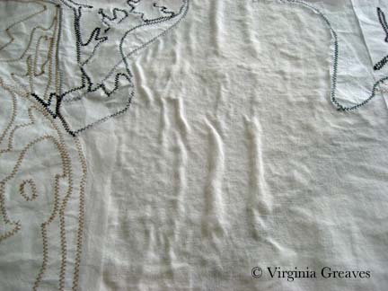
I did want to point out that — given the complexity of the piece — and given that I was appliquéing in between sections — the white muslin developed some wrinkles on the back side. I decided it didn’t really matter as long as the top layer is flat. The wrinkles should nestle into the batting and not be an issue.
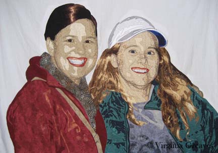
This is both of the figures appliquéd with no background. It was startling to see it with the white background knowing that I would be working them into a night scene. With a white background, the white hat really doesn’t look right.
The sky was a difficult piece of fabric to find but it works well to convey the feel of the sky after the sun has set.
The background is really another design that has to enhance the figures. It is definitely different than what I’ve done before. There are two blacks in this center detail — one represents the water and the other represents the shadow of buildings with lights. (I wish the photograph showed the difference — but c’est la vie.)
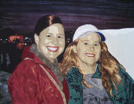
This next picture shows the edge of the wall that the figures are standing in front of — then the water — and then a Roman arch with the city in the very background. I took a chance using the rust orange in the lit up arch but I think it works.
And then this shows the completed water and skyline of buildings on the right.
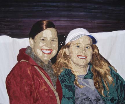
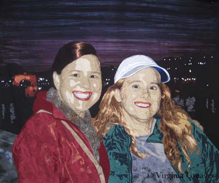
And that is the final composition. This afternoon I pinned it to ready it for quilting.
Does it work from a color standpoint? The hot colors are on the left, the cool colors are on the right, and the mixture falls into the sky. Is there enough tension created by using complementary colors?



Your portrait quilts are amazing. I love how you show the progress and the changes that you’ve made.