Teaching

school art studio

Teaching the Young

0

school art studio

About once a year, I go to my daughters’ school and talk to the art classes — this year, both the middle school and high school. I have spent many years mentoring this age range and I always enjoy the time I spend with them. Sunday school classes are different from art, but the light bulb moments are just the same.

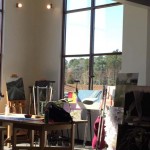
When I arrived last Wednesday, the MS art teacher Mrs. Purdy introduced me to the school’s new art studio. It has been built on the top of the school — and the high ceilings and natural light are the perfect backdrop for creativity. She showed me a project that the 8th graders had been doing — sculpture made from hanger wire, stretched pantyhose, and paint. The results were stunning.

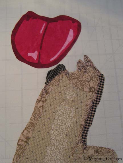
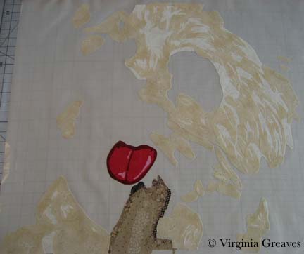
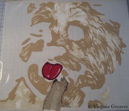
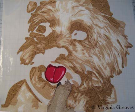
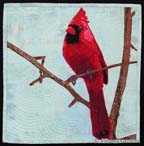
I had the 6th graders first. They had the biggest ears, and when I asked them who was afraid to fail, most all of them eventually raised their hands after I raised mine and encouraged them. They asked many questions and wanted to see all of my quilts. The boys were more interested than the girls — a strange fact I found in all three of the MS grades — and they were interested in dollars and cents — which I shared to help give them perspective. I also gave them a quick idea of how a small piece — The Cardinal — was made — showing them the value painting, the pattern, the vinyl overlay, and the quilting outline.

The 7th graders were second. They were interested — but noticeable less so than the 6th graders. They asked less questions and only half of them raised their hands when I asked them about fear of failure.

The CardinalThe 8th graders were third. They were almost absent — but at this age, I understand that social fear is very high. The girls hovered nearby with pomegranate juice and food. I don’t think they noticed that I grabbed my pieces to place nearer to the boys who didn’t have staining materials. (I did find an ink pen placed between the pieces later in the day. At least the pen was closed.) When I asked about fear of failure, I don’t know that anyone raised their hand. The question brought blank stares. At the very end, I received an outcry from one of the girls who finally comprehended that I had made a piece a couple of years ago with her mother as one of the subjects. Their attention was the most difficult to gain but they were mostly quiet and listened.

At that point, I came home for lunch. I did notice a jump in interest in my blog — I think a few of them spent some time after I left perusing the website. It’s hard to know who listens and who doesn’t but maybe I was able to help someone.

I had high hopes for the high schoolers. I only knew that a few of them were interested in design — specifically clothing — which is not really my forte, but the HS art teacher had bought a sewing machine and needed someone that could talk to them about the basics. I took a few quilts with me — but I planned to spend only an hour. Not knowing what gaps in knowledge I could help with — I planned for this to be a question time so that I could perhaps return later with some more specific demos tailored to their interests.

Sadly, we met after school. Only one girl came. I have a high schooler — I know how busy they typically are in the afternoon — and how hard it is to grab their attention. They really didn’t know me from Adam. Thankfully — I brought almost the same materials I had prepared for the MS — and it was on the same day. <shaking head> What can I say?

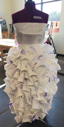
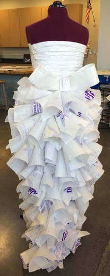
The girl that did come is very talented — Sarah Finch. She is a painter and photographer — she even has a social media presence for her work and a full website built on WIX.com. She showed me this amazing dress that she made from rice bags. It has a wonderful teardrop shape in the back. There is no muslin structure, but it’s sewn securely on a sewing machine — and all of the curls on the skirt are hot glued on.

ricedress_front


ricedress_back

She is a senior — really didn’t need my help — but it was great fun to meet her and see where her Muse was taking her in life.

Yorkie

0

For Christmas, I received this wonderful large applique pressing sheet. My old one is 18″x18″ — and I’ve done some larger pieces that made it difficult to do it off of a base like muslin.

Applique Pressing Sheet

To be honest, I don’t love it. I taped my vinyl overlay on top of it — placed it on my work table with the ironing cover — but when I iron the pressing sheet, it holds the heat a long time. If I place the vinyl overlay back on top too soon, it melts and shrinks the vinyl. (Ask me how I know.) My old sheet is made from a different material and I never had this issue.

Anyway, I started working on my Yorkie last week. I know — it’s a complex pattern. The only way I could begin to keep track of it was to cover it with Sharpie in different colors.

This shows the finger in front of the dog. It will be surrounded by fur.

Finger

And this shows her tongue. I have reservations about the tongue — but because it’s all constructed on the pressing sheet, I can always rip it off later.

Tongue

This shows the first value of the Yorkie. Not a lot to see yet.

Value 1

The second value shows more definition.

Value 2

And the third value really brings out her personality. This layer was painful to do. Can you tell? There was a lot to keep track of.

Value 3

And this is the fourth layer. Also difficult. I like the way the fabrics are working together though.

Value 4

I’ve just finished the fifth layer today and have started on the sixth — then I’ll go back & add the black, the eyes, the collar around her neck, and finally the background.

I have been working on only fabrics in my stash. In some cases, I had little fabric to work with. The third layer I actually ran out of — but I remembered where I bought it a year ago and took a scrap back in the hopes that they still had some. The fabric angels were smiling on me that day — the woman at Tiny Stitches went into the back and came back with a very small bolt. She said she couldn’t sell me much because it was on hold for their embroidery group, but I only needed a small amount.

The fourth layer was also close — I made all of my patterns and placed them on the fabric before I started for fear that I would run out of it.

Next week, I’m speaking at my Fiber Art Fusion group on Color/Value & Choosing Fabrics. I’ve been writing out some notes but need to pull out fabrics to take with me. It’s hard for me to pull out of a project once I’ve sunken into it. It’s like becoming a hermit and it’s difficult to focus on other things.

A Walk in Twilight

1

Some time has passed since my last blog entry. Although I try to write regularly, I think my posts are more dramatic when they offer a progression of a work in progress. I also tend to be drawn into the creative process, and although I take pictures along the way, writing uses a different part of the brain, and once I get rolling, I don’t want to stop and write on the blog. Writing is a different kind of pleasure — each to be savored in their own time.

My last post discussed my Dog Portrait workshop at the Gwinnett Quilter’s Guild. Two members sent me pictures of their finished work. I think they did an excellent job bringing my sweet Solomon to life.

Molly Samuels

Kathleen Ward

Both of them worked in brown tones. I had the students bring 3 values — and then they added black & white — from which comes a most convincing portrayal of our deceased Brittany Spaniel.

Once I had finished working with the guild, I came home to my current work in progress. In my last update, I showed both figures on the design wall. Keep in mind that although they were photographed on white, they were only pieces pinned on the wall — their heads, their torsos, and in the case of the figure on the right — her hair.

This is also a mock-up of the pieces. You can see that when I started the red jacket, I chose three values that work — but not together. Sadly, the lightest value is just too pink.

I took the jacket piece and ripped the pink off the back — and then found a rusty orange that works better I think. It’s more subtle.

And then I started working on the second figure’s t-shirt and jacket. Here you see the original t-shirt. It doesn’t work at all. The original photograph shows a medium gray value t-shirt with a light gray sweater on top. The lighter color on bottom doesn’t look right — and the ruffles of the sweater don’t translate.

I first changed the colors from blue to blue gray — and then simplified the lines of the shirt, taking out references to the sweater. Then I added the jacket. This picture also shows her with her hat finally on her head.

I wanted to point out that I changed the teeth on the first figure. When I stood back from the piece, it looked to me like she had braces. When I went back to look at the pattern, I had forgotten to add the piece for the bottom row of teeth.

With all of the pieces for the two figures, I could begin to assemble them. I laid down my white muslin with the plastic overlay and positioned the first figure’s head. I did realize at this point that I would have to take off the overlay. If I fused everything down and then tried to appliqué it, pieces would start coming off everywhere. If I was going to appliqué in sections, the overlay would get in the way. So after fusing a section — in this case, the first head — I took off the overlay and appliquéd it down. This meant that I had to be very careful with using the overlay in the succeeding sections. In fact, when I first laid down the red jacket, I had to rip off the scarf and relay it because the jacket didn’t line up correctly with the scarf.

I did want to point out that — given the complexity of the piece — and given that I was appliquéing in between sections — the white muslin developed some wrinkles on the back side. I decided it didn’t really matter as long as the top layer is flat. The wrinkles should nestle into the batting and not be an issue.

This is both of the figures appliquéd with no background. It was startling to see it with the white background knowing that I would be working them into a night scene. With a white background, the white hat really doesn’t look right.

The sky was a difficult piece of fabric to find but it works well to convey the feel of the sky after the sun has set.

The background is really another design that has to enhance the figures. It is definitely different than what I’ve done before. There are two blacks in this center detail — one represents the water and the other represents the shadow of buildings with lights. (I wish the photograph showed the difference — but c’est la vie.)

This next picture shows the edge of the wall that the figures are standing in front of — then the water — and then a Roman arch with the city in the very background. I took a chance using the rust orange in the lit up arch but I think it works.

And then this shows the completed water and skyline of buildings on the right.

And that is the final composition. This afternoon I pinned it to ready it for quilting.

Does it work from a color standpoint? The hot colors are on the left, the cool colors are on the right, and the mixture falls into the sky. Is there enough tension created by using complementary colors?


Dog Portrait Workshop – Gwinnett

5

On Tuesday, I visited the Quinnett Quilter’s Guild in Snellville. This was the most fun group of women I’ve encountered in some time. At 170 members, there were probably just under 100 for their guild meeting. I lectured for an hour on my work and showed my quilts. Afterwards, they invited me to their officer/new member luncheon which was also wonderful. My hostess, Molly Samuel, helped me with everything and made me feel welcome. I do hope that they invite me again another time.

I didn’t take any pictures Tuesday, but about 20 of them came for a workshop yesterday on making a dog portrait — and I took many pictures. This meeting was in Lawrenceville — not far from where we were previously, but it had more small town charm. I love how Atlanta has peripheral towns that have that feel — but you’re still fairly close to good shopping opportunities.

I spent time talking about the process, going through how to draft a pattern, how to use technology, how to enlarge without the computer — and the part that is always a challenge — fusing. I fuse all the time so I don’t think twice about it — but I think it requires you to understand the whole front versus back issue. Reversing half the time & not the other can be confusing. I did see some lightbulbs go over a few heads during the workshop. That “AHA!” moment — always fun to see. I also counseled on the importance of making lemonade out of lemons. In fusing, you can always lay down another piece to cover up a place where the edges don’t overlap. You can also make your piece backwards — who’s going to know? Don’t want to cut and sew the sharp angles — straighten the line. It’s your piece.

I took my Chameleon quilt for reference. I spent some time talking about fabric choices and relative value.

In this picture, everyone is drafting. I gave them everything they needed — except they still needed to copy the image to the vinyl overlay. Everyone got very quiet during this stage.

This is my favorite part — the cutting!

And of course the fusing part is fun — watching the piece start to come to life.

Towards the end, I snapped a few quick shots over a few shoulders of the work that they had completed.

(This one was purple — but my camera was determined to make it look blue.)

Most all of them were on their way to finishing. I am hoping that they will email me pictures of their completed pieces that I can share.

It was a wonderful adventure, and — I think — a good time was had by all!

Fiber Art Fusion Class

0

Last night, I walked through my process with my Fiber Art Fusion group. Great bunch — always a fun group to spend creative time with — but I was so nervous about doing this in front of MY group. Speaking in front of strangers is so much easier. In addition, this was more than a trunk show — I was walking through my process — which is complicated. Yes, there are other ways to achieve the same ends. I tried to tell them which things I had tried & explain why I do things the way that I do. I tried to make it as simple as possible — but at one point, all of those blank faces was truly daunting. It’s a detailed technique and requires a lot of drafting — so I guessed that about half would love it and half would hate it — which I think accurately described the meeting.

I have been working with fusibles for so long I had forgotten all of the misunderstandings. Although most everyone immediately understood machine applique — and there were hardly any questions about Photoshop — using Wonder Under created the most problems. If I do this again, I’ll have to come up with a better way to demo how it’s done.

This is Martha Meyers working on drafting:

And this is Rebecca Reasons-Edwards happily cutting away (my favorite part):

I’m hoping that a few of them will share their finished fused projects. Unfortunately, most of them only got through with drafting and a couple only through the first value by the time we were done for the evening.

Before I ran through the project, I did spend some time showing them some of my portrait quilts including one that I finished just in time for show & tell — Cracked:

You can read more about this piece in the gallery section of my website here.

I did have someone ask for resources for learning Photoshop. I have taken online classes at both Eclectic Academy & LVSOnline & found them both to be wonderful.

After spending the last 3 weeks quilting & wanting to finish my quilt in time for the class, it feels strange to have a day without a deadline looming over me.

I do want to point out that there is a substantial border on Cracked — which I don’t usually do. After hanging Duodecim in my dining room with my usual black skinny binding as a stand-in for the only border — I decided that maybe my piece needed breathing room. If it were a painting, I would have added a broader frame — for a quilt, a wider border. So I added one on this quilt.

When I was done quilting the plate pieces, I was really stuck on how to quilt the rest of it. I took a 16 x 20 piece of paper, mapped out a corner, took out the quarter circle, and starting drawing with a pencil. I made a few adjustments along the way — and the corners had to have room to change since the plate pieces affected each corner a little differently, but this is my last drawing.

In the final border, I added what I call piano keys. I had intended to stipple — but it’s been a while & my stipple was just too rough. The keys add a more formal border anyway, which I like.

I’m not sure I’ll do another one with a wide border again. I’ll have to hang it in my dining room first and see if I like it better.

Go to Top