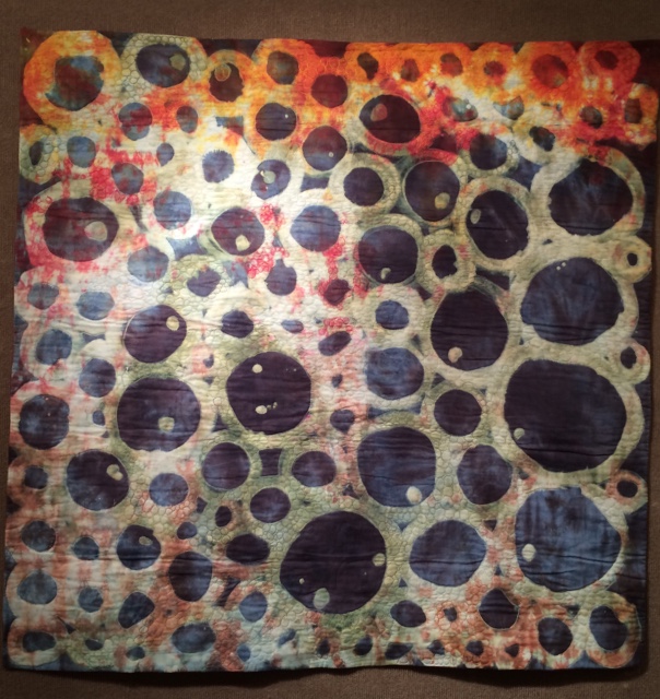
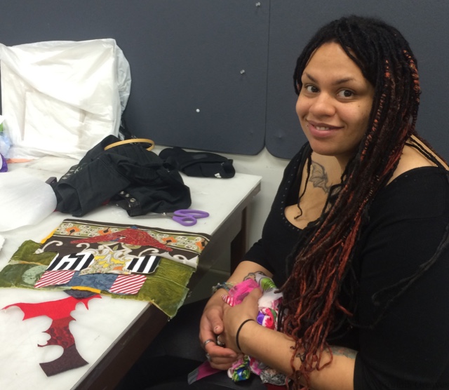
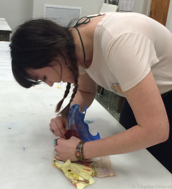
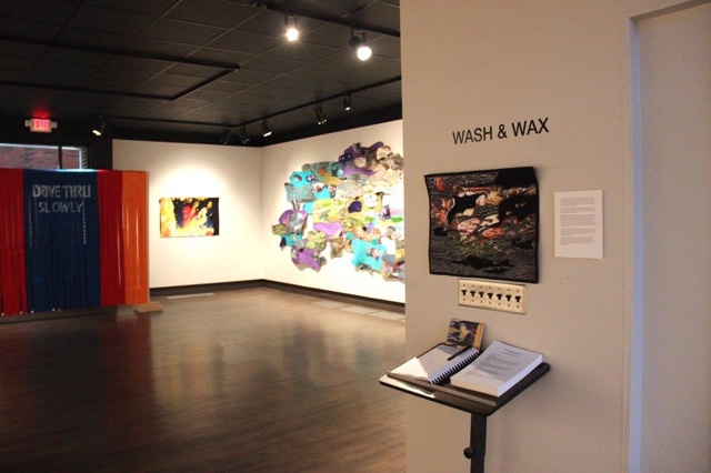
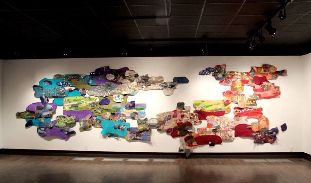
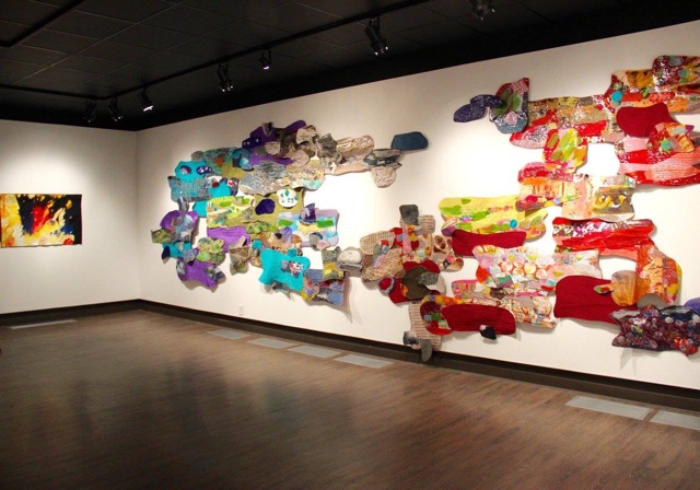
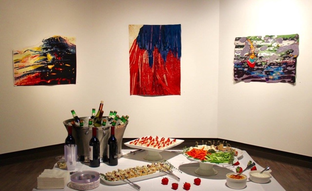
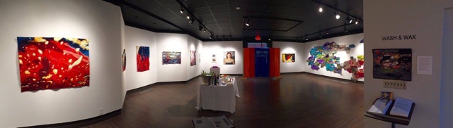
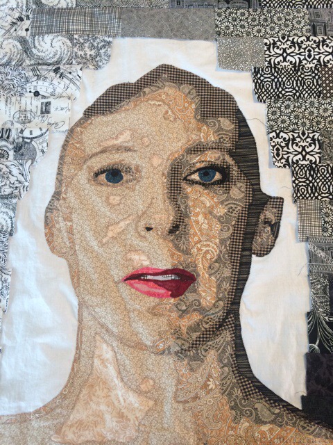
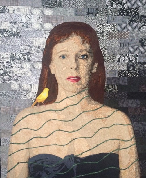
Back in late July (I had to look this up — I can’t believe how long I’ve been working in this piece), I had an idea for a new piece. I had finished up most of the work for the Wash & Wax exhibit and wanted to get back to realism. A SAQA call for entry created a spark of imagination, and I was off and running on a large ambitious piece.
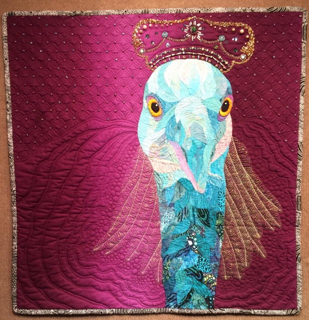
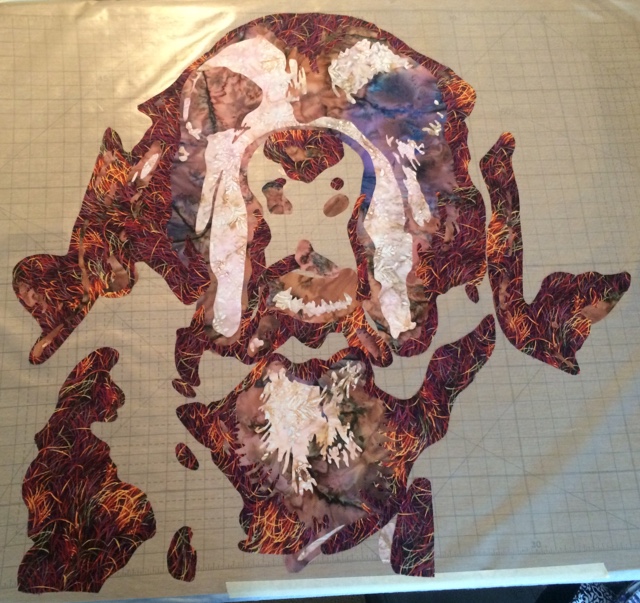
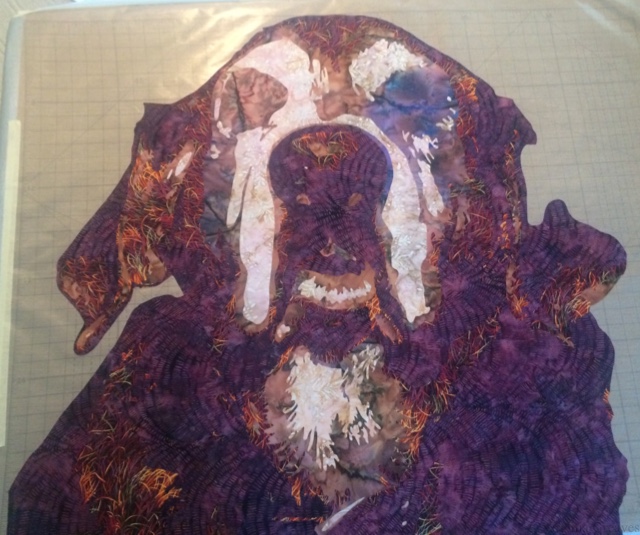
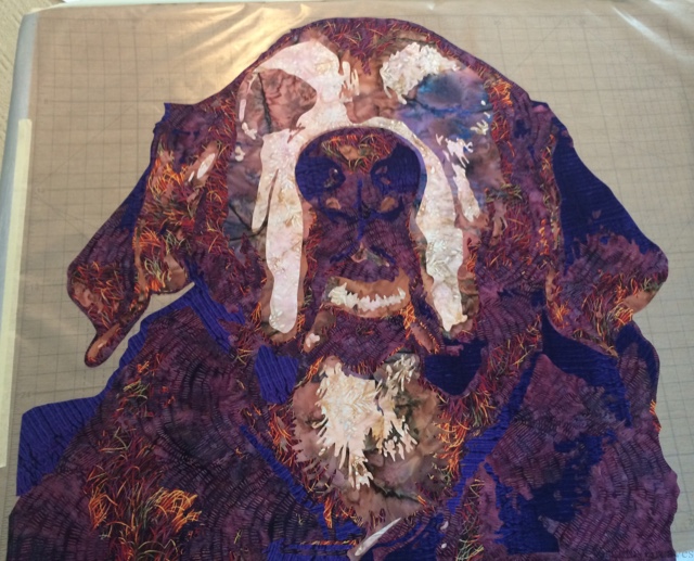
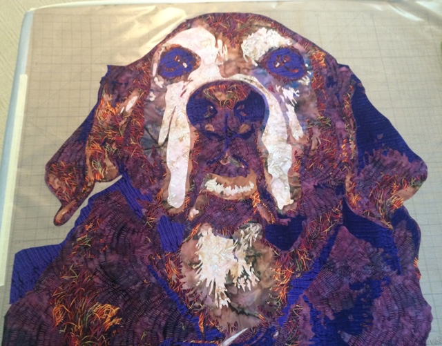
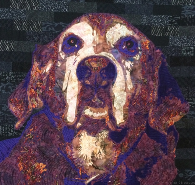
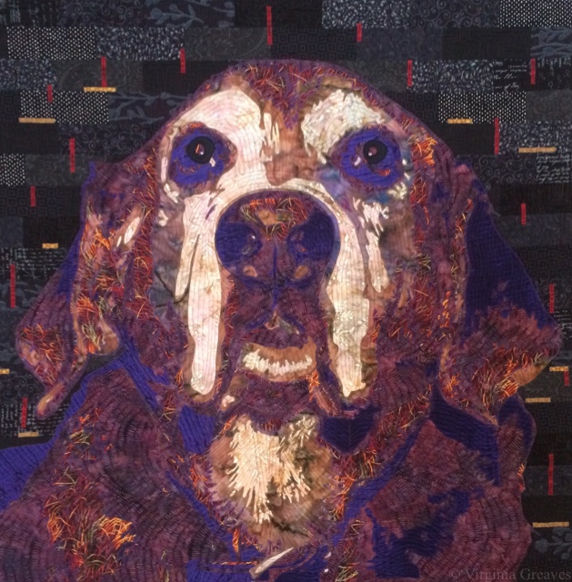
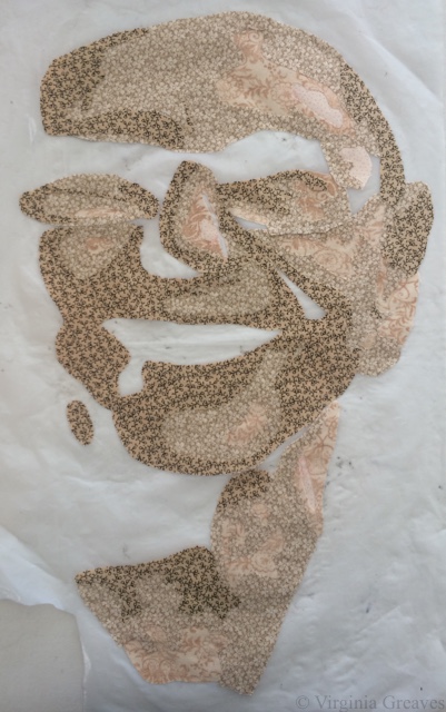
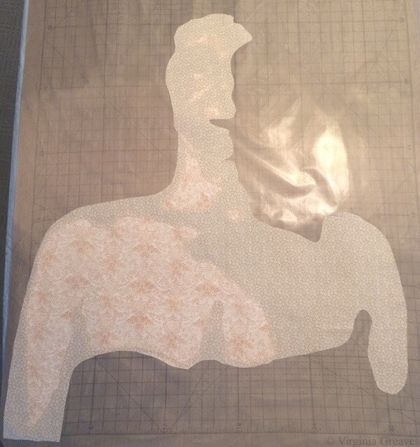
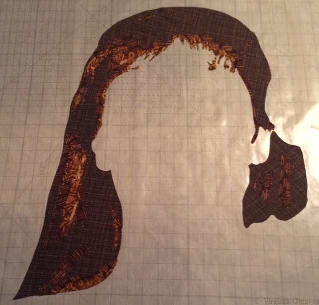
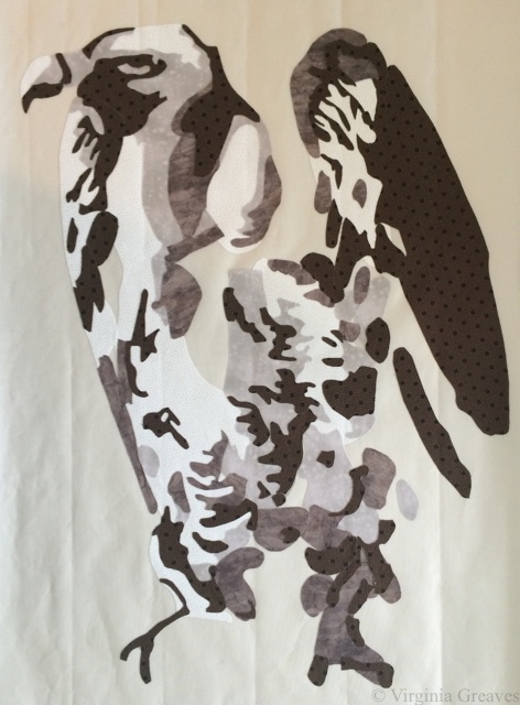
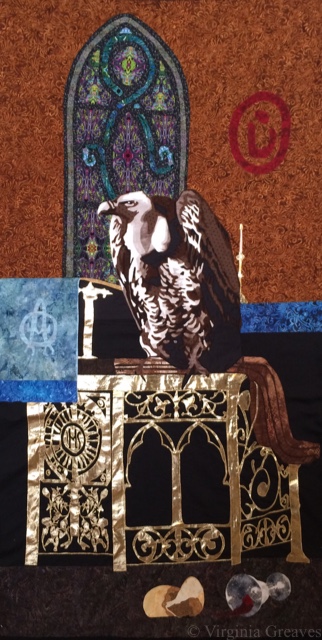
The central figure in this piece is a vulture. This is the vulture with the first value.
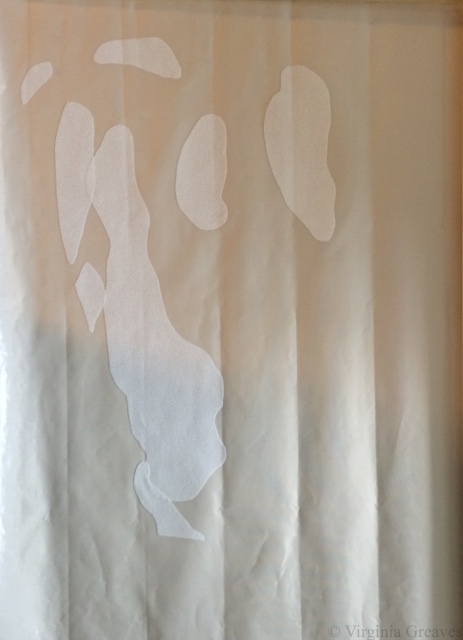
The second value.
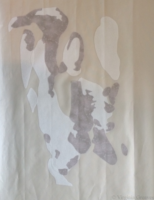
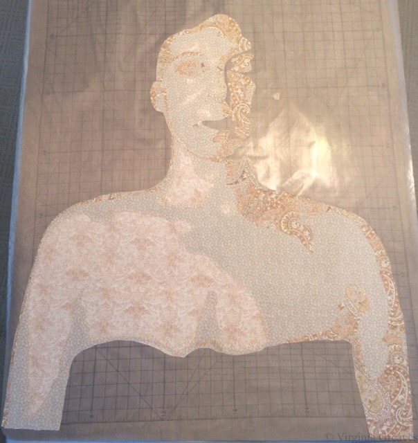
The third value.
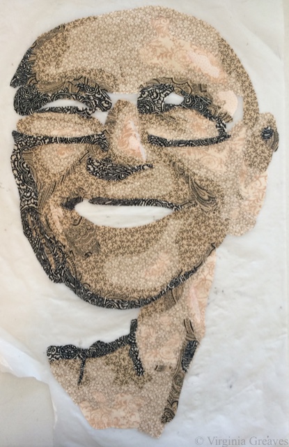
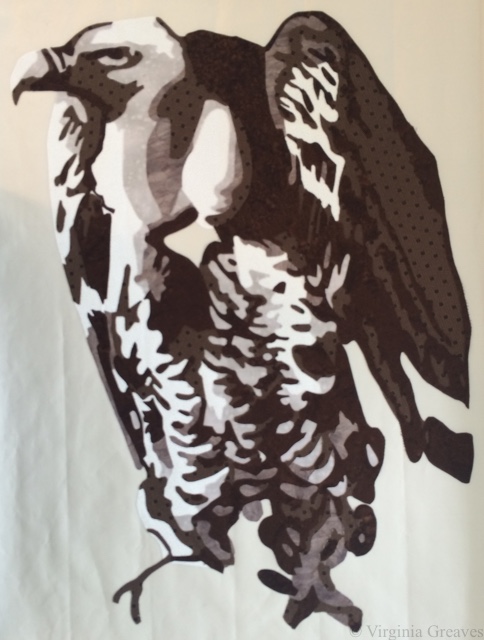
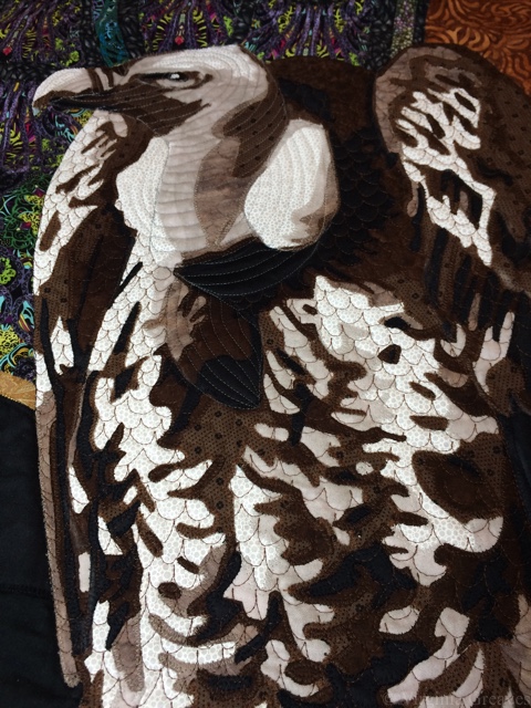
The fourth value. The bird really starts to come alive here.
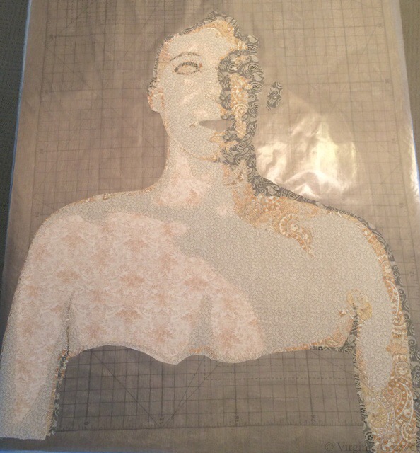
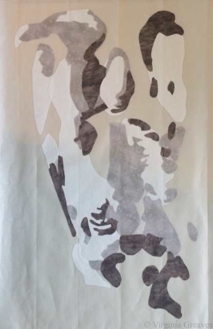
The fifth value.
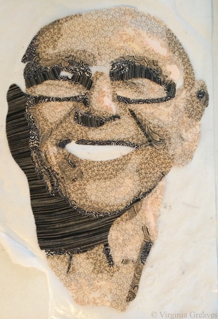
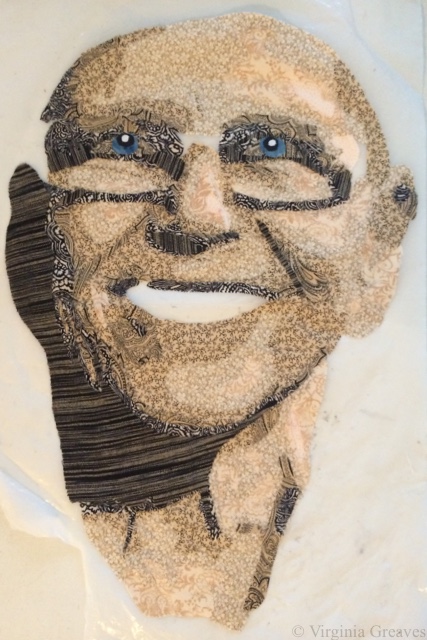
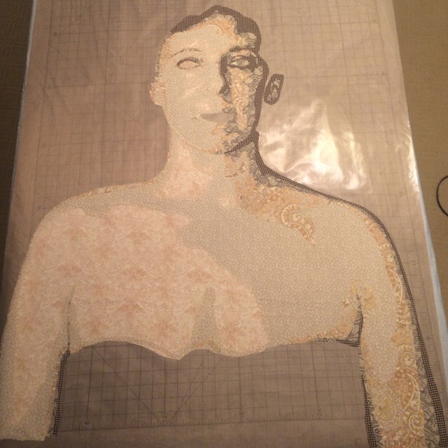
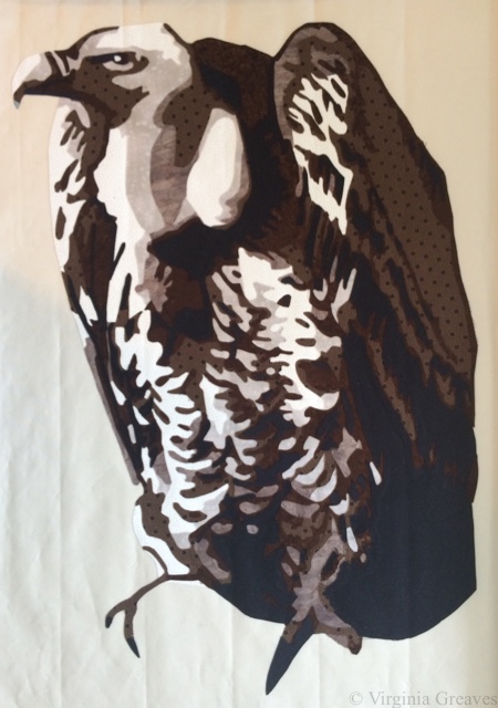
And the sixth value — all those really dark nooks and crannies.
But there’s a lot more to this piece than just the vulture. There’s also a stained glass window. I knew that if I had the right fabric, I could fussy cut sections to give me the stained glass effect. I scoured the local quilt shops, but they just didn’t have what I needed. I ended up finding some Paula Nadelstern prints online, however, that were perfect.
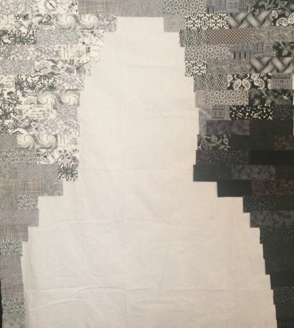
This is the beginning. The drawing is under the pressing sheet so you can see where I’m going with this.
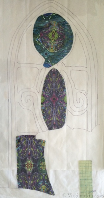
I originally picked a print in teal, but at the last minute, I also bought it in another color way and ended up using them both. I used the teal for the swirls and the purple/green/red for the main windows.
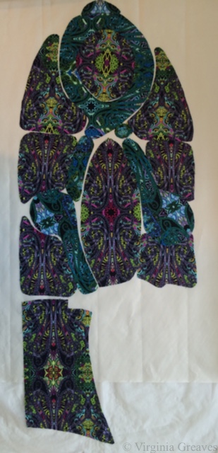
I had a very small piece of fabric in my stash that was perfect for the outer border. I had less than a fat quarter, but I had just enough.
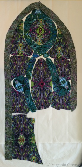
And then I added this black stained glass print for the leading (also a Paula Nadelstern print.)
I pinned it to my black design wall with the vulture to see how if they were working together.
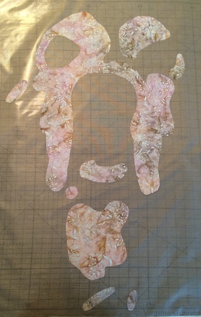
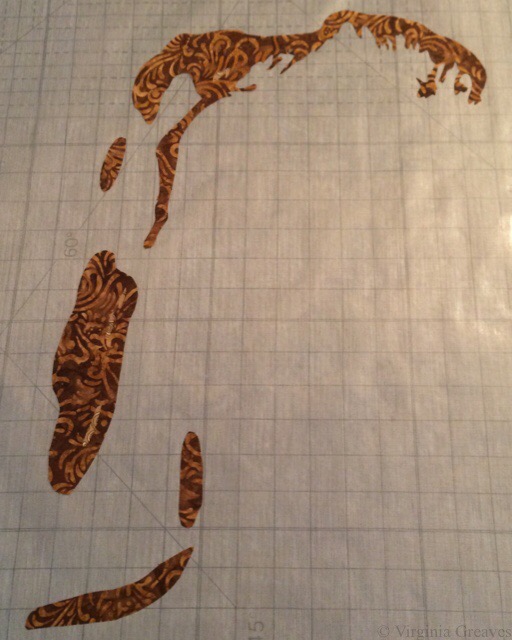
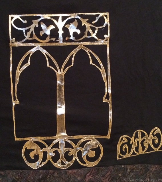
And then I kept going. I had a picture I had taken years ago of the brass lectionary podium in a church. I considered drafting out values and using flat cotton fabrics, but really, there’s a lot more choices in that fabric store beyond cottons. I found this metallic gold spandex nylon that has a black shadow to it. It’s stretchy, but what the heck. I figured the Wonder Under would help stabilize it.
I was still able to cut out some fairly complex shapes without it falling apart. This is a part of a screen section.

And this is part of the larger structure. I didn’t take many pictures of the lectionary as I worked on it. Suffice it to say that I had luckily cut out all of the complex parts before I broke my wrist — my right wrist.
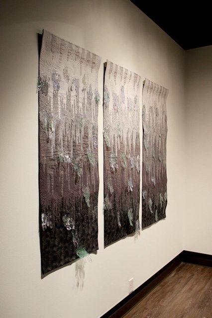
That was on Labor Day. I was in the middle of curating a show at The Art Place and preparing for the opening of Wash & Wax. Thankfully, the only work I had left for the opening was to hand sew the binding of a 9 foot long piece. With a cast on my right arm, I would insert the needle with the right hand, and then pull it through & out with the left.
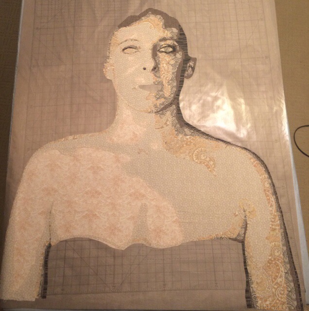
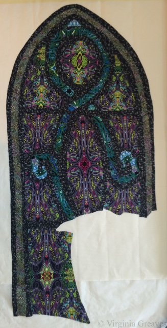
This shows the lectionary completed with a wooden railing at the top, the stained glass window, and other elements.

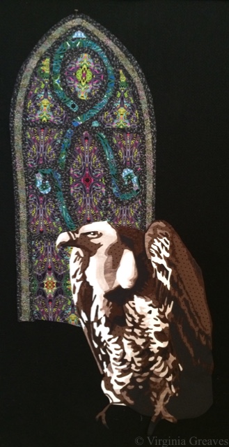
And here is the vulture in his place. I did, by the way, appliqué each piece on to the background as I went. I couldn’t risk the spandex stretching out of control on me, and it didn’t stick as well as I would have liked with the Wonder Under — but working one piece at a time, I worked through it like a large puzzle.
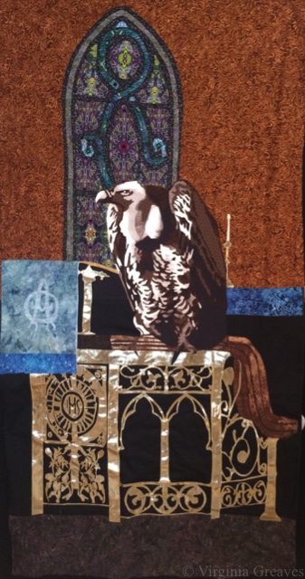
This pic is blurry (the sheen off that metallic fabric was confusing the camera in my iPhone), but it shows the addition of the Arabic symbol for Nazarene spray painted on the back wall.
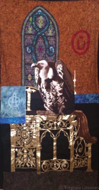
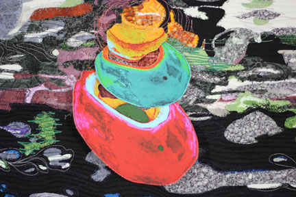
And then of course I had to add the spilled wine and broken bread at the bottom — symbolizing the broken blood and body of Christ — which also symbolizes the broken body and blood of Christians being murdered in the Middle East.
And even though I was in a lot of pain, I just kept going. Entries were due October 31, and I had spent too much time on this piece to miss the deadline.
I really worried about quilting this large piece. I still had my cast on, and I knew it would be heavy. I debated renting time on a long arm at the local quilt shop, but I finally realized that that was a new skill for me, and I really didn’t want this to be a practice piece for quilting.
So I moved all of my tables in my studio. In front of my machine, I have a board (which sits on my ironing board), and I put one table on the other side of that. Then I crammed another one just to the left of my chair. (I briefly envisioned creating a sewing table built like a doughnut.)
In the end, it worked. It supported the quilt perfectly, and I was able to quilt this in a week.
In this pic, you can see how the quilting outlines the vulture’s neck and defines his feathers better.
At about this time, I got my cast off, only to learn that I had lost 50% range of motion in my wrist. But I just kept going. I managed to add the facing and the sleeve to the back. And then I photographed it myself. I bought some more lights since the piece is so large (once again wishing I had a Speedlite flash), but after spending a couple of days on it (and wishing I had someone I could just take it to), I finally got some good, sharp pics for entry.
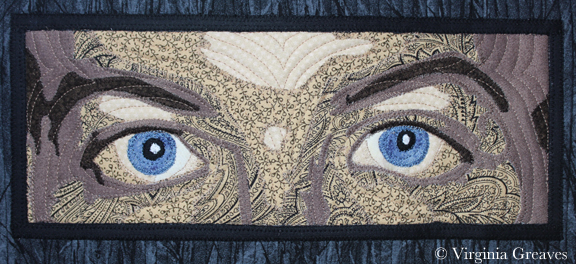
I entered it a week before the deadline. I was so proud of myself. I loved how the piece turned out, and I felt confident that it would be a great contender for inclusion in the show. You can see the full piece on its page The Last Supper.

I was wrong. My rejection email came this morning. However, I’m still very proud of this piece, and I was pushed to develop a complex story for my subject. I wouldn’t change a thing.
So I take the sting of rejection, and I move on. I will enter it somewhere else, and it will have a life. It didn’t fit in that show, but it will fit somewhere else. I just have to figure out where next is.