Many years ago, I entered Quilt National, and like many others, my piece was rejected. Since then, I haven’t entered again due to their virgin rules which said that the piece couldn’t have been displayed anywhere at all ever in any part online or on physical view in a public venue. I have always enjoyed showing my in progress work on my blog which disqualified anything I might want to enter.
But this year, in their infinite wisdom, the powers that be at Quilt National have changed their rules. They now allow social media marketing of your piece. They only require that the piece not have exhibited publicly in the US or been published.
And I have a piece that I’ve been working on most of the summer that I just finished, so I held my breath and entered it. We’ll see. Quilt National takes 3%, I believe, of their entries. In the past, they’ve been almost completely an abstract show, but in the last exhibit in ’15, there were a few illustrative pieces, so I’ve decided to try. You never know if you don’t try.
This has been a strange piece for me. I can do realism in fabric. That isn’t a stretch for me. But I’m to the point that I need more. I need my work to speak more. And so I’ve stepped out of my comfort zone. I drafted a picture of one of my dogs, but I couldn’t get excited about making her in realistic colors, so I chose wild ones. My base was purple. I even went down into pink for the latest shade.
It was my original intent to use Kaffe Fassett prints — but I still haven’t figured out how to makes those work. There are some fabulous artists that do, like Danny Amazons and Sophie Standing. I think my issue is one of scale. They work very large, and making the large Kaffe Fassett prints work in a very large piece is much easier than in a medium piece.
So as I went, I changed several fabrics.
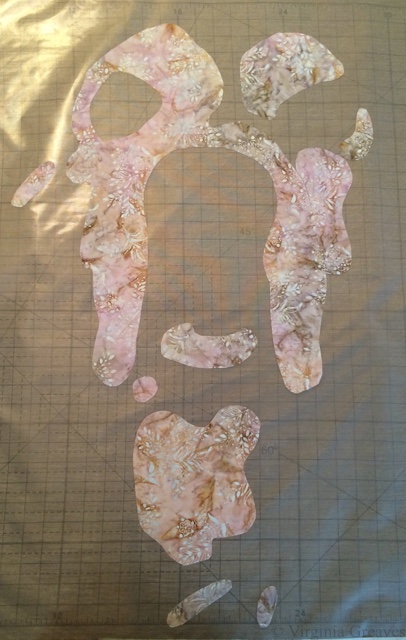
This is how I began, a pink batik.
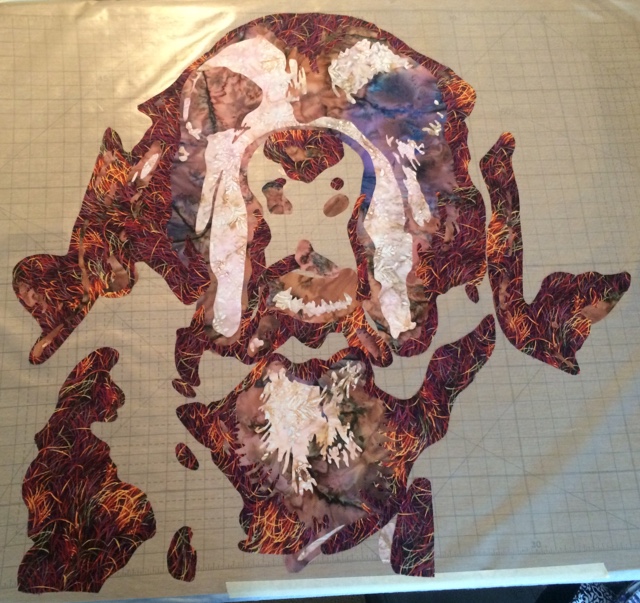
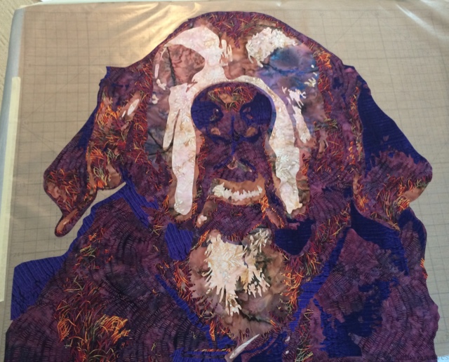
This shows the next two values, a batik that varies from a muddy pink to a blue purple and a print with red, purple, and yellow. This last one was my wild card. To me, it gives the impression of the spiky fur.
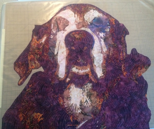
The fourth value is a deeper purple.
And the fifth value is the deepest purple.
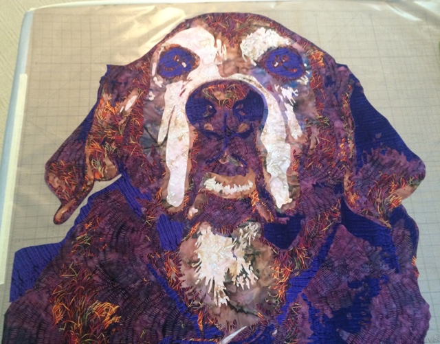
And this is what she looks like after I went back and added the eyes. And I’m struck because I’ve used pink and purple, and yet she still comes across and orange and brown.
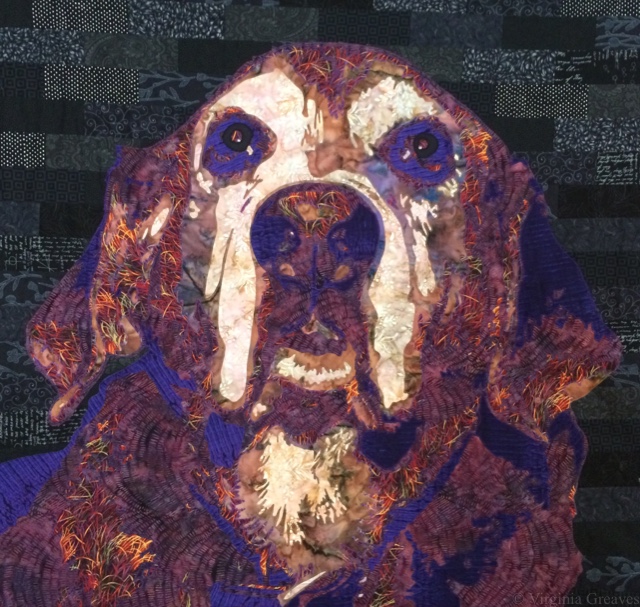
I made a black pieced background for her. At this point, I realized that she needed the deeper black in the pupil — the purple alone wasn’t giving quite enough depth.
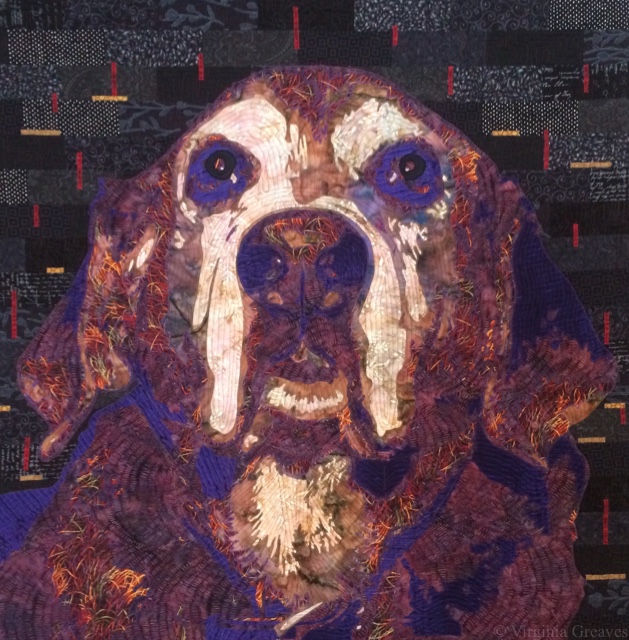
And then I played with the background to make the piece come alive. My first thought was to add many narrow yellow strips on the black, but that became distracting. Someone suggested using some red too, and I played with placement until I came up with something that adds energy to the piece but doesn’t distract from the main subject.
It is about 36″ square which is what I would call a medium piece — but it’s large for the head of a dog. Its greatest impact is seen when you step back from the piece.
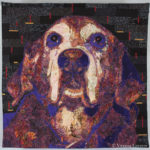 If you want to see it as completed, click on the thumbnail pic to the left or here.
My intention was for her to be somewhat abstracted, and in some way, my experiment yielded something strangely more realistic. I think using the deep purples pulls on the Impressionistic background I learned from my mother’s work. I may continue to explore that in my next piece.

I read all your details of creating your beautiful quilts and I still am amazed at your talent. How you decide on colors, placement and size is beyond anything I can imagine.
Excellent work, that is a delightful, interesting rendering of your dog … I like it very very much … it was fun to follow your progress in the photos …. you seemed to be very decisive in your fabric selections — which is such a blessing! — and they worked beautifully. Whether QN picks it up or not, you’ve created a very excellent, artistic, creative piece — and I am certain it is even more interesting and evocative when seen in real life, rather than in 4″ x 4″ thumbnails on the screen. Excellent work, woman, kudos and gold stars!