Reality Bites
0I was getting ready yesterday to write about my trip to the beach and about some books I had read recently — but I got distracted by upgrading WordPress. Sometimes those mundane tasks are comfortable and keep us from moving forward.
And then yesterday, I watched that old movie Reality Bites with Ethan Hawke and Winona Ryder — an early Ben Stiller movie. Much more serious than his later stuff.
I am a member of Generation X — and that is what this movie is about. At one point, Winona says that she was supposed to really be somebody by the age of 23 — and Ethan tells her that all she has to be is herself — and she says that she doesn’t know who that is.
Another theme in this movie is about selling out. Ben Stiller’s character (he cast himself in the movie) is Winona’s corporate boyfriend — and he has sold his soul. He takes her heartfelt documentary about her friends and their problems and changes it into a puff piece about how silly they are in order to impress the TV networks. When she finds out & gets upset, he promises to have them delete the pizza image — as if a silly fix like that would undo the damage that has been done.
And Troy, Ethan Hawke, Winona’s live-in friend who wants to be the boyfriend — he lives on the edge. He has been fired 12 times and his passion is singing nights in a band. That is the only thing he can commit himself to — unless Winona will change her mind and dump her boyfriend for him.
There is a great scene in which Winona accuses Troy of having sold out just like everybody else — except he doesn’t get paid for it.
And I think that that is what has me stumped.
Anyway, last week we went to the beach. I took a picture of my foot:
I went to all that trouble to paint my toenails, I thought that I should preserve them for posterity. I also did my girls’ toes and intended to take pictures of their toes in the sand, but good intentions don’t usually get us very far.
This is the view down the beach at SanDestin last week:
The first 2 days were beautiful and I burned. I always burn in Destin no matter how much sun block I put on. The last full day I spent under shelter.
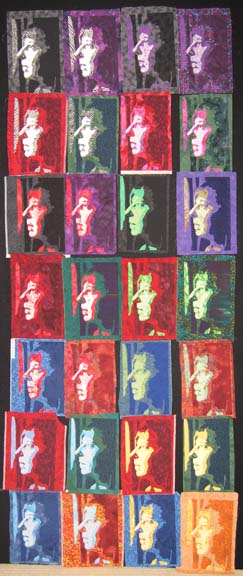
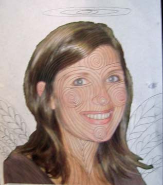
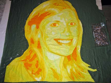
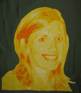
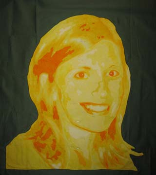
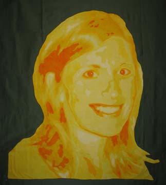
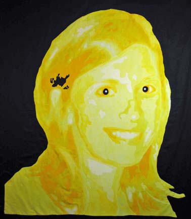
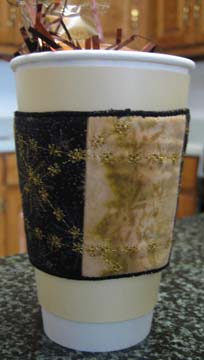
I’ve been trying to improve my photography skills. I think that the hardest thing is just composition. I know my camera fairly well at this point — but the outside world is another thing. Maybe I’ll get a friend & go out one day next week just to take pictures. I could use the inspiration. I have felt burned out lately — the move took a lot more energy than I expected. I have almost all of the applique done on the cloned profiles I’ve been working on — and I finally got a good idea about setting it all together — but it will involve paint and stamps and foil and playing. I am thinking about setting it up in the garage. We don’t have a shop sink at this house, though. I didn’t realize how nice that was until it was gone. A wet studio is harder to set up than a dry one — although my dry studio is still a mess.
Cloning
0I have been making progress at putting my studio together in our new house. I had to cut down the design walls to fit 8 foot ceilings but I realized that I didn’t have to wait on someone else & I did it myself. I had to have to room for my cloning. I took the piece that I started at the old house and started experimenting. I started with black (& white) facing purple, red facing green, and blue facing yellow. Then I made an inverse of yellow which I thought would be cool — it wasn’t. Then I made stages between the sets horizontally — light shades of black with dark shades of purple and light shades of purple with dark shades of black — and then I made stages between the sets vertically.
Sharon, a friend of mine, came over to the house yesterday, and since she was being toured through the house, she saw it. I don’t like showing in process pieces — well, at a stage that I haven’t picked at least — and she obviously didn’t like it. Don’t get me wrong — I realize not everyone is going to like my work and I’m OK with that — but Sharon is a friend of mine & it took a little bit of excitement out of the piece for me. I’m going to work on an exciting way to set all of the blocks in the hopes of bringing life back to it. Oh well — it happens sometimes. It’s usually my husband.
And I forgot to mention — some of these were very challenging to do and I have a few rejects — and a few that had several lives before they were happy on the design wall. It is very hard, for example, to put 2 light blues with 2 dark yellows — and get the contrast in values that I’m looking for in order to have depth. That is why I had to move into orange.
“One Gorgeous Read”
0I haven’t written in a while because I moved — from a small town to a large one. I am still walking through grocery stores with tears in my eyes while I attempt to comprehend all of the choices that I now have available to me. Having spent so many years in a small town, I am still geared to start my endeavors at Wal-Mart — I wonder if that will ever change. I have found that I literally have to leave stores because I am so overwhelmed with everything. I hate to think that they are mini panic attacks, but I’m sure that that is what my doctor would call them. I have a friend that has panic attacks and has to leave the house — I have them & have to return. All the years of being a stay-at-home mom have turned me into something of a hermit.
Which leads me to my other passion: books. I had promised myself that I would confine my blog to quilts, but really my blog is about me — and I am a bibliophile. I also find it difficult, at times, to find a really good read — and it occurred to me that there are others that may have the same issue — so I decided to share.
I just finished The Shadow of the Wind by Carlos Ruiz Zafon. Stephen King remarks on the back cover that it is “one gorgeous read” — and that it is. It is certainly one of my favorite books. Too adult to share with my tween, but an excellent choice for adults.
This book captured my attention when I was wandering through a Books-A-Million several months ago. It starts in a Cemetery of Forgotten Books and revolves around someone who burns books and those who cherish them — which immediately captured my attention — since I cherish books. It was originally written in Spanish & was translated in ’04 — and although many places have the kinds of names that require your tongue to roll and flutter in your mouth (if you were to say them aloud) — the transition in language is otherwise flawless. The romanticism of the names, I think, added to the charm and magic of the story.
If you like this book, you should also try The Thirteenth Tale by Diane Setterfield. It has that same sense of intrigue and mystery without being a mystery novel. I also recommend The Memory Keeper’s Daughter by Kim Edwards and The Life of Pi by Yann Martel.
Epiphany
7Epiphany is a wonderful thing. I have felt disconnected from a lot of my work for a while, probably a result of having so much trouble with my last portrait in yellow. So a couple of days ago I was looking through photographs trying to find inspiration for a new piece. I was coming up with nothing.
And then it hit me. I have a camera. Equipment. Me. Isn’t that enough?
So I set up one of the wonderful lights that I bought for photographing my work and starting taking digital pictures of myself. I turned off the flash & used one of my black design walls as a background. Well, it wasn’t working — so I moved all of the equipment to my closet (no windows) and closed the door. The only light was from my lightstand. I used my husband’s dark suits as the background. And I experimented with moving the light and taking shots of my profile (by the way, one side is better than the other). I finally took one that I knew would work — and then used it as the basis for a simplified drawing. Simple because I knew at that point that I was going to make this many times in different colors.
What I have been doing in color portraits has been experimenting with how color affects the face. I have also been reading Deidre Sherer’s book and wondering at how textured fabrics affect the face. The result of this is an experiment in color and texture and the human form multiplied out many times.
Now that I have done all of the basic colors, I’m thinking of inverting them — even mixing them up.
Did I mention that I’m moving next week?
I am desperately trying to make this quilt top knowing that my time in limited and that very soon, I will have no time to work on it. But it has felt wonderful to have my creative soul back.
Drawing on Your Quilt Top
0A completed top is a lot like a blank piece of paper. Unless it is small and we intend to mount it & frame it, we have to quilt it. To me, adding the quilting is very sculptural. I try to take a picture of the piece just before I quilt it so that it can be compared with the piece after quilting and the full impact of the quilting can be appreciated.
I spend a lot of time creating my quilt tops, and I get so involved in making them, I do not spend time quilting every day. So it is like a rusty wheel that has to be oiled before I get back down to business.
I have a home machine and I quilt my faces on the machine without a frame. (I have a Hinterberg frame but I haven’t gotten a deeper throat machine for it — and I haven’t explored quilting my art quilts on it.) A lot of my lines are sweeping — they go from the top of the face to the bottom. I would love to say that I sit down and just do it — but I can’t. Without the help of a frame, I can’t do this on my home machine.
So, I print out a copy of the original photograph — take out a pencil — and start making lines. It is a rough outline of how I will quilt the piece. If I don’t like the way a line looks, I erase it and draw another line. This is my plan, and it is very forgiving.
Amy is the wife of a priest and has served as a living angel in the life of my family so I thought that it would be fun to quilt her wings and a halo.
I had someone tell me once that my quilting lines seemed topographical. That is a fairly good comparison as I am trying to mimic the contours of the face.
Now I do something that some would consider scary. I pin the top flat — and I draw on it with water soluble pens. Blue or white, depending on the fabric. Be very careful not to iron over the blue pen — that would make it permanent. I draw on the quilt top directly using my sketch as my guideline. If I draw a line I don’t like, I erase it with water on a Q-tip. It is best to sketch as much as possible before pinning — although I always leave some of it for later. In this case, I left the background to do after I’ve quilted the face. I may change my mind about what I want to do there.
And when I quilt it with needle and thread (I typically use Superior’s MonoPoly invisible thread all over) , I don’t neccessarily follow my lines. Usually, the applique throws off the drawn line some and I can straighten it out with the needle and thread. However, having the guideline of the pen marks on the fabric are very valuable for me to see the entire picture and how it will all work together. The eyes have to work with the nose — the cheeks can’t overwhelm the eyes — the chin needs to work with the cheeks — and in places like the lips and the nose, the quilting lines complete what the applique suggests.
I would be in big trouble if I couldn’t get out the marked lines when I was done because the blue ink on the fabric looks a little scary.
It is very important to be careful with the top until the lines are washed out. Any exposure to heat or soap can set the ink and make it permanent.
As I work, I will spray the sections that I have completed with water to see how the piece is coming along. However, some ink marks will inevitably work themselves back to the surface after it has dried. The only way to know for certain that all of the ink has washed out is to submerge the entire quilt in clean clear water. I will do that once I have finished quilting and binding it.
Refinement
3Trying to refine a picture is one of the most challenging things to do. I move away from the pattern and use the original photograph to make alterations. The goal is to give the essence of the person in the quilt.
I have made subtle changes to the yellow portrait. This is what I started with:
This morning, I added deeper color to her eyebrows and the area around her eyes. I also made the eye on the right side smaller since that side of the face is receding away from the viewer.
I then decided that there was not enough highlight on the right eye in the corner by the nose so I added a lighter color there. I needed deeper shadows in a few places to highlight certain areas so I added deeper color under the chin, in the throat area, and on the right side of the face to give more separation between the face and her hair.
At this point, the mouth still looked wrong to me. At some point, I had cut away the shadow of the upper lip on the right hand side because it was too deep — but in hindsight, there needed to be some deeper line there to show the full character of the smile. I raised the lip a quarter inch or so and changed the shadow so that it created a crease in its corner.
I feel very good about the piece at this point.
Working Through Fear and Difficulty
4OK. I received a bunch of really helpful feedback from some of the members of quiltart. It is so helpful to belong to this group (www.quiltart.com). Constructive criticism can be hard to come by since I don’t have a creative outlet — and it is difficult for painters to understand the limits of fabric as opposed to paint. It is true that I could have painted the quilt top to make changes — but I am not a painter. I am more of a collage artist — in fabric. My mom, a fantastic painter, has been wonderfully supportive over the years, and her comments, for the most part, are helpful. However, she inevitably says that I have to have a specific color — which I don’t have and don’t know how to dye. One day I’ll get to take Carol Soderlund’s class and I’ll be able to dye anything — but at this point, I recognize my limitations.
So I read all of the constructive criticism and started thinking. I was so dead set on using the black — so I decided that I probably needed to let it go. It sets off colors so well, but it just wasn’t helping me with the bright yellow. Someone mentioned using an olive green instead — which was kismet since I have a great olive green sateen in my collection that I had been thinking about.
Someone reminded me that the values were all light & middle — which led me to an exercise I should have thought to do on my own which is to take a picture of the piece into Photoshop & remove all of the color. It fell flat. My darkest yellow just wasn’t dark enough.
I decided to go into a dark yellow orange for the shadows since that is what is next on the color wheel — rather than introducing a contrasting color. This is really meant to be a color study of yellow — and I have learned a lot. When I made the pink quilt, I had to go into red, so it only made sense in this series for me to include orange in the yellow range.
Perhaps the most fascinating realization was that orange worked best for the eyes. Thank goodness you can peel off fusing as you go along — and I have peeled off many sets of eyes on this one. Really, if the eyes don’t work, the whole thing falls flat. Someone made the interesting comment that I should look at the eyes of lions — that they are yellow and match their manes. Beautiful — but they are rimmed in black which didn’t work here, but I realized that it was really OK to not use black.
When I stepped back from the piece, I finally started to see Amy peeking back at me. When I get that feeling, I think that I am getting close.
Following the progress of this piece wasn’t intended as a documentation of failure, but I suppose in following the ups and downs of the piece, it is easier to learn about what can go wrong. I have never been one to accept defeat easily, but I will say that this yellow piece almost got me.
Art & Fear
5I started this portrait in yellow quite some time ago. I completely fused the front after very carefully following my current methodology, and then hung it on the wall for what I call the “gut check”.
And it failed. Part of the problem is that the main color is yellow and it is hard to develop features with this color. Another problem was my computer. The pictures on the computer looked better than the quilt top. Once I propped up the piece and walked down the hall away from her, her face became a mass with no distinction. The last problem was the initial picture. I realize now that it was a poor choice because it wasn’t helping me much.
And so I bought the fabric for the background and began working on Christmas projects. I even took the background fabric & draped it over the front of the quilt. It hurt to look at it — it just wasn’t right.
Once the holidays were over, I spent some time adding shadows — and they looked completely out of place. I folded up the quilt top and tried to decide if I should just abandon it.
But really folding it up seemed to help. I realized that the entire face needed to be redone in darker hues. I took out the pattern and decided on the line around the face that would be my new beginning point. The fabric at that point was a 3 in the value scale — so I pulled the 4 value fabric and made that the main part of the face. I then pulled a value that I had pulled out of the dyed stack & decided not to use. I used this one because it contrasted nicely with 4. Using a pencil, I then renumbered the values in the face using these other 2 fabrics as reference points.
While I was doing this, I redrew a few lines in order to simplify some shapes. I allowed myself to be less involved with the left side of the brain and let the right side run the process. It became a completely visual experience.
I don’t know how much of her personality it captures but I am hoping that more of that will come through with the quilting.
This is the original photo. Do you think I came close?
In the end, I need to remind myself that this is art and not intended to be a reproduction of the original photograph. There has been a lot of discussion on the quiltart email list about illustration and its merits. I think that I was greatly influenced by Wayne Spradley. He is a famous watercolorist that lives close by, and I took a class from him a couple of years ago. He is a master at offering suggestion of a shape and allowing the brain to fill in the rest. It would not be as engaging if he added all of the details, for example, of a person in the background, and yet the suggestion has to be just so in order for the brain to become involved.
Thanks for the Coffee and Chocolate!
1If you remember in a previous post, I made coffee cuffs for teacher gifts. I put them on tall cups and, for presentation, filled them with chocolate and gourmet coffee. I let the children deliver them except for one I gave myself.
Well I was shocked when I received thank you notes from the teachers — very politely thanking me for the coffee and chocolate — !! I couldn’t believe that they had totally missed what I had given them. I shiver to think that they may have just thrown them away.
The one gift that I personally delivered was to the school art teacher. She knew immediately what it was and was very excited. She had never seen a custom one and asked if it was my idea. Sadly no — and you’ll be happy to know I didn’t take credit for the original idea. But I was happy that she knew what the gift was. I told her about the reaction from some of the other teachers — and she told me that, as a knitter, you should never give a piece of your work to a non-knitter — there is no way that a non-knitter can appreciate the time that has gone into the work. I am inclined to agree with her on this point (from a quilting perspective of course).
I have spent at least a month trying very hard not to work on a face quilt that is sitting on my design wall. It is yellow. Next week, when the children return to school, I’m either going to fix it or move on. It is easy to get distracted in December. There a million things for a mother to do — and on top of all of that, one of my daughters has her birthday in December.
And did I mention that my grand-father died? He was a great man. He passed away in his sleep on Christmas Eve. My husband put it best. If you had to pick a day to die, wouldn’t you want to go on Christmas Eve? You would be in heaven just in time for Jesus’s birthday. I remember several years ago when I brought my daughter home from the hospital, and I sat in an armchair, holding my newborn, and slept while he hand washed dishes in the kitchen. He always sent me a birthday card, up until the time when his Alzheimer’s robbed him of his ability to remember things. When I was a child, he brought me chocolate Easter bunnies and let me drive his car while I sat on his lap.
I have a bunch of ties from his house, but they were covered with mold when I got them, and rather than using dry cleaning bags in the dryer (which I realize now would have been the best way to clean them), I ran them through a gentle cycle in the washer. Several came apart which isn’t really a problem since I would take them apart anyway, but many of them lost their sheen.
My collection of ties is probably getting out of control, but they are so beautiful. I gave my mother-in-law the pillow I made from her deceased husband’s ties, and she cried. It fascinates me how the essence of people is carried in the fabrics that they wear, and how personal the pieces are that I make with them.
Getting Ready for Christmas
0It has been a long time since I posted. It is amazing how this time of year can become so overwhelming — and then on top of it all, the flu comes around. I had the flu which infected my sinuses which led to this disgusting Sulfa antibiotic I’ve been taking that makes it taste like I have been chewing on rubber tires.
So in between not feeling good and running hundreds of little errands, I have been making things for Christmas. A couple of years ago, I was really turned off by the commercialism of Christmas, and I reacted by making most of my Christmas gifts. And now, several years later, I am still not completely burned out on the idea.
While I was really ill, I started making coffee cuffs for teacher gifts. I made ten at one time, and I was really surprised that they took longer than I thought they would — about two days.
I added Ghirardelli coffee and biscotti. I hope they like them.
Then I deconstructed all of my late father-in-law’s ties. There is really an art to doing this quickly. Most ties are made with hand strung stitches — so if you clip the top & bottom, you can pull the thread all the way through. Anyway, I’ve done it enough it doesn’t take as long as it used to.
I separated the ties out to see what I had — mostly red and black, a few blue, a few brown, and one yellow. I decided to make a star — but different from the tie stars I’ve done in the past. I used the yellow for the center, the reds for the next layer, and then blacks and blues for the outer layer. I intend to make it into a pillow to give my mother-in-law for Christmas.
And when I burned out on that, I still didn’t want to go back to the real world, so I made some bias cut skirts for my mom. They are fairly plain — one black and one red — but she wanted bias skirts that wouldn’t wrinkle & were easy to wash. She had given me one to use as a pattern, but I knew that that was a real problem the moment I realized it was bias cut. The skirt had stretched out too much to be helpful with a pattern, so I found a Kwik Sew pattern that was very simple. They do have a wonderful flow to them.
The last few days I have been working on the craft for my daughter’s class Christmas party. I made felt stockings — monogrammed with their names — for the children to decorate during their party. It looks very plain now, but I hope that felt cutouts, sequins and pompoms will give each one personality. My other daughter got so excited that I had to make one for her, too — which made 23 total.
I’ll take pictures next week to share. I am looking forward to what the kids come up with.