Admin

General Comments

Holiday Spirit

0

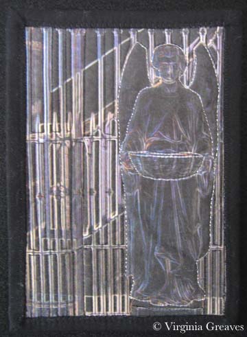
Last night my Fiber Art Fusion art group had our holiday party and we exchanged 5″x7″ sized pieces.

I created this from a picture I took in a church in New Orleans. I’m so pleased with it that I think I will make a larger version for myself. I love the dark angel against all of the ironwork. My friend Hellene Vermillion took this home. She is an incredible silk painter — you can visit her on her website here.

Dark Angel

We brought all of our pieces in a plain brown wrapper so no-one could cherry pick. A couple of women wanted to turn it into Dirty Santa and have stealing — but we decided that that might lead to hurt feelings so we kept what we opened.

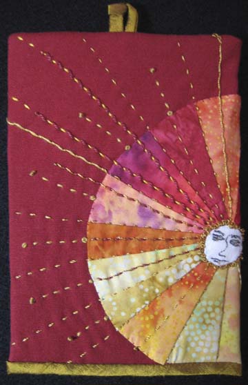
I was lucky indeed to receive this piece entitled Here Comes the Sun from Martha Myers. The sun wraps around the back. I love the sashiko stitches in gold thread — and the colors are wonderfully vibrant.

Here Comes the Sun by Martha Myers

Here Comes the Sun by Martha Myers

I have quite a collection of pieces from past parties. I almost didn’t go — everything is so crazy this time of year — but I set aside several hours yesterday to finish my piece so I could go. I’m glad I did.

I feel blessed to have such wonderful friends — and artists to boot!

Finito

1

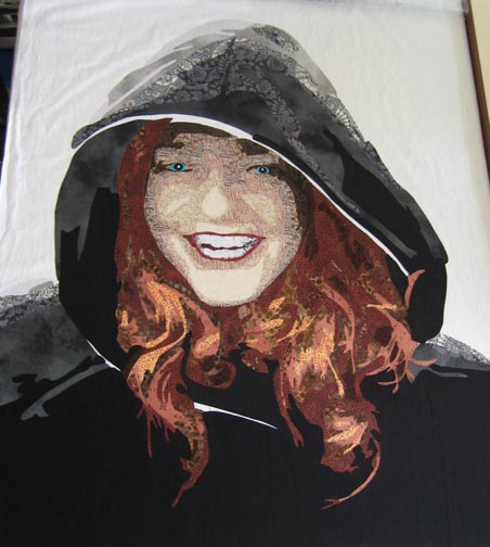
I have finally finished my latest piece Laura Margaret. It is going immediately into a private collection. With any luck, it will be a complete surprise. I loved working on the eyes in this one. I put a lot more detail into them than I have in the past. I took some liberty over-highlighting the rim under the eyes — but I think it makes the piece more striking.

I’m not certain about what I’m going to do next. I am mulling over a few ideas and will hopefully decide soon. I don’t have a lot of time in November and December because of school holidays — but hopefully I can finish a small piece between now and the end of the year.

My piece Bukonyan Elder won first place in the Open: Fiber Art Quilted category at the La Connor Quilt Festival in October and will be held in their extended Top Honors exhibit until the end of the year. I also received exciting news that Celtic Woman will be highlighted in a book being published in April — more details to come later. Finally, my piece Unconditional was invited into a special exhibit called Pets at the International Quilt Show in Houston this November.

The Finish Line

0

I am embarrassed to say I realized the other day that I had not written a blog post during the month of August. My only defense are deadlines. I have been writing several proposals — I’ve been entering more shows — and I spent a frantic two weeks (once school had started back) finishing my piece for the Fiber Art Fusion show. We hung it on Tuesday at The Art Place in Marietta, GA. I will post pictures of the show later. The artist’s reception will be on the 13th at 7pm — and it runs through this month only.

I have two pieces in this show — Arminta Patterson and my new piece, made from men’s ties, The Ties That Bind Us.

I have had one piece juried into the La Connor Quilt Festival in La Connor, WA– Bukonyan Elder. It will be on display in October.

I have had two pieces juried into IQA Houston’s World of Beauty show — Beach Guardians and A Walk In Twilight. They will be on display in November.

Interestingly, there was quite a bit of debate when the acceptance letters for Houston went out. It used to be that you’d receive a fat or skinny envelope and share the results on QuiltArt (an online forum that works on email) — but technology is speeding us forward. Now many of us have a presence on Facebook, a blog, a website — and we post pics of our work.

The debate is over whether that is fair. IQA judges felt that seeing work online before judging would affect their decisions — so they asked that all pictures of work accepted into the show be removed from the internet.

Which on the surface sounds reasonable. They want only virgin art in their show.

My first argument against this is that seeing a picture of a piece online and seeing it in person are two different kinds of experience. One enhances from the other — it doesn’t detract from it.

My other argument is how much it destroys creativity. My blog & my website are my creative endeavors. If I can’t show a piece that I intend to enter into a virgin show — my blog goes away. Most of my blog shows in process — none of that would then be possible.

I would also be holding pieces for as much as a year before I could publish them on my website — for a show that I might not get into.

IQA does not currently HAVE this rule — they are considering it. Quilt National has this rule — and they are biennial — which would mean that I would hold pieces as long as TWO years before I could publish them on my website.

Virgin rules would effectively take away my ability to interact with the world through my blog and my website — if I choose to enter them. It is my choice to enter them or not. I hope that IQA doesn’t add the virgin rules — because then I choose — my blog or their show.


More Than One Way to Fly

1

There is certainly more than one way to fly and I found that I was not quite done working on the theme for this impending exhibit Taking Flight. I’ve covered a bird & Amelia Earhart — but I decided to have some fun making three dimensional hot air balloons.

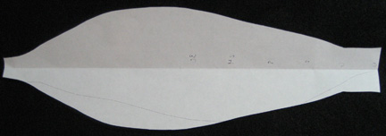
Coming up with a pattern wasn’t so hard. I found a place on the web for making a very large one for a paper balloon. I used the math, scaled it down, smoothed it out, and this is my paper pattern.

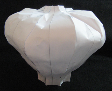
I took eight of these & taped them together to see if they would work — and they do. I’ll be making my balloons with a Peltex layer for stiffness — but it should be similar to the paper. I think it was Jamie Fingal’s blog where she made a sculpture from paper & then used that as a pattern to make her fabric pieces. It’s actually simpler than you would think — working with the paper — & if it doesn’t work, you trim or substitute another piece — or throw away & start over.

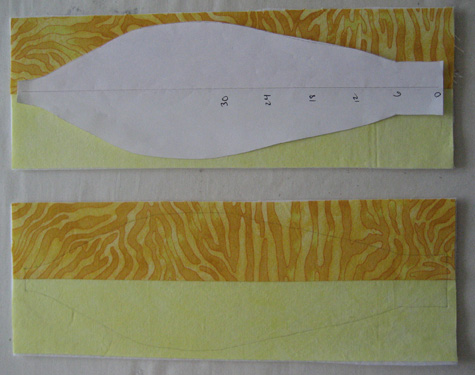
So I sewed strips together for the first balloon & fused them to Peltex stiff interfacing — then I sewed down the middle. I didn’t worry about the back since it will be inside the balloon. Then I outlined from my pattern and cut them out. It was easy on the yellow — I used the center half of the pattern to line up with the crease between the yellows — but when I started sewing the next balloon in blue, it was easier to mark on the back with a pencil on the Peltex & use the quilted line as a guide for the middle.

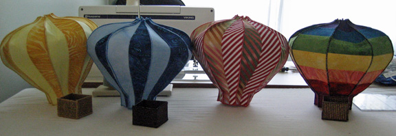
Once I had eight pieces, I zigzagged with a matching thread on the tops & bottoms — the 2 shortest sides. After that, I lined up pieces wrong sides together and zigzag stitched pieces together on the long sides. Two wasn’t difficult, four wasn’t bad, eight was a challenge.

The yellow & blue ones were easy — and then I made the rainbow with vertical seams. Then I found a great red stripe fabric with the stripe on the bias — perfect for a chevron — but it would have been nicer if I had bought enough to make the entire balloon. Mistakes happen. I pulled a similar stripe from my stash, cut it on the bias, and made it just like the yellow & blue ones.

Right now I’m making a more vintage one with cream & black stripes (4 stripes on each panel) on the bottom & a vintage check on the top. Odd numbers are good — five would be a good place to stop — if I didn’t have another one lined up. I have a great blue & gold Renaissance fabric that would look cool if I fussy cut the panels.

Good News

I found out this week that my blog was included in Quilter’s Home list of Top 55 Blogs. Really — little me. I was shocked — and pleased — and excited. I think this is worthy of a happy dance.

If you don’t believe me (I was skeptical too) or want to see the rest of the list, it’s here.

How to Fly: Finished

1

I have finished my Amelia Earhart piece — you can view it in detail here. I finished her just in time for the end of the month. (If I didn’t set deadlines for myself I’d never finish anything.)

I even had time left over to ship my Childhood quilt to the Quilt Symposium in Alabama. They called me recently & I asked if I would send it for their 10th Anniversary Best of Show exhibit to be held in June. (I recently added this one to the website so that people attending that show could see it online if they wanted to. I still haven’t put everything on since I migrated to having the full website in WordPress — but the Early Work tab has a lot of new quilts added recently.) This was the very first quilt that I ever entered into a show, and I remember being completely floored when I walked in & saw that Best of Show award. It was a high honor and I am so grateful for having received it. Although I haven’t been that lucky since, it showed me that I could accomplish whatever I put my mind to.

And of course my entry to the International Quilt Festival: World of Beauty show has been sent. The deadline is the day after tomorrow and for the first time, I managed to send it early enough that I didn’t need to send it with special postage. I hope to be included again this year. It’s in Houston and I’ve never been lucky enough to go myself. My quilts have always traveled more than me — but I think that that is really more because I have children in school. Once they are both in college, I’ll have the chance to go to the shows — maybe even travel teach.

I usually stop working for the summer but I’m thinking about one more piece to do for the show in July. I’m still in the planning stages, but when I have more, I’ll take pictures and be sure to share.

How To Fly Part 2

0

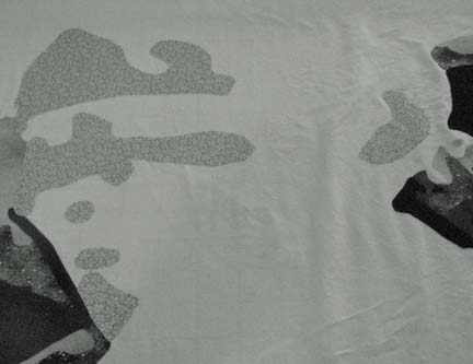
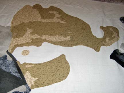
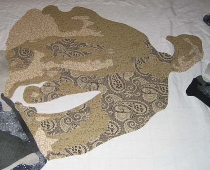
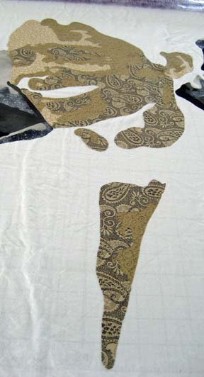
Now that the pieces of the plane are all together, I could start working on Amelia’s face. This first picture was taken mistakenly in black & white. I forgot that I changed the setting on my camera (which I will do to study values on fabrics). The first value never shows much detail anyway though.

Back in color mode, you can see the beige tones that I’m working with.  The second value begins to show the outline of her face.

And the third really begins to give her character.

Of course, at this point, I realize that I have neglected her neck — and that in order to continue, I have to go back and fill in the values of her neck. (In studying the original photograph, I was surprised at how open the front of her shirt is given that it was the 1930’s — but it really did plunge down that low down. I suspect that she had just landed from flight and was oblivious to the state of her clothing — although in today’s society, no-one would blink twice at it.)

The darker values can be harder to find. I’ve learned to go beyond the categorizations that I make when I purchase the fabric & place it in a color drawer — and now go look in other less obvious places.


She really was a beautiful woman. I have not added her eyes and mouth which I normally do at this point. I made a half-hearted attempt at her eyes that you’ll see in the next section on her hair — but I’ve since ripped them off. I’m beginning to see that the color of the eyes are better chosen when more of the surrounding pieces are in place. You want to generally stick with eye color that is representative of the person you’re doing — but the exact color and shade are more effective if they are relative to other fabrics in the piece. For instance, I started with a gray blue that completely fell flat. After laying in her scarf in blues — and then the sky — I see that the blue in her eyes needs to be more vibrant to draw the eye into the middle of the piece. So although her eyes were blue gray — I take artistic license as to what will look best in the piece.

Celestial Home

0

Just as the month turned over to April, I completed Celestial Home — which you can see here. The last time that I shared this piece, I was still debating on the background. I ended up with a batik and didn’t piece any of it. The cloud layer is really at the base of the mountain — and to add clouds to the sky behind the eagle would throw the piece off balance. Really, above the clouds, there is only sky. To break up the sky would diminish the importance of the eagle given its size relative to the rest of the piece.

The goal of the piece is for the eye to look to the eagle and then move across the expansive sky to the left. With the blue background added, I found that the eye just moved out in any direction. Adding the black border on the top & bottom are an attempt to keep the sightline moving in the direction that I want.

When I began quilting, I knew that I would add something worthwhile to the black background. From past experience, I’ve found that matching the thread to the background is a great way for the quilting to become completely unobtrusive — so if I’m going to spend time adding interesting quilting, use another color. I used purple so you can see the quilting design.

I also did some research on the eagle and found them fascinating. Their wingspan is incredibly large — 10 inches more than the width of the quilt — and they mate for life. I think that the black markings on their face give them the ferocious look that the founding fathers of the United States found so compelling — although the eagle has been used as a symbol  for other noble civilizations including the Sumerians and Romans.

They live in the celestial regions of this world and call the vast sky their home. I hope I’ve conveyed some of the feel of that home.

WordPress: From Blog to CMS Part I

0

Several years ago, I wrote my website using DreamWeaver. I bought the software and a huge book to teach me how to do it. And then several years later, I started writing a blog using WordPress. And everything has stayed pretty much the same since then.

But the issue of what to do with DreamWeaver has been looming in my mind for some time. I wrote the website years ago, and quite frankly, it could use some freshening up. I thought about buying the upgrade for DreamWeaver, but then we bought a Mac and relegated the PC to my studio where it sits largely unused except for the handful of times in the year that I update my website or need to use CorelDraw (which is sadly not Mac compatible). It’s slow and a pain to use. It definitely takes an extra measure of patience before I go turn it on.

And when I though about upgrading DreamWeaver so I could have a copy on the Mac, it occurred to me that WordPress was more than capable of handling the entire website (and for those that don’t understand geek speak, CMS stands for content management system which means the website). In fact, at the time, WordPress was advertising their 3.0 release that would utilize navigation menus — the last piece of the puzzle to make it a good CMS builder.

I waited and waited and finally 3.0 came out — and I did nothing. Life got in the way — art got in the way. It didn’t get done. Well, I did choose a new theme that would be able to accept navigational menus — not all of them do. Mine is Mystique.

But as the new year rolled around, I realized that quite some time had passed & I hadn’t updated the website with my newest piece because I don’t use the PC and I don’t want to use the PC.

But where to begin? I thought enough time had passed by that I could find a book that could tell me how to do this — but interestingly, most of the WordPress books center around making a blog — I all ready have one of those — and not about building a CMS — and not about building your CMS around your blog & then moving it to the prime domain of your website.

Yes there are articles in the WordPress archives — but they aren’t really in a helpful order. So as I started this process, I thought it might help someone else to share my experience.

The FIRST thing that I did was build my main PAGES — the pages that would represent my menu headings. Posts are blog/journaling entries — Pages are static entries like the pages of a website that don’t change over time. I didn’t publish any of them at first. I wanted to keep everything in test mode and go live later. But I learned that in WordPress, some things aren’t visible until you do other things. For instance, I was trying to change the Front Page in General Settings > Reading — but it doesn’t exist until you publish some pages. I don’t mean it’s grayed out — I mean it isn’t there at all.

I found this helpful page in the Codex that runs you through how to set up your Home page and then your Blog page where all of blog entries will post — Creating a Static Front Page. You create a Home page, publish it — and then create a BLANK Blog page & publish it. Then you go to Administration > Settings > Reading and choose Static Page — and then Home as your Static page — and Blog as your posts page. And then for some reason that still eludes me, you need your Settings > Permalinks to show the page title in the address. I had all ready done that so it wasn’t something I had to change.

Once this is done, the navigational menu now magically shows Home and Blog.

Then I went back to my other pages and published them. Interestingly, they also added to the navigation menu. I had added order #’s to them which kept them where I wanted them relative to each other — and I took the sidebar off the static pages — they only make sense on the blog page — with a handy dropdown box that is even available in QuickEdit mode.

And here I am. I still have to add pages for all of the quilts — and I’m fairly certain that I’ll redo the menu using the Administration > Appearance > Menus rather than the parent/child options in editing Pages.

When you are directed to the blog, it will show you my Home page on the WordPress site, even if you came from my website and chose the Blog menu option. So I have dual sites — one on DreamWeaver and one on WordPress. Messy — but it will have to do until I move things over. I mapped out where I want the quilts to go in the new categories — hopefully it won’t take me too long.

Celtic Woman

4

I lost my blog yesterday — an experience I don’t care to ever repeat. It was running really slow so I added a 5 star add-on called WP Tuner. After I activated it, I learned what the white screen of death is. It’s a little like the blue screen of death you see sometimes in Windows. It means that your blog has disappeared. No error messages — just nothing.

I can say that I learned a lot. I learned how to access phpMyAdmin on my hosting server and change settings in the raw code. I restored all of my database files from a backup, deactivated all of my plugins, and changed to the default theme. Still gone. I finally went back into my history files to find the WordPress page from which I had found WP Tuner — and although it had 5 stars, as I scrolled down, I found that it was considered “broken” in WP3.0. Reading on, I found some discussion that led me to the realization that this plugin had changed my wp_config.php file. I went back upstairs to my clunky PC that I keep just in case & looked at the php files on the server. There was a new wp_configPCTuner.php file (something like that) — so I erased it. There was no mention in the wp_config.php file — but the site still wasn’t working, so I uploaded the copy of the file that I had stored on the PC from my original install. Finally — it worked.

What a nasty plugin. I have to be much more careful in the future. It made me worry about putting the entire website in WP. I’ve loved WP & have wanted to move away from Dreamweaver — but Dreamweaver really saved me yesterday.

On to my original intent for posting . . .

I was scanning prints into my computer recently and found an extraordinary picture of my sister-in-law. It was taken at Christmas almost 10 years ago, and she had just received a beautiful black cloak. She has red flowing hair that is very striking against the black, and the picture of her taken in the side garden of our old house captures her personality in such a striking way.

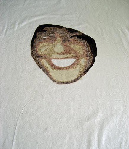
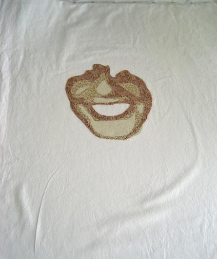
This is the first value layer — not much to see — the white muslin that I use for a base with a few shapes in a light value.
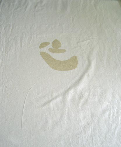
This is the 2nd value layer — you begin to see a little more contour in her face. You’ve got her nose — her chin — suggestion of her cheeks.

Then the 3rd layer — now she really starts to come out.
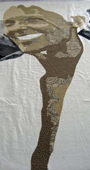
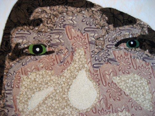
This one shows the problem I was having with her eyes. She has light green eyes — but that would be lost in this picture of her. Too light and yellow on the left — too dark on the right.
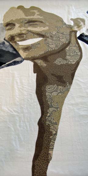
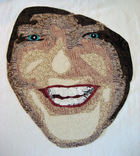
This is her with her teeth and the eye color that I chose. The eyes look really strong up close — but make sense once all of the values are on the wall and you step back. The mouth was fun — this is the first time that I’ve shown the inside of the mouth — just a little peek.

Also eerie about this is that it is just the face — so at this point, knowing the family as well as I do, I can see other people in the family peeking out at me, not just my sister-in-law.

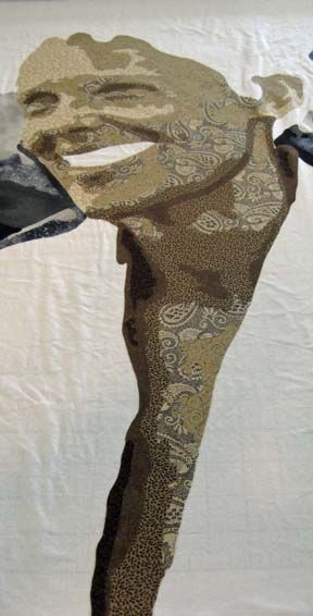
Her face is also shadowed in an interesting way. This will make more sense when the cloak is added around her face.
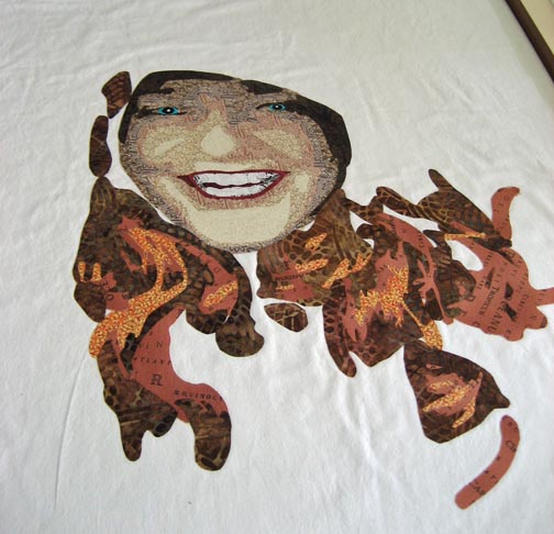
I started her hair with a very brash orange. The more I looked at her picture, the more I realized that I needed more of this color — and I ended up using this for value 1 & 2 in order to get enough of it. The darker colors are nice — but the bright orange is needed for the highlight. It will make more sense in a minute.
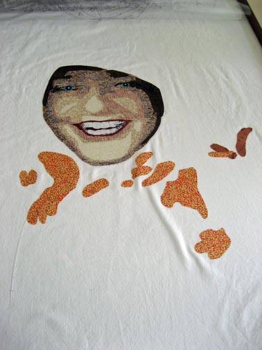
For her, a lot of the effect is the hair.

And then the cloak. The top of the cloak is the lightest as that is where the sun is hitting her. There is still a blank edge around the rim of the cloak. I had to figure out a clever way to show the braid on the edge.
I decided to use a black stripe cut on the bias that I could manually curve around her face. Most of the black stripes I found were black & white — too much contrast — but I found this homespun with black and neutral tan/taupe that seems to work fairly well. I cut it wider than what I needed — and then ironed it down as I curved it to fit the line I needed — but I just ironed it down a little on that one side. Then I went back and cut the opposite side to match the other line. I took artistic license in getting it where I wanted it to be.
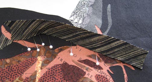
In the end, I think you get that feeling of the rolled edge — and the neutral in the stripe doesn’t shout.

I also added a green background which I’ll show later. I’m working on the applique now.
The Fat and the Skinny

3

Although this may sound like a discussion of waist size, it’s actually about envelopes. When you enter an juried exhibition, you generally know by the size of the envelope whether or not your piece was accepted. It is the same when sending applications to colleges. A fat envelope tells you that you got in — the skinny envelope is <hopefully> a polite decline.
I was lucky enough yesterday to receive a fat — and a skinny. One acceptance — one rejection. I value humility as a character trait so I can swallow the rejection — and certainly, it’s more digestible with a fat envelope in the other hand.

For those in the know, I’m talking about the International Quilt Festival World of Beauty exhibition to be held in Houston in November of this year. I am thrilled to be included. I’m still holding out hope that some day I’ll win something — “hope springs eternal” right?

Both of my entries were in the “Art: People, Portraits, & Figures” category. The one going to Houston is Rwandan Lady:

I hope she does well.

I try to show each piece at least once, so I now have 2 other pieces from this year to put out into the world. I’ll have to start thinking about other venues.

Go to Top