Design
Design

Irony
0Irony is that the hottest thing on my blog about quilting is the entry I made on zentangling last summer. And I mean by a lot.
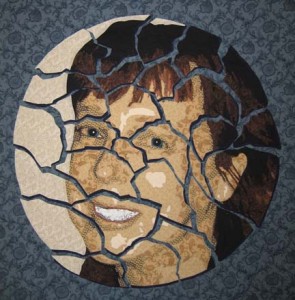
Irony is cutting up the face — only to then begin to realize how much harder it makes everything. There are a lot more lines to applique — and now I’m starting to dread quilting this thing. All of the applique is finally done — and I printed out a B&W picture of it to start penciling quilting ideas — and it hit me. All those stops & starts. What was I thinking?
Cutting a piece up causes all kinds of unexpected problems. I also had a problem with the white backing layer (on each of the individual plate pieces) showing up between the dark colors and the now blue background. I used a black & brown micron pen on the edges which did a fairly good job of making the white go away.
So this relatively small piece has become infinitely complex.
I also starting to think that it needs something more. I’m not a big fan of borders — I’ve been using the plain small band of black on the binding for years. However, I recently hung Duodecim in my dining room — and it could use more space between the image and the wall. The black binding is not enough. I’m so used to seeing things on my black design wall — I tend to forget that most walls are lighter in color.
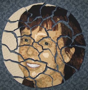
So I played with this in Photoshop & I think I’m going to add a narrow black border, then a couple inches of the dark blue used to shadow the plate pieces, and then finish with the black binding.

Taking Care of the Little Details
1Now that I have it constructed & de-constructed, what more could there be? Well, it occurred to me that it might be cool to add a drop shadow to the pieces — to give the illusion of the plate pieces on the surface of the table. I really had no idea how to do that. It’s easy in Photoshop — well, in the latest version it’s in a new place, but it’s just a few clicks away once you know where it is. And in Photoshop, it is a fairly subtle illusion — I’m limited by the solidity of fabric to create my illusion — which is more solid than scattered pixels.
It occurred to me that I could take a small lamp (I used a rabbit lamp from one of the kid’s rooms) and lift each piece to see where the shadows would fall.
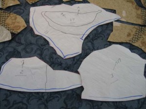
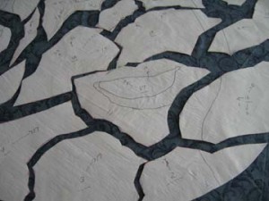
Then I marked each piece with a blue line on the sides where I wanted to add a shadow.
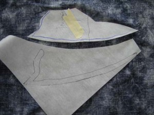
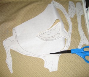
Then I carefully lifted the paper backing from each piece — and used that as the template for another fusible template for only the lines I wanted to shadow. It didn’t need to be exact — this is about creating suggestion — and I only needed 1/4″ or so to tuck under the larger pieces.
Here you can see all of the pieces with their shadows — except it is on a flat surface & a little hard to see at this angle. If I were taller or my table were shorter, it might have worked, but I wanted to have a better angle for judging where all of the pieces would ultimately sit on the background. I took masking tape & lightly taped the pieces to the background — transferred the whole thing to my design wall — and then replaced the tape with less obtrusive pins.
This next part is more maddening than I expected. There are a lot of different looks you can get depending on the space between the pieces — and all of the pieces are interdependent so if you move one, you have to move several. At one point, I put them all tightly together so that I could regain the relationship between the pieces because I don’t want to entirely lose that when I pull them apart.
In this incarnation, I pulled the head pieces a little more askew & out. Unfortunately, because I used a variant of white in the circle portion of the portrait, it created a piece that then pointed outside of the piece — which is not the direction I want the eyes of the viewer to go.
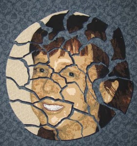
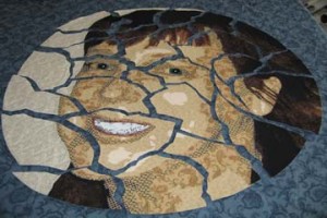
I think that this is what I’m going to stay with. It shows all of the pieces still in relation to each other without any one piece wandering off, and yet the pieces are still distinct and apart from each other.
I like the effect of the drop shadow. It isn’t overly obvious that it is there, but it creates a depth in the piece that wasn’t there before.

Not All It’s Cracked Up To Be
1My latest face is rather small — but my intention when it’s done is to cut it up. I know I know — but it’s time to do something unexpected.
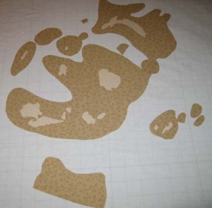
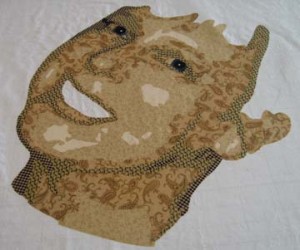
To start, the face is made the same way. This pic shows the first 2 layers. Since I’m ultimately going to make an applique out of the entire thing, I’m much more careful with my layers so that I have as few of them as possible. I put down the 1st value — and then the 2nd value with cutouts for reverse appliqueing the 1st values.
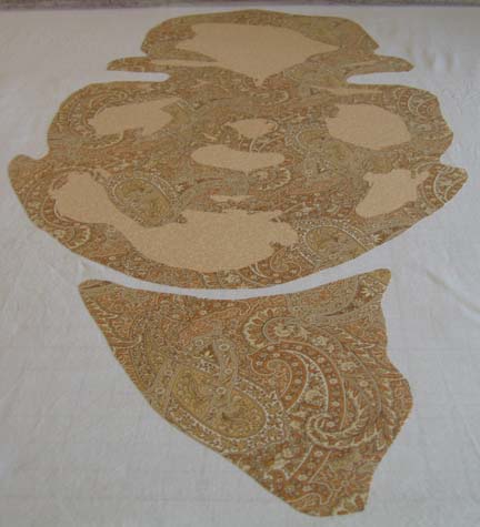
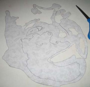
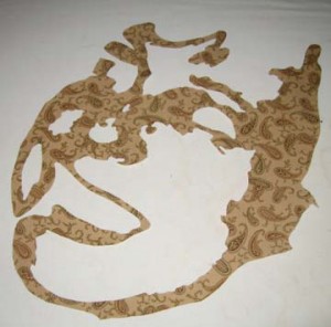
I thought I would show what the cutting out looks like. This is the back of the 3rd value with some large areas still left to be cut out.
This is it cut out entirely. The 3rd value in the face tends to be the most complex.
I thought that I would mention that you can really screw up these complex shapes. If you draw a deep curve onto the paper backed fusible, cut it close to the lines, then fuse it, cut it out & try to apply it — it can get really wonky. Sinewy lines won’t lay flat when you fuse them & thus when you try to lay out the fabric, it won’t lay straight on your design. So there are times that it is best to leave big empty spaces in the fusible. You don’t want to fuse them down — that would be wasting fabric — but you can fuse down the lines you do want & use the big spaces to help you lay your design flat while you are fusing. Then you cut away the excess fusible.
These are the 4th & 5th layers.
And now the eyes.
Then I added the mouth & started on the hair. There are only a few pieces of the 1st layer of hair — so this pic shows the first 2 layers.
Most of the hair is made up in the 3rd & 4th layers.
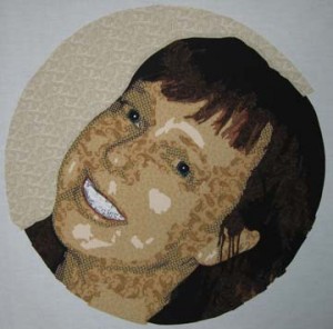
And then I finished the piece with a background. I wanted something circular in a fabric that wouldn’t distract from the hues in the skin but that would work well with the background blues I’m going to add. Since I’m going with the idea of a plate, it made sense to go with a stoney white. It doesn’t compete with the yellows in the face or make it seem that the face is bleeding into the background. It will give a good contrast to the blue but not draw too much attention.
And now comes the scary part. I draw my circle onto Wonder Under and using my pattern, draw out the outline of the front of the face, the two eyes, and the mouth. I try to place the Wonder Under approximately on top of the corresponding elements. I prefer not to cut through the eyes and the mouth.
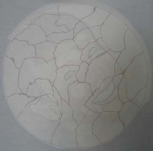
Now, how do I draw the lines to make it looked cracked? Hmmm — well in Photoshop, it’s fairly easy to use the magnetic lasso tool so I can estimate what it is going to look like — but I have to take a leap of faith & a pencil & draw my cracks onto the Wonder Under. When I’m happy with it, I draw over all of the lines to cut in red to make sure I don’t try to cut one of the guide lines I drew earlier.
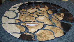
This is what the front looks like with my neat circle cut out.
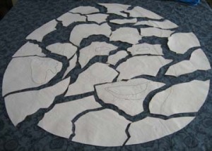
I then turned it over and (gulp) started cutting. It helped that I couldn’t see it as I did it. (I did in fact cover this piece as I worked on it for fear that someone in my house would grow attached to it before I cut it up & give me grief for sacrificing it.)
It was then that I started thinking about turning it over. You can see that it is sitting on the background blue fabric that I picked out — but you can’t just turn each piece over. It is a mirror image — so things on the right have to be moved to the left. I started worrying about putting it back together again — so I numbered the pieces on the back with hints to the pieces that bordered each other.
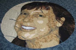
Then I stacked them all up by number, turned them over, and laid them back down as close as I could to make the puzzle pieces match.
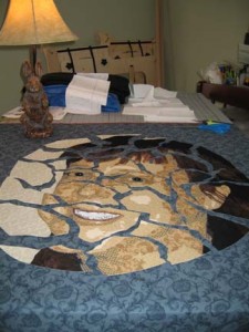
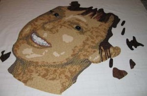
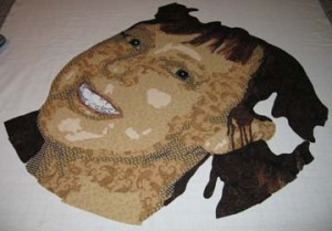
And then I pulled the pieces apart so you could really see the cracks.
I spent today adding a drop shadow to the pieces in a dark blue so that they look dimensional. I’ll show that later. I got it all up on my design wall and I’m second guessing the placement of the pieces before I fuse it all down. (I fused the drop shadows on a teflon sheet so that I could attach them to their pieces but keep them loose. This way I can play with them on the design wall.)
Part of me wants to start sewing immediately, but some perspective might help the overall design. There may be another way of presenting this other than what I’ve all ready considered.

5×7 Is Really Small
1My Fiber Art Fusion group has a holiday exchange in December of a 5″ x 7″ piece of art — which sounds really easy — probably won’t take a lot of time. But actually, I find it much harder to work small. When you’re used to working in a particular scale, going far from that can really throw you.
Which is to say that my first piece totally bombed. I tried to do a 4 value beach scene in black & white — three people in the surf with their backs to the viewer. I think that it is a good idea for a piece — but it really needs to be larger. Lower the # of values was not enough to make this simple. First there were too many really small pieces needed to evoke the surf — and second, all of the fabric prints had to be really small scale for it to work. I thought I had a handle on that — but I wasn’t thinking small enough. At some point I realized that I was at a point of diminishing returns and I stopped.
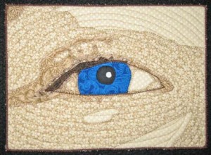
At this point, I thought about just doing an eye — it is a shape I’m familiar with and enjoy doing and its creation would help me grow in my work by concentrating on one small yet very important part of portraits.
It’s made me think that I should spend some more time studying just the eye. It is done differently than in my portraits and although simplified, I like the broader use of color. I may spend the time from now until the holidays working on small eye studies.

What To Do When You’re Not in Houston at Festival
3The International Quilt Festival is going on this week in Houston. I was lucky to have two quilts juried into their World of Beauty exhibit this year, Adelpho and Unconditional. Unfortunately, I will not get to see them hanging. My quilts travel more than I do. When my husband retires and the children are grown and gone, I hope to go to more shows.
I also had two quilts recently in the East Cobb Quilt Guild: Georgia Celebrates Quilts biannual show here in Atlanta, Sweet Dreams and Shoshanna. Shoshanna won Judge’s Recognition and 2nd Place in the Original Design category.
(Interesting side note — I took my friend that modeled Shoshanna to the show so that she could see it hanging. After the show, I had several quilters tell me that they had seen the woman at the show that looked like the quilt, and I of course assumed that they were talking about my model. Then I received several emails from a woman that had gone to the show earlier in the day and looks a lot like the quilt and hence the model. This is the first time I’ve had this happen. Unfortunately, the visitor to the show really wanted to meet the model, but I couldn’t violate my friend’s privacy.)
As this has been a banner year for me to be in shows (which makes up for only being in one show last year), I am also honored to have two quilts in the Art Quilts XIV: Significant Stitching show at the Chandler Center for the Arts in Chandler, AZ starting in November. Sweet Dreams will travel as will Chameleon.
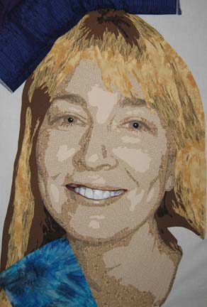
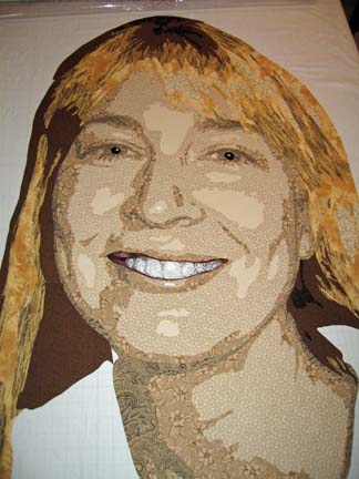
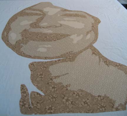
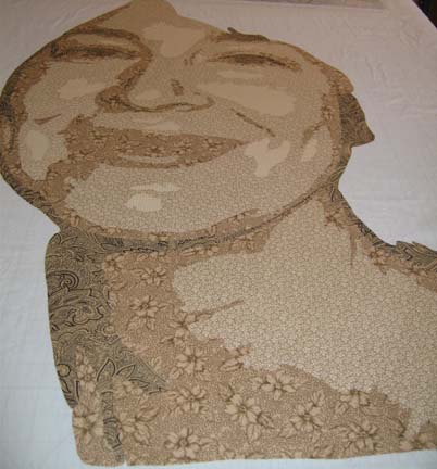
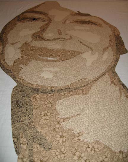
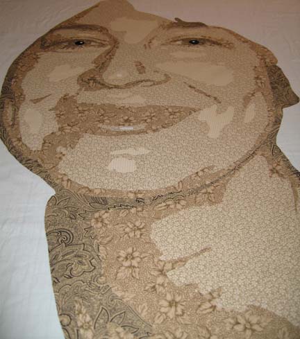
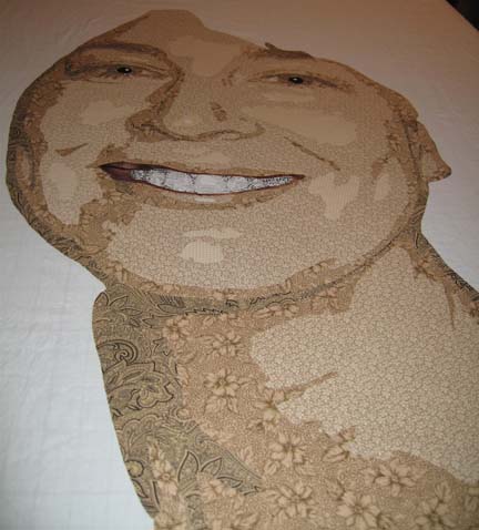
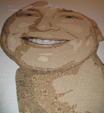
Enough about me. I haven’t posted in a month and although family obligations keep trying to derail me, I have actually made some progress on a new piece. I’ve been taking a lot of pictures and I’m getting ready to quilt it, but since I’m procrastinating, I thought that I would show you the development of the face. (Keep in mind that all of the pictures except the last two were taken of the piece on a high table — and I’m a short woman — so there is some distortion in the features.)
This is all about layering values. I always (well I do now anyway) start with the lightest value in the face. In one quilt, I used the 2nd value first — and had show through which drove me nuts — so unless the piece of fabric is fairly small, I put down the values from lightest to darkest (which, by the way, is the opposite of how Deidre Scherer does her faces, but she free-hand cuts everything).
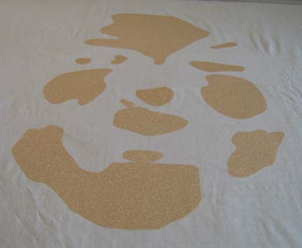
The 2nd value for the face is a bold choice — I admit it. I was pushing the limits of what I thought I could get away with. It is a paisley with tan, stone, and orange in it. There are even some hints at white. I had actually bought this for another quilt & didn’t use it — but the subject in this one is more carefree so I thought I might be able to pull it off.
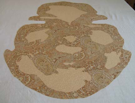
The next value is a tan and blue stripe — but it is more tan than blue so I knew it would work for shading. I worked so hard to make the stripes vertical — and when I was done I wished that I had placed them on an angle. Maybe next time.
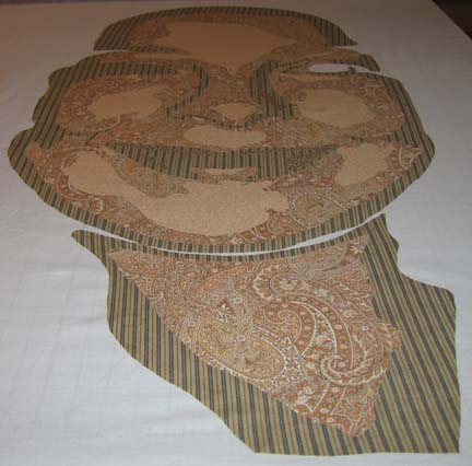
The next value is a little harder to see in this picture — but it is a tan with a small blue floral print. Again — it works for shading.
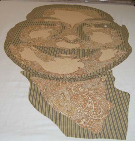
The next value — I’m really pushing what I can find in values — is a small stone and black paisley print — very busy. The stone is too light but I figured that the density of the black will overcome this flaw.
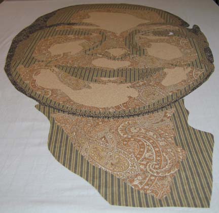
The last value for the face was found in my brown drawer of fabrics. It is a dark taupe with black and helps to outline the eye and the eyebrows.
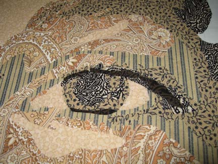
Here you see that I have not added the eyebrows — I got distracted & started working on the eyes. I originally chose a gray blue for the pupils which you will see later I had to change.
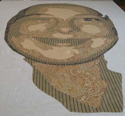
Here are both eyes with the eyebrows.
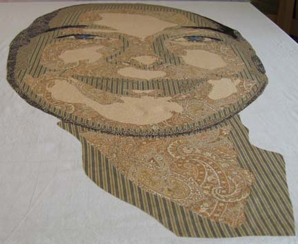
The crowning touch is of course the mouth. It has a red border which signifies the inner edge of the mouth — and the mouth itself with the teeth are constructed from values of white — and by that I mean from white to gray using prints with varying densities of pattern to vary the value. (I do admit that I straightened the teeth of the model. My mom, an oil painter that has done a few portraits, agrees with me that most models like their features to be represented as better than they truly are — regardless of what the mirror tells them.)
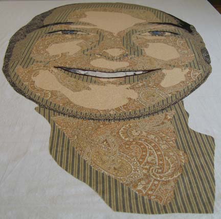
At this point, I start on the hair. This is the first value of brown.
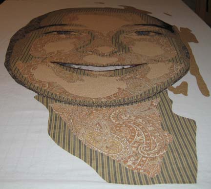
This is the 2nd value — not coming together yet.
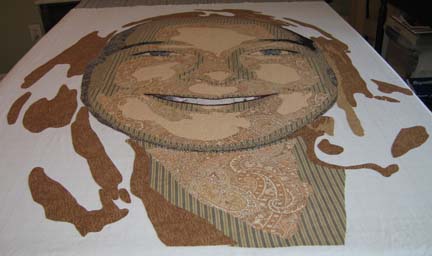
The 3rd value is where most of her hair starts to come together.
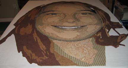
This shows the 4th value of hair.
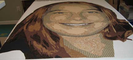
This is the final applique before I start adding the background. I have added some black in the hair — and the eyes need to be changed. The color isn’t strong enough — and they need more work.
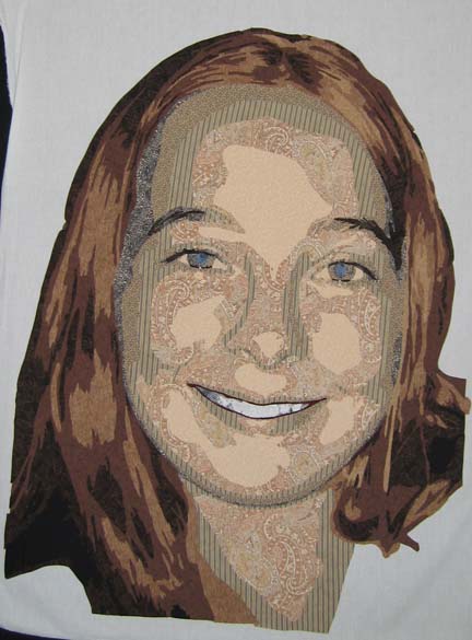
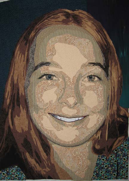
Here I have changed the eyes to a stronger color — a green/blue which is actually the back of the fabric used in the background on the left side of the picture. I had a really hard time with a background for this piece. You want it to support but not detract from the piece — or call too much attention to itself. Again, the fabric I used for the T-shirt is a bold choice, but I wanted something playful to represent the youth of the model. I drove all over town (aren’t I lucky to finally live in a place that has a bunch of fabric stores?) and couldn’t find anything for the background other than the T-shirt fabric. I ended up pulling 2 fabrics — one from my green drawer and one from my blue drawer — which just goes to show that you should never limit yourself by how you or someone else has classified the fabric.
Countdown to Summer
0During the summer, I do not have time to produce much work, so I try to finish up all of my large projects before the end of May.
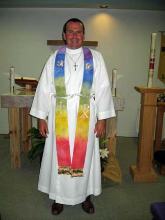
The stole that I gave to Jonathan was well received and helped to brighten our Easter service. It reminds me of a stained glass window, which is nice since we don’t have one in our current building.
(You can read more about this stole on my website HERE.)
The portrait that I am working on is ready to sandwich and prepare for quilting. I finished the applique work in time to put it on my design wall & show my mother who visited last week. I realized then that I could easily change her eyes — add some color and thus some realism. I did it this morning, very easily. (My mom is an oil painter and I always benefit from her critiques. I wished she lived closer.)

I Love Photoshop
2Photoshop is such a great design tool. I have the little Elements version — but it never ceases to amaze me. I don’t know what I would do without it. Julie Hirota showed me how to manipulate a piece of my work in Photoshop a couple of years ago — and I still use it a lot. It is always easier to visualize the piece before you cut everything out & then see your mistakes.
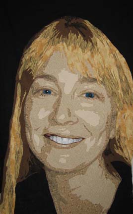
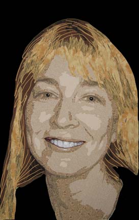
This morning I’ve been looking at my latest piece trying to decide what to use for the background — and if I should change the brown in the background of the hair. Stacy West suggested I use black for the background — and then I added some lines in a light blond/orange color for the quilting lines.
I think that the dark brown will work fine once I add the lighter color thread in the quilting stage. I tried to use a color closer to ash as a substitute — but then it kept fighting with the 3rd value range in the skin.
And I love the black. I haven’t decided if I’ll also use it for her shoulders or not.

First Things Last
2When I make a portrait, I typically add the background last & do something unrelated to the original picture. Unfortunately, with my latest piece, I have used so much of my energy on the face, now that it is done, I have hit a creative block. I do not know what to do for the shirt and background.
Here is what it looks like now with a few fabrics auditioned against it:
I know that blue, green, and purple are far enough away on the color wheel from yellow to give me some good contrast, but I also know that the choices have to be fairly dark to offset the hair and the neck. Nothing in my closet is jumping out at me though.
This is frustrating because spring break is almost upon me — so I won’t get any work done next week — and then I only have a short period of time to finish it completely before school is out for summer — and I don’t have any studio time.
I can either use one big piece for the background, something patterned (but not too much — I don’t want it to look like bad wallpaper), or I can use strips — giving a more abstract feel. What to do, what to do . . . . .

Another Sneak Peek
0This is what I have so far. The face is done — though I may still change the mouth — but I still have some work to do on the hair. I’m not sure about how the colors are working together — I may make some adjustments. But at this point, I’m going to finish it & then stand back from it & study it for a while. I knew that doing a blond would be challenging.

Always Up for a Challenge
1Using commercial fabrics has added an interesting complexity to my work that I didn’t expect. Sometimes, a fabric works great in the auditioning — and then bombs in the piece — because of the tightness & regularity of the pattern relative to the size of the pieces cut out for the face. I have been building a new face in the last few days — and have been playing with her mouth quite a bit this morning. I thought the in-process pictures would be interesting. (Keep in mind that all of these are taken on a flat table — so there is some camera distortion in these pics.) I always love to see the life grow under my fingers when I work.
This is the base laid out:
This is the face with a little more detail added:
Here I’ve added detail to the eye on the left:
And here I’ve completed the 2nd eye on the right:
This was one of the mouths that I did. I wasn’t happy with how it came out from the original pattern I drew, so I grabbed my Sharpie and scissors and started working away:
This is the mouth as it is now. I’m fairly happy with it — although I may change it when I make final adjustments:
Now I’m off to work on her hair. She is a blond — so this is a new challenge for me. I think I have it all in my stash though — amazing what you can find in that closet if you just search hard enough through the bins.