The International Quilt Festival is going on this week in Houston. I was lucky to have two quilts juried into their World of Beauty exhibit this year, Adelpho and Unconditional. Unfortunately, I will not get to see them hanging. My quilts travel more than I do. When my husband retires and the children are grown and gone, I hope to go to more shows.
I also had two quilts recently in the East Cobb Quilt Guild: Georgia Celebrates Quilts biannual show here in Atlanta, Sweet Dreams and Shoshanna. Shoshanna won Judge’s Recognition and 2nd Place in the Original Design category.
(Interesting side note — I took my friend that modeled Shoshanna to the show so that she could see it hanging. After the show, I had several quilters tell me that they had seen the woman at the show that looked like the quilt, and I of course assumed that they were talking about my model. Then I received several emails from a woman that had gone to the show earlier in the day and looks a lot like the quilt and hence the model. This is the first time I’ve had this happen. Unfortunately, the visitor to the show really wanted to meet the model, but I couldn’t violate my friend’s privacy.)
As this has been a banner year for me to be in shows (which makes up for only being in one show last year), I am also honored to have two quilts in the Art Quilts XIV: Significant Stitching show at the Chandler Center for the Arts in Chandler, AZ starting in November. Sweet Dreams will travel as will Chameleon.
Enough about me. I haven’t posted in a month and although family obligations keep trying to derail me, I have actually made some progress on a new piece. I’ve been taking a lot of pictures and I’m getting ready to quilt it, but since I’m procrastinating, I thought that I would show you the development of the face. (Keep in mind that all of the pictures except the last two were taken of the piece on a high table — and I’m a short woman — so there is some distortion in the features.)
This is all about layering values. I always (well I do now anyway) start with the lightest value in the face. In one quilt, I used the 2nd value first — and had show through which drove me nuts — so unless the piece of fabric is fairly small, I put down the values from lightest to darkest (which, by the way, is the opposite of how Deidre Scherer does her faces, but she free-hand cuts everything).
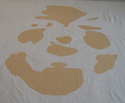
The 2nd value for the face is a bold choice — I admit it. I was pushing the limits of what I thought I could get away with. It is a paisley with tan, stone, and orange in it. There are even some hints at white. I had actually bought this for another quilt & didn’t use it — but the subject in this one is more carefree so I thought I might be able to pull it off.
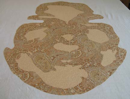
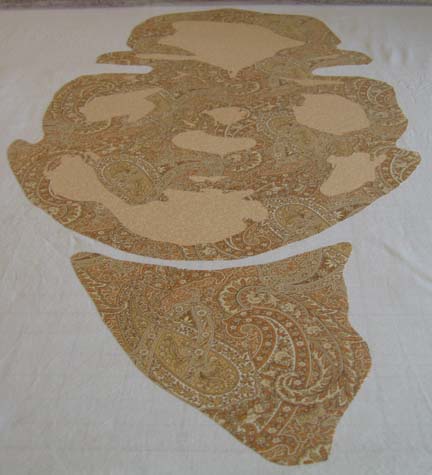
The next value is a tan and blue stripe — but it is more tan than blue so I knew it would work for shading. I worked so hard to make the stripes vertical — and when I was done I wished that I had placed them on an angle. Maybe next time.
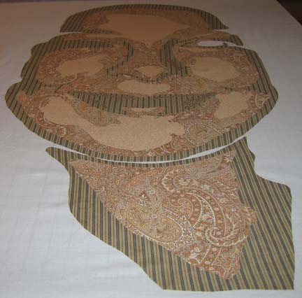
The next value is a little harder to see in this picture — but it is a tan with a small blue floral print. Again — it works for shading.
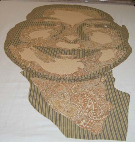
The next value — I’m really pushing what I can find in values — is a small stone and black paisley print — very busy. The stone is too light but I figured that the density of the black will overcome this flaw.
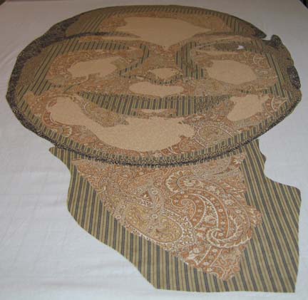
The last value for the face was found in my brown drawer of fabrics. It is a dark taupe with black and helps to outline the eye and the eyebrows.
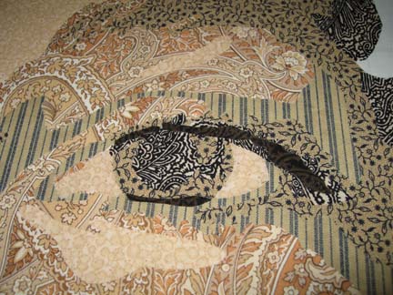
Here you see that I have not added the eyebrows — I got distracted & started working on the eyes. I originally chose a gray blue for the pupils which you will see later I had to change.
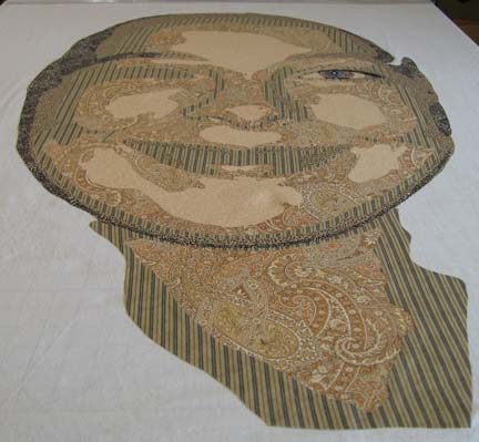
Here are both eyes with the eyebrows.
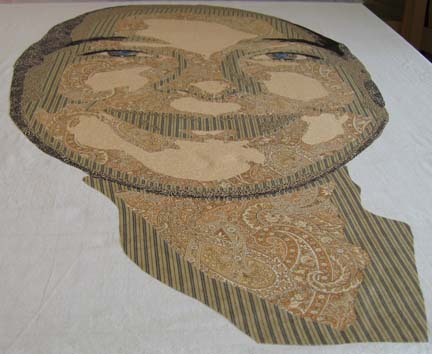
The crowning touch is of course the mouth. It has a red border which signifies the inner edge of the mouth — and the mouth itself with the teeth are constructed from values of white — and by that I mean from white to gray using prints with varying densities of pattern to vary the value. (I do admit that I straightened the teeth of the model. My mom, an oil painter that has done a few portraits, agrees with me that most models like their features to be represented as better than they truly are — regardless of what the mirror tells them.)
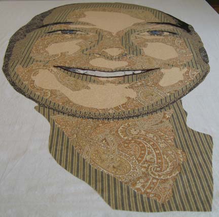
At this point, I start on the hair. This is the first value of brown.
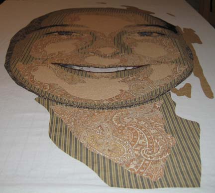
This is the 2nd value — not coming together yet.
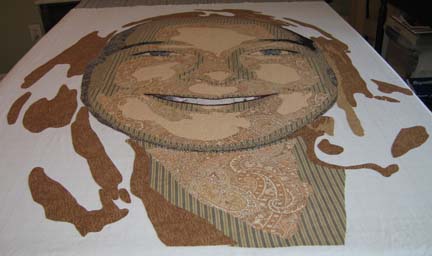
The 3rd value is where most of her hair starts to come together.
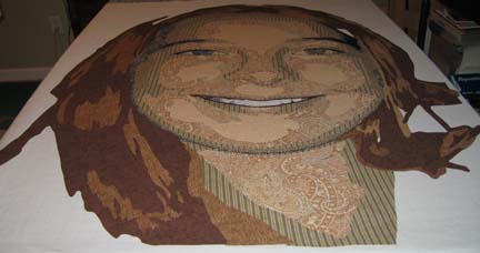
This shows the 4th value of hair.
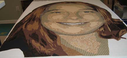
This is the final applique before I start adding the background. I have added some black in the hair — and the eyes need to be changed. The color isn’t strong enough — and they need more work.
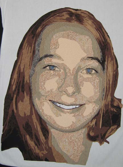
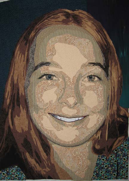
Here I have changed the eyes to a stronger color — a green/blue which is actually the back of the fabric used in the background on the left side of the picture. I had a really hard time with a background for this piece. You want it to support but not detract from the piece — or call too much attention to itself. Again, the fabric I used for the T-shirt is a bold choice, but I wanted something playful to represent the youth of the model. I drove all over town (aren’t I lucky to finally live in a place that has a bunch of fabric stores?) and couldn’t find anything for the background other than the T-shirt fabric. I ended up pulling 2 fabrics — one from my green drawer and one from my blue drawer — which just goes to show that you should never limit yourself by how you or someone else has classified the fabric.
I love your site! Wow, this is terrific showing how you did this! My question was that you said the other artist ‘free hand cuts everything’ which led me to wonder… How do you cut your pieces?
This is just absolutely an amazing tutorials that you have generously shared. You make it look so easy but I am sure it is not in the beginning . Thank you for your kindness. Imagine and Live in Peace, Mary Helen Fernandez Stewart
Hi… I was at Houston and saw “Unconditional”. He is lovely! I only shoot a few photos at a show because I am getting my computer jammed full of other people’s quilt photos,lol. So Unconditional was one of the 10 I shot. Very nice work indeed.
I like to do people and am very interested in your facial quilting. That is always a hard one. You have done a good job. Thanks for sharing your photos on your blog. You can check out my faces at marilynjsmith.blogspot.com