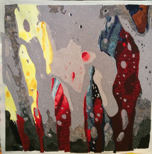
So I haven’t written in a while. I’ve been working on a very personal piece, a self-portrait. I’m a very private person, and I need to remind a few of you of the boundaries here. I write my blog as a teaching tool. This is not intended as a preview into my personal life. If you enjoy reading it, that’s great, but if you know me personally, I don’t intend to answer questions about anything other than process to fellow artists and/or quilters. So please, don’t ask.
My original intention was to make two companion pieces. I intended to make a whole portrait of me (a picture I took of myself with a handy remote control for my camera) and then cut it in half. One piece would be the left half of the realistic me, & the right side would be an artistic interpretation of me inside. The other piece would be the same in reverse. Each piece would focus on two different views of who I am.
But this piece took on a life of its own. It didn’t want to be cut in half, and as I worked on her, she told me what to do.
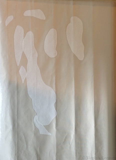
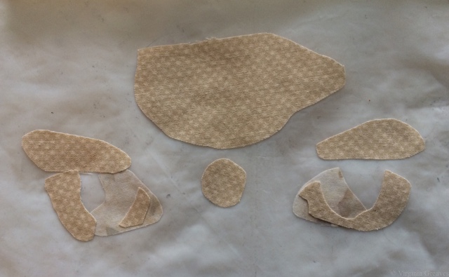
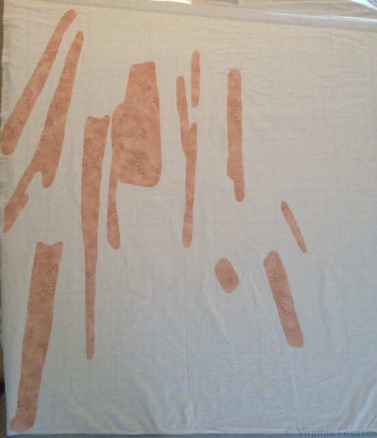
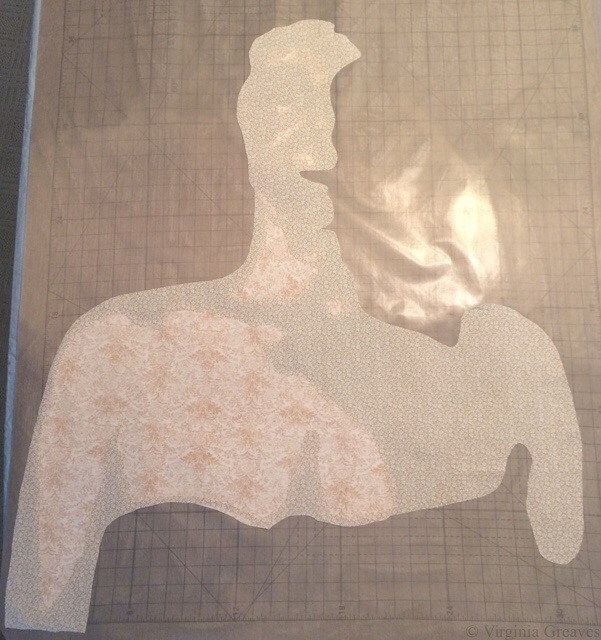
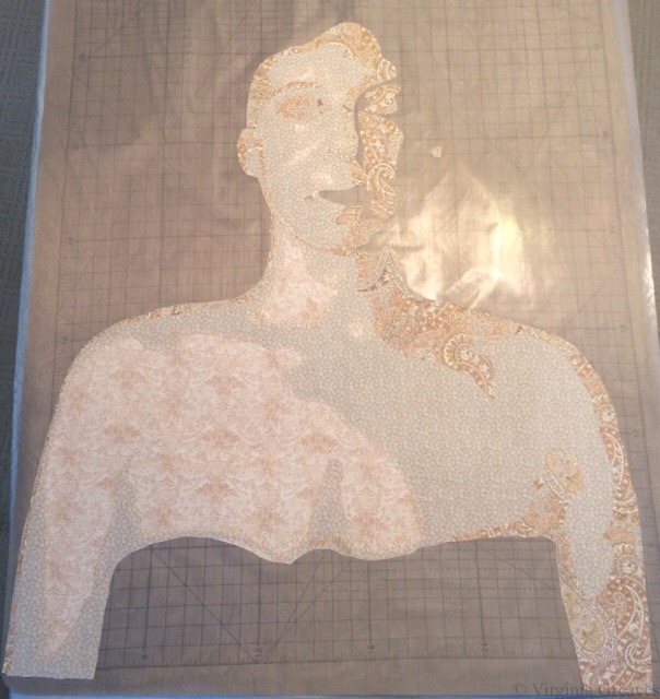
This is the first flesh value.

This is the second. It’s a full bust and shows my shoulders and a little of my arms.
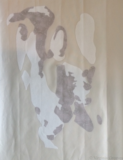
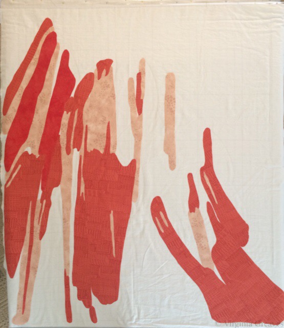
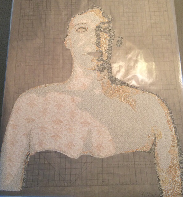
This is the third value. You can begin to see the outline of my face.
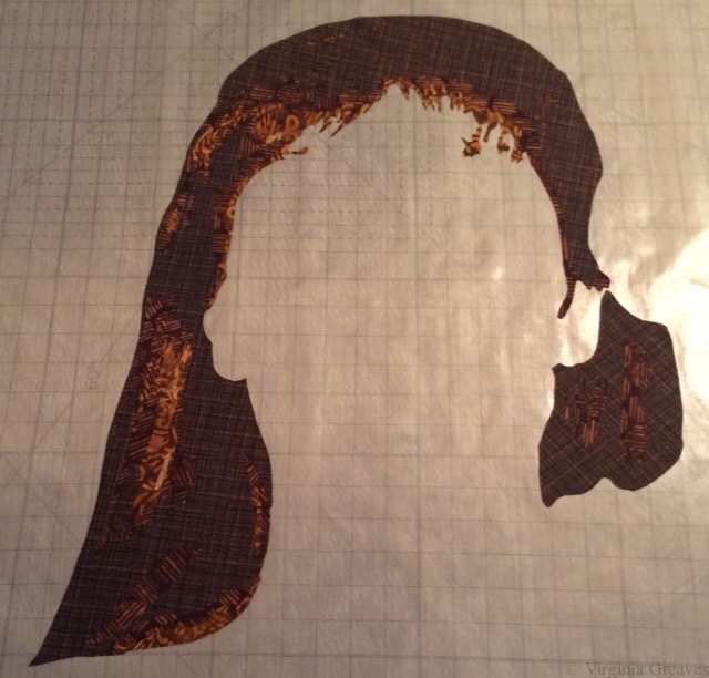
The fourth value shows shadow.
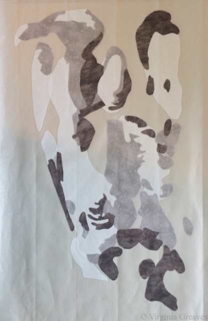
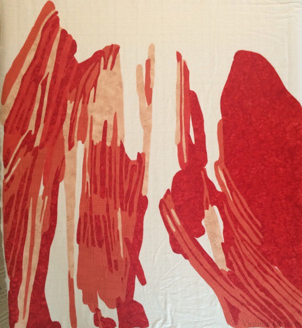
The fifth value.
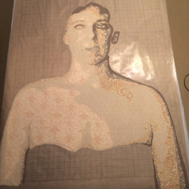
The sixth value.
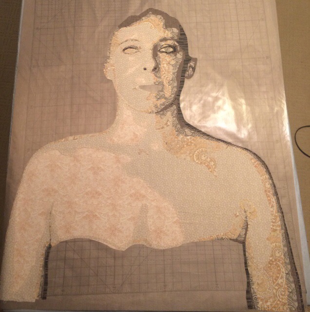
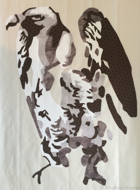
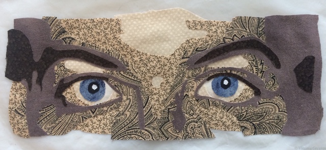
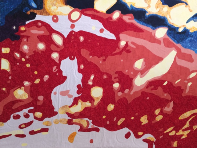
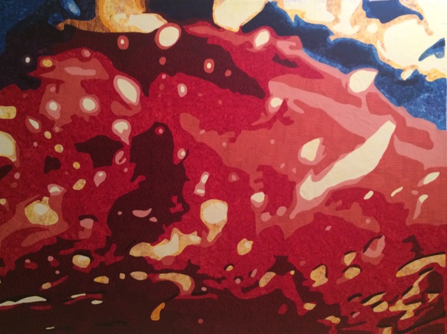
My eyes added. Don’t know why I don’t have a pic with the mouth. I used strong colors on the mouth — very red.

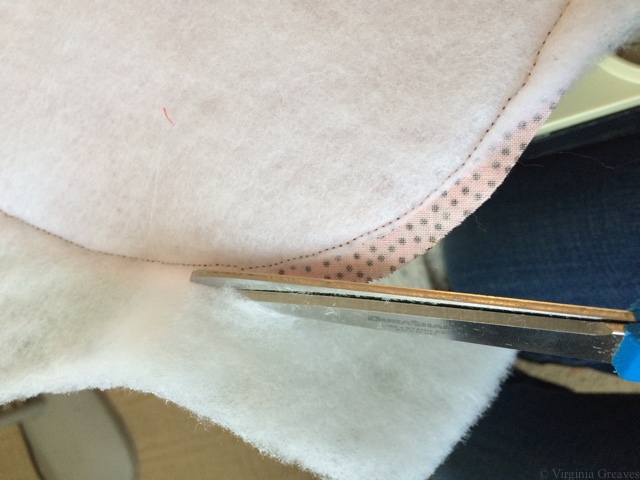
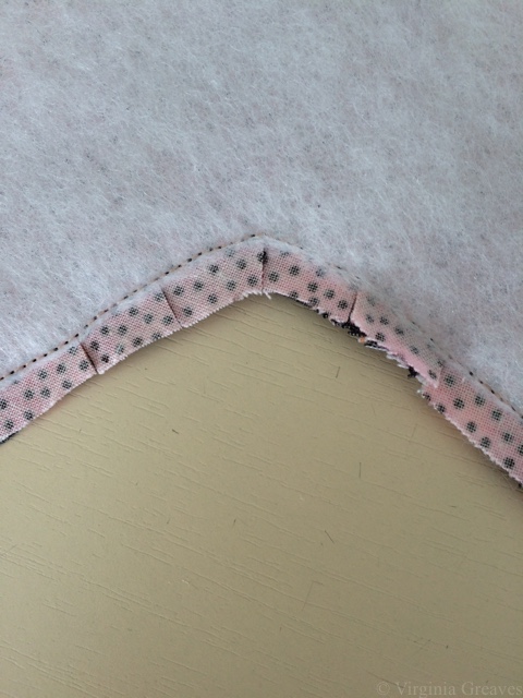
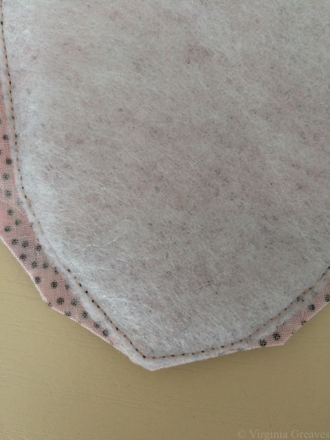
I am, by the way, creating these sections on a pressing sheet. In fact, I bought the Holy Cow pressing sheet just for this project.
This is the beginning of the hair.
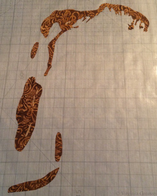
Second value.

Third value.
Fourth value.

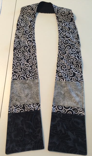
At this point, I pinned the sections up on the design board to see if they were working together. I even added a black sarong around my chest (because I’m just not THAT girl).

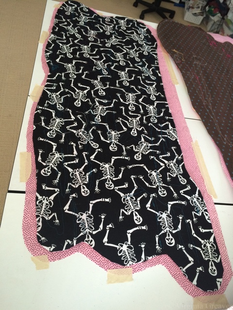
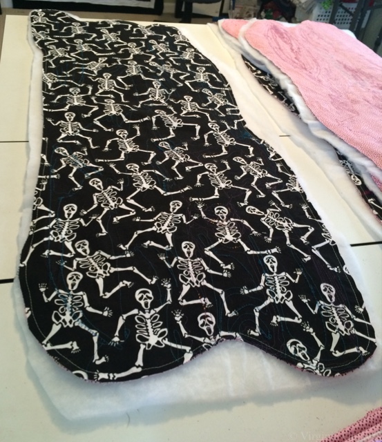
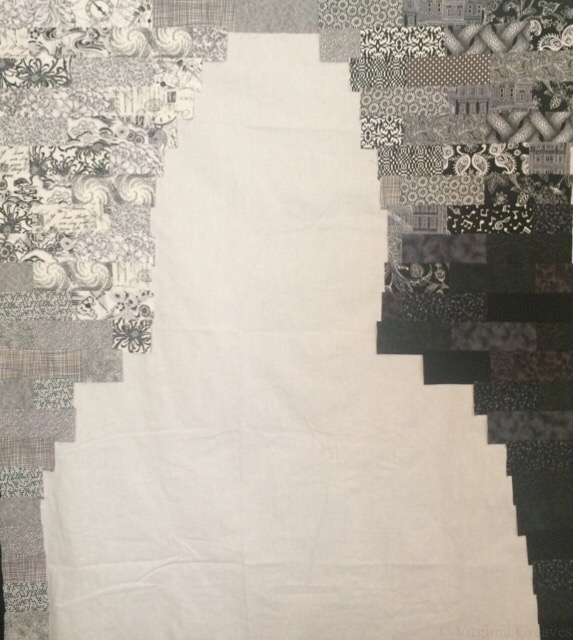
And then rather than add a solid background, I started cutting out black and white fabrics. Not sure why. I had a lot of them in my stash, small pieces, and I cut them into strips and arranged them by value.
And then I sewed on the flesh section. It was really humbling to see myself bald. I had a friend years ago who shaved her head in solidarity with another woman who lost her hair due to cancer treatments. I had not really thought about it before, but women invest some of their identity in their hair. I don’t know that I could have done the same & shaved it. What would I look like bald? I guess now I have an idea. It’s not as bad as I expected.
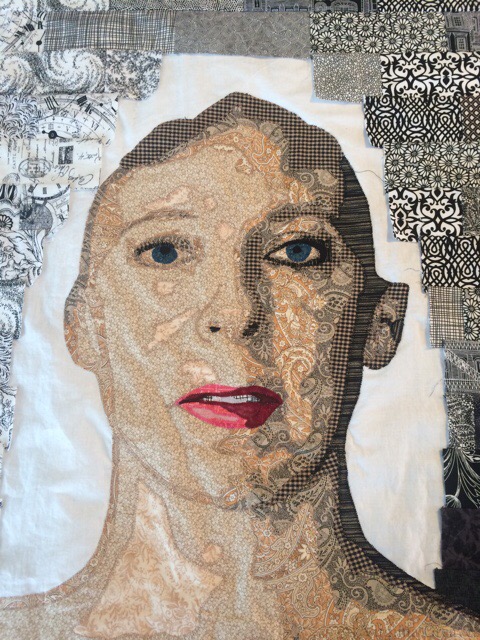
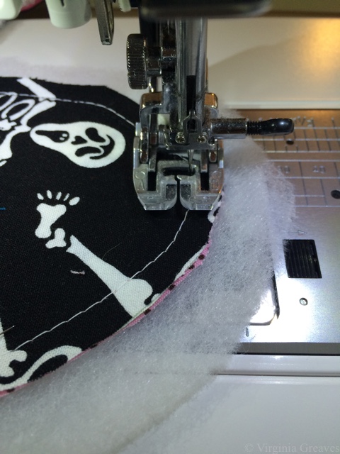
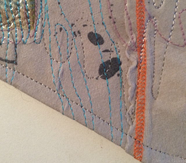
At this point in the appliqué, the interfacing underneath causes some wrinkling on the top. It’s a little unsettling, but when I rip it off the back and iron it, it will be flat again.
And then I pinned this piece on the wall and asked my muse what it needed next.
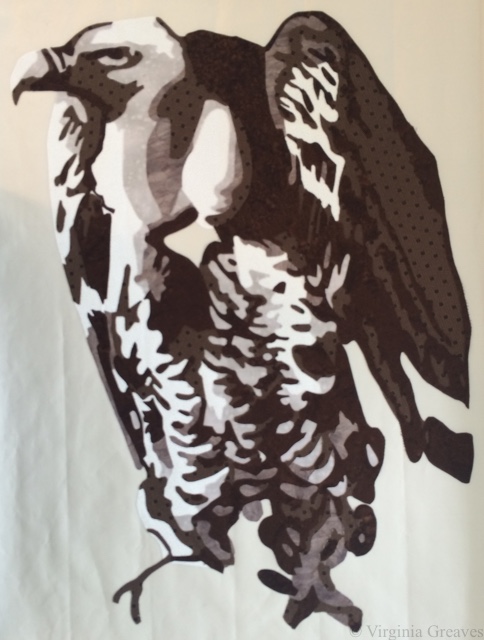
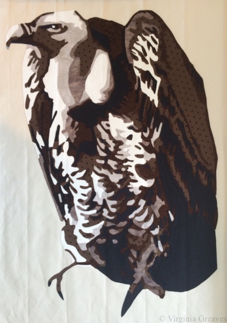
I considered adding a raven on my shoulder. I like ravens, but I didn’t think it would work well with the background. So after thinking about it for a while, I settled on a little yellow canary. She adds a nice punch of color to my shoulder. Canaries are also the birds that miners used take into the mines with them to judge the air quality. As they went about their work in a dangerous place, the bird kept them safe through their life.
This was my first try. Yellow is hard to do. I decided she was too dark.
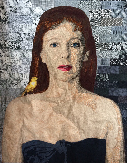
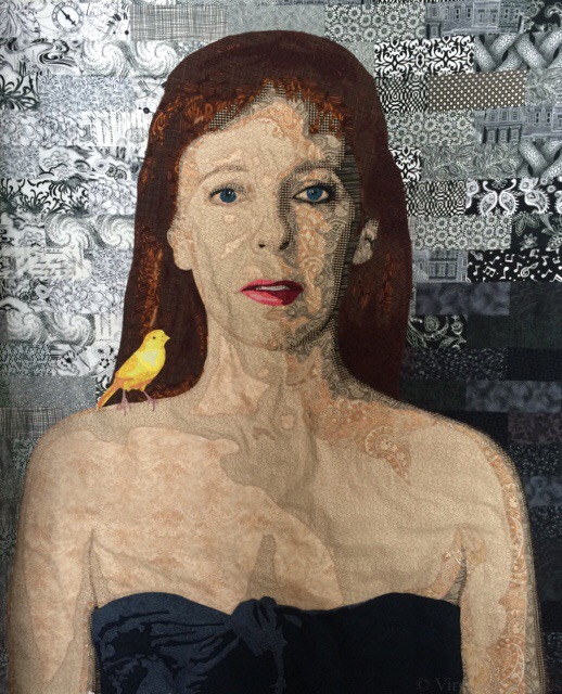
So here’s my second try — much better. I also added some white highlights in the iris of the eyes.
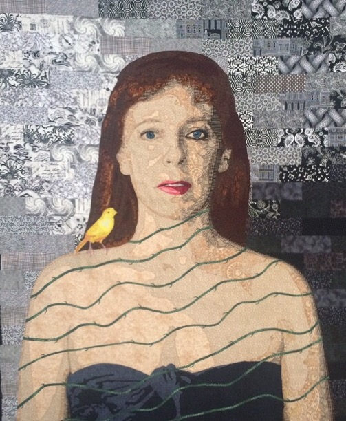
Then I decided that I wanted her to be wrapped with vines, so I cut 1/4 strips of a green fabric on the bias and ironed them on in waves.
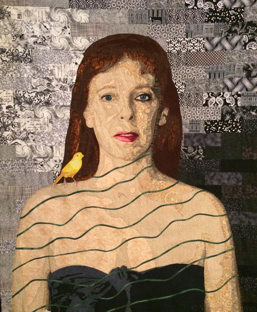
After appliquéing them down, they looked too plain, so I decided to embroider thorns on the vines.
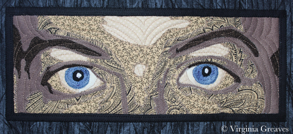
And at this point, it’s just not quite right. The left eye is too plain compared to the right eye. So I added darker fabric and some black embroidery around the left eye. It’s the light side of the face, but it has to balance the right.
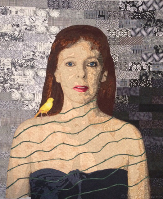
Subtle, but I think it makes a difference.
Did I think of Frida Kahlo’s self-portrait with thorns when I did this? At some point, I did. But this is my interpretation. Me and my canary.
She’s basted now and ready for quilting. The deadline for the exhibit I’m entering her in is still over a month away, but I have a lot to get done between now and then. The first week of March, the Wash & Wax exhibit will be hung at Jacksonville State University, and Leisa Rich and I are making 5 more Microbubbles (small framed pieces) and one more large piece — a triptych.