Design

Design

Studio Frenzy

0

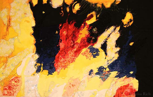
Last week, I finished cutting the 4th abstract in the Car Wash series that I’m working on with Leisa Rich.

Like my other pieces, I approached it with the intent of cutting it out in color order starting with the yellows, then the purples, then the blues — but as I went on, the entire thing became unwieldy. Breaking it down into meaningful pieces became really hard. I became best friends with my colored highlighters — and I bought more of them. I rued the day that I had drafted this thing. I think I may have pulled some hair out.

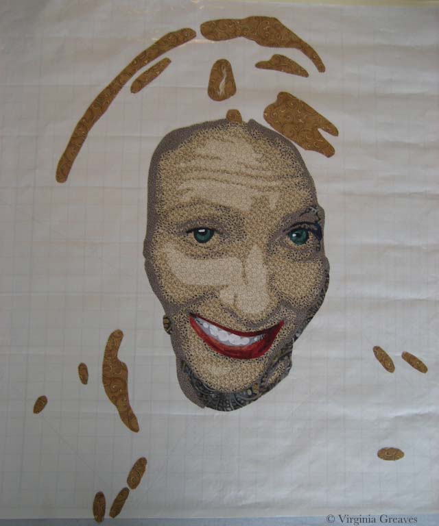
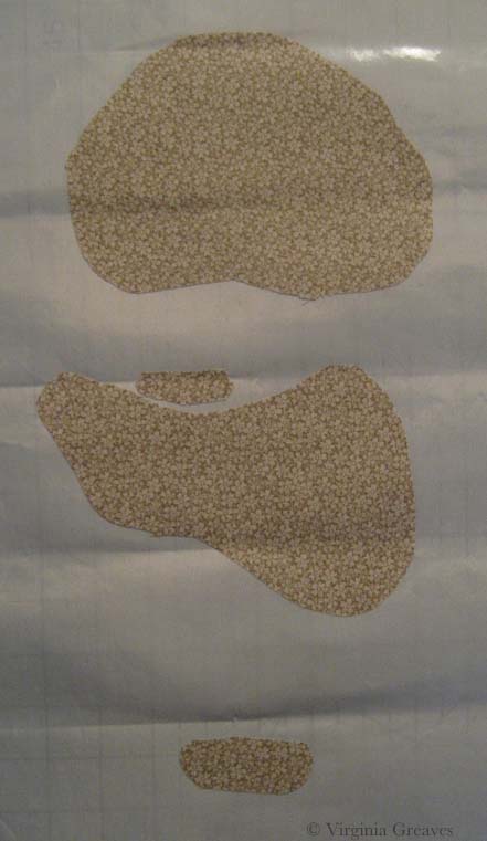
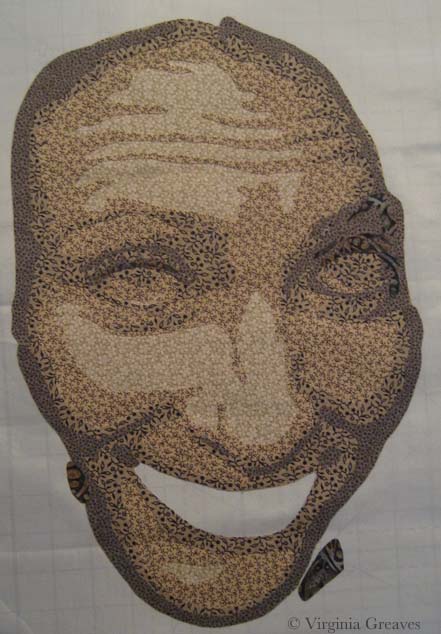
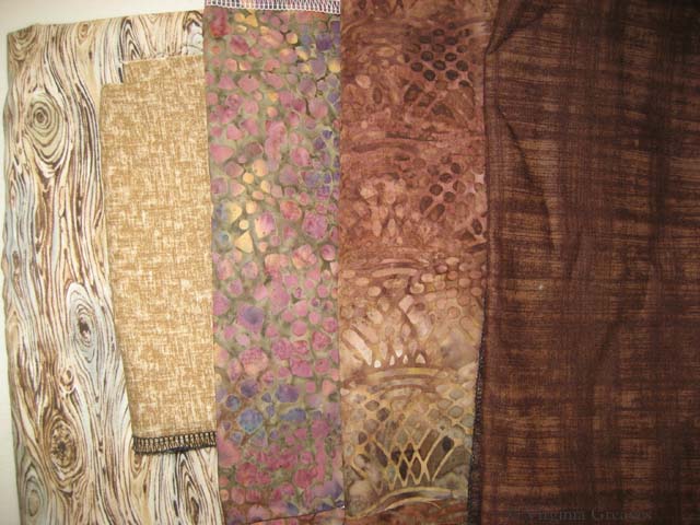
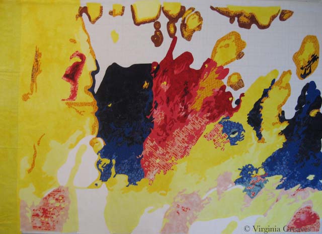
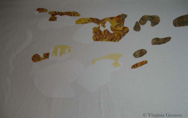
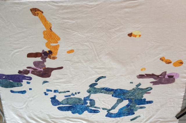
I ended up with all of my fabrics on the cutting board and the master pattern on top of the piece I was constructing.

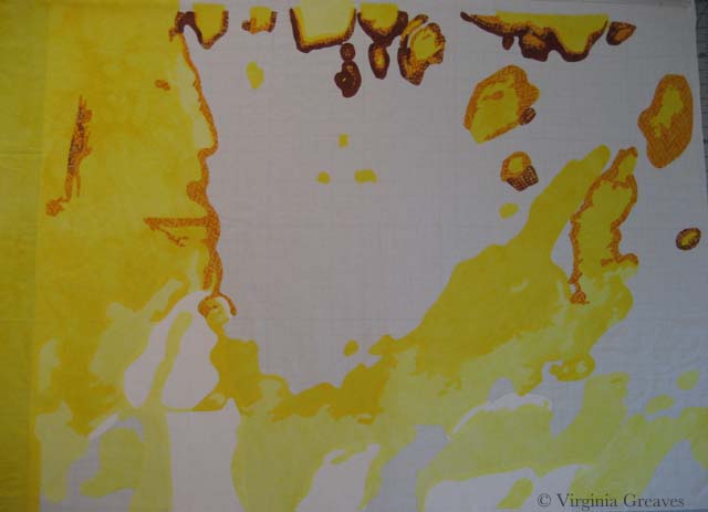
This was my first picture.

abstract4_1

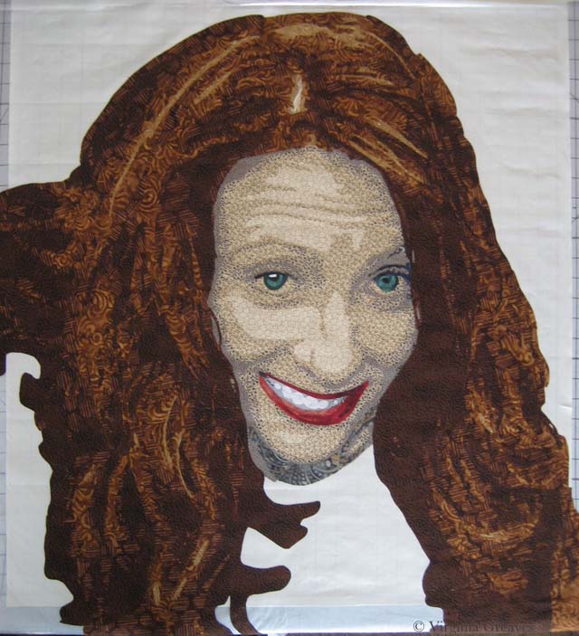
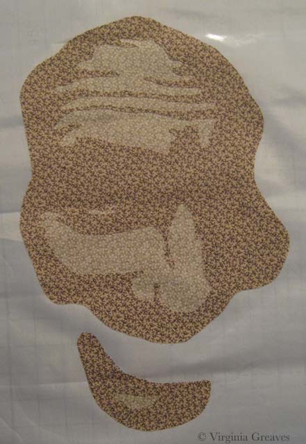
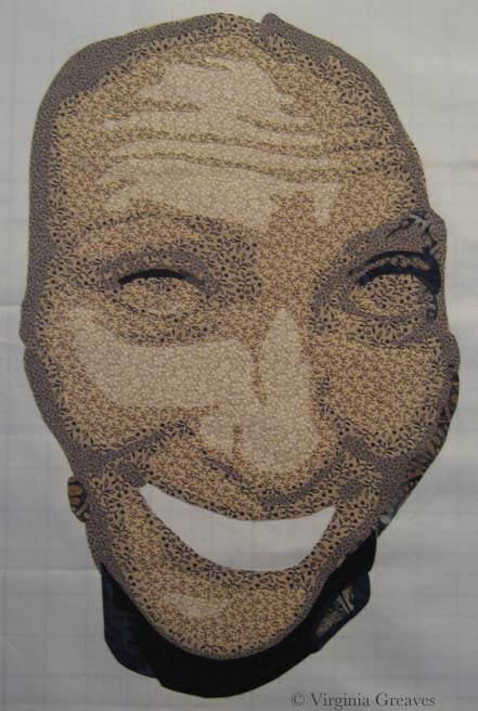
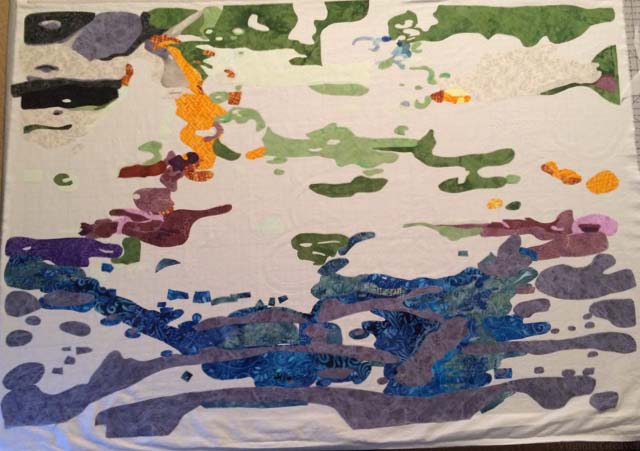
I started working on the blues at the bottom, then adding in the grays.

abstract4_2

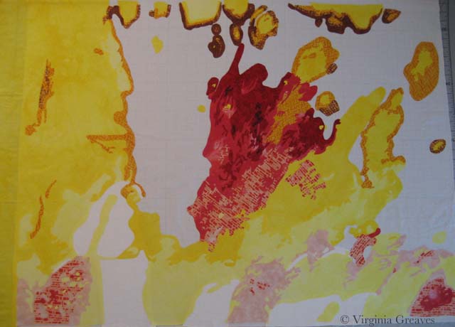
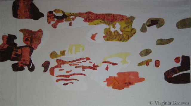
Then I started working on the top but was coming to the realization that the only way I could approach this monster was to finish whole sections as I came to them.

abstract4_3

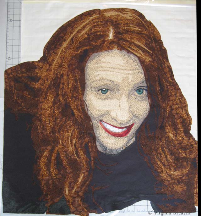
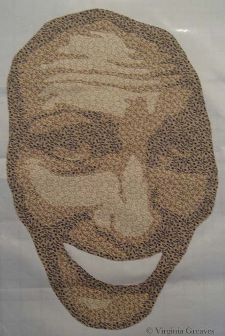
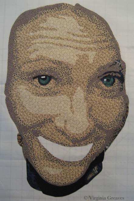
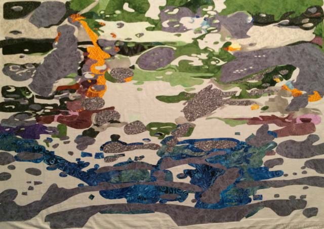
This is just insanity. I did realize that  I was almost out of that medium gray and I was going to need more. I was very pragmatic about it, though. I put all of the gray that I did have along the outer edges. Then I planned a search mission to the fabric store and luckily found something in the same color and value. It has a lot more texture, but I think that that’s fine.

abstract4_4

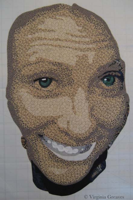
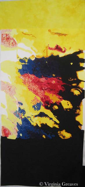
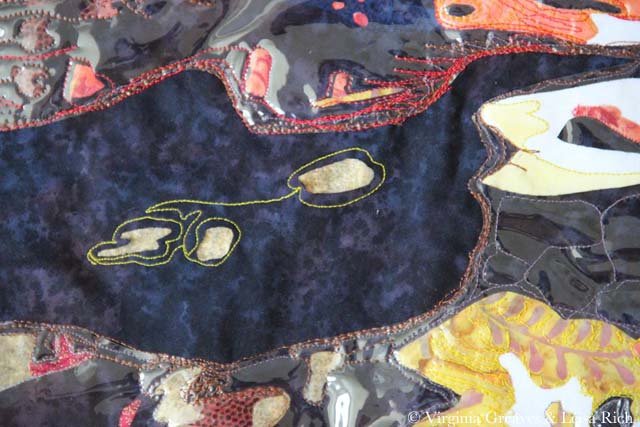
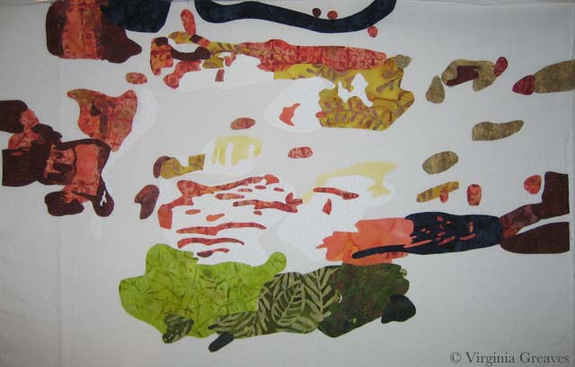
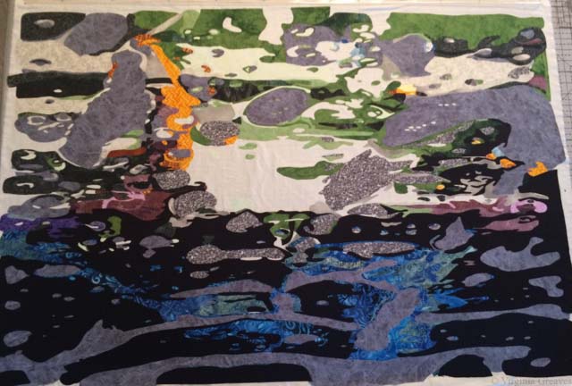
Here, I can see the light at the end of the tunnel. Literally, everything is done but the part in the very middle. At this point, I highlighted that section in the middle on my pattern so I’d know where I was. I kept getting lost.

abstract4_5

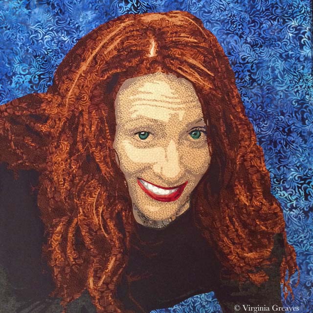
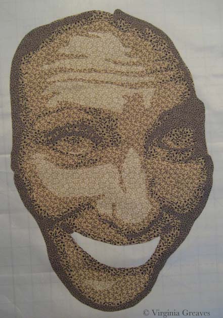
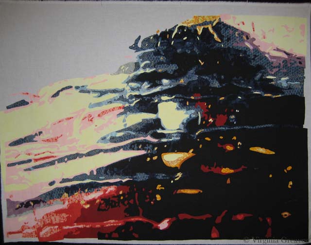
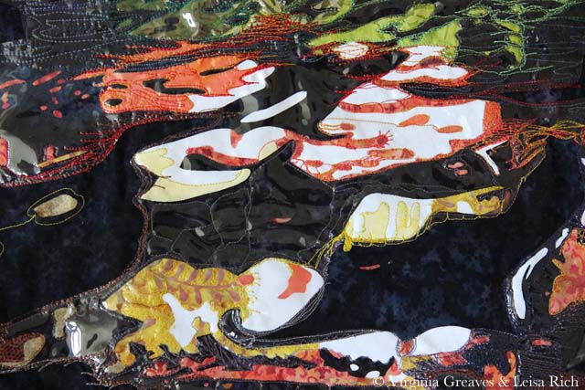
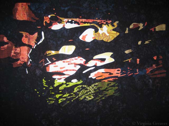
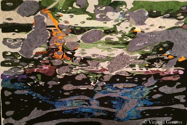
And here it is before I gave it to Leisa — a quick shot on my wall before I whisked it away. She is embroidering it. So many edges.

abstract4_6

On my new time keeping app, I can easily see how much time I’ve spent doing something. I spent 39 1/2 hours cutting this out. Holy cow.

So my next piece is going to be much simpler. It has to be. I have at least 4 more large pieces to do for the show and I want to have them completed by the end of May.

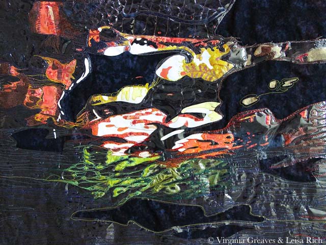
Since I handed this last abstract piece off to Leisa, I’ve been working on the abstract piece that will cover the largest wall in the gallery. It will be made up of a lot of smaller pieces that will be hung individually.  Leisa is making the tops of these pieces — and she gave me a bunch to work on. I pillowcase turned them — no easy feat — topstitched them, and am now adding some quilting. They’re meant to be very textural on the wall so they aren’t heavy with quilting. I’ll share some pics later.

I also wanted to share this picture of my daughter in the Dominican Republic. She went after Christmas on a mission trip with her school and her father.

camera


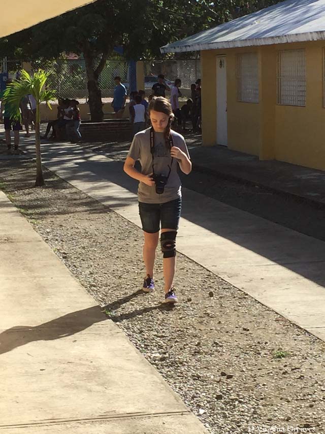
I let her take my camera — my DSLR Canon T3i. I was looking forward to seeing all of the pictures of the DR, but alas, the only pictures I will see are the ones they took with their cell phones. This is the last known sighting of my camera — it was stolen at the airport on her return trip home.

It made me very sad, but I have all ready replaced it. The camera body came last week — and I’m waiting on the lens. It should be here today or tomorrow. Instead of the 18-55mm kit lens, this time I opted for the “nifty fifty” — the prime 50mm lens. It has no image stabilization or zoom — but it’s “faster glass” with an f-stop of 1.8 compare to the f-stop of 3.5-5.6 on the kit lens. It’s a less expensive lens, but I’m told that it’s a far superior lens. Can’t wait for it to get here!


Having a Good Hair Day

0

Before I left for Houston, I had made some good progress on the hair in this portrait. I always find it hard to leave in the middle of a project, but I had finished most of the hair.

In this pic, here is only one small part of the first value in the part — in the top at the middle. Then the next value is golden.

hair value 1

Although I really wanted to go with brown purples, I just didn’t have them in my stash and I couldn’t find them in the store nearby, so I ended up going from golden into an orange brown — which is really more of a realistic choice for this model’s actual hair.

hair value 2

The next value shows the brown. (I somehow managed to lose one of the highlights in her right eye — didn’t notice it until her hair was done.)

hair value 3

And this shows the darkest browns.

hair value 4

Then I laid in all the blacks, which included her shirt, and the little bit of gray.

shirt

I spent of lot time trying to find a perfect background. I had bought several greens, but in the end, they fell flat. A purple seemed like a striking choice, but I didn’t have anything that worked well. I had a blue that I liked, but I’ve used it as a background before, so I went to the store with the mission of finding one similar. This batik has some deeper shadows that I like. It sets her hair off nicely. I took this pic with my iPhone which makes her hair look more red than it is.

I also replaced the highlight in the right eye and put more gray in her right arm. I had it all brown which was just wrong and caused by blurred lines between her hair and her shirt.

background

This week, I added the background and started the appliqué. Her face is done and I’m about halfway done with her hair. I hope to start quilting her soon. The days are clicking by quickly and my deadline approaches.


Building Character in a Face

3

I have been busy cutting away here recently. This is my favorite part — cutting and fusing. It’s meditative and yet the puzzle is still challenging.

I do have to say, however, that my decision to choose different colors has resulted in an even greater sense of realism than I have had before. Because of this, presenting the face in layers feels more odd than ever before. By the time the face is fully shown at the end of this post, without hair, it feels like looking at a naked face. It’s a little unsettling.

I also confess that, after taking several pictures of my model, I chose not to go with one that you would choose to go on your mantle. I think this is a more playful picture that shows her personality better. She’s actually looking up a little at the viewer.

This is the first layer. I’ve learned the hard way not to go any lighter than this.

face value 1

And this is the second value. I know that my model is screaming at me right now. I promised not to show any wrinkles. The truth is that because she is looking up into the camera, there are lines of personality here. They seem stark in this picture, but bear with me. In the end, especially once all of the hair is fused on, they will only add to her character and will not be seen as age lines.

face value 2

Here is the third value. It’s always important to remember that eyes are set INTO our faces so even if the picture doesn’t give us darker values around the eyes, it’s best to put it there for our rendering to give a sense of depth.

face value 3

Here is the fourth value. I was surprised that this stony gray worked so well in this gradation.

face value 4

This is the sixth value. There isn’t much of it here.

face value 5

This is the seventh value. It’s actually a deep navy blue.

face value 6

The eighth value is black which is mostly in the neck. I’ll revisit that in a minute.

face value 7

These are her lovely green eyes. You can begin to see her peeking out of the fabric.

face with eyes

And these are her teeth. They don’t make a lot of sense yet without her lips. These are the only pieces that I put on in reverse order — dark to light.

face with teeth

And here she is with her mouth. She looks a little stark without her hair — but I’m working on that now.

At this point, I step back and think about how this will work with what I have to do next. Her neck is too dark given that her shirt will be black, so I decide to pull the values back and re-do the neck.

face with mouth

Here they are re-done. You see a lot more of value six, which I prefer, but you still get the sense of the jawline and the recession of the neck.

face with redone neck

Hopefully I’ll finish her hair before I leave for Houston next week.

Breathing Soul

0

I have been considering my portrait for entry into the National Portrait Gallery (NPG) competition. It’s always a challenge, artistically, to reverse engineer something — but it also can create a better opportunity for success.

I’ve been studying the work from last year that reached the finals — and I know that whatever I do, my goal is not realism necessarily. There were certainly pieces in last year’s competition that were realistic — and some that were abstract but clearly representative of the human form. I think the greater question is — what can I do that sets my work apart? I can make a piece that looks like a painting from a distance of a couple of feet — but perhaps the better curatorial choice would be one that best represents the materials being used — which in my case is fabric.

So I spent a few days considering the painting of the man with the quilt pulled up to his chin — but in the end, I decided that that’s a poor place for me to start. I don’t make traditional quilts and I have no interest in calling to mind the traditional pieced quilts that grandmothers have created for years.

And then a friend of mine said something on Facebook that struck me. She said — not in regards to me but in general — she felt that representative work in contemporary art was soulless. Wow. And I went back and looked at the fabrics that I was considering for my next portrait (yes there are some value issues here I had not yet resolved) — and I realized that I was following the formula I knew for creating a realistic portrait — and that it was going to feel soulless and boring.

fabrics_face1

I have felt for a long time that the soul of a portrait is found in the eyes — or the hands — and that’s true — but it’s not enough — not nearly enough for the piece to stand out and grab the attention of the viewer.

And then I started thinking in terms of color. Color does not have to be as straight forward as I was making it. A strict gradation from beige into black was perfectly acceptable — but was it exciting?

I’ve been considering the work of Vincent van Gogh a lot recently — and his work is largely arresting because he used color theory so successfully. Forget what color the thing you’re representing really is — make it what it needs to be in the piece to make the piece successful.

So I started over. I started with beige again but then I went into blue, ending with a deep midnight blue. My fifth fabric, the blue and brown batik, is a step out — but it transitions the beige into the blue. The fourth fabric was difficult. I ended up finding this clay color in my brown bin. It’s a transitional neutral fabric and it’s the right value so it works.

fabrics_face2

I usually pick the first color family and then start cutting, but I knew that all of it is in relationship to each other — so I went on to pick the fabrics for the eyes. My model does have green eyes — and for this piece, I think that these two will stand out well.

fabrics_eye

My goal in the hair is to have purplish brown. This is my starting place. The middle one may be too red — but unfortunately, I can’t make it to the fabric store today. (Someone stole my credit card number yesterday and I am stuck waiting on a new one to be delivered.) I think my stash is not complete enough here and I plan to change a couple of these with new fabrics soon — but this gives you an idea of where I’m headed.

fabrics_hair

I have a beautiful mottled green I’ll probably use in the background.

My goal is to create an analogous color harmony — to use what I know about color to breathe soul into her — to make her come alive in cloth — for her spirit to become apparent in the image. Let’s hope that my bold choices in fabric will help me achieve that goal.

As to whether it will be enough to be juried into the NPG — who knows? But hopefully it will help move me further along in my artistic journey.

Leisa’s Turn with Abstract #3

0

Leisa and I are having a such an exciting time with this series. It is so much fun to see what the other is going to do with the work. This is the 3rd one that we’ve done and we’re already planning #4 and #5.

I was wrong — this is not the one Leisa plans to cut into strips. In fact, she cut off all the extra yellow and black that I had added at the top and bottom and returned it to its horizontal orientation. I just chuckled. I liked it better that way too but it was her prerogative.

She free motion embroidered it like crazy, added black lace, painted it, added vinyl, and painted some of the vinyl (on the inward facing side) with nail polish. It gives it the coolest effect. (I’ll have to be careful about quilting those sections lightly though. I’m a little worried if you can needle through nail polish.)

Leisa's in process #3

And this is a detail shot — you can see the wandering embroidery lines a little bit better here.Leisa's in process #3 detail


It’s interesting to see the unintended forms that come out of this process. I love where this one is going. I’m going to quilt it and then let Leisa have another crack at it — she is thinking about adding handwork after the quilting.

I have finished the binding on #2 — and I’m almost done with adding the sleeve. I do think I’ll have to add another one though. It’s not straight across at the top so figuring out how to sleeve this one has been a challenge. I added a short sleeve at the very top where it is straight — I think I’ll have to add another one lower down on the other side. I couldn’t work it into the binding edge thought because it isn’t straight.

And then I need to bind and sleeve #1, the first small one that we did. I’m having to use different techniques on these. For instance, I couldn’t pin baste #1 because of the vinyl — I had to spray baste. I’ll have to do the same with #3. #1 also has a lot of vinyl on it around the edges — so it occurs to me that can’t use my usual water soluble glue trick to help me bind the edges (which thankfully are at least straight on this one).

And because of this issue, I realized that I probably shouldn’t use my usual blocking technique on these — particularly the ones with vinyl. If I soak them in water, the vinyl may inhibit evaporation and could lead to molding — a distinct possibility as I live in the Deep South — so I’m going to forego that as well. I haven’t had a waviness problem on any of them — yet — but if it becomes an issue, I’ll block them with spritzes of water — not a full soaking.

I need to make myself stop. It’s September and I would like to have a piece to enter in the Outwin Boochever Portrait Competition sponsored by the National Portrait Gallery. I need to start photographing inspiration for that one. I entered a few years ago and wasn’t juried in so I just assumed that it was a bias against alternative mediums. Completely untrue. Be careful not to create obstacles for yourself that don’t exist. Last year, the People’s Choice award winner was a sculpture made from rice, rice noodles, and glue by Saeri Kiritani — and there was a fiber finalist — Lia Cook. I can’t be accepted if I don’t enter. You can see last year’s winners here.

Third in Abstract Series

0

I met with Leisa over a week ago. As I last mentioned, I had finished quilting our 2nd collaborative piece and I offered it back to her for additional changes. We decided that it was done and that I would bind it — which I started yesterday. Last week, I spent a glorious week of cutting and fusing our 3rd abstract piece. Leisa was out of town and I wanted to have something to give her when she returned this week.

She asked in that meeting if we could extend out the edges on this piece. It was already drafted but after talking about it, we decided to rotate it and extend the two sides — which would become the top and bottom.

I started with the whites and yellows. In retrospect, this piece has a lot of yellow and I wish I had toned it down. This is its original orientation. It’s on my drafting table that’s covered with an ironing mat. I have to stand on a ladder and hold the camera above the piece to attempt a picture. Moving it to the design wall doesn’t work well for my process.

in process yellow

Then I added the reds.

in process red

And then the blues. I rather like it at this point.

in process blue

Then I added the black and changed the orientation. I’d be lying if I didn’t say I was completely flummoxed. There are several things that changed in the piece when I changed in the orientation — some of the shapes began to take on new and unintended meanings.

My first reaction was to take off the black and replace it with something else — but Leisa wants it just like this. I hope she paints it. I know she intends to cut strips in the bottom — maybe also the top. It’s just very striking color wise. Maybe that isn’t such a bad thing. It still has a lot of transformation until it becomes its final self.

in process black

ad;lkfja;skdjf

Collaboration

0

Yesterday I met with Leisa. She still has plans for the small piece we did first so I didn’t get it back — but I took her the larger abstract piece that is second in the series — now that it’s quilted — and she liked it! I thought she would want to embellish it but she made an excellent point about restraint and knowing when to stop. We are both happy with it as it is — so I will add a binding and sleeve and consider it done.

quilted abstract #2

I’m strangely drawn to the thought of an almost completely machine stitched binding. I’ve only done this one other time but it seems apropos to the piece — and has the plus of eliminating a large part of the hand sewing.

I have finished drafting a third piece — I picked out fabrics today — and Leisa and I talked about a fourth piece which will be a whole cloth that we will cut into strips and otherwise playfully manipulate. I have learned so much in this collaboration.

I really didn’t know how to work in groups until graduate school — and I was really forced to do it there. We each gave our best to create the best collective effort. Now it’s easy — with the right people that know how to do it too. People with control issues don’t work well in collaborations. It has to be a give and take. You don’t always get your way but you learn from the other person and respect their opinion. You don’t worry about getting your way — you work on finding a solution that works for both of you. It’s a beautiful theory — it’s a shame that governments don’t work this way.

IP3 Carwash #2 Final

Making Friends with Abstract

1

For the last couple of weeks, I’ve been busy working on another piece inspired by a pic taken by Leisa Rich. I know — I haven’t finished the last one — but I wanted something to work on when I handed the other piece off to her. I don’t like to have more than one project open at a time — but in working collaboratively, it just happened.

This one is much bigger — it’s about 42″ wide by 36″ high.

I didn’t take a ton of in process pics. It just doesn’t make as much sense as it does when working in pictorial. I tried to take pics for each color group, but I ran into a problem with that. This piece was pinned on my drafting table with the ironing pad. I pinned it there so it wouldn’t shift around. I couldn’t construct this piece in sections — the entire piece had to fit together like a puzzle. However, it’s so large, if I stood on a chair and took a picture of the top, I couldn’t get the entire piece in the frame and everything would be skewed. Therefore, I took a lot of pics, many of which were terrible — and I got to be friends with the Delete All option on my camera. Unfortunately, in doing that, I inadvertently deleted an all yellow and all red pic that I had taken and planned to use. C’est la vie.

That yellow with the pink is really horrid. I think that this was the worst stage — with all the hot colors and none of the cool colors (there was a little bit of purple and green but not enough to balance the hot).

IP1 Carwash #2 Hot

Then I started adding the blues. It made a world of difference. Adding the cold colors gave life to the hot colors. I also needed the intensity of a deeper value. That comes in the dark blue — and then ultimately in the black.

I took this picture while it was tilted on the table. For the previous picture, I had unpinned it from the table and set it vertically on the design wall for a good pic. Unfortunately, it shifted everything around in my puzzle — so I wasn’t going to do that again until the end.IP2 Carwash #2 Cold

And here is the final pic of the top — vertical on the design wall — with all of that deep black.

I am very fond of this piece. I am using the skills that I learned in making pictorials but applying them to abstract design. IP3 Carwash #2 Final

Collaboration 1 -- full

Struggling with Abstract

0

This week I met Leisa Rich at Abernathy Arts Center. We picked up our work from the Georgia Artists show that closed last week and spent about an hour talking about our abstract piece. She has added a bunch of stitching and it looks amazing.

Collaboration 1 -- full

I love the vinyl on the piece — it makes it look a lot like water. She took these pictures. I admit to having a problem photographing it. The vinyl is very reflective and cannot take direct light. But I was so pleased at the different life that it has now taken on.

These are detail pics.

Collaboration 1 -- detail1

Collaboration 1 -- detail2

Collaboration 1 -- detail3


I can’t get over how much its character has changed. I love it so much more than what I would have done with it.

She handed the piece back to me and we talked about what to do next with it. We’re considering making a larger but more realistic piece that this would fit into — but I’m having a problem working out value problems. There is so much huge contrast in this section that it’s difficult to resolve the focal point issue with the entire piece. Obviously the focal point should be the abstract. I’m still working out in my head how to accomplish that in light of this other idea.

And while I was waiting on Leisa to do her part last weekend, I started another abstract piece — a much larger one — and to be honest, I’m struggling. I can’t rely on my usual practice of logic to determine where colors go. I usually have no problems turning my value studies into colors — but that system doesn’t work very well here. It was an issue with the small piece, but I was able to work around it. It’s harder to do in a piece 45″ wide.

I’m telling myself that there are no wrong answers. It can be whatever I want it to be.

Right now I’m marking all of the sections on my pattern with colors. I’ll hopefully finish that later today so I can move on to picking fabrics. Maybe I’ll even come up with an excuse to take a trip to Red Hen!

And let’s face it — it’s summer. There are numerous distractions to take me from something that isn’t holding my attention very well. Even in art we have to slog through difficult tasks sometimes.

One last thing — Leisa has asked if she can be a guest writer on this blog to which I happily agreed. Given that our work is a collaboration, I definitely think that her point of view should be shown as well. I’m looking forward to having her contribution.

5th black

Outside My Comfort Zone

2

When I went to the opening reception of Georgia Artists last month, I was so glad to see Lauren Bernazza there. She is the former Curator and Program Director of the Abernathy Arts Center (she’s retired to raise twins — been there, done that).

We did get the chance to talk about the work I had in the show, and at one point, she challenged me to make an abstract piece. I was standing with her and Leisa Rich, a friend of mine that had work hanging next to mine — and I slowly smiled. I challenged myself to make an abstract piece last year — and as whole, I didn’t consider it very successful — which I patiently explained — but neither of them would hear it! Finally Leisa took pity on me and told me that we could collaborate on a piece. I’ve never done that before and I was so excited at the thought of working with such a talented artist as Leisa, I quickly agreed.

The collaboration rules are that I start and then pass the piece to her. We pass it back and forth a few times. The goal is to end up with something different and hopefully better than either of us could create individually.

I purposefully made this small — it’s about 23″ x 17″.

For inspiration, I started with a pic Leisa had taken from inside her car during a car wash. I loved the luminescence of it.

Car Wash pic

photo courtesy of Leisa Rich

When I printed out the pic, I ran out of black ink halfway through — so I had to go to the store for more. Then I printed it out again — and ran out of colored ink. Such is my lot in life. I sighed and decided to take it as a sign that I could make it whatever I wanted — so I did. I’m supposed to not be so literal with this piece anyway — and I often change colors in my pieces.

I started with a white piece of muslin as my canvas. Then I added white. I know — but it’s a brighter white than the muslin — so I went to the trouble.

1st white

Then I added three values of yellow. I know — just blobs of color.

2nd yellow

Then I added orange — I think there are five values.

3rd orange

And then I added four values of green at the bottom — and I decided at this point to add some dark blue. It looks black here against the white — but it’s a subtle change from the black that will be placed in the background. (There is also just a little red in the upper right area.)

This is it except for the background. It doesn’t make much sense on the white.

4th blue & green

However, once I added the black batik as the background, the entire piece comes together and makes sense. It took hours to cut out all those spaces in the background but worth it in the end.

5th blackI’m pleased with it. I’ll take it to Leisa today or tomorrow and let her have her way with it.


Go to Top