Design

Design

Life Is Like A Song

1

Etta James died today. I’m listening to her song At Last — I don’t think anyone else can ever do this song the justice that she does. Here’s to everyone feeling as happy as Etta obviously was when she sang this song.

For the past two weeks, I have been quilting away on my latest piece. If there is one thing that I’m probably not very good at — it’s quilting. I don’t have a stitch regulator (but I don’t want one).

My greatest fear comes when faced with quilting one of my pieces. It’s the hardest mental block for me.

After quilting the faces and figures, the background is always difficult for me to figure out — especially an abstract like this one. I wanted to use something that would be provocative of how the water pools in the sand at the edge of the ocean.

My favorite place to go for inspiration has become Leah Day’s site The Free Motion Quilting Project. She has spent over a year coming up with a new and fresh quilting idea every day. Literally. She takes a small square and brings it to life with her stitching. She doesn’t have a large quilting machine — she doesn’t have a stitch regulator (at least I don’t think so) — but she has a home machine, a camera, and desire. Watching her stitch reminds me that quilting is about confidence. Yesterday, I didn’t have enough and I broke my thread countless times. Today, I was on a mission to finish and I quilted an incredible amount in a small amount of time — and I broke the thread only twice.

I started with Leah’s pattern called Mud Flats. I liked it on the drawing . . .

. . . so I started quilting in the lower left hand corner.

About the time I reached the top, I realized that this would have to loop around most of the piece. For it to look right, I would have to continue the pattern over the head of the figure on the left — over to the right hand side — and then down over the figure on the right.

Luckily this pattern is forgiving with fullness.

The rule in quilting is that you quilt from the outside in. No matter how much you smooth out the top when you pin it though, if you quilt something densely, it will stretch the cotton fabric enough to create a ripple. Sometimes you can quilt through it — and sometimes it’s best not to try.

I will confess to something. When I’m quilting a large complex piece and I’m done quilting the figures, I move the pins on the background, smoothing the fullness out to the edges. I know you’re not supposed to move the pins once they’re in — but I’ve found that I can save myself some headache in quilting if I will move the pins one at a time and smooth out some of the ripples that tight quilting have created.

This quilt was a challenge because I couldn’t quilt from the inside out. I quilted the heads/hair independently — and then I quilted the left arm of the left figure, the left figure’s dress, the interlocked arms in the middle, then the right figure’s dress and her right arm. I still ended up with fullness between the figures that I had to contend with when I started quilting the background. The space just under the holding hands was the hardest. Because of the position of the figures, most of the fullness could not be pushed out. Short of quilting it first, I’m not certain what I could have done differently to have avoided the fullness in this area.


Muscular Industry

1

With the children back in school, I spent all of last week finishing the appliqué on the 2nd figure and preparing the quilt sandwich.

After that, I always stumble. The blank canvas is daunting, and quilting is difficult to undo.

One of the criticisms of Just Call Me Jack that I received from a judge’s sheet from IQA Festival was that they found the quilted circles in his face distracting.

Knowing how to quilt the face is a hard thing. There are no rule books and many people try to avoid adding quilting lines to the face because they think it makes the face look wrinkly. However, an unquilted face sags over time, especially if the piece is closely quilted around the face.

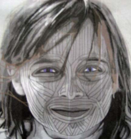
I’ve had several people ask if I follow the muscles. The answer is yes and no. Our faces are not just muscles – we have more character than that. I use curves, swirls, and combination lines to fill in intersections. So I take instruction from the muscles but I’m also trying to give the impression of depth in the face.

But I wanted to see if quilting the lines strictly according to the muscles was a better option. I’m open to change. I need to grow in my work, so I took out my pencil and made a sketch on a picture of the appliqué so I could assess that as an option without having to commit it in thread.

To be honest, I’m not thrilled with it. This is more what I would do.

. . . And I like it better. The first is too choppy for me. I think faces need to have more flow. And I like the swirls. They give an impression of where light hits the outermost parts of the face — the cheeks, the chin, the nose, and sometimes the forehead.

For now, I like my style. Both of them seem reminiscent of face painting in ancient cultures, but the effect in thread will be more subtle. To me, quilting can give the illusion of things — take over where the appliqué stops. I’m working more with suggestion than is obvious upon first glance. The appliqué doesn’t always give you the needed visual clues — sometimes the quilting lines take over and finish the job.

Holiday Exchange

1

My Fiber Art Fusion group met last night for our annual Holiday meal. Imagine 13 artists crammed together in a dark corner of a popular restaurant giggling and laughing and eating. It’s so wonderful to be part of a group of people with such innovative interests. I got to catch up with Sharon Ahmed who I haven’t seen in ages — she has become a master Japanese embroiderer and has been asked to teach at the Japanese Embroidery Center here in Atlanta — only the fourth American to be given the privilege.

One of the benefits of going is an exchange. We are required to make a 5″x7″ piece and wrap it in a plain wrapper. We went around the table and everyone got to choose. We did it by the letters of our first name so I was last but everyone went home with a cool piece.

This is the fourth year I’ve been so I have a nice collection I thought I would share.

This year, I received this piece from Pamela Rishfeld. It is photo transfer with machine embroidery.

Last year I received this one from Vickie Lord. All that hand stitching really makes it shine.

My second year I received this batik wax piece from Diane Shulteiss.

And my very first year, I received this piece from Suzanne Freed. It makes me really miss the beach and the ocean.

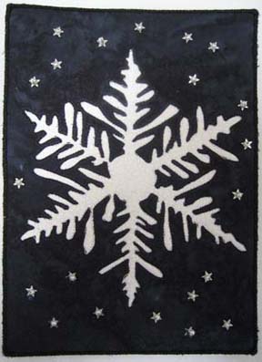
And what did I do this year? In the past, I’ve done miniature portraits, but this year I decided to do something different and I made a snowflake.

I used a dark blue and white because I was thinking of indigo dyeing at the time. It is reverse machine applique and the smaller snowflakes are silver star sequins with pearl beads (it looked too blank without some extra embellishing — and small pieces are great opportunities to add beads).

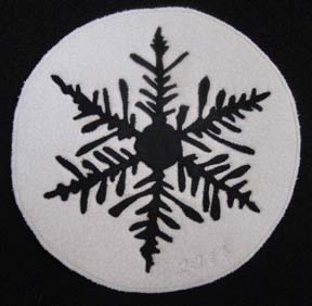
I very carefully cut it out so I could have the reverse image of the blue snowflake to fuse on a white background.

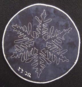
And this is the back.

I’m thinking that I’ll add an O ring to the top & use it as a large ornament.

I wanted to use the dark blue on the back of the piece and quilt it with white thread so it would give an interesting back — but I didn’t realize until I finished it that it was now too dark for me to write on it — and I didn’t want to ruin the effect with a label — so I just embroidered 2011 on the front in white thread.

It’s What’s In the Background

0

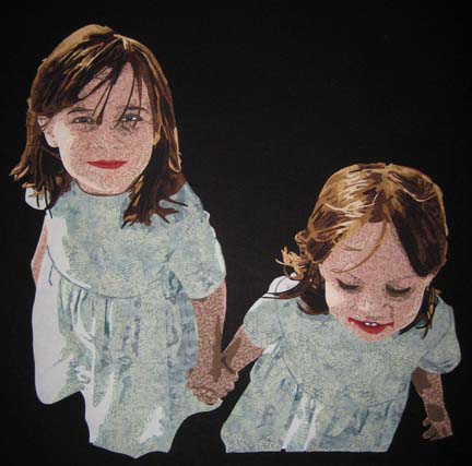
As good as my figures look on my design wall, it isn’t their final home.

First I have to make them dresses. In the photograph, they are wearing red toile dresses — so I attempt to use a pink — which doesn’t work well with the red in their faces. In fact, she washes out entirely. I abandoned this fairly quickly.

I ended up using a seafoam green that evokes the color of the sea. This is what they look like pinned on my black design wall. Black makes everything look good. But I can’t always have a black background — these are children at the beach — not hanging in space.

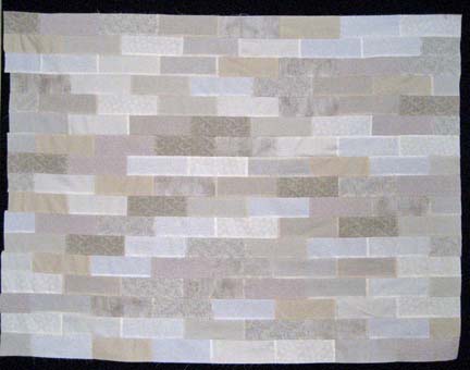
The background . . . what to do for the background. At first, I buy a patterned fabric that I think will work well as a stand-in for sand — but it just looks so plain. Also, for the size of the figures, the pattern isn’t nearly large enough.

So I spent Thanksgiving break thinking about what would be best — and I opted for something abstract — and pieced — which is not like me at all — but it seemed like the best idea for this piece. I pulled about 12 fabrics in shades of white, gray, and khaki, cut them into 2 1/2 x 6 1/2 strips (finished 2×6 — which is a golden ratio) — and pieced them into strips from which I create the background.

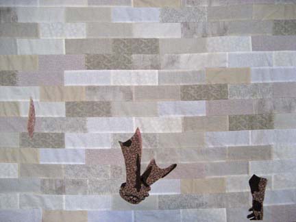
And this is where the beauty of my new fusing system begins to come together. I can make the background completely separate — and then fuse the pieces in small groups.

The tricky thing about fusible is that if it is on a printed fabric, the fusible doesn’t bond well with the fabric. As you twist your project under the needle while appliqueing, the pieces will start to separate from the background, and it becomes a race to finish before you lose too many pieces. With my new system, I can create a larger and more complex piece without having to worry about too much moving around or coming off.

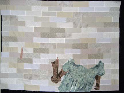
I started by just adding the arms. I fused them down and then appliqued them.

Then I fused down a dress — and appliqued that down as well.

The second dress is done after the first.

Headless children! No really — I have their heads done — they just aren’t sewn onto the piece yet. I am almost finished adding the head on the first piece. The second will not be finished until after Christmas.

The Madness Continues

0

The hair — I went a little overboard with the hair on both of these figures. I need to remember that I still have to sew it when I’m finished cutting it out. I’m appliqueing the first one now — but I still need to show the development of the hair on the 2nd figure.

There are seven values in her hair — going all the way from the lightest blond to a very black shadow. This shows the very light yellow.

The next shade is more honeyed.

The third value is golden.

The fourth is a great fabric between gold and brown.

The fifth value is the foundational brown.

The sixth is a darker brown.

And the final value is the black.

When I first started doing hair, I would not have thought I could go so far in my color range — from lightest yellow into black — but actually I think it gives a remarkable depth.

Keep in mind that this piece is all fused to a fusing sheet. I can now peel her off and move her head around at will. And I do. I put both heads on my black design wall and it gives a neat effect.


The Holiday Avalanche

0

It’s only the first week of December and the avalanche of holiday commitments is rolling heavy around here. Potlucks, cookie swaps, cakes, choir, clinics, exams, cooking, driving, cleaning, hosting — it’s enough to drive anyone from the studio.

But I have been working diligently lately. I was surprised to see that I haven’t written in over a month — but I have a lot of pictures to share. I’ve been working hard in the studio — although my time for the rest of the year is limited. It is always hard to have a work in process you have to stop and restart later — I always feel as if I lose momentum — certainly a lot of the enthusiasm for the piece.

In my current piece, there are two figures — something I haven’t done since my first portrait of my beloved dalmatians in Dalmatian Downs. I have shown you the first face — the second is more complex.

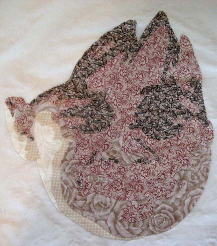
These are the first few values which give the outline of the jaw.

The next is a bold red print. It doesn’t look right here — but I knew it wouldn’t until I added in the darker values. Besides, the figures are at the beach and have a little bit of sunburn on their faces — so the red is appropriate.

Here you can see the red working better. Many things don’t make sense without the shadows. Unfortunately, you can tell I was eager to work on this piece as there is a deep shadow on them. I don’t usually work late in the studio and don’t have good light once the sun sinks low on the horizon — but I was anxious to see her personality come out.

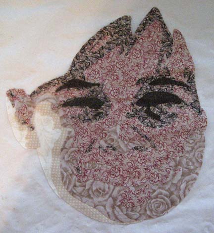
This is the 2nd shadow.

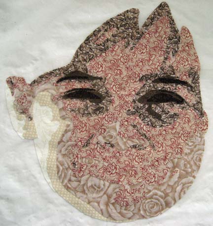
And this is the final shadow. At this point, she really needs eyes.

And wow don’t these pop right out — they do to me. It’s a little startling without her mouth — so I add that next.

There she is.

Creating Magic

1

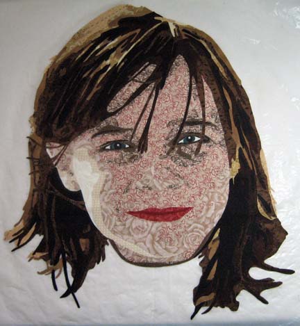
I always love creating a face from fabric. I use a lot of prints and always find it fun to see what works and what doesn’t.

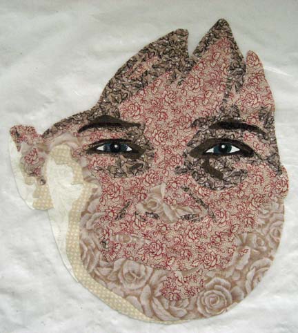
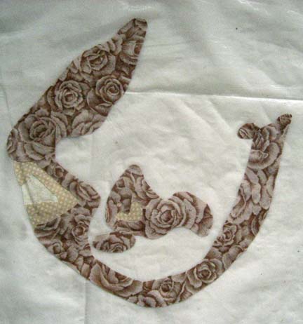
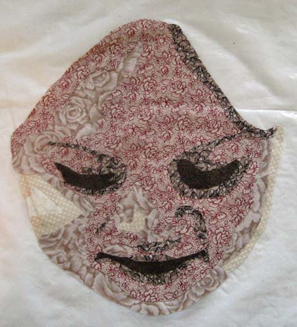
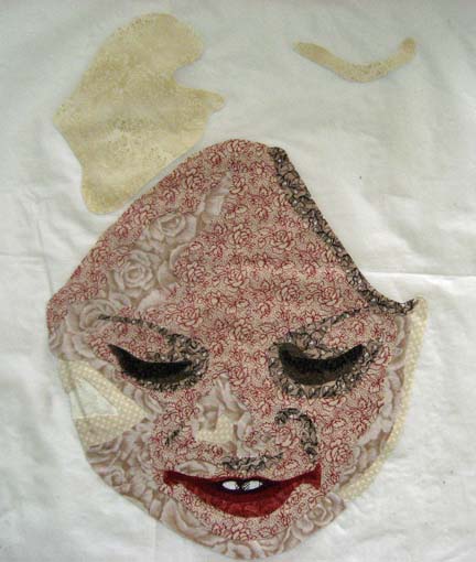
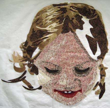
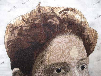
This shows the first figure in my current piece with the first three layers. There is very little of the lightest layer. I love this beige rose fabric. My DH bought it for me years ago, and it was the inspiration for my first portrait with prints.

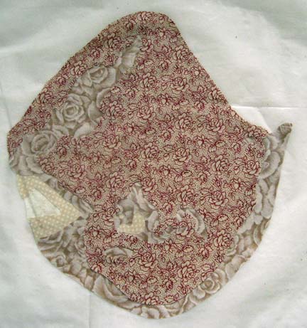
The next layer is bold — a red print. Even I’m a little dismayed at what it gives me at this point — but I know that I have to have the darker fabrics for it to make sense — and I decided to use the beige and red print because the figures are at the beach and have sunburns.

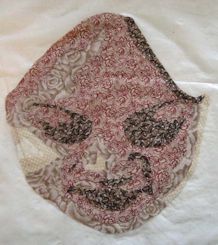
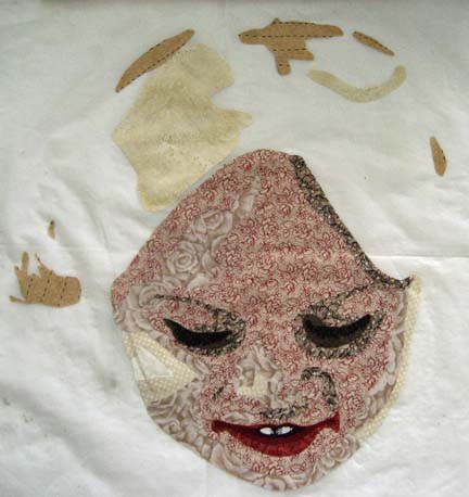
This shows the next darker value and outlines her eyes, her mouth, a little of her nose.

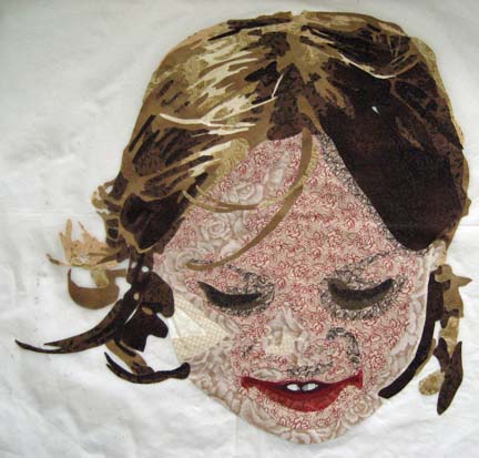
The next darker value emphasizes these — but it’s clear that it isn’t going to work for the mouth. She is looking down and has her face in shadow, but her lips this dark make her look dead — and she is a very young girl with a blush to her lips.

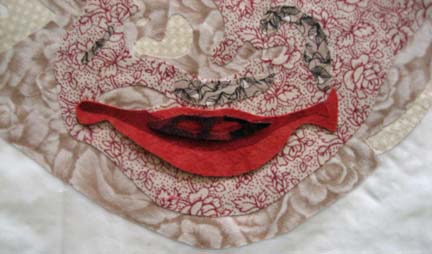
My first try is unsuccessful. I use the red and beige print as my starting point and build onto that with reds — but the cherry red is too much.

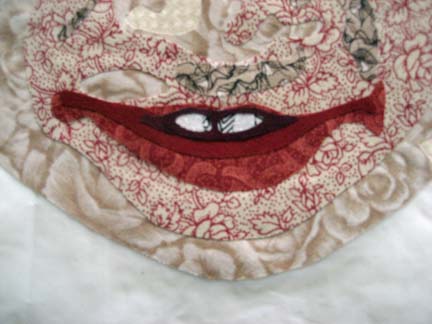
The more rust red looks better for her mouth. I have also added her two front teeth.

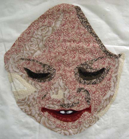
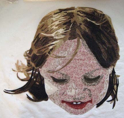
And then this shows the final face with the final dark shadows for the eyelashes and the red mouth. Because she is looking down, we don’t get to see her eyes — but her personality comes through her mouth.

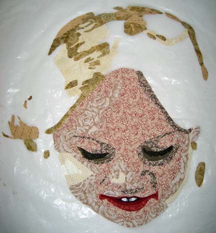
The hair is difficult. Sometimes when I am drawing, I forget that I have to go back and actually cut all of this out. It took me several days to do her hair, but I think the end result is worth it.

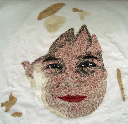
She has brown hair with blond highlights so the first layer is a very light cream.

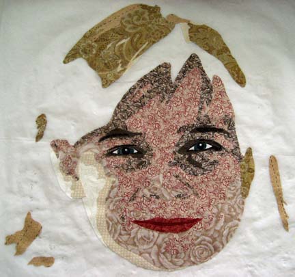
The next layer is more golden.

And the third layer is even more golden.

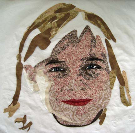
With the fourth layer, I found a wonderful fabric that sits between gold and brown.

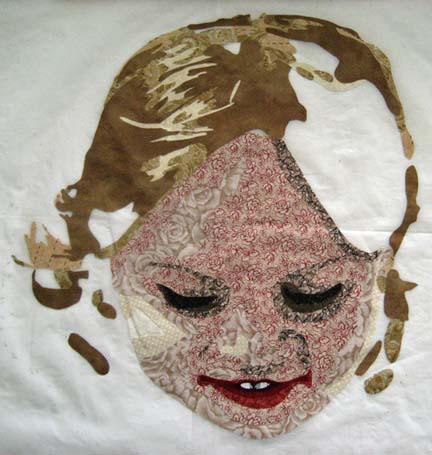
After that, the first brown layer goes down and you can really see her hair taking shape.

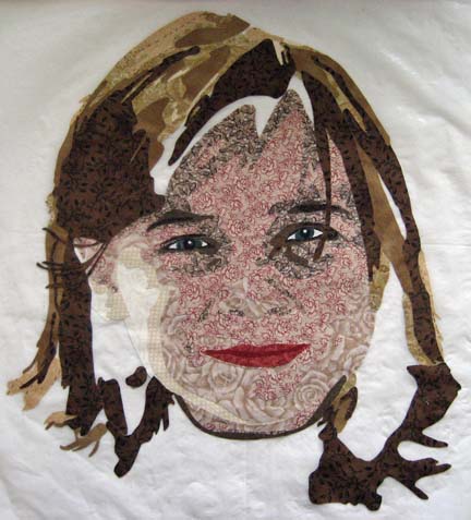
The next brown makes up more of the dark underneath part of the hair.

A few black accents and she is finally done.

This is the first time that I’ve assembled a piece on a teflon sheet. I usually put the entire piece on white muslin but my pieces are getting too complex and large for that format so I’m trying the teflon with parts at a time. Working on the hair and all of those small pieces, I did start to worry that it would all fall apart when I tried to peel it off.

But it didn’t. It came off beautifully.

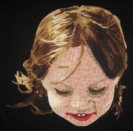
And this is what she looks like on my black design wall.

For me, this is the magic — taking something innocuous like printed fabric and making it into something realistic.

I’m not certain that I’ll leave her mouth like that. The two corners are a little large — but the overall picture was taken from above — so I think I’ll wait until more of it is complete to decide if I’ll change it or not.


Drafting Part II

1

In case it wasn’t obvious in my previous post, we have been working on drafting a pattern.

At this point, we can print out the pattern. For a long time, I would take an 8 1/2 x 11 sheet to a blueprint shop and ask them to enlarge it for me. If I remember correctly, most of the large format printers go up to 36 inches. The problem I had was inconsistency — if the employee wasn’t skilled, he would give me something smaller.

I finally found that I enjoyed having control over the final size. You can make anything large in Photoshop — but after many years of complaints, it still won’t tile print. For that function, you must use a vector program like Illustrator or CorelDraw.

A couple of years ago when I made the change, I went with CorelDraw. I took a class and was able to purchase it at a student rate. And CorelDraw is a very good product. Unfortunately, it isn’t Mac compatible — so I keep a PC in my studio just for CorelDraw — which, if I haven’t mentioned, is a pain.

When I first bought CorelDraw, I learned about all of the many things it could do — and for a while, I would import my BMP from Photoshop, and using my Graphire pad and pen, I would draw the outline of all of the shapes — and add in the numbers for values. Over time, I found that it is really easiest for me to import the file, print it out, and draw on it with a Sharpie. It gives me my pattern and my reverse pattern all at once.

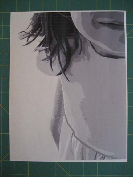
In this picture — just one slice of the overall piece — there are overlap places on all four sides — the white area. You can choose which two sides to take off — just be consistent. I take off the right and bottom sides.
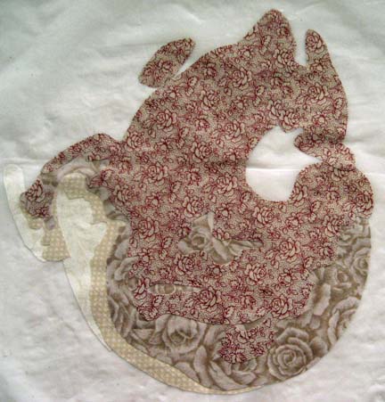
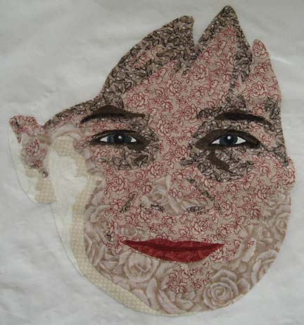
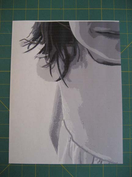
This is what it looks like after it is cropped.

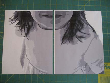
After I have cropped the first page, it will fit neatly over the next page, hiding the white spaces on the top and left sides (in this picture, just the left side). I find the closest join that I can, and then I attach them with clear tape, being careful not to tape on a form that I’ll need to outline with Sharpie.

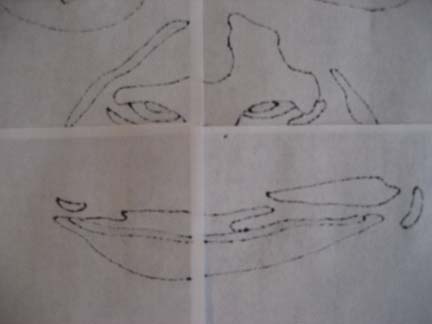
This is what it starts to look like after I have outlined shapes with a black ultra-thin Sharpie.

And this is the backside. It is a perfect mirror image of the front because the Sharpie bleeds through — and the only thing I need to correct are the overlaps — using the Sharpie to fill in the edges of the shapes that are lost in the overlap. This doesn’t take long and is much faster than assembling another set of mirror printouts.

I also need to mark the values by number. If the shapes are close to another color family, sometimes I will add another code to keep the items separate in the pattern.

Also, unfortunately, I need a third copy of the pattern: the front side copied onto thin vinyl. This is found in general fabric stores in the same place as tablecloth covers sold by the yard.

From this point, I can start looking at fabric and choosing my color palette.

Quilting the Third Dimension

0

Most people presume that quilts are two dimensional objects. It is flat like a painting. But in actuality, the quilting that we add to a piece can add another layer of realism to surprise the people that view the piece from an arms length distance.

I’m always surprised by how much a piece changes from the end of the applique stage to the end of the quilting stage.

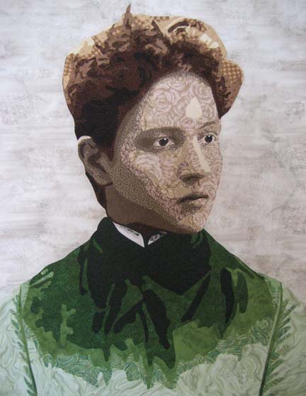
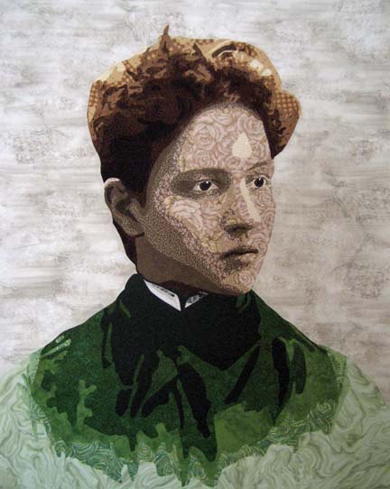
This is a picture of Arminta after applique but before quilting.

And for those of you curious about the back (and for some reason a lot of quilters are), this is what the back looks like before the excess stabilizer is removed. It’s interesting on its own — in a different way from the realistic perspective.

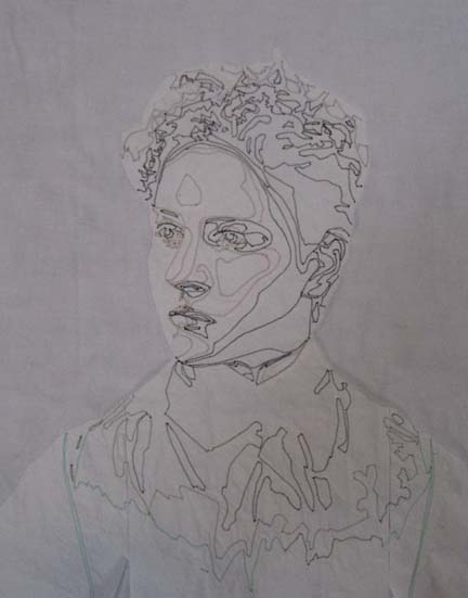
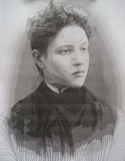
I used to get a creative block whenever it came time to quilt a piece, but I’ve found over the years that if I take my drafted pattern and draw on it with a pencil, I can create a quilting plan for how to approach this piece. The best part about it is that if I don’t like what is happening, I can erase it — which is much easier than un-sewing on the actual piece.

This is her face once it is quilted. I quilt about 1/4″ apart so I have to quilt from the middle out. Because the quilting is so close together, I can easily have the piece stretch as I quilt — and sometimes I have to move pins out as I go to accommodate the wave of fabric I’m pushing over — hopefully to the edge. I had this issue when I made Amelia Earhart.

So I tend to start with the face as it’s the focus in most portraits & the central design element. I start with the nose as it’s the center of the face. Its line affects the eyes, the forehead, the cheeks. I usually do the forehead second, but on this piece, I knew from my plan that the lines from the nose would extend & end at the cheek lines — so I made those second.

I usually have a few independent lines from which the rest branch out. Why do I quilt the face the way that I do? I’m trying to give an impression of the bones and muscles under the face — and this is how I see that coming out for this person.

After the face I do the shirt. Notice that I used all one color thread to quilt the face and all one color thread to quilt the shirt. I used to worry a lot about thread — but then I made I Am the Vine, You Are the Branches. When I made the tree, I used the opposite thread on the color wheel from the fabric — and I found it astonishing how almost completely unnoticeable this fact is in the final piece. It isn’t unless you get within inches of the piece that it is noticeable at all.

So now I choose a midrange color from the color family I’m in. A taupe for the face (although I will use a dark brown around the irises) and a medium green for the coat.

Her last part is her hair. I purposefully left a couple of the guidelines for you to see. I draw 3 or 4 of them and the remaining ones are based on those structures.

Of course, at this point, I have to start thinking about the background. I always spend some time puzzling over this part. I spend some time at Leah Day’s website or leaf through the book on backgrounds I have by Dijanne Cevaal — and in the end, I spend a little time sketching in my sketch book. Pencil is so much easier to erase than thread.

Continuing On

1

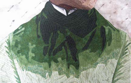
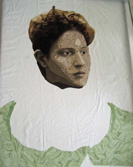
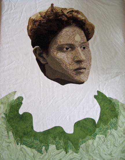
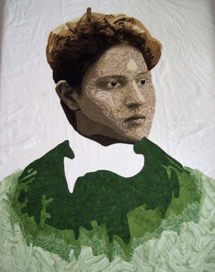
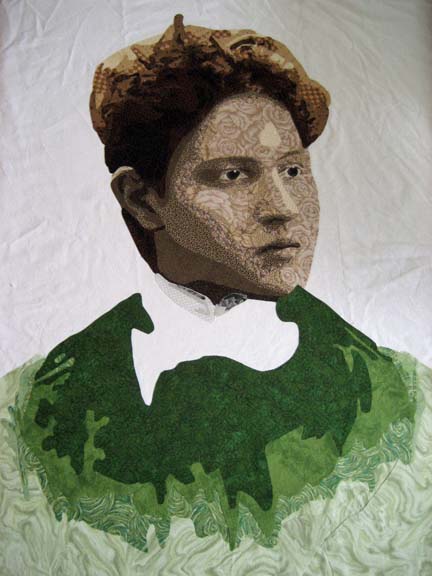
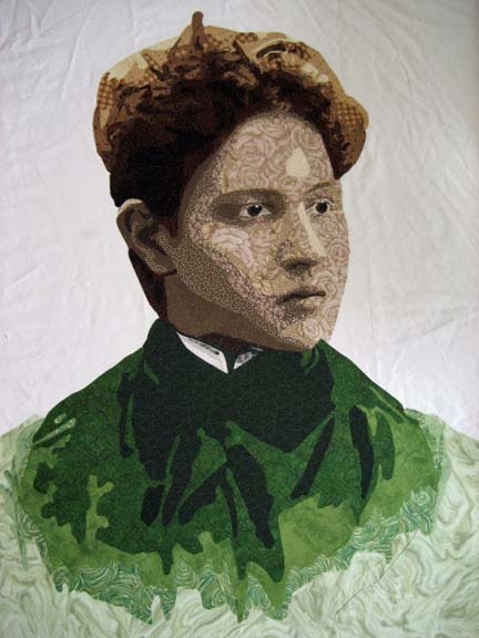
Arminta — what to wear . . . what to wear. In the original photograph, she has on a fitted jacket with a lace collar — very intricate. I had to be more simple. I decided to go with emerald green — I’ve been working with a lot of blue lately and wanted a change.

This is the first value.

When you see the second value and compare this picture to the one above it, you can see I made a mistake in my cutting. Given my limited supply of this fabric, I laid some additional pieces underneath. These seams will require some extra stitching to cover them but because I will match the thread to the fabric, they won’t be noticeable in the final piece.

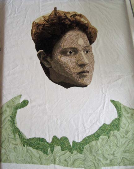
The third value shows the curve of the collar.

And the fourth value fills in the rest of the shape except for the deepest shadows.

It is at this point I realize that I have to complete her collar before I can add the final dark green — which you see here — values of white into gray.

And here you see the final green. (This is the first picture taken vertically. All of the previous pictures were taken horizontally and suffer from some distortion.)

With the collar done, it was time to start thinking about the background. I spent a lot of time on this part — which sounds strange given how simple it is. I tried to create a halo effect similar to the one in the original photograph — and it just didn’t look right — no matter what color range I was using. My husband finally told me that it was distracting from Arminta — it made the eye want to look elsewhere.

I don’t ever want the background to be an after-thought — something added that doesn’t add to the final piece — but I’ve decided that for many portraits, the purpose of the background is to not distract. Although the Amelia Earhart piece has a plane in the background, it is not always advantageous to start adding extraneous information into the background of a portrait for the portrait to be successful.

The jacket at this point bothered me. I realized that she needed the definition of her sleeves so I sketched up a quick change on my pattern.


Go to Top