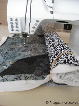
I don’t tend to show a lot of my quilting on my blog. I don’t know that I consider myself all that competent at it — there are certainly better machine quilters out there — and I’m not a master at feathers and curlicues. I tend to either follow the contours of a shape or use abstract designs that add texture to the shapes. Also, I have worked on a frame before — and now I use just a home machine and my hands. Quilting is a more difficult proposition at this level than when the quilt is stretched out on a frame that the machine hovers over.
But making a complex piece like this creates some problems for quilting on a home machine without a frame — and since I’ve made a few mistakes of my own, I thought I would walk through the steps that I used on this quilt to address issues before they became problems.
Everyone is told by the quilt police that you quilt from the inside out. So you start in the middle of the quilt, and any ripples that form as you go along get pushed out. This is particularly a problem with dense quilting. I quilt about 1/4″ apart — and even though I use a 70/30 cotton/poly batting with a scrim to keep it from stretching — it still happens.
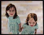
If you have more than one figure in your piece, however, you are working from more than one focal point. I typically quilt the face first, then the hair, then the clothing, and finally the background. With two figures, as I found in Beach Guardians, you can end up with a lot of fabric left to distribute in the space between the two figures if you aren’t careful.
I started by taking the black and white picture of my design and drawing on it with pencil. It does look a little spooky — but it gives me a plan of how I want my quilting lines to go.

Since I haven’t quilted in a while, I pulled out my erasable blue pen (it comes out with water) and marked my beginning lines. It gives me confidence when I feel unsure about starting. This is the first figure’s face completely quilted.

And this is the second figure’s face completely quilted. When I was done with her face, I then quilted her scarf, then her jacket within the line of the purse strap, and then the rest of the jacket. I did her hair last.

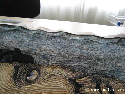
The picture below is to give a reference point. I’ve done both faces — as well as the entirety of the figure on the left. I would normally want to work on one thing at a time — all of the jacket — all of the water — but I have to split it up for this to work. At this point, I need to worry about the space between their faces and make sure that I can distribute the fabric as evenly over the space between the faces as I can.

This is a closeup of the water and cityscape between the two heads. I used metallic threads for the water and jagged black lines — avoiding the white lights — for the cityscape.

I then quilted the left side of the hair of the figure on the right. It seems elementary — but trust me — there is method in the madness. I suppose I could have taken it farther & not quilted the face of the person on the right until after this stage — but old habits die hard and I really want to concentrate on the faces first since they are the focal points of the piece.

Below the hair is the left side of the jacket — which came next.

Then I moved to the right to quilt her shirt.

And then her collar on the right hand side.

At this point, instead of working on the rest of the jacket, I switched over to the right side of the hair. I used long wavy lines to show the texture in her hair.

Then below her hair — still on the right hand side — I quilted the lines of her jacket.

If you look at the top of the picture above, there is a small piece showing the fingers on the shoulder of the jacket. Again, I used my erasable pen to make a few guidelines before I started.

The only part left on this figure is the hat. I tried to take one picture of the hat, but because most of it is white and the inside of the brim is dark blue, I couldn’t take one picture that successfully showed the quilting lines on both sides.
This, then, is the white part of the hat.

And this shows the inside of the brim.

At this point, I’m left with the background on the right and left sides. I work on the water on the right hand side first — using metallic threads in a wavy line. I used a traveling stitch at the top. At first, I thought I should cover that with a solid line at the top — and finally decided that it looked more realistic like this. I like the traveling lines as they are — so I left them as they are.

Then I completed the water on the left side of the piece.

Staying on the left side, I then quilted the small section showing the concrete railing that the figures are leaning against. This is just below the water.

And then I had to think about the cityscape above the water. This area on the right side is full of white lights but otherwise signifies buildings going up a cliff. I chose a jagged line in black thread — avoiding the white lines and thus making them even more prominent.

The left side is the same — except for the stone arches which I worked on in rust colors.

The only thing left at this point was the sky. I used a gray purple in the purple areas and a dark blue in the blue areas — and used a water puddle design. The thread matches so well that it is really hard to show it well in a picture. Trust me — it works. It covers the area without distraction — the quilting stitches create the harmony that is felt in the bleeding colors of the sky.

My point is that quilting can be a puzzle. Quilting from the inside out is a good rule of thumb, but when you have multiple complex structures to quilt, you need to logically consider how they relate to each other and how you’re going to address fullness created in the quilting process.
After quilting, it’s time to add the binding. Maybe I’ll document that one day — but not today. I used my signature black on the binding and a busy black & white print on the back with a matching sleeve. I don’t usually enjoy handwork, but the handwork on this piece coincided with some needed stress relief — and I was glad to have it to work on.
Then I had to soak it. I use a clear glue in the binding to help me get it into place perfectly (thank you Sharon Schamber) so I have to soak it in water to disintegrate the glue as much as possible. I filled my washing machine with cold water (warm water or even soap could set the erasable blue pen marks permanently so be careful) and left the top open so it wouldn’t spin. Then I folded the quilt with the top facing outward — and this time, I put a dye magnet sheet on each of their mouths. If you remember, on my last quilt, the red in the mouth bled onto other white parts of the quilt — never to come out. I wasn’t taking a chance this time. I laid it in the water, making sure all of it soaked well — taking care to keep the mouth from touching anything other than the dye magnets. After about an hour, I let the machine take it through a slow spin to wring out the excess water.
When I pulled it out — no crocking of color this time. I’ll have to remember that trick next time.
And then I laid it out on one of my design walls. This one has started to bend from the water that seeps into it when I block on it. In my previous home, I could pin right into the rug — but I have looped carpet now so I don’t have that luxury. I keep this wall for blocking — another for photographing. I didn’t realize at first that the water was warping the Celotex — it really messes up photographs. It took me a while to realize it was a warp in the board.

One final note — how I did I decide how much sky to add? I spent quite a bit of time thinking about that. I think that most people would cut the line just above the heads and consider the sky empty space without design details. However, it is much better that the horizon line (which I see as the median line of the tops of the cityscape) fall at 2/3rds — which brings the golden ratio into the composition. I end up with quite a bit more sky in the piece, but even though it isn’t full of appliqué details, it brings an overall harmony to the piece that it wouldn’t otherwise have.

I’m still working on a name for this piece — I’ll post a page for it when I’ve made a decision.

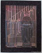
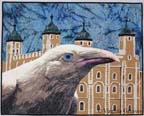 I have finally completed The White Raven. The bird was wonderful — the Tower of London was tedious — but I think in the end that it all came together. It’s ironic that I now have such a creative flow while constructing portraits and my more difficult moments are in the backgrounds.
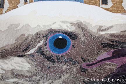 At the end, after I had washed it, blocked it, and added the label, I went back and added more quilting in the raven’s eye. It’s the focus of the piece and it did not have enough quilting relative to what was around it. I didn’t want it to sag over time.