Posts tagged portrait

Quilting a Face & Conquering Your Fears

6

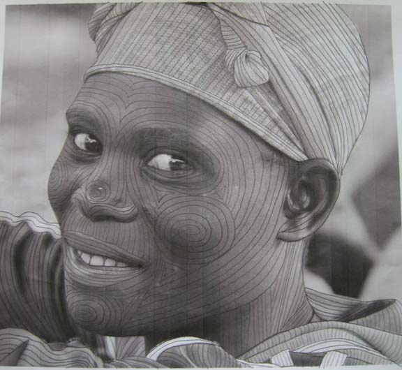
I should say, conquering MY fears. Every time I finish a quilt, the hardest point for me is when I have to sit down & start quilting. I think about everything else in the world I can do to put it off, and my heart races at the thought of beginning. I think it is very similar to the fear of drawing — which is the fear of failure. Moving through a process that makes it less initimidating & breaks it into smaller, workable pieces is how I have to approach quilting — or I would never get it done. To be honest, I’ve even considered skipping this part altogether. I know an artist that mounts all of his fabric pieces on wood — and another one that mounts it onto a frame — but in the end, I know that the quilting adds a dimensionality to the piece that I like. I just don’t always know how to get there.

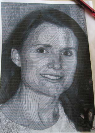
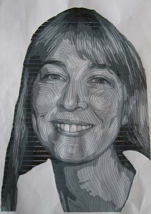
What works for me is to take a black & white picture of my photograph & start drawing on it with a pencil. I can mess up, erase, and start over. I try to follow the natural contours of the face — or the line of the shirt, or the neck, or the ear. Pulling all of these lines together into something cohesive is what I am working out on paper so that I won’t be pulling out stitches later on the quilt. I used to draw all of my lines on the quilt — I don’t do that anymore (it took too long & once I had my confidence, I didn’t need it anymore.) I look at my roadmap & I draw in a few primary lines on the quilt — and then fill them in with contour quilting lines.

I won’t always follow my map exactly, but I have an idea of where I want to go and I refer back to it as I quilt.

Studio Time

5

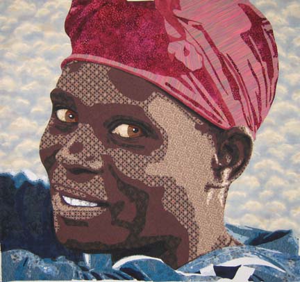
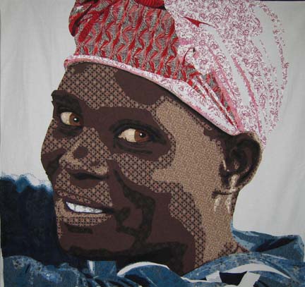
I had to remind myself today to hold studio time more sacred. I realized that I have just over a month to complete my current quilt if I want to enter it into Houston. So I ignored the ringing phone and did everything I could to finish cutting out the appliques on my latest quilt. I had to re-do the turban — I really didn’t like the fabrics in my 1st effort & the actual drawing in the turban needed some tweaking.

Even though the light is at the back of her head, all of that white just looked wrong so I switched it with my medium tone used on the front of the forehead to add balance. I then added some deeper tones in the folds and ignored the final value I had in the drawing — I didn’t have enough in my new fabric range & I decided it looked fine without it.

I am so pleased with it. Strange that the turban would be the part that gave me the most trouble.

Tomorrow I will begin covering the raw edges with an applique stitch — I use a narrow zig-zag. That will take me about a week — although it will be next week until I finish it as I have company coming tomorrow for a few days. Nose to the grindstone.

Rwandan Redemption

1

One of the great things about being in the Anglican church in Atlanta is that we fall under the diocese of Rwanda. Years ago, when our priest went to Rwanda to talk to our bishop, he asked him if there was anything that he could do in return to help Rwanda in exchange for all of the blessings that they had provided him — and the bishop answered him simply “sell our coffee”.

So Jonathan started Land of a Thousand Hills which owns three coffee houses here in Atlanta & sells coffee directly to many churches in our area. It is a beautiful opportunity to provide the people of Rwanda a living wage while giving others the gift of their wonderful coffee.

Jonathan returns to Rwanda about once a year and as I was sitting in church a couple of weeks ago, he started talking about the friendship between a man and a woman — one Hutu, one Tutsi — who were personally linked through murder during the genocide of the 90’s but who now accept redemption and forgiveness — and work together in the coffee fields.

That is an amazing thing — to ask for & receive — or to give — forgiveness for murdering family members — all through the grace of God.

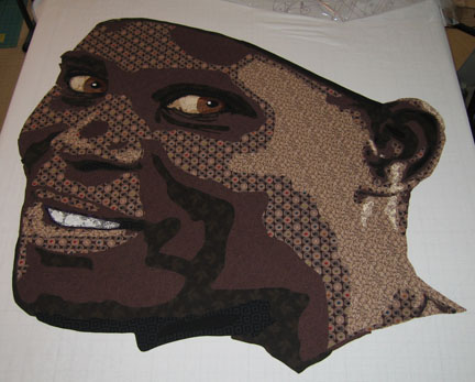
I had been struggling with my next project — which sounds like a meagre anxiety in comparison to people familiar with machetes — but it became clear to me that it was important that I make a portrait that would capture this beautiful story. Jonathan (and his coordinator Karen) were kind enough to allow me to choose one of the many pictures that he has taken on his trips. After looking through many, there was one of a woman bending over the grates, sorting coffee beans, with a relaxed and happy expression on her face — a light in her eyes.

I am Caucasian and all I’ve done in the past have been Caucasians so I was nervous about working on an African portrait — I knew that the palette would have to be different — but I surprised myself. I walked into the fabric store & came out with a wonderful value range. It was strangely easier — but I do think that my eyes are becoming more trained to see value over color. The more you do it, the more you can see it.

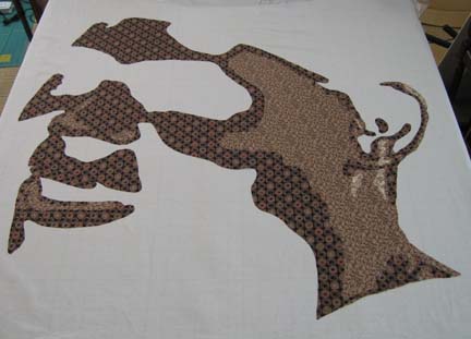
This is what she looks like with the 1st 3 values. You can’t see the outline of her face well with only the 1st 2 so I thought I would skip to the 3rd. I was really surprised at what I chose for the 3rd value. It is a dark brown with taupe circles with green, red, black, & blue in the centers. It doesn’t seem that it would work — but the print is small enough in relation to the overall piece that it does.

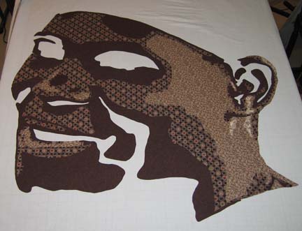
This is with the 4th value — you can really see her coming to life.

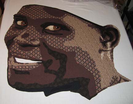
This is with all of the values — and her eyes. I will admit I had an uh-oh moment — I had 6 values & realized I needed 7 but all ready had 5 fused. The last value is a jet black — so I used a black for the 6th that has a pattern on it. Although the effect is subtle — and you probably can’t see it here — it works OK in the piece. I could have technically eliminated one of them & just used the jet black — there is only one place where they are touching — but what I did works fine.

And the eyes. Most Africans have brown irises — but with the brown skin, I thought it important to use another brown altogether. I think that the more yellow brown helps her eyes pop a little more. Also, in Caucasians, I have used the face colors to make the sclera — or white part of the eye — and it’s always worked. I’ve always preferred that to just white fabric. However, with this piece, I couldn’t re-use the face fabrics for the eye — but it was easy to see that I just had to go pull the fabrics I used in previous pieces & that would work perfectly.

The mouth was another challenge. The teeth were made the same but the color around the mouth was an issue. I realized that I had to choose something that would be darker in value than the skin tone just around it. I tried browns, reds, purples — I had half my stash out of the closet. After thinking about it for a while, I decided I needed a really deep purple — which I did have to run out & get since I didn’t have any on hand. I also shortened the mouth & used the printed black for the corner of her mouth as the purple extending beyond her gumline made no sense.

I’m really pleased with how she is turning out. Next week I will work on adding her hair turban and shirt as well as a background. In the photograph, she has an orange turban & blue shirt — but I may well change it. I’ll take this last in-process picture into Photoshop & decides what looks best on her next to her skin as I have recreated it.

Fiber Art Fusion Class

0

Last night, I walked through my process with my Fiber Art Fusion group. Great bunch — always a fun group to spend creative time with — but I was so nervous about doing this in front of MY group. Speaking in front of strangers is so much easier. In addition, this was more than a trunk show — I was walking through my process — which is complicated. Yes, there are other ways to achieve the same ends. I tried to tell them which things I had tried & explain why I do things the way that I do. I tried to make it as simple as possible — but at one point, all of those blank faces was truly daunting. It’s a detailed technique and requires a lot of drafting — so I guessed that about half would love it and half would hate it — which I think accurately described the meeting.

I have been working with fusibles for so long I had forgotten all of the misunderstandings. Although most everyone immediately understood machine applique — and there were hardly any questions about Photoshop — using Wonder Under created the most problems. If I do this again, I’ll have to come up with a better way to demo how it’s done.

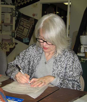
This is Martha Meyers working on drafting:

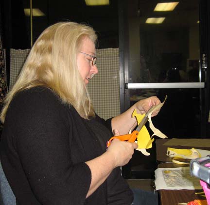
And this is Rebecca Reasons-Edwards happily cutting away (my favorite part):

I’m hoping that a few of them will share their finished fused projects. Unfortunately, most of them only got through with drafting and a couple only through the first value by the time we were done for the evening.

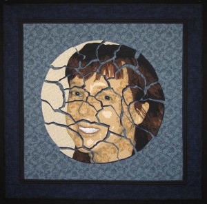
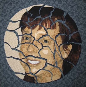
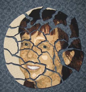
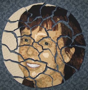
Before I ran through the project, I did spend some time showing them some of my portrait quilts including one that I finished just in time for show & tell — Cracked:

You can read more about this piece in the gallery section of my website here.

I did have someone ask for resources for learning Photoshop. I have taken online classes at both Eclectic Academy & LVSOnline & found them both to be wonderful.

After spending the last 3 weeks quilting & wanting to finish my quilt in time for the class, it feels strange to have a day without a deadline looming over me.

I do want to point out that there is a substantial border on Cracked — which I don’t usually do. After hanging Duodecim in my dining room with my usual black skinny binding as a stand-in for the only border — I decided that maybe my piece needed breathing room. If it were a painting, I would have added a broader frame — for a quilt, a wider border. So I added one on this quilt.

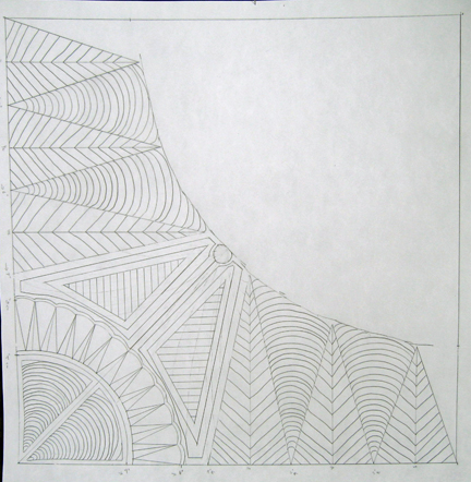
When I was done quilting the plate pieces, I was really stuck on how to quilt the rest of it. I took a 16 x 20 piece of paper, mapped out a corner, took out the quarter circle, and starting drawing with a pencil. I made a few adjustments along the way — and the corners had to have room to change since the plate pieces affected each corner a little differently, but this is my last drawing.

In the final border, I added what I call piano keys. I had intended to stipple — but it’s been a while & my stipple was just too rough. The keys add a more formal border anyway, which I like.

I’m not sure I’ll do another one with a wide border again. I’ll have to hang it in my dining room first and see if I like it better.

Irony

0

Irony is that the hottest thing on my blog about quilting is the entry I made on zentangling last summer. And I mean by a lot.

Irony is cutting up the face — only to then begin to realize how much harder it makes everything. There are a lot more lines to applique — and now I’m starting to dread quilting this thing. All of the applique is finally done — and I printed out a B&W picture of it to start penciling quilting ideas — and it hit me. All those stops & starts. What was I thinking?

Cutting a piece up causes all kinds of unexpected problems. I also had a problem with the white backing layer (on each of the individual plate pieces) showing up between the dark colors and the now blue background. I used a black & brown micron pen on the edges which did a fairly good job of making the white go away.

So this relatively small piece has become infinitely complex.

I also starting to think that it needs something more. I’m not a big fan of borders — I’ve been using the plain small band of black on the binding for years. However, I recently hung Duodecim in my dining room — and it could use more space between the image and the wall. The black binding is not enough. I’m so used to seeing things on my black design wall — I tend to forget that most walls are lighter in color.

So I played with this in Photoshop & I think I’m going to add a narrow black border, then a couple inches of the dark blue used to shadow the plate pieces, and then finish with the black binding.

Taking Care of the Little Details

1

Now that I have it constructed & de-constructed, what more could there be? Well, it occurred to me that it might be cool to add a drop shadow to the pieces — to give the illusion of the plate pieces on the surface of the table. I really had no idea how to do that. It’s easy in Photoshop — well, in the latest version it’s in a new place, but it’s just a few clicks away once you know where it is. And in Photoshop, it is a fairly subtle illusion — I’m limited by the solidity of fabric to create my illusion — which is more solid than scattered pixels.

It occurred to me that I could take a small lamp (I used a rabbit lamp from one of the kid’s rooms) and lift each piece to see where the shadows would fall.

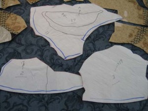
Then I marked each piece with a blue line on the sides where I wanted to add a shadow.

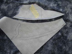
Then I carefully lifted the paper backing from each piece — and used that as the template for another fusible template for only the lines I wanted to shadow. It didn’t need to be exact — this is about creating suggestion — and I only needed 1/4″ or so to tuck under the larger pieces.

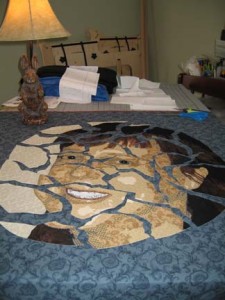
Here you can see all of the pieces with their shadows — except it is on a flat surface & a little hard to see at this angle. If I were taller or my table were shorter, it might have worked, but I wanted to have a better angle for judging where all of the pieces would ultimately sit on the background. I took masking tape & lightly taped the pieces to the background — transferred the whole thing to my design wall — and then replaced the tape with less obtrusive pins.

This next part is more maddening than I expected. There are a lot of different looks you can get depending on the space between the pieces — and all of the pieces are interdependent so if you move one, you have to move several. At one point, I put them all tightly together so that I could regain the relationship between the pieces because I don’t want to entirely lose that when I pull them apart.

In this incarnation, I pulled the head pieces a little more askew & out. Unfortunately, because I used a variant of white in the circle portion of the portrait, it created a piece that then pointed outside of the piece — which is not the direction I want the eyes of the viewer to go.

I think that this is what I’m going to stay with. It shows all of the pieces still in relation to each other without any one piece wandering off, and yet the pieces are still distinct and apart from each other.

I like the effect of the drop shadow. It isn’t overly obvious that it is there, but it creates a depth in the piece that wasn’t there before.

Not All It’s Cracked Up To Be

1

My latest face is rather small — but my intention when it’s done is to cut it up. I know I know — but it’s time to do something unexpected.

To start, the face is made the same way. This pic shows the first 2 layers. Since I’m ultimately going to make an applique out of the entire thing, I’m much more careful with my layers so that I have as few of them as possible. I put down the 1st value — and then the 2nd value with cutouts for reverse appliqueing the 1st values.
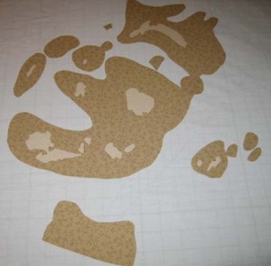
I thought I would show what the cutting out looks like. This is the back of the 3rd value with some large areas still left to be cut out.
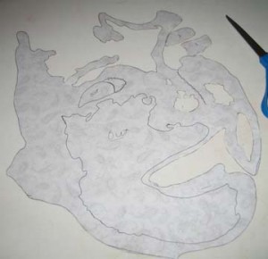
This is it cut out entirely. The 3rd value in the face tends to be the most complex.

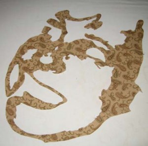
I thought that I would mention that you can really screw up these complex shapes. If you draw a deep curve onto the paper backed fusible, cut it close to the lines, then fuse it, cut it out & try to apply it — it can get really wonky. Sinewy lines won’t lay flat when you fuse them & thus when you try to lay out the fabric, it won’t lay straight on your design. So there are times that it is best to leave big empty spaces in the fusible. You don’t want to fuse them down — that would be wasting fabric — but you can fuse down the lines you do want & use the big spaces to help you lay your design flat while you are fusing. Then you cut away the excess fusible.
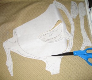
These are the 4th & 5th layers.

And now the eyes.
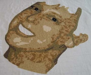
Then I added the mouth & started on the hair. There are only a few pieces of the 1st layer of hair — so this pic shows the first 2 layers.
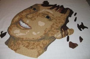
Most of the hair is made up in the 3rd & 4th layers.
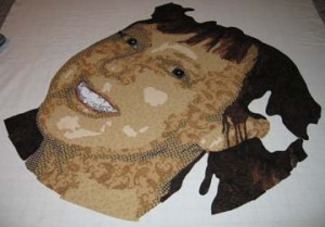
And then I finished the piece with a background. I wanted something circular in a fabric that wouldn’t distract from the hues in the skin but that would work well with the background blues I’m going to add. Since I’m going with the idea of a plate, it made sense to go with a stoney white. It doesn’t compete with the yellows in the face or make it seem that the face is bleeding into the background. It will give a good contrast to the blue but not draw too much attention.
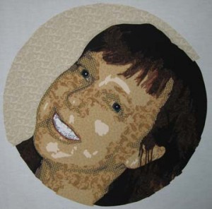
And now comes the scary part. I draw my circle onto Wonder Under and using my pattern, draw out the outline of the front of the face, the two eyes, and the mouth. I try to place the Wonder Under approximately on top of the corresponding elements. I prefer not to cut through the eyes and the mouth.

Now, how do I draw the lines to make it looked cracked? Hmmm — well in Photoshop, it’s fairly easy to use the magnetic lasso tool so I can estimate what it is going to look like — but I have to take a leap of faith & a pencil & draw my cracks onto the Wonder Under. When I’m happy with it, I draw over all of the lines to cut in red to make sure I don’t try to cut one of the guide lines I drew earlier.
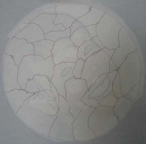
This is what the front looks like with my neat circle cut out.

I then turned it over and (gulp) started cutting. It helped that I couldn’t see it as I did it. (I did in fact cover this piece as I worked on it for fear that someone in my house would grow attached to it before I cut it up & give me grief for sacrificing it.)
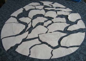
It was then that I started thinking about turning it over. You can see that it is sitting on the background blue fabric that I picked out — but you can’t just turn each piece over. It is a mirror image — so things on the right have to be moved to the left. I started worrying about putting it back together again — so I numbered the pieces on the back with hints to the pieces that bordered each other.
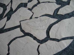
Then I stacked them all up by number, turned them over, and laid them back down as close as I could to make the puzzle pieces match.
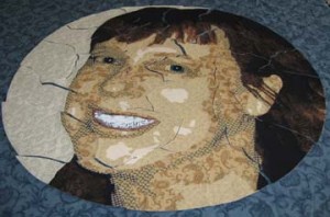
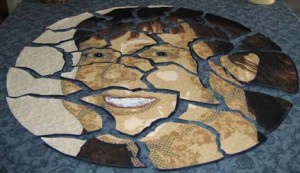
And then I pulled the pieces apart so you could really see the cracks.
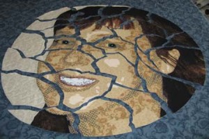
I spent today adding a drop shadow to the pieces in a dark blue so that they look dimensional. I’ll show that later. I got it all up on my design wall and I’m second guessing the placement of the pieces before I fuse it all down. (I fused the drop shadows on a teflon sheet so that I could attach them to their pieces but keep them loose. This way I can play with them on the design wall.)

Part of me wants to start sewing immediately, but some perspective might help the overall design. There may be another way of presenting this other than what I’ve all ready considered.
Re-Connecting

0

I confess — I haven’t written in quite a while — for many reasons. I stopped most all studio work after Thanksgiving in order to prepare for Christmas. It felt good to have all of my things done & properly prepared — but I also really missed the studio. I thought about my sketch book — even carried it around — but didn’t really work in it. I’ve also been letting Facebook take more of my life than I should. I think in the new year I’m going to limit my access.

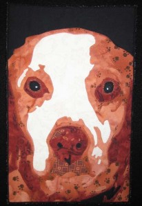
I did make a small piece for my husband as a gift — it’s made from a picture of his dog Solomon. I made one of Solomon last year and gave it away in my fiber art group’s annual 5×7 exchange — and I didn’t realize how much that bothered him until it was all ready done. So this year I tried to make it up to him by making this small piece (Solomon II):

Not easy finding commercial fabrics in rust but I think I did an OK job. I even used a print with paw prints on it — which I think works out OK given Solomon’s age. He is a Brittany Spaniel & his life expectancy was 10 — he is 19 and still going strong.

I also had the complication of a new computer — on a new platform. We had an XP PC that was over 7 years old & it was making noises like the hard drive could crash any minute. We looked at new computers — and in the end bought an iMac which is SO much faster. There are new things to learn though — and the files aren’t as compatible as I would like. Microsoft Office files ARE compatible with the Mac — but hey, not all Microsoft WORKS files are compatible. Add in the fact that the CD writer on the old PC doesn’t always work. I finally brought over all of my old pictures using an external hard drive. I also set up a wireless network. I had tried for a VERY long time to do that with a DLink router — and it never worked — but the Airport  Time Capsule  set up like a dream & works with Macs & PCs.

My last technical struggle involves software. I use Photoshop A LOT — and CorelDraw to resize my patterns — and DreamWeaver for my website. I did upgrade Photoshop on the Mac — haven’t decided yet about DreamWeaver. I’m thinking about putting my entire website in WordPress. It’s been years since I’ve changed the look of it — may be time for a change — and WP is great software.

Once I got Photoshop on my Mac — and my pictures — I could start figuring out a new piece. Hmmm — not much to work with. I really need to dedicate myself to taking more pictures and maybe taking a photography class.

I have had an idea pinging around in my brain for a while. It involves doing a portrait — and then cutting it up to make it look like a cracked plate. Can I do that? Can I cut up a portrait? After thinking about who would be cracked — I decided that the answer could only be me. Although we always talk about how crazy other people are, everything is relative to ourselves — and you can’t deny that it’s possible that everyone else is sane & I’m the one that’s cracked.
I think that I just need to move away from my comfort zone of a straight forward portrait. Test some boundaries. Something maybe realistic with the unexpected thrown in.

5×7 Is Really Small

1

My Fiber Art Fusion group has a holiday exchange in December of a 5″ x 7″ piece of art — which sounds really easy — probably won’t take a lot of time. But actually, I find it much harder to work small. When you’re used to working in a particular scale, going far from that can really throw you.

Which is to say that my first piece totally bombed. I tried to do a 4 value beach scene in black & white — three people in the surf with their backs to the viewer. I think that it is a good idea for a piece — but it really needs to be larger. Lower the # of values was not enough to make this simple. First there were too many really small pieces needed to evoke the surf — and second, all of the fabric prints had to be really small scale for it to work. I thought I had a handle on that — but I wasn’t thinking small enough. At some point I realized that I was at a point of diminishing returns and I stopped.
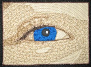
At this point, I thought about just doing an eye — it is a shape I’m familiar with and enjoy doing and its creation would help me grow in my work by concentrating on one small yet very important part of portraits.

eyeknow

It’s made me think that I should spend some more time studying just the eye. It is done differently than in my portraits and although simplified, I like the broader use of color. I may spend the time from now until the holidays working on small eye studies.

How to Quilt a Face

7

When it comes time for me to quilt, I usually have a fear of starting. Most people don’t quilt the face at all — but my entire quilt is a portrait and I have no choice but to quilt it. And let’s face it — the trend at shows is close quilting. I have tried sparsely quilting faces — and the judges don’t like it. I’m not saying that you have to make your choices based on what the latest trends are, but I do think that judges are following the trendsetters when they are judging & jurying — and close quilting has become the norm. (Stitch regulators too — but I won’t even go there. I don’t personally care too much about stitch length — I’m creating art not a bed quilt. I guess this is where I draw my line.)

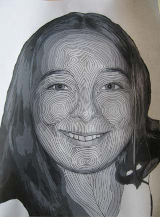
The easiest thing for me is to take a black & white picture of the model, grab & pencil, and start drawing away. I can erase anything I don’t like — it isn’t permanent & doesn’t involve ripping out stitches. I do try to follow what I consider to be the contours of the face so that the quilting itself will give dimension to the face. I follow the contours of the applique sometimes — and completely ignore them at other times. There are no rules — just my imagination.

quiltingsketch1

quiltingsketch2

quiltingsketch3

I show three pictures to give you an idea of how I might change things depending on the pose — or what things are more similar. To be honest, I have found it easier to take out previous photographs and see what I have done before I start. I have also found it easier to do something else while I draw on the photo — like talk on the phone. I tend to be more creative that way & not as likely to second guess everything I do.

I used to transfer most of my lines to the actual quilt before starting using a blue or white erasing pen. Now I transfer very few lines — only a few guidelines as I go — and the forehead which is generally based on the applique of the lightest color. If I quilt from the outside in, I get a big poofiness in the middle (ask me how I know) — so it is generally just easier to draw it out & then quilt on the lines.

I quilt about 1/4 inch apart so poofiness can be a big issue. I pin the whole quilt before I start & try to quilt from the inside out as much as possible. When I get to the outer borders of the head, I’ve pushed quite a bit of fabric out to the edges — so I’ve learned the hard way not to outline the head first — save that for last. I also tend to smooth out the fabric in the background & move my pins to accommodate the moving poof — pushing it out to the edges — before I start quilting that area.

There is stretch that goes on when you quilt that close — both in the top and the batting. I use the 70/30 Quilter’s Dream batting. There is a scrim side I used to always face to the back because it has some cotton imperfections — but one day I made a mistake & put it scrim side up facing the top — and I’ve had a lot less waviness when I’m done quilting since then. I’m sure there is a rule somewhere about scrim up or down that I’ve never heard. But this is what works for me.

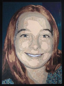
I have finished this one — decided to name it Duodecim which is latin for twelve. I’ve always thought this was the perfect age and have always felt that age in my heart. This is the final pic but there are more detail shots on my website here.

duodecim

Go to Top