Virginia Greaves
(7 comments, 341 posts)
This user hasn't shared any profile information
Home page: http://www.virginiagreaves.com
Posts by Virginia Greaves

More Than One Way to Fly
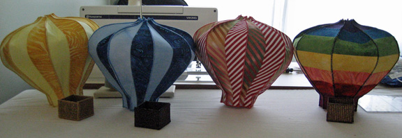
1There is certainly more than one way to fly and I found that I was not quite done working on the theme for this impending exhibit Taking Flight. I’ve covered a bird & Amelia Earhart — but I decided to have some fun making three dimensional hot air balloons.
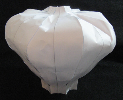
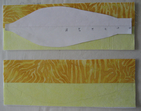
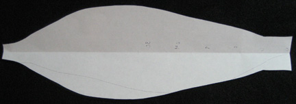
Coming up with a pattern wasn’t so hard. I found a place on the web for making a very large one for a paper balloon. I used the math, scaled it down, smoothed it out, and this is my paper pattern.
I took eight of these & taped them together to see if they would work — and they do. I’ll be making my balloons with a Peltex layer for stiffness — but it should be similar to the paper. I think it was Jamie Fingal’s blog where she made a sculpture from paper & then used that as a pattern to make her fabric pieces. It’s actually simpler than you would think — working with the paper — & if it doesn’t work, you trim or substitute another piece — or throw away & start over.
So I sewed strips together for the first balloon & fused them to Peltex stiff interfacing — then I sewed down the middle. I didn’t worry about the back since it will be inside the balloon. Then I outlined from my pattern and cut them out. It was easy on the yellow — I used the center half of the pattern to line up with the crease between the yellows — but when I started sewing the next balloon in blue, it was easier to mark on the back with a pencil on the Peltex & use the quilted line as a guide for the middle.
Once I had eight pieces, I zigzagged with a matching thread on the tops & bottoms — the 2 shortest sides. After that, I lined up pieces wrong sides together and zigzag stitched pieces together on the long sides. Two wasn’t difficult, four wasn’t bad, eight was a challenge.
The yellow & blue ones were easy — and then I made the rainbow with vertical seams. Then I found a great red stripe fabric with the stripe on the bias — perfect for a chevron — but it would have been nicer if I had bought enough to make the entire balloon. Mistakes happen. I pulled a similar stripe from my stash, cut it on the bias, and made it just like the yellow & blue ones.
Right now I’m making a more vintage one with cream & black stripes (4 stripes on each panel) on the bottom & a vintage check on the top. Odd numbers are good — five would be a good place to stop — if I didn’t have another one lined up. I have a great blue & gold Renaissance fabric that would look cool if I fussy cut the panels.
Good News
I found out this week that my blog was included in Quilter’s Home list of Top 55 Blogs. Really — little me. I was shocked — and pleased — and excited. I think this is worthy of a happy dance.
If you don’t believe me (I was skeptical too) or want to see the rest of the list, it’s here.

How to Fly: Finished
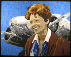
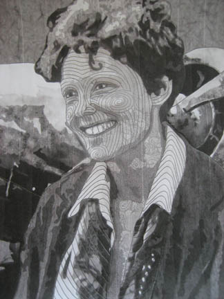
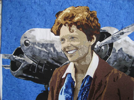
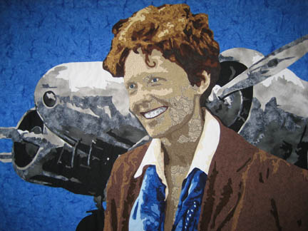
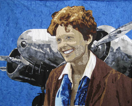
1I have finished my Amelia Earhart piece — you can view it in detail here. I finished her just in time for the end of the month. (If I didn’t set deadlines for myself I’d never finish anything.)
I even had time left over to ship my Childhood quilt to the Quilt Symposium in Alabama. They called me recently & I asked if I would send it for their 10th Anniversary Best of Show exhibit to be held in June. (I recently added this one to the website so that people attending that show could see it online if they wanted to. I still haven’t put everything on since I migrated to having the full website in WordPress — but the Early Work tab has a lot of new quilts added recently.) This was the very first quilt that I ever entered into a show, and I remember being completely floored when I walked in & saw that Best of Show award. It was a high honor and I am so grateful for having received it. Although I haven’t been that lucky since, it showed me that I could accomplish whatever I put my mind to.
And of course my entry to the International Quilt Festival: World of Beauty show has been sent. The deadline is the day after tomorrow and for the first time, I managed to send it early enough that I didn’t need to send it with special postage. I hope to be included again this year. It’s in Houston and I’ve never been lucky enough to go myself. My quilts have always traveled more than me — but I think that that is really more because I have children in school. Once they are both in college, I’ll have the chance to go to the shows — maybe even travel teach.
I usually stop working for the summer but I’m thinking about one more piece to do for the show in July. I’m still in the planning stages, but when I have more, I’ll take pictures and be sure to share.

How to Fly Part 5
1My Amelia piece is coming to an end. She is in the final stages of completion. But there are still a few things I wanted to share.
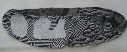
First of all, teeth. I think I stumbled into making teeth when I made Shoshanna. It’s a formula of fabrics that I’ve used many times — but on this piece, I wanted to change it up — so I picked new fabrics — and it doesn’t work.
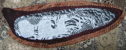
It was still instructive. It taught me that even though you have a good value range that works — it may still not work for the realism you’re looking for. In the case of teeth, the first value isn’t really white — it’s a very hard to find gray — but it isn’t bright white — because let’s face it, most people don’t really have bright white teeth. Also, the following value, the 2nd one, needs to be more white than black. Teeth are small and if you get an evenly spaced pattern of black & white — you’ll see more black in this layer than you’ll want.
This is what I used for the mouth — it works better.
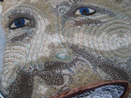
Quilting. I’ve been quilting and quilting and quilting. This is a large piece — for me anyway — and it has taken me a couple of weeks to finish quilting it.
How do I start? I take a picture of the piece & print it out in black & white. Than I draw on it with a pencil to plan how I will quilt the piece.
I don’t like to mark the piece if I can get away with not — but there are always the main lines of the face that I lay out with a soluble pen. A few lines here & there — and the rest of it flows outward.
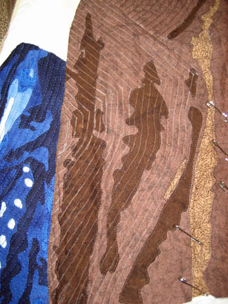
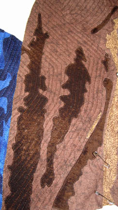
Have you ever heard that you should quilt from the inside out? It is true — especially if you are quilting closely together. My lines are about 1/4 inch apart. But remember, I prefer to mark the main lines & echo from there — but that can mean that I can quilt myself into a corner — like I did here. The blue scarf to the left is all ready closely quilted. Then I laid out the lapel on the right side — and starting quilting in — only to find a hump that I tried really hard to ignore & “quilt it out”. Sometimes you can do that — if it’s small enough — but this was just not working. What could I do? I spent about an hour ripping it out.
And then I marked my lines from the outside in — so I could quilt from the inside out.
See how nice & flat it is now?
On a piece this large — I developed quite a bump on the top that I smoothed as I went. I quilted the face first, then the neck & scarf — and then it became apparent that I was developing a wave on the right & left.
Even though I started with a perfectly smooth top pinned to the batting & backing — it stretched as I quilted it. Even though I had a base muslin layer that was perfectly straight — it stretched. I suspect that I wouldn’t have the same problem on a frame. It may just be the nature of working on a home machine and the tension that the hands put on the top as you work along. I’m sure some of it is the result of tight quilting.
So I made the decision to move pins as I went — to smooth out the top. And now that I’m putting on the binding, the entire thing is <almost> completely flat. And the back is smooth — no tucks.
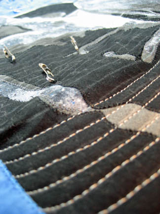
One last thought — did you see how freaking EVEN my free motion stitching is up there? I have amazed myself. I think that making more pieces this year has meant more quilting experience & maybe therefore more even quilting. It isn’t my intention — I really think that even quilt stitches are more pertinent for bed quilts than art quilts — but it’s interesting to see it arise from the many hours of practice.

How to Fly Part 4
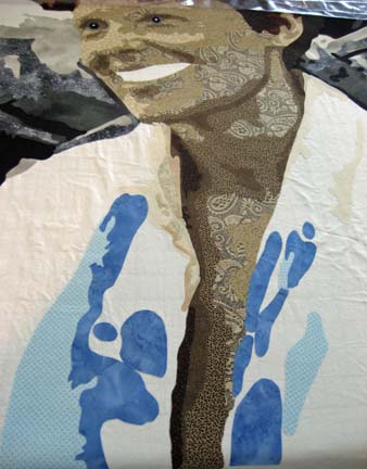
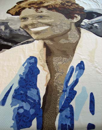
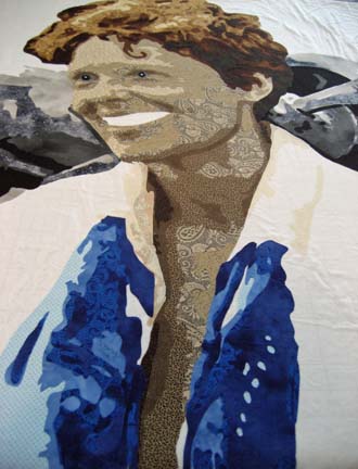
0At this point, I have added the collar of her shirt — but most of it is white so it won’t show up — so we progress to her scarf. I intentionally made it blue — because her eyes will be blue — because the background will be blue. This shows the 1st 2 layers.
It starts to make more sense in the 3rd value.
Fourth . . . .
And finally fifth value . . . . . (Notice that I finally ripped off the eyes — they just weren’t working.)
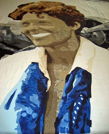
At this point I add her bomber jacket. Because of everything else, I kept it fairly simple — only 3 values.
Notice her eyes. They’re not right. The photograph was no help — she is actually squinting in the original — and all is lost. I added the irises when I did my design and thought — I’ll deal with that later. Well now later has come — and this doesn’t look quite right.
I wish I had copies of everything I tried. I used what I had done on past eyes to help me — and really nothing looked right. The one below is getting a little better — you needed the contrast of the sclera (the “white” part of the eye) — but it’s too much. (I used the lightest skin tone for the sclera.)
This next one is better. I took the darkest skin tone and wrapped it around most of the eye. The deep contrast to the sclera gives the impression of depth — which you need in an eye.
I also softened her mouth with a pinky brown. I usually add a dark color to indicate the recess of the inner mouth — but I chose to soften it by adding some lips. I haven’t done this before. I usually stay with the normal skin tones & quilt in the shape of the mouth. In this instance, the dark red shouted too much so I added a small line above and below it (except in the corner facing away from us).
Did I get it right? Hmmmmm. Well it seems better. I ripped off the white glint I sometimes put in the eye — it gave her a strange look. I think the sclera makes her bright eyed enough. I worried about doing that since she is so gaunt and withdrawn in the original — but I took artistic license. It’s allowed.
Amelia also had large teeth. Hopefully when I quilt it that will come across.

How to Fly Part 3
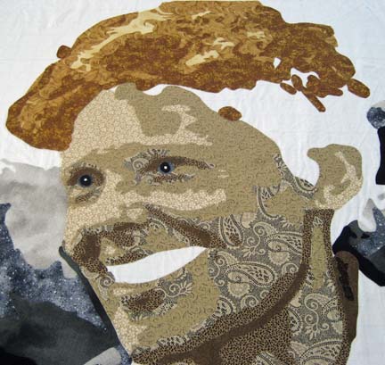
0Now that Amelia’s face is complete, I could start on her hair — another color family. Her pilot’s license said that she was a blond — but there are several sources that say she was a red-head. Of course, the black & white photographs taken of her give no hint of her hair color, so I decided to go with a blond on top darkening into an auburn underneath. I pulled a color card on the net that shows the hair strands once they’ve been colored this way — and started pulling fabrics. It always surprises me what I can find in my stash — usually in different color bins. The top 2 color values were in my yellow bin.
The next value was a wonderful transitional fabric. I’m not certain that I could have moved from the blond into the rust tones without it — although I have previously considered that piece of fabric hideous & unusable. For this, it was perfect.
The next value is a rust red — an orange-y red. This is actually a Kona cotton because it is such a hard color to find in fabric. I think it’s called cinnamon, and although it is one of those colors that alone may not be appealing, with other colors it can be quite attractive. It is also a color that is all around you in everyday things although you may not realize it.
Years ago, I took a watercolor workshop with Wayne Spradley, and he showed us how, if you really look, there is Burnt Umber in everything. It was maddening — I was almost blinded driving home with all of the understanding of Burnt Umber flashing in front of me. If you paint, you need this color in your stash — in the same way that you really need this rusty cinnamon.
The next value is the bottom note of dark red.
And the final value is almost a black.
And with that — this color family is complete — and her hair is complete.
I did, by the way, rip off the eyes at about this point. They just didn’t look right to me. Even though her eyes were described as gray, the value is too weak for the piece. Never be afraid to take artistic license. You want to do what is best for the overall piece regardless of reality.

How To Fly Part 2
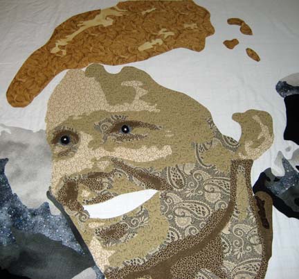
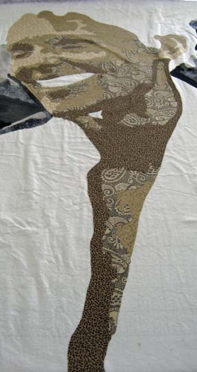
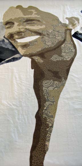
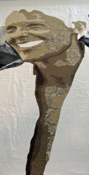
0Now that the pieces of the plane are all together, I could start working on Amelia’s face. This first picture was taken mistakenly in black & white. I forgot that I changed the setting on my camera (which I will do to study values on fabrics). The first value never shows much detail anyway though.
Back in color mode, you can see the beige tones that I’m working with. The second value begins to show the outline of her face.
And the third really begins to give her character.
Of course, at this point, I realize that I have neglected her neck — and that in order to continue, I have to go back and fill in the values of her neck. (In studying the original photograph, I was surprised at how open the front of her shirt is given that it was the 1930’s — but it really did plunge down that low down. I suspect that she had just landed from flight and was oblivious to the state of her clothing — although in today’s society, no-one would blink twice at it.)
The darker values can be harder to find. I’ve learned to go beyond the categorizations that I make when I purchase the fabric & place it in a color drawer — and now go look in other less obvious places.
She really was a beautiful woman. I have not added her eyes and mouth which I normally do at this point. I made a half-hearted attempt at her eyes that you’ll see in the next section on her hair — but I’ve since ripped them off. I’m beginning to see that the color of the eyes are better chosen when more of the surrounding pieces are in place. You want to generally stick with eye color that is representative of the person you’re doing — but the exact color and shade are more effective if they are relative to other fabrics in the piece. For instance, I started with a gray blue that completely fell flat. After laying in her scarf in blues — and then the sky — I see that the blue in her eyes needs to be more vibrant to draw the eye into the middle of the piece. So although her eyes were blue gray — I take artistic license as to what will look best in the piece.

How To Fly Part 1
0I’ve had many people ask me how I make my quilts, and the answer is — one piece at a time. You break everything down into workable areas — or really into color families.
The piece that I’m currently working on is Amelia Earhart. When I was designing the piece, I didn’t like the picture of the plane in the background — so I took a different picture of her plane and put it in the background — moving it so that it accentuated her silhouette.
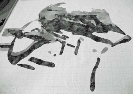
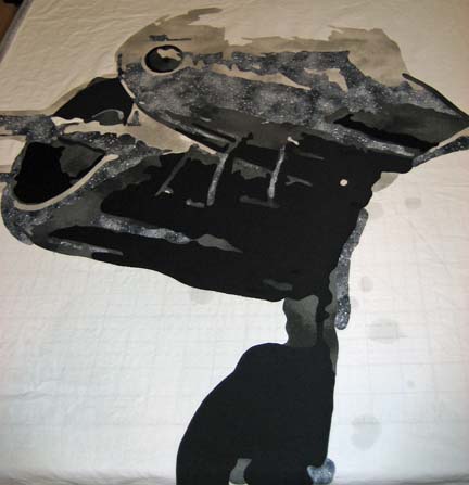
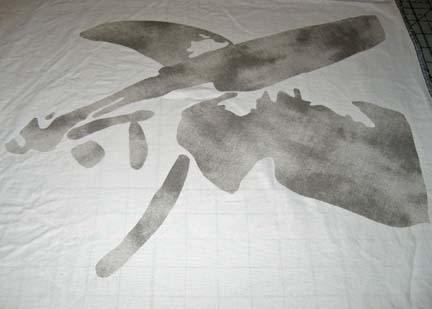
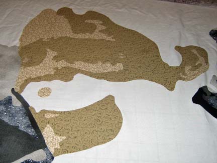
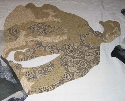
I decided to start with the plane. The plane itself is gray — but gray is a spectrum from white to black. I chose fabrics in a range of values in that color range. I used the actual foundation fabric as the white and started building from there. With the first layer of gray, it’s difficult to see the left wing and engine.
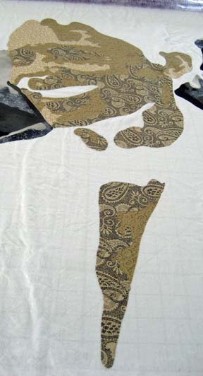
The next value give more definition to the object.
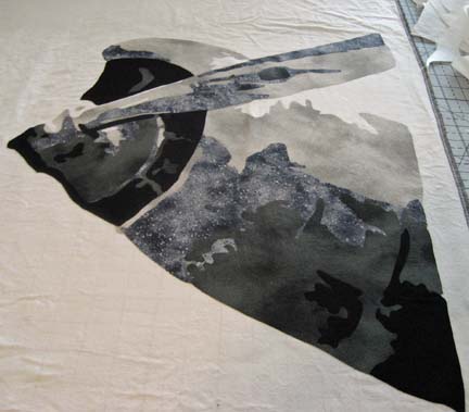
And as I add the layers of values, the image begins to emerge.
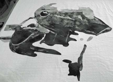
The final layer shows all of the details. (Keep in mind that this lays flat on a table. If I don’t stand on my tip toes when I take the picture, the camera adds a shade to the picture. I don’t always remember to make myself tall when I take the picture. Because It’s on a table, there is also some distortion in the shapes that you’ll see when I finally hang the piece vertically.)
Amelia stands in the middle — with the engine & wings on either side of her. This is the beginning of the right side.
And this is what it looks like completed.
It still looks unfinished — but most of that blank space is where Amelia will go.
I’m actually done except for her bomber jacket and the sky in the background but I decided that I would show you this in pieces — by color family — to show you how I work it out in my head. The next part will be about her face — and then her hair — and then her scarf — and hopefully by then, her jacket.

Celestial Home
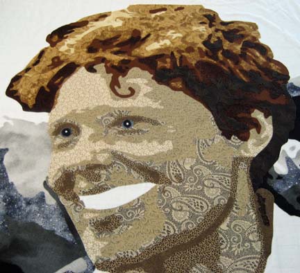
0Just as the month turned over to April, I completed Celestial Home — which you can see here. The last time that I shared this piece, I was still debating on the background. I ended up with a batik and didn’t piece any of it. The cloud layer is really at the base of the mountain — and to add clouds to the sky behind the eagle would throw the piece off balance. Really, above the clouds, there is only sky. To break up the sky would diminish the importance of the eagle given its size relative to the rest of the piece.
The goal of the piece is for the eye to look to the eagle and then move across the expansive sky to the left. With the blue background added, I found that the eye just moved out in any direction. Adding the black border on the top & bottom are an attempt to keep the sightline moving in the direction that I want.
When I began quilting, I knew that I would add something worthwhile to the black background. From past experience, I’ve found that matching the thread to the background is a great way for the quilting to become completely unobtrusive — so if I’m going to spend time adding interesting quilting, use another color. I used purple so you can see the quilting design.
I also did some research on the eagle and found them fascinating. Their wingspan is incredibly large — 10 inches more than the width of the quilt — and they mate for life. I think that the black markings on their face give them the ferocious look that the founding fathers of the United States found so compelling — although the eagle has been used as a symbol for other noble civilizations including the Sumerians and Romans.
They live in the celestial regions of this world and call the vast sky their home. I hope I’ve conveyed some of the feel of that home.

Sharing is Good
1i had previously written that I wasn’t going to share my latest piece since it is an invitational piece — but I’ve changed my mind. The truth is that the writing process is helpful to me to work through issues in my work — and I like sharing.
I decided not to make a portrait for this exhibit — something that truthfully pained me. I find so much fascination in the human visage — that I can’t seem to find in landscapes. (The easy answer is that my mom does landscapes so I do something different.) But there is an animal in it — an eagle. I want it to look like a panoramic shot with the eagle entering the piece from the right — getting ready to swoop past the tops of snow covered mountain peaks.
As usual, the animal was easy — the mountains gave me a hard time.
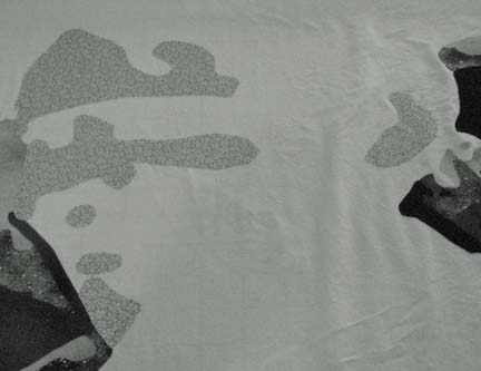
It is unfinished. The background is not intended to be white. I could just slap a blue on there — but I’m beginning to think that that may be too easy of a way out. But I’m also stuck as to what to do. I don’t want clouds — they would distract from the snow and mist. Decisions decisions.

Finished Jack
0I finally finished Just Call Me Jack. I was really trying to finish before the end of the month so I could start the new month fresh with a new piece, but on Monday, I kept sticking the needle through my finger as I was trying to sew on the binding, and I decided that I should only have to donate so much of my blood for a new piece — and finished the next day (with a metal thimble).
Now I am working on a piece for an invitational exhibit in July. The theme is Taking Flight. I am much better at making what I want to and then using my creative writing skills to fit a piece into a theme, but this time, I’m doing it the other way around and working with the theme. I would only do this for close friends — but I’m making the most of it. I am drafting it now. I may not share it since it is for a special exhibit and it should properly have its unveiling there. It’s also not a portrait — although it is illustrative. Let’s hope it works.